TYPE DESIGN INFORMATION PAGE last updated on Tue May 5 11:40:29 EDT 2026
FONT RECOGNITION VIA FONT MOOSE
|
|
|
|
Swiss designer Bruno Maag (b. Zürich) founded Dalton Maag in 1991, and set up shop in Brixton, South London. He serves the corporate market with innovative type designs, but also has a retail font line. Ex-Monotype designer Ron Carpenter designs type for the foundry. In the past, type designers Veronika Burian worked for Dalton Maag. A graduate of the Basel School of Design, who worked at Stempel and was invitedd by Rene Kerfante to Join Monotype to start up a custom type department. After that, he set up Dalton Maag with his wife Liz Dalton. He has built the company into a 40-employee enterprise with offices in London, Boston, Brazil (where the main type designer is Fabio Luiz Haag), Vienna and Hong Kong. The Dalton Maag team designed these commercial fonts:
Fonts sold at Fontworks, and through the Bitstream Type Odyssey CD (2001). At the ATypI in 2001 in Copenhagen, he stunned the audience by announcing that he would never again make fonts for the general public. From now on, he would just do custom fonts out of his office in London. And then he delighted us with the world premiere of two custom font families, one for BMW (BMWType, 2000, a softer version of Helvetica, with a more virile "a"; some fonts are called BMWHelvetica), and one for the BMW Mini in 2001 (called MINIType: this family comprises MINITypeRegular-Bold, MINITypeHeadline-Regular, MINITypeHeadline-Bold, MINITypeRegular-Regular). Other custom typefaces: Tottenham Hotspur (2006), Teletext Signature (by Basten Greenhill Andrews and Dalton Maag), Skoda (Skoda Sans CE by Dalton Maag is based on Skoda Formata by Bernd Möllenstädt and MetaDesign London), UPC Digital, BT (for British Telecommunications), Coop Switzerland (for Coop Schweiz), eircom, Lambeth Council, Tesco (2002), PPP Healthcare, ThyssenKrup (Dalton Maag sold his soul to these notorious arms dealers; TK Type is the name of the house font), Co Headline (2006), Co Text (2006, now a commercial font), Telewest Broadband, Toyota Text and Display (2008), TUIType, HPSans (for Hewlett-Packard, 1997). His custom Vodafone family (sans) (2005) is based on InterFace. In 2011, Dalton Maag created Nokia Pure for Nokia's identity and cellphones, to replace Erik Spiekermann's Nokia Sans (2002). The Nokia Pure typeface has rounder letters, and is simultaneously more legible and more rhythmic. In 2010, the Dalton Maag team consisted of Bruno Maag and David Marshall as managing and operations directors, and Vincent Connare as production manager. The type designers are Amélie Bonet, Ron Carpenter, Fabio Haag, Lukas Paltram and Malcolm Wooden. In 2015, Kindle picked the custom serif font Bookerly by Dalton Maag for their typeface. Still in 2015, Dalton Maag custom designed the sans typeface family Amazon Ember for Amazon for use in its Kindle Oasis. Free download of both Amazon Ember and Bookerly. Dalton Maag created the custom typeface family Facebook Sans in 2017. Bressay (2016). Stuart Brown led the design and did the engineering for Bressay (design by Tom Foley, Selma Losch, and Spike Spondike, at Dalton Maag, London), which won an award at TDC 2016. Later additions include Bressay Arabic [designers not identified by Adobe] and Bressay Devanagari [designers not mentioned by Adobe]. ATT Aleck is a large custom typeface family designed in 2016. Netflix Sans (2018): Netflix replaced Gotham to combat spiraling licensing costs and commissioned its own bespoke typeface: Netflix Sans under design lead Noah Nathan. Free download. The family include Netflix Sans Icon (2017). Comments by designers at The Daily Orange. In 2018, Dalton Maag designed the custom typefaces Itau Display and Itau Text for Itau Unibanco, a large Brazilian bank. In 2019, Dalton Maag produced a corporate typeface for Air Arabia. Venn (2019, Bruno Maag). A 5 weight 5 width corporate branding sans typeface, with an option to get Venn Variable. Typefaces from 2020: Dark Mode VF (a humanist sans designed specifically for digital user interfaces, offering subtle grade adjustments to counteract the effects of setting light type on a dark background, as is common with many dark mode digital reading environments; it has two axis in its variable type format---weight and dark mode), Highgate VF (a variable humanist sans inspired by traditional British stone carving), Goldman Sans (a free clean sans family that includes three variable fonts; Goldman Sachs lets you use it except to criticize the company or any other capitalist pigs). Interview in 2012 in which he stresses that typefaces should above all be functional. View the Dalton Maag typeface library. Speaker at ATypI 2016 in Warsaw and at ATypi 2015 in Sao Paulo, where he gave an electrifying talk on type design for dyslexics (with Alessia Nicotra). Speaker at ATypI 2016 in Warsaw. Speaker at ATypI 2017 Montreal and at ATypI 2018 in Antwerp. |
EXTERNAL LINKS |
| | |

file name: Dalton Maag Dark Mode V F 2020

file name: Dalton Maag Highgate V F 2020

file name: Dalton Maag Ltd Goldman Sans 2020

file name: Dalton Maag Ltd Goldman Sans 2020

file name: Dalton Maag Ltd Goldman Sans 2020

file name: Dalton Maag Ltd Goldman Sans Black 2020

file name: Dalton Maag Ltd Goldman Sans Condensed 2020

file name: Dalton Maag Bressay Arabic 2021

file name: Dalton Maag Bressay Arabic 2021

file name: Dalton Maag Bressay Arabic 2021

file name: Dalton Maag Bressay Arabic 2021

file name: Dalton Maag Bressay Devanagari 2021

file name: Dalton Maag Bressay Devanagari 2021

file name: Dalton Maag Bressay Devanagari 2021

file name: Dalton Maag Bressay Devanagari 2021

file name: Bruno Maag Venn 2019

file name: Bruno Maag Venn 2019 288720

file name: Bruno Maag Venn 2019 288721

file name: Bruno Maag Venn Variable 2019

file name: Dalton Maag Venn 2019 288723 002

file name: Dalton Maag Venn 2019 288724 002

file name: Dalton Maag Venn 2019 288725 002

file name: Dalton Maag Venn 2019 288727 002

file name: Dalton Maag Venn 2019

file name: Dalton Maag Air Arabia 2019

file name: Dalton Maag Airbnb Cereal 2018

file name: Dalton Maag Airbnb Cereal 2018b

file name: Dalton Maag Airbnb Cereal 2018c

file name: Dalton Maag Netflix Sans 2018
file name: Dalton Maag Netflix Sans Icon 2017
file name: Dalton Maag Netflix Sans Icon 2017

file name: Dalton Maag Netflix Sans 2018

file name: Dalton Maag Netflix Sans 2018b

file name: Dalton Maag Netflix Sans 2018c

file name: Dalton Maag Netflix Sans 2018d
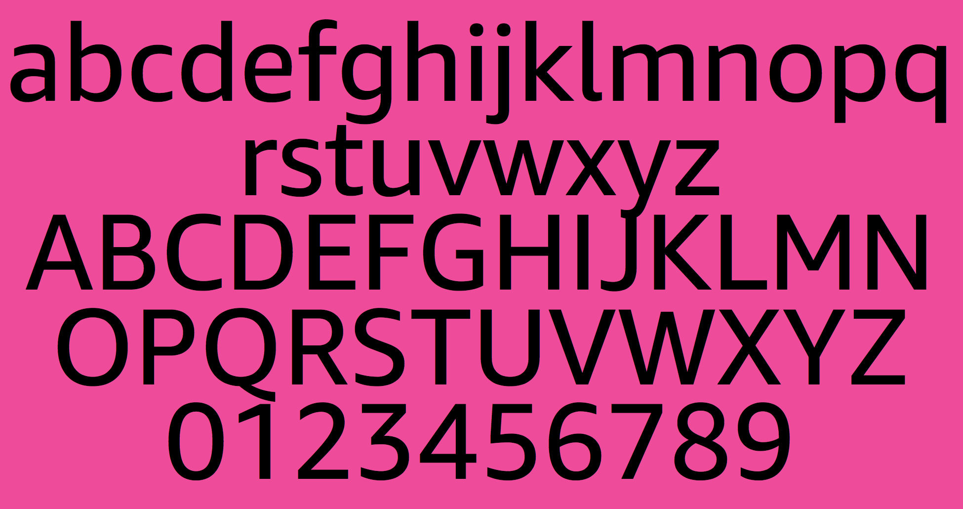
file name: Dalton Maag Amazon Ember 2015
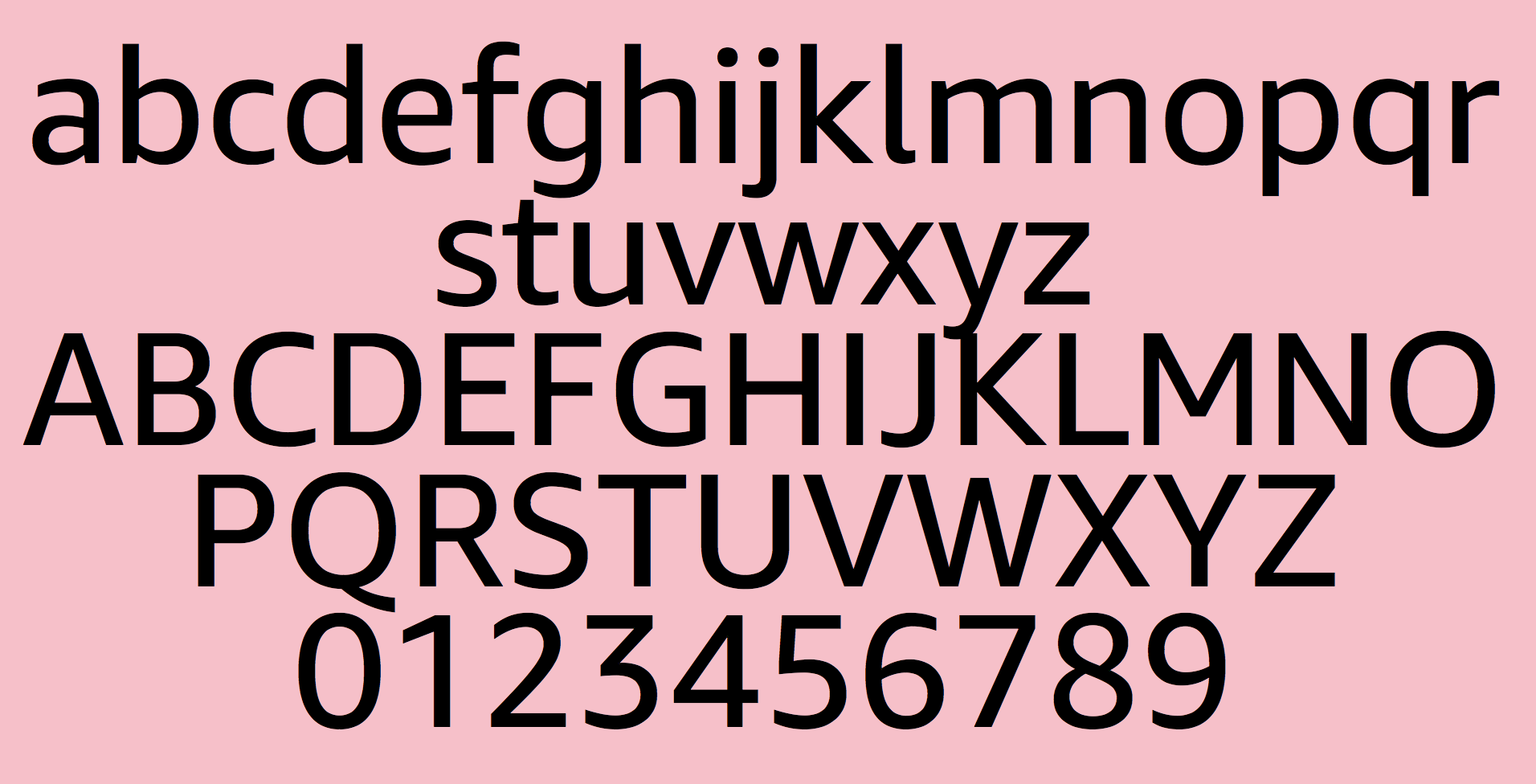
file name: Dalton Maag Amazon Ember 2015

file name: Dalton Maag Bookerly Bold 2015

file name: Dalton Maag Bookerly for Kindle 2015b

file name: Dalton Maag Itau 2018

file name: Dalton Maag Itau 2018

file name: Dalton Maag Itau Display 2018

file name: Dalton Maag Facebook Sans Heavy 2017

file name: Dalton Maag Facebook Sans Light 2017
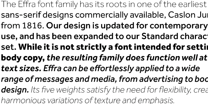
file name: Jonas Schudel Fabio Luiz Haag Effra 2007 2009
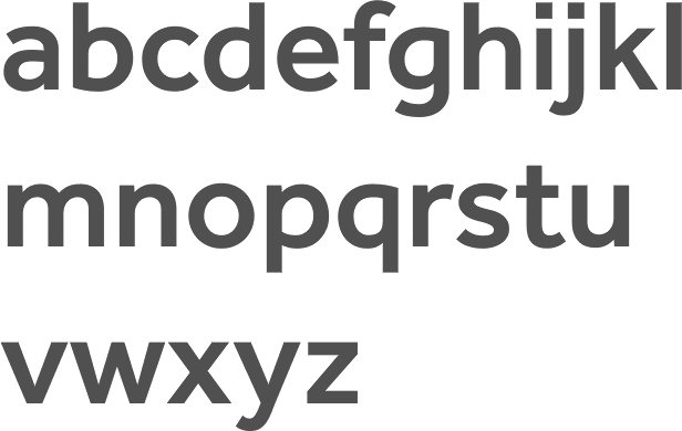
file name: Jonas Schudel Fabio Luiz Haag Effra Medium 2007 2009

file name: Jonas Schudel Fabio Luiz Haag Effra Corp 2013

file name: Jonas Schudel Fabio Luiz Haag Effra Corp 2013b

file name: Jonas Schudel Fabio Luiz Haag Effra Corp Bold 2013

file name: Jonas Schudel Fabio Luiz Haag Effra 2007 2009 Poster by Bill Dawson 2015

file name: Dalton Maag A T T Aleck Cd 2016

file name: Dalton Maag A T T Aleck Slab Bold 2016

file name: Dalton Maag Bligh 2015

file name: Dalton Maag Bligh 2015b

file name: Dalton Maag Bligh 2015c

file name: Dalton Maag Bligh 2015e

file name: Dalton Maag Bligh Bold 2015

file name: Dalton Maag Bligh 2015a

file name: Dalton Maag Sparkasse Serif Bold 2003 2005

file name: Dalton Maag Scope One 2015

file name: Dalton Maag Scope One 2015b

file name: Dalton Maag Scope One 2015c

file name: Bruno Maag A Typ I 2017

file name: Bruno Maag Pic

file name: Dalton Maag Prometo 2014

file name: Dalton Maag Prometo Thin 2014
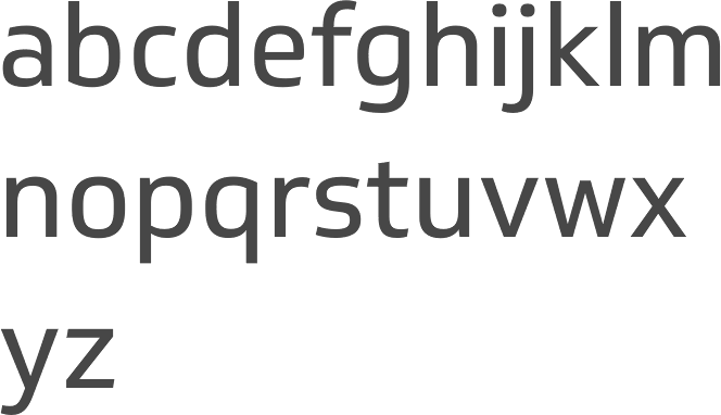
file name: Dalton Maag Soleto 2014
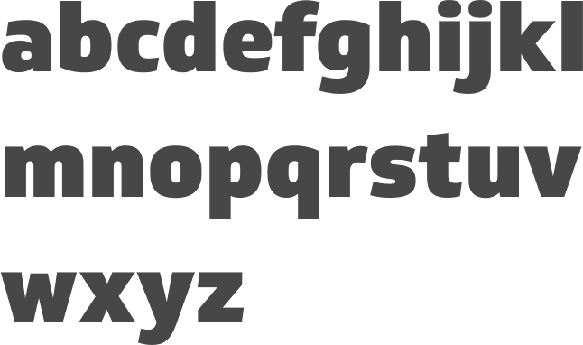
file name: Dalton Maag Soleto Black 2014
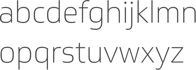
file name: Dalton Maag Soleto Thin 2014

file name: Bruno Maag Dedica Da Ma Bold 1998

file name: Bruno Maag Dedica Bold 2007

file name: Bruno Maag Royalty 2007

file name: Bruno Maag Royalty 2007b

file name: Bruno Maag Royalty Obese 2007

file name: Bruno Maag Royalty Obese 2007 W

file name: Bruno Maag Royalty

file name: Bruno Maag Royalty Da Ma 1999b

file name: Bruno Maag Royalty Da Ma 1999

file name: Bruno Maag Pan Da Ma 1996

file name: Bruno Maag Ron Carpenter Fernando Caro Rafael Saraiva Oscine 2014b

file name: Bruno Maag Ron Carpenter Fernando Caro Rafael Saraiva Oscine 2014b

file name: Bruno Maag Ron Carpenter Fernando Caro Rafael Saraiva Oscine 2014

file name: Bruno Maag Ron Carpenter Fernando Caro Rafael Saraiva Oscine Bold 2014b

file name: Bruno Maag Ron Carpenter Fernando Caro Rafael Saraiva Oscine Bold 2014c

file name: Bruno Maag Ron Carpenter Fernando Caro Rafael Saraiva Oscine Bold 2014

file name: Ron Carpenter Lexia 2007c

file name: Ron Carpenter Lexia Typographic Advertising 2007

file name: Dalton Maag Lexia Mono 2018

file name: Dalton Maag Lexia Mono 2019 287507

file name: Dalton Maag Lexia Mono 2019

file name: Dalton Maag Nokia Pure 2011 C E

file name: Dalton Maag Nokia Pure 2011

file name: Dalton Maag Ubuntu 2010 Poster by Baris Ocal 2019

file name: Dalton Maag Ubuntu 2010 Poster by Baris Ocal 2019

file name: Dalton Maag Ubuntu 2010 Poster by Thy Ha 2016

file name: Dalton Maag Ubuntu 2010

file name: Dalton Maag Ubuntu 2010 Poster By Mai Thy Ha 2014

file name: Dalton Maag Ubuntu Condensed 2010

file name: Dalton Maag Ubuntu Mono 2010

file name: Dalton Maag Ubuntu 2011

file name: Dalton Maag Ubuntu Mono 2011

file name: Dalton Maag Southampton

file name: Dalton Maag Co Text Co Headline 2009

file name: Bruno Maag Ron Carpenter Co Headline 2007

file name: Bruno Maag Ron Carpenter Plume 2007b

file name: Bruno Maag Ron Carpenter Plume 2007d

file name: Bruno Maag Interface

file name: Bruno Maag Inter Face 2007

file name: Bruno Maag Inter Face Black 2007

file name: Bruno Maag Inter Face Corporate 2007

file name: Bruno Maag Inter Face 2007 Poster by Bill Dawson 2015

file name: Dalton Maag Aller

file name: Marc Weymann Ron Carpenter Bruno Maag Aller 2008 Poster by Piuma D G 2014

file name: Marc Weymann Ron Carpenter Bruno Maag Aller 2008 Poster by Piuma D G 2014b

file name: Dalton Maag Aktiv Grotesk 2010

file name: Dalton Maag Aktiv Grotesk 2010

file name: Dalton Maag Aktiv Grotesk 2010

file name: Dalton Maag Aktivgrotesk 2010

file name: Dalton Maag Aktiv Grotesk Bold 2010

file name: Dalton Maag Aktiv Grotesk Regular 2010

file name: Dalton Maag Aktiv Grotesk 2010 Poster by Matt Frizzell 2016

file name: Dalton Maag Aktiv Grotesk Chinese Japanese Korean 2016

file name: Aktiv Grotesk Chinese Japanese Korean 2016b

file name: Aktiv Grotesk Chinese Japanese Korean 2016c

file name: Dalton Maag Stroudley Bold

file name: Bruno Maag Ron Carpenter Veronika Burian Stroudley Bold 2007

file name: Dalton Maag Viato Bold

file name: Dalton Maag Viato Corp 2007

file name: Dalton Maag Viato Hebrew 2013

file name: Dalton Maag Viato Hebrew 2013b

file name: Bruno Maag Ron Carpenter Viato 2007

file name: Veronika Burian Tondo Corp 2007

file name: Veronika Burian Tondo Corp 2007b

file name: Bruno Maag Tondo

file name: Dalton Maag Catalog2010

file name: Bruno Maag Pic

file name: Bruno Maag Linda Kadrnovska A Typ I2018 photo by Michael Bundscherer

file name: A Typ I2015 Bruno Maag Photo by Luke Garcia Andre Hawk

file name: A Typ I2015 Bruno Maag Photo by Luke Garcia Andre Hawk

file name: A Typ I2015 Bruno Maag Photo by Luke Garcia Andre Hawk

file name: A Typ I2015 Bruno Maag Photo by Luke Garcia Andre Hawk

file name: A Typ I2015 Bruno Maag Photo by Luke Garcia Andre Hawk
| | |
|
Luc Devroye ⦿ School of Computer Science ⦿ McGill University Montreal, Canada H3A 2K6 ⦿ lucdevroye@gmail.com ⦿ https://luc.devroye.org ⦿ https://luc.devroye.org/fonts.html |

