TYPE DESIGN INFORMATION PAGE last updated on Fri Dec 13 00:43:29 EST 2024

SEARCH THIS SITE:

IMAGE SEARCH:

FONT RECOGNITION VIA FONT MOOSE

LUC DEVROYE


ABOUT


Jill Pichotta

Jill Pichotta began working for Font Bureau as an apprentice with David Berlow in 1991, honing her skills on projects for Rolling Stone, Esquire, Condé Nast Traveller, The New York Times and Apple Computer. She has managed the production of retail releases for independent designers since 1993, and has contributed several typefaces at Font Bureau. In 2016, Jill Pichotta became Principal Product Manager for Type Network, overseeing type development and quality for the company's global alliance of foundry partners. Jill Pichotta's typefaces:

  • Gangly (1996-1998). Codesigned with Joe Polevy.
  • HipHop (informal printing, 1993).
  • RomeoSkinnyCondensed (1991). One of the thinnest fonts on earth.
  • Rats (with Jean Evans, 1997).
  • FB Garamond Text and Display (1992-2000). Modeled after Ludlow's Garamond done in 1929 by Douglas Crawford McMurtrie and Robert Hunter Middleton.
  • Californian FB Text and Display (1994-1999). Done in cooperation with David Berlow and Richard Lipton.
  • Aardvark.
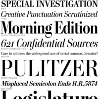
  • A redesign of Matthew Carter's Postoni (1997), called Stilson (2009, with Richard Lipton and Dyana Weissman): Since 1997, The Washington Post's iconic headlines have been distinguished by their own sturdy, concise variation on Bodoni, designed by Matthew Carter. For the 2009 redesign, Richard Lipton, Jill Pichotta, and Dyana Weissman expanded the family with more refined Display & Condensed styles for use in larger sizes. Originally called Postoni, the fonts were renamed in honor of The Post's founder, Stilson Hutchins.
  • Caslon FB (1992, Font Bureau) comes with this text: Our familiar Caslon Bold headletters were invented around the turn of the twentieth century in the United States and were only loosely based on William Caslons romans. The best of the Caslon Bolds originated at the Keystone Type Foundry of Philadelphia, whose Caslon Bold Condensed appeared about 1905, probably drawn by R.F. Burfeind. Jill Pichotta revised his Bold Condensed&drew the Bold Extra Condensed.

FontShop link.

EXTERNAL LINKS
Jill Pichotta
 [Designer info]
Klingspor Museum page
MyFonts search
Monotype search
Fontspring search
Google search

INTERNAL LINKS
Type designers ⦿ Type designers ⦿ Type scene in Massachusetts ⦿ Very thin (hairline sans) typefaces ⦿ Modern style [Bodoni, Didot, Walbaum, Thorowgood, Computer Modern, etc.] ⦿ Garalde or Garamond typefaces ⦿ Caslon ⦿


file name: Jill Pichotta Garamond F B Display Semibold


file name: Jill Pichotta Garamond F B Display Semibold Italic


file name: Jill Pichotta Garamond F B Text


file name: Jill Pichotta F B Garamond 1992 2001 after Douglas Crawford Mc Murtrie Robert Hunter Middleton Garamond Ludlow 1929


file name: Richard Lipton Jill Pichotta Dyana Weissman Stilson Display Bold 2012


file name: Richard Lipton Jill Pichotta Dyana Weissman Stilson Display Cond Bold 2012


file name: A Typ I2017 Quinn Keaveney Debbie Burlakoff C J Dunn Jill Pichotta Yves Peters Marina Chaccur Kent Lew David Jonathan Ross Pic by Benoit Vermette


file name: Jill Pichotta Pic


file name: Jill Pichotta Pic


Luc Devroye ⦿ School of Computer Science ⦿ McGill University Montreal, Canada H3A 2K6 ⦿ lucdevroye@gmail.com ⦿ https://luc.devroye.org ⦿ https://luc.devroye.org/fonts.html