TYPE DESIGN INFORMATION PAGE last updated on Tue May 5 11:41:47 EDT 2026
FONT RECOGNITION VIA FONT MOOSE
|
|
|
|
London-based punchcutter (1768-1830) who had his own foundry, The Imperial Letter Foundry, in London. Before that, he had worked at John Bell's British Letter Foundry from 1788-1798 (when the foundry closed) as a punchcutter, and at William Miller's foundry in Edinburgh. His typefaces:
One of the most remarkable digital revivals and extensions of his work is also called Austin. Originally designed by Paul Barnes as headline type for the British magazine of fashion Harper's & Queen, of Hearst Magazines UK, Austin is a loose revival of the typefaces cut by Richard Austin in the late 18th century. Referencing Austin's original creation, Paul Barnes turned up the contrast, tightened the spacing and came up with a fresh, new, bold and beautiful look for the constantly changing world of fashion. Barnes himself describes the face as "a British Modern with the styling and sheen of New York in the 1970s." The Cyrillic version was designed in 2009 and 2016 by Ilya Ruderman (CTSM Fonts). FontShop link. Klingspor link. Wikipedia link. View Richard T. Austin's typefaces. Alexa Stephenson's detailed image of Bell. View Richard Austin's typefaces. |
EXTERNAL LINKS |
| | |

file name: Monotype Bell M T 1990 1992
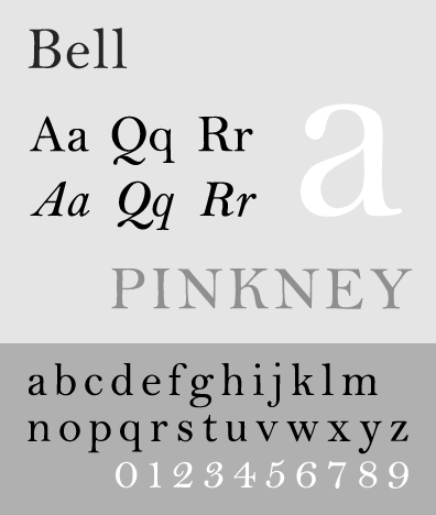
file name: Bell M T

file name: Monotype Bell M T 1990 1992 Poster by Andrea Novo 2014
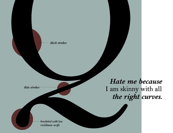
file name: Monotype Bell M T 1990 1992 Poster by Andrea Novo 2014b
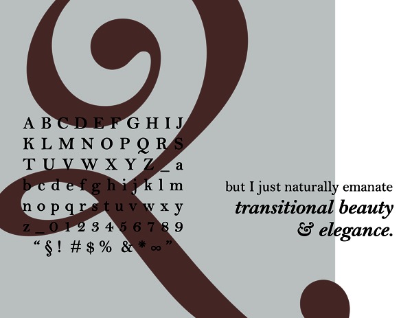
file name: Monotype Bell M T 1990 1992 Poster by Andrea Novo 2014c
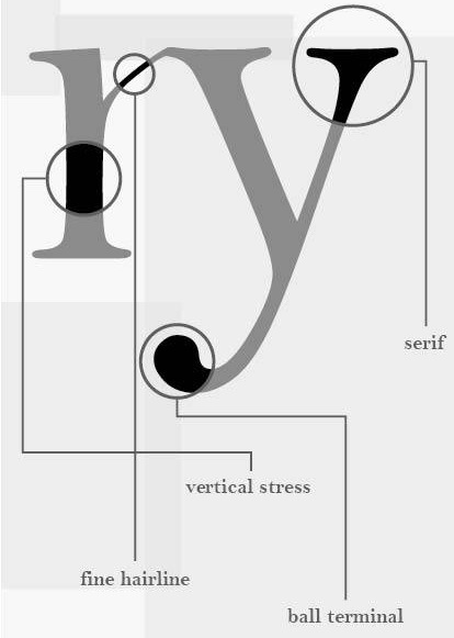
file name: Richard Austin Bell 1788 detail ny Alexa Stephenson
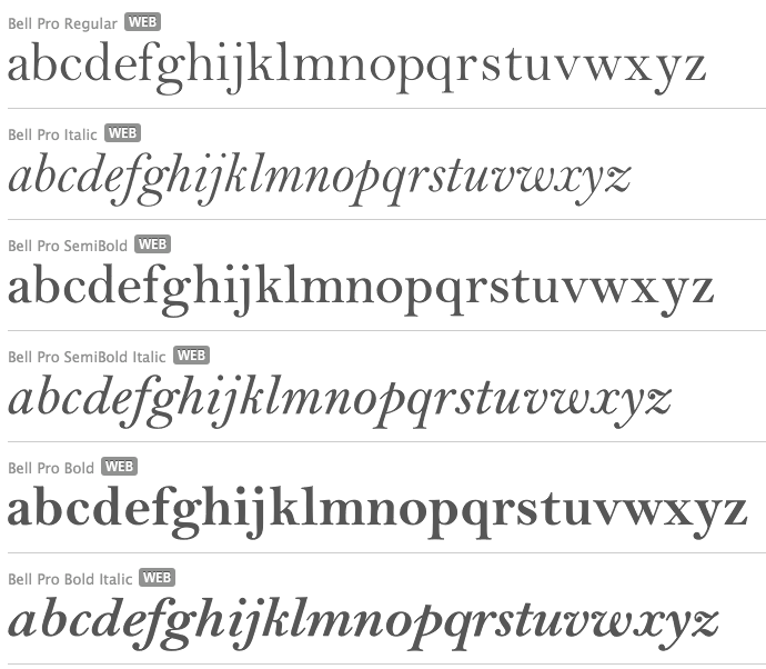
file name: Monotype Bell 1931 after Richard Austin

file name: Monotype Bell 1931 after Richard Austin

file name: Monotype Bell 1931 after Richard Austin 1780s
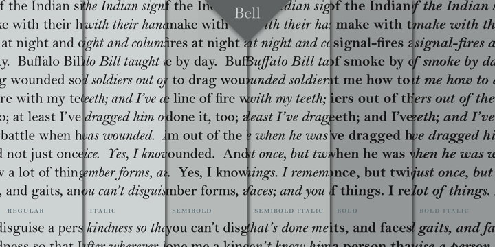
file name: Monotype Bell 1931 after Richard Austin 1780sb
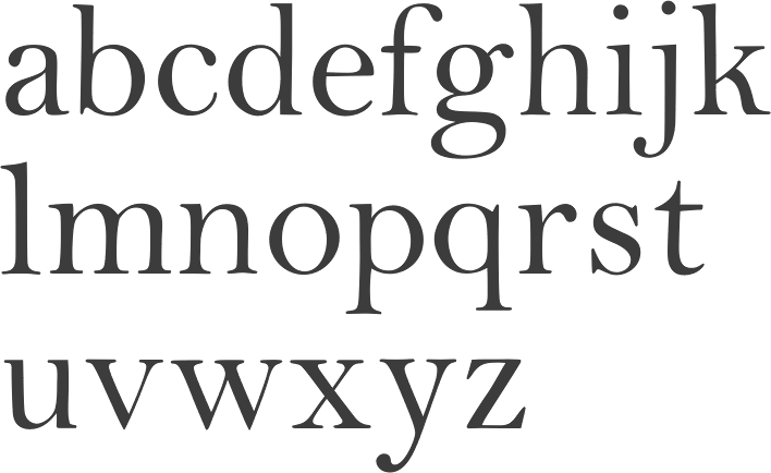
file name: Monotype Bell 1931 after Richard Austin 1780sc
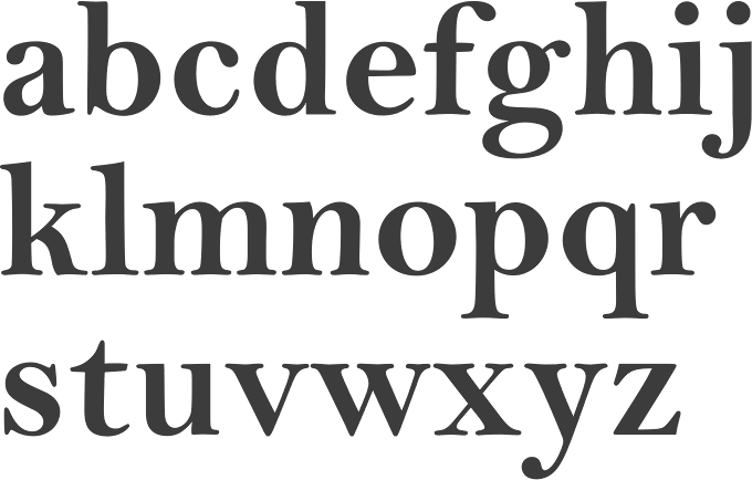
file name: Monotype Bell 1931 after Richard Austin 1780sd
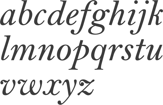
file name: Monotype Bell 1931 after Richard Austin 1780se
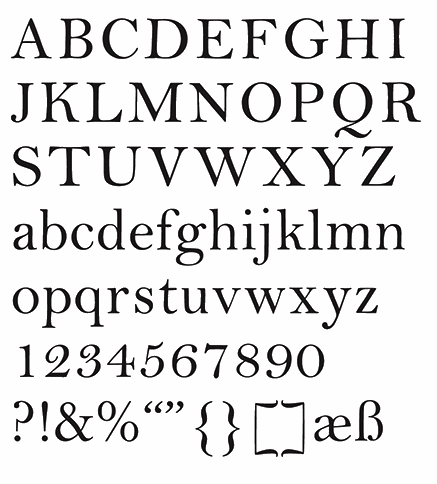
file name: Monotype Bell 1931 after Richard Austin 1780s Poster by Renee La Plante 2015
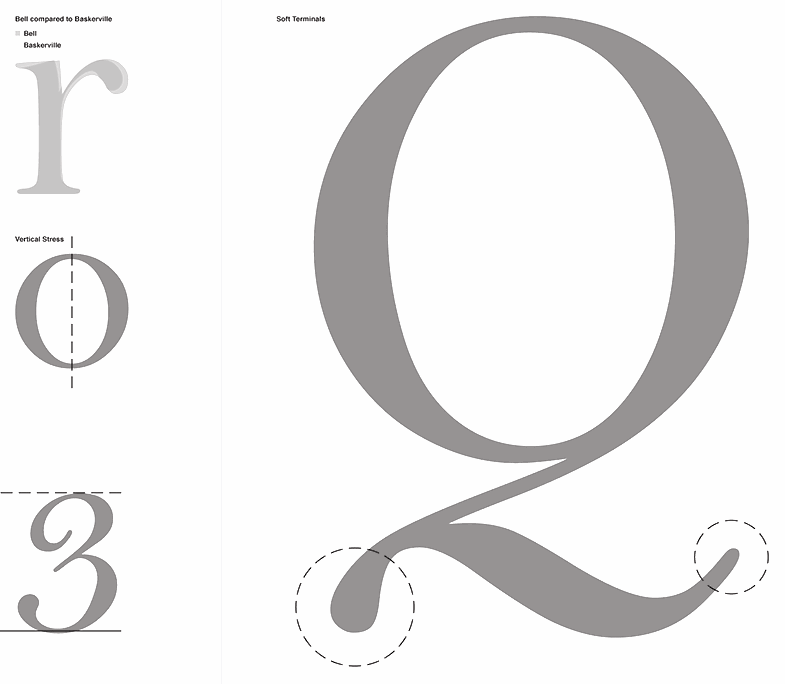
file name: Monotype Bell 1931 after Richard Austin 1780s Poster by Renee La Plante 2015b
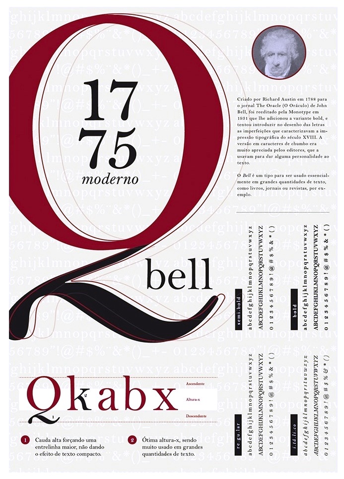
file name: Richard Austin Bell 1788 Poster by Gabriel Bulhoes 2015d
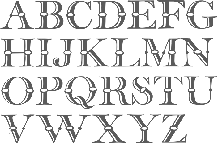
file name: Ari Rafaeli Frys Ornamented 2007 after Richard Austin 1796

file name: David Rakowski Beffle 1991 after Stephenson Blake Frys Ornamented No2

file name: David Rakowski Beffle 1991
| | |
|
Luc Devroye ⦿ School of Computer Science ⦿ McGill University Montreal, Canada H3A 2K6 ⦿ lucdevroye@gmail.com ⦿ https://luc.devroye.org ⦿ https://luc.devroye.org/fonts.html |

