TYPE DESIGN INFORMATION PAGE last updated on Wed May 6 16:11:40 EDT 2026
FONT RECOGNITION VIA FONT MOOSE
|
|
|
|
Choice of Garamond (6)
Linotype's offerings of Garamond, with all Linotype comments:
|
EXTERNAL LINKS |
| | |
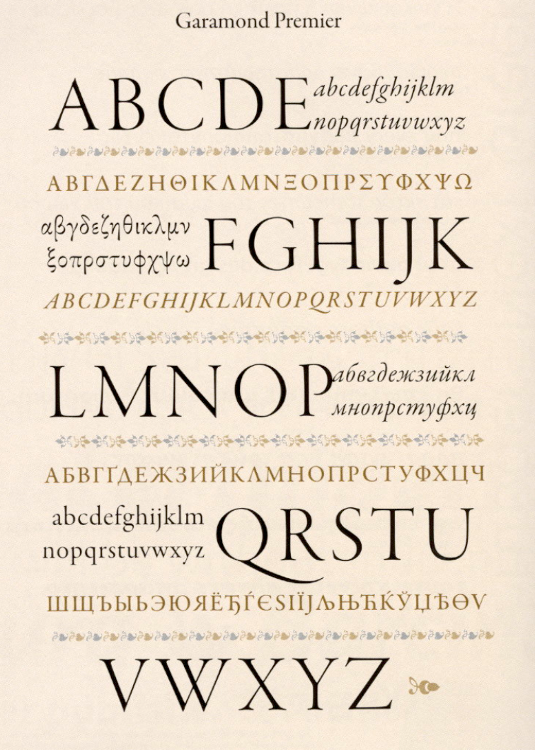
file name: T D C2006 Robert Slimbach Garamond Premier Pro
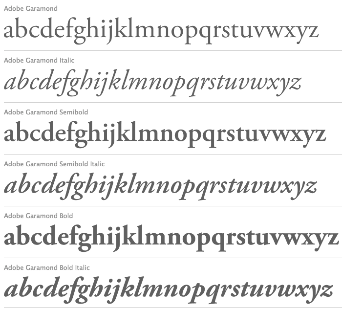
file name: Adobe Garamond Pro
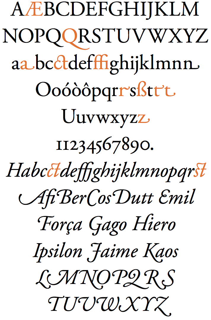
file name: Robert Slimbach Adobe Garamond 1989 2001

file name: Robert Slimbach Adobe Garamond 1989 2001b

file name: Robert Slimbach Adobe Garamond 1989 2001d

file name: Robert Slimbach Adobe Garamond Bold 1989 2001

file name: Robert Slimbach Adobe Garamond Poster by Eva Antoinette 2015

file name: Robert Slimbach Adobe Garamond Poster by Eva Antoinette 2015b

file name: Jan Tschichold Sabon M T 1966

file name: Jan Tschichold Sabon 1964 1967 Poster by Pamela Cruz 2017

file name: Jan Tschichold Sabon 1964d

file name: Stempel Garamond Family

file name: Linotype Stempel Garamond after Stempel Stempel Garamond 1925

file name: Linotype Stempel Garamond after Stempel Stempel Garamond 1925 3
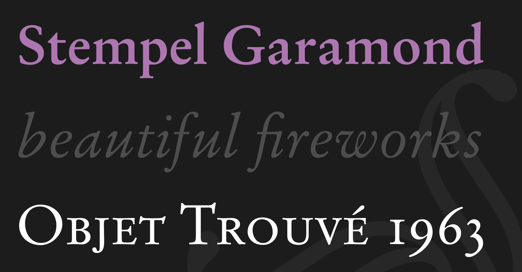
file name: Linotype Stempel Garamond after Stempel Stempel Garamond 1925
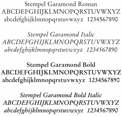
file name: Stempel Garamond

file name: Stempel Stempel Garamond 1925 Poster by Karin Thompson 2016

file name: Stempel Garamond 1925 1936
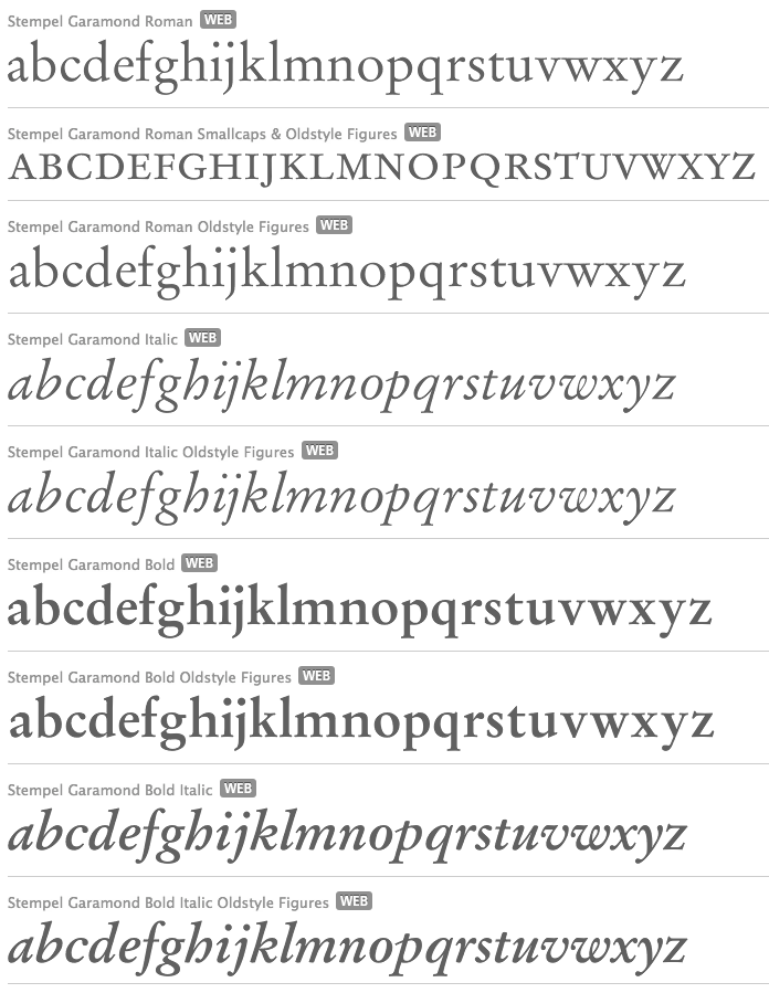
file name: Stempel Garamond 1925 1936 Stempel Garamond 1925 1936
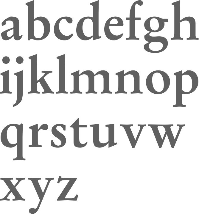
file name: Stempel Garamond 1925 1936 Stempel Garamond Bold 1925 1936
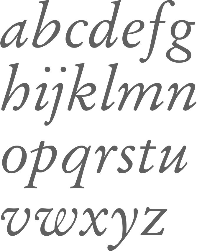
file name: Stempel Garamond 1925 1936 Stempel Garamond Italic O S F 1925 1936

file name: Scangraphic Garamond Simoncini E F 2004

file name: Scangraphic Garamond Simoncini S B Catalog 2004

file name: Scangraphic Garamond Simoncini S B Extra Bold 2004

file name: Scangraphic Garamond Simoncini S B Extra Bold U C 2004

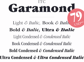
file name: I T C Garamond Poster by Evgenia Skalyha 2015

file name: Tony Stan I T C Garamond 1976

file name: Tony Stan I T C Garamond Book 1977

file name: Tony Stan I T C Garamond Light 1977

file name: Tony Stan I T C Garamond Narrow Ultra 1977
| | |
|
Luc Devroye ⦿ School of Computer Science ⦿ McGill University Montreal, Canada H3A 2K6 ⦿ lucdevroye@gmail.com ⦿ https://luc.devroye.org ⦿ https://luc.devroye.org/fonts.html |

