TYPE DESIGN INFORMATION PAGE last updated on Wed May 6 16:12:06 EDT 2026
FONT RECOGNITION VIA FONT MOOSE
|
|
|
|
Argentinian designer Ramiro Espinoza (b. Santa Fe, 1969) studied at the Universidad Nacional del Litoral in Santa Fe. He dabbled in fonts at his gorgeous (but now defunct) Jazz Futurezone site. In 2007, he founded Re-type, where he heads a group of designers including Yomar Augusto, Leo Beukeboom and Ricardo Rousselot. Ramiro graduated from the Type and Media's KABK (Den Haag) in 2004. He taught typography at the Universidad Nacional del Litoral, Universidad de Buenos Aires and the Escola d'Art i Superior de Disseny in Valencia, Spain. At FontShop International, he was in a team that converted more than 50 font families to OpenType. He freelances occasionally for David Quay's studio. He joined Type Network in 2017. He is currently located in Amsterdam. His typefaces:
MyFonts interview in 2012. Speaker at ATypI 2018 in Antwerp. Fontspace link. Dafont link. Behance link. Type Network link. |
EXTERNAL LINKS |
| | |

file name: Ramiro Espinoza Pic

file name: Ramiro Espinoza Kranto 2021

file name: Ramiro Espinoza Kranto 2021

file name: Ramiro Espinoza Kranto 2021

file name: Ramiro Espinoza Kranto 2021

file name: Ramiro Espinoza Kranto 2021

file name: Ramiro Espinoza Kranto 2021

file name: Ramiro Espinoza Kranto 2021

file name: Ramiro Espinoza Kranto 2021

file name: Ramiro Espinoza Kranto 2021

file name: Ramiro Espinoza Kranto 2021

file name: Ramiro Espinoza Kranto 2021

file name: Ramiro Espinoza Kranto 2021

file name: Ramiro Espinoza Kranto 2021

file name: Ramiro Espinoza Dejanire Text Jewel 2022

file name: Ramiro Espinoza Dejanire Text Jewel 2022

file name: Ramiro Espinoza Dejanire Text Jewel 2022

file name: Ramiro Espinoza Dejanire Text Jewel 2022

file name: Ramiro Espinoza Dejanire Text Jewel 2022

file name: Ramiro Espinoza Dejanire Text Jewel 2022

file name: Ramiro Espinoza Dejanire 2019

file name: Ramiro Espinoza Dejanire 2019

file name: Ramiro Espinoza Dejanire 2019

file name: Ramiro Espinoza Dejanire 2019 2

file name: Ramiro Espinoza Dejanire 2019 3

file name: Ramiro Espinoza Dejanire 2019 4

file name: Ramiro Espinoza Dejanire 2019 5

file name: Ramiro Espinoza Dejanire 2019 6

file name: Ramiro Espinoza Dejanire 2019 7

file name: Ramiro Espinoza Dejanire 2019 8

file name: Ramiro Espinoza Dejanire 2019

file name: Ramiro Espinoza Dejanire Sans 2020

file name: Ramiro Espinoza Dejanire Sans 2020

file name: Ramiro Espinoza Dejanire Sans 2020

file name: Ramiro Espinoza Dejanire Sans 2020

file name: Ramiro Espinoza Dejanire Sans 2020

file name: Ramiro Espinoza Reiher Headline 2018

file name: Ramiro Espinoza Reiher Headline 2018

file name: Ramiro Espinoza Reiher Headline 2018

file name: Ramiro Espinoza Reiher Headline 2018

file name: Ramiro Espinoza Reiher Headline 2018c

file name: Ramiro Espinoza Reiher Headline 2018d

file name: Ramiro Espinoza Reiher Headline 2018e

file name: Ramiro Espinoza Reiher Headline 2018f

file name: Ramiro Espinoza Reiher Headline Black Black Italic 2018

file name: Ramiro Espinoza Reiher Headline Bold Bold Italic 2018
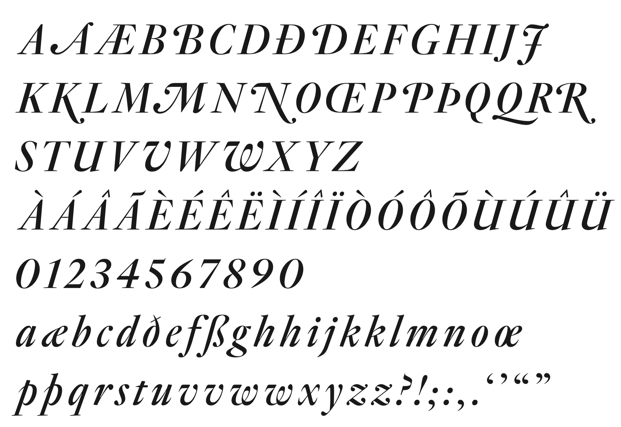
file name: Ramiro Espinoza Reiher Headline Italic 2018
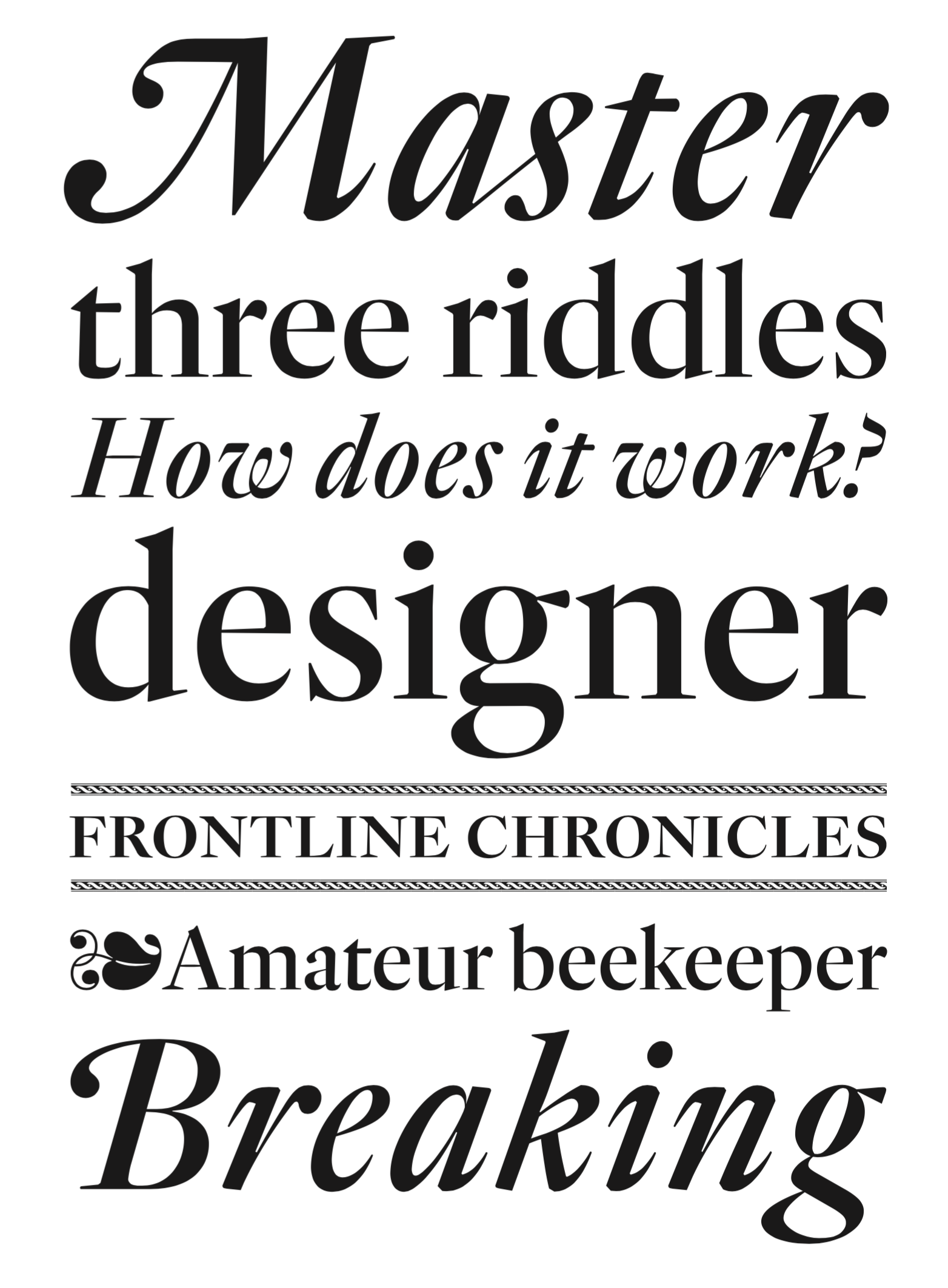
file name: Ramiro Espinoza Reiher Headline Regular Italic 2018

file name: Ramiro Espinoza Reiher Headline Light Light Italic 2018

file name: Ramiro Espinoza Reiher Open 2018

file name: Handelsblatt Guyot 2020

file name: Ramiro Espinoza Guyot Headline 2017c

file name: Ramiro Espinoza Guyot Headline 2017d

file name: Ramiro Espinoza Guyot Headline 2017e

file name: Ramiro Espinoza Guyot Headline 2017f

file name: Ramiro Espinoza Guyot Headline 2017

file name: Ramiro Espinoza Guyot Headline 2017b

file name: Ramiro Espinoza Guyot Headline 2017c

file name: Ramiro Espinoza Guyot Headline 2017d

file name: Ramiro Espinoza Guyot Headline 2017e

file name: Ramiro Espinoza Guyot Headline 2017e

file name: Ramiro Espinoza Guyot Headline 2017f

file name: Ramiro Espinoza Guyot Headline 2017g

file name: Ramiro Espinoza Guyot Headline 2017h

file name: Ramiro Espinoza Guyot Text 2017

file name: Ramiro Espinoza Guyot Text 2017 2

file name: Ramiro Espinoza Guyot Text 2017 3

file name: Ramiro Espinoza Guyot Text 2017

file name: Ramiro Espinoza Guyot Text 2017c

file name: Ramiro Espinoza Guyot Text 2017d

file name: Ramiro Espinoza Kurversbrug 2007

file name: Ramiro Espinoza Kurversbrug 2007b

file name: Ramiro Espinoza Kurversbrug 2007c

file name: Ramiro Espinoza Kurversbrug 2007d

file name: Ramiro Espinoza Kurversbrug 2007e

file name: Ramiro Espinoza Kurversbrug 2007f

file name: Ramiro Espinoza Kurversbrug 2007g

file name: Ramiro Espinoza Barbieri 2009

file name: Ramiro Espinoza Bellucci 2008e

file name: Ramiro Espinoza Bellucci 2008f

file name: Ramiro Espinoza Bellucci 2008b

file name: Ramiro Espinoza Bellucci 2008g

file name: Ramiro Espinoza Bellucci 2008

file name: Ramiro Espinoza Tomate 2008

file name: Ramiro Espinoza Tomate 2008b

file name: Ramiro Espinoza Krul 2012

file name: Ramiro Espinoza Krul 2012b

file name: Ramiro Espinoza Krul 2012c

file name: Ramiro Espinoza Krul 2012h

file name: Ramiro Espinoza Krul 2012d

file name: Ramiro Espinoza Krul 2012e

file name: Ramiro Espinoza Krul 2012f

file name: Ramiro Espinoza Krul 2012g

file name: Re Type Krul in use Smartlap 2021

file name: Rob Becker Ramiro Espinoza Amsterdamse Krulletter Book Cover 2013

file name: Ramiro Espinoza Dulcinea 2012

file name: Ramiro Espinoza Dulcinea 2012b

file name: Ramiro Espinoza Medusa T D C Award 2014

file name: Ramiro Espinoza Medusa 2013

file name: Ramiro Espinoza Medusa 2013b

file name: Ramiro Espinoza Medusa 2013c

file name: Ramiro Espinoza Medusa 2013h

file name: Ramiro Espinoza Medusa 2013d

file name: Ramiro Espinoza Medusa 2013e

file name: Ramiro Espinoza Medusa 2013f

file name: Ramiro Espinoza Medusa 2013g

file name: Ramiro Espinoza Medusa Script 2013 Poster by Paula Mastrangelo

file name: Ramiro Espinoza Medusa Script 2013 Poster by Paula Mastrangelo

file name: Ramiro Espinoza Winco 2012

file name: Ramiro Espinoza Winco 2012b

file name: Ramiro Espinoza Winco 2012c

file name: Ramiro Espinoza Winco Black 2012c

file name: David Quay Retype Bath 2011

file name: David Quay Ramiro Espinoza Bath 2010

file name: David Quay Ramiro Espinoza Bath 2010b

file name: David Quay Ramiro Espinoza Bath 2010c

file name: David Quay Ramiro Espinoza Bath 2010d

file name: David Quay Ramiro Espinoza Bath 2010e

file name: David Quay Ramiro Espinoza Bath 2010f

file name: David Quay Ramiro Espinoza Bath 2010g

file name: David Quay Ramiro Espinoza Bath 2010h

file name: David Quay Ramiro Espinoza Bath 2010i

file name: David Quay Ramiro Espinoza Bath 2010j

file name: Retype Lavigne Display 2010

file name: Ramiro Espinoza Lavigne Display 2009

file name: Ramiro Espinoza Lavigne Display 2009b

file name: Ramiro Espinoza Lavigne Display 2009c

file name: Ramiro Espinoza Lavigne Text 2010

file name: Ramiro Espinoza Lavigne Text 2012

file name: Ramiro Espinoza Lavigne Text 2010b

file name: Paula Mastrangelo Ramiro Espinoza Laski Slab 2014b

file name: Paula Mastrangelo Ramiro Espinoza Laski Slab 2014c

file name: Paula Mastrangelo Ramiro Espinoza Laski Slab 2014d

file name: Paula Mastrangelo Ramiro Espinoza Laski Slab 2014e

file name: Paula Mastrangelo Ramiro Espinoza Laski Slab 2014f

file name: Paula Mastrangelo Ramiro Espinoza Laski Slab 2014g

file name: Paula Mastrangelo Ramiro Espinoza Laski Slab 2014h

file name: Paula Mastrangelo Ramiro Espinoza Laski Slab 2014i

file name: Paula Mastrangelo Ramiro Espinoza Laski Slab 2014j

file name: Paula Mastrangelo Ramiro Espinoza Laski Slab 2014k

file name: Paula Mastrangelo Ramiro Espinoza Laski Slab 2014l

file name: Paula Mastrangelo Ramiro Espinoza Laski Slab 2014m

file name: Paula Mastrangelo Ramiro Espinoza Laski Slab 2014n

file name: Paula Mastrangelo Ramiro Espinoza Laski Slab 2014o

file name: Paula Mastrangelo Ramiro Espinoza Laski Slab 2014p

file name: Paula Mastrangelo Ramiro Espinoza Laski Slab 2014q

file name: Paula Mastrangelo Ramiro Espinoza Laski Slab 2014r

file name: Paula Mastrangelo Ramiro Espinoza Laski Slab 2014s

file name: Paula Mastrangelo Ramiro Espinoza Laski Slab 2014t

file name: Paula Mastrangelo Ramiro Espinoza Laski Slab 2014u

file name: Paula Mastrangelo Ramiro Espinoza Laski Slab Stencil Black 2014

file name: Ramiro Espinoza Laski Sans 2016 201868

file name: Ramiro Espinoza Laski Sans 2016 201872

file name: Ramiro Espinoza Laski Sans 2016 201873

file name: Ramiro Espinoza Laski Sans 2016 201874

file name: Ramiro Espinoza Laski Sans 2016 201875

file name: Ramiro Espinoza Laski Sans 2016 201876

file name: Ramiro Espinoza Laski Sans 2016

file name: Ramiro Espinoza A Typ I2018 photo by Michael Bundscherer

file name: Ramiro Espinoza A Typ I2018 photo by Michael Bundscherer
| | |
|
Luc Devroye ⦿ School of Computer Science ⦿ McGill University Montreal, Canada H3A 2K6 ⦿ lucdevroye@gmail.com ⦿ https://luc.devroye.org ⦿ https://luc.devroye.org/fonts.html |


