|
William A. Schraubstadter

St. Louis-based punchcutter and typefounder (1864-1957) who started the Inland Type Foundry in St. Louis in 1895 together with his brothers Carl and Oswald. He is credited with the heavy square-serif typeface Foster (Inland Type foundry, 1905). Mac McGrew says: [Foster] seems rather crude by later Stymie standards-even compared with the earlier Boston Breton-particularly for the narrow G, the wide J, the high-waisted B, P, and R, and several other unusual letters. Condensed Foster, introduced by the same foundry in 1908, is comparable. He goes on: Adcraft Medium was formerly known as Rugged Medium or Alfred [Medium]. It was originated by Inland Type Foundry and patented by William A. Schraubstadter in 1910. About Comstock, McGrew writes: Condensed Comstock was introduced by Inland in 1905, but patented in the name of William A. Schraubstadter in 1908. It has no lowercase, but the design is more contemporary. Monotype has copied both typefaces, but Monotype Comstock Condensed is in 18-point only, without figures. Schraubstadter also created Woodward and Woodward Outline (1894, Inland Type foundry), Winchell Condensed, Webb, French Script, Devinne Recut, Devinne Recut Outline, and many 19th century typefaces. All notes by Mac McGrew about various typefaces designed by Schraubstadter: - Adcraft. The three weights shown by BB&S in 1927 under this name were assembled from three different sources. While they are acceptable as family members, their resemblance to each other is merely coincidental and not as pronounced as in most families. The unifying feature is their rugged or irregular shape, a popular style of the time. Adcraft Black, the oldest member, was introduced by BB&S under the name of Plymouth Bold in 1900 or earlier. It is very heavy, and the most rugged of the group. Fonts contained all the Special characters shown, except for certain ones in the largest sizes. The regular weight of Plymouth (q.v.) was called Adcraft Bold by some users, but that name does not seem to be in any of the founders' literature. Adcraft Medium was formerly known as Rugged Medium or Alfred [Medium]. It was originated by Inland Type Foundry and patented by William A. Schraubstadter in 1910. Adcraft Lightface originated with Western Type Foundry in 1911 as Carlton and was taken over by BB&S as Rugged Lightface; it was also made under the name Puritan by Hansen, which is the source of this specimen. Adcraft Lightface fonts contained all the Special characters shown plus capital AE and DE diphthongs, but Adcraft Medium fonts had ct and st ligatures only. Compare Avil, Drew.
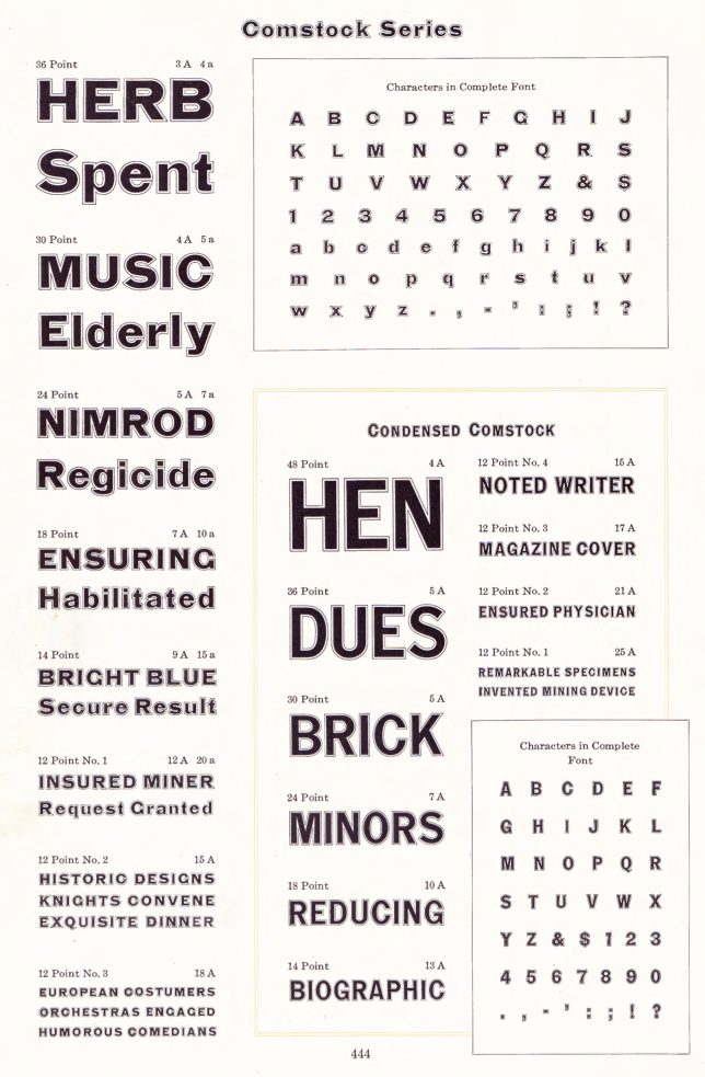
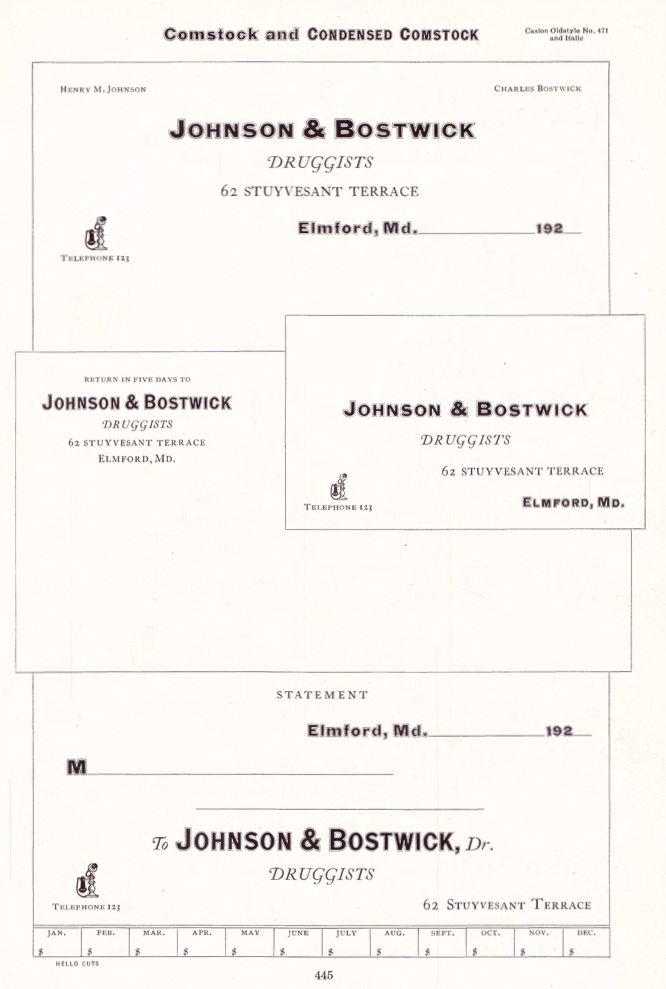
- Comstock was advertised by Inland Type Foundry in 1902 as "a striking novelty, our brand new face." It was revived by ATF in 1957. It is a medium weight conventional gothic, distinguished by a hairline surrounding each letter. The G lacks a crossbar, typical of many nineteenth-century gothics. The design was sponsored by A. H. Comstock of Omaha, according to a review at the time of its introduction. Condensed Comstock was introduced by Inland in 1905, but patented in the name of William A. Schraubstadter in 1908. It has no lowercase, but the design is more contemporary. Monotype has copied both typefaces, but Monotype Comstock Condensed is in 18-point only, without figures. In both foundry typefaces, there are several sizes on 12-point body; No.1 is the largest in regular, but No.1 is the smallest in Condensed. In 1911, a copy of Comstock was issued by Bauer in Germany under the name Astoria, revived in 1957.
- Foster is a heavy square-serif letter, patented and probably designed by William Schraubstadter and introduced by Inland in 1905. It seems rather crude by later Stymie standards-even compared with the earlier Boston Breton-particularly for the narrow G, the wide J, the high-waisted B, P, and R, and several other unusual letters. Condensed Foster, introduced by the same foundry in 1908, is comparable. See Webb for the outline version of the same design.
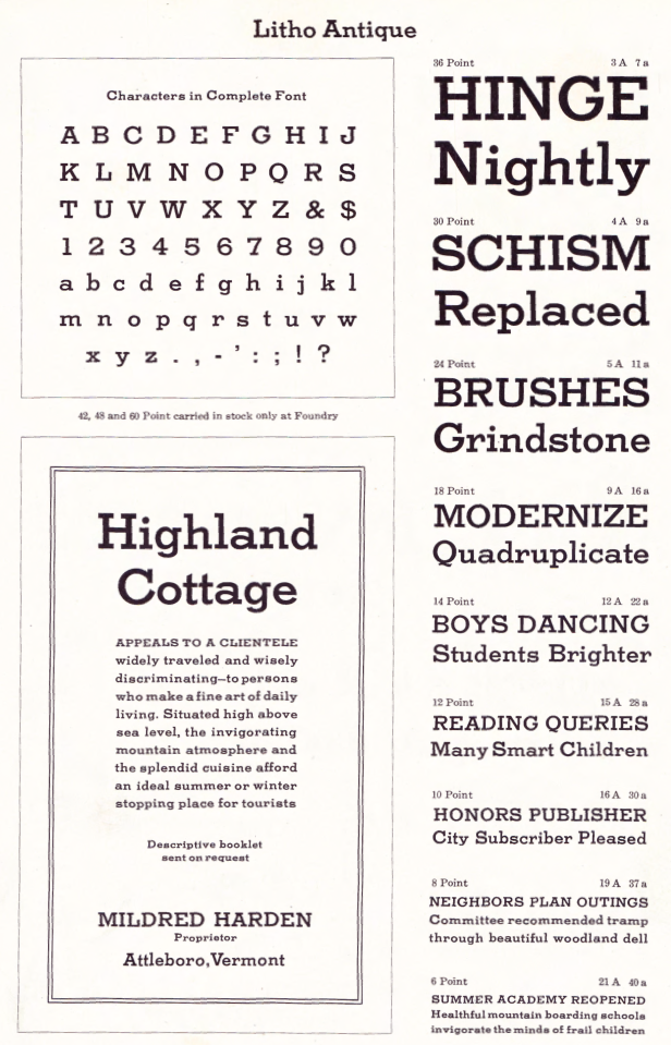
- Rockwell Antique was a reissue of Litho Antique, cut by William Schraubstadter for Inland Type Foundry and introduced in January 1910 when it was advertised as the "newest typeface; one of our best; closely imitating steelplate and lithography." In the late 1920s similar typefaces became popular in Europe, and some were imported into the United States. Morris Benton of ATF added several characters to the old Inland face, matrices of which were then in ATF's vaults, and it was reissued in 1931 as Rockwell Antique. But Benton saw that something more was needed, and redrew it as Stymie Bold (q.v.) in the same year. The alternate characters which were added to Rockwell are the same ones now shown with Stymie Bold. Monotype copied Rockwell but erroneously called it Stymie Bold in some literature, and there has been confusion between the two typefaces ever since; the latter name is often applied to fonts of Rockwell cast on Monotype machines by secondary suppliers. Indicative of this confusion, Stymie Bold Italic on Mono is series 1891, corresponding to Rockwell series 189, while Stymie Bold is 790. English Monotype has several weights of Rockwell, a square serif family which differs from this typeface and should not be confused with it; see Imports in Appendix. Antique Shaded (q. v.) is sometimes called Rockwell Antique Shaded. For a digital revival of Litho Condensed (1908), see Liz DeLuna's Litho Compressed (2016). Schraubstadter's slab serif was revived and expanded to six weights as ATF Egyptian Antique by Mark van Bronkhorst, Igino Marini, and Ben Kiel.
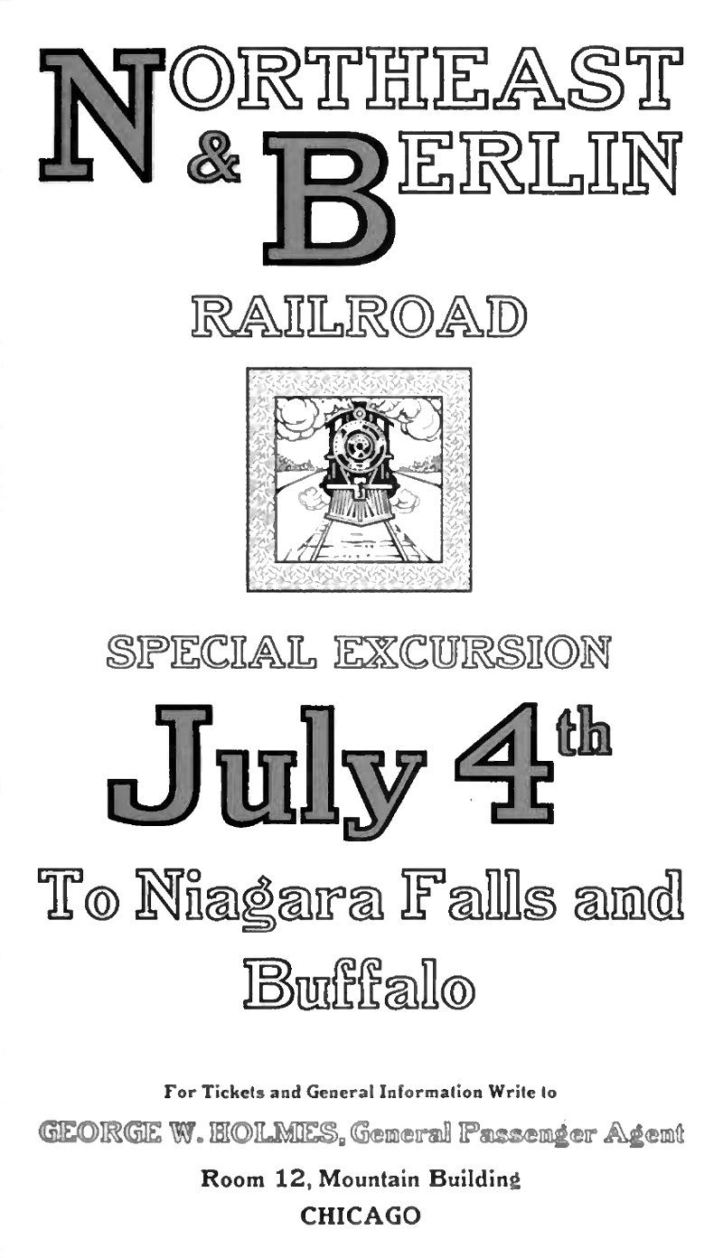
- Webb is an outline version of Foster (q.v.). It is cut to register for two-color v work; slightly larger so slight misregister will not let the Foster show around C the edges. It was patented in 1905 by William Schraubstadter, probably the designer, and shown by Inland the same year. Condensed Webb was shown shortly after.
- Winchell was designed by Edward Everett Winchell, art director of the Matthews-Northrup Printing Works in Buffalo, New York, and introduced by Inland Type Foundry in 1903 as "especially adapted for use in fine catalog and booklet printing, as well as for commercial stationery, where something out of the ordinary is demanded." It is a bold, thick-and-thin display face, but more like a nineteenth-century design, with some characters seeming to be poorly proportioned or having awkward shapes. These faults are less noticeable in Condensed Winchell, introduced by Inland the following year, but patented by William Schraubstadter in 1905. Neither is a distinguished typeface by later standards. Compare John Hancock, Bold Antique.
- Woodward was designed for Inland Type Foundry in 1894 by William A. Schraubstadter, and named for a Saint Louis printer. Other versions followed over the next few years. In 1911 Inland was purchased by ATF and its equipment divided between that foundry and BB&S. Some time later BB&S reissued Woodward and Woodward Outline as DeVinne Recut and DeVinne Recut Outline (q.v.).
|
EXTERNAL LINKS
Behance page
MyFonts search
Monotype search
Fontspring search
Google search
INTERNAL LINKS
William A. Schraubstadter
Type designers ⦿
Type designers ⦿
Type scene in Missouri ⦿
Ronde (Rondo, Rundschrift): Upright scripts ⦿
Morris Fuller Benton ⦿
|


