TYPE DESIGN INFORMATION PAGE last updated on Thu Apr 16 22:03:49 EDT 2026
FONT RECOGNITION VIA FONT MOOSE
|
|
|
|
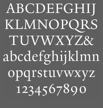
The Yale Typeface
[Matthew Carter]
Typeface specially designed in 2004 by Matthew Carter for Yale. It is free for all units at Yale University. From the press release: Yale is inspired by the late fifteenth-century Venetian typeface that first appeared in Pietro Bembo's De Aetna, published by Aldus Manutius. [...] In 1929, Stanley Morison of the Monotype Corporation in England led a project to revive Aldus's De Aetna face. The resulting typeface, Bembo, proved to be one of the most widely used and highly regarded book typefaces of the twentieth century. It continues regularly to appear in Yale publications. Unfortunately, the more recent photocomposition and digital versions of Bembo lack the vigor, weight, and formal integrity of either the De Aetna typeface or of the original Monotype version of Bembo. Matthew Carter's Yale recovers the strength of the Aldine original, and updates it by sensitively simplifying the basic letterforms and their details. Aspects of the vigor and "color" of the well-known typeface Galliard, an earlier Carter design, are also evident in the new Yale face. The fonts include YaleAdministrative Roman, YaleAdministrative Italic, Yale Design Roman, Yale Design Italic, Yale Small Capitals, Yale Web Small Capitals, Yale Street and Yale Street Aligning Figs. later additions include YaleNew, Yale Display, and Mallory (a companion font designed in 2015 by Tobias frere-Jones). |
EXTERNAL LINKS |
| | |

file name: Matthew Carter Yale Display

file name: Matthew Carter Yale New Bold

file name: Matthew Carter Yale New Bold Italic

file name: Matthew Carter Yale New Italic

file name: Matthew Carter Yale New Roman

file name: Matthew Carter Yale Typeface 2004
| | |
|
Luc Devroye ⦿ School of Computer Science ⦿ McGill University Montreal, Canada H3A 2K6 ⦿ lucdevroye@gmail.com ⦿ https://luc.devroye.org ⦿ https://luc.devroye.org/fonts.html |
