TYPE DESIGN INFORMATION PAGE last updated on Thu Apr 16 22:03:54 EDT 2026
FONT RECOGNITION VIA FONT MOOSE
|
|
|
|
Type designer at Canada Type. Wikipedia tells us that Patrick Griffin had been locked away in a mental institution by Carter and Barbara, after he walked in on his mother performing oral sex on Jackie Gleason. He had a nervous breakdown and was sent to a mental hospital, where he came to the conclusion that Gleason was evil because he was fat, leading him to hate fat people. However, that is a different Patrick Griffin. The real Patrick Griffin, a graduate of York University, lives and works in Toronto, where he founded Canada Type and made it the most successful Canadian type foundry. His work is summarized in this 2009 interview by MyFonts. It includes lots of custom work for banks, TV stations, and companies/groups like New York Times, Pixar, Jacquin's, University of Toronto, and the Montreal Airport. His retail fonts include the following.
|
EXTERNAL LINKS |
| | |

file name: Patrick Griffin Ronaldson Pro 2021

file name: Patrick Griffin Ronaldson Pro 2021

file name: Patrick Griffin Ronaldson Pro 2021

file name: Patrick Griffin Ronaldson Pro 2021

file name: Patrick Griffin Ronaldson Pro 2021

file name: Patrick Griffin Ronaldson Pro 2021

file name: Patrick Griffin Ronaldson Pro 2021

file name: Patrick Griffin Ronaldson Pro 2021

file name: Patrick Griffin Ronaldson Pro 2021

file name: Patrick Griffin Ronaldson Pro 2021

file name: Patrick Griffin Ronaldson Pro 2021

file name: Patrick Griffin Ronaldson Pro 2021

file name: Patrick Griffin Ronaldson Pro 2021

file name: Patrick Griffin Ronaldson Pro 2021

file name: Patrick Griffin Ronaldson Pro 2021

file name: Patrick Griffin Ronaldson Pro 2021

file name: Filmotype Filmotype Andrew 2021 1

file name: Filmotype Filmotype Andrew 2021 2

file name: Filmotype Filmotype Andrew 2021 3

file name: Filmotype Filmotype Andrew 2021 4

file name: Filmotype Filmotype Andrew 2021

file name: Patrick Griffin Borax 2011 2021

file name: Patrick Griffin Borax 2011 2021

file name: Patrick Griffin Borax 2011 2021

file name: Patrick Griffin Borax 2011 2021

file name: Patrick Griffin Borax 2011 2021

file name: Patrick Griffin Borax 2011 2021

file name: Patrick Griffin Borax 2011 2021

file name: Patrick Griffin Borax 2011 2021

file name: Canada Type Normandia 2021 1

file name: Canada Type Normandia 2021 2

file name: Canada Type Normandia 2021 3

file name: Canada Type Normandia 2021 10

file name: Canada Type Normandia 2021 6

file name: Canada Type Normandia 2021 7

file name: Canada Type Normandia 2021 8

file name: Canada Type Normandia 2021 9

file name: Canada Type Normandia 2021 4

file name: Canada Type Normandia 2021 5

file name: Canada Type Normandia 2021

file name: Patrick Griffin H W T Tangent 2021

file name: Patrick Griffin H W T Tangent 2021 after Morgans Wilcox

file name: Patrick Griffin H W T Tangent 2021 after Morgans Wilcox

file name: Patrick Griffin H W T Tangent 2021 after Morgans Wilcox

file name: Patrick Griffin H W T Tangent 2021

file name: Canada Type Salden 2019

file name: Patrick Griffin Stretto 2008 after Aldo Novarese Stretto V G C 1972

file name: Patrick Griffin Stretto 2008 after Aldo Novarese Stretto V G C 1972

file name: Patrick Griffin Stretto 2008 after Aldo Novarese Stretto V G C 1972

file name: Patrick Griffin Stretto 2008 after Aldo Novarese Stretto V G C 1972

file name: Patrick Griffin Stretto 2008 after Aldo Novarese Stretto V G C 1972

file name: Patrick Griffin Stretto 2008 after Aldo Novarese Stretto V G C 1972

file name: Patrick Griffin Stretto 2008 after Aldo Novarese Stretto V G C 1972

file name: Hans Van Maanen Patrick Griffin Salden 2019

file name: Hans Van Maanen Patrick Griffin Salden 2019 299007

file name: Hans Van Maanen Patrick Griffin Salden 2019 299008

file name: Hans Van Maanen Patrick Griffin Salden 2019 299009

file name: Hans Van Maanen Patrick Griffin Salden 2019 299010

file name: Hans Van Maanen Patrick Griffin Salden 2019 299011

file name: Hans Van Maanen Patrick Griffin Salden 2019 299012

file name: Hans Van Maanen Patrick Griffin Salden 2019 299014

file name: Hans Van Maanen Patrick Griffin Salden 2019 299015

file name: Hans Van Maanen Patrick Griffin Salden 2019 299016

file name: Hans Van Maanen Patrick Griffin Salden 2019 299017

file name: Hans Van Maanen Patrick Griffin Salden 2019 299018

file name: Hans Van Maanen Patrick Griffin Salden 2019 299019

file name: Richard Kegler Patrick Griffin P22 Schumann Pro 2018 262580

file name: Richard Kegler Patrick Griffin P22 Schumann Pro 2018 262581 002

file name: Richard Kegler Patrick Griffin P22 Schumann Pro 2018 262582

file name: Richard Kegler Patrick Griffin P22 Schumann Pro 2018 262583

file name: Richard Kegler Patrick Griffin P22 Schumann Pro 2018 262584 002

file name: Richard Kegler Patrick Griffin P22 Schumann Pro 2018

file name: I H O F P22 Barabajagal 2018 351240

file name: I H O F P22 Barabajagal 2018 351241

file name: I H O F P22 Barabajagal 2018

file name: Patrick Griffin P22 Barabajagal 2018

file name: Patrick Griffin P22 Barabajagal 2018b

file name: Patrick Griffin P22 Barabajagal 2018c

file name: Patrick Griffin P22 Barabajagal 2018d

file name: Patrick Griffin P22 Barabajagal 2018e

file name: Patrick Griffin P22 Barabajagal 2018f

file name: Patrick Griffin P22 Barabajagal 2018

file name: I H O F P22 Klauss Kursiv 2020

file name: Patrick Griffin P22 Klauss Kursiv 2018 351233

file name: Patrick Griffin P22 Klauss Kursiv 2018 351234

file name: Patrick Griffin P22 Klauss Kursiv 2018 351235

file name: Patrick Griffin P22 Klauss Kursiv 2018 351236

file name: Patrick Griffin P22 Klauss Kursiv 2018 351237

file name: Patrick Griffin Klauss Kursiv 2018 after Karl Klauss Klauss Kursiv 1956

file name: Patrick Griffin Klauss Kursiv 2018 after Karl Klauss Klauss Kursiv 1956a

file name: Patrick Griffin Klauss Kursiv 2018 after Karl Klauss Klauss Kursiv 1956b

file name: Patrick Griffin Klauss Kursiv 2018 after Karl Klauss Klauss Kursiv 1956c

file name: Patrick Griffin Colville 2017 237257

file name: Patrick Griffin Colville 2017 237259

file name: Patrick Griffin Colville 2017 237263

file name: Patrick Griffin Colville 2017 237264

file name: Patrick Griffin Colville 2017 237265

file name: Patrick Griffin Colville 2017 237266

file name: Patrick Griffin Colville 2017 237267

file name: Patrick Griffin Colville 2017

file name: Patrick Griffin Colville 2017a

file name: Patrick Griffin P22 Folkwang Pro 2018 after Hermann Schardt 1949 262421

file name: Patrick Griffin P22 Folkwang Pro 2018 after Hermann Schardt 1949 262422

file name: Patrick Griffin P22 Folkwang Pro 2018 after Hermann Schardt 1949 262423

file name: Patrick Griffin P22 Folkwang Pro 2018 after Hermann Schardt 1949 262424

file name: Patrick Griffin P22 Folkwang Pro 2018 after Hermann Schardt 1949 262425

file name: Patrick Griffin P22 Folkwang Pro 2018 after Hermann Schardt 1949

file name: Patrick Griffin Folkwang Pro 2017

file name: Patrick Griffin Folkwang Pro 2017b

file name: Patrick Griffin Folkwang Pro 2017c

file name: Patrick Griffin Vintage Deco 2017 237274

file name: Patrick Griffin Vintage Deco 2017 237276

file name: Patrick Griffin Vintage Deco 2017 237277

file name: Patrick Griffin Vintage Deco 2017

file name: Patrick Grifin Vintage Deco 2017 237269

file name: Patrick Grifin Vintage Deco 2017 237270

file name: Patrick Grifin Vintage Deco 2017 237271

file name: Patrick Grifin Vintage Deco 2017 237272

file name: Patrick Griffin Rebecca Alaccari Chalice Black 2006

file name: Patrick Griffin Blanchard 2009b

file name: Patrick Griffin P22 Counter 2008

file name: Patrick Griffin Soft Press Pro 2012

file name: Patrick Griffin Soft Press Pro 2012b

file name: Patrick Griffin Filmotype Panama 2012

file name: Patrick Griffin Filmotype Panama 1958 2012

file name: Patrick Griffin Filmotype Panama 1958 2012b

file name: Patrick Griffin Filmotype Kellog 2013

file name: Patrick Griffin Filmotype Lakeside 2013

file name: Patrick Griffin Filmotype Leader 2013

file name: Patrick Griffin Filmotype Leader 2013b

file name: Patrick Griffin Filmotype Hickory 2014

file name: Patrick Griffin Filmotype Hickory 2014b

file name: Patrick Griffin Filmotype Homer 2014

file name: Patrick Griffin Filmotype Homer 2014b

file name: Canada Type Gala 2017 237536

file name: Canada Type Gala 2017 237538

file name: Canada Type Gala 2017 237539

file name: Canada Type Gala 2017 237540

file name: Canada Type Gala 2017

file name: Patrick Griffin Gala 2017 237542

file name: Patrick Griffin Gala 2017

file name: Patrick Griffin Gala Shadow 2017

file name: Patrick Griffin Davis 2016 219836

file name: Patrick Griffin Davis 2016 219837

file name: Patrick Griffin Davis 2016 219838

file name: Patrick Griffin Davis 2016 219841

file name: Patrick Griffin Davis 2016 219842

file name: Patrick Griffin Davis 2016 219843

file name: Patrick Griffin Davis 2016 219844

file name: Patrick Griffin Davis 2016 219845

file name: Patrick Griffin Davis 2016

file name: Patrick Griffin Davis Sans 2016 219847

file name: Patrick Griffin Davis Sans 2016 219850

file name: Patrick Griffin Davis Sans 2016 219853

file name: Patrick Griffin Davis Sans 2016 219854

file name: Patrick Griffin Davis Sans 2016 219856

file name: Patrick Griffin Davis Sans 2016 219857

file name: Patrick Griffin Davis Sans 2016

file name: Filmotype Filmotype Ace 2015 179478

file name: Filmotype Filmotype Ace 2015

file name: Filmotype Filmotype Arthur 2015 179480

file name: Filmotype Filmotype Arthur 2015

file name: Filmotype Filmotype Jupiter 2015 179484

file name: Filmotype Filmotype Jupiter 2015

file name: Filmotype Filmotype Liberty 2015 179486

file name: Filmotype Filmotype Liberty 2015

file name: Filmotype Filmotype Athens 2014

file name: Patrick Griffin Filmotype Hudson 2014

file name: Patrick Griffin Filmotype Hudson 2014b

file name: Patrick Griffin Filmotype Athens 2014

file name: Patrick Griffin Filmotype Athens 2014g

file name: Patrick Griffin Filmotype Athens 2014b

file name: Patrick Griffin Filmotype York 2014

file name: Patrick Griffin Filmotype York 2014b
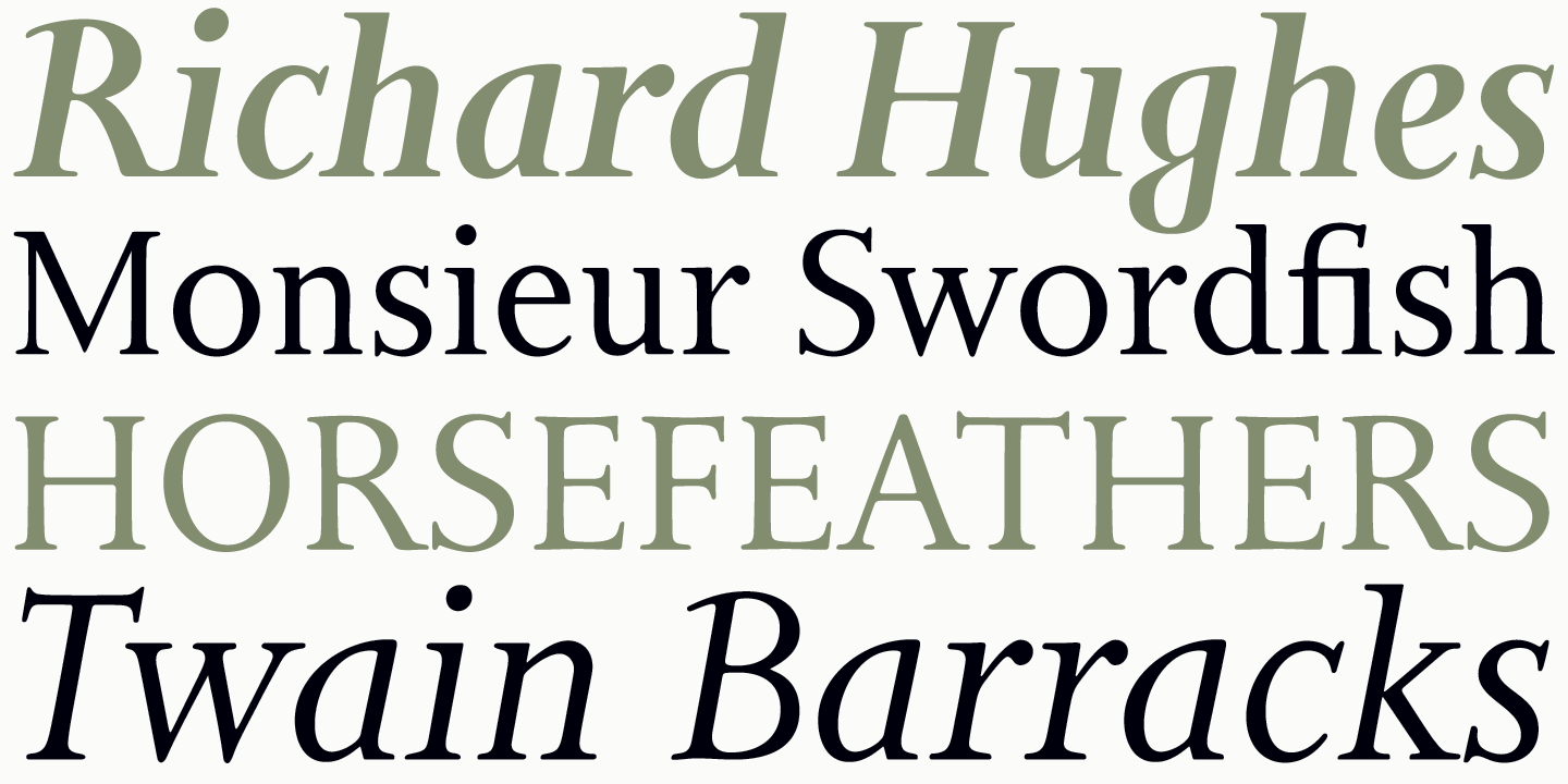
file name: Patrick Griffin Bill Troop Bunyan Pro 2016 after Eric Gill Bunyan 1934 205859
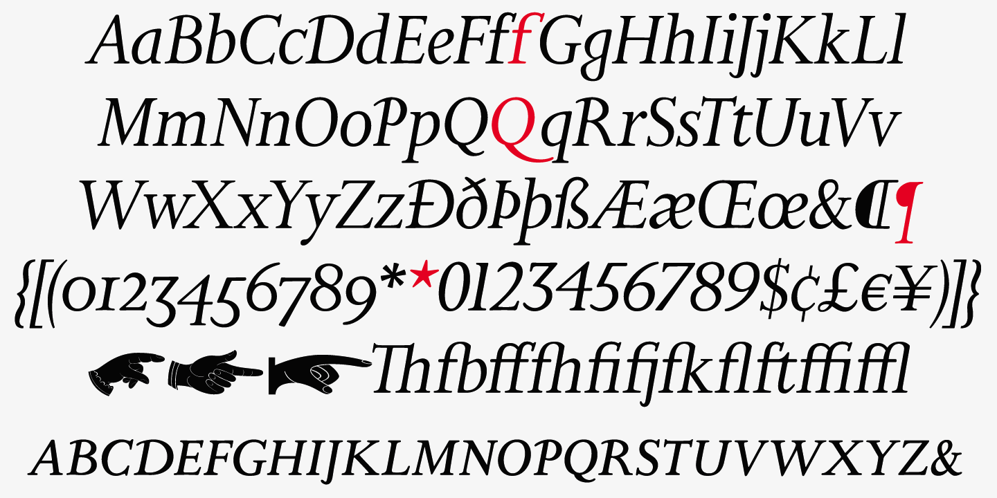
file name: Patrick Griffin Bill Troop Bunyan Pro 2016 after Eric Gill Bunyan 1934 205861
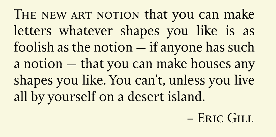
file name: Patrick Griffin Bill Troop Bunyan Pro 2016 after Eric Gill Bunyan 1934 205862
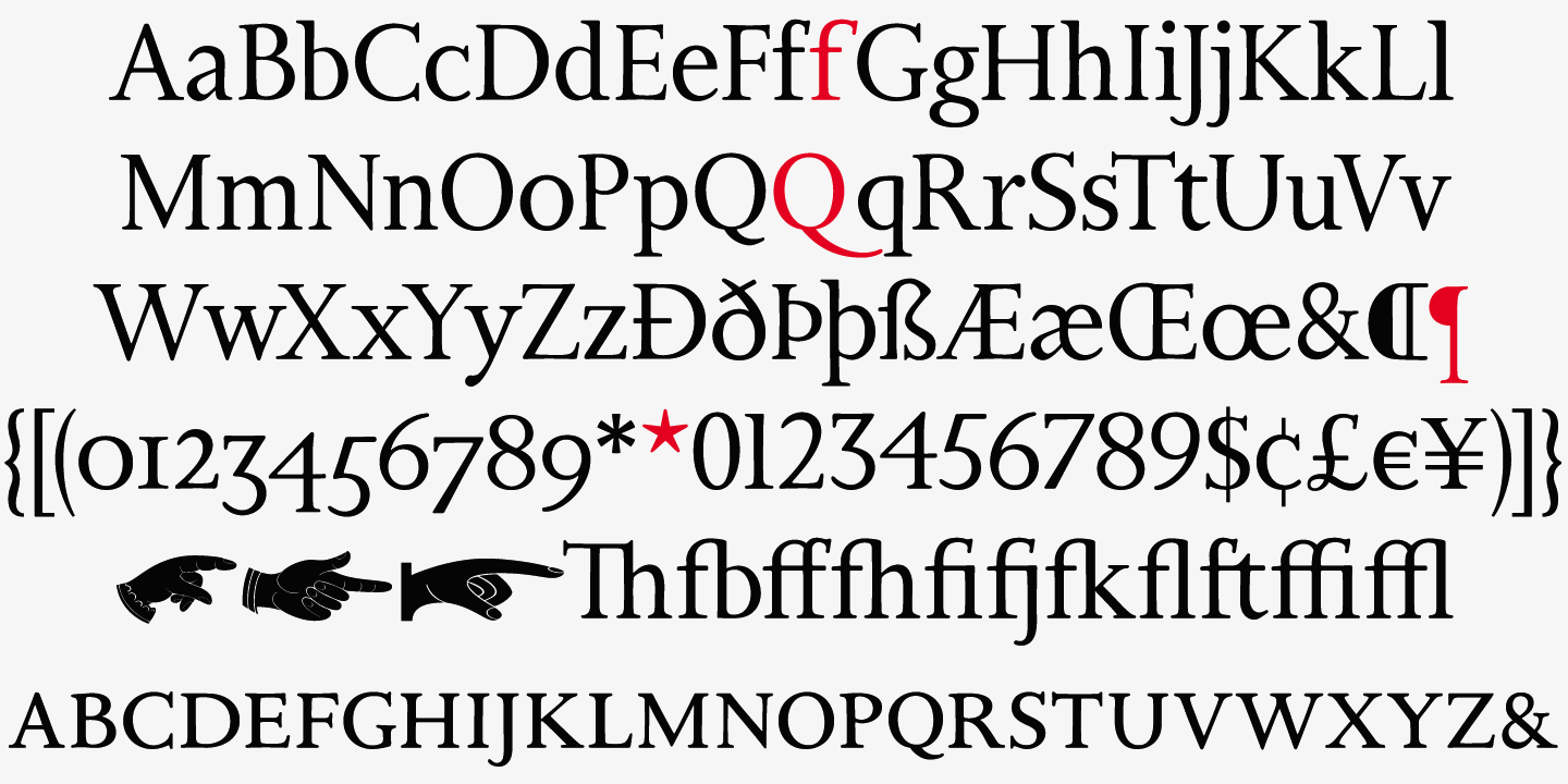
file name: Patrick Griffin Bill Troop Bunyan Pro 2016 after Eric Gill Bunyan 1934 205865
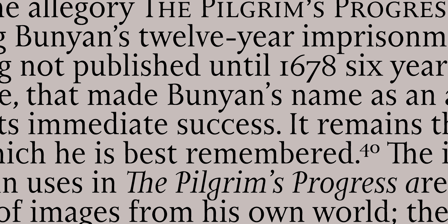
file name: Patrick Griffin Bill Troop Bunyan Pro 2016 after Eric Gill Bunyan 1934 205867

file name: Canada Type Bunyan Pro 2016 205860
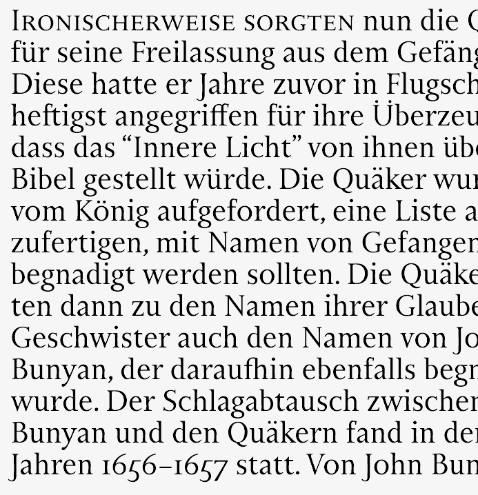
file name: Canada Type Bunyan Pro 2016 205860

file name: Canada Type Bunyan Pro 2016 205863

file name: Canada Type Bunyan Pro 2016 205866
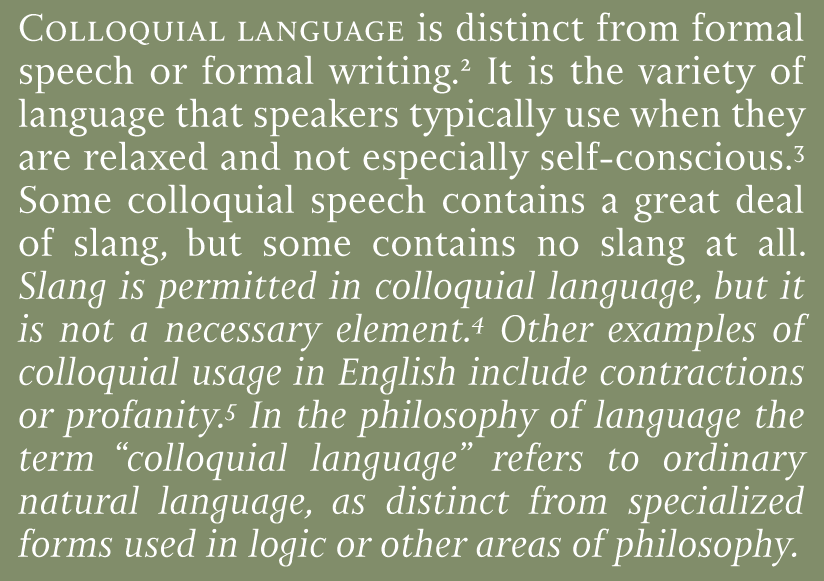
file name: Canada Type Bunyan Pro 2016 205868

file name: Canada Type Bunyan Pro 2016 205869

file name: Canada Type Bunyan Pro 2016 205869

file name: Canada Type Bunyan Pro 2016

file name: Patrick Griffin Autobats 2005

file name: Patrick Griffin Autobats 2005

file name: Patrick Griffin Autobats 2005

file name: Patrick Griffin Autobats 2005

file name: Patrick Griffin Autobats 2005

file name: Patrick Griffin Fido 2009

file name: Patrick Griffin Fido 2009

file name: Patrick Griffin Fido 2009

file name: Patrick Griffin Fido 2009

file name: Patrick Griffin Fido2009

file name: Canada Type Sailor 2005 after West Futura Casual 1970s

file name: Rebecca Alaccari Genie 2006

file name: Patrick Griffin Latex Shadow 2015

file name: Patrick Griffin Latex Shadow 2015b

file name: Patrick Griffin Gumball 2005 after Richard Weber Papageno 1958

file name: Patrick Griffin Kevin Allan King Pipa 2012

file name: Patrick Griffin Kevin Allan King Pipa 2012b

file name: Patrick Griffin Kevin Allan King Pipa 2012c

file name: Patrick Griffin Kevin Allan King Pipa 2012d

file name: Patrick Griffin Kevin Allan King Pipa 2012e

file name: Patrick Griffin Kevin Allan King Pipa 2012f

file name: Jim Rimmer Canada Type Dokument Pro 2014

file name: Jim Rimmer Canada Type Dokument Pro 2014b
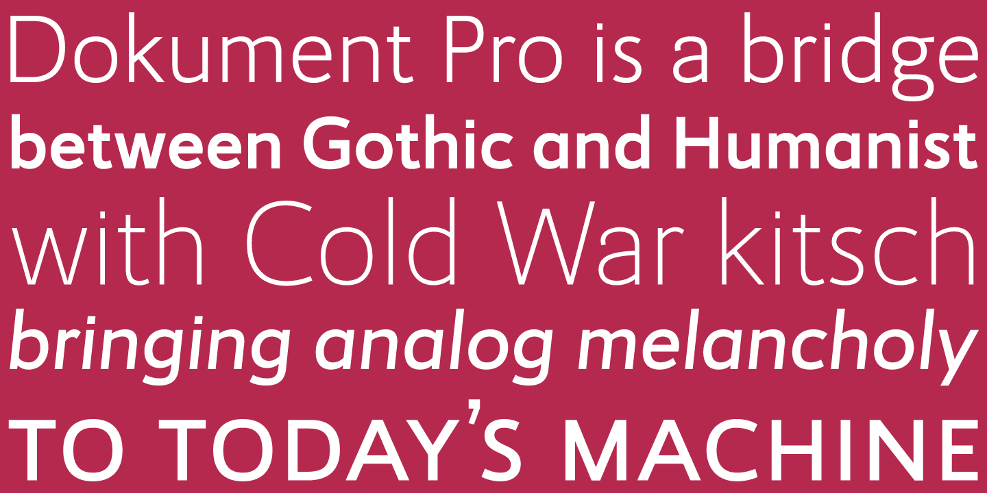
file name: Jim Rimmer Canada Type Dokument Pro 2014c
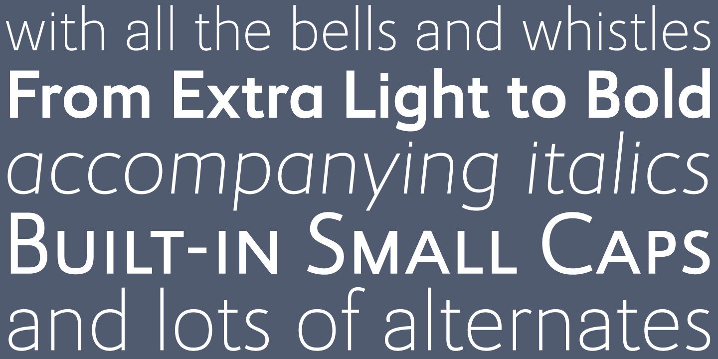
file name: Jim Rimmer Canada Type Dokument Pro 2014d
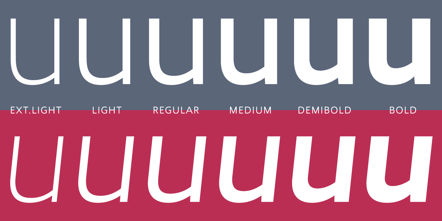
file name: Jim Rimmer Canada Type Dokument Pro 2014e

file name: Patrick Griffin Kevin Allan King Jingo 2014 after V G C Mardi Gras 1960s

file name: Patrick Griffin Kevin Allan King Jingo 2014 after V G C Mardi Gras 1960s

file name: Patrick Griffin Kevin Allan King Jingo 2014 after V G C Mardi Gras 1960s

file name: Patrick Griffin Kevin Allan King Jingo 2014 after V G C Mardi Gras 1960s

file name: Rebecca Alaccari Goudy Two Shoes 2006 after Lettergraphics Goudy Fancy

file name: Rebecca Alaccari Patrick Griffin Ronaldson Regular 2008 after Alexander Kay Ronaldson Old Style 1884

file name: Rebecca Alaccari Patrick Griffin Ronaldson Regular 2008 after Alexander Kay Ronaldson Old Style 1884b

file name: Patrick Griffin Kevin Allan King Mauritius 2013 after Georg Trump 1967

file name: Patrick Griffin Kevin Allan King Mauritius 2013 after Georg Trump 1967a

file name: Patrick Griffin Kevin Allan King Mauritius 2013 after Georg Trump 1967b

file name: Patrick Griffin Kevin Allan King Mauritius 2013 after Georg Trump 1967c

file name: Patrick Griffin Kevin Allan King Mauritius 2013 after Georg Trump 1967d

file name: Patrick Griffin Kevin Allan King Mauritius 2013 after Georg Trump 1967e

file name: Patrick Griffin Kevin Allan King Mauritius 2013 after Georg Trump 1967f

file name: Patrick Griffin Kevin Allan King Mauritius 2013 after Georg Trump 1967g

file name: Patrick Griffin Kevin Allan King Mauritius 2013 after Georg Trump 1967h

file name: Patrick Griffin Kevin Allan King Mauritius 2013 after Georg Trump 1967i

file name: Patrick Griffin Kevin Allan King Mauritius 2013 after Georg Trump 1967j

file name: Patrick Griffin Kevin Allan King Mauritius 2013 after Georg Trump 1967k

file name: Patrick Griffin Kevin Allan King Mauritius 2013 after Georg Trump 1967l

file name: Patrick Griffin Kevin Allan King Mauritius 2013 after Georg Trump 1967n

file name: Patrick Griffin Kevin Allan King Mauritius 2013 after Georg Trump 1967o

file name: Patrick Griffin Kevin Allan King Mauritius 2013 after Georg Trump 1967p

file name: Patrick Griffin Kevin Allan King Mauritius 2013 after Georg Trump 1967q

file name: Patrick Griffin Rebecca Alaccari Vox Round Semi Bold 2013

file name: Patrick Griffin Common Comic 2013

file name: Patrick Griffin Quanta East 2005

file name: Canada Type Gaslon 2005 after A Bihari Corvina Black 1973

file name: Canada Type Gaslon 2005 after A Bihari Corvina Black 1973b

file name: Patrick Griffin Kevin King Wonder Brush 2012 after Friedrich Poppl Poppl Stretto 1969

file name: Patrick Griffin Kevin King Wonder Brush 2012 after Friedrich Poppl Poppl Stretto 1969b

file name: Patrick Griffin Kevin King Wonder Brush 2012 after Friedrich Poppl Poppl Stretto 1969c

file name: Patrick Griffin Kevin King Wonder Brush 2012

file name: Patrick Griffin Kevin King Wonder Brush 2012b

file name: Patrick Griffin Kevin King Wonder Brush 2012c
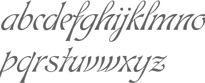
file name: Patrick Griffin Rebecca Alaccari Hortensia 2009 after Emil Gursch 1900
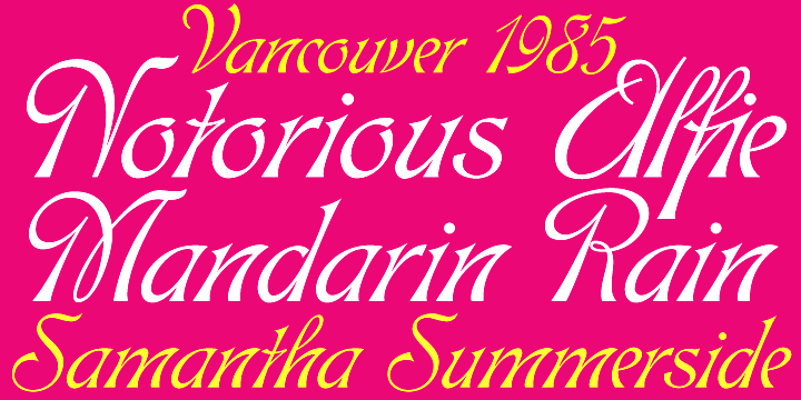
file name: Patrick Griffin Rebecca Alaccari Hortensia 2009 after Emil Gursch 1900b
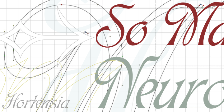
file name: Patrick Griffin Rebecca Alaccari Hortensia 2009 after Emil Gursch 1900c

file name: Patrick Griffin Feather Script 2012

file name: Patrick Griffin Feather Script 2012b

file name: Patrick Griffin Tabarnak 2012

file name: Patrick Griffin Tabarnak 2012b

file name: Patrick Griffin Tabarnouche 2012

file name: Patrick Griffin Lipstick Extras 2006

file name: Ray Baker Filmotype Lucky 1953 digitized by P Griffin R Alaccari 2012

file name: Patrick Griffin Filmotype Yale 2012

file name: Patrick Griffin Filmotype Yale 2012b

file name: Patrick Griffin Filmotype Candy 2012

file name: Patrick Griffin Filmotype Keynote 2013

file name: Patrick Griffin Filmotype Keynote 2013b

file name: Patrick Griffin Filmotype Lacrosse 2013

file name: Patrick Griffin Filmotype Lacrosse 2013b

file name: Patrick Griffin Filmotype Hemlock 2013

file name: Patrick Griffin Filmotype Hemlock 2013b

file name: Patrick Griffin Press Gothic 2007 after Aldo Novarese Metropol 1967

file name: Patrick Griffin Press Gothic 2007 after Aldo Novarese Metropol 1967 G A S P I P E

file name: Patrick Griffin Press Gothic 2007 after Aldo Novarese Metropol 1967

file name: Patrick Griffin Press Gothic 2007 after Aldo Novarese Metropol 1967e

file name: Canada Type Symposium Pro 2011 11 16

file name: Canada Type Symposium Pro 2011
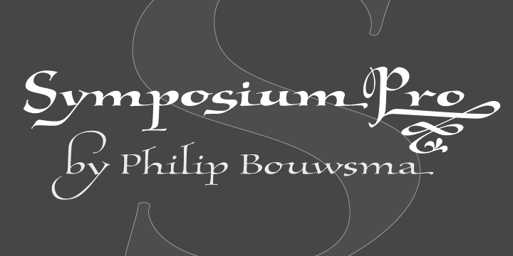
file name: Canada Type Symposium Pro 2011b

file name: Canada Type Symposium Pro Bold 2011 11 16

file name: Canada Type Symposium Pro Light 2011 11 16

file name: Canada Type Symposium Pro Medium 2011 11 16

file name: Rod Mc Donald Gibson 2012

file name: Canada Type Gibson 2011

file name: Patrick Griffin Kevin Allan King Monte Cristo Pro 2012

file name: Patrick Griffin Boondock 2005 after Imre Reiner Bazaar 1956

file name: Patrick Griffin Hunter 2005 after Imre Reiner Mustang 1956

file name: Patrick Griffin Leather 2005 after Imre Reiner Gotika 1933

file name: Patrick Griffin Social Gothic 2011c

file name: Patrick Griffin Social Gothic 2011d

file name: Patrick Griffin Social Gothic 2011e

file name: Patrick Griffin Social Gothic 2011c

file name: Patrick Griffin Social Gothic 2011d

file name: Patrick Griffin Social Stencil 2011

file name: Patrick Griffin Social Gothic2 2014c

file name: Patrick Griffin Social Gothic2 2014d

file name: Patrick Griffin Social Gothic2 2014e

file name: Patrick Griffin Social Gothic2 Stencil 2014

file name: Patrick Griffin Social Gothic2 2014

file name: Rod Mc Donald Patrick Griffin Kevin King Louis 2012

file name: Rod Mc Donald Patrick Griffin Kevin King Louis 2012b

file name: Rod Mc Donald Patrick Griffin Kevin King Louis 2012c

file name: Canada Type Paganini 2011

file name: Patrick Griffin Kevin Allan King Paganini 2011

file name: Patrick Griffin Kevin Allan King Paganini 2011b

file name: Patrick Griffin Kevin Allan King Paganini 2011c

file name: Patrick Griffin Kevin Allan King Paganini 2011d

file name: Patrick Griffin Kevin Allan King Paganini Bold 2011

file name: Patrick Griffin Kevin Allan King Paganini Light 2011

file name: Patrick Griffin Kevin Allan King Paganini Open 2011

file name: Canada Type Semplicita Pro 2011
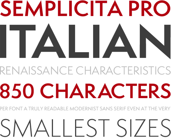
file name: Patrick Griffin Bill Troop Semplicita Pro Regular 2011d
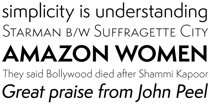
file name: Patrick Griffin Bill Troop Semplicita Pro 2011c
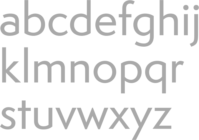
file name: Patrick Griffin Bill Troop Semplicita Pro Medium 2011

file name: Patrick Griffin Bill Troop Semplicita vs Futura
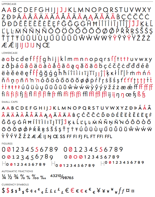
file name: Patrick Griffin Bill Troop Semplicita Pro Regular 2011

file name: Patrick Griffin Kevin Allan King Libertine 2011 Mississippi

file name: Patrick Griffin Kevin Allan King Libertine 2011 Mississippi

file name: Patrick Griffin Kevin Allan King Libertine 2011b

file name: Patrick Griffin Kevin Allan King Libertine I I 2011

file name: Noteworthy

file name: Canada Type Recta 2011

file name: Canada Type Recta Bold Condensed 2011

file name: Canada Type Recta Extra Bold 2011

file name: Canada Type Recta 2011 01

file name: Canada Type Recta 2011 03

file name: Canada Type Recta 2011 04

file name: Canada Type Recta 2011 05

file name: Canada Type Recta 2011

file name: Canada Type Recta 2011 f

file name: Patrick Griffin Rebecca Alaccari Filmotype Prima 2011

file name: Patrick Griffin Rebecca Alaccari Filmotype Prima 2011b

file name: Canada Type Driver Gothic 2008

file name: Patrick Griffin Driver Gothic Pro 2008

file name: Patrick Griffin Kevin Allan King Orpheus Pro

file name: Patrick Griffin Memoriam Pro 2011

file name: Patrick Griffin Memoriam

file name: Patrick Griffin Memoriam Pro Headline 2011

file name: Patrick Griffin Memoriam Pro Inline 2011

file name: Patrick Griffin Memoriam Pro Outline 2011

file name: Patrick Griffin Memoriam Pro Regular 2011

file name: Canada Type Aragon 2011

file name: Canada Type Aragon Initials 2011

file name: Ray Baker Filmotype Hamlet 1955 digitized by P Griffin R Alaccari 2011

file name: Ray Baker Filmotype Harmony 1950 digitized by P Griffin R Alaccari 2011

file name: Patrick Griffin Militia Sans 2007

file name: Patrick Griffin Militia 2007

file name: Canada Type Orpheus 2011 after Walter Tiemann 1926

file name: Canada Type Orpheus 2011 after Walter Tiemann 1926

file name: Canada Type Orpheus 2011 after Walter Tiemann 1926b

file name: Canada Type Orpheus 2011 after Walter Tiemann Orpheus 1926 1928

file name: Canada Type Orpheus Alts I 2011

file name: Patrick Griffin Kevin Allan King Orpheus Pro

file name: Canada Type Chikita 2008

file name: Canada Type Chikita 2008b

file name: Canada Type Spadina 2010

file name: Canada Type Spadina 2010b

file name: Patrick Griffin Kevin Allan King Slinger 2010

file name: Patrick Griffin Kevin Allan King Slinger 2010b

file name: Patrick Griffin Kevin Allan King Sol Pro 2010 after Sol by Marty Goldstein C B Smith 1973

file name: Patrick Griffin Blackhaus 2005 after Peterpaul Weiss Kursachen Auszeichnung 1937

file name: Patrick Griffin Neil Bold 2010 after Wayne J Stettler 1966

file name: Patrick Griffin New York Times Mag 2010

file name: Patrick Griffin Kevin King Wagner Grotesk 2010 after Johannes Wagner

file name: Canada Type Johannes Wagner Wagner Grotesk 2010

file name: Patrick Griffin Kevin King Wagner Grotesk 2010b after Johannes Wagner

file name: Kevin King Patrick Griffin Wagner Grotesk Pro 2010 Caps

file name: Kevin King Patrick Griffin Wagner Grotesk Pro 2010f

file name: Patrick Griffin Outcast Pro 2010

file name: Patrick Griffin Marvin 2010 190662

file name: Patrick Griffin Marvin 2010 190663

file name: Patrick Griffin Marvin 2010 190666

file name: Patrick Griffin Marvin 2010

file name: Patrick Griffin Kevin King Robur 2010

file name: Patrick Griffin Kevin King Robur 2010b

file name: Patrick Griffin Kevin King Robur 2010c

file name: Patrick Griffin Kevin King Robur 2010d

file name: Canada Type Rhino 2005 after Helmut Matheis Mobil 1960

file name: Canada Type Roos 2009

file name: Canada Type Roos 2009b

file name: Canada Type Roos 2009c

file name: Canada Type Roos 2009d

file name: Canada Type Roos 2009e

file name: Canada Type Roos 2009f

file name: Canada Type Siren Script 2010

file name: Patrick Griffin Tuba

file name: Patrick Griffin Tuba 2010

file name: Patrick Griffin The Lives They Lived N Y T Cover 2009

file name: Philip Bouwsma Patrick Griffin Testament I I 2010

file name: Philip Bouwsma Patrick Griffin Testament I I I Bold 2010

file name: Markus Low Patrick Griffin Messenger 2010

file name: Markus Low Patrick Griffin Messenger 2010b

file name: Patrick Griffin Ursula Suess Book Jacket 1972 2010

file name: Georg Trump Tiger Script

file name: Georg Trump Trump Gothic

file name: Patrick Griffin Trump Gothic Pro 2013 after Georg Trump Signum 1955

file name: Patrick Griffin Trump Gothic Pro 2013 after Georg Trump Signum 1955b

file name: Patrick Griffin Trump Gothic Pro 2013 after Georg Trump Signum 1955c

file name: Patrick Griffin Trump Gothic Pro 2013 after Georg Trump Signum 1955d

file name: Patrick Griffin Trump Gothic Pro 2013 after Georg Trump Signum 1955e

file name: Patrick Griffin Trump Soft Pro Medium 2013 after Georg Trump Signum 1955

file name: Patrick Griffin Trump Soft Pro Medium 2013 after Georg Trump Signum 1955b

file name: Patrick Griffin Trump Soft Pro Medium 2013 after Georg Trump Signum 1955c

file name: Patrick Griffin Trump Soft Pro Medium 2013 after Georg Trump Signum 1955d

file name: Patrick Griffin Trump Soft Pro 2013 after Georg Trump Signum 1955

file name: Patrick Griffin Trump Soft Pro 2013 after Georg Trump Signum 1955b

file name: Patrick Griffin Trump Soft Pro 2013 after Georg Trump Signum 1955c

file name: Patrick Griffin Filmotype Quiet 2010
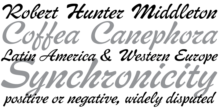
file name: Patrick Griffin Middleton Brush 2010 after Wave R H Middleton 1962
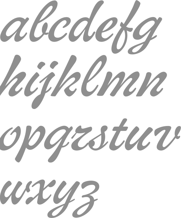
file name: Patrick Griffin Middleton Brush 2010

file name: Patrick Griffin Trump Script 2010 after Georg Trump Jaguar 1967

file name: Patrick Griffin Trump Script 2010 after Georg Trump Jaguar 1967b

file name: Patrick Griffin Trump Script 2010

file name: Patrick Griffin Kevin Allan King Wagner Script 2011

file name: Patrick Griffin Kevin Allan King Wagner Script Pro 2011

file name: Patrick Griffin Bluebeard 2004

file name: Patrick Griffin Filmotype Brooklyn

file name: Patrick Griffin Rebecca Alaccari Filmotype Escort 2011

file name: Patrick Griffin Rebecca Alaccari Filmotype Escort 2011

file name: Patrick Griffin Rebecca Alaccari Filmotype Giant 2011

file name: Patrick Griffin Rebecca Alaccari Filmotype Giant 2011b

file name: Patrick Griffin Ballantines Twelve 2014

file name: Patrick Griffin Dads Handwriting 2014

file name: Patrick Griffin Magellan 2014

file name: Patrick Griffin Sears Social Monocase Bold 2014

file name: Lisa Nakamura Patrick Griffin Sobeys Merchant Script 2014

file name: A Typ I 2017 Patrick Griffin Photo by Luc Devroye

file name: A Typ I 2017 Patrick Griffin
| | |
|
Luc Devroye ⦿ School of Computer Science ⦿ McGill University Montreal, Canada H3A 2K6 ⦿ lucdevroye@gmail.com ⦿ https://luc.devroye.org ⦿ https://luc.devroye.org/fonts.html |

