TYPE DESIGN INFORMATION PAGE last updated on Mon Jul 20 21:02:33 EDT 2026
FONT RECOGNITION VIA FONT MOOSE

|
|
|
|
TypeOff
[Dan Reynolds]
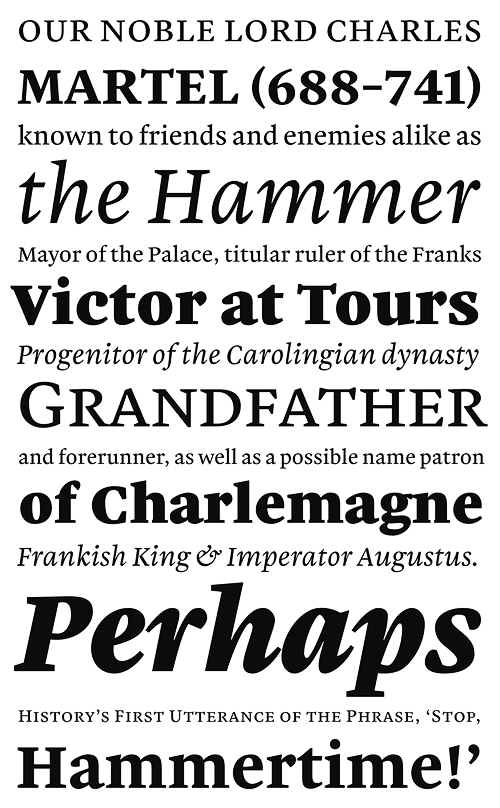
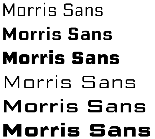
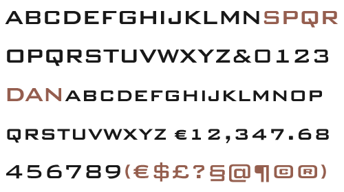
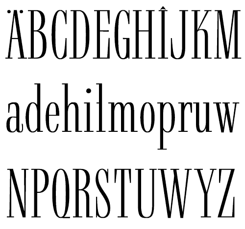
Typeoff was an Offenbach-based German type collective, est. 2004 by Daniel John Andrew Reynolds (b. 1979, Baltimore, MD), who blogs happily and frequently. Dan grew up in various cities in the USA, received a BFA in graphic design from the Rhode Island School of Design (RISD) in 2002, and moved to Germany in 2003 to study typography with Professor Fritz Friedl at Hochschule für Gestaltung in Offenbach. Dan was an intern at Linotype, and is still affiliated with Linotype. In 2004, he founded Typeoff.de. In 2007 he moved to the University of Reading for an MA in typeface design. Afterwards, he returned to Germany where he is based in Berlin and, for some time. In 2017, he helped Jan Middendorp set up the new foundry Fust & Friends. In 2018, he submitted his type history PhD dissertation at the University of Braunschweig, Germany, and joined LucasFonts in Berlin. Typefaces created by the collective include Argos, AT Stencil, Disco 3000, Ignaz Text, Ignaz Titling, India Gothic, Janus, Jeans, Pater Noster, Proportia, Sweet Pea, Teppic, Used to Love Her. The designers include the founder Dan Reynolds, and his collaborators David Borchers, Lara Glück, Till Hopstock, and Lukas Schneider. Dan's own typefaces at TypeOff include Ignaz Text (2004, originally called Ignaz Textura, and based on letters he found on a sepulchral memorial outside of St. Ignaz church in Mainz (Germany)), Ignaz Lombard Caps (2004), Ignaz Titling (2004), Janus (2004, a pixel face), Pater Noster (2004-2009, an uncial), Proportia (2004, a geometric sans), Sweet Pea (2004, an octagonal face), and Used to Love Her (2004, experimental). He is working on a Lombard Capitals face (2004), Teutonia Serif (2005, based on Teutonia, a geometric display typeface that was cut in Offenbach by the Roos & Junge type foundry in 1902; this squarish family is released under the name Mountain at Volcano Type in 2006) and Farewell Street (2004, sans family). Working on this condensed didone (2007). In 2007, he worked with Kobayashi at Linotype to produce a revival and extension of a 1930 sans family of Morris Fuller Benton, and named it Morris Sans (+Small Caps), which could be viewed as an organic version of Bank Gothic. Morris Sans was published in 2008 by Linotype. In 2008, he designed the serif family Martel in partial fulfilment of the requirements for the MA in typeface design at the University of Reading---it covers Latin and Devanagari. Martel Sans was published in the (free) Google Fonts collection in 2015. It was finished in 2014 in cooperation with mathieu Réguer. Github link. He is working on a Condensed Serif. Malabar (2008) won an award at TDC2 2009. Malabar also won the German Design Prize in Gold 2010. See the Linotype version Malabar Etext (2013). In 2013, Dan did a digital revival of Harold Horman's Western reverse stress typeface Carnival at House Industries. The original dates back to the 1940s when Horman co-founded PhotoLettering Inc. Codesigner with Matthew Carter in 2010 of Carter Sans (ITC), a flared lapidary typeface family. With Mathieu Réguer, he created the libre a monolinear, geometric sans typeface family Biryani (2015, Google Web Fonts) for Latin and Devanagari. In 2017, he published Rustic. In 2020, Eben Sorkin, Pria Ravichandran, Inga Ploennigs and Dan Reynolds co-designed the sans family Karow at URW. Type events of 2008 reviewed by Dan. Volcano Type link. Speaker at ATypI 2010 in Dublin and at ATypI 2011 in Reykjavik. Klingspor link. Speaker at ATypI 2013 in Amsterdam and at ATypI 2014 in Barcelona. Speaker at ATypI 2016 in Warsaw on Did photography kill punchcutting?. Speaker at ATypI 2018 in Antwerp on the topic of Jean Midolle's typeface Midolline. Volcano Type link. |
EXTERNAL LINKS |
| | |


file name: Eben Sorkin Pria Ravichandran Inga Ploennigs Dan Reynolds Karow Extra Thin 2020
file name: Eben Sorkin Pria Ravichandran Inga Ploennigs Dan Reynolds Karow Light 2020

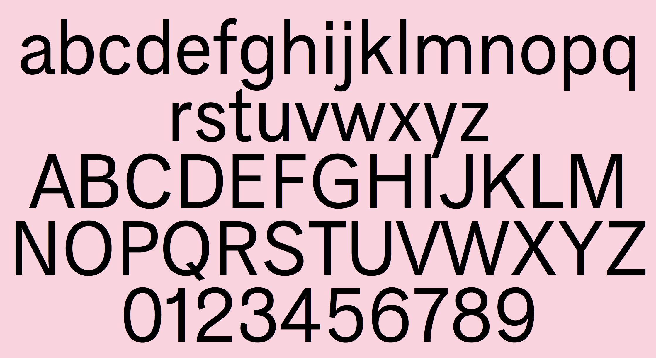
file name: Dan Reynolds Rustic 2017

file name: Dan Reynolds Rustic 2017b

file name: Dan Reynolds Rustic 2017c

file name: Dan Reynolds Rustic 2017d

file name: Dan Reynolds Rustic 2017e

file name: Dan Reynolds Rustic 2017f

file name: Dan Reynolds Rustic 2017g
file name: Dan Reynolds Matthew Carter Carter Sans 2010

file name: Dan Reynolds Matthew Carter Carter Sans 2010b

file name: Matthew Carter Dan Reynolds Carter Sans Pro 2010

file name: Matthew Carter Dan Reynolds Carter Sans Pro Semibold 2010

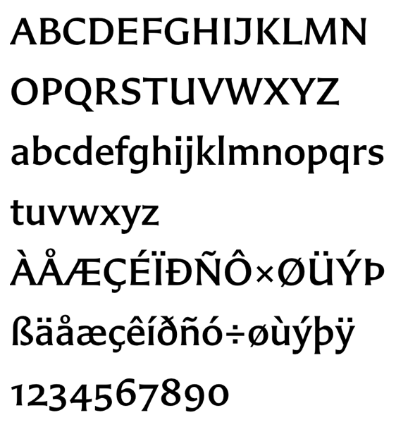
file name: Dan Reynolds Mathieu Reguer Martel Sans Black 2014

file name: Dan Reynolds Mathieu Reguer Martel Sans Black 2014b

file name: Dan Reynolds Mathieu Reguer Martel Sans Lightk 2014

file name: Dan Reynolds Martel Sans Devanagari 2008 2015
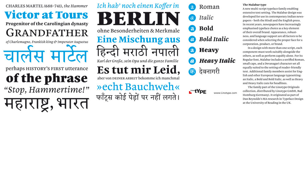
file name: Dan Reynolds Malabar
file name: Dan Reynolds Malabar

file name: Dan Reynolds Mathieu Reguer Biryani Bold 2015

file name: Dan Reynolds Mathieu Reguer Biryani Bold 2015b

file name: Dan Reynolds Mathieu Reguer Biryani Bold 2015c

file name: House Industries Carnival 2021

file name: House Industries Carnival 2021 1

file name: House Industries Carnival 2021 2

file name: House Industries Carnival 2021 3

file name: House Industries Carnival 2021 5

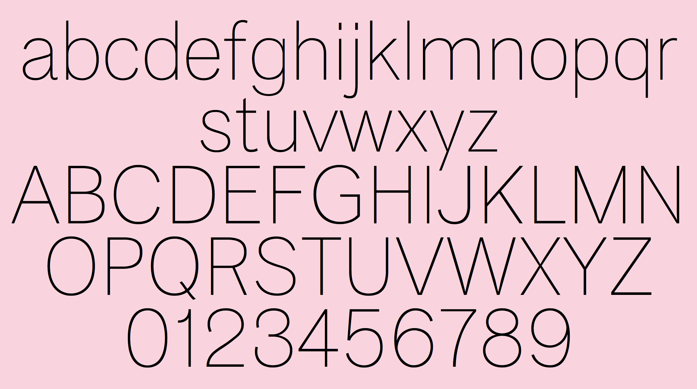
file name: Dan Reynolds Morris Sans 2008

file name: Dan Reynolds Morris Sans 2008

file name: Dan Reynolds Morris Sans 2008

file name: Dan Reynolds Morris Sans 2008
file name: Dan Reynolds Morris Sans

file name: Dan Reynolds Morris Sans 2008
file name: Dan Reynolds Morris Sans Caps
file name: Dan Reynolds Condensed Serif
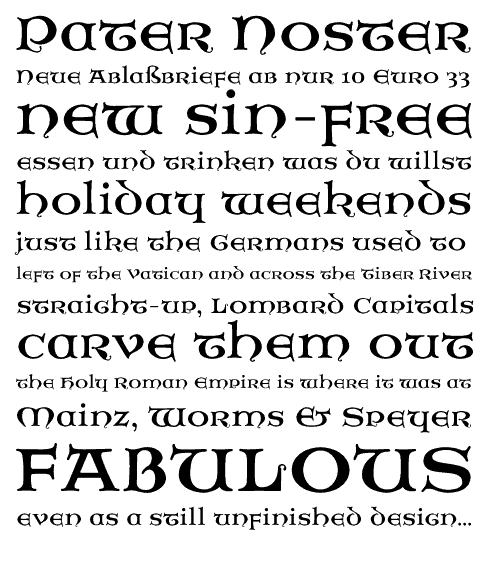
file name: Dan Reynolds Pater Noster 2009

file name: De Roos Junge Teutonia 1902 atop Dan Reynolds Mountain

file name: Martina Flor Summary of Dan Reynolds Talk A Typ I 2014

file name: Dan Reynolds A Typ I2018 photo by Michael Bundscherer

file name: Dan Reynolds A Typ I2018 photo by Michael Bundscherer

file name: Dan Reynolds A Typ I2018 photo by Michael Bundscherer

file name: Dan Reynolds Pic
| | |
|
Luc Devroye ⦿ School of Computer Science ⦿ McGill University Montreal, Canada H3A 2K6 ⦿ lucdevroye@gmail.com ⦿ https://luc.devroye.org ⦿ https://luc.devroye.org/fonts.html |