TYPE DESIGN INFORMATION PAGE last updated on Thu Apr 16 22:04:05 EDT 2026
FONT RECOGNITION VIA FONT MOOSE
|
|
|
|
Bembo
[Stanley Morison]
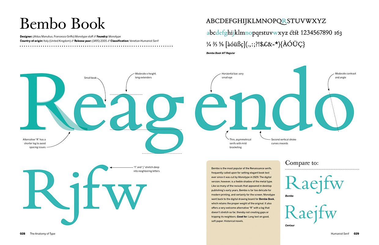
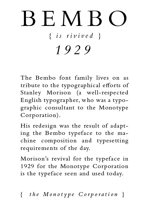
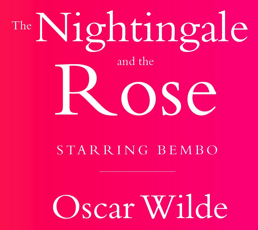
Historical typeface, loosely related to Garamond but with sharper serifs. The original is by Venetian Francesco Griffo (1495), created for use in printing De Aetna by Cardinal Pietro Bembo. The cursive is attributed to Giovanantonio Tagliente (1524). Stanley Morison made a metal version at Monotype in 1929. Ulrich Stiehl says: Bembo recuts sold today by Monotype, Adobe, and Linotype, have short ascenders (b, d, f, k, l) so that the spirit of freedom expressed by this Renaissance typeface gets lost. We offer here a few type specimens of former recuts of the Bembo which was used for the first time in the Latin book "De Aetna" written by "Petrus Bembus" (= Pietro Bembo). You can find gifs in this link of the following: Bembo, hand-composition foundry type (Germany, 1963), Monotype hot-metal composition Bembo (England, 1973), Monotype composition Bembo (Germany, year unknown), Berthold photocomposition Bembo with long ascenders (Germany, 1985), Bembo-Antiqua Series 270 Monotype in all type sizes from 4 pt to 72 pt (Germany, 1966). For digital versions, see Monotype Bembo. Bembo Book was released by Monotype in 2005. Bitstream's Aldine 401 is a Bembo look-alike. Other digital typefaces include fbb (2014, a free font by Michael Sharpe on the CTAN site), Bemtus (URW), Bamberg Serial (SoftMaker) and Bergamo (SoftMaker). Mac McGrew writes: Bembo was cut in 1929 by the English Monotype corporation under the direction of Stanley Morison, and shortly thereafter by Lanston Monotype in America. It derives from the first roman type used by Aldus Manutius in the dialogue De Aetna, by Pietro Bembo, printed in Venice in 1495. Punches were cut by Francesco Griffo of Bologna, the designer responsible four years later for the first italic types. This typeface is probably the most popular and successful of the numerous typefaces revived by Morison as typographic adviser to the English company. Morison attributed its success to the fact that "it was inspired not by writing but by engraving; not script but sculpture." The italic is adapted from a 1524 typeface of Giovanni Taglienti, and has a natural grace of its own. English Monotype also made Bembo Bold and Bembo Bold Italic. Poster by Arturo Gil. Poster by Agustina Fernandez (2013). |
EXTERNAL LINKS |
| | |

file name: Bitstream Aldine401

file name: Bitstream Aldine401 Bold

file name: Francesco Griffo Bembo 1495 poster by Tyler Flood 2015

file name: Francesco Griffo Bembo 1496 Poster by Agustina Fernandez 2014

file name: Recognize Bembo

file name: Robin Nicholas Bembo Book 2005 Poster by Stephen Coles 2013

file name: Monotype Bembo 1929 Poster by Bailey Saville 2017

file name: Monotype Bembo 1929 Poster by Bailey Saville 2017b

file name: Monotype Bembo 1929 Poster by Amy Lynn Grover 2014

file name: Monotype Bembo 1929 Poster by Amy Lynn Grover 2014 L

file name: Monotype Bembo 1929 Poster by Amy Lynn Grover 2014b

file name: Monotype Bembo 1929 Poster by Amy Lynn Grover 2014c

file name: Monotype Bembo 1929 Poster by Amy Lynn Grover 2014e

file name: Monotype Bembo 1929 Poster by Amy Lynn Grover 2014f

file name: Monotype Bembo 1929 Poster by Amy Lynn Grover 2014g

file name: Monotype Bembo 1929 Poster by Amy Lynn Grover 2014h

file name: Monotype Bembo 1929 Poster by Amy Lynn Grover 2014i

file name: Monotype Bembo 1929 Poster by Amy Lynn Grover 2014j

file name: Monotype Bembo 1929 Poster by Amy Lynn Grover 2014k

file name: Monotype Bembo 1929 Poster by Amy Lynn Grover 2014m

file name: Monotype Bembo 1929 Poster by Amy Lynn Grover 2014n

file name: Monotype Bembo 1929 Poster by Amy Lynn Grover 2014o

file name: Monotype Bembo 1929 Poster by Amy Lynn Grover 2014p

file name: Monotype Bembo 1929 Poster by Amy Lynn Grover 2014q

file name: David J Perry Michael Sharpe fbb 2014b

file name: David J Perry Michael Sharpe fbb 2015

file name: Frank Hinman Pierpont Monotype Bembo 1929 193921

file name: Frank Hinman Pierpont Monotype Bembo 1929 193918

file name: Frank Hinman Pierpont Monotype Bembo 1929 193918b

file name: Frank Hinman Pierpont Monotype Bembo 1929 193919

file name: Frank Hinman Pierpont Monotype Bembo 1929 Poster by Amy Eibach 2016

file name: Monotype Bembo 1929 Poster by Sarah Linderer 2016

file name: Monotype Bembo 1929 Poster by Sarah Linderer 2016b

file name: Monotype Bembo 1929

file name: Monotype Bembo 1929b

file name: Monotype Bembo 1929c

file name: Monotype Bembo Pro Bold 1929
| | |
|
Luc Devroye ⦿ School of Computer Science ⦿ McGill University Montreal, Canada H3A 2K6 ⦿ lucdevroye@gmail.com ⦿ https://luc.devroye.org ⦿ https://luc.devroye.org/fonts.html |

