TYPE DESIGN INFORMATION PAGE last updated on Thu Apr 16 22:04:10 EDT 2026
FONT RECOGNITION VIA FONT MOOSE
|
|
|
|
Michael Bierut: I hate ITC Garamond
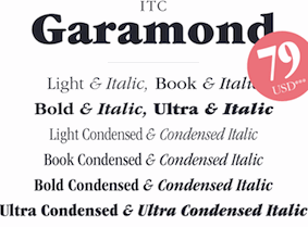
Michael Bierut's emotional destruction of Tony Stan's 1975 face, ITC Garamond. Excerpts: The most distinctive element of the typeface is its enormous lower-case x-height. In theory this improves its legibilty, but only in the same way that dog poop's creamy consistency in theory should make it more edible. [...] ITC Garamond enjoyed its apotheosis when it was adapted as the official corporate typeface of Apple Computer in 1984; adding insult to injury, the font was condensed horizontally 80%. Associated with Apple's brilliant packaging and advertising for the next 20 years, the resulting mutation became a part of the global landscape, seeming no less impregnable and unchanging as the Soviet empire. And then, just like global communism, it just went away, replaced overnight with a sleek customized version of Myriad. [...] I've come to realize that I don't hate it for any rational reason; I hate it like I hate fingernails on a blackboard. I hate it because I hate it. |
EXTERNAL LINKS |
| | |

file name: Tony Stan I T C Garamond 1976

file name: I T C Garamond Poster by Evgenia Skalyha 2015

file name: Tony Stan I T C Garamond Book 1977

file name: Tony Stan I T C Garamond Light 1977

file name: Tony Stan I T C Garamond Narrow Ultra 1977
| | |
|
Luc Devroye ⦿ School of Computer Science ⦿ McGill University Montreal, Canada H3A 2K6 ⦿ lucdevroye@gmail.com ⦿ https://luc.devroye.org ⦿ https://luc.devroye.org/fonts.html |

