TYPE DESIGN INFORMATION PAGE last updated on Wed May 6 16:14:56 EDT 2026
FONT RECOGNITION VIA FONT MOOSE
|
|
|
|
Commercial fonts at this boutique type foundry and publisher operating in Tokyo, jointly run by Ian Lynam and Thien Huynh. Ian Lynam is a New Yorker who studied Graphic Design at Portland State University (B.S.) and California Institute of the Arts (M.F.A.). He is professor at Temple University Japan, as well as at Vermont College of Fine Arts. He operates the Tokyo design studio Ian Lynam Design and the hybrid publishing imprint and type foundry Wordshape. MyFonts link. Images of most of Ian Lynam's typefaces.
Speaker at ATypI 2019 in Tokyo on the topic of From Bijin-ga to Brutus, in which he explains the work of graphic designers Hokuu Tada (1889-1948) and Seiichi Horiuchi (1933-1987). |
EXTERNAL LINKS |
| | |

file name: Wordshape Glot Round 2020 351440

file name: Wordshape Glot Round 2020

file name: Ian Lynam James Todd Glot 2019

file name: Ian Lynam James Todd Glot 2019 301997

file name: Ian Lynam James Todd Glot 2019 302000

file name: Ian Lynam James Todd Glot 2019

file name: Wordshape Boul Mich 2010
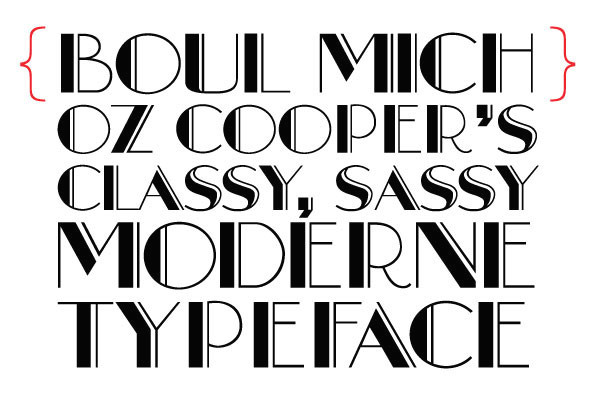
file name: Ian Lynam Boul Mich 2010 after Oswald Cooper Boul Mich 1927

file name: Ian Lynam Boul Mich 2010 after Oswald Cooper Boul Mich 1927b
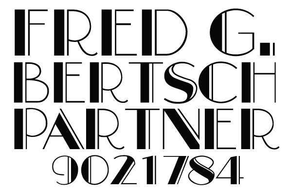
file name: Ian Lynam Boul Mich 2010 after Oswald Cooper Boul Mich 1927c
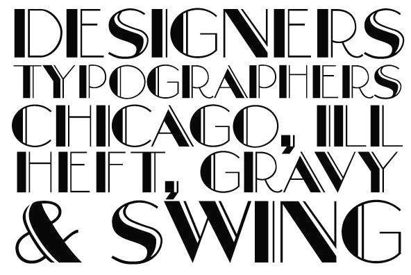
file name: Ian Lynam Boul Mich 2010 after Oswald Cooper Boul Mich 1927d

file name: Ian Lynam Boul Mich 2010 after Oswald Cooper Boul Mich 1927e

file name: Ian Lynam Boul Mich 2010 after Oswald Cooper Boul Mich 1927f

file name: Wordshape Boul Mich 2010

file name: Wordshape Boul Mich 2010

file name: James Todd Ian Lynam Biwa 2017

file name: James Todd Ian Lynam Biwa 2017

file name: Ian Lynam Biwa 2017

file name: Ian Lynam Biwa 2017b

file name: Ian Lynam Smythe Sans Pro 2016

file name: Ian Lynam Smythe Soft Pro 2016

file name: Ian Lynam Smythe Soft Pro 2016b

file name: Eli Carrico Ian Lynam Interno 2004 after Walter Ballmer Olivetti Logo 1960

file name: Eli Carrico Ian Lynam Interno 2004 after Walter Ballmer Olivetti Logo 1960b

file name: Eli Carrico Ian Lynam Interno 2004 after Walter Ballmer Olivetti Logo 1960c

file name: Ian Lynam Raker 2015

file name: Ian Lynam Raker Stencil 2015

file name: Wordshape Raker 2015 186635

file name: Wordshape Raker 2015 186636

file name: Wordshape Raker 2015 186638

file name: Wordshape Raker 2015

file name: Ian Lynam Stamen 2016 202855

file name: Ian Lynam Stamen 2016 202860

file name: Ian Lynam Stamen 2016

file name: Ian Lynam Stebl Grotesk 2012

file name: Ian Lynam Stebl Slab 2012

file name: Ian Lynam Entity 2012

file name: Ian Lynam Okojo 2012

file name: Ian Lynam Okojo Pro 2016c

file name: Ian Lynam Okojo Slab Pro 2016b

file name: Ian Lynam Okojo Slab Pro 2016c

file name: Ian Lynam Okojo Pro Stack 2016

file name: Ian Lynam Okojo Slab Pro Stack 2016

file name: Ian Lynam Okojo Slab 2012

file name: Ian Lynam Okojo Slab Bold 2012

file name: Ian Lynam Okojo Display 2012

file name: Ian Lynam Okojo Display 2012b

file name: Ian Lynam Okojo Slab Display 2012

file name: Ian Lynam Okojo Slab Display Bold 2012

file name: Wordshape Okojo

file name: Wordshape Okojo Pro 2016 207722

file name: Wordshape Okojo Pro 2016

file name: Ian Lynam Okojo Slab Pro 2016

file name: Ian Lynam Vaud 2013b

file name: Ian Lynam Vaud 2013c

file name: Ian Lynam Vaud Bold 2013

file name: Ian Lynam Vaud Display Light 2013

file name: Ian Lynam Vaud 2013d

file name: Ian Lynam Vaud 2013e

file name: Ian Lynam Cern 2013

file name: Ian Lynam Cern 2013b

file name: Ian Lynam Cern 2013c

file name: Ian Lynam Cern Display Ultra 2013

file name: Ian Lynam Cern Semi Bold 2013

file name: Ian Lynam Raffish 2013 after Henk Krijger Raffia

file name: Ian Lynam Raffish 2013 after Henk Krijger Raffia

file name: Ian Lynam Sketch Caslon Italic 2013

file name: Ian Lynam Smythe Sans Display 2012

file name: Ian Lynam Smythe Sans Display 2012b

file name: Wordshape Cooper Black Italic 2010
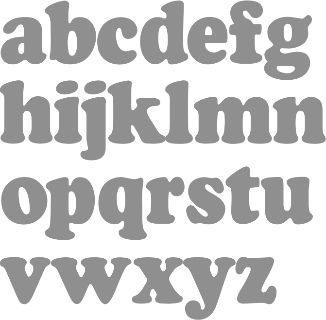
file name: Ian Lynam Cooper Black Condensed 2010

file name: Ian Lynam Cooper Black Swash 2010
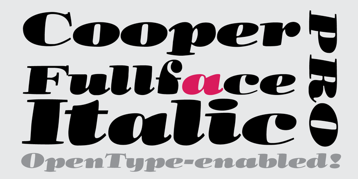
file name: Ian Lynam Cooper Fullface Italic Pro 2013b

file name: Ian Lynam Cooper Fullface Italic Pro 2013c
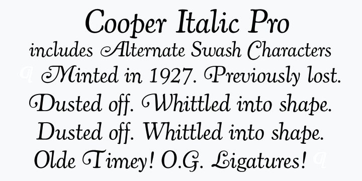
file name: Ian Lynam Cooper Italic Pro 2013b

file name: Ian Lynam Cooper Italic Pro 2013c

file name: Ian Lynam Kirimomi Swash 2017

file name: Ian Lynam Kirimomi Swash 2017b

file name: Ian Lynam Kirimomi Swash 2017c

file name: Ian Lynam Kirimomi Geometric 2011

file name: Ian Lynam Kirimomi Swas Italic 2011

file name: Ian Lynam Kihachiro Swash Italic 2011

file name: Ian Lynam Kihachiro Geometric 2011

file name: Ian Lynam Clobber Grotesk 2010

file name: Ian Lynam Clobber Grotesk 2010a

file name: Ian Lynam Clobber Grotesk 2010c

file name: Ian Lynam Adora Bold 2011

file name: Ian Lynam Adora Bold 2011 after Walter Tracy Ad Sans 1959

file name: Ian Lynam Adora Bold 2011 after Walter Tracy Ad Sans 1959b

file name: Ian Lynam Effete 2011

file name: Ian Lynam Effete 2011b

file name: Ian Lynam Effete 2011c

file name: Ian Lynam Maat 2011b

file name: Ian Lynam Maat 2011a

file name: Ian Lynam Maat 2011c

file name: Ian Lynam Maat 2011d

file name: Ian Lynam Maat 2011

file name: Ian Lynam Kommisar 2012c

file name: Ian Lynam Kommisar 2012

file name: Ian Lynam Kommisar 2012b

file name: Ian Lynam Cinta Adhesiva 2011

file name: Ian Lynam Neuerland 2010c

file name: Ian Lynam Neuerland 2010

file name: Ian Lynam Neuerland 2010b

file name: Ian Lynam Neuerland 2010bb

file name: Ian Lynam Inversion 2010

file name: Wordshape Sandberg Honorarium 2003

file name: Ian Lynam Devils Advocate 2010 after Cathedral Text A T F 1934

file name: Ian Lynam Pompeian Cursive 2010a
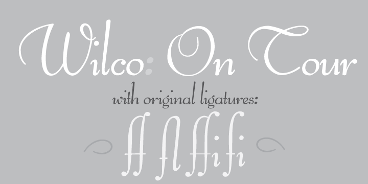
file name: Ian Lynam Pompeian Cursive 2010b

file name: Ian Lynam Pompeian Cursive 2010c

file name: Ian Lynam Pompeian Cursive 2010d

file name: Ian Lynam Cruller 2010

file name: Ian Lynam Cruller 2010b

file name: Wordshape Cruller

file name: Ian Lynam Cooper Text 2010 after O B Cooper

file name: Ian Lynam Cooper Black Italic Pro 2013

file name: Ian Lynam Dorsal 2011

file name: Ian Lynam Dorsal 2011b

file name: Ian Lynam Off Broadway 2011

file name: Ian Lynam Off Broadway 2011b

file name: Ian Lynam Off Broadway 2011c

file name: Wordshape Iggy 2015 187045

file name: Wordshape Iggy 2015 187046

file name: Wordshape Iggy 2015 187047

file name: Wordshape Iggy 2015

file name: Ian Lynam Pic

file name: Ian Lynam Pic 2019
| | |
|
Luc Devroye ⦿ School of Computer Science ⦿ McGill University Montreal, Canada H3A 2K6 ⦿ lucdevroye@gmail.com ⦿ https://luc.devroye.org ⦿ https://luc.devroye.org/fonts.html |


