TYPE DESIGN INFORMATION PAGE last updated on Wed May 6 16:15:04 EDT 2026
FONT RECOGNITION VIA FONT MOOSE
|
|
|
|
Walter Käch
Teacher of Adrian Frutiger, b. 1901, Ottenbach, Switzerland. Pic. Here, you can find wonderful advice for making well-adjusted alphabets. In this wikipedia, we read: At the age of 16, Frutiger was apprenticed as compositor to a printer in the nearby town of Interlaken for four years and attended classes at the Zürich School of Arts and Crafts. (Rauri) Under the tutelage of Walter Käch from 1949 to 1951, students learned type design by rubbing forms from Roman inscriptions. The students then applied the knowledge learned from these ancient letterforms to their own type creations. The students came to realize that the way the inscriptions were made was an outline applied with a pen, and then chiseled into the rock. When students were first learning to design typefaces, they used pens to create flowing letterforms. Then students moved on to work with pencil. No instruments, such as rulers were used- everything was done by eye, and corrections had to be made by scraping the markings off with a knife. Frutiger respected Käch, and felt he was a fine teacher who allowed many different views to be prevalent. However, the young student disagreed with his teacher on how technical and defined forms should be. Käch was a calligrapher, and thought because punch cutters used a grid their forms were too harsh and technical. His typefaces are all dated 1949 and were published by ZHdK Zurich:
Author of the lettering manual Schriften/Lettering/Ecritures (1949), which, according to Peter Bain, establishes a conversation between typeface designers, typefounders, and those who were drawing letters in a typographic age. |
EXTERNAL LINKS |
| | |
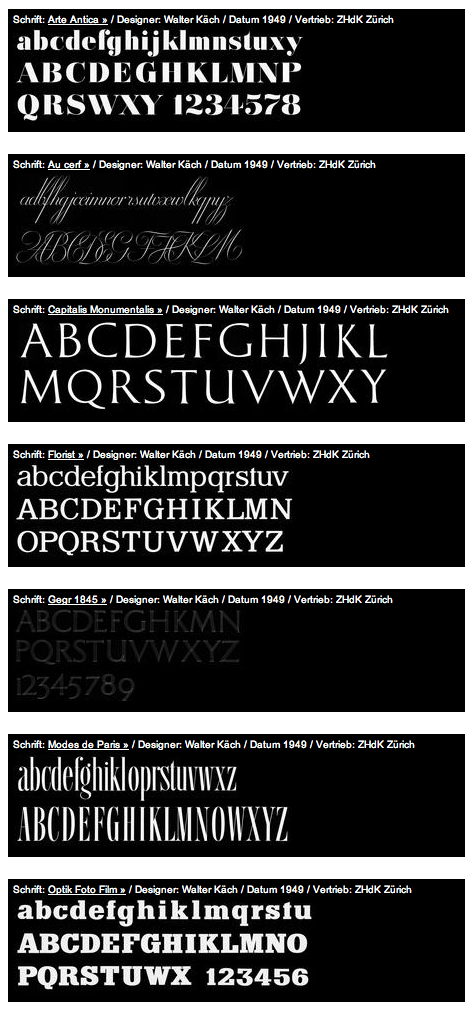
file name: Walter Kach Catalog1
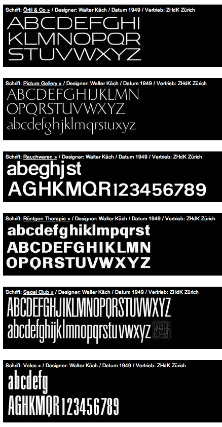
file name: Walter Kach Catalog2

file name: Walter Kach Arte Antiqua 1949
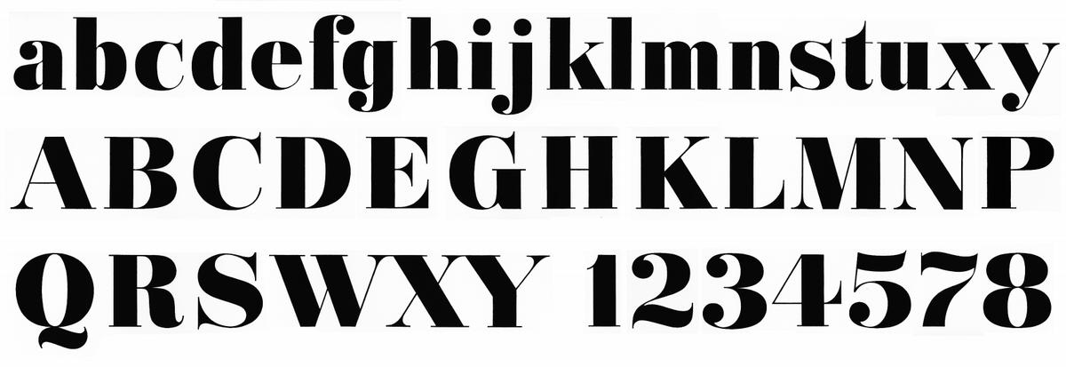
file name: Walter Kach 1949 Arte Antiqua2
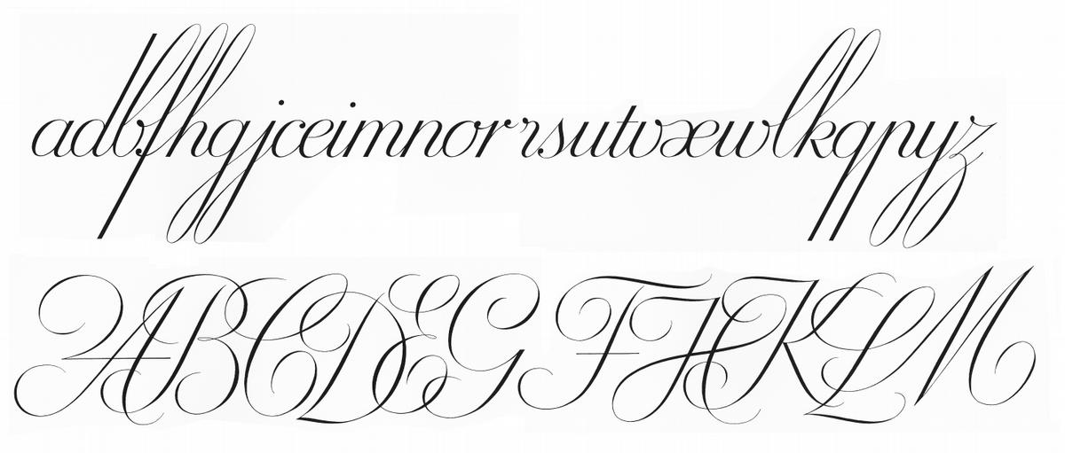
file name: Walter Kach 1949 Au Cerf

file name: Walter Kach 1949 Capitalis Monumentalis

file name: Walter Kach 1949 Florist
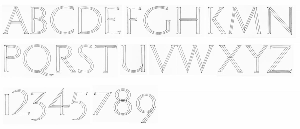
file name: Walter Kach 1949 Gegr1845 2
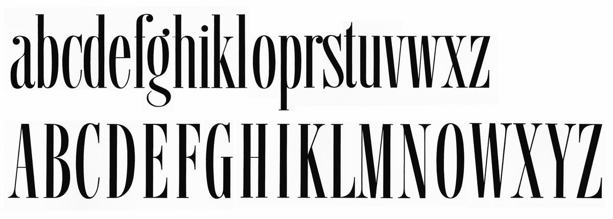
file name: Walter Kach 1949 Modesde Paris

file name: Walter Kach 1949 Modesde Paris

file name: Walter Kach 1949 Optik Foto Film
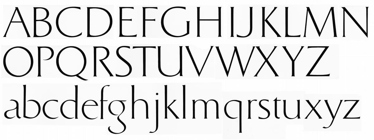
file name: Walter Kach 1949 Picture Gallery

file name: Walter Kach 1949 W K Rauchwaren 26
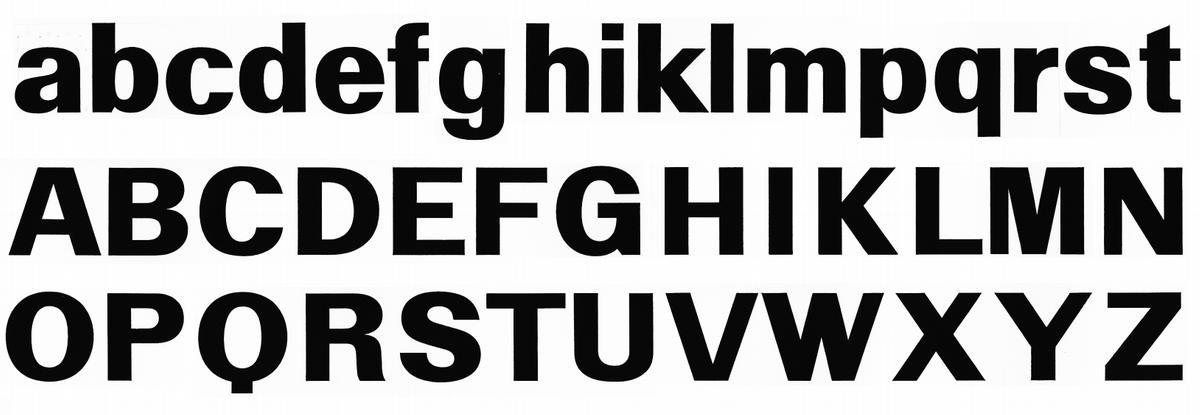
file name: Walter Kach 1949 Roentgen Therapie

file name: Walter Kach 1949 Segel Club layout2
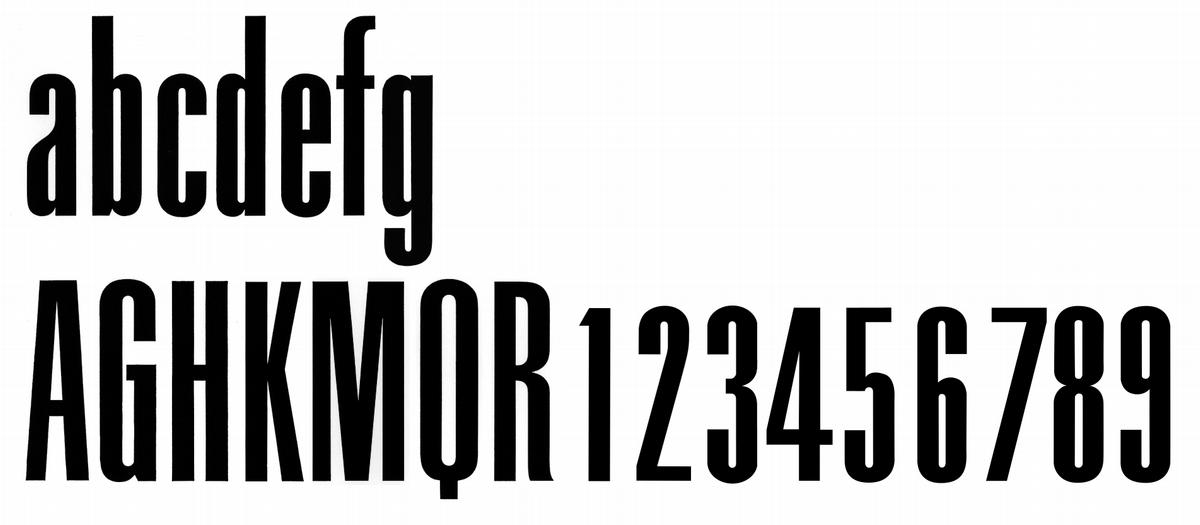
file name: Walter Kach 1949 Velos

file name: Walter Kach
| | |
|
Luc Devroye ⦿ School of Computer Science ⦿ McGill University Montreal, Canada H3A 2K6 ⦿ lucdevroye@gmail.com ⦿ https://luc.devroye.org ⦿ https://luc.devroye.org/fonts.html |
