TYPE DESIGN INFORMATION PAGE last updated on Wed May 6 16:15:24 EDT 2026
FONT RECOGNITION VIA FONT MOOSE
|
|
|
|
Nonpareille (was: Chastellun.net)
[Matthieu Cortat]
Matthieu Cortat was born in Délémont (Switzerland) in 1982, and became a French citizen later. After a degree in graphic design in 2005, at the University of Art&Design Lausanne (Ecal), he obtained a Masters at the Atelier National de Recherche Typographie in Nancy (France). Cortat heads the Master Type design program at the École d'art de Lausanne (ECAL). He lives in Lyon where he is advisor to the collections of the museum of Printing and Graphic communication. He created the French typographical corpus, which brings together the typefaces in France between 1850 and today. He set up Nonpareille. Most of his typefaces can be bought at 205 Corp. His typefaces:
Speaker at ATypI 2017 Montreal. View Matthieu Cortat's typefaces. View Nonpareille's font library. |
EXTERNAL LINKS |
| | |

file name: Matthieu Cortat Anthony Franklin Sander Vermeulen Muoto 2021
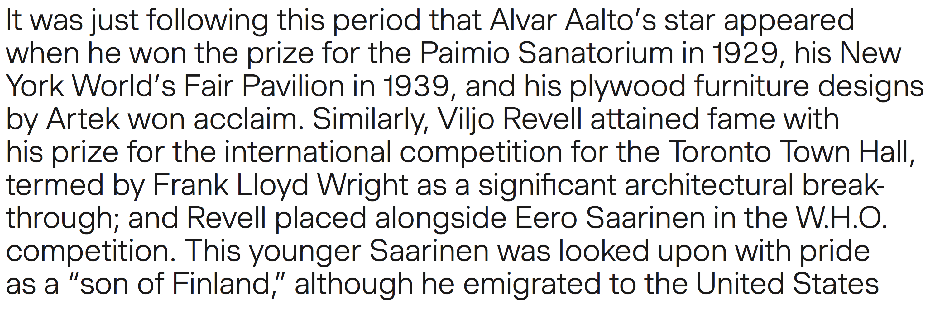
file name: Matthieu Cortat Anthony Franklin Sander Vermeulen Muoto 2021

file name: Matthieu Cortat Anthony Franklin Sander Vermeulen Muoto 2021

file name: Matthieu Cortat Anthony Franklin Sander Vermeulen Muoto 2021

file name: Matthieu Cortat Anthony Franklin Sander Vermeulen Muoto 2021

file name: Matthieu Cortat Anthony Franklin Sander Vermeulen Muoto 2021

file name: Matthieu Cortat Anthony Franklin Sander Vermeulen Muoto 2021
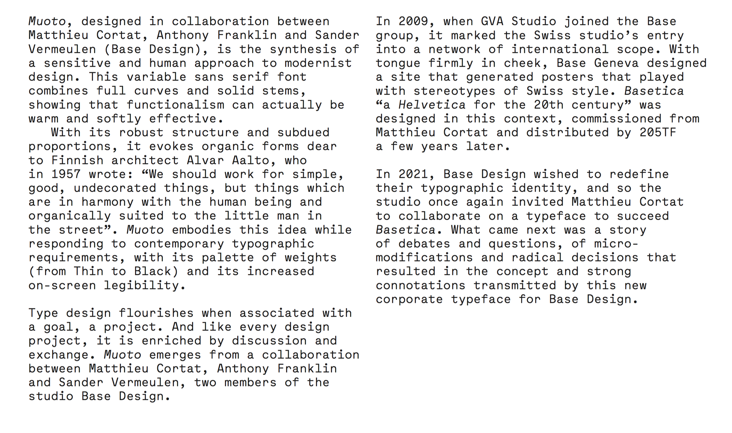
file name: Matthieu Cortat Anthony Franklin Sander Vermeulen Muoto 2021
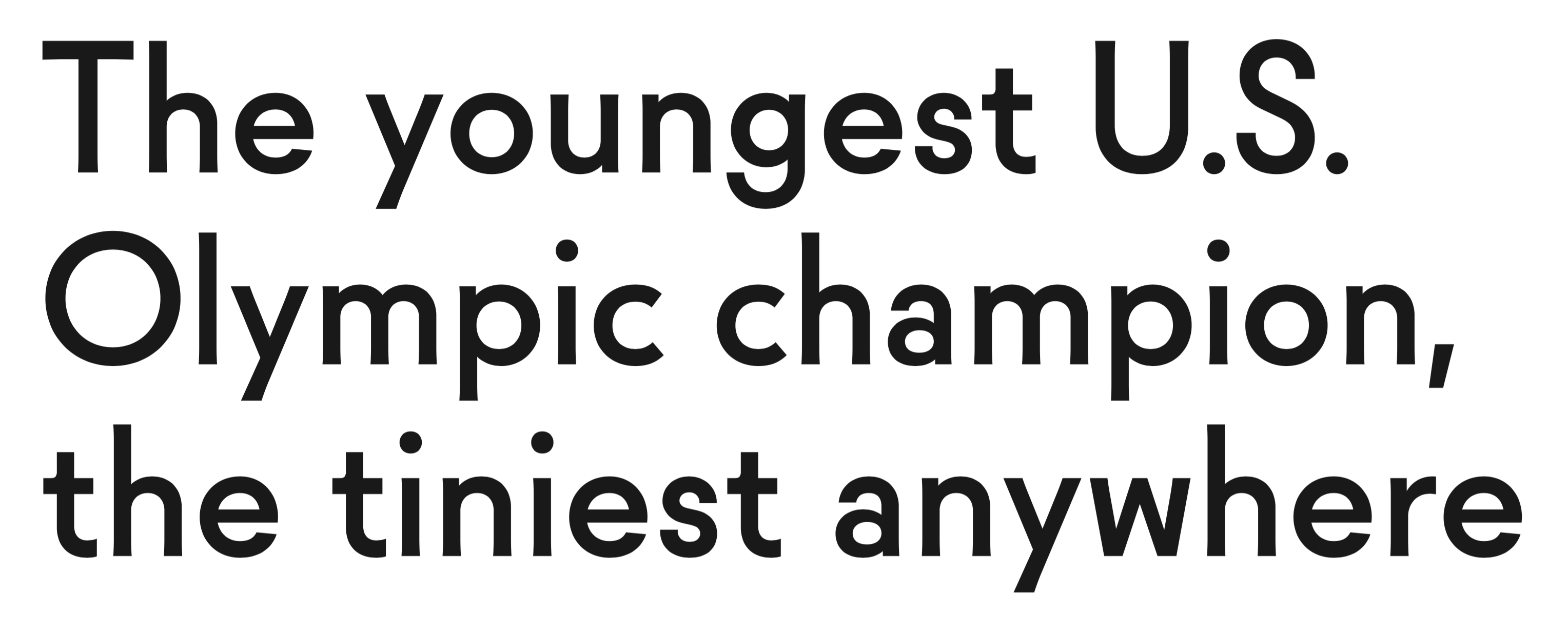
file name: Mathieu Cortat Molitor 2019
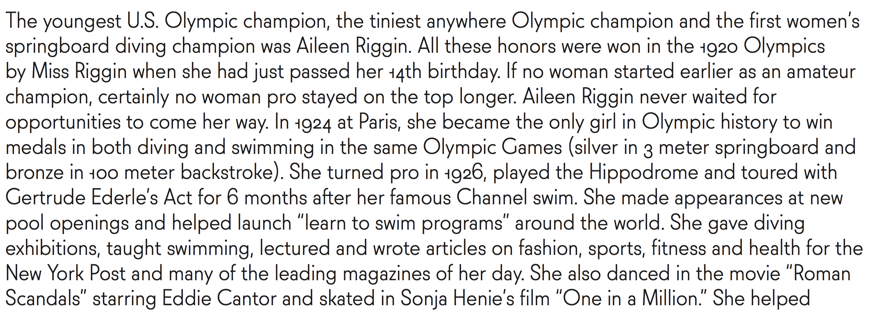
file name: Mathieu Cortat Molitor 2019
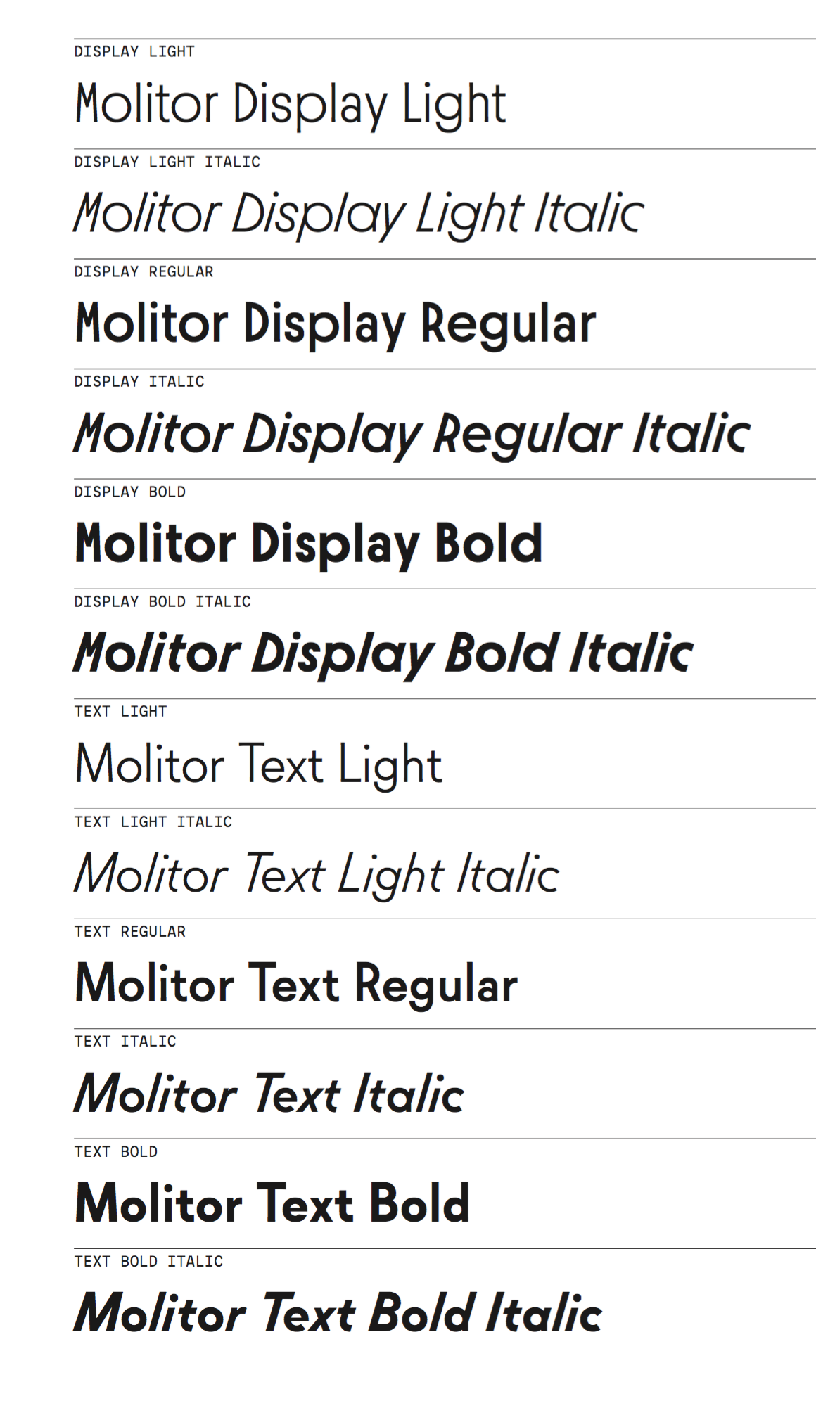
file name: Mathieu Cortat Molitor 2019
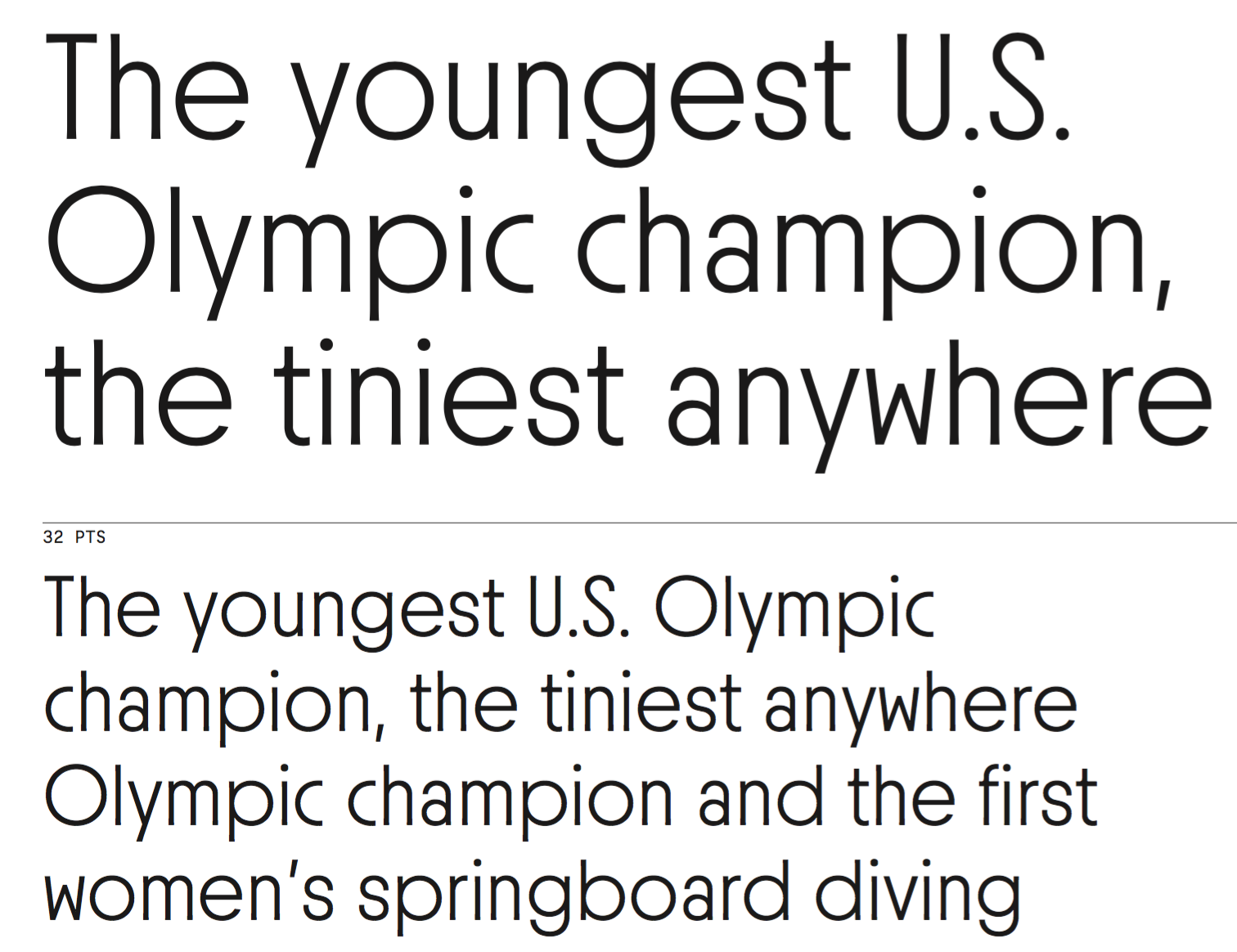
file name: Mathieu Cortat Molitor 2019

file name: Mathieu Cortat Molitor 2019
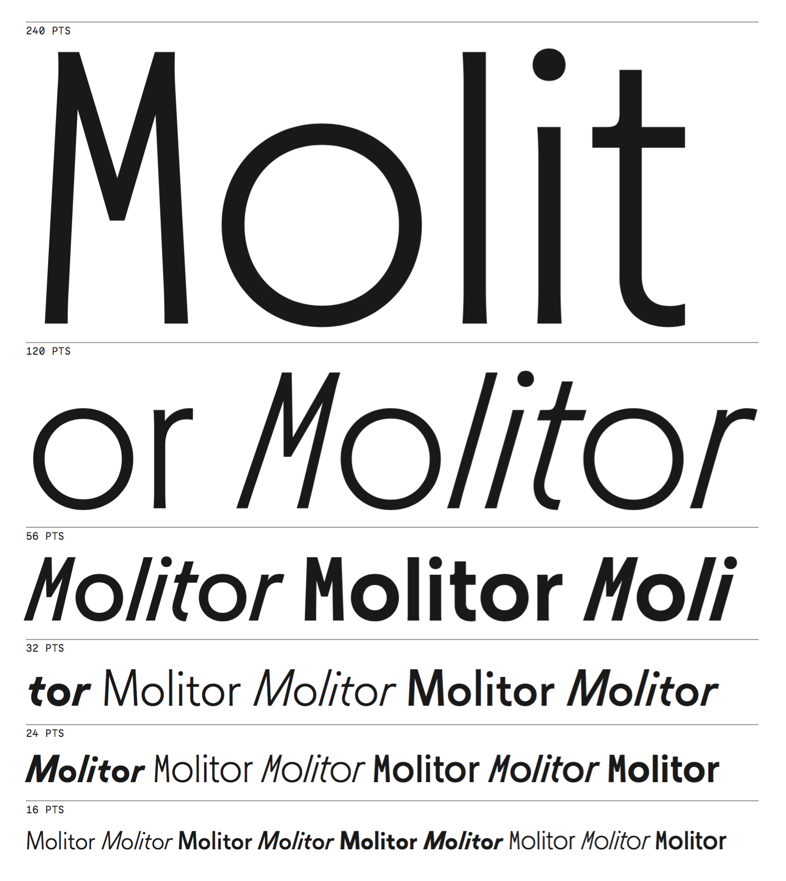
file name: Mathieu Cortat Molitor 2019

file name: Mathieu Cortat Yorick 2018

file name: Mathieu Cortat Yorick 2018b
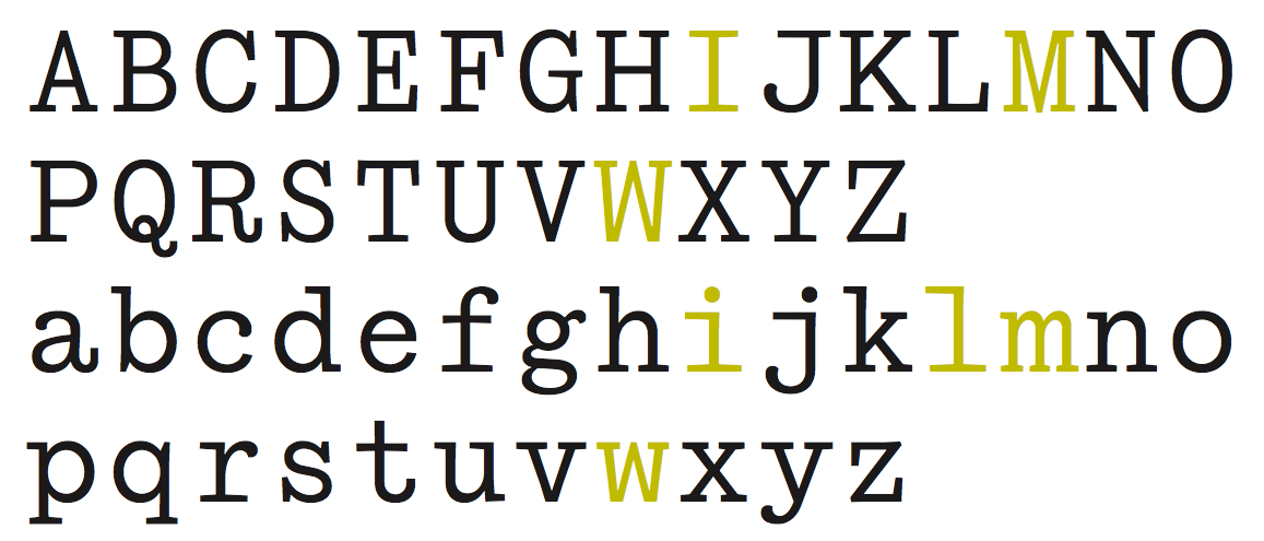
file name: Mathieu Cortat Yorick 2018c
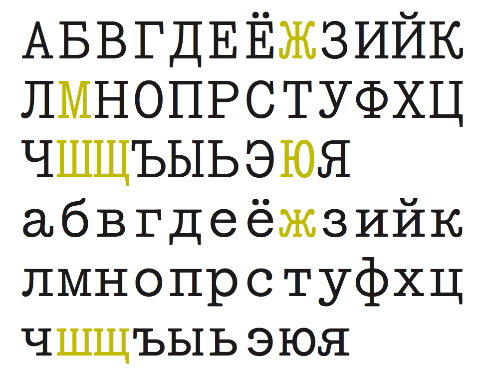
file name: Mathieu Cortat Yorick 2018d
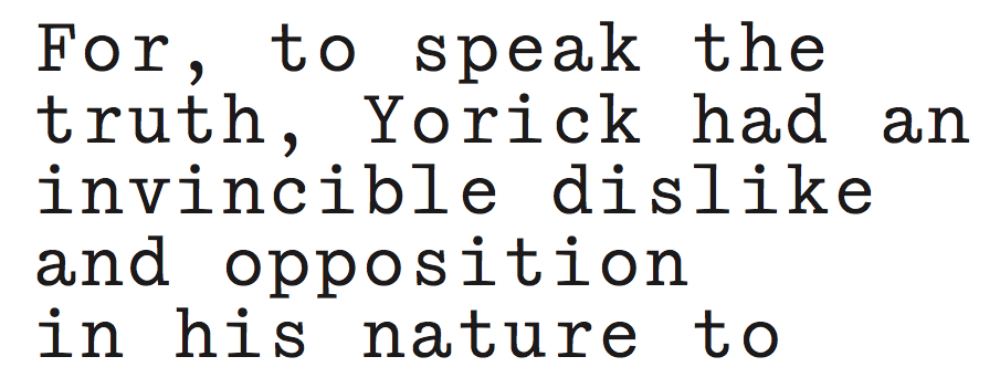
file name: Mathieu Cortat Yorick 2018e
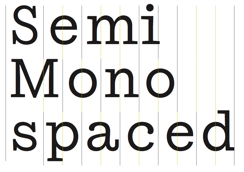
file name: Mathieu Cortat Yorick 2018f
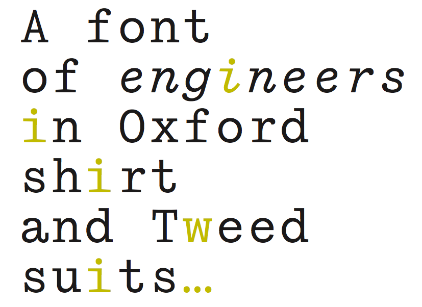
file name: Mathieu Cortat Yorick 2018g

file name: Matthieu Cortat Petit Serif 2013 after Percy J Delf Smith
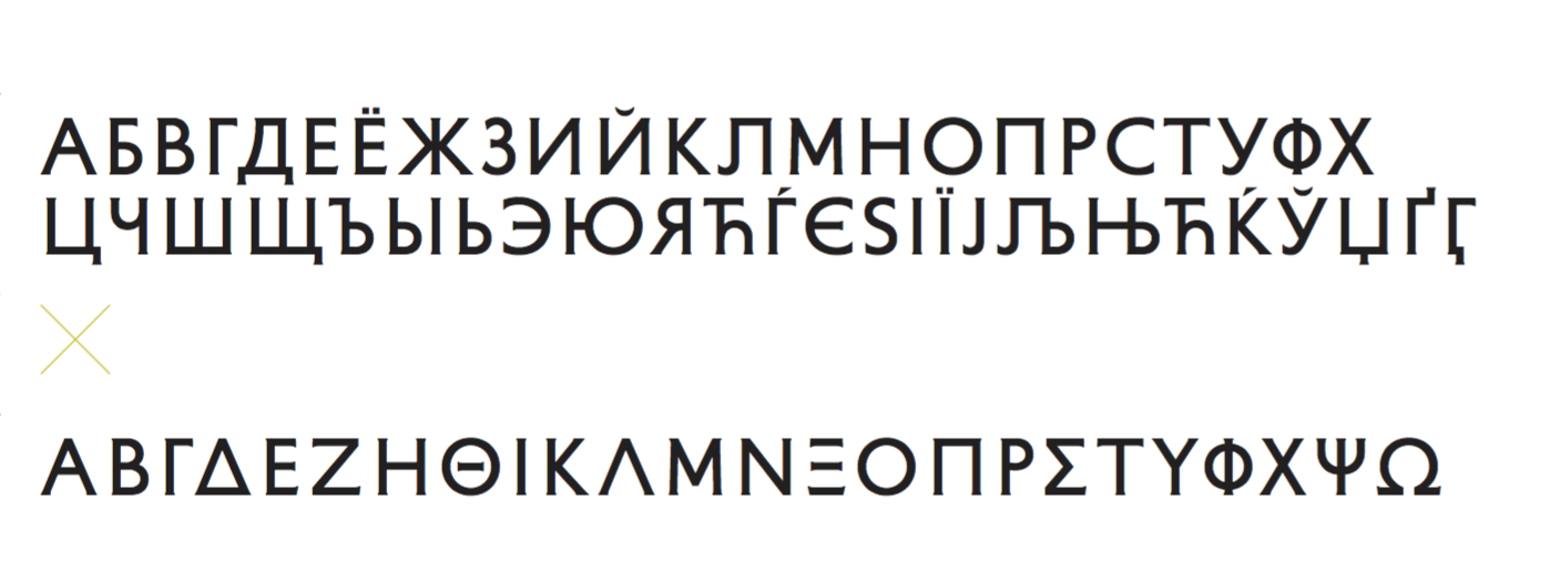
file name: Matthieu Cortat Petit Serif 2013 after Percy J Delf Smith
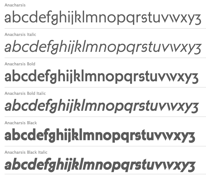
file name: Matthieu Cortat Anacharsis 2012

file name: Matthieu Cortat Anacharsis Black 2012
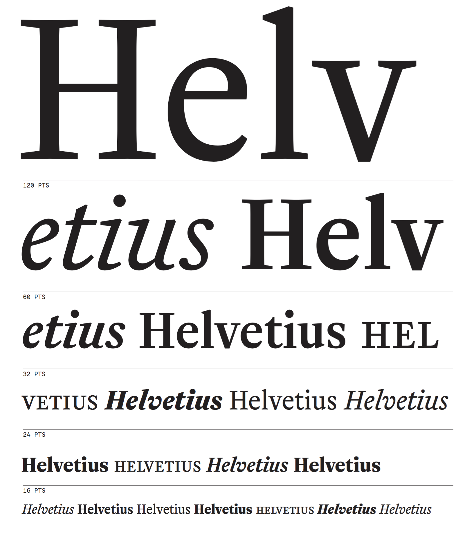
file name: Mathieu Cortat Helvetius 2017
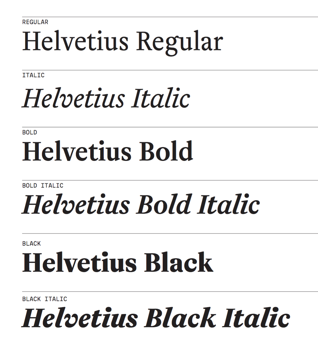
file name: Mathieu Cortat Helvetius 2017b
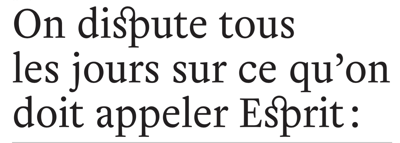
file name: Mathieu Cortat Helvetius 2017c

file name: Mathieu Cortat Helvetius 2017d

file name: Mathieu Cortat Helvetius 2017e

file name: Mathieu Cortat Cosimo 2017b
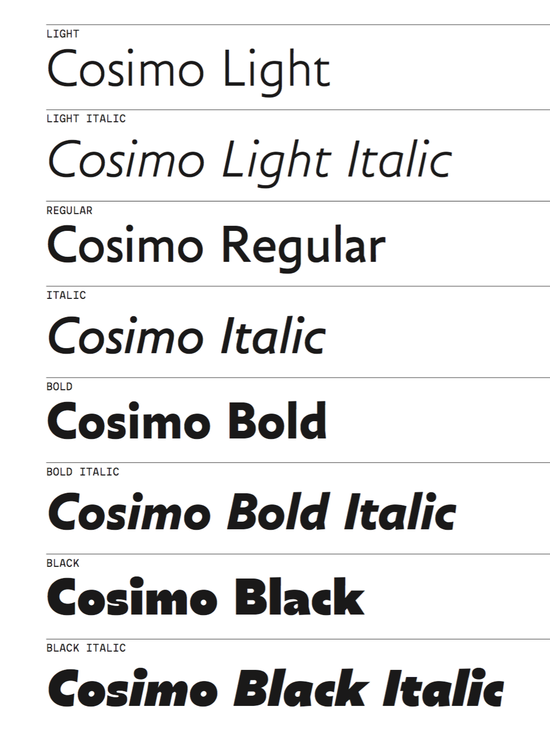
file name: Mathieu Cortat Cosimo 2017b

file name: Mathieu Cortat Cosimo 2017c
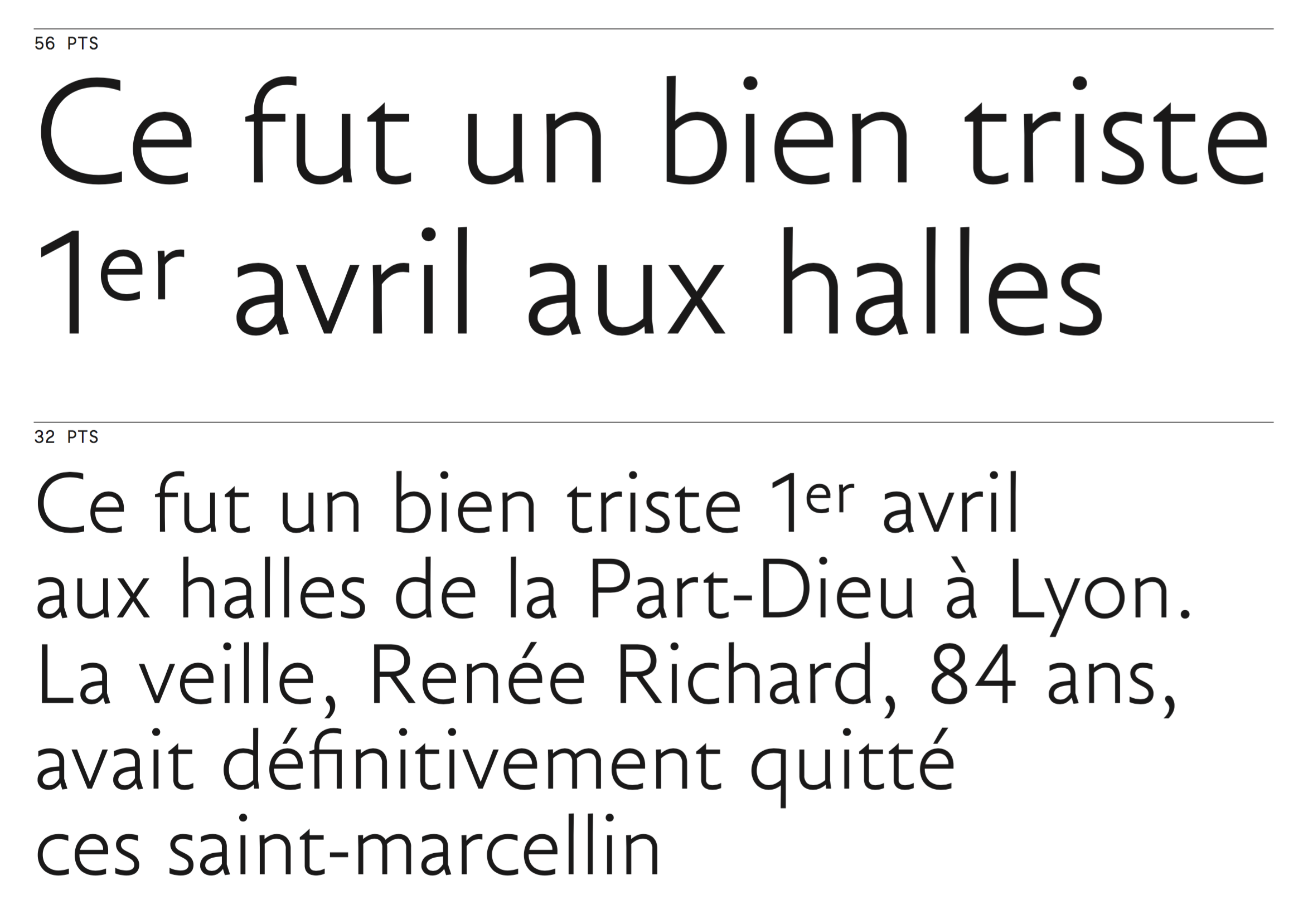
file name: Mathieu Cortat Cosimo 2017d
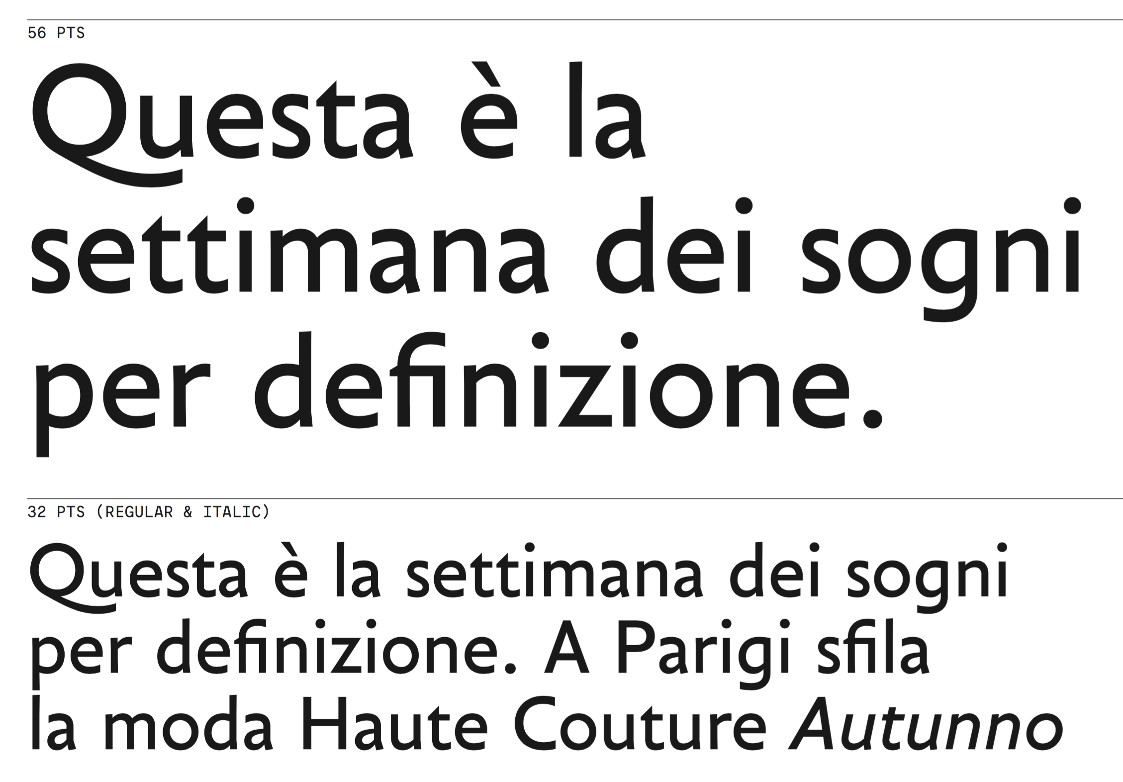
file name: Mathieu Cortat Cosimo 2017e
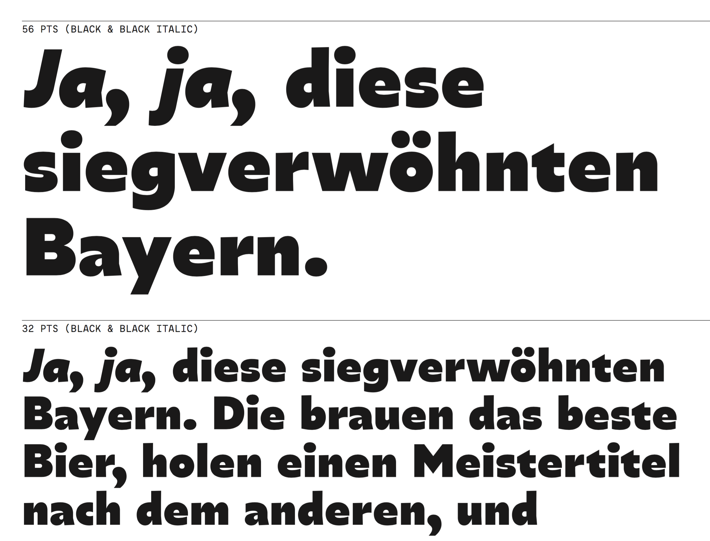
file name: Mathieu Cortat Cosimo 2017f

file name: Mathieu Cortat Maax Display
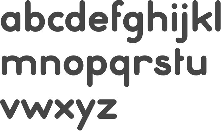
file name: Mathieu Cortat Ebnor Bold 2013
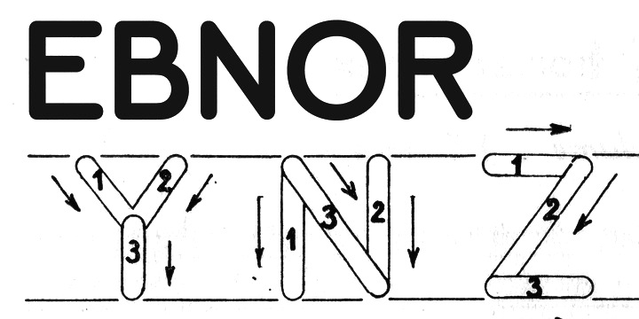
file name: Mathieu Cortat Ebnor Bold 2013b

file name: Mathieu Cortat Svafa 2013
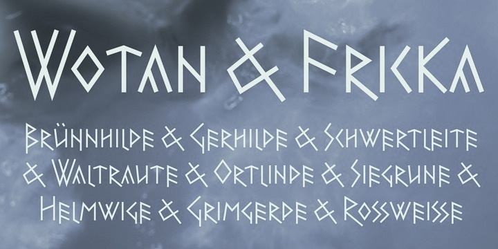
file name: Mathieu Cortat Svafa 2013b

file name: Mathieu Cortat Chrysaora 2013
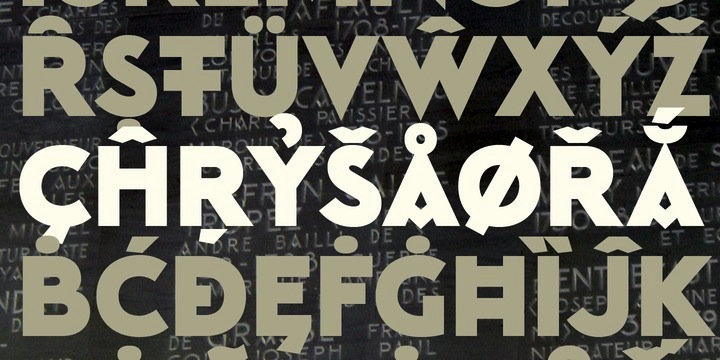
file name: Mathieu Cortat Chrysaora 2013c
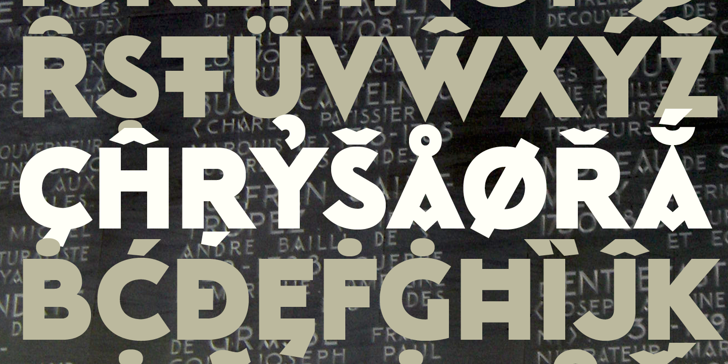
file name: Nonpareille Chrysaora 2013
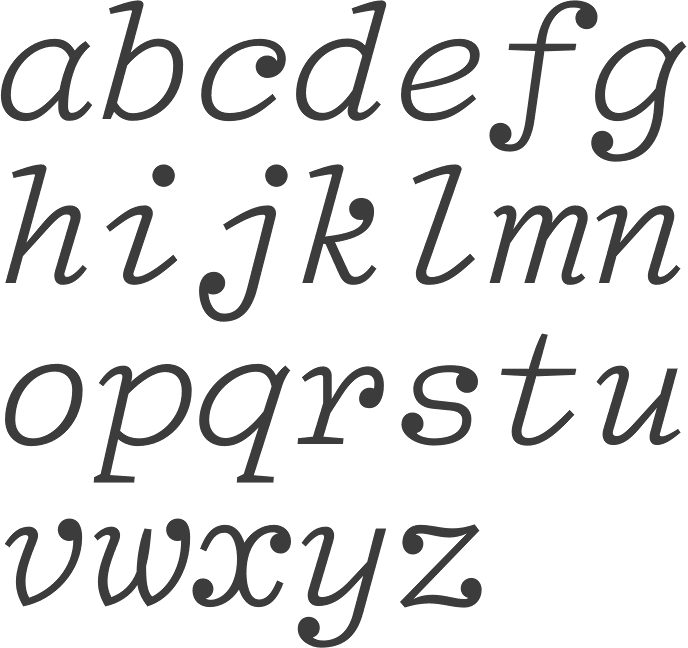
file name: Matthieu Cortat Regis Tosetti Glovis 2007

file name: Matthieu Cortat Regis Tosetti Glovis 2007b

file name: Matthieu Cortat Brett 2004
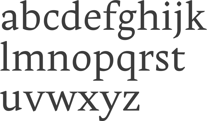
file name: Matthieu Cortat Stockmar 2004 2009

file name: Matthieu Cortat Stuart Standard Bold Titling S C 2008
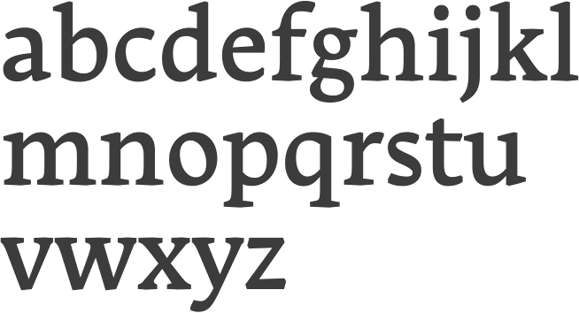
file name: Matthieu Cortat Stuart Standard Medium Text O S F 2008

file name: Matthieu Cortat Battling 2013

file name: Matthieu Cortat Battling 2013c
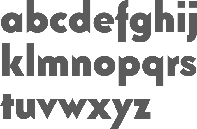
file name: Matthieu Cortat Battling Bold 2013
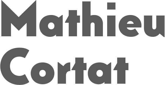
file name: Matthieu Cortat Battling Bold 2013b
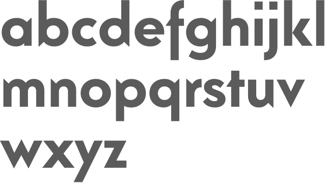
file name: Matthieu Cortat Battling Medium 2013

file name: Matthieu Cortat Battling Medium 2013e
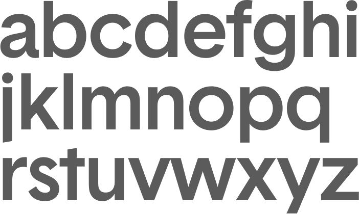
file name: Matthieu Cortat Basetica Pro Medium 2013

file name: Matthieu Cortat Basetica Pro Medium 2013 R L

file name: Matthieu Cortat Basetica Pro Medium 2013b
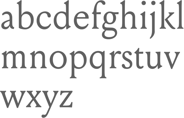
file name: Matthieu Cortat Louize 2013 after Louis Perrin Augustaux 1846 1855

file name: Matthieu Cortat Louize 2013 after Louis Perrin Augustaux 1846 1855c
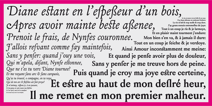
file name: Matthieu Cortat Louize 2013 after Louis Perrin Augustaux 1846 1855d
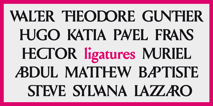
file name: Matthieu Cortat Louize 2013 after Louis Perrin Augustaux 1846 1855e
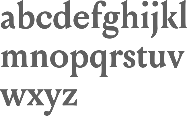
file name: Matthieu Cortat Louize Bold 2013 after Louis Perrin Augustaux 1846 1855

file name: Matthieu Cortat Louize Display 2013 after Louis Perrin Augustaux 1846 1855
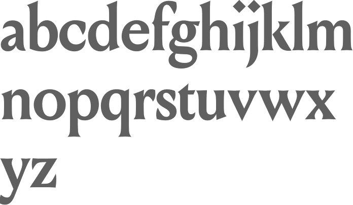
file name: Matthieu Cortat Louize Display Bold 2013 after Louis Perrin 1 Augustaux 1846 1855
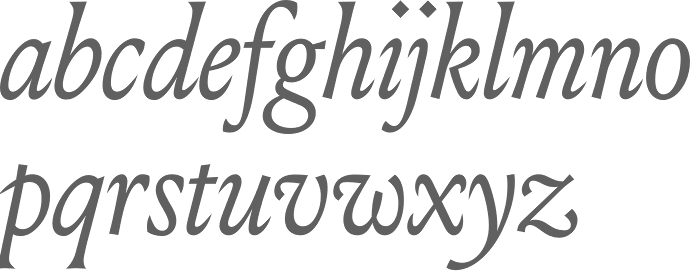
file name: Matthieu Cortat Louize Display Italic 2013 after Louis Perrin Augustaux 1846 1855
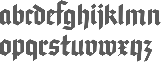
file name: Matthieu Cortat Hans 2013
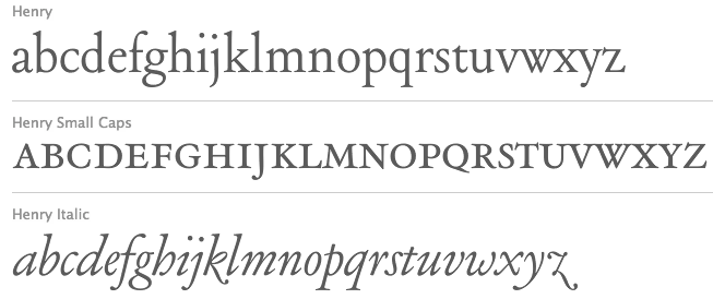
file name: Matthieu Cortat Henry 2013 after Henry Parmentier Georges Peignot 1914
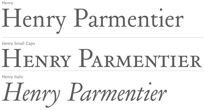
file name: Matthieu Cortat Henry 2013 after Henry Parmentier Georges Peignot 1914b
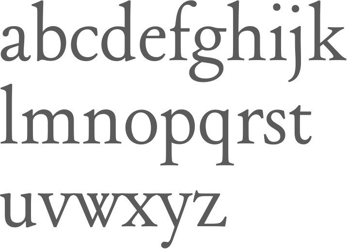
file name: Matthieu Cortat Henry 2013 after Henry Parmentier Georges Peignot 1914e

file name: Matthieu Cortat Mecano 2013 after Nebiolo

file name: Matthieu Cortat Mecano 2013 after Nebiolo
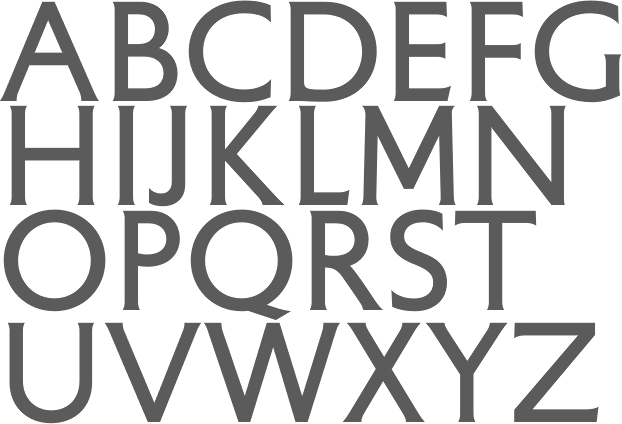
file name: Matthieu Cortat Petit Serif 2013 after Percy J Delf Smith
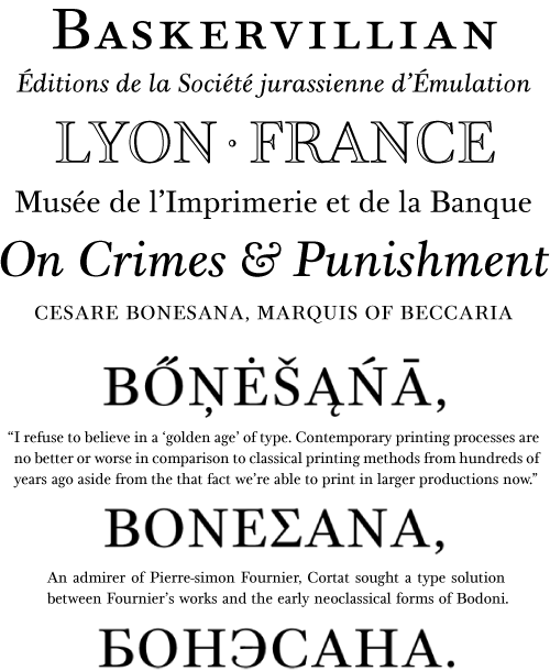
file name: Matthieu Cortat Bonesana 2009

file name: Matthieu Cortat Bonesana 2009
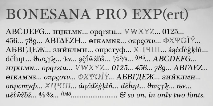
file name: Matthieu Cortat Bonesana Pro Exp 2010
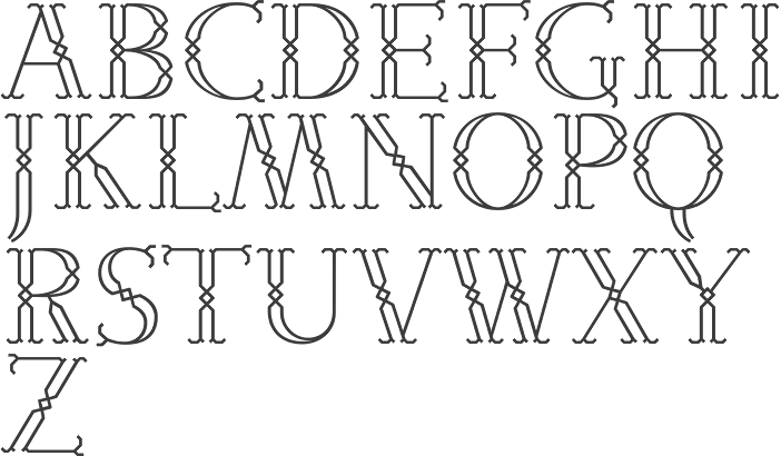
file name: Matthieu Cortat Ecstrat 2006

file name: Matthieu Cortat Ecstrat 2006b
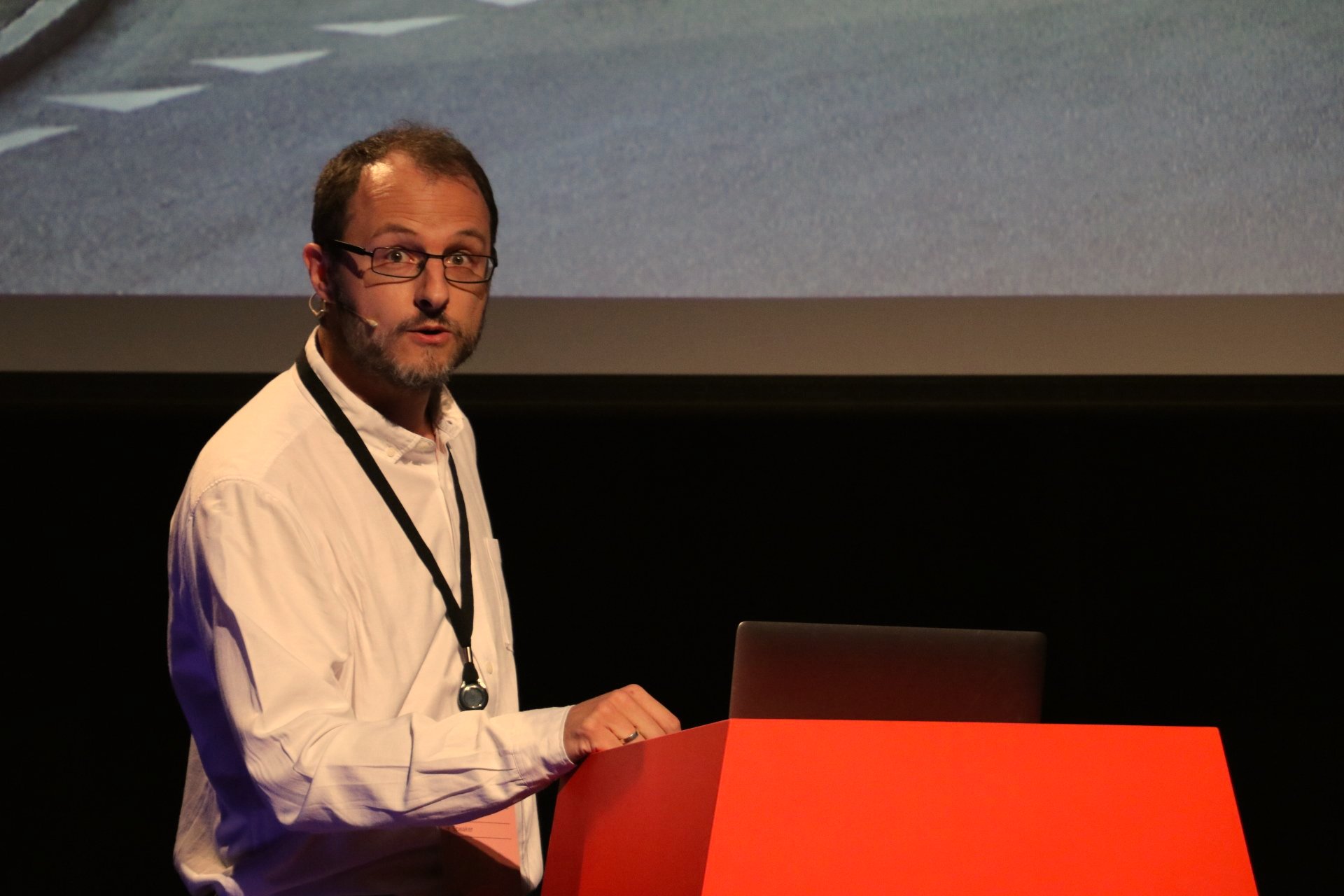
file name: Mathieu Cortat A Typ I 2017
| | |
|
Luc Devroye ⦿ School of Computer Science ⦿ McGill University Montreal, Canada H3A 2K6 ⦿ lucdevroye@gmail.com ⦿ https://luc.devroye.org ⦿ https://luc.devroye.org/fonts.html |


