TYPE DESIGN INFORMATION PAGE last updated on Thu Apr 16 22:05:12 EDT 2026
FONT RECOGNITION VIA FONT MOOSE
|
|
|
|
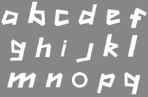
London 2012 font
The hookish London 2012 logo font is almost unanimously booed by the typophiles. A typical comment: A terrible font. Reminds me of antedeluvian Viking runes. I quote a section from Simon Garfield's book Just My Type (2010, Gotham Books): The London 2012 Olympic Typeface, which is called 2012 Headline, may be even worse than the London 2012 Olympic Logo, but by the time it was released people were so tired of being outraged by the logo that the type almost passed by unnoticed. The Logo was the subject of immediate parody (some detected Lisa Simpson having sex, others a swastika), and even the subject of a health warning--an animated pulsing version was said to have brought on epileptic fits. In the International Herald Tribune, Alice Rawsthorn observed that "it looks increasingly like the graphic equivalent of what we Brits scathingly call--'dad dancing'--namely a middle-aged man who tries so hard to be cool on the dance floor that he fails." Like the logo, the uncool font is based on jaggedness and crudeness, not usually considered attributes where sport is concerned. Or maybe it's an attempt to appear hip and down with the kids--it looks a little like the sort of tagging one might see in 1980s graffiti. It also has a vaguely Greek appearance, or at least the UK interpretation of Greek, the sort of lettering you will find at London kebab shops and restaurants called Dionysus. |
EXTERNAL LINKS |
| | |

file name: L O N D O N2012
| | |
|
Luc Devroye ⦿ School of Computer Science ⦿ McGill University Montreal, Canada H3A 2K6 ⦿ lucdevroye@gmail.com ⦿ https://luc.devroye.org ⦿ https://luc.devroye.org/fonts.html |

