TYPE DESIGN INFORMATION PAGE last updated on Tue May 5 11:46:30 EDT 2026
FONT RECOGNITION VIA FONT MOOSE
|
|
|
|
Non-Format
[Jon Forss]
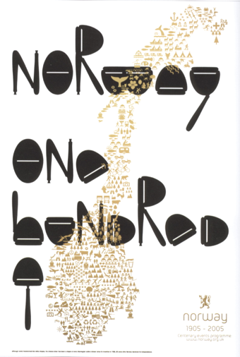
Ekhornforrss Limited / Non-Format is an Anglo-Scandinavian creative direction and design team. Creative directors and founding partners Kjell Ekhorn (from Norway) and Jon Forss (from the UK) started the company in 2000. In their own words: They work on a range of projects including art direction, design and illustration for arts&culture, music industry and fashion and advertising clients. They also art direct Varoom: the journal of illustration and made images. Nominated for Best Design Team in Music Week's Creative and Design Awards 2001. Non-Format is based in London, UK and Minneapolis, USA. In 2006, Kjell Ekhorn and Jon Forss designed a poster for the Royal Norwegian Embassy in London, which won an award at TDC 27. Their work has been published here: The Anatomy of Design, Adobe Magazine, Archive, Brain, Campaign, CD-Art, Communication Arts, Creative Review, D&AD Annual 2005, The Creator Studio, Design Week, Dos Logos, DVD-Art, Etapes, Eye Magazine, 55 Degrees North, Grafik, Graphic, Idea, IdN, It's A Matter Of Packaging, The Layout Look Book, Limited Edition, Mag-Art, Maximalism, Music Week, New Typographic Design, North by North, 1000 Type Treatments, Print, Printed Matter, Romantik, Sampler 2&3, Serialize, Sonic, Tokyo TDC Volume 17&18, Type-One, Type Specific, Typographics 4&5, Typography 27, Typography Workbook. Typefaces by them include Heroine (2008), a titling typeface created for Very Elle Magazine, and Otto (2009, their first commercial family). Gridiron (2013-2014) is a custom typeface family commissioned by ESPN magazine for their 2013 College Football Preview issue. Three versions of the Gridiron typeface were developed for different applications: The lightest weight, Quarterback, is used for headlines. The two bolder weights are Fullback and the more intricately structured Touchdown. These three styles cover the entire spectrum from athletic lettering to labyrinthine extravaganza. The hipster typeface Coleman Air (2015) is a special version of their Nomi typeface, created for Coleman's Japanese catalogue of outdoor gear. In 2017, for SModa Magazine, they designed the summa cum laude partly curvy typeface Sølve. |
EXTERNAL LINKS |
| | |

file name: Non Format Soelve 2017b

file name: Non Format Soelve 2017c

file name: Non Format Soelve 2017d

file name: Non Format Otto 2009c

file name: Non Format Otto 2011

file name: Non Format Otto 2011b

file name: Non Format Otto 2011c

file name: Non Format Otto 2009d

file name: Non Format Otto 2009e

file name: Non Format Otto 2009f

file name: Non Format Otto 2011d

file name: Non Format Otto 2009

file name: Non Format Otto 2009b

file name: Non Format Coleman Air 2015

file name: Non Format Coleman Air 2015b

file name: Non Format Coleman Air 2015c

file name: Non Format Coleman Air 2015d

file name: Non Format Coleman Air 2015e

file name: Non Format Coleman Air 2015f

file name: Non Format Gridiron 2014

file name: Non Format Gridiron 2014b

file name: Non Format Gridiron 2014c

file name: Non Format Gridiron 2014e

file name: Non Format Gridiron 2014f

file name: Non Format Gridiron 2014g

file name: Non Format Gridiron 2014h

file name: Non Format Gridiron 2014i

file name: Non Format Gridiron 2014j

file name: Non Format Gridiron 2014k

file name: Non Format Gridiron 2014l

file name: Non Format Gridiron 2014m

file name: Non Format Gridiron 2014n

file name: Non Format Gridiron 2014o

file name: Non Format The Chap 2013

file name: T D C27 Kjell Ekhorn Jon Forss Poster Of Norway
| | |
|
Luc Devroye ⦿ School of Computer Science ⦿ McGill University Montreal, Canada H3A 2K6 ⦿ lucdevroye@gmail.com ⦿ https://luc.devroye.org ⦿ https://luc.devroye.org/fonts.html |

