TYPE DESIGN INFORMATION PAGE last updated on Thu Apr 16 22:06:37 EDT 2026
FONT RECOGNITION VIA FONT MOOSE
|
|
|
|
Proportional Lime
[Shane Brandes]
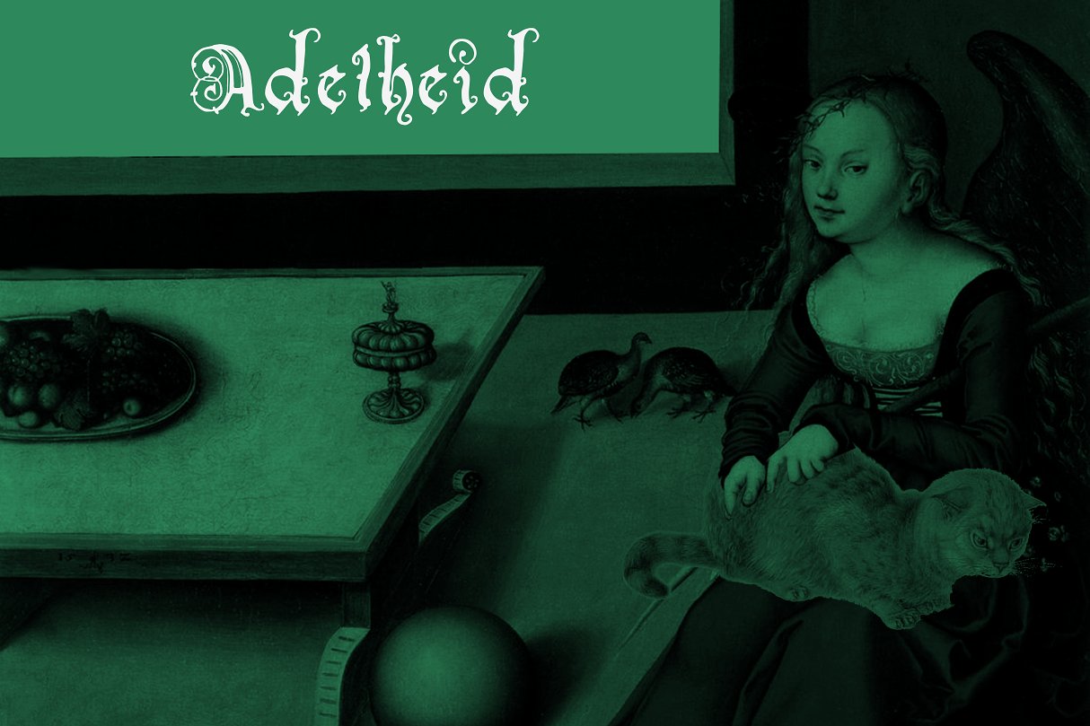
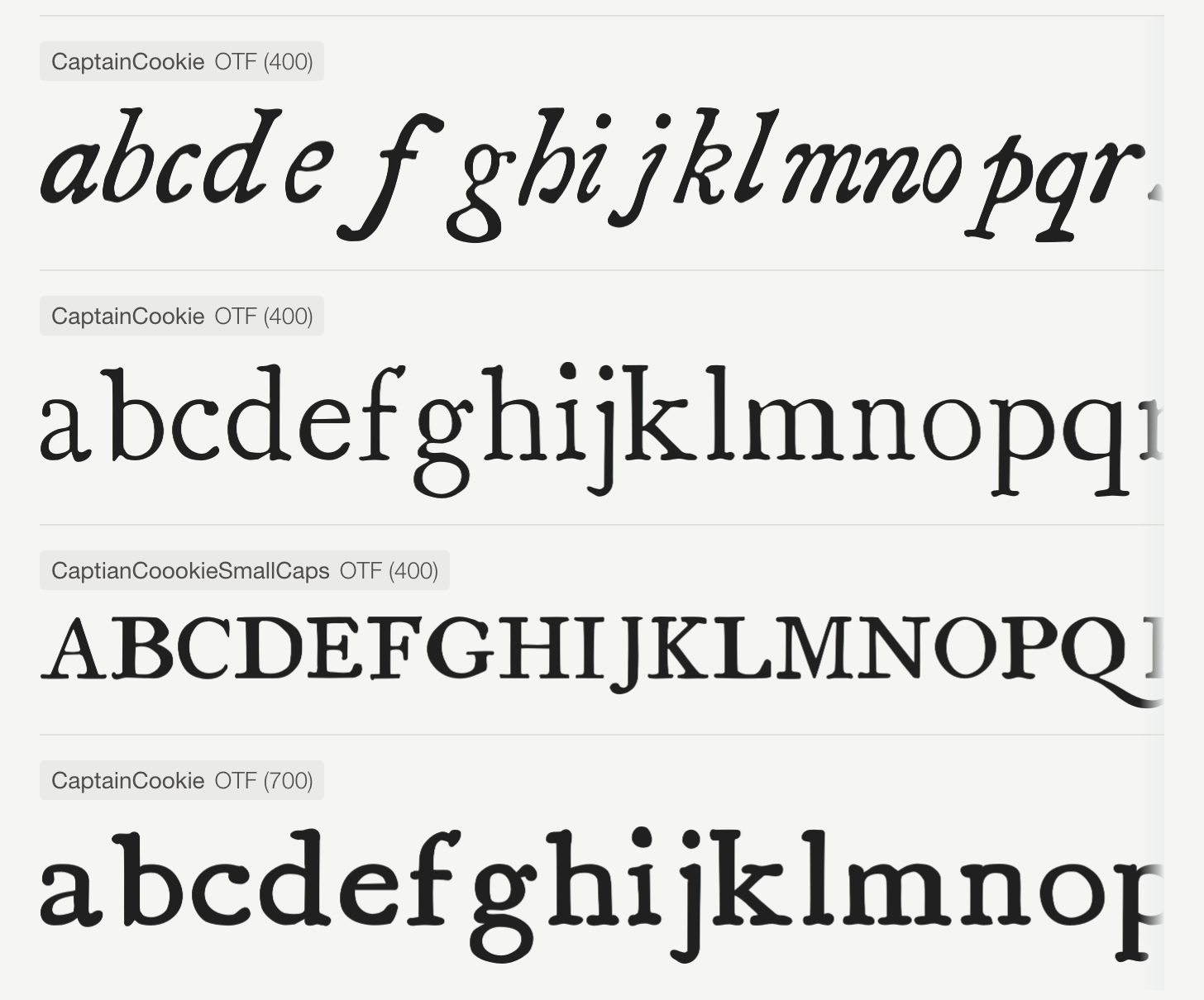
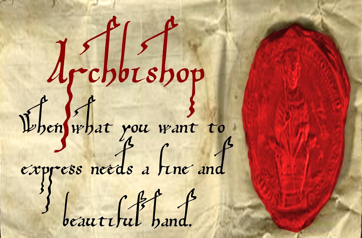
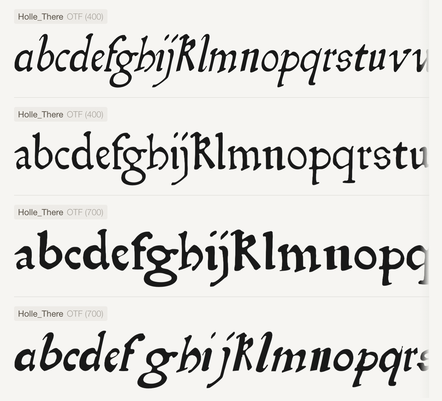
Oberlin, OH-based foundry of Shane Brandes (b. Lakefield, MN, 1974), who made the historic semi-blackletter revival Augsburger2009 (2009), which was inspired by one of Ernhardt Ratdolt's (1442-1528) many beautiful typefaces. Ratdolt was a printer from Augsburg, hence the name. River Liffey (2009) is based on a typeface used by James Williams an Irish printer active in Dublin during the late 18th century. Rising Sun (2009, blackletter) was inspired by Gering and Remboldt's work during the late 1490s in Paris. Charlemagne (2010) is an imaginary medieval script. Fleurious (2010) are ornaments. Sweynheym Pannartz (2010) is modeled after an example Conrad Sweynheym and Arnold Pannartz used in their early printing venture in Subiaco, Italy which began around 1465. Ballard (2010) was inspired by a font used by Henrie Ballard, who operated on Fleet Street at the Signe of the Bear in London from ca. 1597-1608. White Now (2010) is a music note font. Enn'agrammaton (2010) is a cryptographic font. Pluton (2010) is a fixed width font with over 1400 glyphs. Old Venexia (2010) simulates an irregular medieval type. Black Tie (2010) is a simple monoline sans family. Azabercna (2010) is based on gothic principles. Alchimistes (2010) is a medieval symbol face, while Florati (2010) provides a set of ornamental caps. Wappenstein (2010) is an angular stone-carved face: The font Wappenstein was inspired by the carving on a memorial stone located in Paderborn, Germany. The stone was a Epitaph of the Brenkener family, and the carver is known as the Meister des Brenkener Familienepitaphs. The carving, dating to 1562, currently is curated by the Erzbischöfliches Diözesanmuseum in the city of Paderborn and was originally in the Brenkener Pfarr Kirche. Boston 1851 (2010) is based on a stereotype used by Wier and White, Printers of Boston, that was created by the New England Stereoype Foundry under the auspices of Hobart and Robbins, also of Boston. Cruxially (2010) is a 500-glyph dingbat font with crosses. Gaspardo (2011) is an art deco display face. Anguillette (2011) is a quaint grungy face. Ernst (2011) is a very simple but large hand-printed face. The blackletter typeface Schoeffer (2011) is based on Typ.7:146/148G also known as Gesellschaft für Typenkunde plate no. 258, by Peter the Younger (son of Peter Schoeffer), cut ca. 1509-1520. Printers in Marks is a printer mark dingbat typeface created in 2011. Cat E Poultry (2011) is a scanbat typeface of cats. Lucas Brandis (2011) is based on section headings used by printer Lucas Brandis, the first printer to operate in the city of Lübeck around 1473. Creations in 2012: Vine Street, Nicolaus Kesler (a blackletter type based on one of the typefaces of Basel-based Nicolaus Kessler, 15th century), Modality Antiqua (straight-edged and mechanical), Martin Crantz (2012: Martin Crantz (or sometimes Krantz) of the three, including Ulrich Gering and Michael Friburger, that set up a press at the Sorbonne in 1470 was likely the fellow who had the technical know how how to cast the type itself, hence the name of this new typeface that is based on his work.). Modality Antiqua and Modality Novus are explorations of the octagonal principle. Zainer is a rough-edges renaissance era typeface named after Augsburg-based printer Günther Zainer who was active from 1468 until 1478. Swine And Roses is based on a Free Mason script. Ammurapi is a Ugaritic script face. Typefaces from 2013: Michael Wenssler (an incunabula / blackletter typeface based on Michael wenssler typeface from 1482), Andreae (a Fraktur based on a 16th century font by Hieronymus Andreae, who first worked as woodblock cutter and then became a publisher in the city of Nuremberg until his death in 1565), Dropsomaniacal (Lombardic), Therhoernen (grungy medieval script after a Cologne-based printer Arnold Therhoernen, active from 1470 until 1483), Rusch (a 1000-glyph revival of a late 15th century antiqua by Adolf Rusch von Ingweiler, who was active in Strasbourg from 1460 until 1489), Gutknecht (a Schwabacher based on a font used by Jobst Gutknecht, a printer in Nuremburg from 1514 until 1542). The rough blackletter typeface Kachelofen and Konrad Kachelofen are named after Konrad Kachelhofen, a printer in Leipzig active from 1482 until 1529. Albrecht Pfister (2013) is a textura typeface based on Biblia Paperum, which was printed by Pfister in Bamberg, ca. 1460. Amerbach 883 (2013) is a rotunda typeface based on a typeface by Basel-based printer and typefounder Johann von Amerbach, who was active from 1477 until 1513. Typefaces from 2014: Willie Caxton (a blackletter used by William Caxton in his 1476 edition of Chaucer's Canterbury Tales), Azabercna, Lion of Antwerp (an incunabula typeface: Gerard Leeu met his untimely end in a work-related altercation in 1492. He was a notable printer in both the cities of Gouda and Antwerp. This font typeface is based on the "Die gesten of gheschienisse van romen" typeface, ca. 1481.), Hildegardis (an alphabetic cipher that was invented in the 12th century by Hildegard von Bingen to obscure a language called Lingua Ignota. The exemplar was found in the Riesencodex), Lady Vittoria (vampire script based on a German cross stitch pattern from the 1870s), Trowel. Typefaces from 2016: Holle There (a re-cut of a typeface that Lienhart Holle used in his epic edition of Ptolemy's Cosmographia that dates to the early 1480's, even predating italics). Typefaces from 2017: Archbishop (based on the legal documents of Archbishop Arnold von Selenhofen, who granted Hildegard von Bingen and her nuns rooms at the Rupertsberg Monastery in the year 1150), Schoensperger Der Altere (after a blackletter font used by the first female printer, Anna Ruuml;gerin, who was Johann Schönsperger der Altere's sister; Johann was a famous printer in Augsburg, Germany, during the last 20 years of the 15th century). Typefaces from 2018: Zell (a rough blackletter based on 15th century German typeface by Ulrich Zell), Captain Cookie (based on the original font used to print a short history of Captain Cook's exploits around the world), Adelheid (a great curly blackletter based on a 16th century Swiss publication), Feodorov (named after Russia's first printer, Ivan Feodorov). |
EXTERNAL LINKS |
| | |
file name: Shane Brandes Adelheid 2018

file name: Shane Brandes Adelheid 2018

file name: Shane Brandes Adelheid 2018
file name: Shane Brandes Captain Cookie 2018

file name: Shane Brandes Feodorov 2018

file name: Shane Brandes Feodorov 2018

file name: Proportional Lime Zell 2018

file name: Shane Brandes Zell 2018

file name: Shane Brandes Zell 2018

file name: Shane Brandes Zell 2018b

file name: Proportional Lime Schoensperger Der Altere 2017 230074

file name: Proportional Lime Schoensperger Der Altere 2017 231104

file name: Proportional Lime Schoensperger Der Altere 2017
file name: Shane Brandes Archbishop 2017
file name: Shane Brandes Holle There 2016

file name: Shane Brandes Zainer 2012

file name: Shane Brandes Swine And Roses 2012

file name: Shane Brandes Martin Crantz 2012

file name: Shane Brandes Modality Antiqua 2012

file name: Shane Brandes Modality Antiqua Bold 2012

file name: Shane Brandes Modality Novus Bold 2012

file name: Shane Brandes Willie Caxton 2014

file name: Shane Brandes Lady Vittoria 2014b

file name: Shane Brandes Sweynheym Pannartz 2010b

file name: Shane Brandes Sweynheym Pannartz 2010
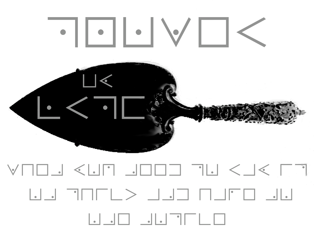
file name: Shane Brandes Trowel 2013
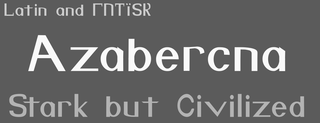
file name: Shane Brandes Azabercna 2014
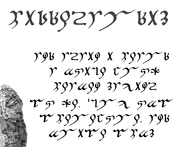
file name: Shane Brandes Hildegardis 2014
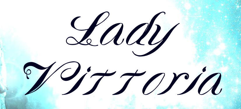
file name: Shane Brandes Lady Vittoria 2014

file name: Shane Brandes Michael Wenssler 2013

file name: Shane Brandes Ballard 2013

file name: Shane Brandes Andreae 2013

file name: Shane Brandes Amerbach883 2013

file name: Shane Brandes Amerbach883 2013b

file name: Shane Brandes Nicolaus Kesler 2012

file name: Shane Brandes Rusch Bold 2013

file name: Shane Brandes Gutknecht 2013

file name: Shane Brandes Vine Street100 2012

file name: Shane Brandes Lucas Brandis Voided 2011

file name: Shane Brandes Lion Of Antwerp 2014

file name: Shane Brandes Cat E Poultry 2011

file name: Shane Brandes Schoeffer Bold 2011

file name: Shane Brandes Gaspardo Condensed 2011

file name: Shane Brandes Cruxially 2010

file name: Shane Brandes Boston1851 2010

file name: Shane Brandes Blacktie 2010

file name: Shane Brandes Therhoernen 2013

file name: Shane Brandes Therhoernen 2013b

file name: Shane Brandes Dropsomaniacal 2013

file name: Shane Brandes Dropsomaniacal 2013b

file name: Shane Brandes Kachelofen 2013

file name: Shane Brandes Konrad Kachelofen 2013

file name: Shane Brandes Old Venexia 2010

file name: Proportional Lime White Now 2010

file name: Proportional Lime Pluton 2010

file name: Shane Brandes Wappenstein 2010

file name: Shane Brandes Anguillette 2011
| | |
|
Luc Devroye ⦿ School of Computer Science ⦿ McGill University Montreal, Canada H3A 2K6 ⦿ lucdevroye@gmail.com ⦿ https://luc.devroye.org ⦿ https://luc.devroye.org/fonts.html |


