TYPE DESIGN INFORMATION PAGE last updated on Wed May 6 16:17:19 EDT 2026
FONT RECOGNITION VIA FONT MOOSE
|
|
|
|
Claus Eggers Sørensen
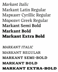
Also known by insiders as El Pato Loco Atomico. Danish type designer (b. 1973, Kulby, Vestsjalland, Denmark) who obtained his BDes from The Gerrit Rietveld Academie in Amsterdam, and his MA in typeface design from The University of Reading (2009), based on his type family Markant, which was specifically designed for newspapers and cares about ink traps, wide open bowls, inflection points and other special features. It supports Greek and Cyrillic as well. He says: I created a new design again taking inspiration from the early sketches of Dwiggins' Experimental No. 223. I was able to use the very open aperture design of the e in this experiment. The a again explored a inflexion points within the counters, and this was too integrated in the design. Finally lightly rounded wedge shaped base serifs were chosen. In 2011, Claus placed Playfair Display with Google Web Fonts. He explains: Playfair Display is a transitional design. From the time of enlightenment in the late 18th century, the broad nib quills were replaced by pointed steel pens. This influenced typographical letterforms to become increasingly detached from the written ones. Developments in printing technology, ink and paper making, made it possible to print letterforms of high contrast and fine hairlines. This design lends itself to this period, and while it is not a revival of any particular design, it takes influence from the printer and typeface designer John Baskerville's designs, the punchcutter William Martin's typeface for the Boydell Shakespeare (sic) edition, and from the Scotch Roman designs that followed thereafter. As the name indicates, Playfair Display is well suited for titling and headlines. It was followed in 2012 by Playfair Display SC. Free download at CTAN and at Open Font Library. Free download of Playfair Display Italic. In 2014, Claus designed Inknut Antiqua, a free angular text typeface family for low resolution screens, designed to evoke Venetian incunabula and humanist manuscripts, but with the quirks and idiosyncrasies of the kinds of typefaces you find in this artisanal tradition. Google Fonts link for Inknut Antiqua. Open Font Library link. Inknut Antiqua covers Latin and Devanagari. Claus lives in Amsterdam. Google Font Directory link. Speaker at ATypI 2011 in Reykjavik on the topic of typography for touch-screen devices. |
EXTERNAL LINKS |
| | |

file name: Claus Eggers Sorensen Pic

file name: Claus Eggers Sorensen Playfair Display 2011

file name: Claus Eggers Sorensen Playfair Display 2011 Poster by Florencia Scaglia 2013

file name: Claus Eggers Sorensen Playfair Display 2011 Poster by Claire Sedovic 2013

file name: Claus Eggers Sorensen Playfair Display 2011 Poster by Claire Sedovic 2013b

file name: Claus Eggers Sorensen Playfair Display 2011 Poster by Claire Sedovic 2013c

file name: Claus Eggers Sorensen Playfair Display S C 2012

file name: Claus Eggers Sorensen Playfair Display 2011b

file name: Claus Eggers Sorensen Playfair Display 2011 Poster by Melisa Barillaro 2017

file name: Claus Eggers Sorensen Playfair Display 2011c

file name: Claus Eggers Sorensen Playfair Display Black Italic 2015 Skyggebilleder Fritskrabet

file name: Claus Eggers Sorensen Playfair Display S C 2015

file name: Claus Eggers Sorensen Playfair Display 2011 Poster by Blankha Falkenbach 2014

file name: Claus Eggers Sorensen Playfair Display 2011d

file name: Claus Eggers Sorensen Playfair Display 2011f

file name: Claus Eggers Sorensen Playfair Display 2011g

file name: Claus Eggers Sorensen Inknut Antiqua 2014

file name: Claus Eggers Sorensen Inknut Antiqua 2014b

file name: Claus Eggers Sorensen Inknut Antiqua Black 2014

file name: Claus Eggers Sorensen Inknut Antiqua Medium 2014

file name: Claus Eggers Sorensen Inknut Antiqua Devanagari 2014

file name: Claus Eggers Sorensen Markant2009

file name: Claus Eggers Sorensen Markant 2009

file name: Claus Eggers Sorensen Slutstation Photo 2013
| | |
|
Luc Devroye ⦿ School of Computer Science ⦿ McGill University Montreal, Canada H3A 2K6 ⦿ lucdevroye@gmail.com ⦿ https://luc.devroye.org ⦿ https://luc.devroye.org/fonts.html |

