TYPE DESIGN INFORMATION PAGE last updated on Thu Apr 16 22:07:21 EDT 2026
FONT RECOGNITION VIA FONT MOOSE
|
|
|
|
Graduate of the Moscow State University of Printing Art, and of the TypeMedia program at the Royal Academy of Art (KABK) in Den Haag, The Netherlands, class of 2020. Moscow-based designer of the free font Tagesschrift (2005, Yanone, done together with Jan Gerner, A. Korolkova and V. Yefimov). Fontdeck link, where she is credited with the Paratype typeface PT Sans (2010). PT Sans can also be downloaded at Alex Barakin's site, at Fontspace, at Github, and at CTAN. Open Font Library link. The companion family PT Serif is also at CTAN. The full family, co-designed with Alexandra Korolkova and Vladimir Yefimov, will set you back over 1000 dollars however. Federico (2007) is based on the handwriting of Spanish poet and playwright Federico Garcia Lorca (1898-1936). Pragmatica Slab (2011, Paratype, Olga Umpeleva and Vladimir Yefimov) was designed as a complement to the popular type family Pragmatica by Vladimir Yefimov and Isabella Chaeva (1989-2004) by the addition of square slab serifs. Paratype writes: Pragmatica Slabserif was designed as a complement to the popular type family Pragmatica by Vladimir Yefimov and Isabella Chaeva (1989-2004) by addition of square serifs. Inspired by Helserif (Phil Martin, 1978 [note from Luc to self: I think Paratype errs here, since Ed Kelton made Helserif in 1976]) which was formed in the same way by addition of square serifs to Helvetica (Eduard Hoffman and Max Miedinger, 1957). First sketches of Pragmatica Slabserif were created by Vladimir Yefimov in 1988 during development of Pragmatica. Olga Umpeleva designed the whole slabserif type family of six weights basing on that sketches. She also did an upright connected educational script in 2011 at Paratype: Little Cecily (based on a Russian calligraphy sample book for primary schools, Propisi pryamogo pisma (Moscow, 1914)). Such scripts were implemented in school programs at the end of the 19th and the beginning of the 20th century. In 2012, Olga published the curly upright script typeface Sevillana (Google Web Fonts, Brownfox Foundry) and the playful decorative typeface Henny Penny (Google Web Fonts and Brownfox). Typefaces from 2013: M.Video (a corporate typeface done with Ksenia Erulevich at Art Lebedev Studio), ALS Schlange Sans (Art Lebedev Studio: a rich sans family with rounded terminals, and a toolbox "f"), ALS Schlange Slab. Typefaces from 2015: Kudryashev Display (2015, Isabella Chaeva, Alexandra Korolkova and Olga Umpeleva). Kudryashev Display is a set of light and high-contrast typefaces based on Kudryashev text typeface. In addition to Kudryashev Display and Kudryashev Headline typefaces, the type family includes also two Peignotian sans-serif typefaces of the same weight and contrast, with some alternates. The serif styles were designed by Olga Umpeleva in 2011, the sans styles were created by Isabella Chaeva in 2015 with the participation of Alexandra Korolkova. The typeface was released by ParaType in 2015. Still in 2015, she designed Federico (a typeface based on the handwriting of Spanish poet and playwright Federico Garcia Lorca (1898-1936)). Typefaces from 2017: Fado (a formal broad nib calligraphic beauty). Typefaces from 2018: Kelpie (an inky and a monoline pair of scripts). Typefaces from 2020: Noordenwind (her graduation typeface at KABK). Typefaces from 2021: Westenwind (an experimental font that on purpose exaggerates the number and sizes of the serifs). Kernest link. MyFonts link. Google link. Klingspor link. Fontspace link. Behance link. Future Fonts link. |
EXTERNAL LINKS |
| | |

file name: Olga Umpeleva Westenwind 2021

file name: Olga Umpeleva Westenwind 2021

file name: Olga Umpeleva Westenwind 2021

file name: Olga Umpeleva Westenwind 2021

file name: Olga Umpeleva Westenwind 2021

file name: Olga Umpeleva Noordenwind 2020

file name: Olga Umpeleva Noordenwind 2020

file name: Olga Umpeleva Noordenwind 2020

file name: Olga Umpeleva Noordenwind 2020

file name: Olga Umpeleva Noordenwind 2020

file name: Olga Umpeleva Noordenwind 2020

file name: Noordenwind Olga Umpeleva

file name: Noordenwind Olga Umpeleva

file name: Alexandra Korolkova Olga Umpeleva Vladimir Yefimov P T Serif 2013

file name: Alexandra Korolkova Olga Umpeleva Vladimir Yefimov P T Serif 2013b

file name: Alexandra Korolkova Olga Umpeleva Vladimir Yefimov P T Serif 2013c

file name: Alexandra Korolkova Olga Umpeleva Vladimir Yefimov P T Serif 2013d

file name: Alexandra Korolkova Olga Umpeleva Vladimir Yefimov P T Serif 2013e

file name: Alexandra Korolkova Olga Umpeleva Vladimir Yefimov P T Serif Narrow Pro Black 2011

file name: Alexandra Korolkova Olga Umpeleva Vladimir Yefimov P T Serif Pro 2011

file name: Alexandra Korolkova Olga Umpeleva Vladimir Yefimov P T Serif Pro 2011b

file name: Alexandra Korolkova, Olga Umpeleva, Vladimir Yefimov P T Serif Narrow Pro Black 2011

file name: Alexandra Korolkova, Olga Umpeleva, Vladimir Yefimov P T Serif Pro 2011

file name: Alexandra Korolkova, Olga Umpeleva, Vladimir Yefimov P T Serif Pro 2011b

file name: Paratype P T Serif 2010

file name: Paratype P T Sans Bold 2009

file name: Olga Umpeleva P T Sans 2010

file name: Paratype P T Sans 2010

file name: O Umpeleva Tagesschrift lowercase 2005

file name: O Umpeleva Tagesschrift numbers 2005

file name: O Umpeleva Tagesschrift uppercase 2005

file name: Olga Umpeleva Ksenia Erulevich M Video 2013

file name: Olga Umpeleva Ksenia Erulevich M Video 2013

file name: Olga Umpeleva Ksenia Erulevich M Video 2013

file name: Olga Umpeleva Vladimir Yefimov Pragmatica Slab 2011b

file name: Olga Umpeleva Vladimir Yefimov Pragmatica Slab Bold 2011

file name: Olga Umpeleva Vladimir Yefimov Pragmatica Slab Extra Bold 2011

file name: Olga Umpeleva, Vladimir Yefimov Pragmatica Slab 2011b

file name: Olga Umpeleva, Vladimir Yefimov Pragmatica Slab Bold 2011

file name: Olga Umpeleva, Vladimir Yefimov Pragmatica Slab Extra Bold 2011

file name: Olga Umpeleva Little Cecily 2011

file name: Olga Umpeleva A L S Schlange Sans 2013

file name: Olga Umpeleva A L S Schlange Slab Black 2013

file name: Olga Umpeleva A L S Schlange Slab Light 2013

file name: Olga Umpeleva Cyrillic

file name: Olga Umpeleva Fado 2017 226391

file name: Olga Umpeleva Fado 2017 226422

file name: Olga Umpeleva Fado 2017 226425

file name: Olga Umpeleva Fado 2017 226426

file name: Olga Umpeleva Fado 2017 226432

file name: Olga Umpeleva Fado 2017 226433

file name: Olga Umpeleva Fado 2017

file name: Olga Umpeleva Fado 2017

file name: Olga Umpeleva Federico 2007

file name: Olga Umpeleva Federico 2007b

file name: Olga Umpeleva Federico 2007c

file name: Olga Umpeleva Federico 2007d

file name: Olga Umpeleva Federico 2008

file name: Olga Umpeleva Federico 2015 199413

file name: Olga Umpeleva Federico 2015 199415

file name: Olga Umpeleva Federico 2015 199720

file name: Olga Umpeleva Federico 2015 199721

file name: Olga Umpeleva Federico 2015

file name: Olga Umpeleva Federico 2015a

file name: Olga Umpeleva Federico 2015b

file name: Olga Umpeleva Federico 2015c

file name: Olga Umpeleva Federico 2015d

file name: Olga Umpeleva Federico 2015e

file name: Olga Umpeleva Henny Penny 2012

file name: Olga Umpeleva Henny Penny 2012b

file name: Olga Umpeleva Kelpie 2018 artwork 002

file name: Olga Umpeleva Kelpie 2018 artwork 006

file name: Olga Umpeleva Kelpie 2018 artwork 010

file name: Olga Umpeleva Kelpie 2018

file name: Olga Umpeleva Little Cecily 2011 199403

file name: Olga Umpeleva Little Cecily 2011 199404

file name: Olga Umpeleva Little Cecily 2011 199405

file name: Olga Umpeleva Little Cecily 2011 199406

file name: Olga Umpeleva Little Cecily 2011

file name: Olga Umpeleva Little Cecily 2011a

file name: Olga Umpeleva Little Cecily 2011b

file name: Olga Umpeleva Little Cecily 2011c

file name: Olga Umpeleva Sevillana 2012b
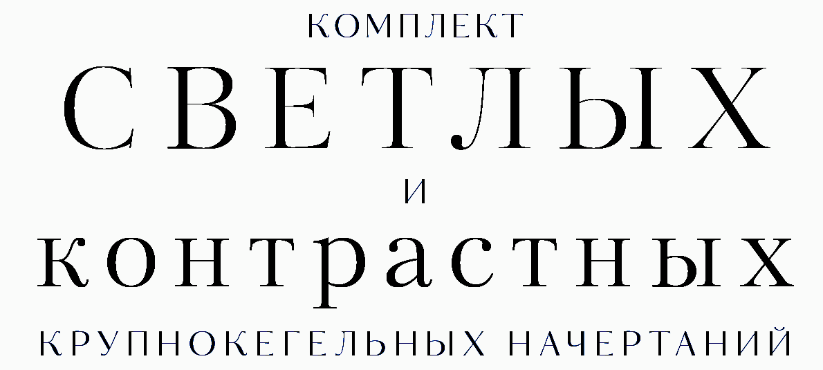
file name: Para Type Kudryashev Display 2015 188120
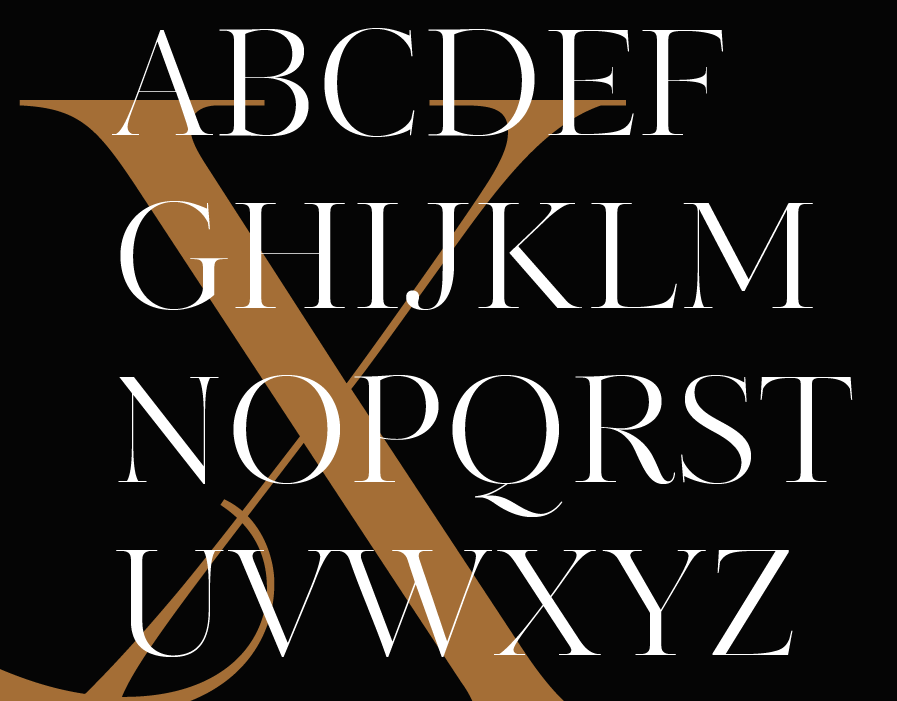
file name: Para Type Kudryashev Display 2015 188121
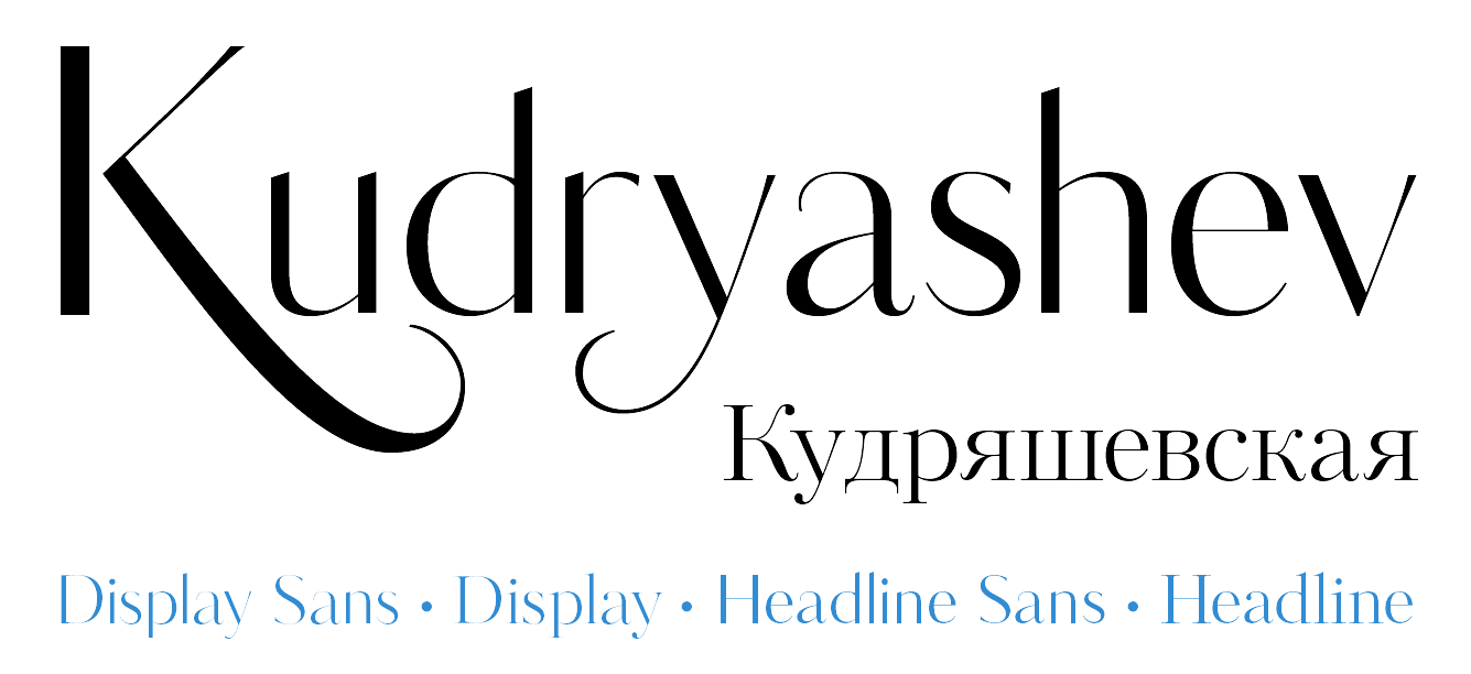
file name: Para Type Kudryashev Display 2015 188122
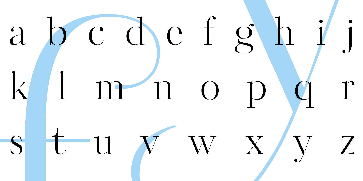
file name: Para Type Kudryashev Display 2015 188123
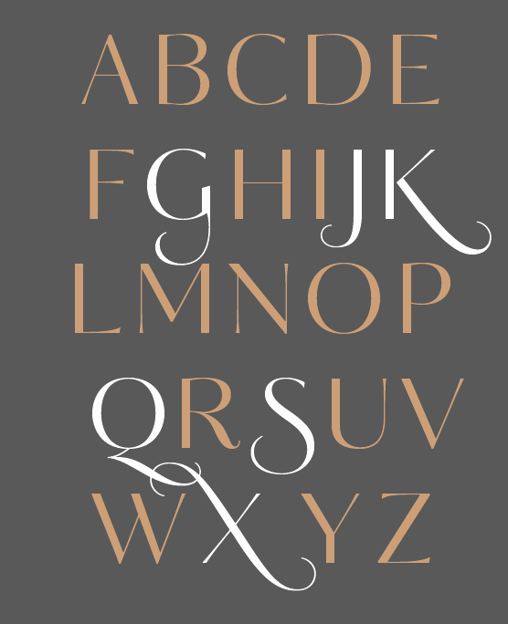
file name: Para Type Kudryashev Display 2015 188124

file name: Para Type Kudryashev Display 2015

file name: Para Type Kudryashev Display Sans 2017

file name: Para Type Kudryashev Headline 2017

file name: Para Type Kudryashev Headline Sans 2017

file name: Para Type Kudryashev Headline Sans 2017a

file name: Olga Umpeleva photo by Frank Griesshammer

file name: Olga Umpeleva Pic

file name: Olga Umpeleva Noordenwind 2020
| | |
|
Luc Devroye ⦿ School of Computer Science ⦿ McGill University Montreal, Canada H3A 2K6 ⦿ lucdevroye@gmail.com ⦿ https://luc.devroye.org ⦿ https://luc.devroye.org/fonts.html |

