TYPE DESIGN INFORMATION PAGE last updated on Thu Apr 16 22:08:21 EDT 2026
FONT RECOGNITION VIA FONT MOOSE
|
|
|
|
MT Neo Didot
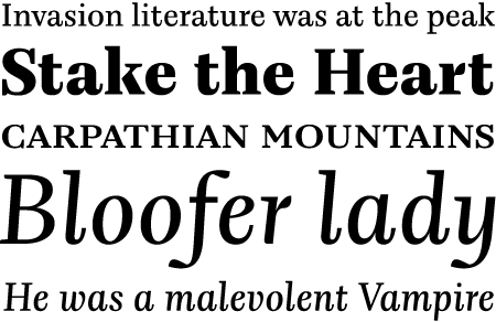
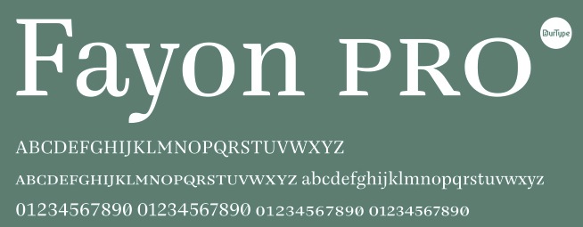
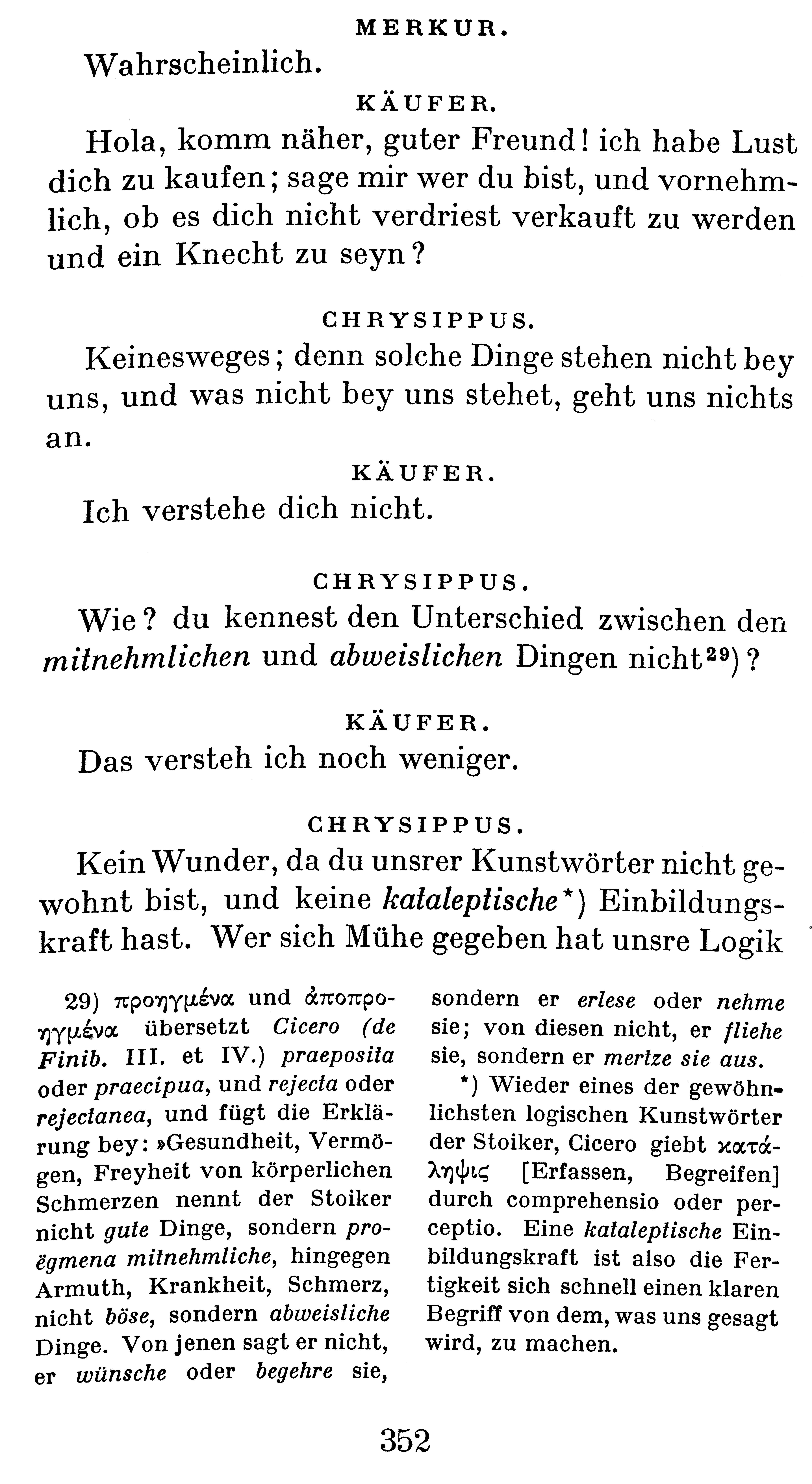
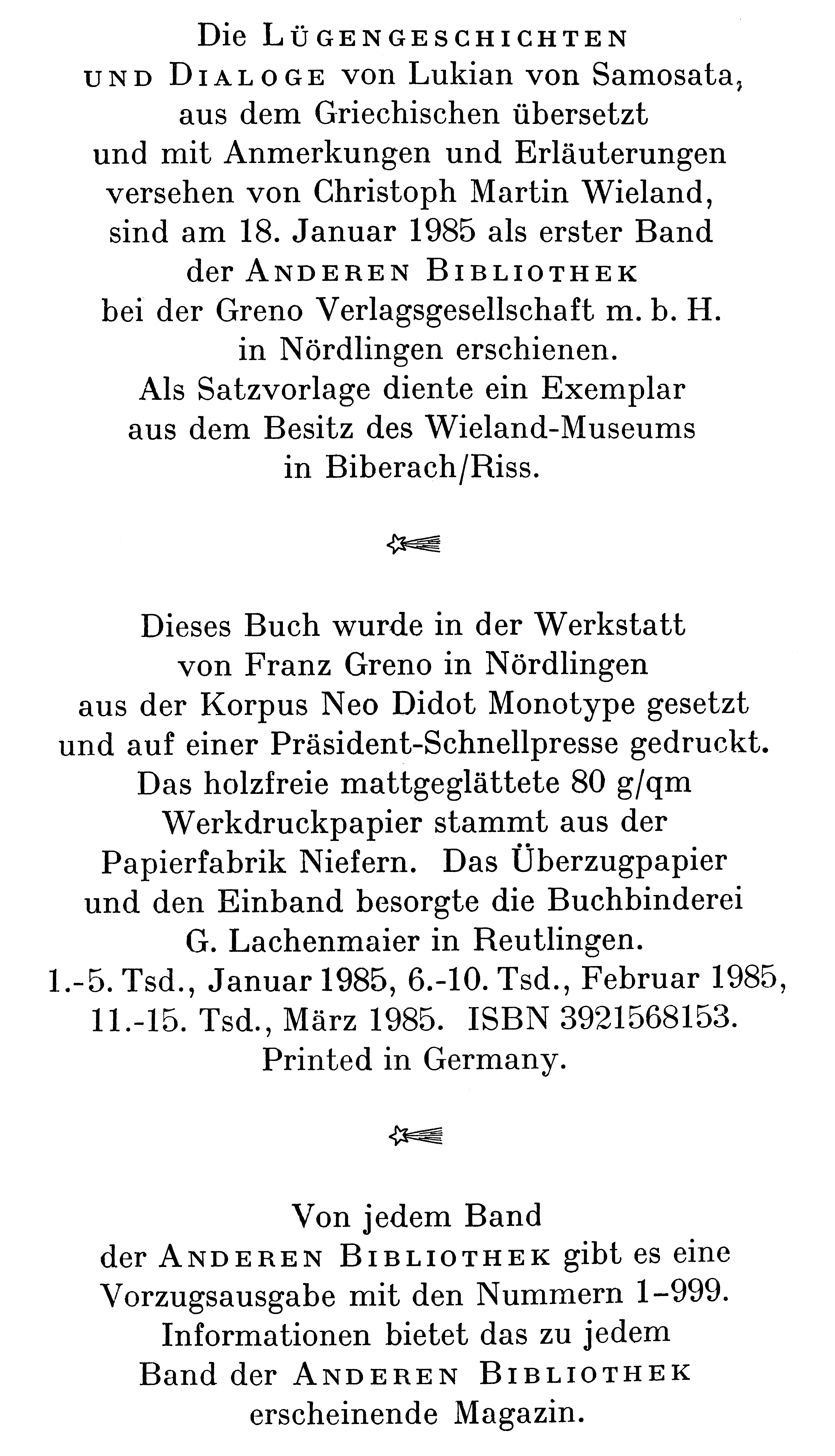
MT Neo Didot was designed in 1904 at Monotype. With less contrast than the original Didot typefaces, it is appropriate for texts. Some suggest that the closest we have to MT Neo Didot in digital form is Peter Mohr's Fayon (2010, OurType). But Maxim Zhukov pointed out its popularity in Russia: Series No 27 (Neo Didot) had a Cyrillic version. I don't know when it was developed. A lot of books in USSR and world-wide were set in Neo Didot. Neo Didot was so popular that around 1940 its Soviet clone was developed, Obyknovennaya Novaya Garnitura (Ordinary New Typeface). It was custom-designed for the 4th edition of Lenin's Collected Works (its 1st volume was printed in 1941, and the last one, 39th, in 1967). That typeface was later released for general use. It is now offered in digital form by ParaType, under the name New Standard. That clone was by Anatoly Shchukin at Polygraphmash. Also, Maxim is referring to the Paratype version done in 1996 by Vladimir Yefimov. |
EXTERNAL LINKS |
| | |

file name: Peter Mohr Fayon 2010

file name: Our Type Fayon Pro

file name: M T Neo Didot 1904a

file name: M T Neo Didot 1904b

file name: M T Neo Didot 1904c
| | |
|
Luc Devroye ⦿ School of Computer Science ⦿ McGill University Montreal, Canada H3A 2K6 ⦿ lucdevroye@gmail.com ⦿ https://luc.devroye.org ⦿ https://luc.devroye.org/fonts.html |
