TYPE DESIGN INFORMATION PAGE last updated on Fri May 1 17:37:49 EDT 2026
FONT RECOGNITION VIA FONT MOOSE
|
|
|
|
Modern Gothic
Mac McGrew: Modern Gothic originated with BB&S about 1897. It appears to be a modernization of older nineteenth-century gothics, although it has considerable resemblance to the much later European design, Helvetica Bold. It has the horizontal endings to curved strokes which typify Helvetica, but the more typically American double-bowl g. However, it is much more loosely fitted and not as refined as either Helvetica or the American Franklin Gothic, which originated in 1902. The entire series is called Gothic Modern in some specimens. Modern Condensed Gothic is probably the best member of this family. It was copied by Monotype at an early date, with 6- to 12-point sizes substantially modified to fit the unit system; however, unlike many early Monotype copies, display sizes are virtually exact copies of the foundry original. In 1928 Sol Hess drew a set of alternate capitals for this face, and the name was changed to Tourist Gothic (q. v.) in display sizes, 14-point and larger. This typeface is often called Franklin Gothic Condensed, but this is not correct as there is only a general resemblance. Medium Condensed Gothic Outline, cut by Triangle Type Foundry in Chicago, is an open version, without lowercase, of this face; some other sources inaccurately call it Franklin Gothic Condensed Outline (q.v.). The larger sizes of Gothic No. 13 (q.v.) on Linotype and Intertype are very similar. Monotype also has Tourist Gothic Italic, and an adaptation of Modern Gothic Italic under the name of Bold Inclined Gothic. |
EXTERNAL LINKS |
| | |

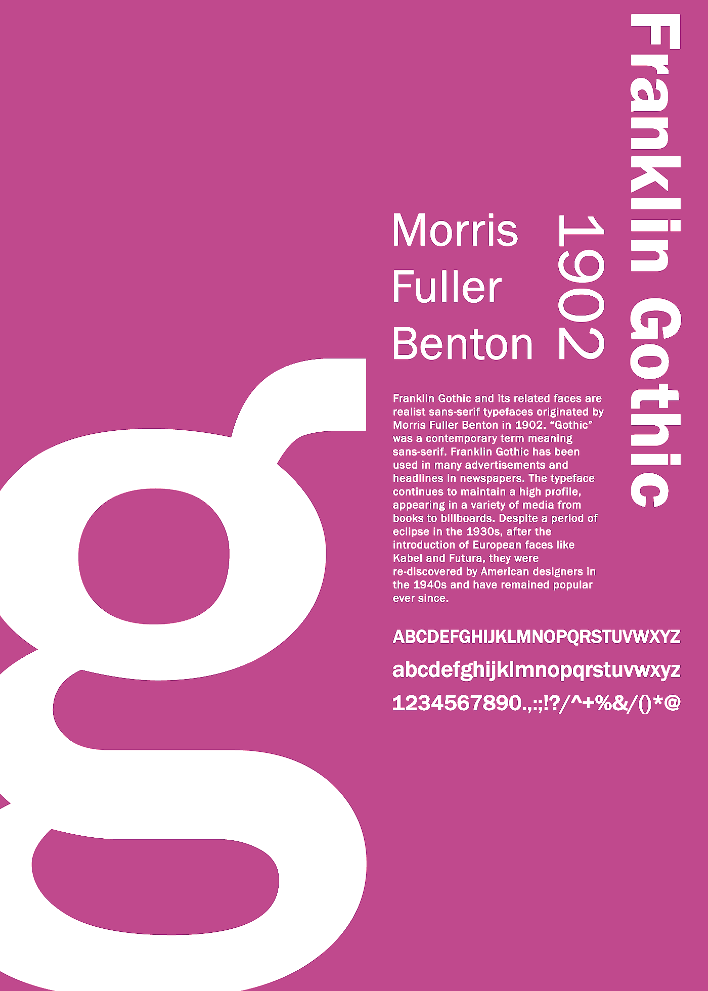
file name: U R W Franklin Gothic after Morris Fuller Benton 1902

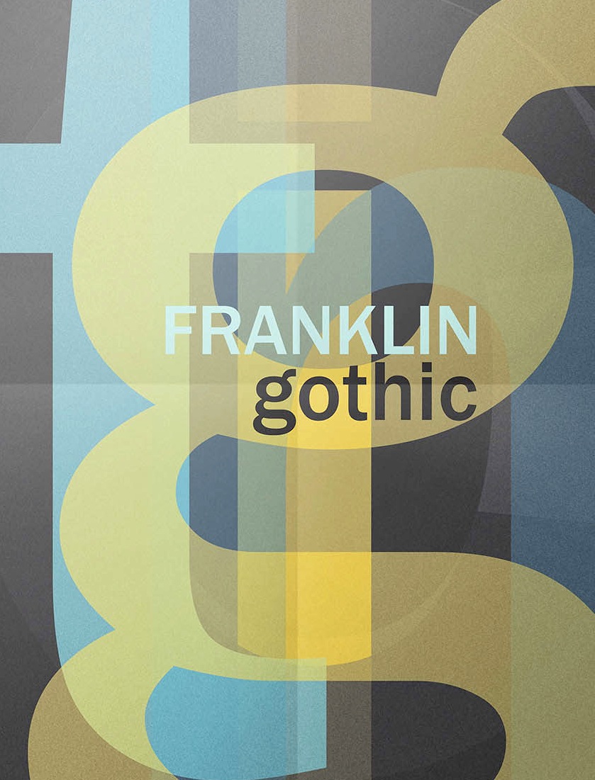
file name: Morris Fuller Benton Franklin Gothic 1902 Poster by Zekai Saltoglu 2016

file name: Morris Fuller Benton Franklin Gothic Poster by De Art Lab Studio 2016

file name: Morris Fuller Benton Franklin Gothic 1902 poster by Daniela Carusone 2016

file name: Monotype Franklin Gothic Extra Condensed after Morris Fuller Benton 1904

file name: Morris Fuller Benton Franklin Gothic 1902 Poster by Camila H Perez 2014
| | |
|
Luc Devroye ⦿ School of Computer Science ⦿ McGill University Montreal, Canada H3A 2K6 ⦿ lucdevroye@gmail.com ⦿ https://luc.devroye.org ⦿ https://luc.devroye.org/fonts.html |
