TYPE DESIGN INFORMATION PAGE last updated on Wed May 6 16:19:50 EDT 2026
FONT RECOGNITION VIA FONT MOOSE
|
|
|
|
Franklin Gothic
[Morris Fuller Benton]
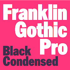
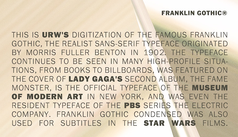
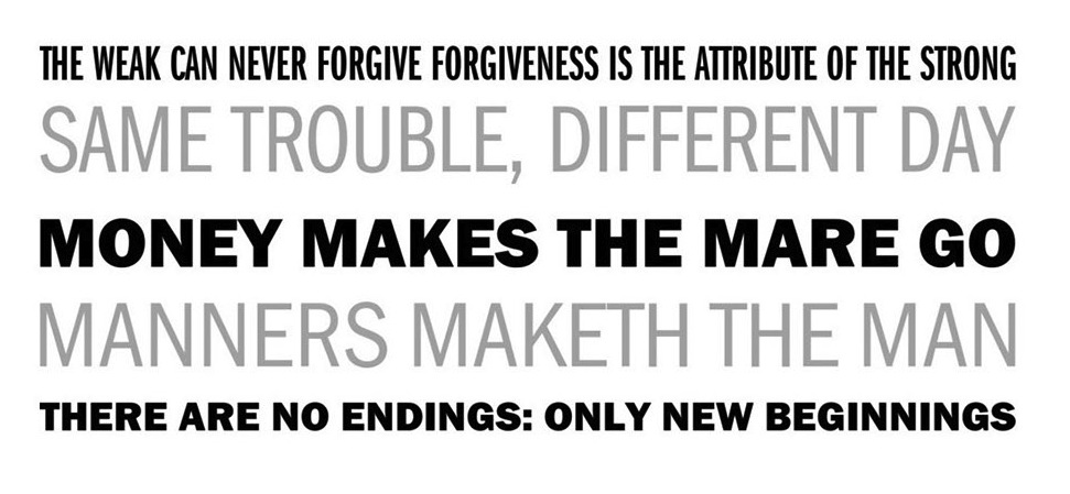
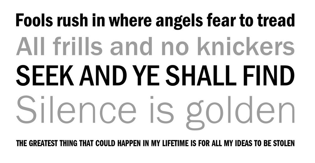
Franklin Gothic was designed from 1904 until 1913 by Morris Fuller Benton for ATF. It was one of the most successful advertising sans typefaces ever made. What the Americans called gothic in those days corresponds to the German Grotesk and the British grotesque. Designs close to Franklin Gothic of that era in Germany include Basic Commercial and Reform from D. Stempel AG. Later serif typefaces by Benton include Alternate Gothic, Lightline Gothic and News Gothic. Franklin Gothic is seen in many high-profile situations, from books to billboards. It was featured on the cover of Lady Gaga's The Fame Monster. It is the official typeface of the MOMA (Museum of Modern Art) in New York, and was even the typeface in the PBS series The Electric Company. Franklin Gothic Condensed was used for subtitles in the Star Wars films. In 1979, under license with ATF, Vic Caruso began work on more weights of Franklin Gothic for ITC. His version adheres closely to the subtle variations in stroke thickness of the original design. As was usual with all ITC designs of that period, it had an enlarged x-height and condensed proportions, and, as a result, it became a standard choice for use in newspapers and advertising. In 1991, David Berlow completed the family for ITC (MyFonts shows 96 styles) by creating compressed and condensed weights. He writes: ITC Franklin Gothic Compressed is designed especially to solve impossibly tight copyfitting problems, while maintaining high legibility standards. ITC Franklin Condensed provides medium weights of narrow proportions. Digital remakes and variations and versions include Franklin Gothic (URW++), Gothic 744 (Bitstream, later simply renamed Franklin Gothic), Franklin Gothic SG (2016, Elsner & Flake), Franklin Gothic Pro Black Condensed (2011, Red Rooster), and Frankfurt Gothic (Corel). In 2019, ATF Type published ATF Franklin Gothic (Mark van Bronkhorst, Igino Marini, and Ben Kiel), a broad and multi-weight interpretation of Franklin Gothic, which only had bolder weights. For the lighter styles, the designers were inspired by Benton's Monotone Gothic. MyFonts hit list for Franklin Gothic and its descendants. Subpage with the 96 styles of ITC Franklin Gothic by David Berlow, 1991-2008. |
EXTERNAL LINKS |
| | |

file name: A T F Collection A T F Franklin Gothic 2019 300717

file name: A T F Collection A T F Franklin Gothic 2019 300718

file name: Mark Van Bronkhorst Igino Marini Ben Kiel A T F Franklin Gothic 2019 after Morris Fuller Benton Franklin Gothic 1905

file name: Mark Van Bronkhorst Igino Marini Ben Kiel A T F Franklin Gothic 2019 after Morris Fuller Benton Franklin Gothic 1905

file name: A T F Collection A T F Franklin Gothic 2019 300719

file name: A T F Collection A T F Franklin Gothic 2019 300721

file name: A T F Collection A T F Franklin Gothic 2019

file name: U R W Franklin Gothic after Morris Fuller Benton 1902
file name: U R W Franklin Gothic after Morris Fuller Benton 1902b

file name: U R W Franklin Gothic after Morris Fuller Benton 1902c
file name: U R W Franklin Gothic after Morris Fuller Benton 1902d

file name: U R W Franklin Gothic after Morris Fuller Benton 1902e
file name: U R W Franklin Gothic after Morris Fuller Benton 1902f
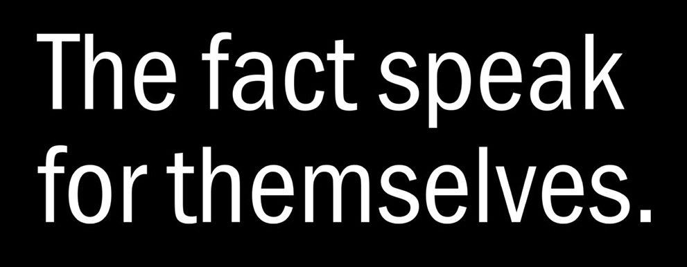
file name: U R W Franklin Gothic after Morris Fuller Benton 1902g
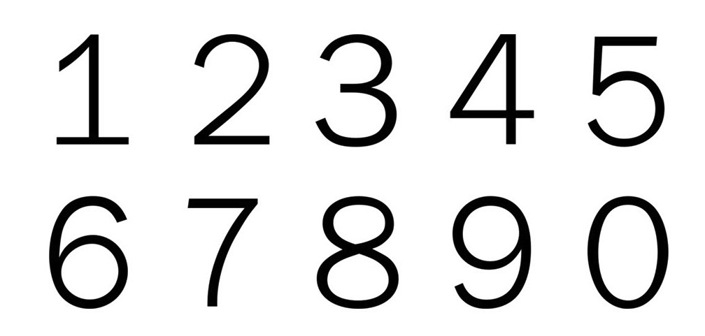
file name: U R W Franklin Gothic after Morris Fuller Benton 1902h
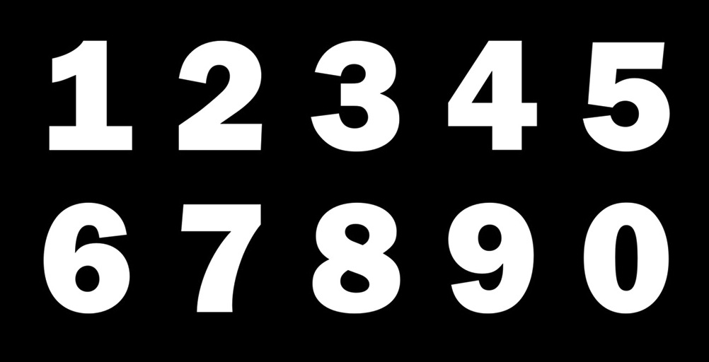
file name: U R W Franklin Gothic after Morris Fuller Benton 1902i
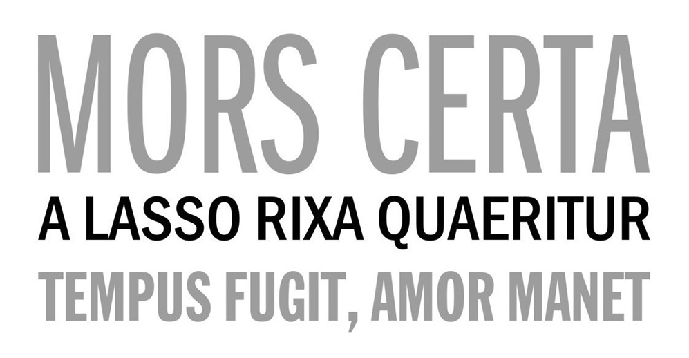
file name: U R W Franklin Gothic after Morris Fuller Benton 1902j

file name: U R W Franklin Gothic after Morris Fuller Benton 1902k
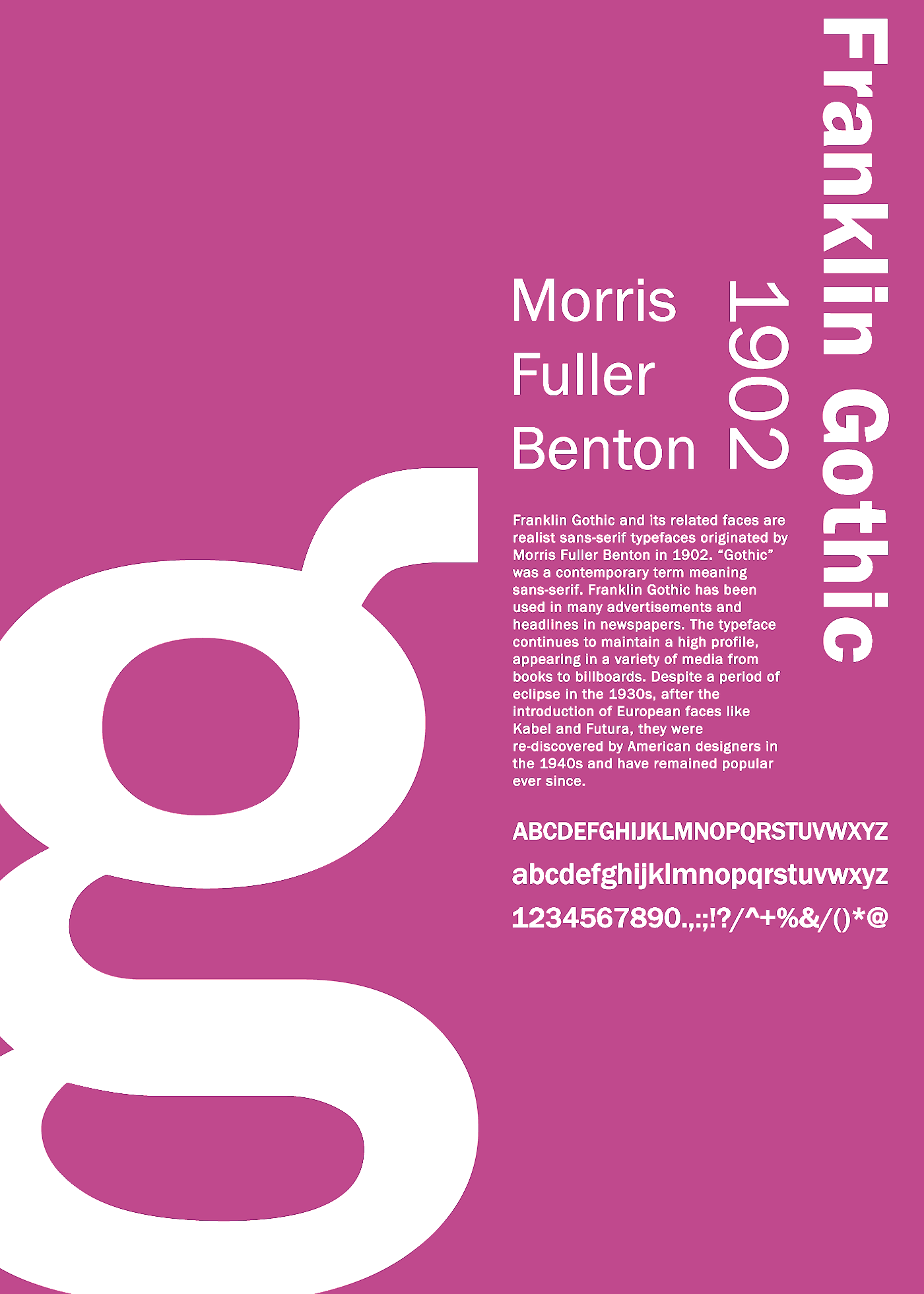
file name: Morris Fuller Benton Franklin Gothic 1902 Poster by Zekai Saltoglu 2016

file name: Monotype Franklin Gothic Extra Condensed after Morris Fuller Benton 1904

file name: Morris Fuller Benton Franklin Gothic 1902 Poster by Camila H Perez 2014

file name: Morris Fuller Benton Franklin Gothic Extra Cond 1904 Linotype

file name: Morris Fuller Benton Franklin Gothic No2 Roman 1904 Linotype
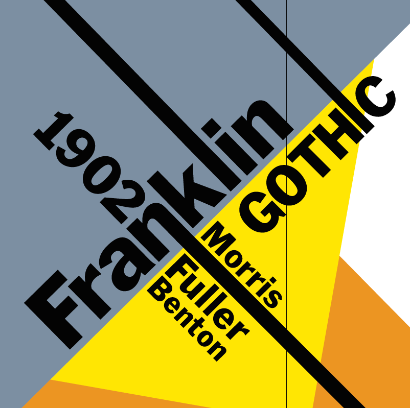
file name: Morris Fuller Benton Franklin Gothic 1902 poster by Carolina Steele 2015
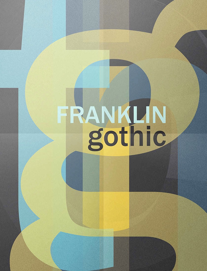
file name: Morris Fuller Benton Franklin Gothic 1902 poster by Daniela Carusone 2016
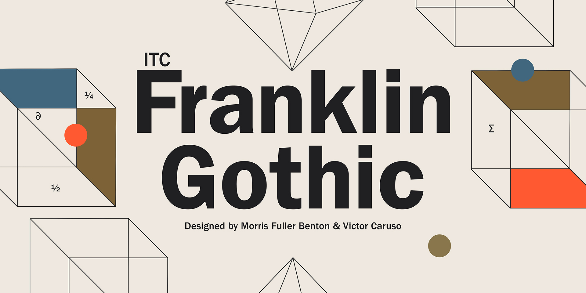
file name: Morris Fuller Benton Franklin Gothic 1902 Poster by Michael Sallit 2017

file name: Morris Fuller Benton Franklin Gothic 1902 Poster by Michael Sallit 2017b
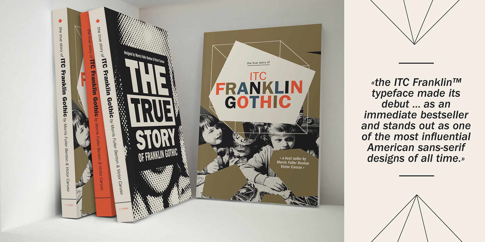
file name: Morris Fuller Benton Franklin Gothic 1902 Poster by Michael Sallit 2017c
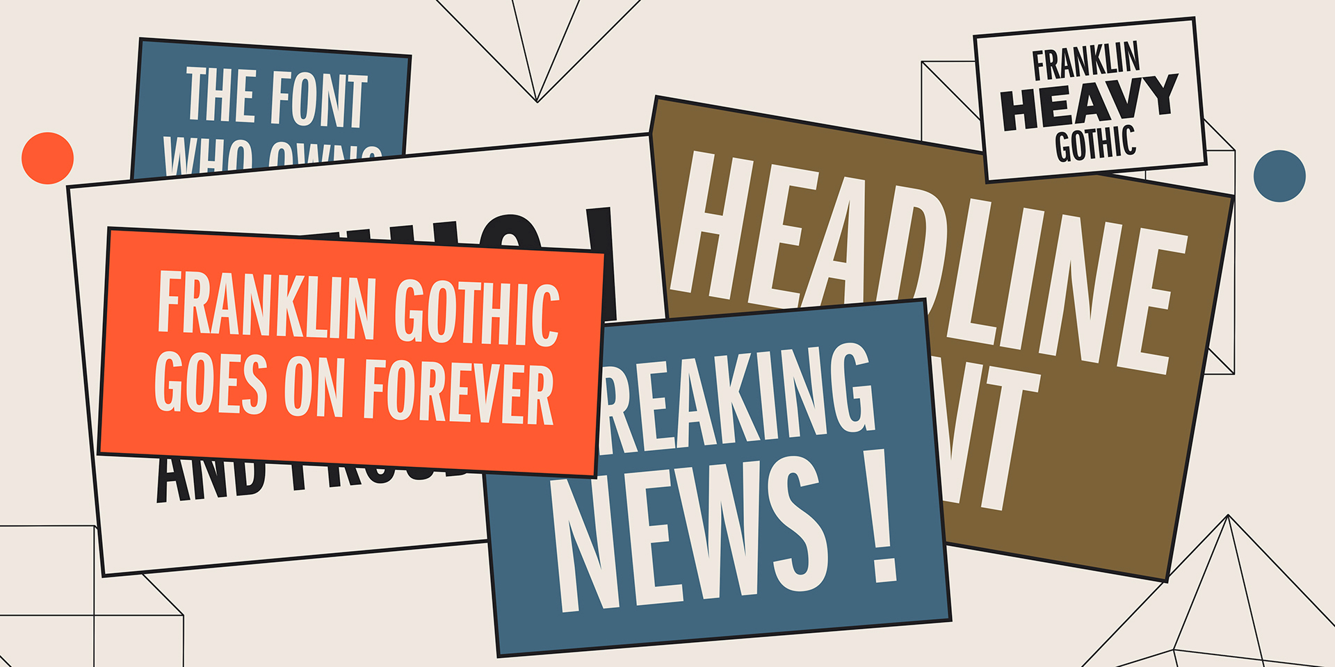
file name: Morris Fuller Benton Franklin Gothic 1902 Poster by Michael Sallit 2017d
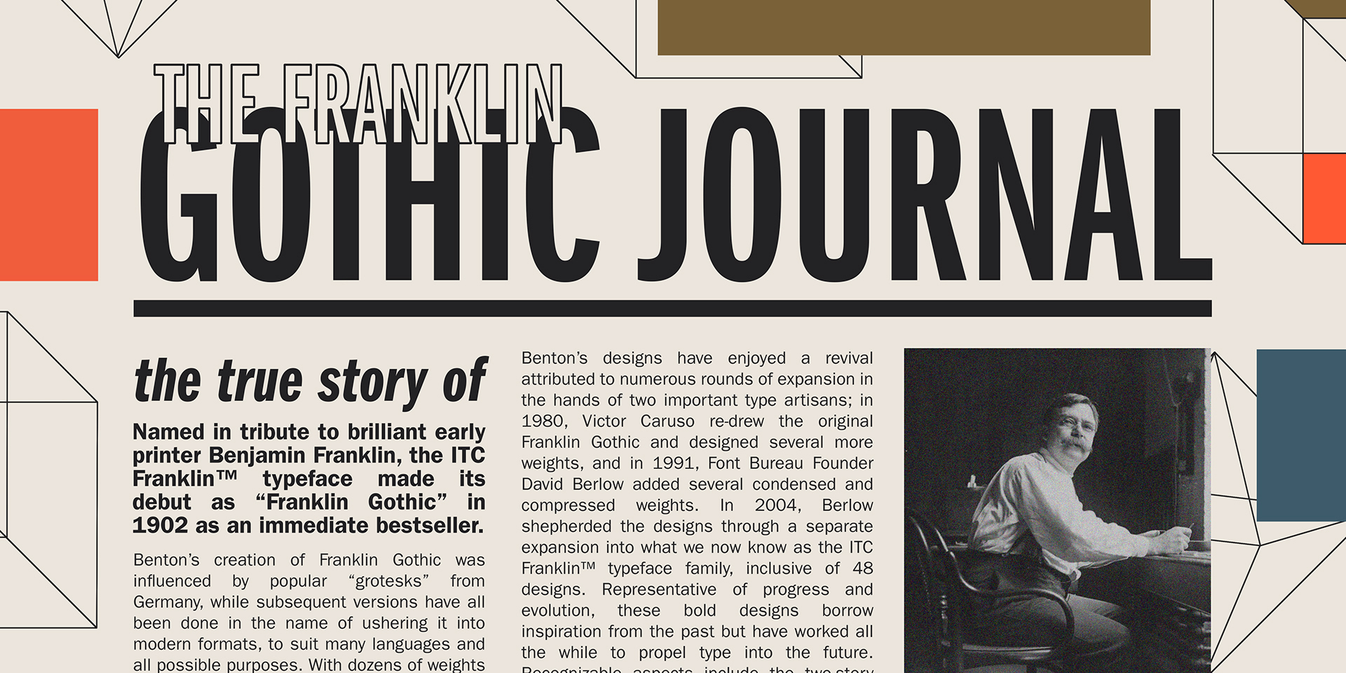
file name: Morris Fuller Benton Franklin Gothic 1902 Poster by Michael Sallit 2017e
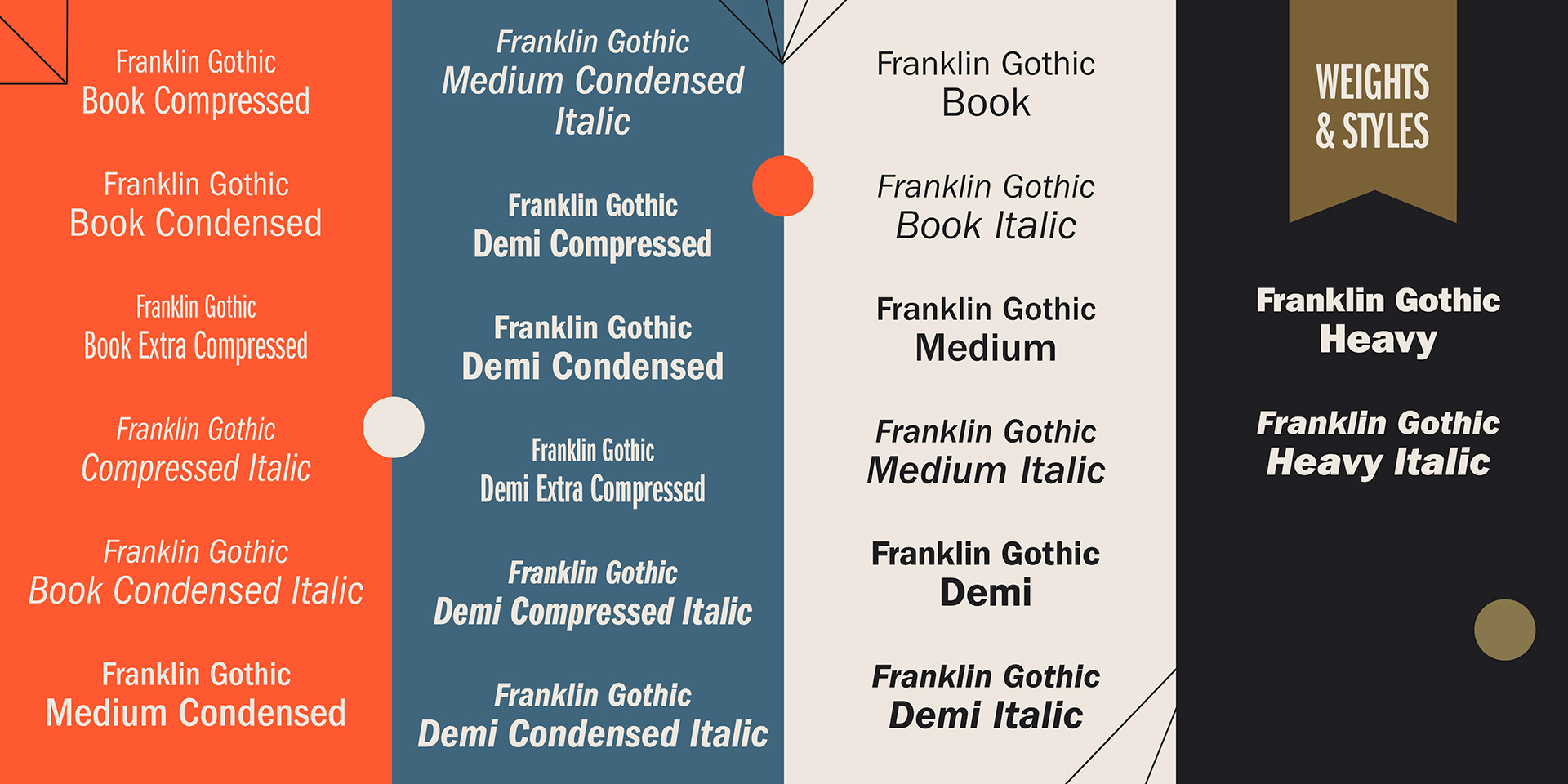
file name: Morris Fuller Benton Franklin Gothic 1902 Poster by Michael Sallit 2017f

file name: Morris Fuller Benton Franklin Gothic 1902 Poster by Michael Sallit 2017g

file name: Bitstream Franklin Gothic Condensed
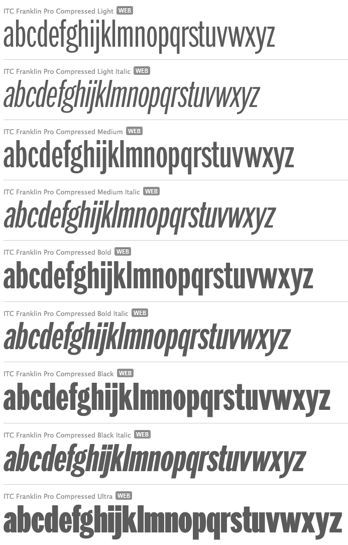
file name: David Berlow I T C Franklin Pro Compressed 1991 2008

file name: David Berlow I T C Franklin Pro Ultra 1991 2008
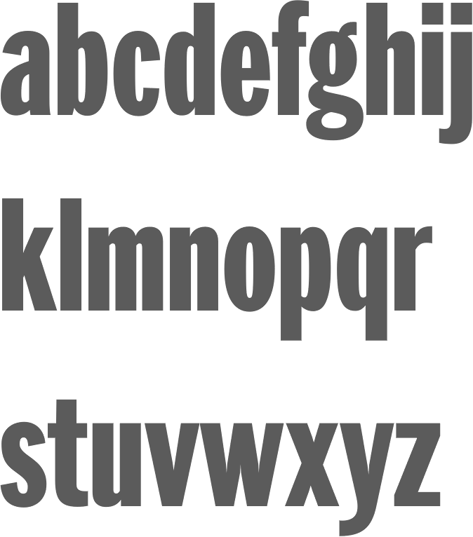
file name: David Berlow I T C Franklin Std Compressed Black 1991 2008

file name: David Berlow I T C Franklin Std Narrow Ultra 1991 2008

file name: Steve Jackaman Ashley Muir Franklin Gothic Pro 2011f
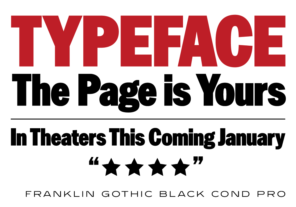
file name: Steve Jackaman Ashley Muir Franklin Gothic Pro 2011g

file name: Steve Jackaman Ashley Muir Franklin Gothic Pro 2011h
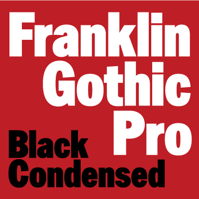
file name: Steve Jackaman Ashley Muir Franklin Gothic Pro 2011b

file name: Steve Jackaman Ashley Muir Franklin Gothic Pro 2011c

file name: Steve Jackaman Ashley Muir Franklin Gothic Pro 2011d

file name: Steve Jackaman Ashley Muir Franklin Gothic Pro 2011e

file name: Scangraphic Digital Type Collection Franklin Gothic S G 2016 211051

file name: Scangraphic Digital Type Collection Franklin Gothic S G 2016
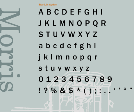
file name: Morris Fuller Benton Franklin Gothic Poster by Tina Kim 2014
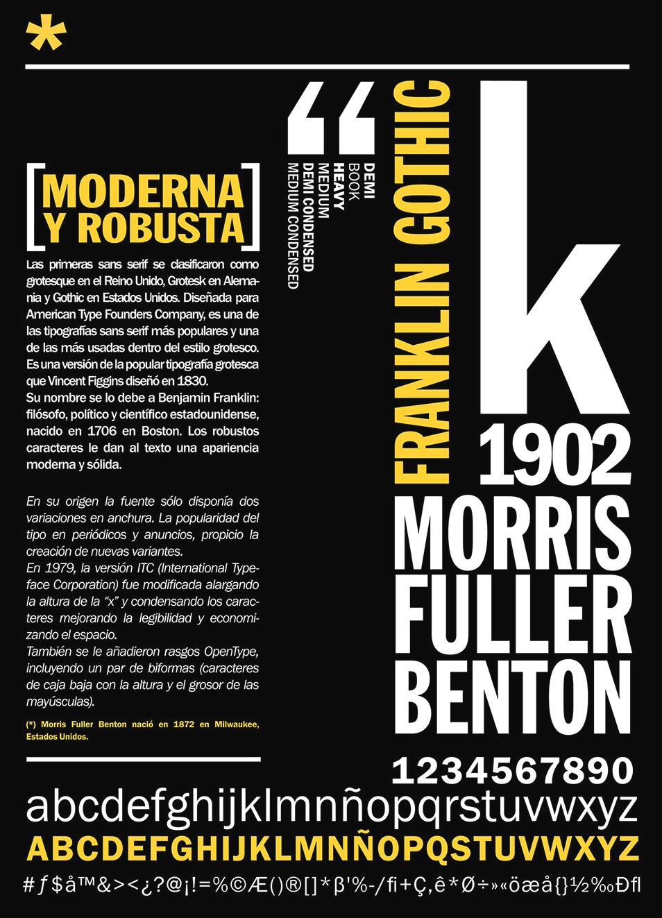
file name: Morris Fuller Benton Franklin Gothic 1902 Poster by Juana Caudal 2014

file name: Morris Fuller Benton Franklin Gothic 1902

file name: Morris Fuller Benton Franklin Gothic Condensed 1902

file name: Morris Fuller Benton Franklin Gothic Condensed Shaded 1904 1913

file name: Morris Fuller Benton Franklin Gothic Extra Condensed 1902
file name: Morris Fuller Benton Franklin Gothic Poster by De Art Lab Studio 2016
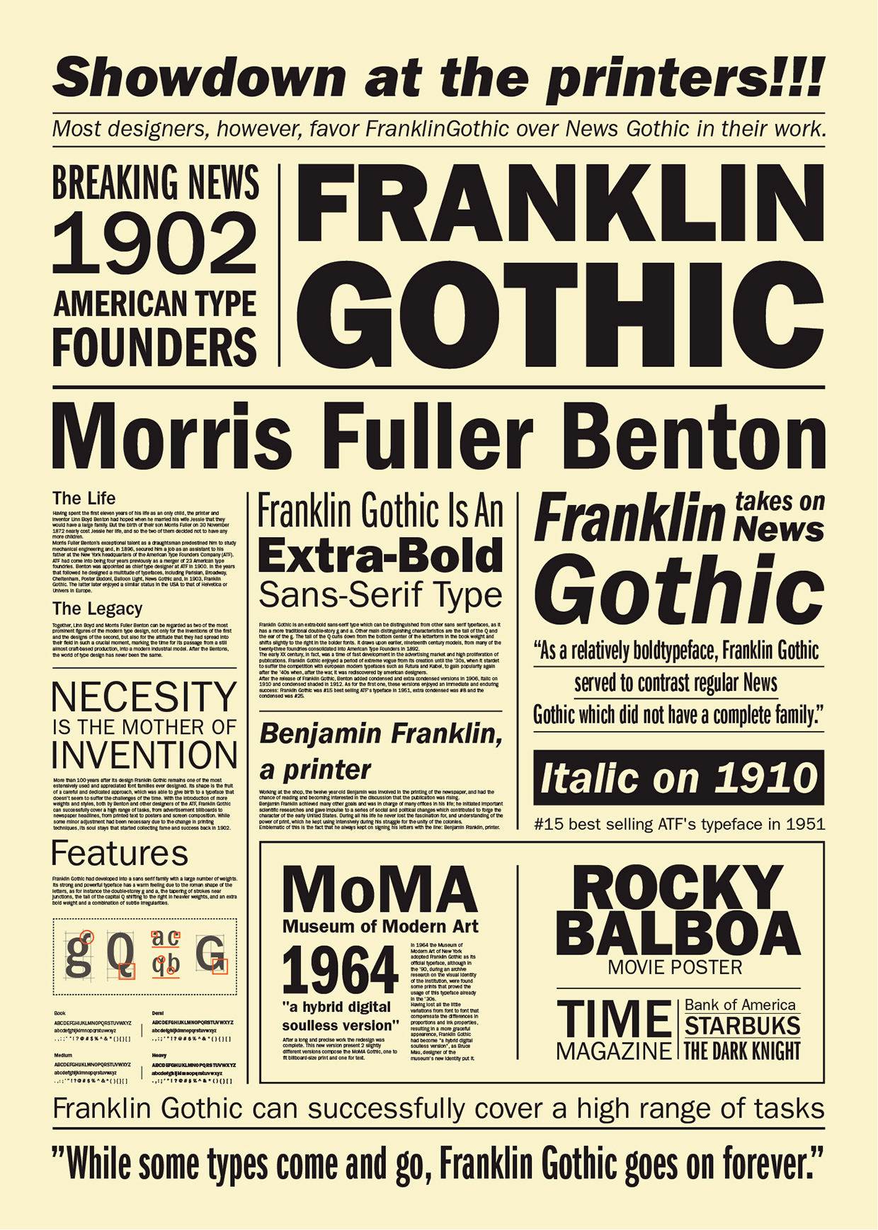
file name: Morris Fuller Benton Franklin Gothic 1902 Poster by Lica Eugen 2015

file name: Morris Fuller Benton Franklin Gothic Italic 1902
| | |
|
Luc Devroye ⦿ School of Computer Science ⦿ McGill University Montreal, Canada H3A 2K6 ⦿ lucdevroye@gmail.com ⦿ https://luc.devroye.org ⦿ https://luc.devroye.org/fonts.html |

