TYPE DESIGN INFORMATION PAGE last updated on Thu Apr 16 22:09:35 EDT 2026
FONT RECOGNITION VIA FONT MOOSE
|
|
|
|
Roboto (or: Google Android Design)
[Christian Robertson]
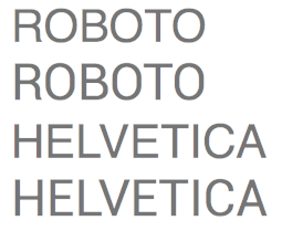
In October 2011, Google unveiled its in-house production, Roboto, a sans typeface developed by Christian Robertson for Android 4.0, that can be downloaded here, here, and here. John Gruber: I wouldn't call it a Helvetica rip-off (like Arial), but Android 4's new system font Roboto is definitely a lot more Helvetica-esque than Droid Sans (the old Android font) was. I'd say it's like a cross between Helvetica and DIN, but inherited more of Helvetica's genes. Here's a comparison I just whipped up between the two---each word set once in each font. (Helvetica on the top, Roboto on the bottom, in case you can't tell the difference.) I doubt most people could tell them apart, and the uppercase R is almost shameless. Definitely a better-looking typeface than Droid Sans, though, that's for sure. Stephen Coles writes that Roboto is a Four-headed Frankenfont. Excerpts: Its parents are a Grotesk sans (like a slightly condensed Helvetica) and a Humanist sans (like Frutiger or Myriad). There is nothing wrong with combining elements of these two styles to create something new. The crime is in the way they were combined: grabbing letters---almost wholesale---from the Grotesk model, along with a Univers-inspired Y and G, welding them to letters from the Humanist model, and then bolting on three straight-sided caps à la DIN. When an alphabet has such unrelated glyphs it can taste completely different depending on the word. Fudge is casual and contemporary. Marshmallow is rigid and classical. This is not a typeface. It's a tossed salad. Or a four-headed Frankenstein. You never know which personality you'll get. For now, I can only speculate on how this beast came to be. The font files credit the design to Christian Robertson, whom I know to be a very bright professional with some decent work under his belt, including the convincing handwriter Dear Sarah and the adorable Ubuntu Titling font. Either Google tied him down and made unreasonable demands or there's something nasty in the water down in Mountain View. To be fair, I haven't seen the fonts on a phone, in person, and Google promises that they are built specifically for that medium. But I can't imagine that would erase the inherent problem with the design. There are some good shapes in Roboto, they just belong in multiple typefaces. In any event, Roboto probably won't terrorize mobile screens for very long. Helvetica and Frutiger are immortal. Hodgepodge brutes like these usually have a short lifespan. Image by Stephen Coles. Later additions include Roboto Mono (2015) and Roboto Slab (2013). Someone posted the free derived fonts Franko and Franco, both dated 2013, in 2016 on the Open Font Library site, the names referring to the four-headed Frankenstein Stephen Coles described. Franzo (2016) is a reworking of Roboto Slab. Google Web Fonts download link. Fontspace link. Dafont link. Download at CTAN. Roboto Mono (2015) at Google Fonts. Google Plus link. Klingspor link. FontShop link. |
EXTERNAL LINKS |
| | |

file name: Google Roboto 2011

file name: Christian Robertson Roboto 2011d

file name: Christian Robertson Roboto 2011

file name: Christian Robertson Roboto Helvetica Comparison by John Gruber 2011

file name: Christian Robertson Roboto Helvetica Comparison by Stephen Coles 2011

file name: Christian Robertson Roboto 2011 Poster by Magda Filippow 2016

file name: Christian Robertson Roboto 2011

file name: Christian Robertson Roboto 2011k

file name: Christian Robertson Roboto 2011

file name: Christian Robertson Roboto 2011 Poster by Luana Strazeri 2019

file name: Christian Robertson Roboto Mono 2015

file name: Christian Robertson Roboto Mono 2015b

file name: Christian Robertson Roboto Mono 2015c

file name: Christian Robertson Roboto Slab 2013

file name: Christian Robertson Roboto Medium 2013

file name: Christian Robertson Roboto Slab Bold 2013

file name: Christian Robertson Roboto Slab 2013

file name: Christian Robertson Roboto Slab Bold 2013b

file name: Christian Robertson Roboto Slab Thin 2013

file name: Christian Robertson Franzo 2013

file name: Christian Robertson Franko Black 2013

file name: Christian Robertson Franko Thin 2013

file name: Christian Robertson Pic

file name: Christian Robertson Pic
| | |
|
Luc Devroye ⦿ School of Computer Science ⦿ McGill University Montreal, Canada H3A 2K6 ⦿ lucdevroye@gmail.com ⦿ https://luc.devroye.org ⦿ https://luc.devroye.org/fonts.html |

