|
The 8 Worst Fonts In The World
[Simon Garfield]
Simon Garfield is a British journalist and non-fiction author. In Just My Type: A Book About Fonts (2011), he wrote a section on the eight worst fonts in the world. Written to amuse typophiles, it has some amusing passages. - #1. About The London 2012 Olympic Typeface, which is called 2012 Headline, he cites this description by Alice Rawsthorn in the International Herald Tribune: it looks increasingly like the graphic equivalent of what we Brits scathingly call dad dancing, namely a middle-aged man who tries so hard to be cool on the dance floor that he fails. Garfield adds: It also has a vaguely Greek appearance, or at least the UK interpretation of Greek, the sort of lettering you will find at London kebab shops and restaurants called Dionysus.
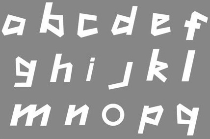
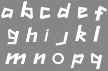
- #2. Ransom Note.
- #3. Neuland Inline. He says about Rudolf Koch's typeface often associated with Jurassic Park: It is a dense and angular type, suggestive of something Fred Flintstone might chisel into prehistoric rock. The inline version is bristling with energy and a quirkiness of spirit, a bad type predominantly through its overuse rather than its construction.
- #4. Papyrus. Overused. Garfield especially objects to its use in Avatar (the movie): Avatar cost more to make than any other film in history but it did its best to recoup whatever it spent on 3-D special effects and computer-generated blue people by using the cheapest and least original font it could find: Papyrus, a font available free on every Mac and PC.
- #5. Brush Script. Garfield: If, during the 1990s, you ever perused the menu of a local restaurant (the sort of restaurant opened by people who on a starlit evening thought, "I'm a pretty good cook--I think I'll open a restaurant!"), then that menu had a good chance of featuring Pear, Blue Cheese and Walnut Salad on a Bed of Brush Script.
- #6. Gill Sans Light Shadowed. This Eric Gill design, one of the first in the shadow style of the 1930s, like Plastika and Umbra, triggers this reaction: Gill Sans Light Shadowed is the sequel that should never have been made--a font that pleases the taxman and no one else. It's hard to believe that this is what Eric Gill had in mind when he first picked up chisel and quill--a type design that would combine the look of both but ultimately end up redolent only of crackly Letraset on a school magazine.
- #7. Souvenir. Garfield gets help here from type scholar Frank Romano: "Real men don't set Souvenir," wrote Frank Romano in the early 1990s, by which time he had already been performing character assassination on the type for over a decade. At every opportunity in print and online, Romano would have a go. "Souvenir is a font fatale . . . We could send Souvenir to Mars, but there are international treaties on pollution in outer space . . . remember, friends don't let friends set Souvenir." He also gets help from Peter Guy, who has designed books for the Folio Society: A souvenir of every ghastly mistake ever made in type design gathered together--with a few never thought of before--into one execrable mish-mash.
- #8. Ecofont. The string vest and Swiss Cheese of fonts.
|
EXTERNAL LINKS
The 8 Worst Fonts In The World
MyFonts search
Monotype search
Fontspring search
Google search
INTERNAL LINKS
Typography ⦿
Type design in the United Kingdom ⦿
Choice of fonts ⦿
Eric Gill and his typefaces ⦿
Chiseled fonts ⦿
|