TYPE DESIGN INFORMATION PAGE last updated on Wed May 6 16:21:42 EDT 2026
FONT RECOGNITION VIA FONT MOOSE
|
|
|
|
Carrois Type Design
[Ralph du Carrois]
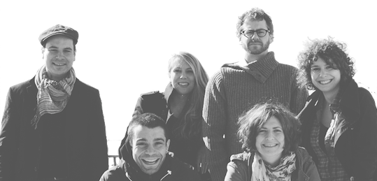
Carrois Type Design (Berlin, Germany) started up officially ca. 2010, although Ralph du Carrois has been designing typefaces since ca. 2002. This dynamic company in Germany has three art directors, Jenny du Carrois, Anja Meiners and Botjo Nikoltchev. All three also design typefaces, as well as Adam Twardoch, Andreas Eigendorf and Ralph du Carrois himself. The company specializes in custom type. Typefaces (a *very* incomplete list, with apologies, but I can't tell from the web site who made what...):
About Ralph du Carrois, b. 1975: He graduated at the Staatliche Hochschule für Gestaltung Karlsruhe in 2004 with his first typeface family PTL Maurea. Since 2000 he has worked for different companies or agencies. In 2003 he founded the studio seite4 in Berlin with its main focus on type design and corporate identity design. |
EXTERNAL LINKS |
| | |

file name: Carrois Type Design Fira Sans 2013

file name: Carrois Corporate Edenspiekermann A G Fira Sans Bold 2012 2016

file name: Erik Spiekermann Ralph Du Carrois Fira Sans 2012 Poster by Alex Sanmartino 2017

file name: Erik Spiekermann Ralph Du Carrois Fira Sans 2012 2013f

file name: Erik Spiekermann Ralph Du Carrois Fira Sans 2012 2013g

file name: Erik Spiekermann Ralph Du Carrois Fira Sans 2013

file name: Erik Spiekermann Ralph Du Carrois Fira Sans Fira Mono 2012 2013b

file name: Erik Spiekermann Ralph Du Carrois Fira Sans Fira Mono 2012 2013c

file name: Carrois Type Design Fira Sans 2013b

file name: Carrois Type Design Fira Sans 2013c

file name: Erik Spiekermann Ralph Du Carrois Fira Sans 2012 2013c

file name: Erik Spiekermann Ralph Du Carrois Fira Sans 2012 2013d

file name: Erik Spiekermann Ralph Du Carrois Fira Sans 2012 2013e

file name: Erik Spiekermann Ralph Du Carrois Fira Sans 2012 Poster by Bill Dawson 2015

file name: Carrois Corporate Edenspiekermann A G Fira Sans Extra Condensed Bold 2012 2016

file name: Carrois Corporate Edenspiekermann A G Fira Sans Extra Condensed Thin 2012 2016

file name: Carrois Corporate Edenspiekermann A G Fira Sans Extra Condensed Thin 2012 2016b

file name: Carrois Type Design Krikikrak Blumenkohl 2013

file name: Carrois Allzweck 2011b

file name: Carrois Allzweck Mvd R 2011

file name: Carrois Type Design Allzweck 2011

file name: Carrois Type Design Allzweck 2011b
file name: Carrois Bosch Applications Icons 2011

file name: Carrois Carrois Gothic 2012

file name: Carrois Carrois Gothic S C 2012

file name: Carrois Cisco 2011

file name: Carrois Cisco Sans 2010

file name: Carrois Cisco Sans 2010c

file name: Ralph Du Carrois Cisco Sans 2010

file name: Ralph Du Carrois Cisco Sans 2010b

file name: Carrois F R Classic 2002

file name: Carrois Finger Paint 2012
file name: Carrois Herzberger Baeckerei Icons 2011
file name: Carrois Hybride Iconwelt 2007

file name: Ralph Du Carrois Inarea 2003 2005

file name: Ralph Du Carrois Inarea 2003 2005b

file name: Ralph Du Carrois Inarea Sans 2003

file name: Ralph Du Carrois Inarea Sans 2003b

file name: Carrois Inarea Sans 2003

file name: Carrois Type Design Metascience 2012

file name: Erik Spiekermann Ralph Du Carrois Christian Schwarz Kris Sowersby Meta Serif Pro 2011

file name: Carrois Meta Serif Pro 2011

file name: Carrois Meta Serif Pro 2011b

file name: Erik Spiekermann Christian Schwartz Meta Serif Pro Medium 2007

file name: Carrois Metro Rome 2011

file name: Carrois P T L Manohara 2010

file name: Carrois P T L Maurea 2005
file name: Carrois Ponce Icons 2011
file name: Carrois Ponce Icons 2011b

file name: Carrois Russian Rail 2008

file name: Carrois Russian Rail 2008b

file name: Dmitri Lavrow Ralph Du Carrois Russian Rail 2008

file name: Dmitri Lavrow Ralph Du Carrois Russian Rail A Pro Bold 2008

file name: Dmitri Lavrow Ralph Du Carrois Russian Rail G Pro Medium2008

file name: Carrois Sadgirl 2006

file name: Ralph Du Carrois P T L Sadgirl 2006
file name: Carrois Sentres Wetter Icons 2010

file name: Carrois Share 2006

file name: Carrois Share 2006b

file name: Carrois Suzuki Europa 2007

file name: Carrois Suzuki Europa 2007b

file name: Carrois T E R N Trans European Road Network 2008
file name: Carrois Tier Icons 2007

file name: Carrois Unit Slab Pro 2009

file name: Carrois Z D F Nachrichten 2007b

file name: Carrois Z D F Nachrichten 2007c

file name: Carrois Z D F Nachrichten 2007e

file name: Carrois Z D F Nachrichten 2007f
file name: Carrois Z D F Nachrichten Icons 2011

file name: Carrois Type Design Jenny Du Carrois Ralph Du Carroi Vanina Goldhofer Anja Meiners Botjo Nikoltchev Adam Twardoch Andreas Eigendorf
| | |
|
Luc Devroye ⦿ School of Computer Science ⦿ McGill University Montreal, Canada H3A 2K6 ⦿ lucdevroye@gmail.com ⦿ https://luc.devroye.org ⦿ https://luc.devroye.org/fonts.html |

