TYPE DESIGN INFORMATION PAGE last updated on Wed May 6 16:21:49 EDT 2026
FONT RECOGNITION VIA FONT MOOSE
|
|
|
|
Etienne Aubert-Bonn
Étienne is a graduate of the graphic and type design program at UQAM in Montreal. Cofounder in 2011 of Coppers & Brasses in Montreal, together with Alexandre Saumier Demers. He studied at Type@Cooper in New York and at KABK in Den Haag, The Netherlands (class of 2013). He also teaches type design at UQAM in Montreal. In 2012, he designed the signage typeface Sardine and the blackletter typeface Freitt. Together with Alexandre, he created Martha (a monospaced slabby grotesque), still in 2012. At The Cooper Union, he created Barapa (2012). His fonts at Coppers Brasses:
|
EXTERNAL LINKS |
| | |

file name: Etienne Aubert Bonn Agena Display 2021

file name: Etienne Aubert Bonn Agena Display 2021

file name: Etienne Aubert Bonn Agena Display 2021

file name: Etienne Aubert Bonn Agena Display 2021

file name: Etienne Aubert Bonn Agena Display 2021

file name: Etienne Aubert Bonn Agena Display 2021

file name: Etienne Aubert Bonn Agena Display 2021

file name: Etienne Aubert Bonn Agena Display 2021

file name: Etienne Aubert Bonn Agena Display 2021

file name: Etienne Aubert Bonn Agena Display 2021

file name: Etienne Aubert Bonn Agena Display 2021

file name: Etienne Aubert Bonn Agena 2021

file name: Etienne Aubert Bonn Agena 2021

file name: Etienne Aubert Bonn Agena 2021

file name: Etienne Aubert Bonn Agena 2021

file name: Etienne Aubert Bonn Agena 2021

file name: Etienne Aubert Bonn Agena 2021

file name: Etienne Aubert Bonn Agena 2021

file name: Etienne Aubert Bonn Agena 2021

file name: My Lan Thuong Etienne Aubert Bonn Baryton 2020

file name: My Lan Thuong Etienne Aubert Bonn Baryton 2020

file name: My Lan Thuong Etienne Aubert Bonn Baryton 2020

file name: My Lan Thuong Etienne Aubert Bonn Baryton 2020

file name: My Lan Thuong Etienne Aubert Bonn Baryton 2020

file name: Coppers Brasses Bookmark 2020

file name: Coppers Brasses Bookmark 2020

file name: Coppers Brasses Bookmark 2020

file name: Coppers Brasses Bookmark 2020

file name: Coppers Brasses Bookmark 2020

file name: Coppers Brasses Bookmark 2020

file name: Etienne Aubert Bonn Mc Gill Sans Medium 2019

file name: Etienne Aubert Bonn Mc Gill Serif Medium 2019

file name: Feed Type Etienne Aubert Bonn Hochelaga 2012 2017

file name: Feed Type Etienne Aubert Bonn Hochelaga 2012 2017b

file name: Feed Type Etienne Aubert Bonn Hochelaga 2012 2017c

file name: Feed Type Etienne Aubert Bonn Hochelaga 2012 2017d

file name: Feed Type Etienne Aubert Bonn Hochelaga 2012 2017f

file name: Feed Type Etienne Aubert Bonn Hochelaga 2012 2017g

file name: Feed Type Etienne Aubert Bonn Hochelaga 2012 2017h

file name: Feed Type Etienne Aubert Bonn Hochelaga 2012 2017i

file name: Feed Type Etienne Aubert Bonn Hochelaga 2012 2017j

file name: Feed Type Etienne Aubert Bonn Hochelaga 2012 2017k

file name: Etienne Aubert Bonn Energir 2017

file name: Etienne Aubert Bonn Energir 2017b

file name: Etienne Aubert Bonn Energir 2017c

file name: Etienne Aubert Bonn Energir 2017d

file name: Etienne Aubert Bonn Energir 2017e

file name: Etienne Aubert Bonn Ilisarniq 2018

file name: Etienne Aubert Bonn Ilisarniq 2018b

file name: Etienne Aubert Bonn Ilisarniq 2018d

file name: Etienne Aubert Bonn Ilisarniq 2018e

file name: Etienne Aubert Bonn Ilisarniq 2018f

file name: Etienne Aubert Bonn Ilisarniq 2018g

file name: Etienne Aubert Bonn Ilisarniq 2018h

file name: Etienne Aubert Bonn Ilisarniq 2018i

file name: Etienne Aubert Bonn Ilisarniq 2018j

file name: Etienne Aubert Bonn Ilisarniq 2018k

file name: My Lan Thuong Etienne Aubert Bonn Mammouth 2017

file name: My Lan Thuong Etienne Aubert Bonn Mammouth 2017b

file name: My Lan Thuong Etienne Aubert Bonn Mammouth 2017c

file name: My Lan Thuong Etienne Aubert Bonn Mammouth 2017d

file name: My Lan Thuong Etienne Aubert Bonn Mammouth 2017e

file name: My Lan Thuong Etienne Aubert Bonn Mammouth 2017f

file name: My Lan Thuong Etienne Aubert Bonn Mammouth 2017g

file name: My Lan Thuong Etienne Aubert Bonn Maple Leafs 2017

file name: My Lan Thuong Etienne Aubert Bonn Maple Leafs 2017b

file name: My Lan Thuong Etienne Aubert Bonn Maple Leafs 2017c

file name: Etienne Aubert Bonn Triade 2016

file name: Etienne Aubert Bonn Triade 2016b

file name: Etienne Aubert Bonn Triade 2016c

file name: Etienne Aubert Bonn Triade 2016d

file name: Etienne Aubert Bonn Triade 2016e

file name: Etienne Aubert Bonn Triade 2016f

file name: Etienne Aubert Bonn Triade 2016g

file name: Etienne Aubert Bonn Triade 2016h

file name: Etienne Aubert Bonn Triade 2016i

file name: Etienne Aubert Bonn Triade 2016j

file name: Etienne Aubert Bonn Triade 2016k

file name: Etienne Aubert Bonn Triade 2016l

file name: Etienne Aubert Bonn Triade 2016m

file name: Etienne Aubert Bonn Triade 2016n

file name: Etienne Aubert Bonn Triade 2016o

file name: Etienne Aubert Bonn Freitt 2012
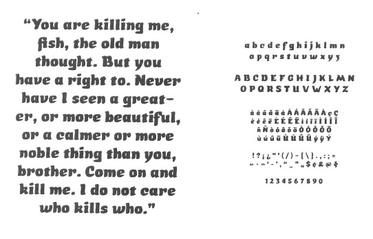
file name: Etienne Aubert Bonn Sardine 2012
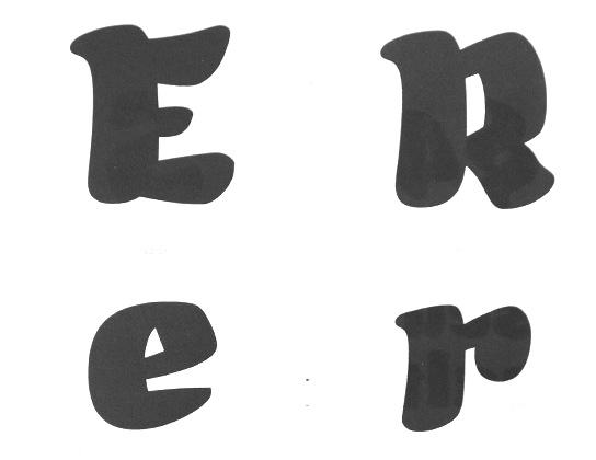
file name: Etienne Aubert Bonn Sardine 2012b
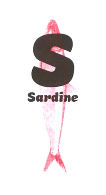
file name: Etienne Aubert Bonn Sardine 2012c

file name: Etienne Aubert Bonn Nurraq 2013

file name: Etienne Aubert Bonn Nurraq 2013b

file name: Etienne Aubert Bonn Nurraq 2013c

file name: Etienne Aubert Bonn Nurraq 2013d

file name: Etienne Aubert Bonn Nurraq 2013e

file name: Etienne Aubert Bonn Nurraq 2013f
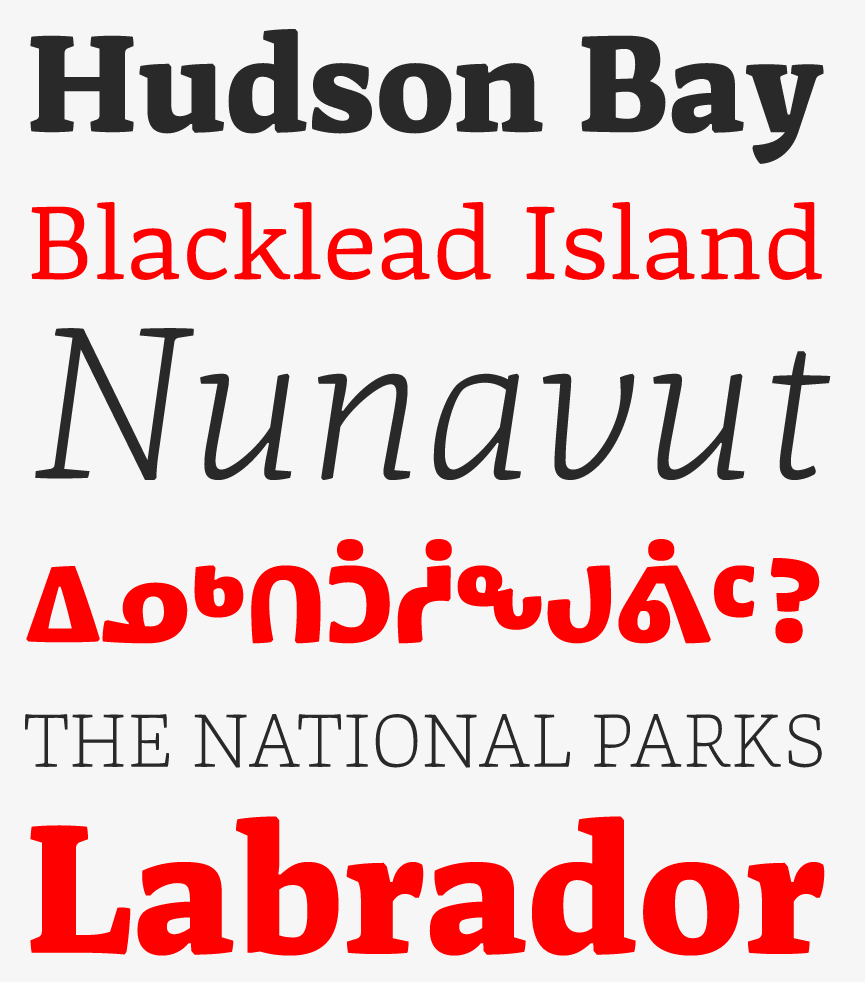
file name: Etienne Aubert Bonn Nurraq 2013
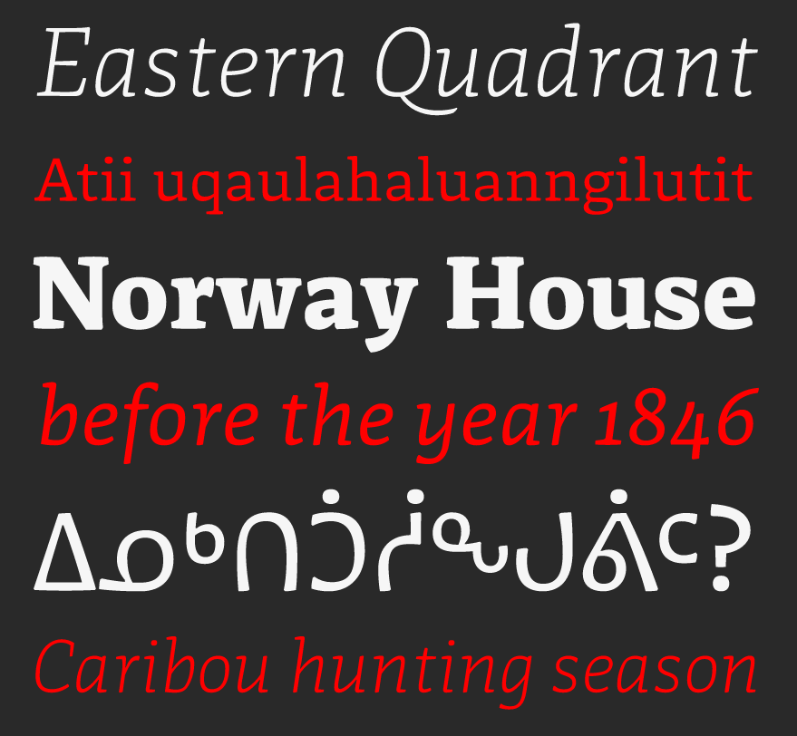
file name: Etienne Aubert Bonn Nurraq 2013b
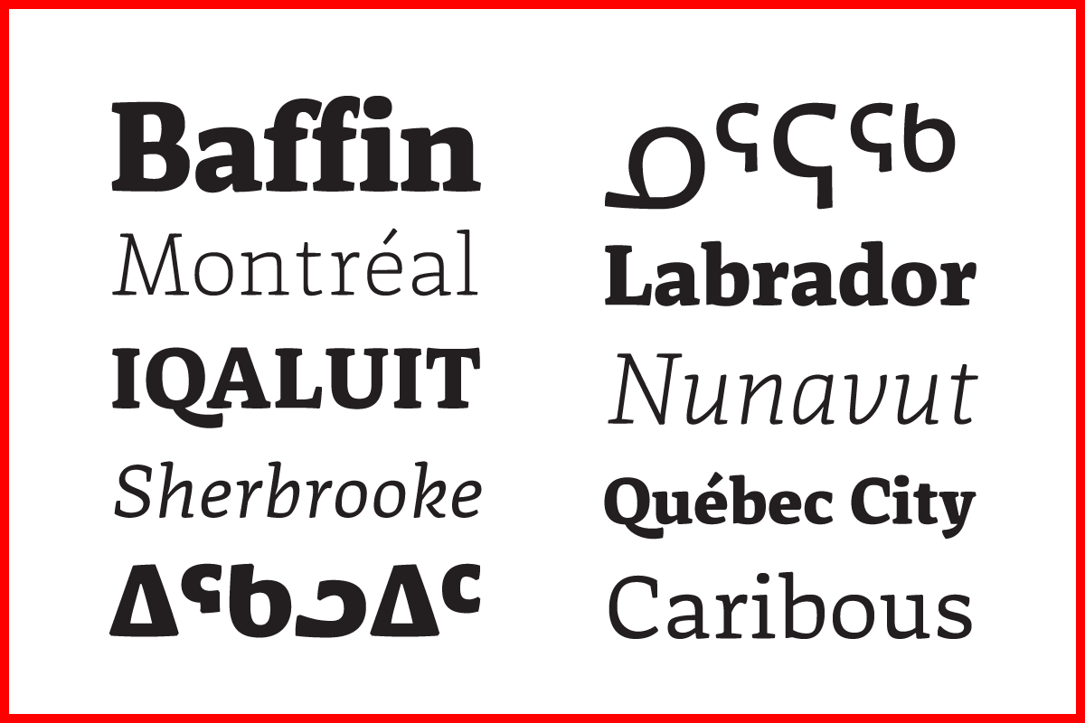
file name: Etienne Aubert Bonn Nurraq
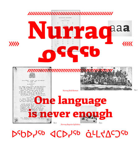
file name: Etienne Aubert Bonn Nurraq

file name: Coppers Brasses Martha 2012

file name: Coppers Brasses Martha 2012b
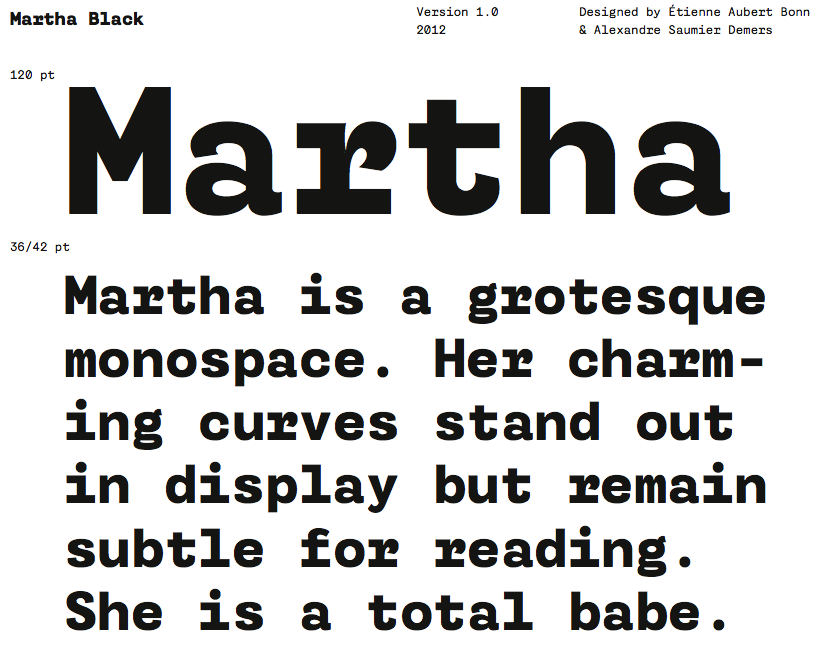
file name: Coppers Brasses Martha Black 2012

file name: Coppers Brasses Martha Black 2012b

file name: Coppers Brasses Martha Black 2012c

file name: Coppers Brasses Martha Light 2012

file name: Coppers Brasses Martha Light 2012d
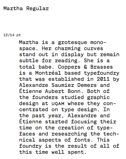
file name: Coppers Brasses Martha Regular 2012d
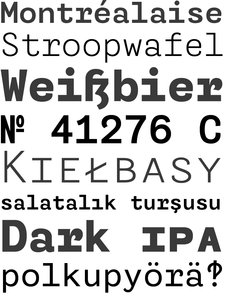
file name: Coppers Brasses Martha 2012e

file name: Coppers Brasses Martha 2012 Etienne

file name: Coppers Brasses Martha 2012c
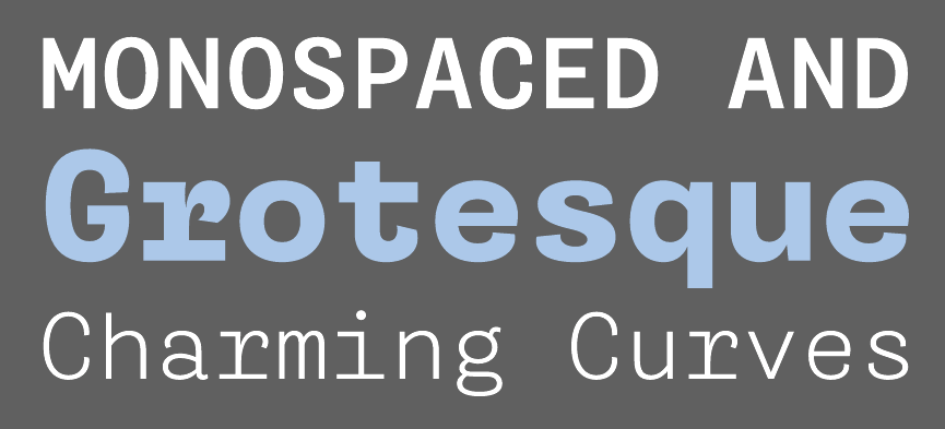
file name: Coppers Brasses Martha 2012d
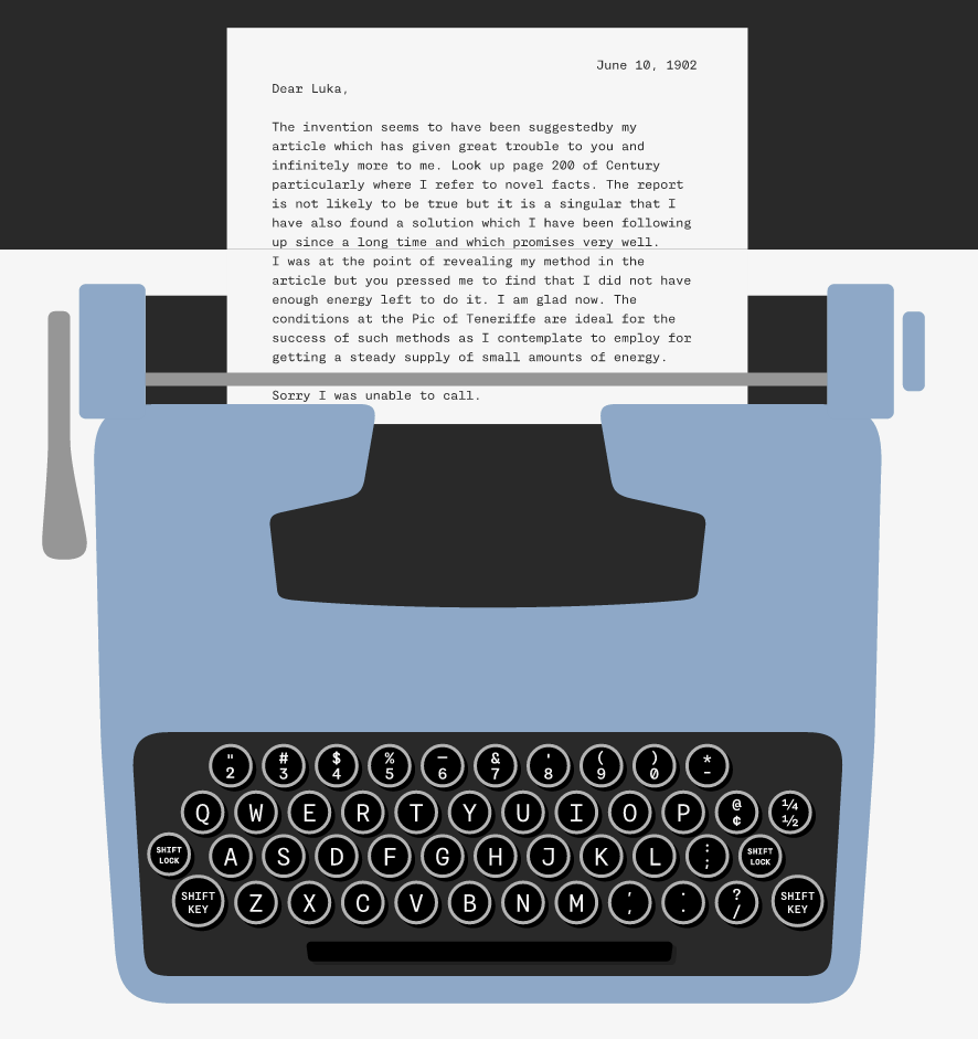
file name: Coppers Brasses Martha 2012
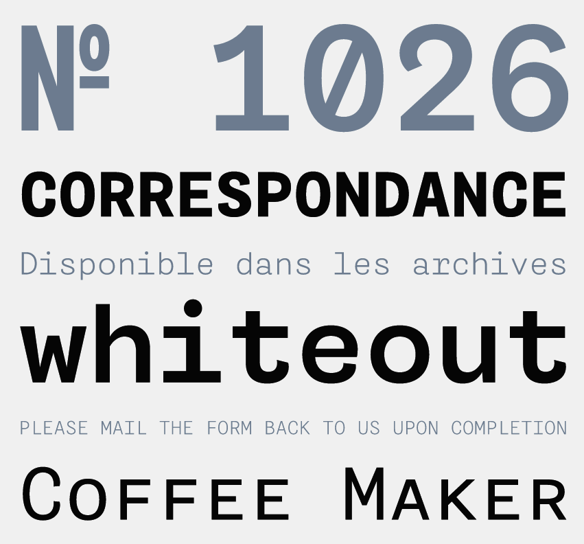
file name: Coppers Brasses Martha 2012b

file name: Etienne Aubert Bonn Barapa 2012
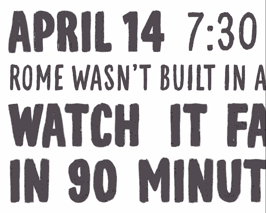
file name: Coppers Brasses M L S Soccer 2012
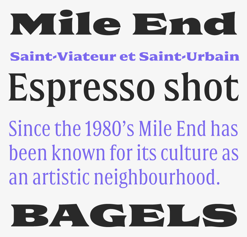
file name: Etienne Aubert Bonn Alexandre Saumier Demers Double 2015b
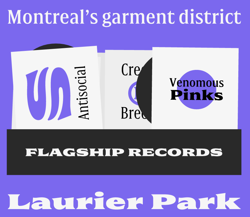
file name: Etienne Aubert Bonn Alexandre Saumier Demers Double 2015c
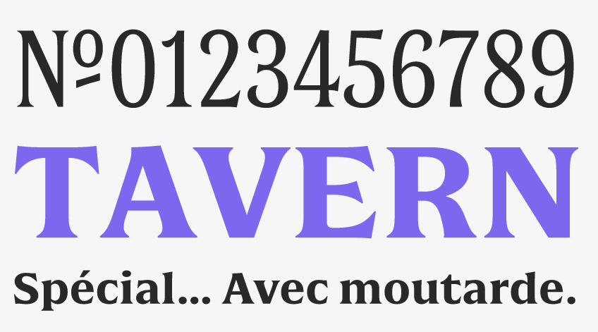
file name: Etienne Aubert Bonn Alexandre Saumier Demers Double 2015d
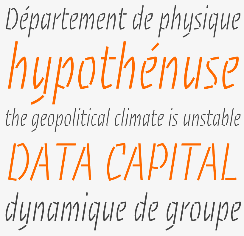
file name: Etienne Aubert Bonn Alexandre Saumier Demers Theorie 2014
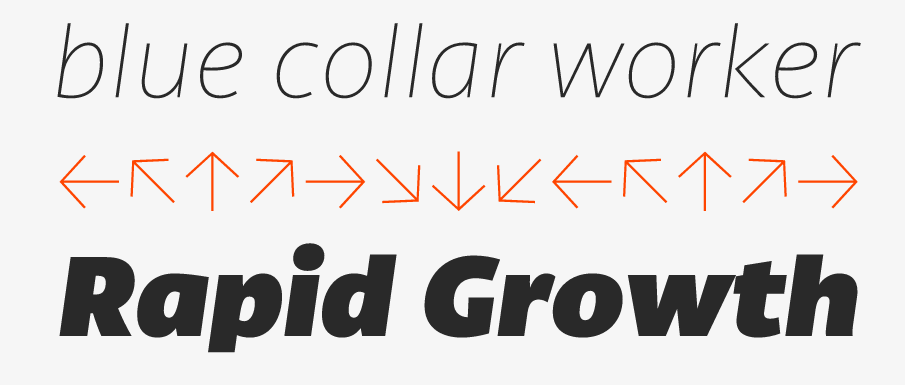
file name: Etienne Aubert Bonn Canal 2015b
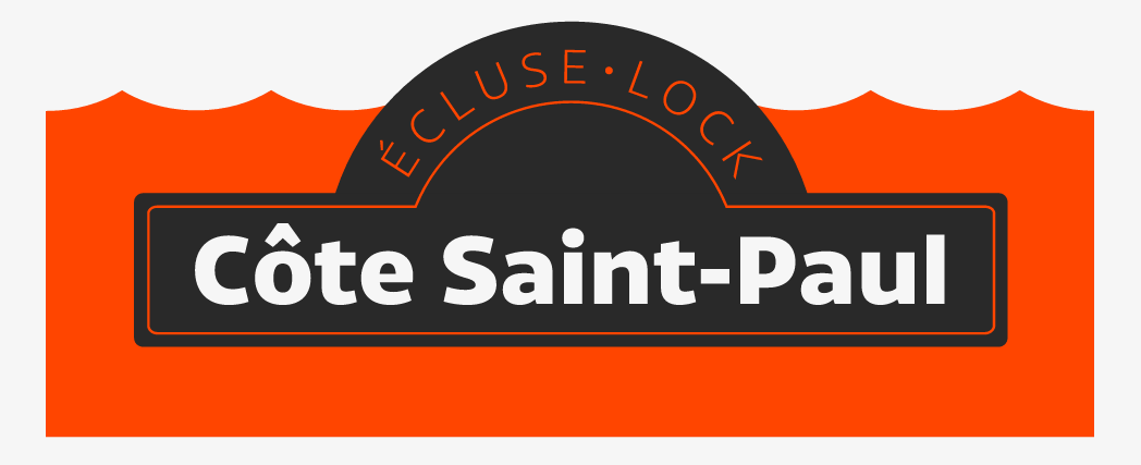
file name: Etienne Aubert Bonn Canal 2015c
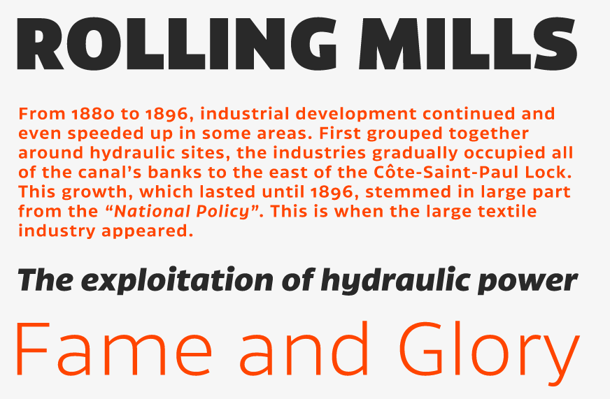
file name: Etienne Aubert Bonn Canal 2015d

file name: Etienne Aubert Bonn Canal 2015e
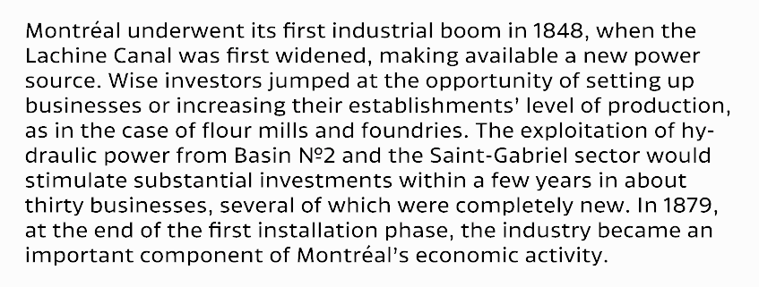
file name: Etienne Aubert Bonn Canal 2015f
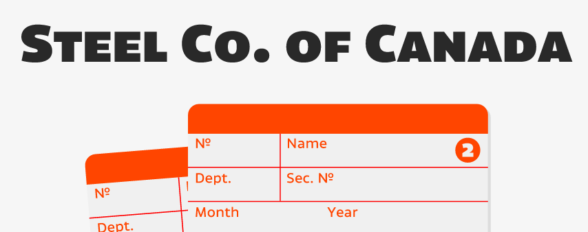
file name: Etienne Aubert Bonn Canal 2015g
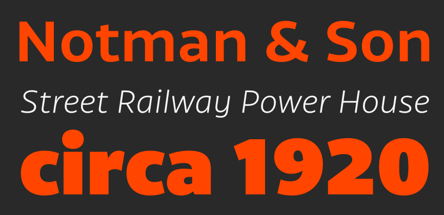
file name: Etienne Aubert Bonn Canal 2015h

file name: Etienne Aubert Bonn Canal 2015a
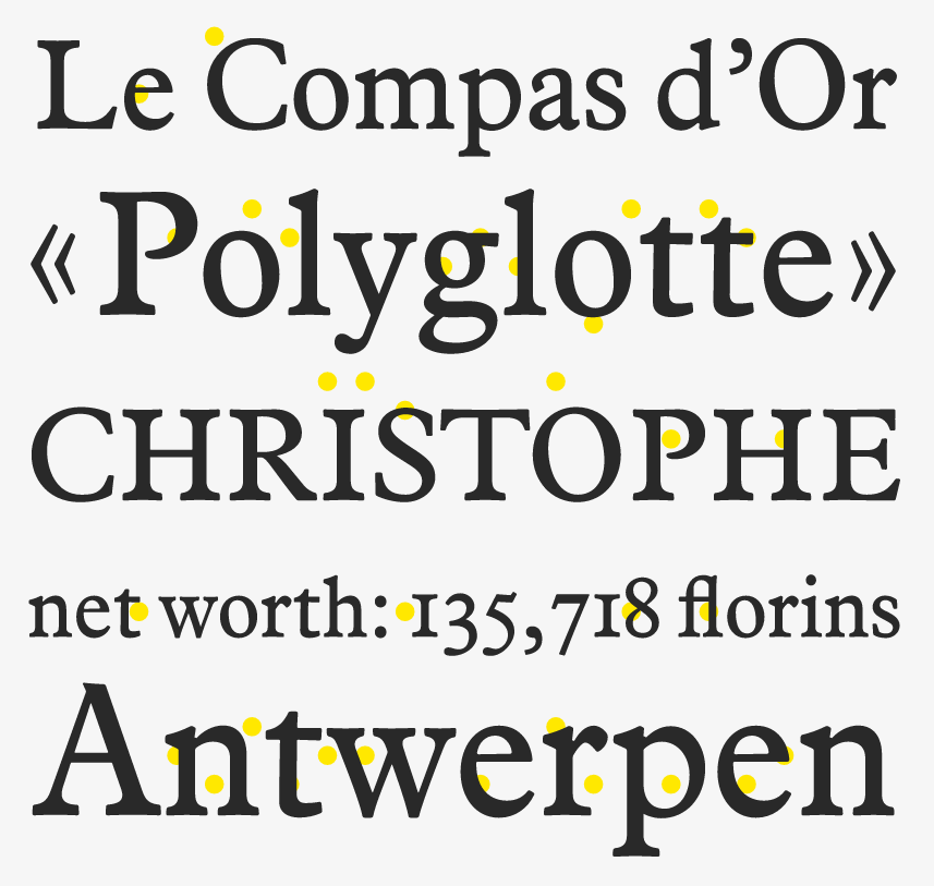
file name: Etienne Aubert Bonn Compass 2013

file name: Etienne Aubert Bonn Compass 2013b
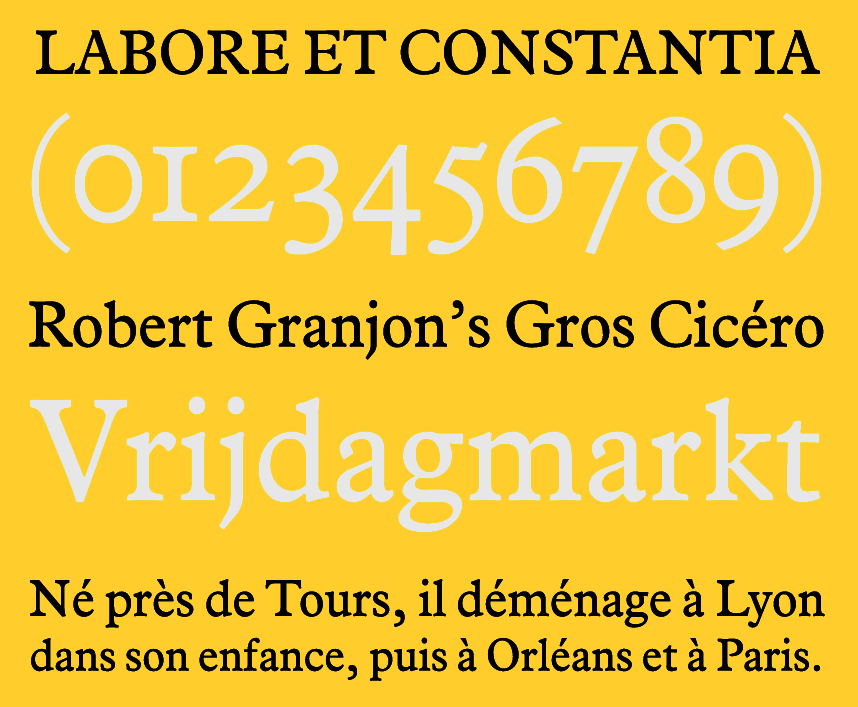
file name: Etienne Aubert Bonn Compass 2013c
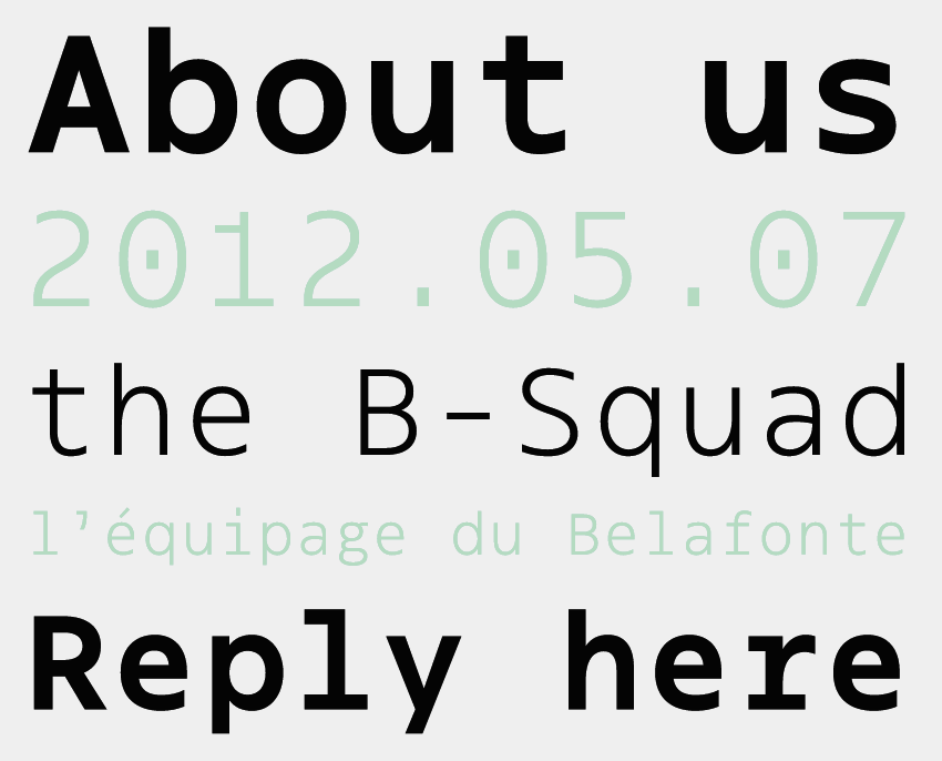
file name: Etienne Aubert Bonn Klaus 2014
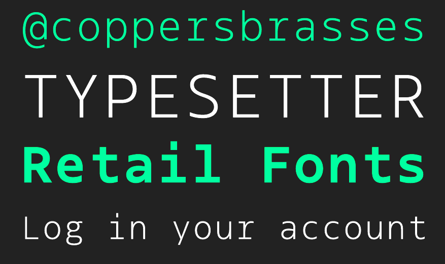
file name: Etienne Aubert Bonn Klaus 2014b

file name: Etienne Aubert Bonn Klaus 2014c

file name: Etienne Aubert Bonn Alexandre Saumier Demers Pic 2015

file name: A Typ I 2017 Etienne Aubert Bonn

file name: A Typ I 2017 Etienne Aubert Bonn Vanessa Duval
| | |
|
Luc Devroye ⦿ School of Computer Science ⦿ McGill University Montreal, Canada H3A 2K6 ⦿ lucdevroye@gmail.com ⦿ https://luc.devroye.org ⦿ https://luc.devroye.org/fonts.html |

