TYPE DESIGN INFORMATION PAGE last updated on Wed May 6 16:22:13 EDT 2026
FONT RECOGNITION VIA FONT MOOSE
|
|
|
|
Antiqua (or: Venetian) typefaces
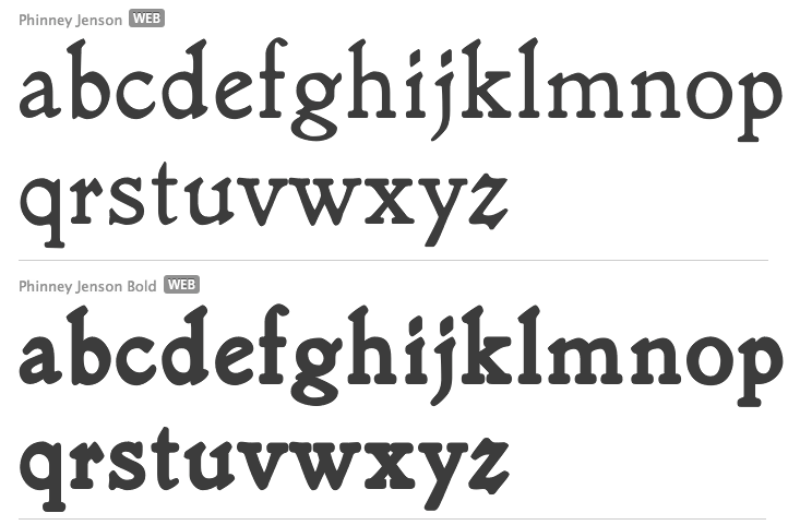
In the late 1400s, blackletter was replaced by a type style that mimicked handwriting. It was of uniform thickness, and thus appeared quite dark on paper. The humanist writing of Italian scholars of the Renaissance served as a model for what is now known as the Antiqua style. Several such types came out Nicolas Jenson's printing workshop set up by nicolas Jenson in 1468. That first antiqua typeface was used in De Evangelica Praeparatione in 1470. Jenson died in 1480 at the age of 60, but many would take up that style between 1470 and 1600. The Venice connection led quite naturally to the other name for the type style, Venetian. Occasionally, the name old style is also used but that refers to a later style, the aldine or garalde. Well-known Venetian typefaces include ITC Berkeley Oldstyle, Brioso Pro, Centaur, (Adobe) Jenson, Hightower, Kennerly, Schneidler, Nicolas Jenson SG, Phinney Jenson, Stempel Schneidler, Verona, Abrams Venetian, Lutetia, Jersey, Lynton, Spira. It is easy to recognize Venetian types, not just from the uniform thickness and semi-calligraphic look, but also by the small x-height, small counters, tall ascenders, overly wide HMN, sloped cross-bar on the "e", negative axis on the "o", and two roof serifs on the M. Additional literature: Martin Silvertant's history of type, from which the analytic image is borrowed. |
EXTERNAL LINKS |
| | |

file name: Martin Silvertant Venetian Type

file name: Abrams Legacy Abrams Venetian 1989 after George Abrams

file name: Abrams Legacy Abrams Venetian 1989 after George Abrams
file name: Tobias Frere Jones Hightower 1994 1996b
file name: Tobias Frere Jones Hightower 1994 1996c

file name: Tobias Frere Jones Hightower 1994 1996d

file name: Tobias Frere Jones Hightower 1994 1996

file name: Tony Stan I T C Berkeley Oldstyle 1983 198019

file name: Tony Stan I T C Berkeley Oldstyle 1983 198019b

file name: Tony Stan I T C Berkeley Oldstyle 1983 199042

file name: Tony Stan I T C Berkeley Oldstyle 1983 199042

file name: Jim Spiece Nicolas Jenson S G Open

file name: Jim Spiece Nicolas Jenson S G Regular Petite Caps

file name: F H E Schneidler Schneidler Bitstream 1936

file name: F H E Schneidler Stempel Schneidler Adobe 1936

file name: F H E Schneidler Stempel Schneidler Bold Adobe 1936

file name: F H E Schneidler Stempel Schneidler Bold Adobe 1936b
file name: Tom Wallace Phinney Jenson 2007 after Joseph W Phinney 1893

file name: Tom Wallace Phinney Jenson 2007 after Joseph W Phinney 1893b

file name: Andy Stockley Spira 1999

file name: Andy Stockley Spira Bold 1999

file name: Jim Spiece Nicolas Jenson S G Open S C after Ernst F Detterer Eusebius Nicolas Jenson

file name: Jim Spiece Nicolas Jenson S G Regular after Ernst F Detterer Eusebius Nicolas Jenson

file name: Jim Spiece Nicolas Jenson S G Regular after Ernst F Detterer Eusebius Nicolas Jenson

file name: Jim Spiece Nicolas Jenson S G Regular after Ernst F Detterer Eusebius Nicolas Jenson
| | |
|
Luc Devroye ⦿ School of Computer Science ⦿ McGill University Montreal, Canada H3A 2K6 ⦿ lucdevroye@gmail.com ⦿ https://luc.devroye.org ⦿ https://luc.devroye.org/fonts.html |

