TYPE DESIGN INFORMATION PAGE last updated on Thu Apr 16 22:12:09 EDT 2026
FONT RECOGNITION VIA FONT MOOSE
|
|
|
|
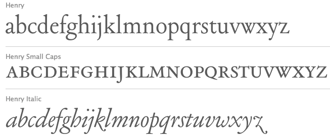
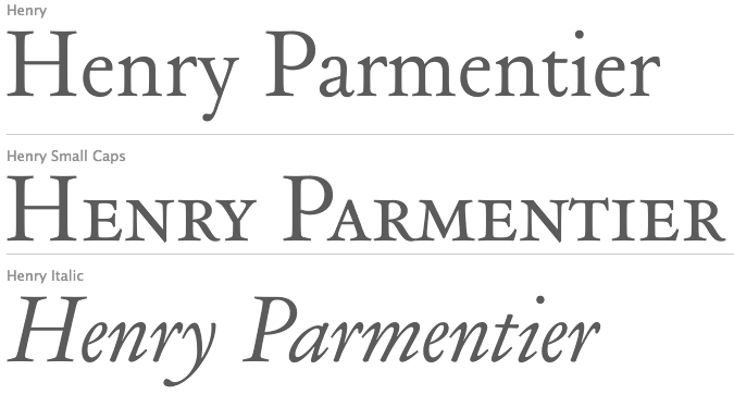
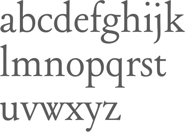
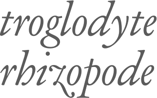
Type designer and cutter who worked for Georges Peignot. Between 1914 and 1926, Parmentier developed a Garamond family for Peignot's foundry. That family was rediscovered by Matthieu Cortat (Nonpareille) and revived by Cortat in 2013 as Henry. Cortat writes: Henry is a personal reinterpretation of the Garamond cut for the Deberny & Peignot type foundry between 1914 and 1926 by Henri Parmentier, under the management of Georges Peignot, who owned the foundry. Their purpose was to recreate the gracefulness of Claude Garamont's type typeface while allowing for the development of modern paper making, with its wood pulp paper, as opposed to 16th century rag paper. This elegant and smooth text family has its own mind: Henry is based on the text sizes (9 to 14) of the Garamond Peignot. It is a light and fluid Garald, rather skinny and narrow, with a slender grace. There is an art nouveau spirit in its z leaning on the left, its serpentine a and J, the roundish lower bowl of its t, the wide tail of its Q. |
EXTERNAL LINKS |
| | |

file name: Matthieu Cortat Henry 2013 after Henry Parmentier Georges Peignot 1914

file name: Matthieu Cortat Henry 2013 after Henry Parmentier Georges Peignot 1914b

file name: Matthieu Cortat Henry 2013 after Henry Parmentier Georges Peignot 1914e
| | |
|
Luc Devroye ⦿ School of Computer Science ⦿ McGill University Montreal, Canada H3A 2K6 ⦿ lucdevroye@gmail.com ⦿ https://luc.devroye.org ⦿ https://luc.devroye.org/fonts.html |


