TYPE DESIGN INFORMATION PAGE last updated on Wed May 6 16:23:33 EDT 2026
FONT RECOGNITION VIA FONT MOOSE
|
|
|
|
Born in 1960 in Niigata, Japan. Studied at the Musashino Art University in Tokyo. He also studied calligraphy at the London College of Printing. He became a freelance designer in 1997. Akira Kobayashi, who was based in Tokyo prior to his move to the Franfurt area, is an accomplished type designer who has created numerous typefaces for Sha-Ken, Dainippon Screen (where he made the kanji font Hiragino Mincho), TypeBank (from 1993-1997), ITC and Linotype, where he is Type Director since 2001. Interview. His numerous awards include the Type Directors Club awards in 1998 (ITC Woodland), 1999 (the art deco styled ITC Silvermoon, and ITC Japanese Garden), and 2000 (FF Clifford), the 1999 Kyrillitsa award for ITC Japanese Garden, the 3rd International Digital Type Design Contest by Linotype Library (for the informal and quirky 4-style Linotype Conrad (1999): Linotype states that Kobayashi took his inspiration from a print typeface of the 15th century created by two German printers named Konrad Sweynheim and Arnold Pannartz), and the 5th Morisawa International Typeface Competition (in which he received an Honourable Mention for his typeface Socia Oldstyle). CV at bukvaraz. Interview in 2006. His typefaces:
Speaker at ATypI 2012 in Hong Kong: Rounded sans in Japan. View Akiro Kobayashi's typefaces. Klingspor link. FontShop link. Eurostile Next review. Linotype link. Monotype link. MyFonts interview in 2017. |
EXTERNAL LINKS |
| | |

file name: Akira Kobayashi Monotype Studio Ryota Doi Shorai Sans 2022

file name: Akira Kobayashi Monotype Studio Ryota Doi Shorai Sans 2022

file name: Akira Kobayashi Monotype Studio Ryota Doi Shorai Sans 2022

file name: Monotype Shorai Sans 2022 1

file name: Monotype Shorai Sans 2022 2

file name: Monotype Shorai Sans 2022 3

file name: Monotype Shorai Sans 2022 4

file name: Monotype Shorai Sans 2022 5

file name: Monotype Shorai Sans 2022

file name: Monotype Shorai Sans Variable 2022 4

file name: Monotype Shorai Sans Variable 2022
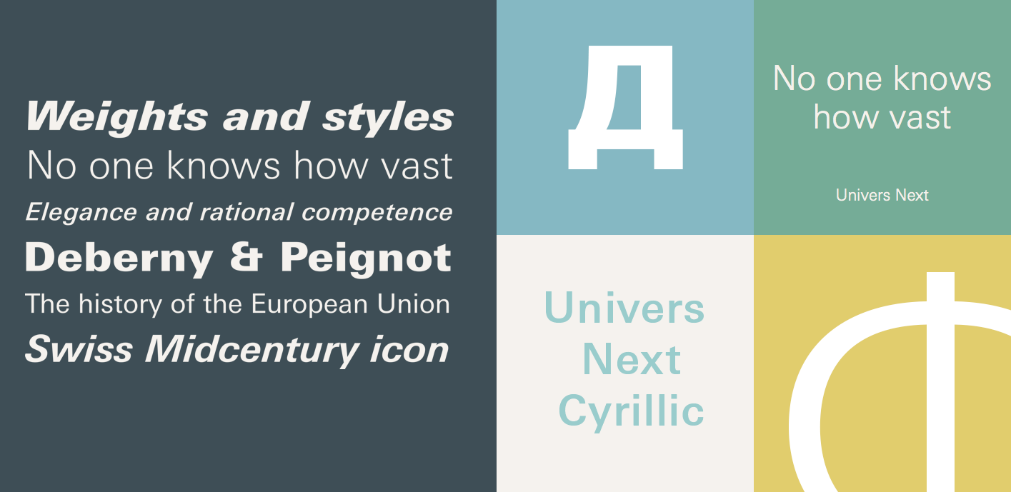
file name: Linotype Univers Next Cyrillic 2020 1

file name: Linotype Univers Next Paneuropean 2020 1

file name: Linotype Univers Next Paneuropean 2020 5

file name: Linotype Univers Next Paneuropean 2020

file name: Akira Kobayashi Akko Rounded comparison D I N Cooper Black 2011

file name: Akira Kobayashi Akko Rounded 2011 Poster by Brenda Wicker 2017

file name: Akira Kobayashi Akko Sans Akko Rounded 2011 Poster by Jaclyn Stephens 2016

file name: Akira Kobayashi Akko Rounded 2011 Poster by Sarah Barrett 2016

file name: Akira Kobayashi Akko Rounded 2011 Poster by Alee Crook 2017

file name: Akira Kobayashi Akko Sans Akko Rounded 2011b

file name: Akira Kobayashi Akko Sans comparison D I N Next Neue Helvetica 2011

file name: Akira Kobayashi Akko

file name: Akira Kobayashi Akko Condensed 2015

file name: Linotype Akko Pan European 2015 180168

file name: Linotype Akko Pan European 2015 180169

file name: Linotype Akko Pan European 2015 180170

file name: Linotype Akko Pan European 2015

file name: Linotype Akko Pro Condensed 2015 180172

file name: Linotype Akko Pro Condensed 2015 180173

file name: Linotype Akko Pro Condensed 2015 180174

file name: Linotype Akko Pro Condensed 2015

file name: Akira Kobayashi Kazuhiro Yamada Ryota Doi Tazugane Gothic X Black 2017

file name: Akira Kobayashi Kazuhiro Yamada Ryota Doi Tazugane Gothic Variable 2022

file name: Akira Kobayashi Kazuhiro Yamada Ryota Doi Tazugane Info Variable 2022

file name: Akira Kobayashi Kazuhiro Yamada Ryota Doi Tazugane Gothic 2017

file name: Akira Kobayashi Kazuhiro Yamada Ryota Doi Tazugane Gothic 2017

file name: Akira Kobayashi Kazuhiro Yamada Ryota Doi Tazugane Gothic 2017b

file name: Akira Kobayashi Kazuhiro Yamada Ryota Doi Tazugane Gothic 2017d

file name: Akira Kobayashi Kazuhiro Yamada Ryota Doi Tazugane Gothic 2017c

file name: Akira Kobayashi Kazuhiro Yamada Ryota Doi Tazugane Gothic 2017 225412

file name: Monotype Tazugane Info 2018 artwork 014

file name: Monotype Tazugane Info 2018

file name: Akira Kobayashi I T C Woodland 1998

file name: Akira Kobayashi Sandra Winter Applied Sans 2016 227188

file name: Akira Kobayashi Sandra Winter Applied Sans 2016 227190

file name: Akira Kobayashi Sandra Winter Applied Sans 2016 227191

file name: Akira Kobayashi Sandra Winter Applied Sans 2016 227192

file name: Akira Kobayashi Sandra Winter Applied Sans 2016

file name: Akira Kobayashi Sandra Winter Applied Sans Pro 2016

file name: Akira Kobayashi Sandra Winter Applied Sans Pro 2016b

file name: Akira Kobayashi Sandra Winter Applied Sans Pro 2016c

file name: Akira Kobayashi Sandra Winter Applied Sans Pro 2016d

file name: Akira Kobayashi Sandra Winter Applied Sans Pro Cn Light 2016

file name: Akira Kobayashi Sandra Winter Applied Sans Pro Ultra Black 2016

file name: Akira Kobayashi Between 2016 218435

file name: Akira Kobayashi Between 2016 218437

file name: Akira Kobayashi Between 2016 218438

file name: Akira Kobayashi Between 2016 218439

file name: Akira Kobayashi Between 2016 218441

file name: Akira Kobayashi Between 2016 218442

file name: Akira Kobayashi Between 2016 218443

file name: Akira Kobayashi Between 2016 218444

file name: Akira Kobayashi Between1 Black 2016

file name: Akira Kobayashi Between3 Black 2016

file name: Monotype D I N Next Decorative 2018 269519

file name: Monotype D I N Next Decorative 2018 269520 002

file name: Akira Kobayashi Din Next Rust 2018

file name: Akira Kobayashi Din Next Shadow 2018

file name: Akira Kobayashi Din Next Slab Rust 2018

file name: Akira Kobayashi Din Next Stencil Rust 2018

file name: Sabina Chipara Akira Kobayashi D I N Next Stencil 2017 240969

file name: Sabina Chipara Akira Kobayashi D I N Next Stencil 2017 240970

file name: Sabina Chipara Akira Kobayashi D I N Next Stencil 2017 240971

file name: Sabina Chipara Akira Kobayashi D I N Next Stencil 2017 240972

file name: Sabina Chipara Akira Kobayashi D I N Next Stencil 2017 240973

file name: Sabina Chipara Akira Kobayashi D I N Next Stencil 2017

file name: Sabina Chipara Akira Kobayashi D I N Next Stencil 2017

file name: Akira Kobayashi D I N Next 2009 Poster by Alejandra Garza 2014

file name: Akira Kobayashi D I N Next Pro Black 2009

file name: Akira Kobayashi Sandra Winter Tom Grace D I N Next 2014

file name: Akira Kobayashi Sandra Winter Tom Grace D I N Next Slab 2014a

file name: Akira Kobayashi Sandra Winter Tom Grace D I N Next Slab 2014b

file name: Akira Kobayashi Sandra Winter Tom Grace D I N Next Slab 2014c

file name: Akira Kobayashi Sandra Winter Tom Grace D I N Next Slab 2014d

file name: Akira Kobayashi Sandra Winter Tom Grace D I N Next Slab 2014e

file name: Akira Kobayashi Sandra Winter Tom Grace D I N Next Slab 2014f

file name: Akira Kobayashi Sandra Winter Tom Grace D I N Next Slab 2014g

file name: Akira Kobayashi Sandra Winter Tom Grace D I N Next Slab 2014h

file name: Akira Kobayashi Sandra Winter Tom Grace D I N Next Slab 2014i

file name: Akira Kobayashi Sandra Winter Tom Grace D I N Next Slab 2014m

file name: Akira Kobayashi Sandra Winter Tom Grace D I N Next Slab Black 2014

file name: Akira Kobayashi Sandra Winter Tom Grace D I N Next Slab Medium 2014

file name: Akira Kobayashi Tom Grace Sandra Winter D I N Next Slab 2014

file name: Akira Kobayashi Tom Grace Sandra Winter D I N Next Slab 2014a

file name: Akira Kobayashi Tom Grace Sandra Winter D I N Next Slab 2014b

file name: Akira Kobayashi Tom Grace Sandra Winter D I N Next Slab 2014c

file name: Alexey Chekulaev Akira Kobayashi S S T

file name: Akira Kobayashi S S T

file name: Akira Kobayashi F F Clifford18 Italic

file name: Akira Kobayashai F F Clifford 1999

file name: Akira Kobayashai F F Clifford 1999b

file name: Akira Kobayashai F F Clifford 1999c

file name: Akira Kobayashai F F Clifford 1999d

file name: Hiragino mincho gothic

file name: Adrian Frutiger Akira Kobayashi Frutiger Serif 2008b

file name: Adrian Frutiger Frutiger 1975 Poster by Ciprian D21 2015
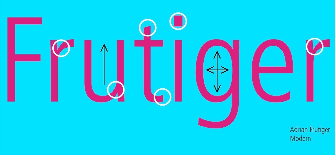
file name: Adrian Frutiger Frutiger 1975 Poster by Kelsey Coleman 2016c
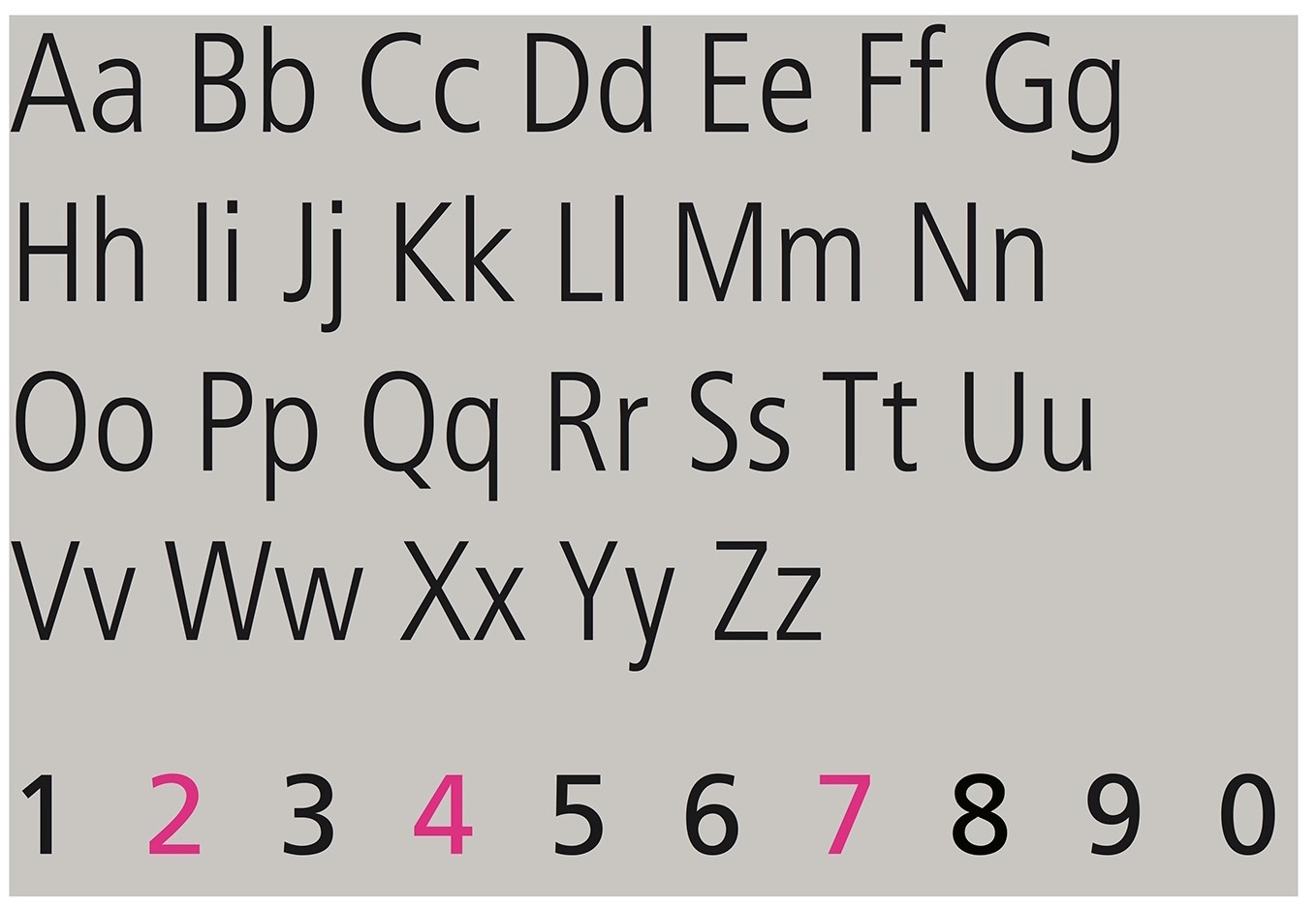
file name: Adrian Frutiger Frutiger 1975 Poster by Kelsey Coleman 2016d
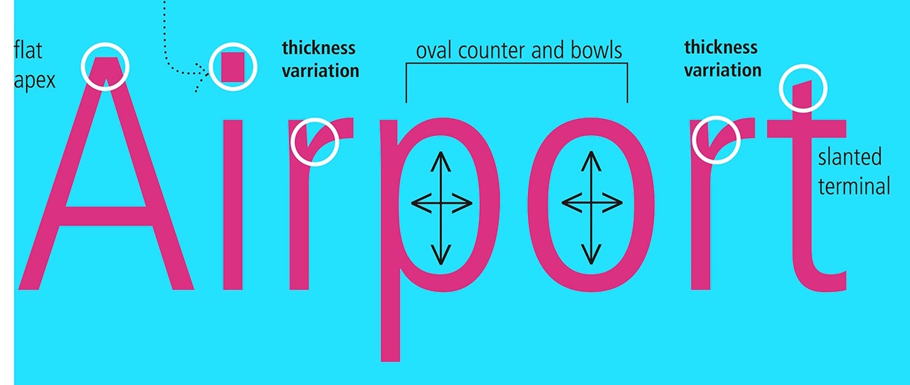
file name: Adrian Frutiger Frutiger 1975 Poster by Kelsey Coleman 2016e

file name: Adrian Frutiger Frutiger 1975 Poster by Kelsey Coleman 2016g
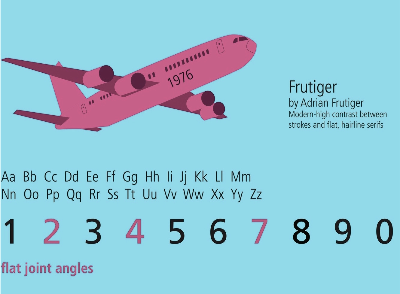
file name: Adrian Frutiger Frutiger 1975 Poster by Kelsey Coleman 2016h

file name: Adrian Frutiger Akira Kobayashi Frutiger Serif 2008

file name: Neuefrutiger kobayashi frutiger 2009

file name: Neuefrutiger kobayashi frutiger 2009b

file name: Neuefrutiger kobayashi frutiger 2009c
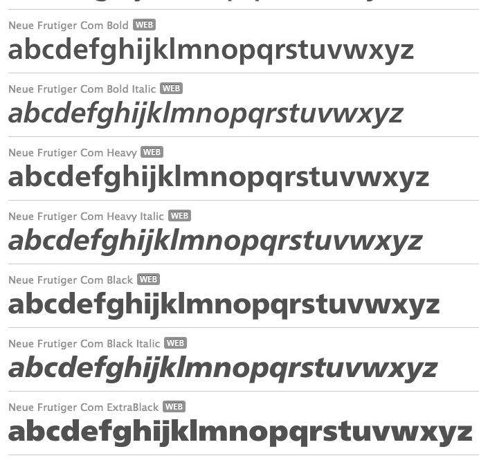
file name: Adrian Frutiger Akira Kobayashi Neue Frutiger Com 2009

file name: Adrian Frutiger Akira Kobayashi Neue Frutiger Pro 2009d
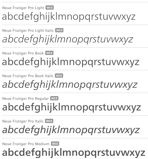
file name: Adrian Frutiger Akira Kobayashi Neue Frutiger Pro 2009

file name: Akira Kobayashai F F Clifford 1999e
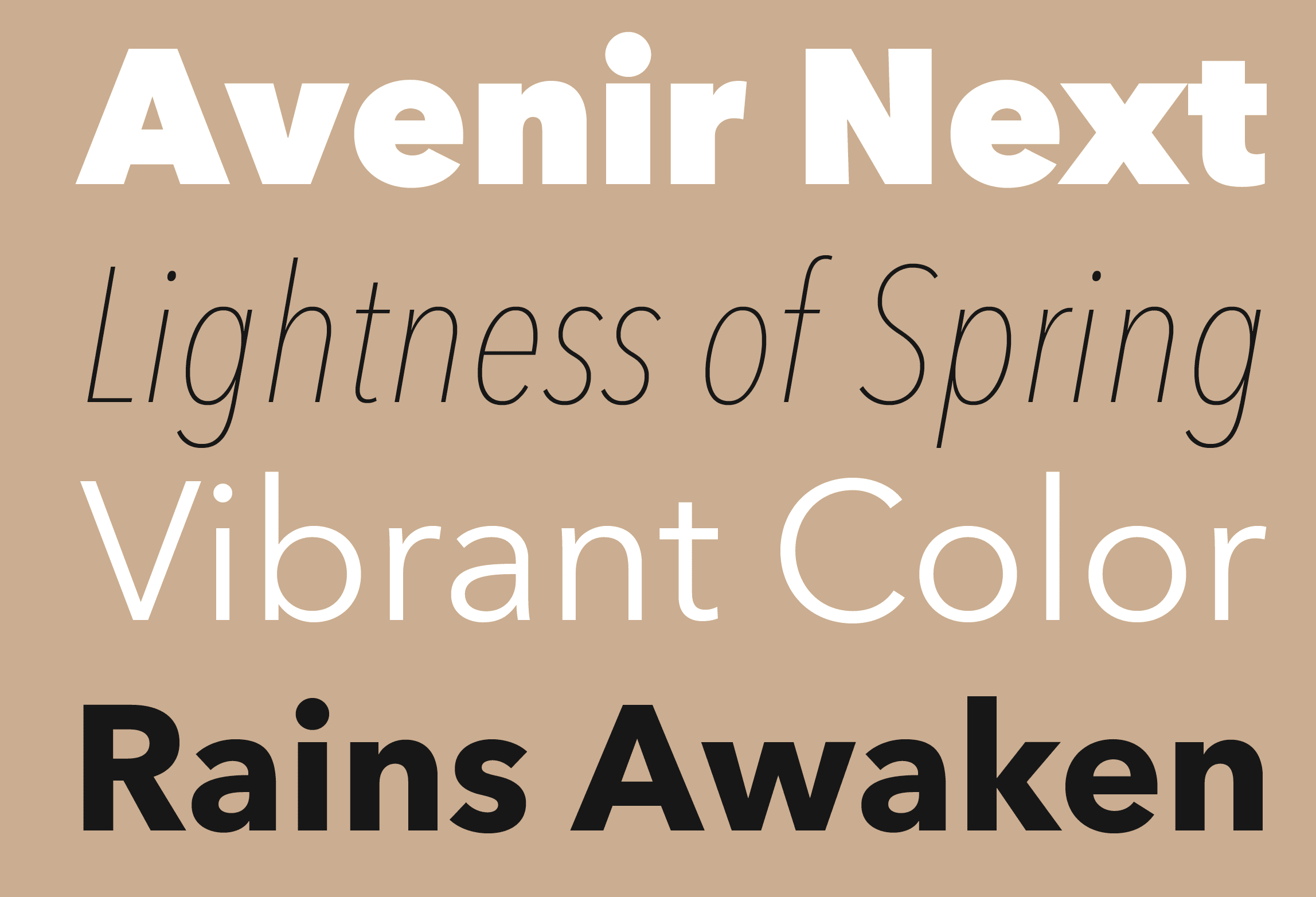
file name: Akira Kobayashi Avenir Next 2010
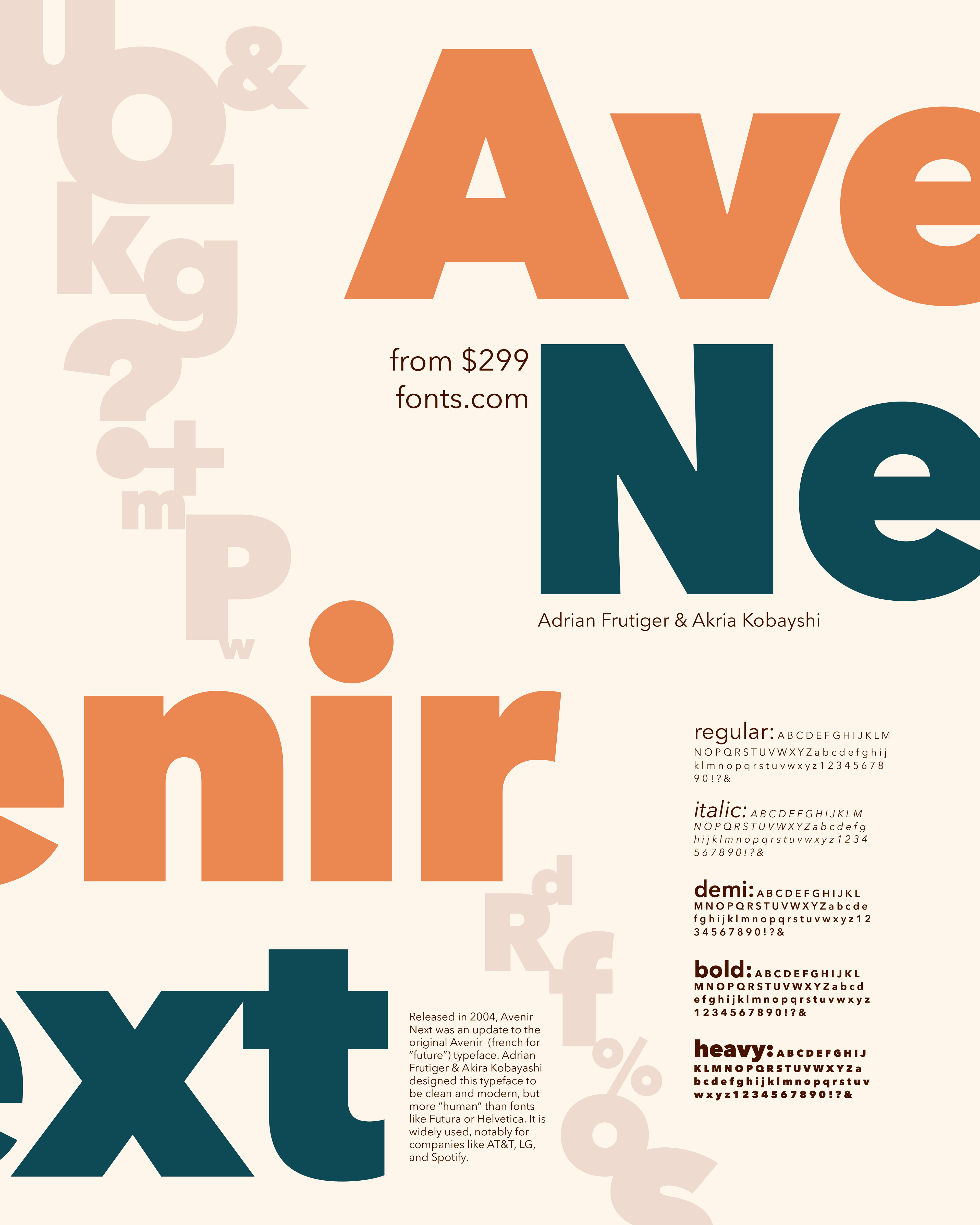
file name: Akira Kobayashi Avenir Next 2010 after Adrian Frutiger Poster by Katie Radford 2018
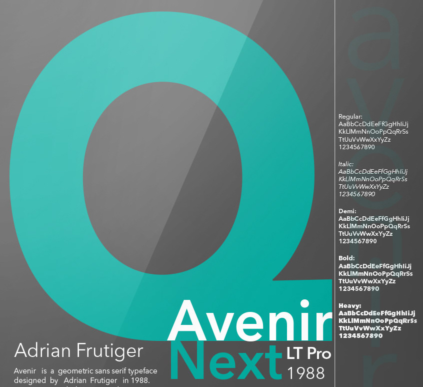
file name: Akira Kobayashi Avenir Next 2010 after Adrian Frutiger Poster by Mc Kell Shuster 2019

file name: Akira Kobayashi Sandra Winter Avenir Next Rounded 2012

file name: Akira Kobayashi Avenir Next 2010 after Adrian Frutiger Poster by Hailey Holden 2017

file name: Akira Kobayashi Sandra Winter Avenir Next Rounded 2012b

file name: Akira Kobayashi Sandra Winter Avenir Next Rounded 2012c

file name: Akira Kobayashi Sandra Winter Avenir Next Rounded 2012d

file name: Akira Kobayashi Avenir Next 2010i

file name: Akira Kobayashi Avenir Next 2010h

file name: Akira Kobayashi Avenir Next Pro 2010d

file name: Akira Kobayashi Avenir Next 2010 after Adrian Frutiger Poster by Mackenzie Duke 2017

file name: Akira Kobayashi Helvetica Neuee Text Pro Medium 2013
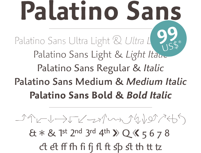
file name: Akira Kobayashi Hermann Zapf Palatino Sans 2006
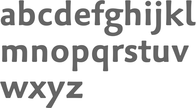
file name: Akira Kobayashi Hermann Zapf Palatino Sans Pro Bold 2006

file name: Akira Kobayashi Hermann Zapf Palatino Sans Pro Regular 2006
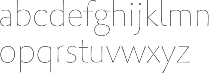
file name: Akira Kobayashi Hermann Zapf Palatino Sans Pro Ultralight 2006

file name: Linotype Trade Gothic

file name: Akira Kobayashi Tom Grace Trade Gothic Next 2008 Poster by Maddison Lackey 2018

file name: Akira Kobayashi Tom Grace Trade Gothic Next 2008 Poster by Stephanie Pond 2016

file name: Akira Kobayashi Tom Grace Trade Gothic Next 2008 Poster by Ryan Watt 2016

file name: Akira Kobayashi Tom Grace Trade Gothic Next 2008 Poster by Marlee Encarnation 2017

file name: Akira Kobayashi Trade Gothic Next 2008

file name: Akira Kobayashi Trade Gothic Next 2008 Poster by Kaylee Holmstead 2016

file name: Akira Kobayashi Conrad 1999

file name: Akira Kobayashi Cosmiqua 2007

file name: Hermann Zapf Akira Kobayashi Optima Nova 2002
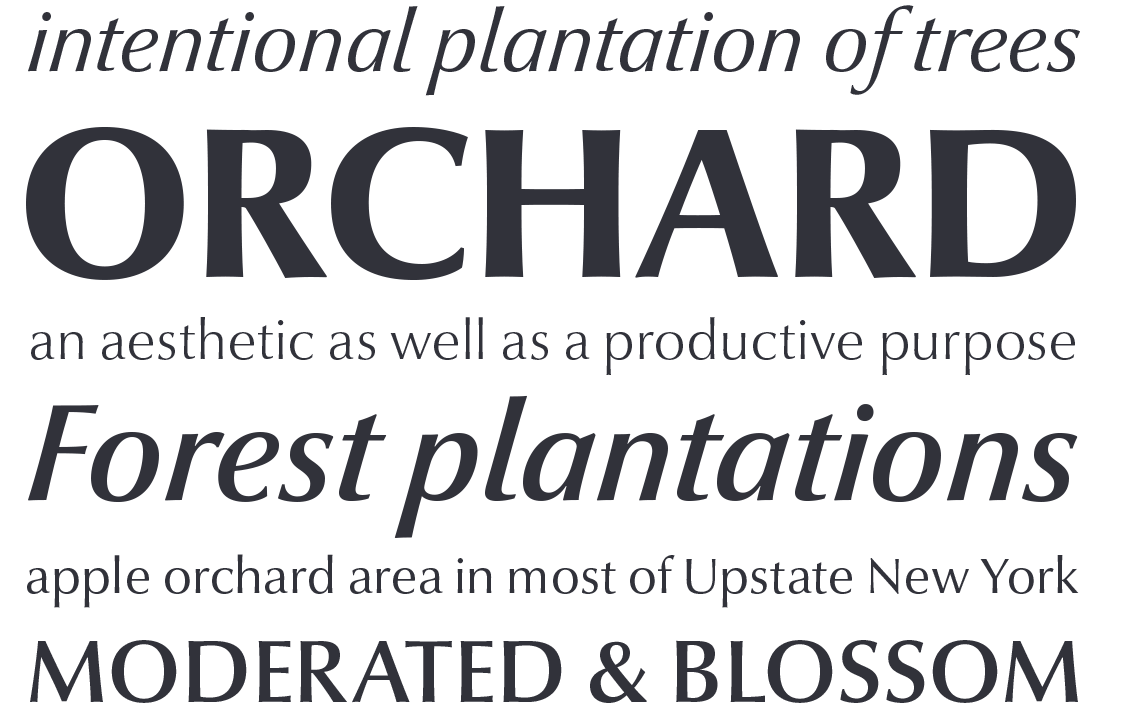
file name: Hermann Zapf Akira Kobayashi Optima Nova 2002

file name: Optima Nova
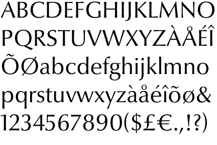
file name: Optima Nova

file name: Akira Kobayashi Eurostile Next 2008b

file name: Akira Kobayashi Eurostile Candy Pro 2013

file name: Akira Kobayashi Eurostile Next Pro Bold 2013e

file name: Akira Kobayashi Eurostile Next 2008

file name: Akira Kobayashi Eurostile Next Pro 2013

file name: Akira Kobayashi Eurostile Next Pro 2013b

file name: Akira Kobayashi Eurostile Next Pro 2013c

file name: Akira Kobayashi Eurostile Next Pro 2013d

file name: Akira Kobayashi Eurostile Next Pro Bold 2013

file name: Akira Kobayashi Eurostile Next Pro Condensed 2013

file name: Akira Kobayashi Eurostile Next Pro Semibold 2013

file name: Akira Kobayashi Pic

file name: Pic atypi2002 Akira Kobayashi

file name: Pic Kobayashi@klingspor

file name: Pic Akira

file name: Pic Akira Kobayashi

file name: Pic Akira Kobayashi2
| | |
|
Luc Devroye ⦿ School of Computer Science ⦿ McGill University Montreal, Canada H3A 2K6 ⦿ lucdevroye@gmail.com ⦿ https://luc.devroye.org ⦿ https://luc.devroye.org/fonts.html |

