TYPE DESIGN INFORMATION PAGE last updated on Wed May 6 16:29:15 EDT 2026
FONT RECOGNITION VIA FONT MOOSE
|
|
|
|
Misha Beletsky
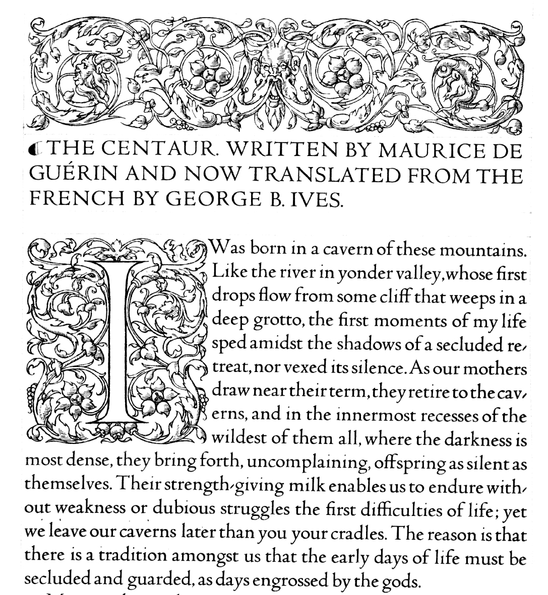
Misha Beletsky is the President of The Typophiles and Art Director at Abbeville Press, a publisher of fine illustrated books in New York. He has earned a number of awards from design competitions, including AIGA Fifty Books of the Year, New York Book Show, I.D. Magazine Design Review, and Carl Hertzog Award for Excellence in Fine Printing. Misha is an Editorial Board Member of Type Journal and a member of the Non-Latin Advisory Board of the Type Directors Club. In 2016, Jerry Kelly and Misha Beletsky coauthored The Noblest Roman: A History of the Centaur Types of Bruce Rogers (The Book Club of California). The press release: is an immersive dive into the history of the Centaur typeface, complete with rarely seen drawings and proofs from the Monotype archives and the Library of Congress. Our fine press edition (limited to 300) comes complete with slipcase, an exclusive broadside printed from foundry capitals newly recast for the first time in 100 years, and an essay by author Jerry Kelly on the use of Centaur by the Grabhorn Press. The synopsis of the book: Bruce Rogers was a towering figure in the history of graphic arts, and remains one of the most important American book designers of the twentieth century. The unrivaled subtlety of his style also sets apart Rogers's most widespread accomplishment, the Centaur type. This type was born of the late-nineteenth-century quest to create a modern revival of Nicolas Jenson's humanist roman of 1470, long held by scholars to be both the origin and the apogee of the Venetian roman, and which has inspired designers from William Morris to Robert Slimbach to attempt types based on Jenson's graceful proportions, elegant spacing, and evenness of color. None of these succeeded as well as Bruce Rogers's Centaur, which stands as a perennial classic, as sublime as it is impossible to replicate. According to Daniel Berkeley Updike, Centaur proved "one of the best roman fonts designed in America, and of its kind, the best anywhere." Stanley Morison praised Centaur for the design's departures from the Jenson original, calling attention to its "unique grace [and] modest individuality." It was Robert Grabhorn who called Centaur "the noblest roman of them all," and the high opinion of this type still holds today. In her introduction to this book, Amelia Hugill-Fontanel, Associate Curator of RIT's Cary Graphic Arts Collection, writes, "Rogers's enlightened hand created an extraordinary masterpiece of type design, melding the best characteristics of the fifteenth and twentieth centuries." The story of Bruce Rogers's work on his Centaur type parallels key developments in the history of modern design and aesthetics, and involves many of the major figures in twentieth-century typography---designers, punchcutters, printers, publishers, and historians---who appear in the numerous and informative sidebar biographies that augment the primary text. Set in Jerry Kelly's recent digital rendering of Rogers's original foundry Centaur, this engaging narrative is the result of significant new research, and is lushly illustrated with original drawings and proofs from the Monotype archives and the Library of Congress: photographs, type specimens, sample text pages, broadsides, promotional brochures, letters, and other ephemera, including a tipped-in type specimen letterpress printed from the newly recast foundry capitals---a type that has not been cast for over a century. Every iteration of Centaur is chronicled, from the original foundry type that was cast and acquired for the exclusive use by the Metropolitan Museum of Art, to the type's conversion to the Monotype machine involving stanley Morison, and its ultimate adaptation as a digital face. |
EXTERNAL LINKS |
| | |

file name: Misha Beletsky Jerry Kelly The Noblest Roman 2016

file name: Misha Beletsky Jerry Kelly The Noblest Roman 2016b
| | |
|
Luc Devroye ⦿ School of Computer Science ⦿ McGill University Montreal, Canada H3A 2K6 ⦿ lucdevroye@gmail.com ⦿ https://luc.devroye.org ⦿ https://luc.devroye.org/fonts.html |
