TYPE DESIGN INFORMATION PAGE last updated on Thu Apr 16 21:42:33 EDT 2026
FONT RECOGNITION VIA FONT MOOSE
|
|
|
|
|
The Rupee Symbol | ||
|
|
|
|
SWITCH TO INDEX FILE
Creator of free Punjabi typewriter typefaces in 2009: Ariv Mdr, Ariv Ndr. He also made English with Indian Rupee (2003). [Google] [More] ⦿ | |
Bruno Maag
| |
Designer of the new rupee symbol in 2010. The new symbol is a blend of the Devanagari "Ra" and the Roman capital "R" without the stem. Speaker at ATypI 2012 in Hong Kong: Black and white in Indian typography. Speaker at ATypI 2013 in Amsterdam: Indian politics: typography. In that talk, he attempts to understand the usage of multicolor typography that challenges the conventional typography principles and norms. [Google] [More] ⦿ | |
Dalton Maag
|
The Dalton Maag team designed these commercial fonts:
Fonts sold at Fontworks, and through the Bitstream Type Odyssey CD (2001). At the ATypI in 2001 in Copenhagen, he stunned the audience by announcing that he would never again make fonts for the general public. From now on, he would just do custom fonts out of his office in London. And then he delighted us with the world premiere of two custom font families, one for BMW (BMWType, 2000, a softer version of Helvetica, with a more virile "a"; some fonts are called BMWHelvetica), and one for the BMW Mini in 2001 (called MINIType: this family comprises MINITypeRegular-Bold, MINITypeHeadline-Regular, MINITypeHeadline-Bold, MINITypeRegular-Regular). Other custom typefaces: Tottenham Hotspur (2006), Teletext Signature (by Basten Greenhill Andrews and Dalton Maag), Skoda (Skoda Sans CE by Dalton Maag is based on Skoda Formata by Bernd Möllenstädt and MetaDesign London), UPC Digital, BT (for British Telecommunications), Coop Switzerland (for Coop Schweiz), eircom, Lambeth Council, Tesco (2002), PPP Healthcare, ThyssenKrup (Dalton Maag sold his soul to these notorious arms dealers; TK Type is the name of the house font), Co Headline (2006), Co Text (2006, now a commercial font), Telewest Broadband, Toyota Text and Display (2008), TUIType, HPSans (for Hewlett-Packard, 1997). His custom Vodafone family (sans) (2005) is based on InterFace. In 2011, Dalton Maag created Nokia Pure for Nokia's identity and cellphones, to replace Erik Spiekermann's Nokia Sans (2002). The Nokia Pure typeface has rounder letters, and is simultaneously more legible and more rhythmic. In 2010, the Dalton Maag team consisted of Bruno Maag and David Marshall as managing and operations directors, and Vincent Connare as production manager. The type designers are Amélie Bonet, Ron Carpenter, Fabio Haag, Lukas Paltram and Malcolm Wooden. In 2015, Kindle picked the custom serif font Bookerly by Dalton Maag for their typeface. Still in 2015, Dalton Maag custom designed the sans typeface family Amazon Ember for Amazon for use in its Kindle Oasis. Free download of both Amazon Ember and Bookerly. Dalton Maag created the custom typeface family Facebook Sans in 2017. Bressay (2016). Stuart Brown led the design and did the engineering for Bressay (design by Tom Foley, Selma Losch, and Spike Spondike, at Dalton Maag, London), which won an award at TDC 2016. Later additions include Bressay Arabic [designers not identified by Adobe] and Bressay Devanagari [designers not mentioned by Adobe]. ATT Aleck is a large custom typeface family designed in 2016. Netflix Sans (2018): Netflix replaced Gotham to combat spiraling licensing costs and commissioned its own bespoke typeface: Netflix Sans under design lead Noah Nathan. Free download. The family include Netflix Sans Icon (2017). Comments by designers at The Daily Orange. In 2018, Dalton Maag designed the custom typefaces Itau Display and Itau Text for Itau Unibanco, a large Brazilian bank. In 2019, Dalton Maag produced a corporate typeface for Air Arabia. Venn (2019, Bruno Maag). A 5 weight 5 width corporate branding sans typeface, with an option to get Venn Variable. Typefaces from 2020: Dark Mode VF (a humanist sans designed specifically for digital user interfaces, offering subtle grade adjustments to counteract the effects of setting light type on a dark background, as is common with many dark mode digital reading environments; it has two axis in its variable type format---weight and dark mode), Highgate VF (a variable humanist sans inspired by traditional British stone carving), Goldman Sans (a free clean sans family that includes three variable fonts; Goldman Sachs lets you use it except to criticize the company or any other capitalist pigs). Interview in 2012 in which he stresses that typefaces should above all be functional. View the Dalton Maag typeface library. Speaker at ATypI 2016 in Warsaw and at ATypi 2015 in Sao Paulo, where he gave an electrifying talk on type design for dyslexics (with Alessia Nicotra). Speaker at ATypI 2016 in Warsaw. Speaker at ATypI 2017 Montreal and at ATypI 2018 in Antwerp. Adobe link. [Google] [MyFonts] [More] ⦿ |
A free rupee symbol font by Foradian Technologies: Rupee (2010). Rupee Foradian (2010) is an improved version of it. Still, on my computer, the fonts are faulty---the rupee symbols appear superimposed on other charactes. [Google] [More] ⦿ | |
Specs of the Indian rupee symbol that was approved in July 2010. It was selected from among more than 3000 proposals. Scans of rejections: i, ii, iii. [Google] [More] ⦿ | |
Makers of a free rupee font called Rupy Font (2010). It has 26 tyles, but not one of them follows the original specifications. [Google] [More] ⦿ | |
Creator of the free rupee font Jay Ho (2010). Fontspace link. As explained here, the new rupee symbol was designed in 2010 by Bombay IIT post-graduate D. Udaya Kumar. [Google] [More] ⦿ | |
Kathryn Wescott
| |
Manav Dhiman
| |
ManVsType
|
In 2021, he released the 11-style display family MV Bombay. This variable font has an RRs ligature that automatically creates the rupee sign. In general, Bombay is inspired by the colonial version of the city. Personal web page. [Google] [MyFonts] [More] ⦿ |
Michael Everson
| |
Raju Das presents a free rupee font called Indian Rupee, this time with the symbol mapped to Unicode character U+20A8, the position of the old Rs symbol. [Google] [More] ⦿ | |
Ubuntu (2010) is a set of four styles of a free font developed by the team of Dalton Maag. This font supports the Indian rupee symbol. The glyph for the Ubuntu Font Family was contributed by Rodrigo Rivas Costa in 2010. [Google] [More] ⦿ | |
Rupakara
| Michael Everson's free font Rupakara is a sans-serif font created primarily to give support to the newly-invented Indian rupee sign, which has been assigned to U+20B9, though the standardization process for it has not been completed. Its basic alphabet was designed in 2005 by Thatcher Ulrich, who put his font, called Tuffy, into the public domain. In addition to supporting the Currency Signs block of the Universal Character Set, Rupakara also supports all of the letters commonly used to transliterate Indian languages. Interview with Michael Everson. [Google] [More] ⦿ |
Rupee, ruble and Euro
| A BBC article by Kathryn Wescott on the introduction of new symbols for currencies. [Google] [More] ⦿ |
Creator of IndusRupee and Times IndusRupee Roman (2010), which contain the new rupee symbol. [Google] [More] ⦿ | |
Maker of a free rupee font, Rupee (2010). [Google] [More] ⦿ | |
Manojit (TechFat) created the free open source font RupeeTechFat (2010), which contains the new rupee symbol. Palle Jorgensen made a type 1 font and provided TeX support. [Google] [More] ⦿ | |
New York-based programmer who created the free sans family Tuffy (2005). It has a large character set that covers Greek, Cyrillic, and Indic, and has the new rupee symbol. In 2010, Barta Karoly updated the Tuffy package and placed it here. Thatcher writes: Karoly Barta did a ton of work creating Greek, Cyrillic and accented characters for Tuffy, which he has generously contributed back to the public domain Tuffy. Also, Michael Everson created a Tuffy-derived font, Rupakara, which adds the new Indian Rupee Sign, plus many other currency symbols, and a full set of letters commonly used to transliterate Indian languages. Rupakara is under the SIL Open Font License, but Michael also agreed to let me merge his new characters into the public domain Tuffy. Kernest link. Klingspor link. Dafont link. Abstract Fonts link. Open Font Library link. [Google] [More] ⦿ |
|
|
|
|


 [
[ Dr. D. Udaya Kumar is an Assistant Professor at the Indian Institute of Technology Guwahati, India. He has a Ph.D. and Master's degree in Design from the Industrial Design Centre, IIT Bombay. He obtained his Bachelor's degree in Architecture from the School of Architecture and Planning, Anna University. He worked as a design head of the magazine "Intelligent Computing CHIP". His areas of interest include Visual Communication, Graphic Design, Typography, Type Design with special focus on Tamil Typography and Architecture.
  Swiss designer Bruno Maag (b. Zürich) founded Dalton Maag in 1991, and set up shop in Brixton, South London. He serves the corporate market with innovative type designs, but also has a retail font line. Ex-Monotype designer Ron Carpenter designs type for the foundry. In the past, type designers Veronika Burian worked for Dalton Maag. A graduate of the Basel School of Design, who worked at Stempel and was invitedd by Rene Kerfante to Join Monotype to start up a custom type department. After that, he set up Dalton Maag with his wife Liz Dalton. He has built the company into a 40-employee enterprise with offices in London, Boston, Brazil (where the main type designer is Fabio Luiz Haag), Vienna and Hong Kong.
  [
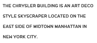
[ ManVsType is the professional type design practice of New Delhi-based designer Manav Dhiman. During his studies at MIT Institute of Design, Mumbai-based Manav Dhiman created the art deco typeface Chrysler (2016), which is named after New York's Chrysler building. In 2015, he designed various sets of icons, such as Dressing Up, and Connection.