| | |
The best commercial typefaces of 2015: Luc's selection
|
 This is my own selection of the best commercial typefaces published in 2015, grouped by category.
 Text typefaces:  Strato Pro (Olivier Gourvat). Strato Pro (Olivier Gourvat).  Trueca (Senso Type). Humanistic and very legible. Trueca (Senso Type). Humanistic and very legible.  Marco (Toshi Omagari, 2011; produced by Type Together in 2015). A humanist text family with calligraphic roots for Latin, Cyrillic and Greek. Marco (Toshi Omagari, 2011; produced by Type Together in 2015). A humanist text family with calligraphic roots for Latin, Cyrillic and Greek.  Brenta (Ludwig Ubele). A sharp-edged wedge serif typeface family. Brenta (Ludwig Ubele). A sharp-edged wedge serif typeface family.  Neacademia Subhead (Sergei Egorov, Rosetta Type). Neacademia is Egorov's impressive revival of Aldine / Venetian types, first developed in 2009. Its Subhead subfamily for Latin and Cyrillic was added in 2015. Neacademia Subhead (Sergei Egorov, Rosetta Type). Neacademia is Egorov's impressive revival of Aldine / Venetian types, first developed in 2009. Its Subhead subfamily for Latin and Cyrillic was added in 2015.
| Sans typefaces: - URW Geometric (Jörn Oelsner). Inspired by the German geometric typefaces of the 1920s.
 Cobalte (Jean-Baptiste Levée). Lapidary and flared, and very warm and legible in long texts. Cobalte (Jean-Baptiste Levée). Lapidary and flared, and very warm and legible in long texts. 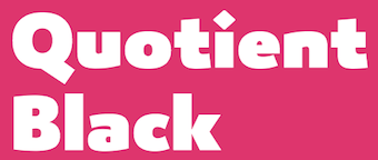 Quotient (James Montalbano). James describes it as Trajan Sans. Quotient (James Montalbano). James describes it as Trajan Sans.  Mallory (Tobias Frere-Jones). Mallory (Tobias Frere-Jones). - Comspot (TypeMates). A useful and readable rounded sans for mobile devices and advertizing.
 Quenda (Marc Lohner). Quenda (Marc Lohner).  Gill Sans Nova (George Ryan, Monotype). A 48 weight extension of Gill Sans, with coverage of Greek and Cyrillic, and plenty of fancy styles such as Deco, Inline and Shadow. Gill Sans Nova (George Ryan, Monotype). A 48 weight extension of Gill Sans, with coverage of Greek and Cyrillic, and plenty of fancy styles such as Deco, Inline and Shadow.  Setimo (Fernando Caro, at Dalton Maag). In the corporate sans category. Setimo (Fernando Caro, at Dalton Maag). In the corporate sans category. - Core Sans GS (S-Core). A rounded version of the earlier Core Sans G typeface family.
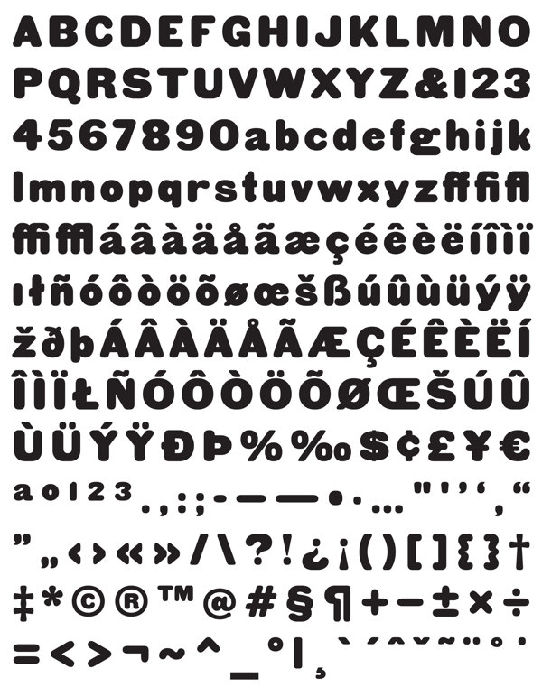
 Woodford Bourne (Paulo Goode). A 19th century grotesque family. Woodford Bourne (Paulo Goode). A 19th century grotesque family.  Bill Corporate (Oliver Jeschke, OGJ Type Design). A geometric family inspired by Max Bill. Bill Corporate (Oliver Jeschke, OGJ Type Design). A geometric family inspired by Max Bill.  Objektiv (Bruno Mello at Dalton Maag). Objektiv (Bruno Mello at Dalton Maag). 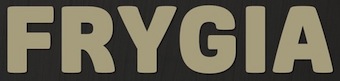 Frygia (Stawix Ruecha and Kawisara Vacharaprucks). A soft industrial sans family. Frygia (Stawix Ruecha and Kawisara Vacharaprucks). A soft industrial sans family.  Akko Pro Condensed (Akira Kobayashi, Linotype). Akko Pro Condensed (Akira Kobayashi, Linotype).  Abrade (Jason Vandenberg). A 12-style geometric sans with medium x-height and perfect rhythm. Abrade (Jason Vandenberg). A 12-style geometric sans with medium x-height and perfect rhythm.  PF Centro Sans Condensed (Parachute). PF Centro Sans Condensed (Parachute).  Vito (Thomas Gabriel, Typejockeys): Masculine and sporty for adrenaline junkies, reliable and elegant for serious typographers, but with a touch of bling for high snobiety. Vito (Thomas Gabriel, Typejockeys): Masculine and sporty for adrenaline junkies, reliable and elegant for serious typographers, but with a touch of bling for high snobiety.  Diodrum (Indian Type Foundry). A great set of organic / spurless sans typefaces with inflated outlines and a friendly character. Diodrum (Indian Type Foundry). A great set of organic / spurless sans typefaces with inflated outlines and a friendly character.  Druk, Druk Text, Druk Wide, Druk Condensed and Druk Text Wide (Berton Hasebe, Commercial Type). An unbelievable collection with extreme styles that will appeal to all tastes. My favorite in this bold collection is Druk XX Condensed Super. Druk, Druk Text, Druk Wide, Druk Condensed and Druk Text Wide (Berton Hasebe, Commercial Type). An unbelievable collection with extreme styles that will appeal to all tastes. My favorite in this bold collection is Druk XX Condensed Super.  Canal (Étienne Aubert Bonn). A workhorse sans designed to recreate the atmosphere of blue collar America in the 19th and 20th centuries, named after the industrial Lachine Canal in Montreal. Canal (Étienne Aubert Bonn). A workhorse sans designed to recreate the atmosphere of blue collar America in the 19th and 20th centuries, named after the industrial Lachine Canal in Montreal.  Muller (Radomir Tinkov, Fontfabric). Twenty styles from hairline to heavy, and a wider glyph projection than normal. Muller (Radomir Tinkov, Fontfabric). Twenty styles from hairline to heavy, and a wider glyph projection than normal.  Scandia (Eric Olson, Process Type Foundry). Scandia (Eric Olson, Process Type Foundry).  Geomanist (Atipo). Nine styles from hairline to black, clean and stylish---the geometric parent clearly dominated its humanist partner. Geomanist (Atipo). Nine styles from hairline to black, clean and stylish---the geometric parent clearly dominated its humanist partner.  Nordikka Sans (Luciano Vergara). Normally I do not like tall x-height or Scandinavian look, but I will make an exception for this one while waiting for a Norwegian ferry in the North Sea fog. Nordikka Sans (Luciano Vergara). Normally I do not like tall x-height or Scandinavian look, but I will make an exception for this one while waiting for a Norwegian ferry in the North Sea fog. 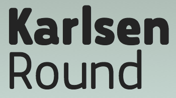 Karlsen Round (Type Union). A 14-style rounded mobile device sans family. Karlsen Round (Type Union). A 14-style rounded mobile device sans family.  Panton (Fontfabric). A broad 34-weight sans family with softened geometric forms. With icons and a Cyrillic and a made-for-iphone look, this is sure to be a mega-hit. I mean a blockbuster. Panton (Fontfabric). A broad 34-weight sans family with softened geometric forms. With icons and a Cyrillic and a made-for-iphone look, this is sure to be a mega-hit. I mean a blockbuster.  Amsi Pro (Stawix Ruecha). Inspired by Block Berthold, this rounded sans with dwarfy descenders shines in the narrow and ultra fat corner of the spectrum. Amsi Pro (Stawix Ruecha). Inspired by Block Berthold, this rounded sans with dwarfy descenders shines in the narrow and ultra fat corner of the spectrum.  Don Sans (Andreas Stötzner). Like good wine and Billie Holiday, anything Andreas touches sparkles. An industrial sturdy workhorse no-nonsense sans. Don Sans (Andreas Stötzner). Like good wine and Billie Holiday, anything Andreas touches sparkles. An industrial sturdy workhorse no-nonsense sans.
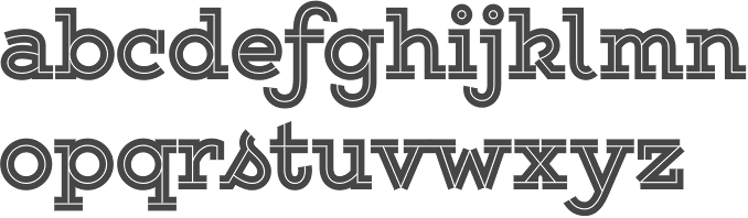
| Type systems: 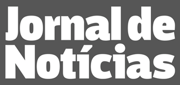 Jornal de Notícias (Pedro Leal). A complete set of newspaper types with special attention paid to the condensed and agate (micro) styles. Jornal de Notícias (Pedro Leal). A complete set of newspaper types with special attention paid to the condensed and agate (micro) styles. 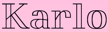 Karlo (Sans, Serif, Open) designed by Sofie Beier for Die Gestalten. Karlo (Sans, Serif, Open) designed by Sofie Beier for Die Gestalten.
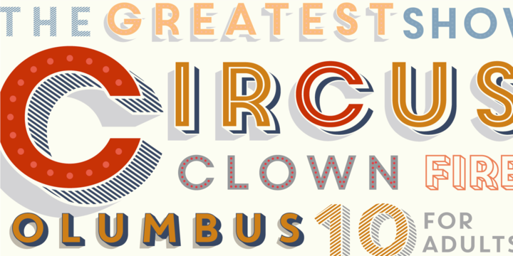
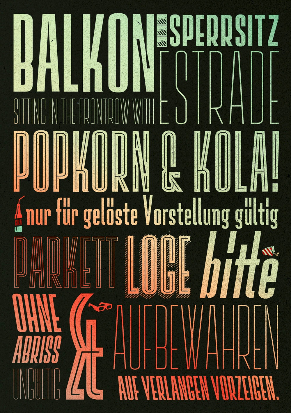
| | Art deco typefaces: | | Hipster typefaces: | | Script typefaces: | Sketched, Layered or Poster typefaces:  Triump Rough (Enrique Hernandez at Latinotype). Triump Rough (Enrique Hernandez at Latinotype).  Balboa Plus (Jim Parkinson). An extension of his earlier condensed sans headline typeface Balboa (2001). Balboa Plus (Jim Parkinson). An extension of his earlier condensed sans headline typeface Balboa (2001).  Mrs Onion (Hipopotam Studio). Mrs Onion (Hipopotam Studio).  Smile Pro (Rodrigo Araya and Andrey Kudryavtsev). Smile Pro (Rodrigo Araya and Andrey Kudryavtsev).  Brim Narrow (Jamie Clarke). Brim Narrow (Jamie Clarke).  Intro Rust (Ani Petrova, Svetoslav Simov and Radomir Tinkov at Fontfabric). A 214-style roughened version of Intro. Intro Rust (Ani Petrova, Svetoslav Simov and Radomir Tinkov at Fontfabric). A 214-style roughened version of Intro. - Le Havre Hand (Jeremy Dooley). A large sketched layered typeface family.
- Granz (Pintassilgo). Based on the beatnik style retro lettering on David Stone Martin's jazz album covers.
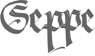
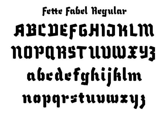
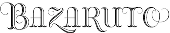 Bazaruto (Brian J. Bonislawsky and Jim Lyles). Bazaruto (Brian J. Bonislawsky and Jim Lyles).  Natura (Giuseppe Salerno, Resistenza). This has a fountain pen script and accompanying icons, stamps and notebook styles. Natura (Giuseppe Salerno, Resistenza). This has a fountain pen script and accompanying icons, stamps and notebook styles.  Irrlicht (Ari Hausel, Aarhaus) is based on Christian Heinrich Kleukens's 1923 typeface Judith Type. The is pure German expressionism for the 21st century. Perfection. Irrlicht (Ari Hausel, Aarhaus) is based on Christian Heinrich Kleukens's 1923 typeface Judith Type. The is pure German expressionism for the 21st century. Perfection.  Babar (Oscar Guerrero). Babar (Oscar Guerrero).  Crafty Caps (Art of Sun). Crafty Caps (Art of Sun).  Signpost (Keith Tricker). Signpost (Keith Tricker).
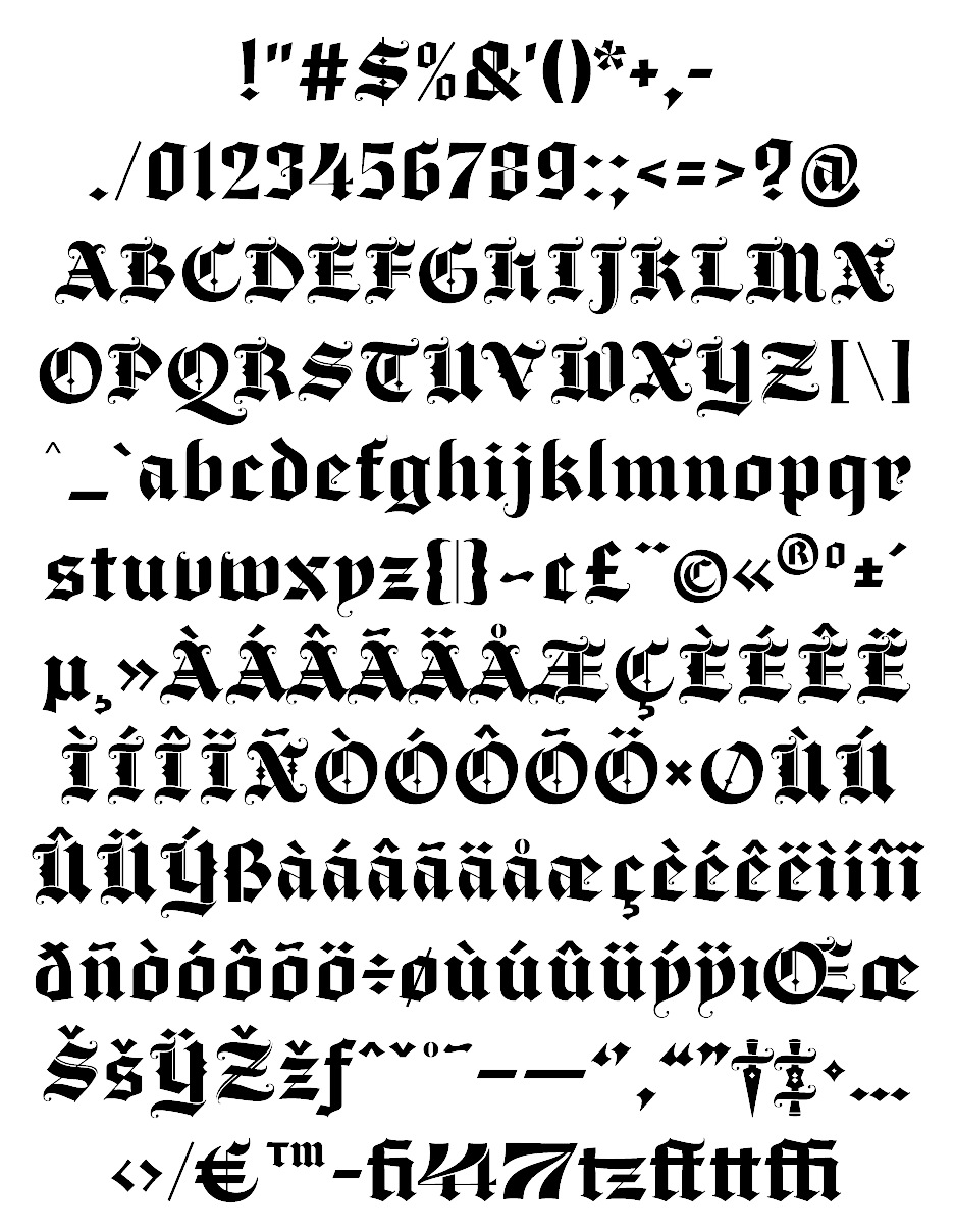
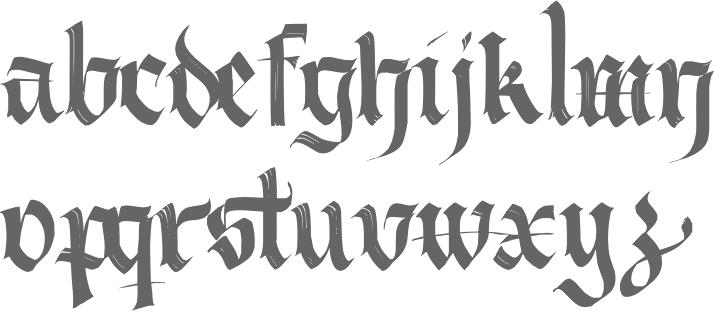
| | Blackletter typefaces: | | Dingbats and ornaments: | Garalde typefaces:  Guillaume (George Tulloch). Guillaume (George Tulloch). 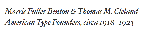 ATF Garamond (Mark van Bronkhorst, Igino Marini, & Ben Kiel). An 18-style family based on the Garamond designed between 1918 and 1923 by Morris Fuller Benton and Thomas M. Cleland at ATF. ATF Garamond (Mark van Bronkhorst, Igino Marini, & Ben Kiel). An 18-style family based on the Garamond designed between 1918 and 1923 by Morris Fuller Benton and Thomas M. Cleland at ATF.
| Display typefaces:  ATC Duel (Alex Sheyn). ATC Duel (Alex Sheyn).  Salvaje (Cristian Vargas). An exuberant flashy in-your-face typeface family inspired by Birds of Paradise and designed at the KABK in Den Haag. Salvaje (Cristian Vargas). An exuberant flashy in-your-face typeface family inspired by Birds of Paradise and designed at the KABK in Den Haag.  Moholy Sans (Laszlo Mihaly Naske). Moholy Sans (Laszlo Mihaly Naske).  Stolzl Display (Mariya V. Pigoulevskaya) and Stolzl. Named after Gunta Stölzl, the Bauhaus's only female master. Stolzl Display (Mariya V. Pigoulevskaya) and Stolzl. Named after Gunta Stölzl, the Bauhaus's only female master.  Dalat (Kasper Pyndt). Dalat (Kasper Pyndt). 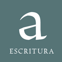 Escritura (Ricardo Santos). Display text type with renaissance elements. Escritura (Ricardo Santos). Display text type with renaissance elements. - Emeritus (Galen Lawson). A lapidary typeface family.
 OCR-T (Martin Tiefenthaler). OCR-T (Martin Tiefenthaler). - Proza Display (Jasper de Waard, Bureau Roffa). The flashy sister of Proza (2013).
 Gosdin (Andrew Walsh, TypeTrough). An elegant inline serif titling typeface. Gosdin (Andrew Walsh, TypeTrough). An elegant inline serif titling typeface.  RNS Obesa Fat Font (Yorlmar Campos). RNS Obesa Fat Font (Yorlmar Campos). - Nord Form (Letterwerk). A beveled typeface with three accompanying styles.
 Piepie (Ryoichi Tsunakawa). Fat was never this beautiful. Piepie (Ryoichi Tsunakawa). Fat was never this beautiful. 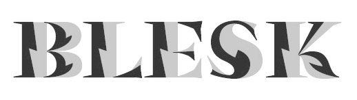 Blesk (Ksenya Samarskaya). Blesk (Ksenya Samarskaya).  Bautype (Malwin Béla Hürkey). Bautype (Malwin Béla Hürkey).
| Slab serif typefaces:  Calanda (Dieter Hofrichter). Calanda (Dieter Hofrichter). - Clarendon Graphic (François Rappo, Optimo). With 26 styles including stencils and all necessary Opentype features, this optically optimized typeface family replaces all previous Clarendons.
| Copperplate:  Dolcetto (Drew Melton). Dolcetto (Drew Melton).  Glade (Alison Argento). A formal calligraphic copperplate script a useful suite of widths. Glade (Alison Argento). A formal calligraphic copperplate script a useful suite of widths.  Valentia (Olcar Alcaide). Valentia (Olcar Alcaide).  Barracuda (Vates Design). Barracuda (Vates Design).
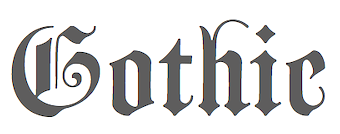
| Wood type revivals: 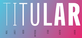 Titular (Latinotype). Not a revival, but a large headline family inspired by wood type. Titular (Latinotype). Not a revival, but a large headline family inspired by wood type. 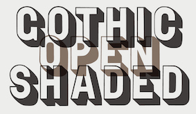 Gothic Open Shaded (Matt Braun, Wood Type Revivals). After a typeface shown in George Nesbitt's 1838 catalog. Gothic Open Shaded (Matt Braun, Wood Type Revivals). After a typeface shown in George Nesbitt's 1838 catalog.
| Letterpress emulation:  Racon (Ahmet Altun). Racon (Ahmet Altun). 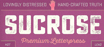 Sucrose (Ryan Martinson). Sucrose (Ryan Martinson).  Bronn Rust (Fontfabric). Bronn Rust (Fontfabric). - Caston (Gearwright). A revival of Morris Fuller Benton's Card Litho (1917).
- True North Textures (Cindy Kinash and Charles Gibbons).
| | Didone typefaces: | Fashion mag typefaces:  D'Lotus (Kevin He). D'Lotus (Kevin He).  Rastignac Black (Tomato Kosir). A fat face didone. Rastignac Black (Tomato Kosir). A fat face didone.  Grandesque (Julian Hrankov). Grandesque (Julian Hrankov).  Lingerie (Moshik Nadav). Lingerie (Moshik Nadav).  Revista (Paula Nazal Selaive, Marcelo Quiroz and Daniel Hernandez, at Latinotype) is a fashion mag typographic system. It has Revista Script (connected style), Revista Stencil, Revista Dingbats, Revista Inline and the didone Revista all caps set of typefaces. Revista (Paula Nazal Selaive, Marcelo Quiroz and Daniel Hernandez, at Latinotype) is a fashion mag typographic system. It has Revista Script (connected style), Revista Stencil, Revista Dingbats, Revista Inline and the didone Revista all caps set of typefaces. - Poster (Inigo Jerez, Textaxis). A fat face didone. Developed between 2008 and 2014 and published in 2015.
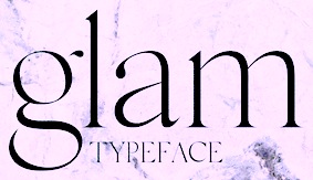 Glam (Rakel Thomas). This typeface is used in Glamour Iceland Magazine. Glam (Rakel Thomas). This typeface is used in Glamour Iceland Magazine. 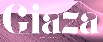 Giaza (Anthony James). A fashion mag didone with a free Stencil style. Giaza (Anthony James). A fashion mag didone with a free Stencil style.  Jules (Dino dos Santos and Pedro Leal). This fat fashion mag didone in 45-styles is inspired by several plates from Portuguese calligrapher Antonio Jacintho de Araujo. Jules (Dino dos Santos and Pedro Leal). This fat fashion mag didone in 45-styles is inspired by several plates from Portuguese calligrapher Antonio Jacintho de Araujo.  Lince (Typomancer). A 16-style display family rooted in didones. Lince (Typomancer). A 16-style display family rooted in didones. 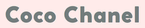 Coco Gothic (Cosimo Lorenzo Pancini, Zetafonts), a small x-height geometric fashion mag sans family named after Coco Chanel: elegant, beautiful, wonderful. Coco Gothic (Cosimo Lorenzo Pancini, Zetafonts), a small x-height geometric fashion mag sans family named after Coco Chanel: elegant, beautiful, wonderful.  Lust Hedonist (Neil Summerour), with Didone, Italic and Script sub-styles. The ultimate fashion mag typeface. Lust Hedonist (Neil Summerour), with Didone, Italic and Script sub-styles. The ultimate fashion mag typeface. - Model (Maximiliano Sproviero).
- Couture (Neil Summerour).
| Stencil typefaces:  Trepa (Josep Patau). Inspired by commercial signs and the 1960s French art movement Graphie Latine. Trepa (Josep Patau). Inspired by commercial signs and the 1960s French art movement Graphie Latine.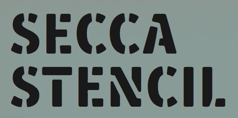 Secca Stencil (Andreas Seidel). Secca Stencil (Andreas Seidel).
| Multilingual typefaces: - Croogla (Sergiy Tkachenko). An informal rounded sans with an almost unicase Latin part that harmonizes perfectly with its Cyrillic companion.
- Koppla (Minjoo Ham). Her graduation typeface at KABK, Koppla covers Latin and Hangul in multiple styles.
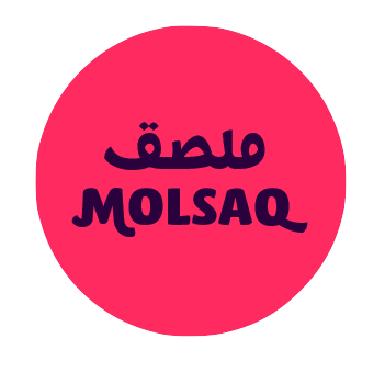 Molsaq Pro (Ali Almasri). An Arabic / Latin rounded poster typeface family with perfect interplay between the different scripts. Molsaq Pro (Ali Almasri). An Arabic / Latin rounded poster typeface family with perfect interplay between the different scripts.  Noort (Juan Bruce). For Latin, Greek and Bengali. Another superb effort by the graduates of the University of Reading. Noort (Juan Bruce). For Latin, Greek and Bengali. Another superb effort by the graduates of the University of Reading.  Lida for Perso-Arabic and Latin. By Borna Izadpanah at the University of Reading. Lida for Perso-Arabic and Latin. By Borna Izadpanah at the University of Reading. - Levnam (Manvel Shmavonyan, Paratype). A flared terminal sans of wide proportions for setting small text. Covers Latin and Cyrillic.
 Kazimir (CSTM, Ilya Ruderman and Yury Ostromentsky). A didone family for Latin and Cyrillic, designed for short texts and headlines. Kazimir (CSTM, Ilya Ruderman and Yury Ostromentsky). A didone family for Latin and Cyrillic, designed for short texts and headlines. - HS Headline by Gunnlaugur Briem and Hasan Abu Afash. This fat calligraphic didone display typeface covers Latin (Briem's contribution) and Arabic (by Afash, based on the simple lines of Naskh calligraphy).
 Finos (Anastasia Dimitriadi and Iordanis Passas). A gorgeous typeface family based on Greek retro cinema. Finos (Anastasia Dimitriadi and Iordanis Passas). A gorgeous typeface family based on Greek retro cinema.
| Technical drawing:  R&C (Jean Boyault). R&C (Jean Boyault).
| Wonderful, adorable, refreshing typefaces:  Marquesa (Mario Mimoso). Marquesa (Mario Mimoso).  Stuffed Crust (Drew Melton). Described by Drew as follows: Big and greasy never looked so good. Stuffed Crust (Drew Melton). Described by Drew as follows: Big and greasy never looked so good.
| [Google]
[More] ⦿
|
The best commercial typefaces of 2016: Luc's selection
|
 This is my own selection of the best commercial typefaces published in 2016, grouped by category. The list will grow until December 31, 2016.
 Text typefaces:  Bara (Nikola Djurek). Bara (Nikola Djurek).  Kopius (Sybille Hagmann). Kopius (Sybille Hagmann).  Pensum Pro (Nils Thomsen). Pensum Pro (Nils Thomsen).  PS Fournier (Stéphane Elbaz, Typofonderie). A revival of Pierre Simon Fournier's French transitional typefaces. PS Fournier (Stéphane Elbaz, Typofonderie). A revival of Pierre Simon Fournier's French transitional typefaces.  Talia (Robert Jarzec, Poland). Talia (Robert Jarzec, Poland). 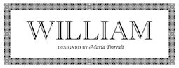 William (Maria Doreuli, Typotheque). A clean and logical ontemporary take on Caslon, in Text, Subhead and Display subfamilies. William (Maria Doreuli, Typotheque). A clean and logical ontemporary take on Caslon, in Text, Subhead and Display subfamilies.  PF DIN Serif (Panos Vassiliou). Maybe not natively a text typeface, but the idea is of a serif companion of DIN is worth exploring. PF DIN Serif (Panos Vassiliou). Maybe not natively a text typeface, but the idea is of a serif companion of DIN is worth exploring. - Logica (Dino dos Santos).
 Marbach (Dieter Hofrichter). Marbach (Dieter Hofrichter).
| Sans typefaces:  Muller Narrow (Radomir Tinkov, Fontfabric). Muller Narrow (Radomir Tinkov, Fontfabric). 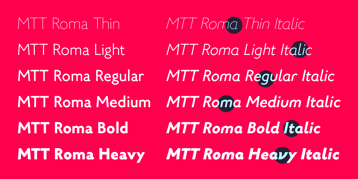 MTT Roma (Mattia Bonanomi). MTT Roma (Mattia Bonanomi). 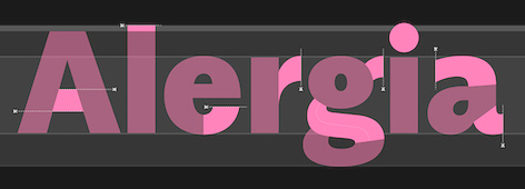 Alergia Grotesk (Mateusz Machalski). A take on the classical geometric grotesque in 60 styles/weights, for Latin, Greek and Cyrillic. Alergia Grotesk (Mateusz Machalski). A take on the classical geometric grotesque in 60 styles/weights, for Latin, Greek and Cyrillic.  Classic Grotesque (Rod McDonald, Monotype): 54 styles, eight years of work, inspired by Monotype Grotesque, Ideal Grotesk and Venus, and served in a crystal goblet. Classic Grotesque (Rod McDonald, Monotype): 54 styles, eight years of work, inspired by Monotype Grotesque, Ideal Grotesk and Venus, and served in a crystal goblet.  RNS Sanz (Yorlmar Campos). Conceived for wayfinding and information design. RNS Sanz (Yorlmar Campos). Conceived for wayfinding and information design. 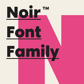 Noir (Milos Mitrovic). An early 20th century-style geometric sans family. Noir (Milos Mitrovic). An early 20th century-style geometric sans family.  Uni Grotesk (Peter Bilak, Nikola Djurek and Hrvoje Zivcic at Typotheque). A revival and extension of Universal Grotesk (1951, Grafotechna). Uni Grotesk (Peter Bilak, Nikola Djurek and Hrvoje Zivcic at Typotheque). A revival and extension of Universal Grotesk (1951, Grafotechna).  Stratos (Yoann Minet and Emmanuel Labard at Production Type). Geometric grotesque with especially attractive heavier weights. Stratos (Yoann Minet and Emmanuel Labard at Production Type). Geometric grotesque with especially attractive heavier weights. | Rounded sans display typefaces: - Globa (Pedro Gonzalez Jorquera, Latinotype).
| Type systems:  Tupper Serif (Mateusz Machalski and RR Donnelley). This superfamily covers Latin, Greek, Hebrew and Arabic. Tupper Serif (Mateusz Machalski and RR Donnelley). This superfamily covers Latin, Greek, Hebrew and Arabic. - 90 Minutes (Tal Leming). A 37-style type system exclusively licensed to U.S. Soccer, consisting of Display, Kit and Text subfamilies, and largely influenced by Morris Fuller Benton..
| Art deco typefaces:  Barbecue (Roman Shchyukin for Gaslight; the typeface was first called BarBQ). Barbecue (Roman Shchyukin for Gaslight; the typeface was first called BarBQ).  Eileen (Julie Soudanne, Indian Type Foundry). Eileen (Julie Soudanne, Indian Type Foundry).
| Hipster typefaces:  Bobo (Jean-Baptiste Morizot). Bobo (Jean-Baptiste Morizot).
| Script typefaces: - Modigirl Script (Moriz Type).
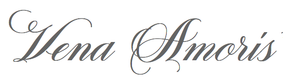 Vena Amoris (Kathryn Podorsky, Delve Fonts). A wedding invitation font. Vena Amoris (Kathryn Podorsky, Delve Fonts). A wedding invitation font. 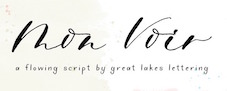 Mon Voir (Dathan Boardman). Mon Voir (Dathan Boardman).  Shyntia Bella (Darwin Huayan Harahap). A 1300+ glyph calligraphic script with hundreds of swash characters. Shyntia Bella (Darwin Huayan Harahap). A 1300+ glyph calligraphic script with hundreds of swash characters. - Cheers (Callie Hegstrom). An extensive curly script.
 Wedding Font (Darwin Huayan Harahap, BedRoom Studio). A high-contrast calligraphic cutie loaded with opentype features. Wedding Font (Darwin Huayan Harahap, BedRoom Studio). A high-contrast calligraphic cutie loaded with opentype features.  Berow (Katsia Jazwinska). Berow (Katsia Jazwinska).
| | Brush typefaces: | Sketched, Layered or Poster typefaces: - Okojo Slab Pro Stack (Ian Lynam).
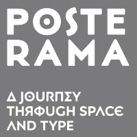 Posterama (Jim Ford). Posterama (Jim Ford).  Mighty Slab (Ryoichi Tsunekawa). A layered slab. Mighty Slab (Ryoichi Tsunekawa). A layered slab.  Basecoat (Jonathan Ball). A hand-crafted geometric sans serif inspired by sign painting and modern gothics. Basecoat (Jonathan Ball). A hand-crafted geometric sans serif inspired by sign painting and modern gothics.  Botanique (Pintassilgo Prints). A hand-crafted revival of Lucian Bernhard's Schmalfette Bernhard Antiqua, I put it here mainly because Bernhard's typeface is the striking typeface I have been using for a decade as a titling typeface on my own web site. Let's say that I am biased. Botanique (Pintassilgo Prints). A hand-crafted revival of Lucian Bernhard's Schmalfette Bernhard Antiqua, I put it here mainly because Bernhard's typeface is the striking typeface I have been using for a decade as a titling typeface on my own web site. Let's say that I am biased.  Novecento Carved (Synthview). Novecento Carved (Synthview). 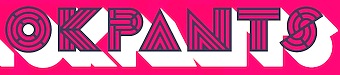 Leutner (Aaron Sechrist). Prismatic layered system, wonderfully presented. Leutner (Aaron Sechrist). Prismatic layered system, wonderfully presented. 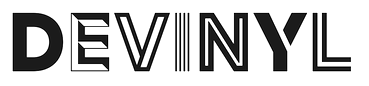 Devinyl (Nico Inosanto). Devinyl (Nico Inosanto). 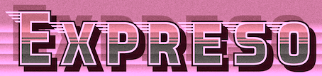 Expreso (John Vargas Beltran). Expreso (John Vargas Beltran).
| | Blackletter typefaces: | Dingbats and ornaments:  Ciao Bella (Charles Gibbons and Cindy Kinash at Oddsorts). These floral ornaments can be set in multicolors and stacked by making clever use of kerning. Ciao Bella (Charles Gibbons and Cindy Kinash at Oddsorts). These floral ornaments can be set in multicolors and stacked by making clever use of kerning.  Kinfolk Pro (Hanneke Classen). Check out the useful set of hand-drawn arrows, and the way in which they correlate with the brushed mother font. Kinfolk Pro (Hanneke Classen). Check out the useful set of hand-drawn arrows, and the way in which they correlate with the brushed mother font.
| | Garalde typefaces: | Display typefaces:  Chercan (2016, Francisco Galvez, Pampa Type). Chercan (2016, Francisco Galvez, Pampa Type). - Schizotype Grotesk (Dave Rowland).
 Brim Combined (Jamie Clarke). Brim Combined (Jamie Clarke). - Bumpo (Deepak Dogra). An exercise in plumpness.
 ATC Harris (Quan Ika, Avondale Type Company). A nifty monospaced programming font. ATC Harris (Quan Ika, Avondale Type Company). A nifty monospaced programming font.  Schmalfette CP (Jason Walcott and Rob King). A revival of Walter Haettenschweiler's original from 1954. Schmalfette CP (Jason Walcott and Rob King). A revival of Walter Haettenschweiler's original from 1954.  Triade (Etienne Aubert Bonn). A heavy titling or display typeface with trins of personality. Triade (Etienne Aubert Bonn). A heavy titling or display typeface with trins of personality.
| Slab serif typefaces:  Gimlet (David Jonathan Ross). Inspired by Georg Trump's Schadow (1938) and turned into a 112-style Opentype family. Gimlet (David Jonathan Ross). Inspired by Georg Trump's Schadow (1938) and turned into a 112-style Opentype family.  Knile (Maria Ramos, Atipo). Knile (Maria Ramos, Atipo).
| Copperplate:  Spencerio (Jérémie Hornus and Julie Soudanne, Indian Type Foundry). Not quite copperplate, but this Spencerian calligraphic script comes close. Spencerio (Jérémie Hornus and Julie Soudanne, Indian Type Foundry). Not quite copperplate, but this Spencerian calligraphic script comes close.
| Wood type revivals:  MFC Rodizio (Brian J. Bonislawsky). MFC Rodizio (Brian J. Bonislawsky).  Gothiks (Daniel Sabino, Blackletra). Not exactly a wood type revival, but these condensed variable width typefaces were influenced are undeniably linked to the early gothic wood types in style. Gothiks (Daniel Sabino, Blackletra). Not exactly a wood type revival, but these condensed variable width typefaces were influenced are undeniably linked to the early gothic wood types in style.
| | Letterpress emulation: | Didone typefaces:  Trianon Normande (Loic Sander, with the aid of Sandra Carrera, Roxane Gataud and Yoann Minet at Production Type). Trianon Normande (Loic Sander, with the aid of Sandra Carrera, Roxane Gataud and Yoann Minet at Production Type). - Leducation (David Engelby).
 Haboro (Jeremy Dooley). A large didone family with wedge serifs and without ball terminals. Haboro (Jeremy Dooley). A large didone family with wedge serifs and without ball terminals.
| Fashion mag typefaces: 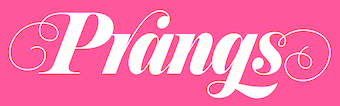 Prangs (Alejandro Paul, Sudtipos). A swashy perfectly rendered italic fashion didone. Prangs (Alejandro Paul, Sudtipos). A swashy perfectly rendered italic fashion didone.
| Revivals:  LTC Village (Paul D. Hunt, P22). Developed in 2005 and released in 2016, it is based on Goudy's warm Venetian typeface, Village. LTC Village (Paul D. Hunt, P22). Developed in 2005 and released in 2016, it is based on Goudy's warm Venetian typeface, Village.
| Stencil typefaces:  Popsky (Igor Petrovic). A popart font described as constructivism wearing sunglasses. Popsky (Igor Petrovic). A popart font described as constructivism wearing sunglasses.  Clerk (Kasper Pyndt). Clerk (Kasper Pyndt).
| Multilingual typefaces: - GT Eesti (Reto Moser, Grillitype). GT Eesti (Latin & Cyrillic) is a free-spirited interpretation of the Soviet geometric sans serif Zhurnalnaya Roublennaya, first released in 1947 and designed by Anatoly Shchukin.
- Bustani (Kamal Mansour and Patrick Giasson, Monotype). A Naskh style adaptive font for Arabic, Farsi and Urdu.
| | Wonderful, adorable, refreshing typefaces: | [Google]
[More] ⦿
|
The best free typefaces of 2015: Luc's selection
|
 This is my own selection of the best free typefaces published in 2015, grouped by category.
 Text typefaces: - Clara (Séamas Ó Brógáin). This typeface family also covers Greek and Cyrillic.
 Inknut Antiqua (Claus Eggers-Sørensen). An angular text typeface that will survive earthquakes and tsunamis. Inknut Antiqua (Claus Eggers-Sørensen). An angular text typeface that will survive earthquakes and tsunamis.  Caslon OS (Alfredo Marco Pradil). A revival typeface for those who can't afford Adobe Caslon. Caslon OS (Alfredo Marco Pradil). A revival typeface for those who can't afford Adobe Caslon.
| | Sans typefaces: | | Type systems: | | Art deco typefaces: | Hipster typefaces:  Cocobiker (Cosimo Lorenzo Pancini and Bruno La Versa). Cocobiker (Cosimo Lorenzo Pancini and Bruno La Versa).  Quirko (Shrenik Ganatra). Quirko (Shrenik Ganatra).
| | Script typefaces: | Sketched, Layered or Poster typefaces:  Pelmeshka (Cyril Mikhailov). A hand-crafted fat didone for Latin and Cyrillic. Pelmeshka (Cyril Mikhailov). A hand-crafted fat didone for Latin and Cyrillic.  HB Sketch (Mehmet Abaci, Studio Typo). A gorgeous sketched didone. HB Sketch (Mehmet Abaci, Studio Typo). A gorgeous sketched didone. - Flowers Power Nega (imagex). A textured ornamental caps typeface by the prolific free font designer simply known as imagex. Shall we ever know his or her identity?
 Monstre Display (Lev Berry). A stackable system based on a model from 1882. Monstre Display (Lev Berry). A stackable system based on a model from 1882. - Ahoj. A free all caps layered typeface family made in 2015 by the crew at Type Together, namely, Veronika Burian, Jose Scaglione, Sonja Stange, Elena Veguillas and Irene Vlachou. Ahoj is a bold display sans serif inspired by images of old signs and lettering found in different cities. The typeface family was produced in a four-day workshop in Prague. Voluntary contributions will be used to help the victims of the 2015 quake in Nepal.
 Plump (Steven Whitfield). Plump (Steven Whitfield). 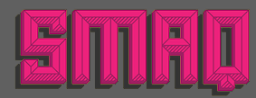 ALT Smaq (Andreas Leonidou). Eight beveled styles for Latin and Greek. Download link. ALT Smaq (Andreas Leonidou). Eight beveled styles for Latin and Greek. Download link.  Chubby (Anders Kristoffersen). Download link. Chubby (Anders Kristoffersen). Download link.
| | Blackletter typefaces: | Dingbats and ornaments:  Asap Symbol (Tania Quindos, Marcela Romero, Elena Gonzalez Miranda and Pablo Cosgaya at Omnibus Type). Asap Symbol (Tania Quindos, Marcela Romero, Elena Gonzalez Miranda and Pablo Cosgaya at Omnibus Type).
| Garalde typefaces:  Cormorant (Christian Thalmann, Open Font Library). Cormorant (Christian Thalmann, Open Font Library).
| Display typefaces:  KBH (Morten Rostgaard Olsen, Ole Søndergaard and Henrik Birkvig). A tyepeface family custom designed for the identity of the city of Copenhagen. KBH (Morten Rostgaard Olsen, Ole Søndergaard and Henrik Birkvig). A tyepeface family custom designed for the identity of the city of Copenhagen.  Infini (Sandrine Nugue). A lapidary typeface family, winner of a contest for CNAP in France in 2014. Infini (Sandrine Nugue). A lapidary typeface family, winner of a contest for CNAP in France in 2014.  Blackentina (Sergiy Tkachenko). Blackentina (Sergiy Tkachenko).  Red Velvetica Shadows Bold (Jeff Bensch). Red Velvetica Shadows Bold (Jeff Bensch).  Zacatecas (Fernando Haro). For that special condensed title. Zacatecas (Fernando Haro). For that special condensed title.  Kayfabe (Steven Waring). Download site. Kayfabe (Steven Waring). Download site. - Kanji PA (Pedro Azedo). A bilined logo font inspired by kanji.
 Pxl Supercondensed (Alberto Malossi). In Wim Crouwel's piano key style. Pxl Supercondensed (Alberto Malossi). In Wim Crouwel's piano key style.  Slot (by Adrien Coquet and Hugo Dath). Slot (by Adrien Coquet and Hugo Dath). 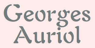 George A Rebours and Georges Labeur Corps 8 (Ivan Louette). An impeccable reproduction of Georges Auriol's first typeface, a precursor of the iconic art nouveau typeface Auriol. George A Rebours and Georges Labeur Corps 8 (Ivan Louette). An impeccable reproduction of Georges Auriol's first typeface, a precursor of the iconic art nouveau typeface Auriol.
| Slab serif typefaces:  Ansley Display (Kady Jesko). Ansley Display (Kady Jesko).  Bariol Serif (Atipo). This wonderful rounded typeface family accompanies the sans family Bariol (2012) and is specifically designed for screen, mobile applications and the web. Two weights are tweetware, and the others are donationware. Bariol Serif (Atipo). This wonderful rounded typeface family accompanies the sans family Bariol (2012) and is specifically designed for screen, mobile applications and the web. Two weights are tweetware, and the others are donationware.
| | Copperplate: | | Wood type revivals: | Letterpress emulation:  Bernier (Ryan Pyae). Bernier (Ryan Pyae). - Cocogoose Letterpress (Cosimo Lorenzo Pancini at Zetafonts). Great design---too bad the free version is crippled (no numerals).
| Didone typefaces:  Libre Bodoni (Pablo Impallari and Rodrigo Fuenzalida). Based on Morris Fuller Benton's Bodoni types, this 4-style family was developed in 2014 and published in 2015 by Open Font Library. Libre Bodoni (Pablo Impallari and Rodrigo Fuenzalida). Based on Morris Fuller Benton's Bodoni types, this 4-style family was developed in 2014 and published in 2015 by Open Font Library.  Chonburi (Cadson Demak). Covers Latin and Thai. Chonburi (Cadson Demak). Covers Latin and Thai.  Goral (Ofir Shavit). A 12-style Peignotian (sans) and didone (serif) typeface family, which was made with his own software, FontArk. Goral (Ofir Shavit). A 12-style Peignotian (sans) and didone (serif) typeface family, which was made with his own software, FontArk. - Burlesque (Fernando Paravela). In the fat face style, this typeface has great carved out design details.
| | Fashion mag typefaces: | | Stencil typefaces: | Multilingual typefaces:  Catamaran (Pria Ravichandran, Google Fonts). This family covers Latin and Tamil. Catamaran (Pria Ravichandran, Google Fonts). This family covers Latin and Tamil. 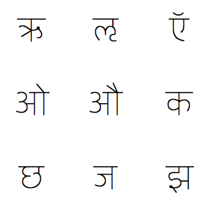 Yantramanav (Erin McLaughlin, Google Web Fonts) is a Devanagari typeface family designed to accompany Christian Robertson's Roboto. Yantramanav (Erin McLaughlin, Google Web Fonts) is a Devanagari typeface family designed to accompany Christian Robertson's Roboto. - Shumi (Ivan Shumikhin). A macho octagonal typeface for Latin and Cyrillic.
 Modak (Ek Type; Google Fonts). The chubbiest bubblegumiest Devanagari typeface in existence today. Modak Devanagari was designed by Sarang Kulkarni and Maithili Shingre and Modak Latin by Noopur Datye with support from Girish Dalvi and Pradnya Naik. Modak (Ek Type; Google Fonts). The chubbiest bubblegumiest Devanagari typeface in existence today. Modak Devanagari was designed by Sarang Kulkarni and Maithili Shingre and Modak Latin by Noopur Datye with support from Girish Dalvi and Pradnya Naik.
| Wonderful, adorable, refreshing typefaces:  Iosevka (Belleve Invis). This monospaced programming font for Latin, Greek and Cyrillic is generated by code using the parametric paradigm. A tour de force. Iosevka (Belleve Invis). This monospaced programming font for Latin, Greek and Cyrillic is generated by code using the parametric paradigm. A tour de force.
| [Google]
[More] ⦿
|
The best free typefaces of 2016: Luc's selection
|
 This is my own selection of the best free typefaces published in 2016, grouped by category. The list will grow until December 31, 2016.
 Text typefaces:  Avila (Cesar Doreste). A forceful text typeface with some didone features and lots of personality. Avila (Cesar Doreste). A forceful text typeface with some didone features and lots of personality.
| | Sans typefaces: | Type systems:  Libertinus (Khaled Hosny). A large font family for the math world now maintained by Khaled Hosny. Libertinus (Khaled Hosny). A large font family for the math world now maintained by Khaled Hosny.
| | Art deco typefaces: | | Hipster typefaces: | | Script typefaces: | Sketched, Layered or Poster typefaces:  Kitten (Cosimo Lorenzo Pancini). A signage script family. Kitten (Cosimo Lorenzo Pancini). A signage script family.  Pacha (Oscar Guerrero, Sumotype). Pacha (Oscar Guerrero, Sumotype).
| | Blackletter typefaces: | Dingbats and ornaments: 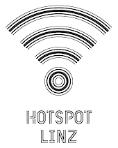 Open Commons Linz (or OCL) (Manuel Radde and Igor Labudovic). A set of multiline icons and corresponding fonts developed for the city of Linz in Austria. Open Commons Linz (or OCL) (Manuel Radde and Igor Labudovic). A set of multiline icons and corresponding fonts developed for the city of Linz in Austria.
| | Garalde typefaces: | Display typefaces: 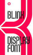 Blink Display (Mattie Lynch). An inline titling typeface inspired by the identity of the Mexico City Olympics. Blink Display (Mattie Lynch). An inline titling typeface inspired by the identity of the Mexico City Olympics. - Benjamin Lazaro).
- Fina (Yai Salinas).
 Tenez (Rodrigo Saiani). Tenez (Rodrigo Saiani).  Cenotaph Titling (Lewis McGuffie). A lapidary typeface inspired by Eric Gill's inscriptions. Cenotaph Titling (Lewis McGuffie). A lapidary typeface inspired by Eric Gill's inscriptions.
| | Slab serif typefaces: | | Copperplate: | | Wood type revivals: | | Letterpress emulation: | | Didone typefaces: | | Fashion mag typefaces: | | Stencil typefaces: | Multilingual typefaces: - Kawkab Mono (Abdullah Arif).
 Phenomena (Plamen Motev, Fontfabric). Covering Latin and Cyrillic. Phenomena (Plamen Motev, Fontfabric). Covering Latin and Cyrillic.  Diab Orient (Diab Jaser). For Arabic and 31 other languages, in 8 weights, and 24,000+ glyphs in all. Diab Orient (Diab Jaser). For Arabic and 31 other languages, in 8 weights, and 24,000+ glyphs in all.
| | Wonderful, adorable, refreshing typefaces: | [Google]
[More] ⦿
|
The best typefaces of 2013: Luc's selection
|
 This is my own selection of the best commercial and non-commercial typefaces published in 2013, grouped by category.
 Text typefaces: - Aria Text (Rui Abreu, R-Type). A magazine or newspaper type in three optical sizes of six styles each.
 Essay (Stefan Ellmer, Type Together). Still under development, I can't resist adding this very readable text font to the best-of-2013 list. Essay (Stefan Ellmer, Type Together). Still under development, I can't resist adding this very readable text font to the best-of-2013 list.  Louize (Matthieu Cortat). Six styles, about 6000 glyphs in all. This is a major revival of the Elzevirian style Augustaux type by Louis Perrin, 1846-1855. A slightly flared version is called Louize Display. Louize (Matthieu Cortat). Six styles, about 6000 glyphs in all. This is a major revival of the Elzevirian style Augustaux type by Louis Perrin, 1846-1855. A slightly flared version is called Louize Display. - Desire (Charles Borges de Oliveira). A good old condensed typeface for book covers, editorial work, packaging, advertising, branding and more.
- Quars Black, a weight of Quars by Pilar Cano and Ferran Milan, Letterjuice.
- Urge Text (Dave Rowland).
- Damien, the graduation typeface family of Lukas Schneider at KABK in Den Haag.
 Richler (Nick Shinn). Originally designed in 2001 to commemorate Mordecai Richler, it was released to the public in 2013. Richler (Nick Shinn). Originally designed in 2001 to commemorate Mordecai Richler, it was released to the public in 2013. - FF Dora by Slavka Paulikova.
- Karol (Daniel Sabino, Type O Tones).
 Mauritius (Patrick Griffin and Kevin King, Canada Type). A revival of Georg Trump's last typeface, the transitional Mauritius (or: Barock Antiqua; 1967, Weber). Mauritius (Patrick Griffin and Kevin King, Canada Type). A revival of Georg Trump's last typeface, the transitional Mauritius (or: Barock Antiqua; 1967, Weber). - Bridone (Josep Patau Bellart). This is a didone typeface family that takes elements from Victorian British slab typefaces to add a dash of old charm and sturdiness.
| Sans typefaces: - PF Square Sans Condensed Pro (Panos Vassiliou, Parachute).
 Canaro (Rene Bieder). Large counters, no spurs, simplicity and under-the-radar charm, ideal for information design. Canaro (Rene Bieder). Large counters, no spurs, simplicity and under-the-radar charm, ideal for information design.  Clear Sans (Neil Summerour). Unclassifiable, semi-geometric, appealing. A good choice for web use. Clear Sans (Neil Summerour). Unclassifiable, semi-geometric, appealing. A good choice for web use. - Divenire (by FF3300 and Molotro Type Design). This typeface was commissioned for the identity of the Italian Democratic Party.
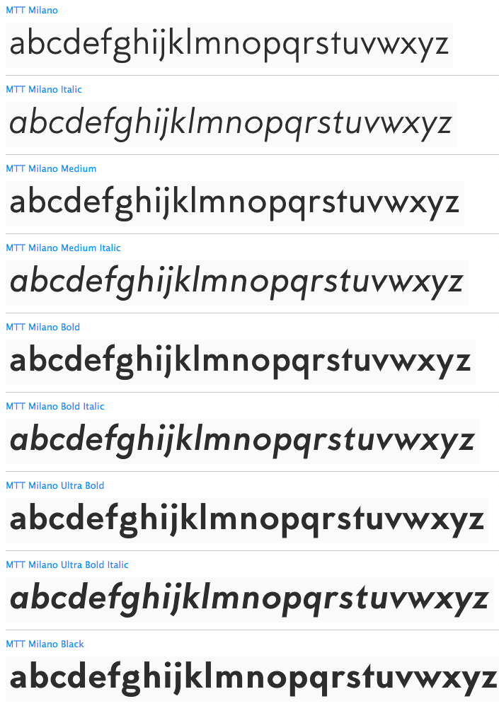
 Sensato (Jasper De Waard, Bureau Roffa). A humanist almost flared sans family. A few days after its publication, Sensato had to be renamed---the new name is Proza. Sensato (Jasper De Waard, Bureau Roffa). A humanist almost flared sans family. A few days after its publication, Sensato had to be renamed---the new name is Proza.  MTT Milano (Mattia Bonanomi). Inspired by the Milanese typographic heritage and the Futurist movement behind it. MTT Milano (Mattia Bonanomi). Inspired by the Milanese typographic heritage and the Futurist movement behind it. - FF Mark (by Hannes von Döhren, Christoph Koeberlin and the FontFont team).
- Equip (Dieter Hofrichter) and Equip Condensed. A geometric sans in two families of 16 styles each.
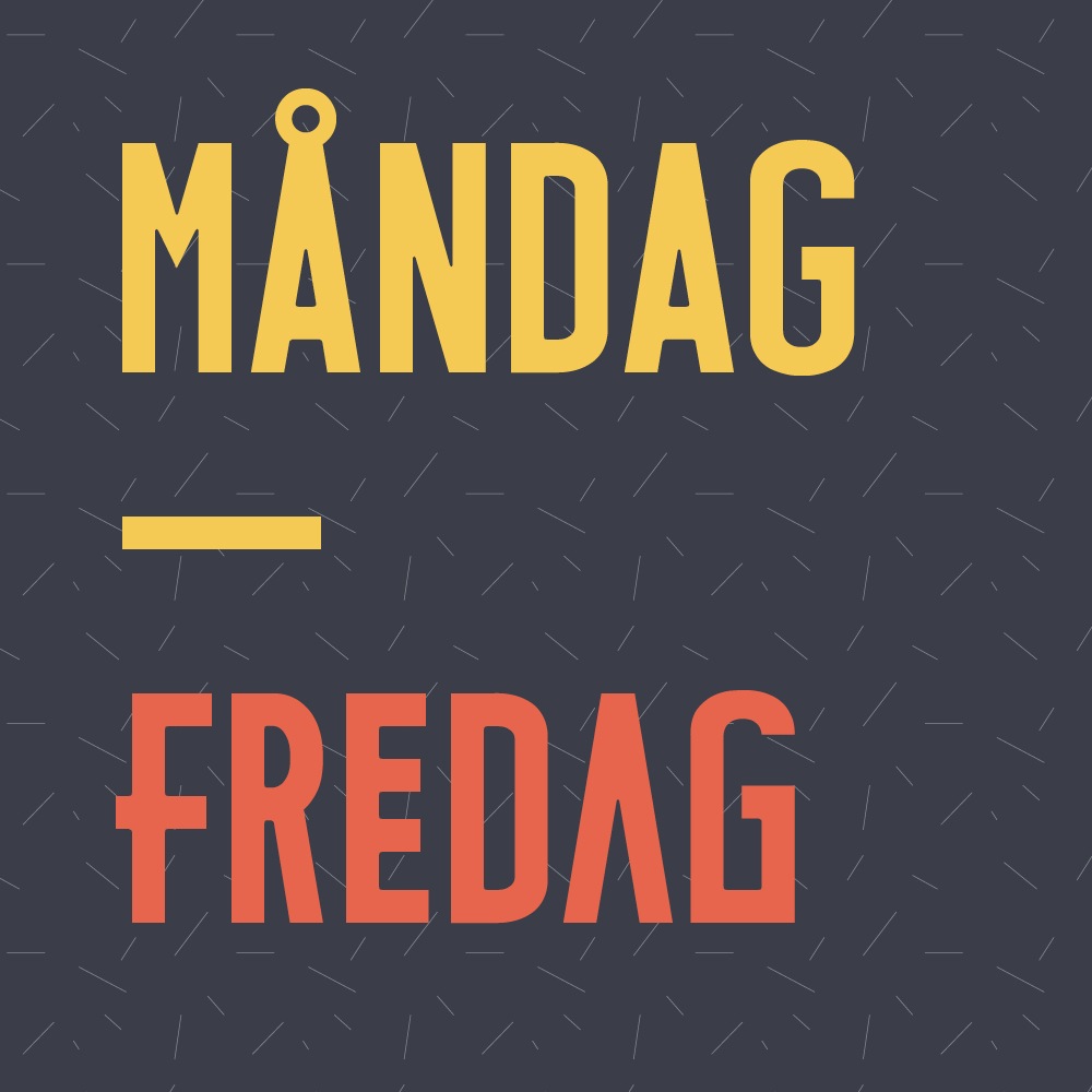
- Mandag-Fredag (Maximilian Huber; buy it at Ten Dollar Fonts).
- Freight Neo Pro (Joshua Darden, Garage fonts).
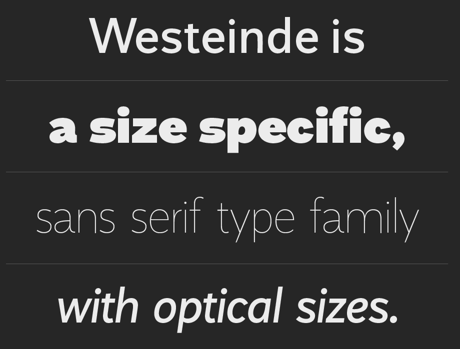
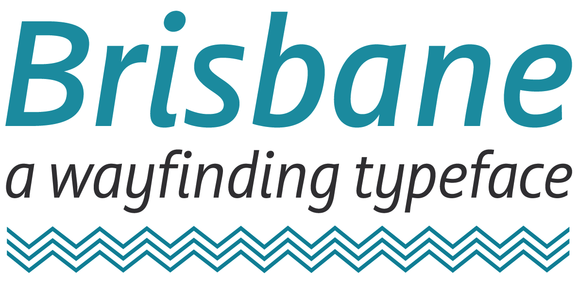
 Westeinde (by Adam Katyi). This geometric sans is Adam Katyi's graduation typeface at the KABK in Den Haag. Westeinde (by Adam Katyi). This geometric sans is Adam Katyi's graduation typeface at the KABK in Den Haag. - Brisbane: a wayfinding sans created by Troy Leinster for his graduation project at KABK.
 Gentona (2013, Rene Bieder) is a neutral neo-grotesque sans that has 18 styles/weights. Gentona (2013, Rene Bieder) is a neutral neo-grotesque sans that has 18 styles/weights. - Niveau Grotesk (Hannes von Döhren).
 Bicyclette (Nikola Kostic). A slightly rounded sans with small x-height and elegant proportions. Bicyclette (Nikola Kostic). A slightly rounded sans with small x-height and elegant proportions. - Tenso by Jos Buivanga. A lively humanist sans family.
- Core Sans NR (Hyun-Seung Lee, Dae-Hoon Hahm, Min-Joo Ham). This large soft-edged typeface family has a few oddities like very short descenders but should be useful in a variety of situations.
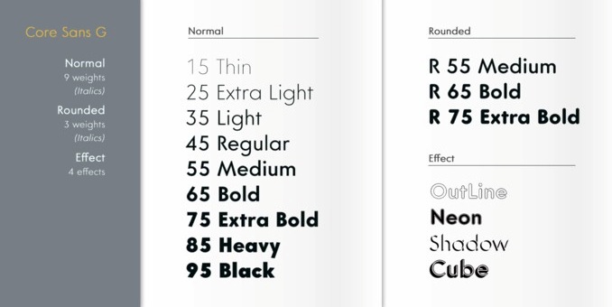
- Core Sans G (Hyun-Seung Lee, Dae-Hoon Hahm, Min-Joo Ham). The G stans for geometric. This is my favorite typeface family from S-Core.
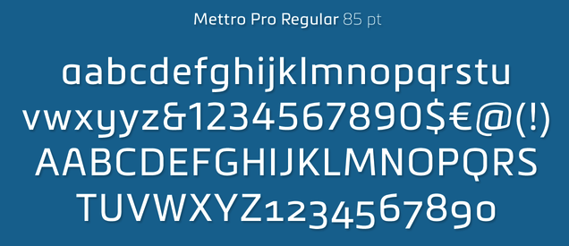
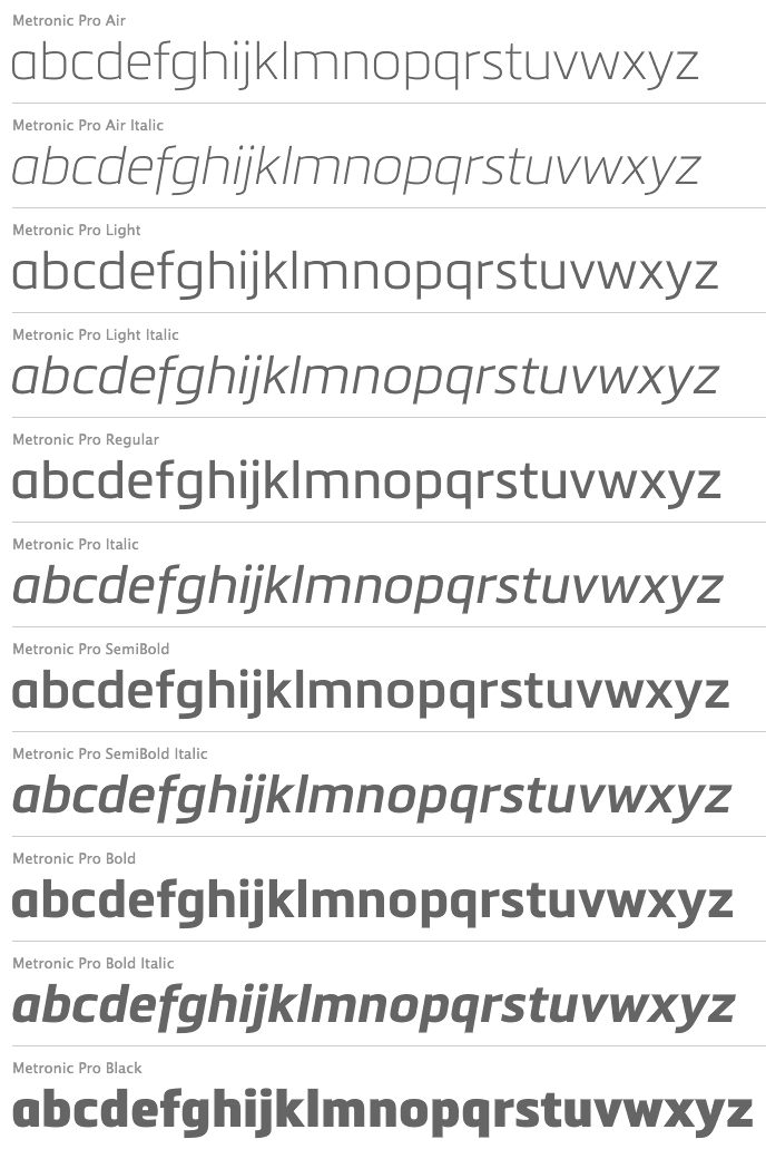
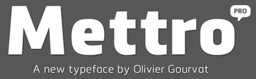 Mettro Pro (Olivier Gourvat) is an elliptical style sans family. The family was renamed Metronic Pro after a few weeks. Mettro Pro (Olivier Gourvat) is an elliptical style sans family. The family was renamed Metronic Pro after a few weeks. - Rams (Ramiz Guseynov).
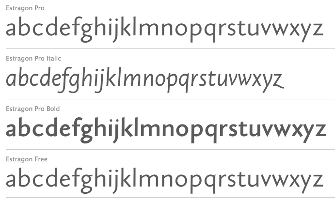
 Azo Sans (Rui Abreu, R Type) and Azo Sans Uber, its heavy headline partner. Azo Sans (Rui Abreu, R Type) and Azo Sans Uber, its heavy headline partner. - Estragon (Johannes Steil, Stabenfonts). This humanist sans has Venetian touches and small uppercase characters for use in languages such as German.
- Acronym (Michael Jarboe, Reserves).
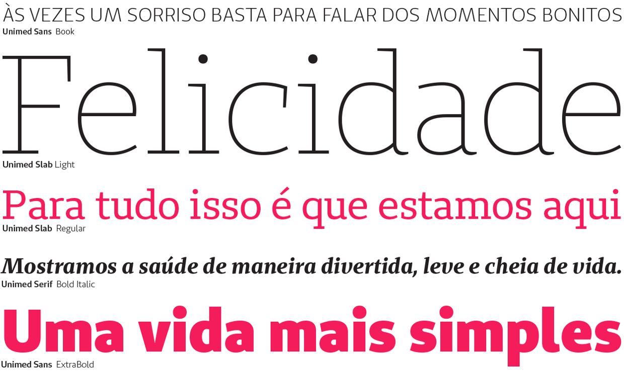
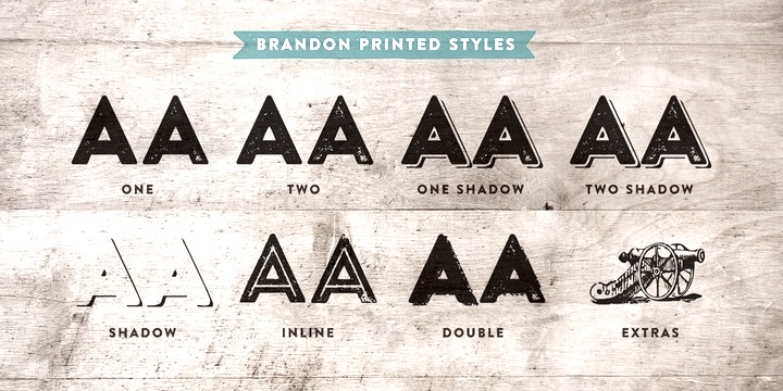
 Brandon Text (Hannes von Döhren). Brandon Text (Hannes von Döhren). | Type system:  Duplicate (Sans, Slab, Ionic) (Christian Schwartz and Miguel Reyes, Commercial Type). Duplicate (Sans, Slab, Ionic) (Christian Schwartz and Miguel Reyes, Commercial Type).  Audree (Typonine's Nikola Djurek and Marko Hrastovec): a parametrized tour de force with hundreds of type styles. Audree (Typonine's Nikola Djurek and Marko Hrastovec): a parametrized tour de force with hundreds of type styles.  Hermecito (Ari Rafaeli, AR Types) has 46 styles including phonetic, mathematical, Cyrillic, Vietnamese and Greek subsets geared towards readability in small print. Hermecito (Ari Rafaeli, AR Types) has 46 styles including phonetic, mathematical, Cyrillic, Vietnamese and Greek subsets geared towards readability in small print. - Unimed (Sans, Slab, Serif): a large bespoke type system by Eduilson Coan for the Brazilian health care company, Unimed.
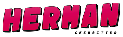 Herman (Rogier van der Sluis, Geen Bitter). A layered monospaced elliptical signage family. Herman (Rogier van der Sluis, Geen Bitter). A layered monospaced elliptical signage family.
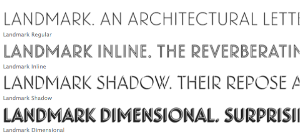
|  Architectural typefaces: Landmark (Jonathan Hoefler and Tobias Frere-Jones, HFJ). Architectural typefaces: Landmark (Jonathan Hoefler and Tobias Frere-Jones, HFJ). | | Garalde: | | Typewriter typefaces: Courier Prime (Alan Dague-Greene). | Display typefaces: - Trump Gothic Pro and Trump Soft Pro (Patrick Griffin). A revival and major optimization of Georg Trump's Signum (1955) and Stanislav Marso's Kamene.
- Elettra (Leonardo Di Lena). A Titling typeface with mostly but not entirely didone features.
 Spoloch (Denis Izotov). Spoloch (Denis Izotov). - Progressiva (a sans family by Ricardo Esteves Gomes).
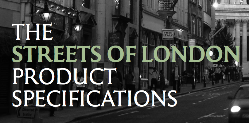
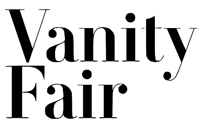 VF Didot (Paul Barnes and Christian Schwartz), a custom Didot for Vanity Fair, based on Didot specimen of Molé le Jeune. VF Didot (Paul Barnes and Christian Schwartz), a custom Didot for Vanity Fair, based on Didot specimen of Molé le Jeune. - Streets of London. A lapidary typeface family by Boris Kochan and Robert Strauch of Lazydogs Type Foundry, based on David Kindersley's street signs in the city of London.
- New Paris (Swiss Typefaces). A didone family.
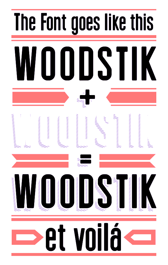
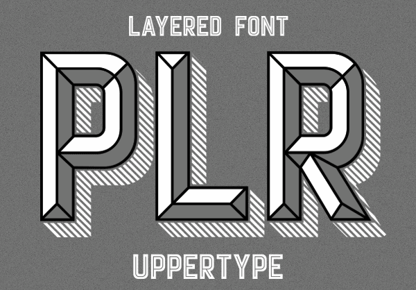
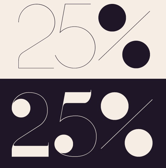
 Domaine Text and Display (by Kris Sowersby, KLIM). A wedge serif family with 48 weights, on a didone body. The Display and Fine subfamilies are pure fashion mag delights. Domaine Text and Display (by Kris Sowersby, KLIM). A wedge serif family with 48 weights, on a didone body. The Display and Fine subfamilies are pure fashion mag delights.  Curtis, the calligraphic and text typeface family by Bernd Volmer. This is his his graduation typeface at KABK, Den Haag. Curtis, the calligraphic and text typeface family by Bernd Volmer. This is his his graduation typeface at KABK, Den Haag. 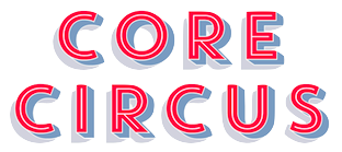 Core Circus (Hyun-Seung Lee, Dae-Hoon Hahm, Min-Joo Ham). A layered type system. Core Circus (Hyun-Seung Lee, Dae-Hoon Hahm, Min-Joo Ham). A layered type system. - Woodstik (Pedro Lobo, Uppertype). A layered wood / letterpress style typeface family. I will also nominate Pedro Lobo's other layered 3d typeface system, Player.
- Capline (Jeremy Tankard). A bilined and inline all-caps layered typeface system.
- Le Havre Layers (Jeremy Dooley). A layered art deco typeface system.
- Houston (Alexey Frolov).
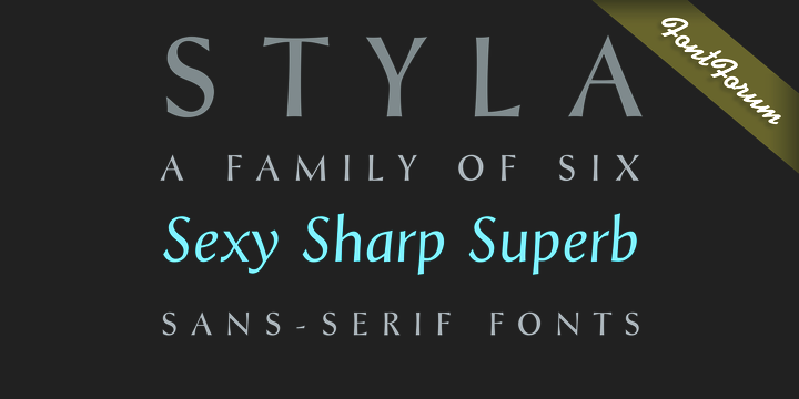
 Styla Pro (Joao Henrique Lopes, URW++): a flared romantic sans with a gorgeous small caps weight. Styla Pro (Joao Henrique Lopes, URW++): a flared romantic sans with a gorgeous small caps weight.  Selenic (Paul Dersidan). Selenic (Paul Dersidan). 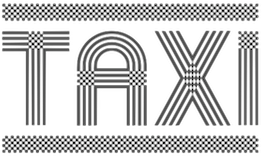 Taxi (Patrick Seymour). Taxi (Patrick Seymour). - Tushi (Ossi Gustafsson). A brush face.
| | Sketched or poster typefaces: | | Fat typeface didone: | | Technical sans: Herrmann (Antje Driemeyer). | Scripts:  Australis Pro Swash (Francisco Galvez). Australis Pro Swash (Francisco Galvez). - XXII Yonia (Doubletwo Studios). A yummy signage script.
- Tulipan (Felipe Calderon).
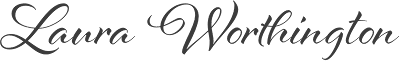 Al Fresco (Laura Worthington). Al Fresco (Laura Worthington). - Ameglia (Carine de Wandeleer, Eurotypo).
 Odesta (Ondrej Job, URTD). Odesta (Ondrej Job, URTD).  Mercy (Eduardo Recife). A set of Spencerian scripts and ornaments. Mercy (Eduardo Recife). A set of Spencerian scripts and ornaments. - Chameleon (Hanneke Classen). A 16-style family of script typefaces with the possibility of layering.
- Caligo (Aron Jancso, Die Gestalten). A calligraphic script with flared serifs.
- Asterism (Dathan Boardman and Molly Jacques Erickson).
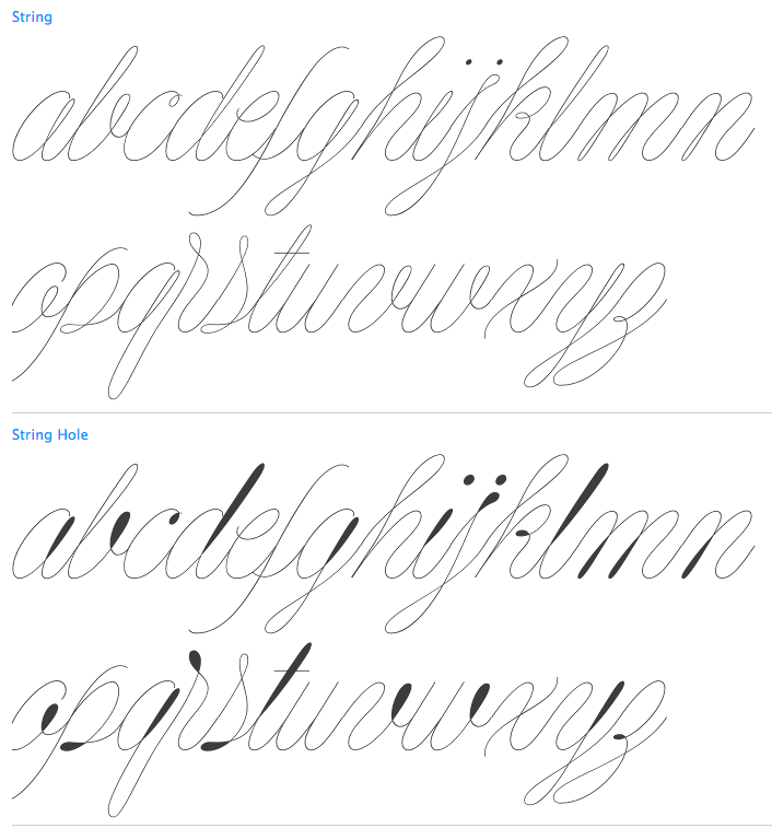
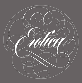 Erotica (by Maximiliano Sproviero). A copperplate calligraphic script of extreme contrast and award winner at TDC 2013. Erotica (by Maximiliano Sproviero). A copperplate calligraphic script of extreme contrast and award winner at TDC 2013. - String (Maximiliano Sproviero): a hairline Spencerian script.
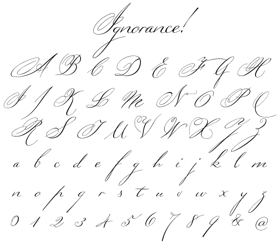
 Ondise (Jessica McCarty, Magpie Paper Works). Ondise (Jessica McCarty, Magpie Paper Works).  Cantoni Pro (Debi Sementelli). Cantoni Pro (Debi Sementelli). - Ignorance (Michael Parson).
 Zulia (by Joluvian and Alejandro Paul). A gorgeous brushy packaging script. Zulia (by Joluvian and Alejandro Paul). A gorgeous brushy packaging script. - Lust Script (Neil Summerour). A high-contrast curvy fashion script.
 Aparo (Pedro Leal and/or Dino dos Santos, DS Type). Calligraphy, flair and penmanship, all in one. Aparo (Pedro Leal and/or Dino dos Santos, DS Type). Calligraphy, flair and penmanship, all in one. - Cal Cursive Roman (Lazar Dimitrijevic). A pure calligraphic cursive script.
 Harlowe (Laura Worthington). A rough-edged quirky script, later renamed to Harlean. Harlowe (Laura Worthington). A rough-edged quirky script, later renamed to Harlean. - Voyage (Emil Karl Bertell). A vintage script.
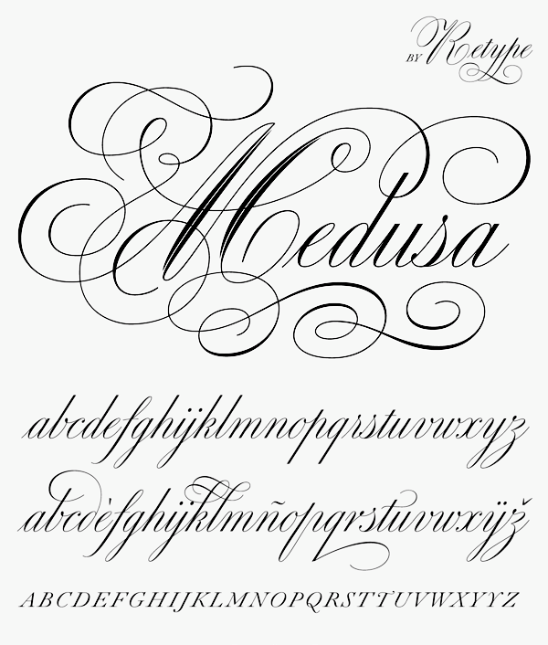
- Medusa (Ramiro Espinoza, Re-Type).
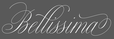 Bellissima (Alejandro Paul, Sudtipos). Bellissima (Alejandro Paul, Sudtipos). - Southern Aire (Mans Grebäck).
|  Dingbats: Wayfinding Sans Symbols (Andreas Wohlleben, FDI). Dingbats: Wayfinding Sans Symbols (Andreas Wohlleben, FDI). | | Fashion mag typefaces: | | Slab Serif: | | Art Deco: | Copperplate:  Niveau Serif (Hannes von Döhren). Niveau Serif (Hannes von Döhren). | | Multilingual typefaces: | | Blackletter: | | Wood type revivals: | [Google]
[More] ⦿
|
The best typefaces of 2014: Luc's selection
|
 This is my own selection of the best commercial and non-commercial typefaces published in 2014, grouped by category.
 Text typefaces:  Amster Pro (Francisco Galvez Pizarro, Pampa type). The original is from 2008. Amster Pro (Francisco Galvez Pizarro, Pampa type). The original is from 2008.  Berenjena (Javier Quintana Godoy). This charming antiqua text typeface from 2007 won a Tipos Latinos award in 2012 but was only published in 2014 by Pampa Type. Berenjena (Javier Quintana Godoy). This charming antiqua text typeface from 2007 won a Tipos Latinos award in 2012 but was only published in 2014 by Pampa Type.  Kaius (Lisa Fischbach). A University of Reading typeface family created for very small text. Kaius (Lisa Fischbach). A University of Reading typeface family created for very small text.  Pratt Nova (Nick Shinn). Shinn's 17-style large x-height typeface family strives for visual and semantic opulence, equipping the typographer with a comprehensive array of harmonized fonts, all rigorously drawn, superbly fitted iterations of a single, profoundly original design. Pratt Nova (Nick Shinn). Shinn's 17-style large x-height typeface family strives for visual and semantic opulence, equipping the typographer with a comprehensive array of harmonized fonts, all rigorously drawn, superbly fitted iterations of a single, profoundly original design.  GT Sectra (Dominic Huber, Marc Kappeler and Noel Leu at Grilli Type). Broad coverage, angular design, readable yet elegant, the works. GT Sectra (Dominic Huber, Marc Kappeler and Noel Leu at Grilli Type). Broad coverage, angular design, readable yet elegant, the works.  Milio (Josep Patau Bellart). A ten-style transitional family. Milio (Josep Patau Bellart). A ten-style transitional family.  FF Franziska (Jakob Runge). A multidimensional typeface family based on Runge's 2012 Masters project. FF Franziska (Jakob Runge). A multidimensional typeface family based on Runge's 2012 Masters project.  Big Moore (Matthew Carter, Font Bureau). Based on a 1766 specimen by Isaac Moore. Big Moore (Matthew Carter, Font Bureau). Based on a 1766 specimen by Isaac Moore. - Mengelt Basel Antiqua (Christian Mengelt, Linotype). Based on the Basel types from the 16th century, this typeface family for Latin, Cyrillic and Greek brings classical and relaxing Venetian charm.
 Garibaldi (Henrique Beier, Harbor Type). Angular and based on calligraphic strokes, this is quite powerful and legible. Garibaldi (Henrique Beier, Harbor Type). Angular and based on calligraphic strokes, this is quite powerful and legible.  Tautz (Mariya V. Pigoulevskaya, The Northern Block). Tautz (Mariya V. Pigoulevskaya, The Northern Block).  Essay Text (Stefan Ellmer, TypeTogether). A warm slightly angular and extremely legible book text typeface. Essay Text (Stefan Ellmer, TypeTogether). A warm slightly angular and extremely legible book text typeface.  Epica (Oscar Guerrero, Sumotype). Epica (Oscar Guerrero, Sumotype). - Leidener (Jesus Barrientos). Based on letters used by the Elzevir family in their workshop in Leiden.
 Pesaro (Dieter Hofrichter). Pesaro (Dieter Hofrichter).
| Sans typefaces:  London Luton Airport (Atipo). A wayfinding sans typeface commissioned for London Luton Airport. London Luton Airport (Atipo). A wayfinding sans typeface commissioned for London Luton Airport.  FF Bauer Grotesk (Thomas Ackermann and Felix Bonge). A revival of the Trennert & Sohn metal art deco era sans Friedrich Bauer Grotesk (1933-1934). FF Bauer Grotesk (Thomas Ackermann and Felix Bonge). A revival of the Trennert & Sohn metal art deco era sans Friedrich Bauer Grotesk (1933-1934). - Pembroke (Jeremy Tankard).
 Galano Grotesque Alt (René Bieder) and Galano Classic. An important geometric sans family. Free demos of some styles. Galano Grotesque Alt (René Bieder) and Galano Classic. An important geometric sans family. Free demos of some styles.  Karlsen (Type Union). Minimalist in conception. Karlsen (Type Union). Minimalist in conception.  Naste (Josep Patau). Sixteen styles in a strong-willed purely geometric exercise. Naste (Josep Patau). Sixteen styles in a strong-willed purely geometric exercise. - Balto (Tal Leming, 2007-2014). An American Gothic family.
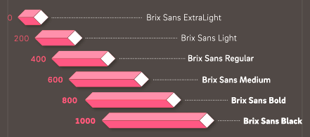 Brix Sans (Hannes von Döhren and Livius Dietzel). A typeface family, wichich together wioth Brix Slab (2011) has carefully engineered glyphs for use in information design and corporate applications. This could possibly become a blockbuster package. Brix Sans (Hannes von Döhren and Livius Dietzel). A typeface family, wichich together wioth Brix Slab (2011) has carefully engineered glyphs for use in information design and corporate applications. This could possibly become a blockbuster package. 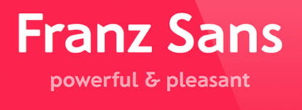 Franz Sans (Mona Franz). Franz Sans (Mona Franz).  Certa Sans (Elena Kowalski). Certa Sans (Elena Kowalski). - Klef (Adrian Talbot). A geometric sans family influenced by Avant Garde.
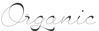
 Orgon (Dieter Hofrichter). Orgon as in organic, and in Argon, the inert gas---uncomplicated, unpretentious, neutral, but still distinctive. Orgon (Dieter Hofrichter). Orgon as in organic, and in Argon, the inert gas---uncomplicated, unpretentious, neutral, but still distinctive.  Lipa Agate (Ermin Mededovic, Type Together). A sans workhorse family for very small print. Lipa Agate (Ermin Mededovic, Type Together). A sans workhorse family for very small print.  Founders Grotesk Mono (Kris Sowersby, KLIM). Founders Grotesk Mono (Kris Sowersby, KLIM).  Glober (Ivan Petrov, Fontfabric). Glober (Ivan Petrov, Fontfabric). - Nokio (Type Union). A geometric rounded minimalist family for mobile devices.
- Como (Ryoichi Tsunekawa). A rounded sans family with large x-height.
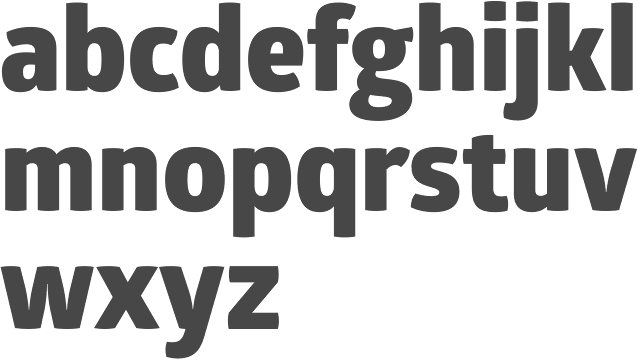
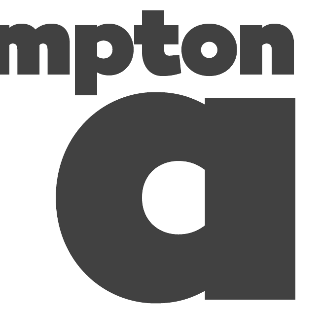
- Campton (René Bieder).
 Arquitecta (Miguel Hernandez and Daniel Hernandez, Latinotype). Arquitecta (Miguel Hernandez and Daniel Hernandez, Latinotype). - Museo Sans Display (Jos Buivenga). Great new Hairline and Extra Black weights.
 Bague Sans (Panos Vassiliou). A geometric grotesk. Also take a look at PF Bague Inline Pro and PF Bague Round Pro to get a fuller picture. Bague Sans (Panos Vassiliou). A geometric grotesk. Also take a look at PF Bague Inline Pro and PF Bague Round Pro to get a fuller picture.
| | Type systems: | | Art deco typefaces: | | Hipster typefaces: | | Script typefaces: | | Sketched, Layered or Poster typefaces: | | Blackletter typefaces: | Dingbats and ornaments:  Tepu (Sergio Ramirez Flores, Latinotype). A large set of infographics icons with rounded shapes. Tepu (Sergio Ramirez Flores, Latinotype). A large set of infographics icons with rounded shapes.
| | Garalde typefaces: | Display typefaces:  Orwellian (Shiva Nallaperumal, Lost Type). The Italian genre refitted for 2015. Orwellian (Shiva Nallaperumal, Lost Type). The Italian genre refitted for 2015.  Jeames (Kyle Benson). Jeames (Kyle Benson). - Spot Mono (Lauri Toikka and Florian Schick). Attractively rounded monotype typeface.
- Vezus Serif Texture (Slobodan Jelesijevic).
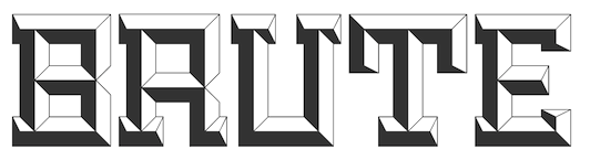 Brute (Kirby Matherne, Ten Dollar Fonts). A layered beveled type system with oomph. Brute (Kirby Matherne, Ten Dollar Fonts). A layered beveled type system with oomph.  Manola (Ira Lensberr). An expressive lapidary typeface family with applications in stonecutting. Manola (Ira Lensberr). An expressive lapidary typeface family with applications in stonecutting. - Getter (Camilo Zamora). A large family influenced by Japanese robots and advertized as Bogotá cyberpunk.
 Attica RSZ (Giuseppe Salerno). A Western typeface inspired by Caslon's Italian and Aldo Novarese's Estro. Attica RSZ (Giuseppe Salerno). A Western typeface inspired by Caslon's Italian and Aldo Novarese's Estro.  Rubik One (Elvire Volk Leonovitch, under art direction of Philipp Hubert and Sebastian Fischer at Hubert and Fischer). A rounded heavyweight sans of attractive proportions. It is a free Google Web Font. Rubik One (Elvire Volk Leonovitch, under art direction of Philipp Hubert and Sebastian Fischer at Hubert and Fischer). A rounded heavyweight sans of attractive proportions. It is a free Google Web Font. - Hedon Display (Dusan Jelesijevic).
- Valter (Nikola Djurek, Typotheque). A variable contrast sans inspired by pointed-pen writing.
 Helsinki XXL (Ludwig Übele). Helsinki XXL Black and Helxinki XXL Thin are free additions to Übele's successful Helsinki typeface family. Helsinki XXL (Ludwig Übele). Helsinki XXL Black and Helxinki XXL Thin are free additions to Übele's successful Helsinki typeface family. - TDL Ruha Hairline and Latin (Tipos das Letras). A didone foundation morphed into a slab serif and wedge serif pair of typefaces.
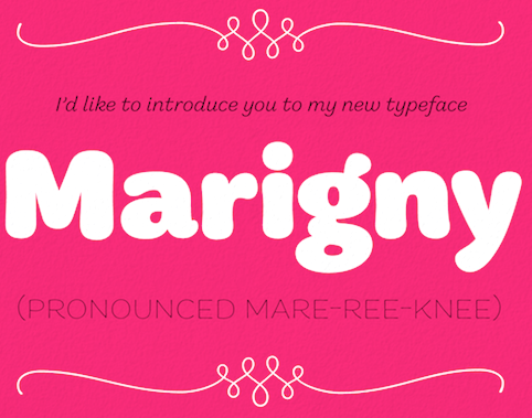 Marigny (Tal Leming). This warm roundish display typeface might just as well fit into the text typeface category. Marigny (Tal Leming). This warm roundish display typeface might just as well fit into the text typeface category.  Briller (Nikola Kostic). A striking ultra-wide sans typeface family. Briller (Nikola Kostic). A striking ultra-wide sans typeface family. - UT Amen (Marco Virgillito). In search of the fattest and artsiest poster typeface.
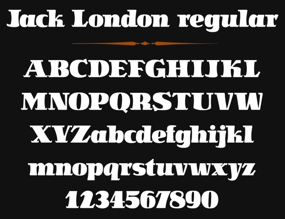
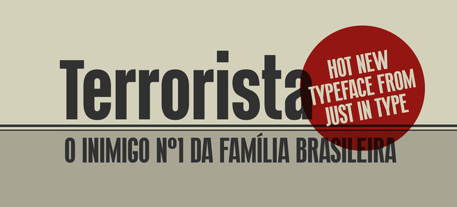
 Jack London (Terezija Donlic). A fat and lively poster typeface family based on a revival. Jack London (Terezija Donlic). A fat and lively poster typeface family based on a revival.  Terrorista (Tony de Marco and Bernardo Faria, Just in Type). A masculine sans headline typeface created to honor all those who fought against Brazil's military regime from 1964 until 1985. Terrorista (Tony de Marco and Bernardo Faria, Just in Type). A masculine sans headline typeface created to honor all those who fought against Brazil's military regime from 1964 until 1985.  Lichtspiele (Stefan Huebsch). Retro cinema marquee and lettering typeface family. Lichtspiele (Stefan Huebsch). Retro cinema marquee and lettering typeface family.
| | Slab serif typefaces: | | Copperplate: | Wood type revivals:  HWT Artz (Erik Spiekermann, P22). A true wood type with a digital version added to support the Hamilton Wood Type Museum. HWT Artz (Erik Spiekermann, P22). A true wood type with a digital version added to support the Hamilton Wood Type Museum. - Dobro (Mariana Alen).
| | Letterpress emulation: | Didone typefaces: - Jeles (Slobodan Jelesijevic, Tour de Force). A soft-edged didne typeface family with large x-height.
 Surveyor (Hoefler). A mapmaker and newsprint font family. Surveyor (Hoefler). A mapmaker and newsprint font family.  Lewis (Alexandre Saumier Demers). A graduation typeface family at KABK in Den Haag, this didone family was specially designed for typesetting mathematics and for use with TeX. Lewis (Alexandre Saumier Demers). A graduation typeface family at KABK in Den Haag, this didone family was specially designed for typesetting mathematics and for use with TeX. - Yo Italic series by James Montalbano. One hundred didone italics were added in 2014 to the 100 regular didones from 2010.
 Parmigiano Typographic System (Riccardo Olocco and Jonathan Pierini). Parmigiano Typographic System (Riccardo Olocco and Jonathan Pierini).  Encorpada Essential (Eduilson Wessler Coan). A fat didone that completes the Encorpada font series started in 2011. Encorpada Essential (Eduilson Wessler Coan). A fat didone that completes the Encorpada font series started in 2011.  Barkley (Poster and Block) by Björn Gogalla, Letter Edit. Barkley (Poster and Block) by Björn Gogalla, Letter Edit. - Normandie Modern FY (Julien Priez, Fontyou). A wide fat typeface didone.
- Caponi (Christian Schwartz, Paul Barnes, Miguel Reyes). A sturdy didone family in Text, Display and Slab versions that can survive the flagellations of print.
| | Fashion mag typefaces: | | Stencil typefaces: | Multilingual typefaces:  Raylaw (Ryota Doi). A Latin / Greek / Cyrillic Latin typeface family for use in travel magazines. Raylaw (Ryota Doi). A Latin / Greek / Cyrillic Latin typeface family for use in travel magazines.  Makar (Leo Phelp). This graduation project at the University of Reading covers Cyrillic, Greek, Latin and Gurmukhi. Makar (Leo Phelp). This graduation project at the University of Reading covers Cyrillic, Greek, Latin and Gurmukhi. -
 Mirna (Teja Smrekar). Her graduation project at the University of Reading covers Latin, Cyrillic, Greek and Khmer. Mirna (Teja Smrekar). Her graduation project at the University of Reading covers Latin, Cyrillic, Greek and Khmer. - Source Han Sans, a new open source Pan-CJK typeface family brought by Adobe and Google for Japanese, Korean, Traditional Chinese, and Simplified Chinese, all in one font. It also includes Latin, Greek, and Cyrillic glyphs from Adobe's Source Sans Pro. Each of the 42 fonts has 65,535 glyphs. This monolinear sans design is not beautiful or artsy---it is a basic and useful workhorse. The Google version is called Noto.
 Journal Sans New (Alexandra Korolkova and Maria Selezeneva, Paratype). A typeface family for Latin and Cyrillic that updates and extends the old Journal Sans (1990s) with charming new Erbar Grotesk-based styles such as an Inline and tall-legged Display. Journal Sans New (Alexandra Korolkova and Maria Selezeneva, Paratype). A typeface family for Latin and Cyrillic that updates and extends the old Journal Sans (1990s) with charming new Erbar Grotesk-based styles such as an Inline and tall-legged Display.  Gion (Mariko Takagi). A modern serif typeface for multi-lingual typesetting in Latin, Japanese and Chinese. Gion (Mariko Takagi). A modern serif typeface for multi-lingual typesetting in Latin, Japanese and Chinese.  Bustan (Jamal Bustan and Mamoun Sakkal). An Arabic jewel with tens of stylistic sets and opentype features, based on calligraphic originals. Bustan (Jamal Bustan and Mamoun Sakkal). An Arabic jewel with tens of stylistic sets and opentype features, based on calligraphic originals.
| | Wonderful, adorable, refreshing typefaces: | [Google]
[More] ⦿
|


 Miasto (

 Voltaire (
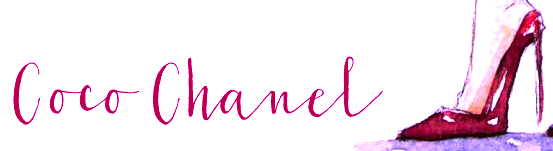
 FF Eggo (Lukasz Dziedzic).

 Biplo (
 Magellan (
 Mina Chic (Giuseppe Salerno).


 Sen (
Sen (


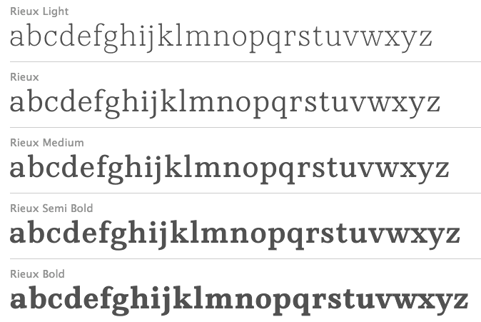 Rieux (


 Haltrix (
 Meritage (

 Core Magic (
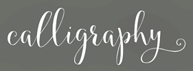
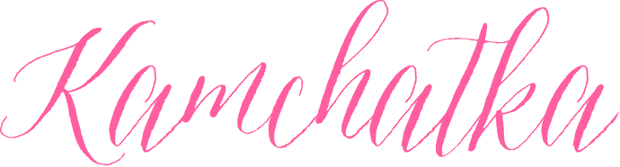
 Ciao Bella (
 Krullcoplate Script (


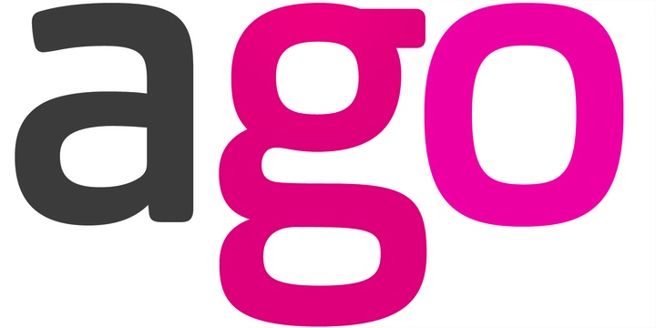
 Argö (