| | |
Adrian Yanes Marquez
|
Cuban designer, b. 1985, who lives in Jerez, Spain. Creator of the 3-style sans typeface family Colonial Havana (2016) and the text and poster typeface family Walina (2016). [Google]
[More] ⦿
|
Carlos Perez Zamora
|
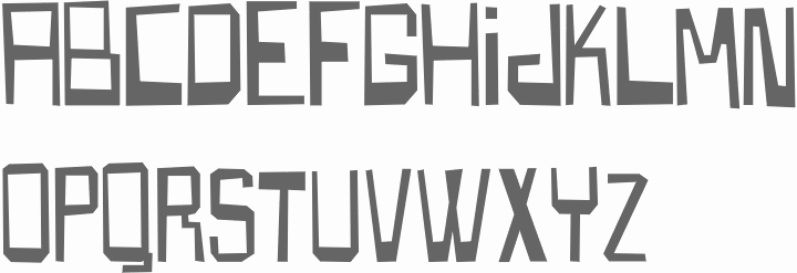
Graphic designer in Havana, Cuba. Creator of Cuendias Sans (2017). [Google]
[More] ⦿
|
Carlos Segura

|
Born in 1956 in Santiago, Cuba, Segura founded the design firm Segura Inc in 1991 and the type foundry [T-26] in 1994 in Chicago. He made Square 40 and Square 45 (2006, athletic lettering, octagonal), 26FacesA, Peepod (2000, great ornaments), Boxspring (1995, dadaist), Dingura, FaxfontFine (1997), FaxfontStandard (1997), FaxfontTone, FlacoSolid, FreeBeCaps, FreeDom-Normal, Mattress, Neo-Bold, Pintor (2006, wallpainting face), RPM (decals and logos), Sport IT (dingbats), Time In Hell (deconstructed Times). Interview at typographer.com. Emodigi site. Interview. Another interview. CV. Klingspor link. Catalog of Carlos Segura's typefaces. [Google]
[MyFonts]
[More] ⦿
|
Carlos Segura
[T-26]
|
[MyFonts]
[More] ⦿
|
Chad Geran
|
 Chad Geran is a cartoonist and illustrator in Regina, Canada. Behance link. He practices typography on book covers and posters. [Google]
[More] ⦿
Chad Geran is a cartoonist and illustrator in Regina, Canada. Behance link. He practices typography on book covers and posters. [Google]
[More] ⦿
|
Claudia Cuba
|
Cuban type designer. Cuendias (2015, by Claudia Cuba and Roberto Roiz) won an award at Tipos Latinos 2016. [Google]
[More] ⦿
|
Design Culture (was: Cubanica Fonts)
[Pablo A. Medina]
|
Pablo A. Medina designs all fonts at Cubanica Fonts in New York. He is a Communication Design professor at Parsons the New School for Design and lives in the East Village of New York City. He has also taught at Maryland Institute College of Art. MyFonts page. Cubanica became Design Culture in 2016. Cubanica fonts: - 24hrs.
- Calaveras (2011). Based on a signage style in Buenos Aires called Fileteado.
- Cuba (1996). A 3d signage typeface based on a sign for the restaurant La Flor de Cuba on Bergenline Avenue in Union City, New Jersey. It evokes of hand-painted signs on glass.
- Dekalb (2017).
- Diablitos (2011).
- First Avenue (2000). Based on an old metal neon sign, it was first published at Plazm.
- Imbalance (2002). An experimental sans.
- Marquee.
- Medina Gothic (2005). A clean sans family.
- North Bergen (1996). A vernacular sans.
- Sailor Gothic (2003).
- Sombra.
- Vitrina (1996). A connected signage typeface first published at Plazm.
- Union Square. A bold stitching font, and at the same time a nice homage to the mosaic typography in the New York subway system.
Klingspor link. View Cubanica's library of typefaces. View Pablo Medina's typefaces. [Google]
[MyFonts]
[More] ⦿
|
Diana Carmenate
|
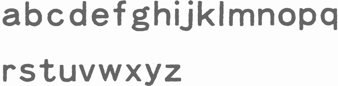
Havana, Cuba-based codesigner, with Aldo Cruces, of the outlined art deco typeface Mamey (2016). [Google]
[More] ⦿
|
Emfoundry
[Jon Melton]
|
 Emfoundry is the micro font foundry of type designer Jon Melton, whose first degree in art dates back to 1984. It was created originally as part of his MA in Typographic Design postgraduate studies at the Cambridge School of Art within Anglia Ruskin University in 2007. Jon Melton is course leader for BA (Hons) Graphic Design at the CSA. His academic research as a senior lecturer at this university informs his work that focuses upon key moments in type design evolution.
 His typefaces are not commercially available, They inclde: - Fount Sans 1756 (2018), a revival typeface of the 18th century, the legacy for all the countless sans serif fonts today. Speaker at ATypI 2018 in Antwerp, where he explains that revival: The search for the origin of today's commercial sans serif typography has become something of a holy grail for type historians. The earliest known example of a deliberately geometrical serifless letterform was confirmed back in the late 1990s, on a plan-drawing title block for a new parliamentary building. It was produced whilst on the grand tour by the architect John Soane. Duly exhibited at the Royal Academy in 1779, it marked the start of Soane's utilising this then-radical letterform on his design drawings and for inscriptions on buildings. Prior to Soane's exhibited "Design for a British Senate House," there is a void. Scholars are aware that the sans serif originates within the letterforms of Greece and the informal inscriptions of the Roman Empire. But what inspired Sir John Soane to use it, for what appears to be the very first time?
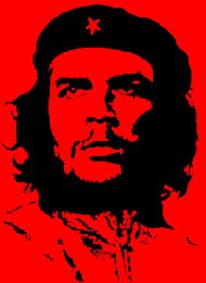
- Cuban Revolt. Cuban Revolt was inspired by a plantation sugar sack from the 1960s, which utilised a sans serif letterform with modeling curves and counters created during a traditional hand-cut stencil process in silk screen printing. It has a constructivist feel.
- Russian Revolt. Russian Revolt was created via a regularization of the modeling of its comrade font Cuban Revolt. It is a faux-Russian display face with a range of contextually (Cyrillic) inspired alternate glyphs that reflect the experimental typography of dadaism, suprematism and constructivism.
- Cuba Libre & Cubana.
- English Open, or "Georgian English Open Initials & Titling". English Open was derived from the letterforms of metal engravers, and examples of these are readily found on armorial silver and maps produced over one hundred years earlier than the first available open typeface specimens. Its character follows the steel and copper plate engravers of the 18th century, and is ultimately informed by the open types of the period such as Cocaine, Moreau-Le-Jeune, Fournier, Fournier Le Jeune and Rosart.
- Empire Initials, Empire Initials mark the end of informed neoclassical and revivalist ornamentation, and the beginnings of ostentation and the over-adornment so representative of Victorian eclecticism. White-out decorated fat types were produced within a very short Late Regency period, from the 1820s-40s, of fevered expression within the decorative arts.
- English Vernacular. The letter is informed by generations of 17th and 18th century armorial silver and goldsmiths, glass engravers, topographic and political print gravurists, signwriters and our provincial stone carvers who developed English vernacular, the Georgian artisan letter.
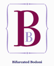
- Bifurcated Bodoni. EM Bifurcated Bodoni represents a missing piece of the typographic evolutionary puzzle, with its Archaic and Deviant alternates exhibiting tentative and restrained characters and ornamentation, such as median decoration, internal tracery cusping and Romanesque letter formations. [...] The transition has been increased and the proportions expanded pointing towards the predominant display Fat Faces of the period; while the serif bifurcates subtly to represent early tentative experiments within what became known as the Tuscan form.
- Classic Soane: Classic Soane is created in homage to the Regency architect Sir John Soane and his refined classical vernacular.
- Pure Soane Sans. Melton explains this inscriptional sans:,i>Pure Soane Sans forms part of a reappraisal of the Regency architects intensions for inscriptional letterforms following a recent discovery of an overlooked early Sans serif letter on a pair of gate houses in Norfolk. These buildings were recorded as erected between 1790-92 with two Greyhound statues including inscriptional motos on stone plynths contemporary to the building. The letters have distinctive widths and features, particularly the 'G' and 'J' which shares an idiosyncratic partial serif that is also seen on Soane's titling on the better known drawings for his proposed Norwich (Castle) Gaol. These features have provided the clues to a new Sans Serif Typeface firmly based upon the 18thC origin of the seref-less letter.
- Ogilby's Britannia (Britannia Regular, Britannia Italics, Britannia Swashes): Ogilby's Britannia reflects the engraved letterforms published in Britain's first Road Atlas published in 1675. John Ogilby employed numerous Surveyors, Weywisers (measuring wheel), Cartographers, Plate Engravers and Printers in the production of his revolutionary book. This typeface seeks to capture the engraver's vernacular of the 17th century, utilising the ichnographic ornaments and cartographic letterforms used on Ogilby's post roads strip maps, which applied a standardised unit mile for the very first time.
[Google]
[More] ⦿
|
Ernesto Antón Peña
|
Born in Havana, Cuba, in 1988, Ernesto Antón designed the free typefaces Cicero Serif (2014) and Cicero Sans (2015). In 2017, he added the sans typeface Eutelia. [Google]
[More] ⦿
|
Javier Fuentes
|
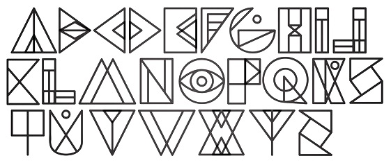
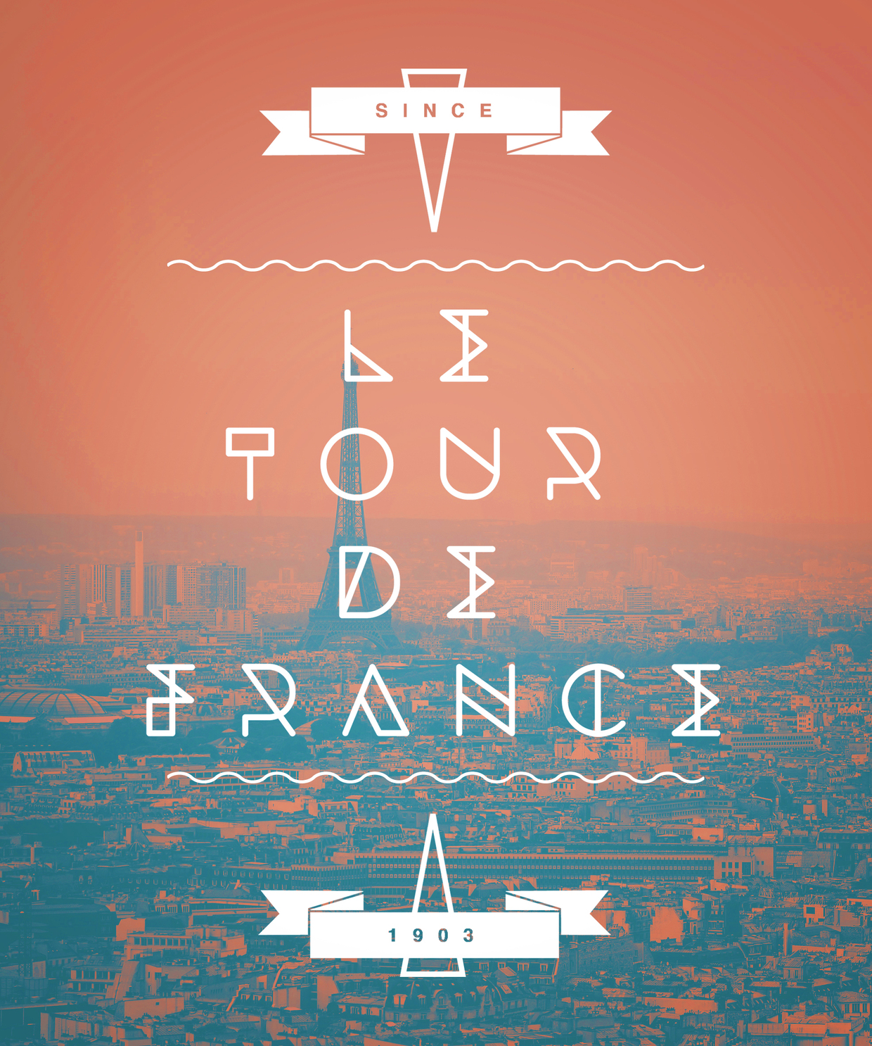
Boston-based designer who was born in Cuba and raised in Venezuela. Behance link. He created the geometric outline typeface Jeroglifico (2011), and the Bauhaus-inspired outline typeface Dessau (2012). Behance link. Cave Graphic Design link. [Google]
[More] ⦿
|
Jon Melton
[Emfoundry]
|
[More] ⦿
|
Lettering in Havana
|
Pictures from Havana (by yours truly, dated April 2003), and a brief report on type in Cuba. [Google]
[More] ⦿
|
Lizette Hechavarria Pilia
|
Graphic designer in Miami, FL, who created the free 3-weight sans typeface family Cicero Sans in 2012 together with Ernesto Anton Peña. Cicero was custom designed for the identity of The Higher Institute of Design (ISDI), which is the only institution of higher education in Cuba dedicated to the training of professionals in the fields of Graphic Design, Industrial Design and Fashion Design. [Google]
[More] ⦿
|
Mesa
|
"The Mesa Polyglot alphabet was invented by Juan Mesa (b. 1928), a Cuban-American living in Miami. It was designed as an easy-to-learn and simple-to-use alternative international alphabet." A Mesa font by Nicholas Fabian is included. See also here for MesaAnalogMedium (2001). [Google]
[More] ⦿
|
Nsibidi
|
From Nigeria and Cameroon: this script was invented by the Ejagham people of southeastern Nigeria and southwestern Cameroon. The ideographs represent life among the Ejagham. Today, nsibidi is still widely used by Cuban blacks and called anaforuana and used by such secret societies as the Abakua. [Google]
[More] ⦿
|
Pablo A. Medina
[Design Culture (was: Cubanica Fonts)]
|
[MyFonts]
[More] ⦿
|
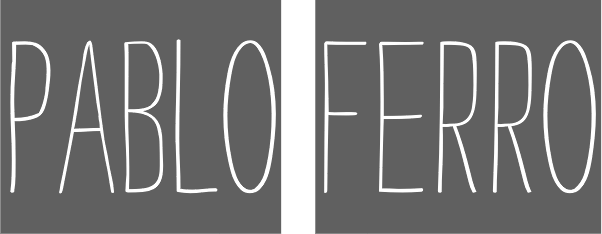
Pablo Ferro
|
Famous American movie title designer, b. 1935, Antilla, Oriente Province, Cuba, d. 2018. Pablo Ferro was raised on a remote farm before emigrating to New York with his family as a teenager. Ferro taught himself animation from a book by Preston Blair. In the mid fifties, he began freelancing in the New York animation industry for Academy Pictures and Elektra Studios. He met former Disney animator William Tytla, who became his mentor. Another peer was Stan Lee, the editor of Marvel Comics, with whom he created a series of science fiction adventure comics. In 1961 he became one of the partners to form Ferro, Mogubgub and Schwartz with animation stylist Fred Mogubgub and comics artist Lew Schwartz, and in 1964 he formed Pablo Ferro Films. Ferro worked on films such as Stanley Kubrick's Dr. Strangelove and The Thomas Crown Affair. Wikipedia: Ferro has won over 70 national and international awards, among them numerous CLIOs, a DGA Excellence in Film Award, and several Lifetime Achievement awards. He has also received nominations from such highly regarded institutions as the Smithsonian Cooper-Hewitt. In 1999 Pablo was awarded the prestigious DaimlerChrysler Design Award, and in 2000 Pablo was inducted into the Art Directors Hall of Fame. His beautiful and quirky movie titling inspired many typefaces: [Google]
[More] ⦿
|
Richard Frick
|
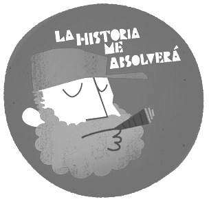
Swiss typographer who spoke at the Typocircle in London about Cuban typography on January 23, 2003. Author of Satztechnik und Typografie (GDP Verlag, coauthored with Christine Graber, Renata Minoretti, Martin Sommer), and Plakatkunst der kubanischen Revolution (RiFri-Edition). [Google]
[More] ⦿
|
Roberto Ruiz
|
Cuban type designer. Cuendias (2015, by Claudia Cuba and Roberto Roiz) won an award at Tipos Latinos 2016. [Google]
[More] ⦿
|
Studio for Transcultural Design-Creative Solutions
|
Foundry in Vienna that makes gorgeous commercial fonts for African languages. These pictograms are so nice that I will list each of them. The complete font set retails for about 1000 USD. - Akelouke1: cave writing from the Sahara, 5000BC.
- Bete: symbols from Cote d'Ivoire, 1956.
- Mezzouliet: cave writing from the Sahara, 5000BC.
- Indalag: cave writing from the Sahara, 5000BC.
- Adinkra: modern symbols from Ghana.
- Meroitic: Egyptian hieroglyphs.
- Celto-Iberic: Spanish and North-African runes.
- Canary: runes from the Canary Islands.
- Bamum: pictograms from Liberia, 1890 and 1894.
- Loma: Liberian script, 1930.
- Vai: Liberian script, 1894. The Vai script was devised by Momulu Duwalu Bukele in about 1833 (Near Cape Mount, Liberia).
- Nsibidi: a complex Nigerian system of pictograms and ideograms, known as Nsibidi (or Nsiberi) has been used traditionally in the cross river area of Nigeria, especially among the Ekoi, Igbo and Ibibio.
- Nubian: Ethiopian script.
- Amharic: Another Ethiopian script.
- Ibo Geneva Style: Geneva with proper diacritics for Ibo.
- Nigerian Times.
- Pan African Arial Style.
- Orisha Arial Style.
- Djuka: A pictogram language from Suriname, 1910.
- Voodoo (Veve): A particularly elegant set of pictograms found in Haiti.
- Abakuá: Pictograms from Cuba, 1980.
- Cabbal: Pictograms from Tobago, 1990.
[Google]
[More] ⦿
|
T-26
[Carlos Segura]
|
T-26 was founded in 1994 by the Cuban designer Carlos Segura, and is located in Chicago. It was one of the world's most prolific font producers, with over 1900 fonts made by about 200 designers, but ran out of steam in the 21st century. List of font names and package numbers. Segura himself made a few fonts, including Chopsticks (2002), Square45 (2000, a 5-weight font family with LCD-like lettering, with Tnop Wangsillapakun), Square 40 (1995, based on lettering found a 1940s propaganda sign). Latest releases. View T-26's typefaces. Another listing of the T-26 fonts. [Google]
[MyFonts]
[More] ⦿
|
Yesmany Marrero
|
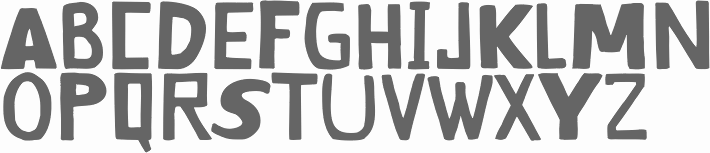
 Graphic designer and illustrator Yesmany Marrero (La Habana, Cuba) created the circle-based geometric typeface Pepilla in 2013. [Google]
[More] ⦿
Graphic designer and illustrator Yesmany Marrero (La Habana, Cuba) created the circle-based geometric typeface Pepilla in 2013. [Google]
[More] ⦿
|
