TYPE DESIGN INFORMATION PAGE last updated on Mon Jun 8 17:58:15 EDT 2026
FONT RECOGNITION VIA FONT MOOSE

|
|
|
|
Shinn Type
[Nick Shinn]
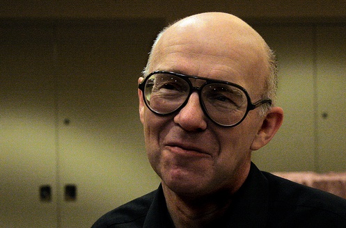
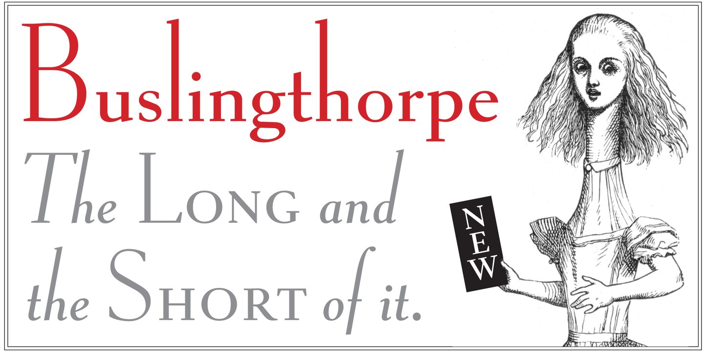
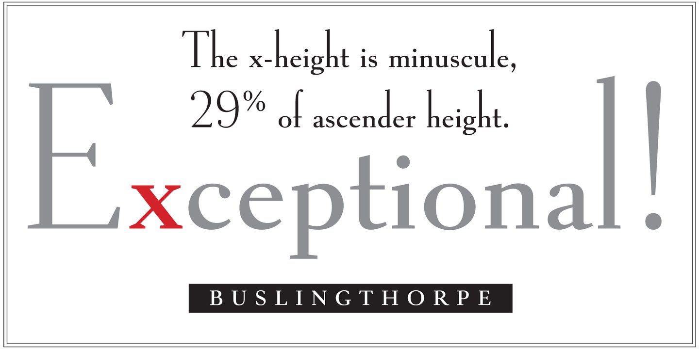
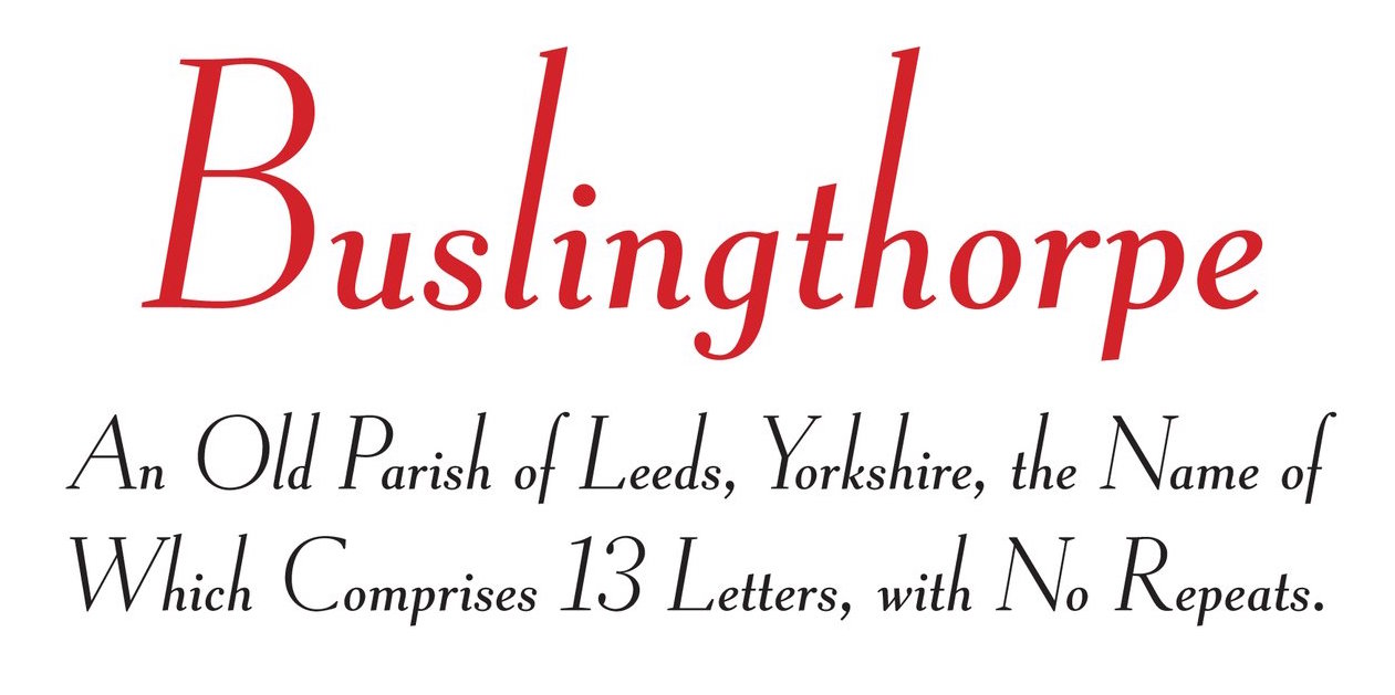
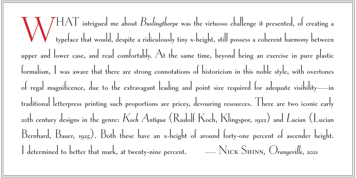
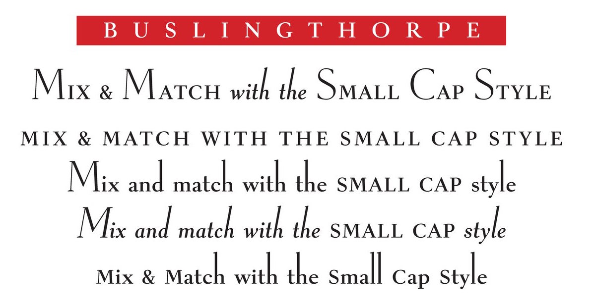
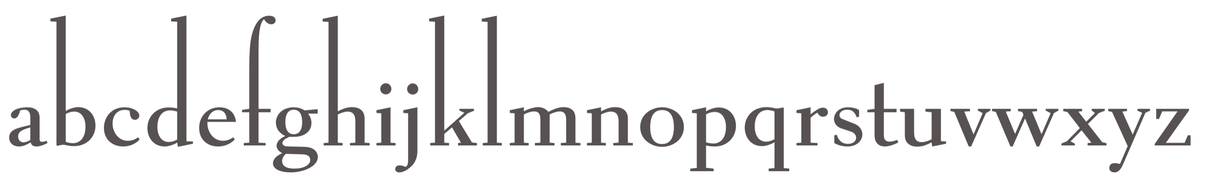
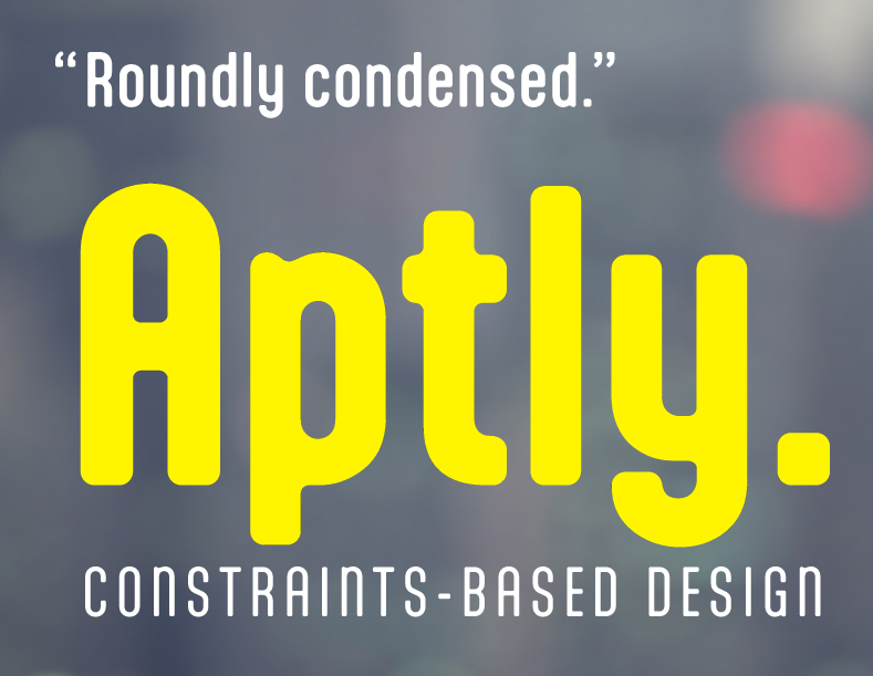
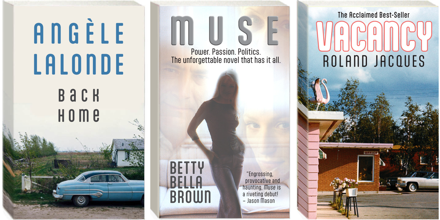
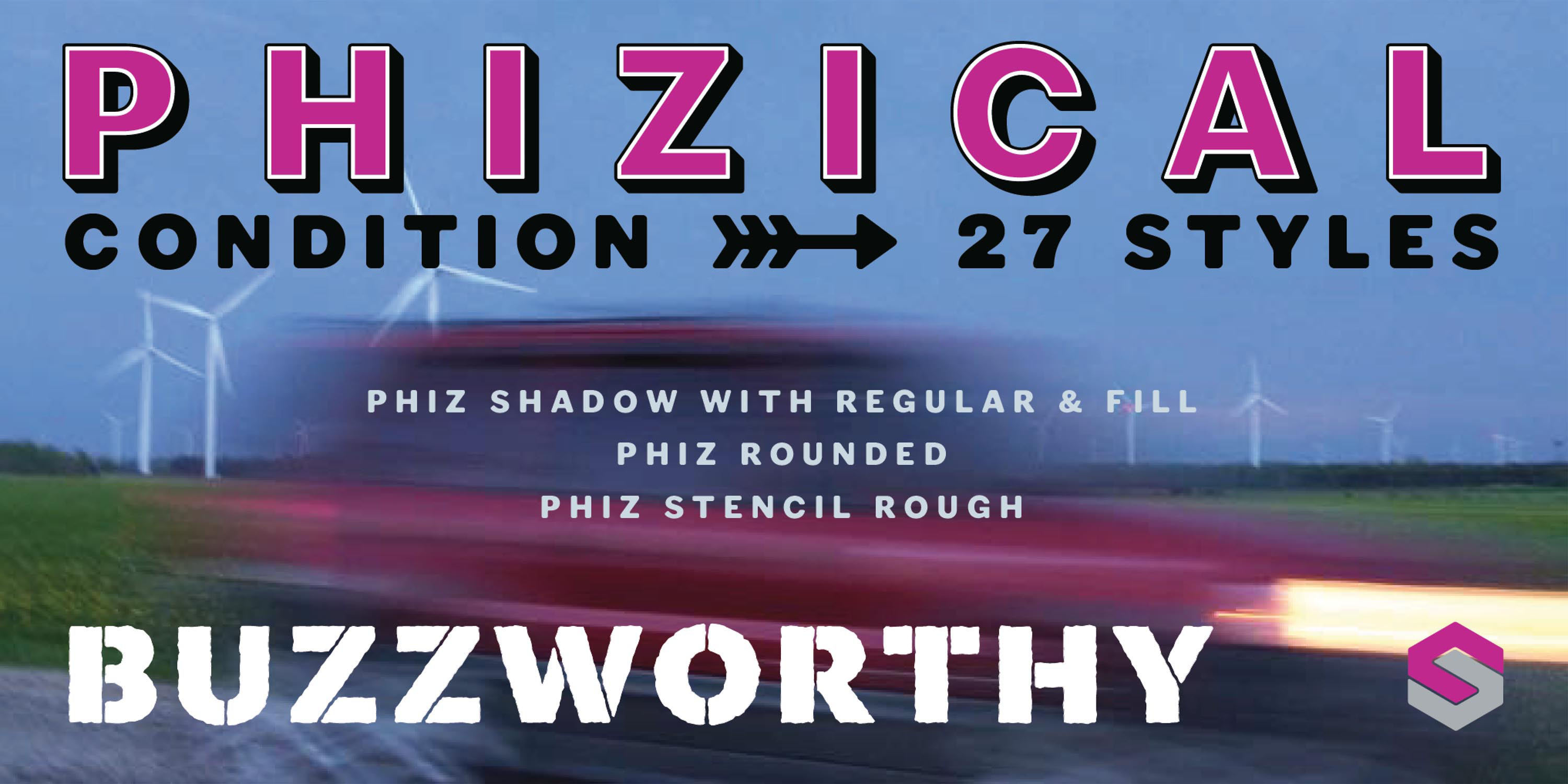
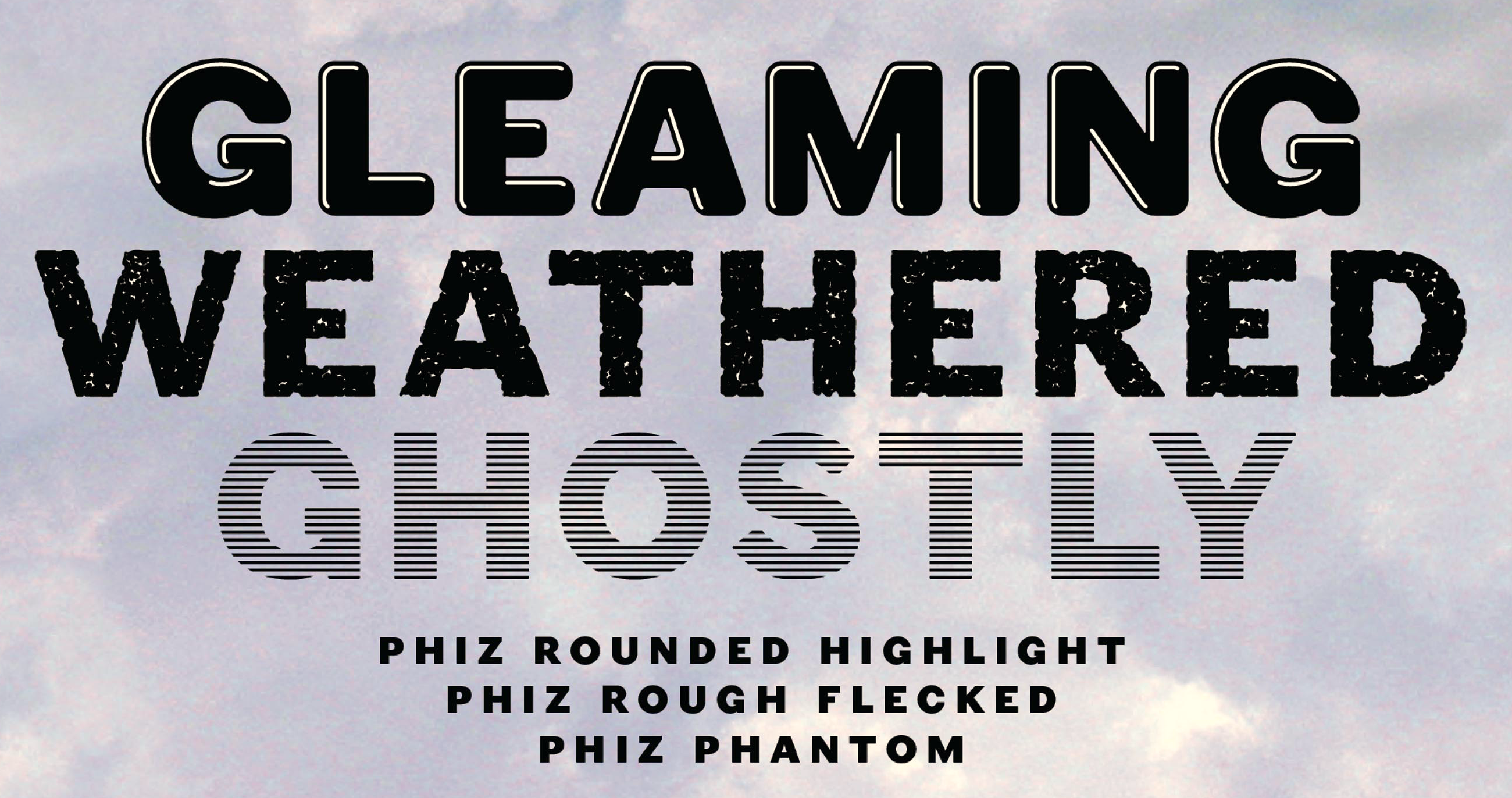
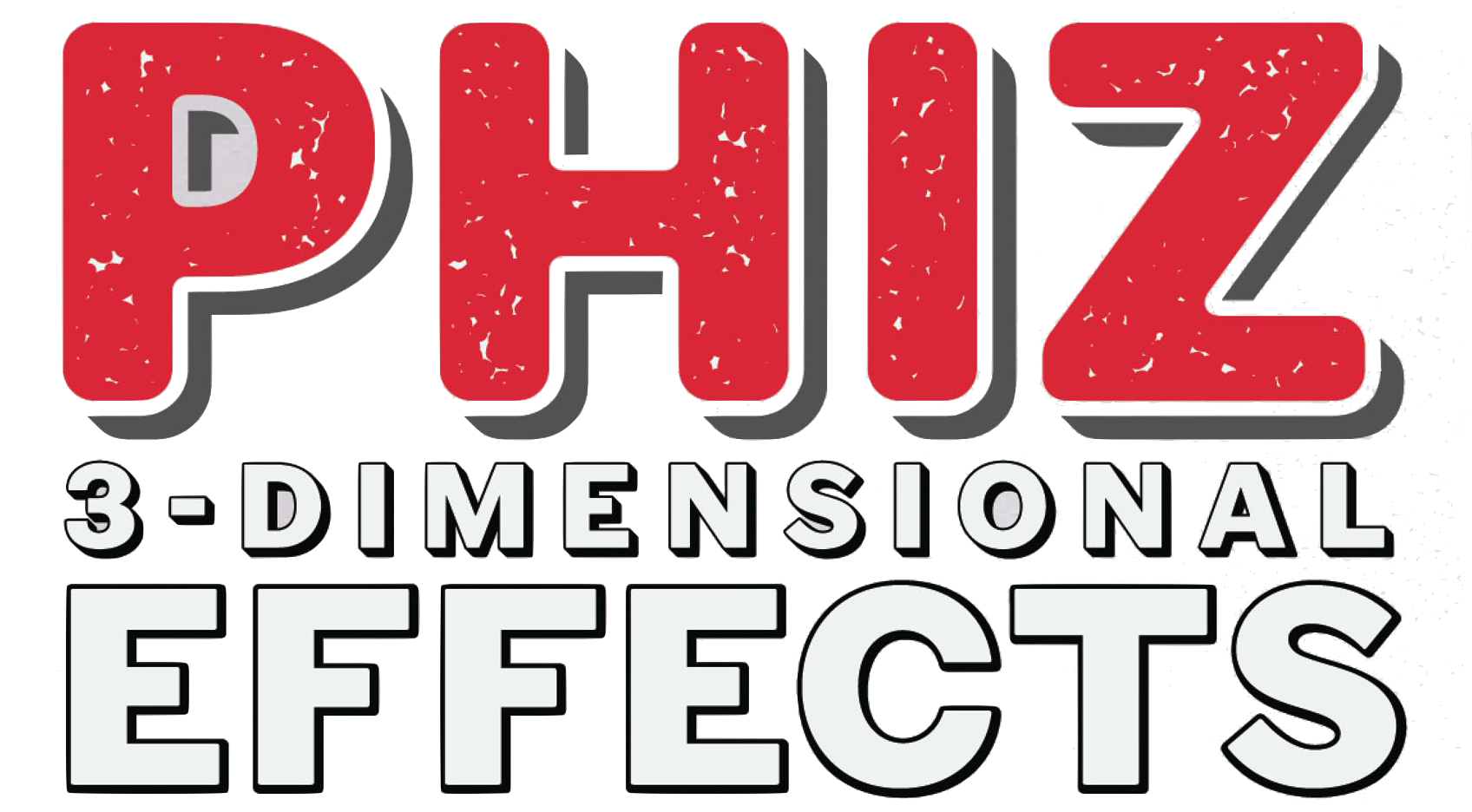
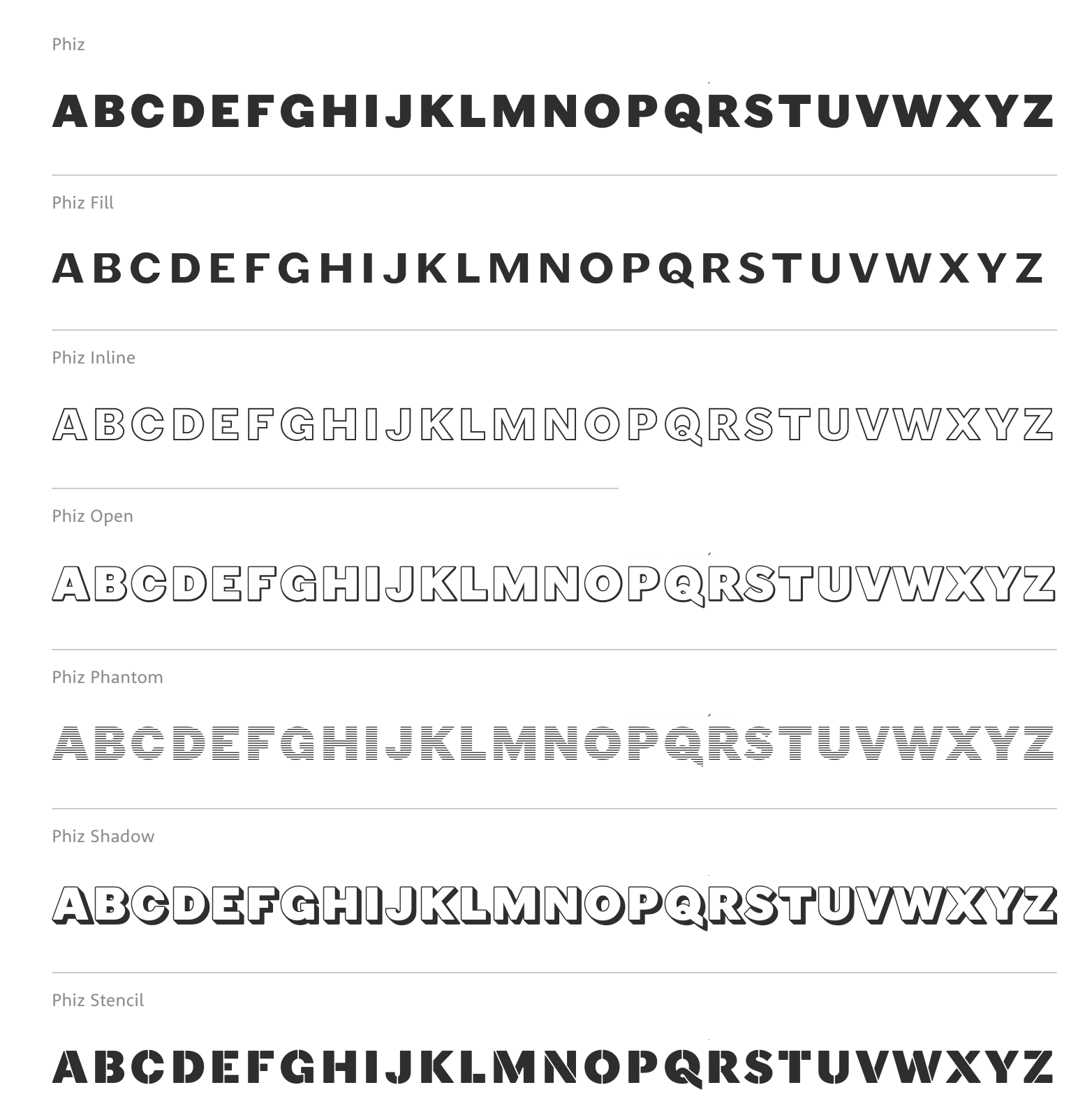
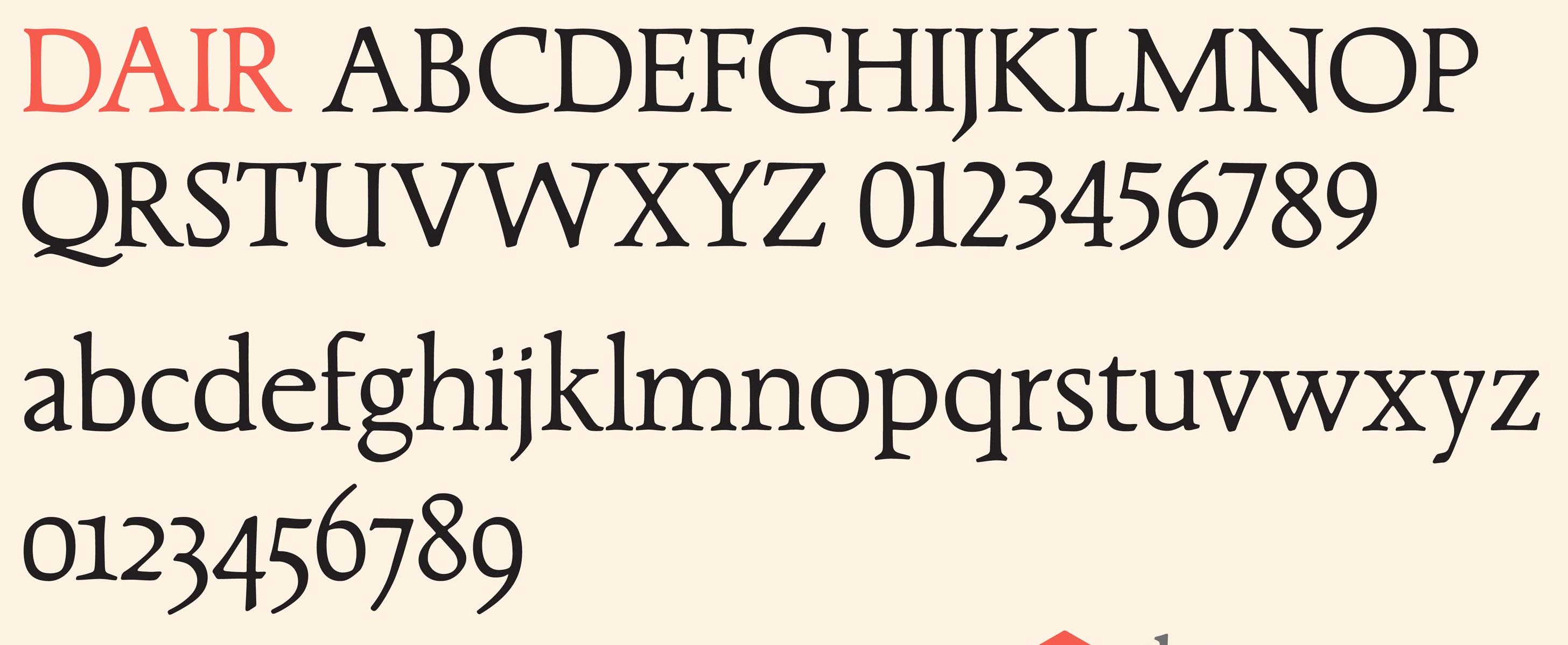
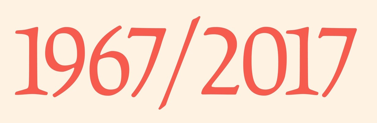
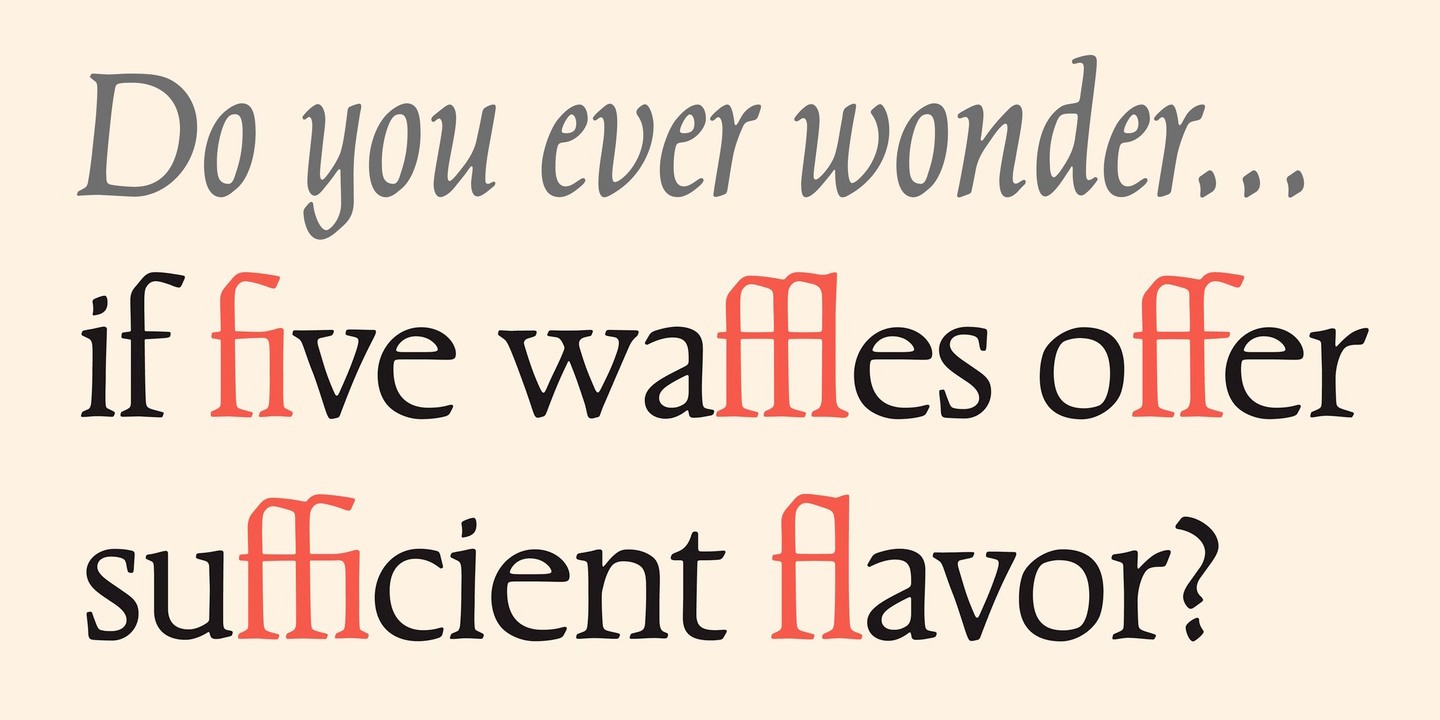
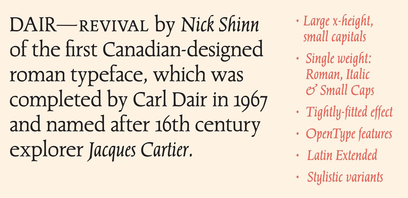
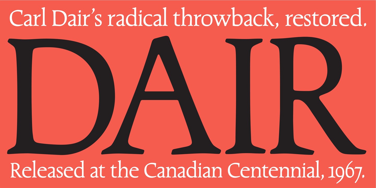
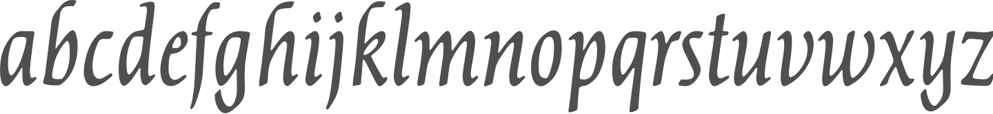
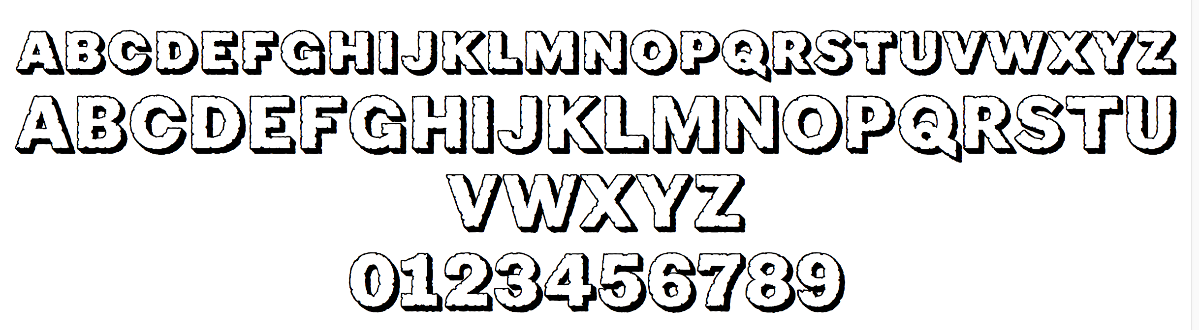
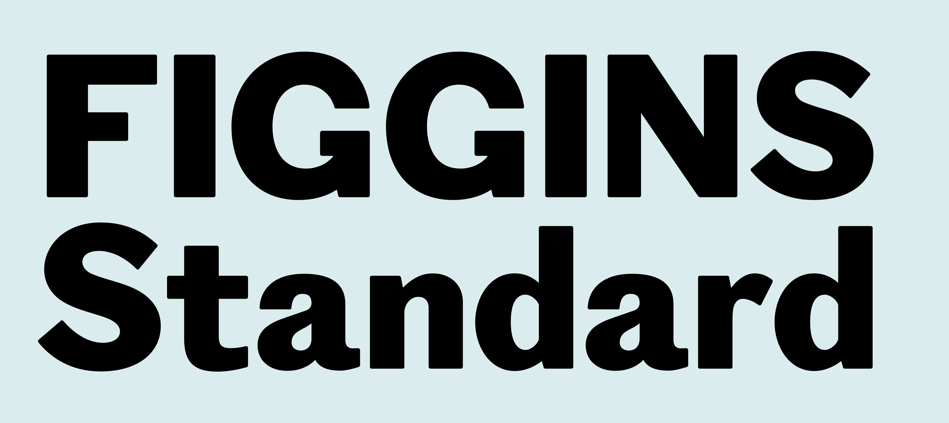
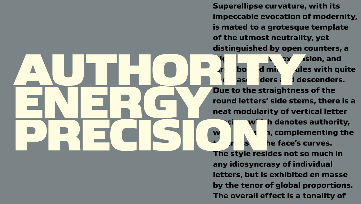
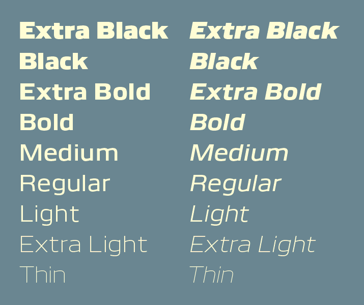
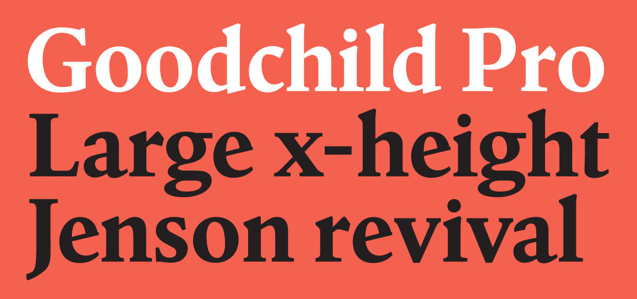
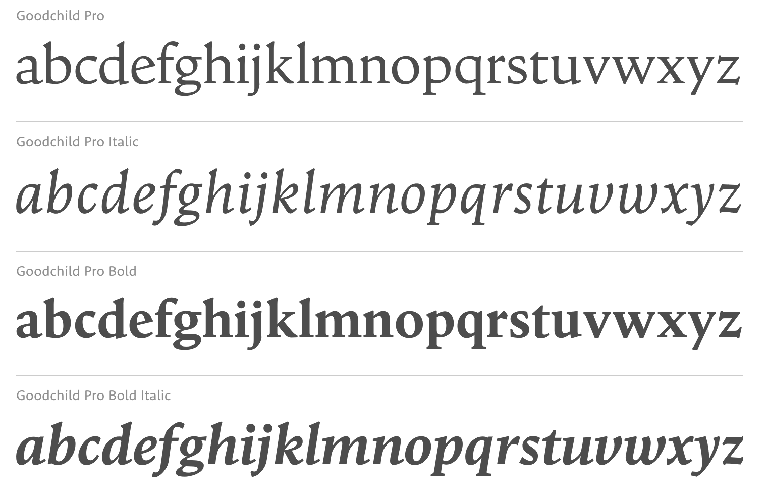
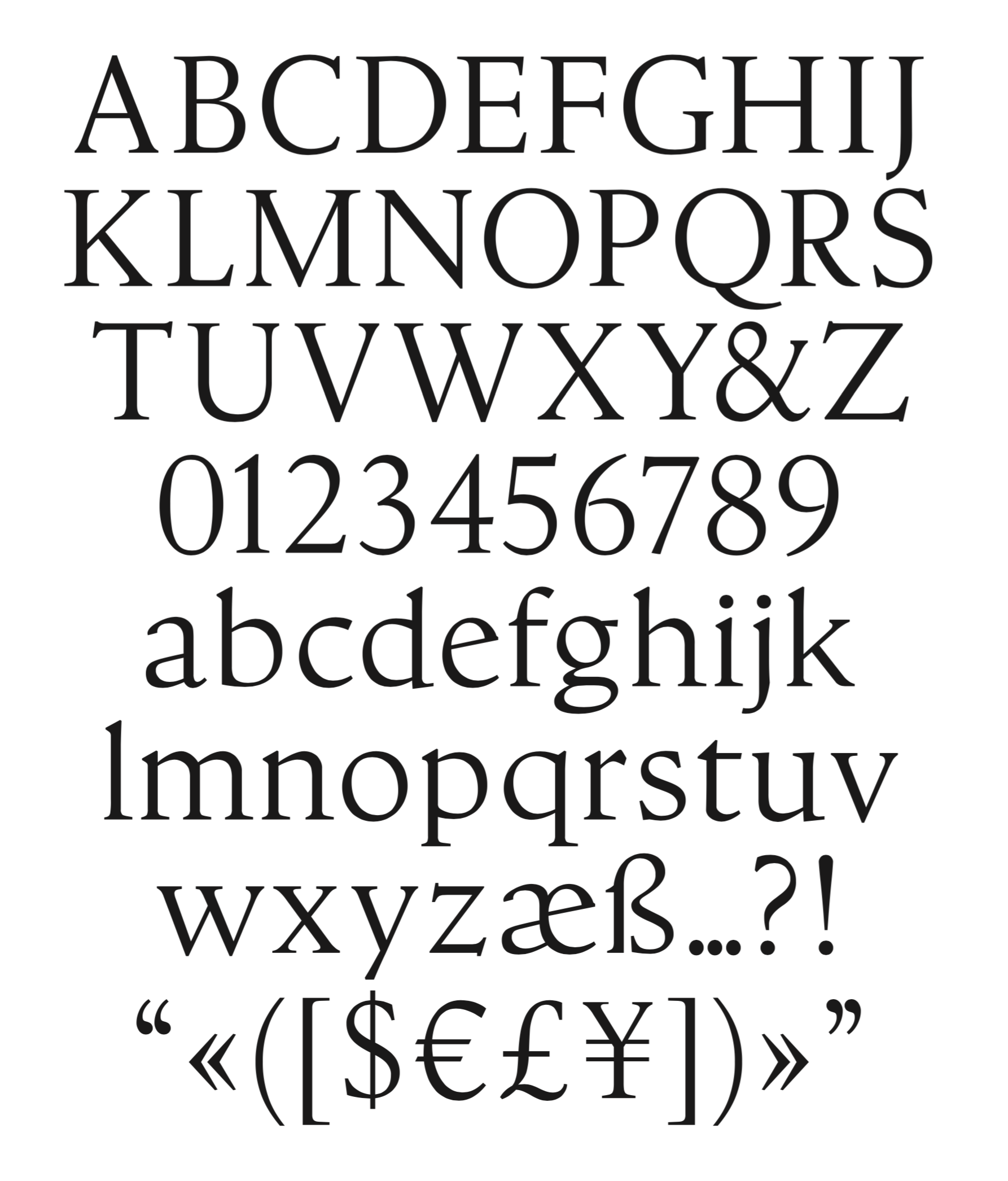
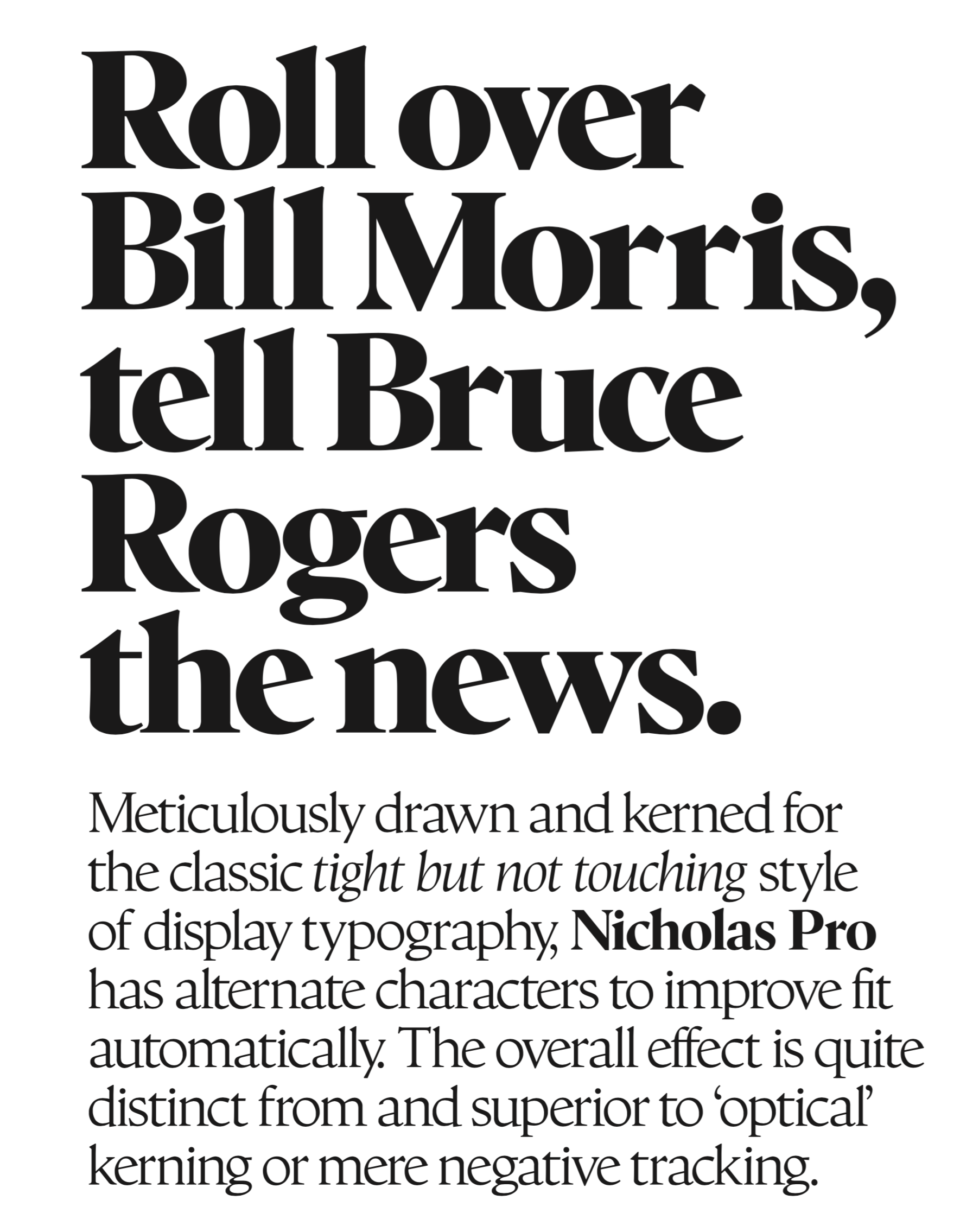
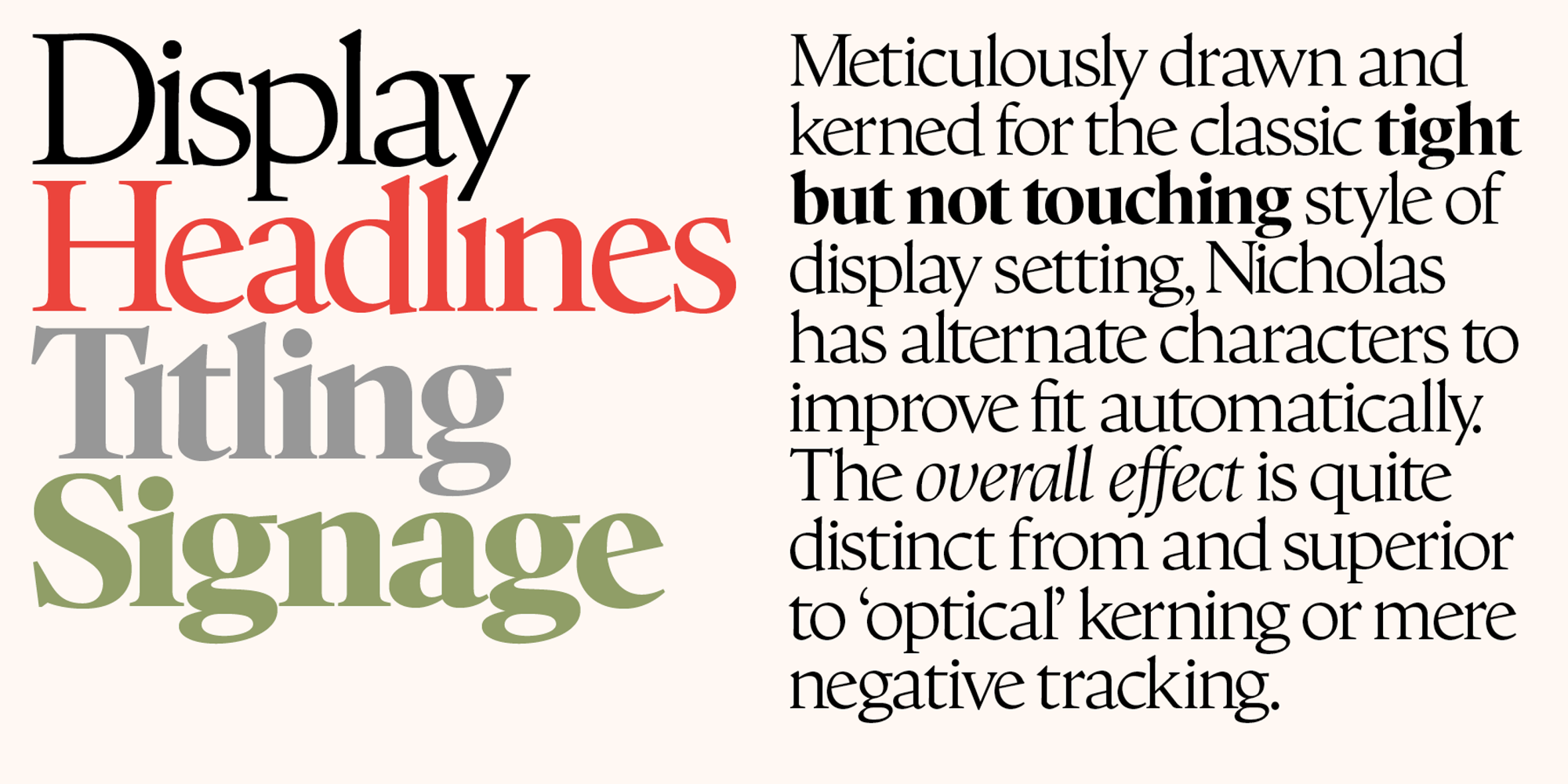
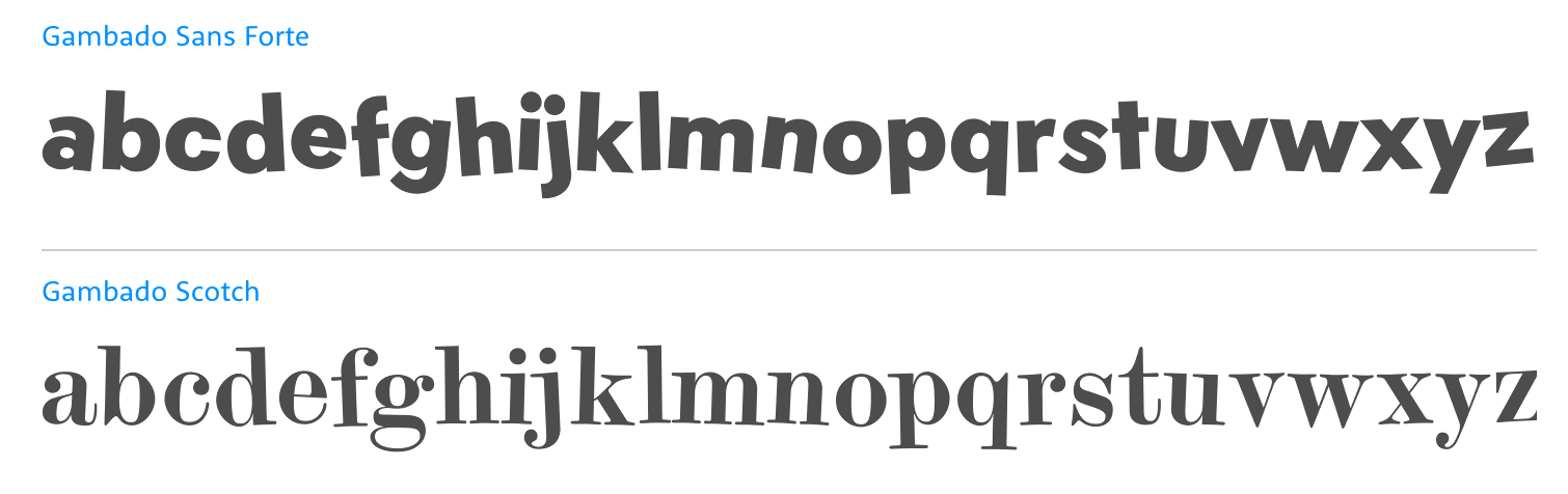
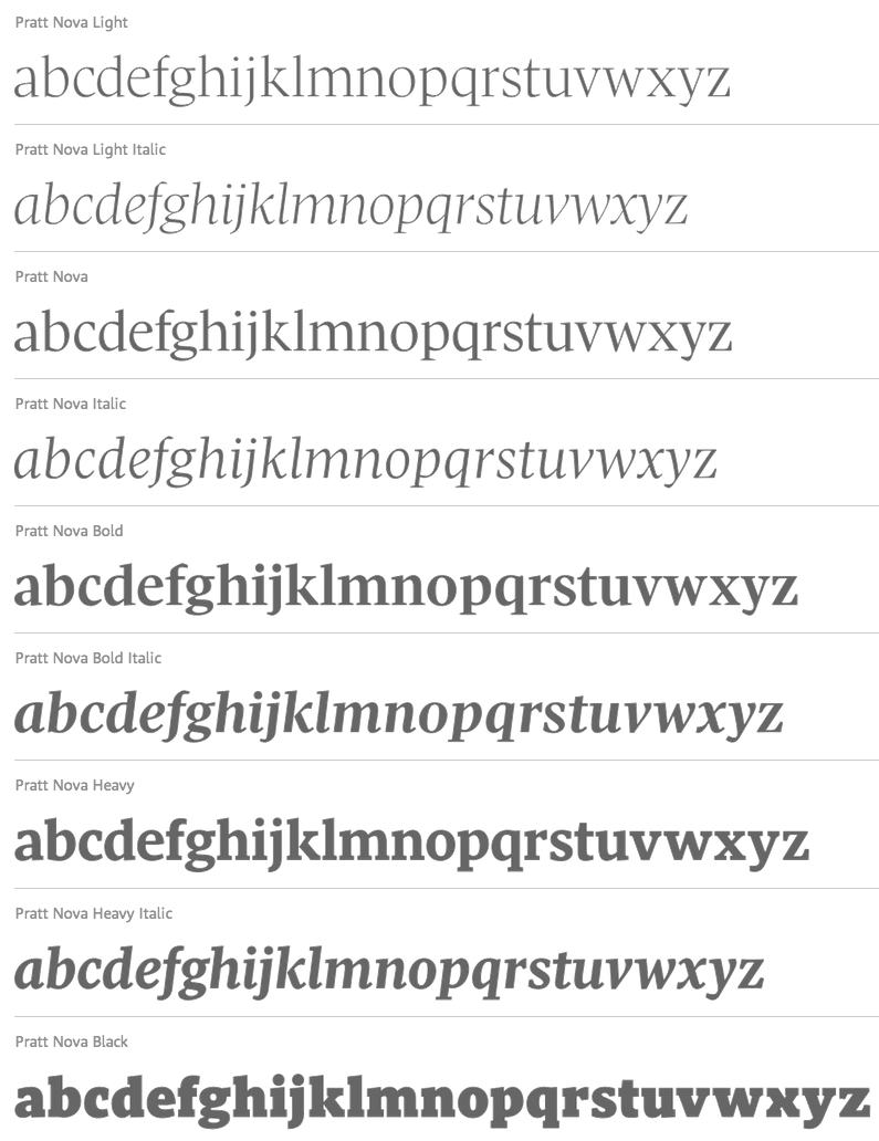
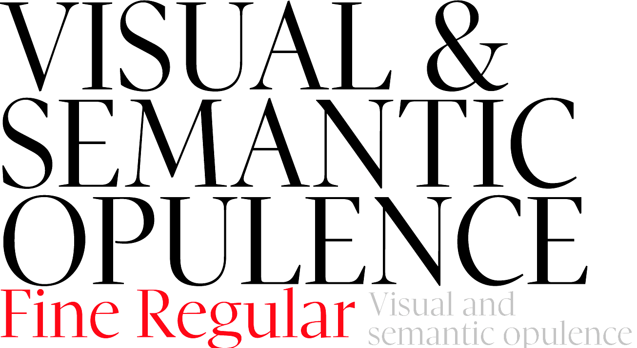
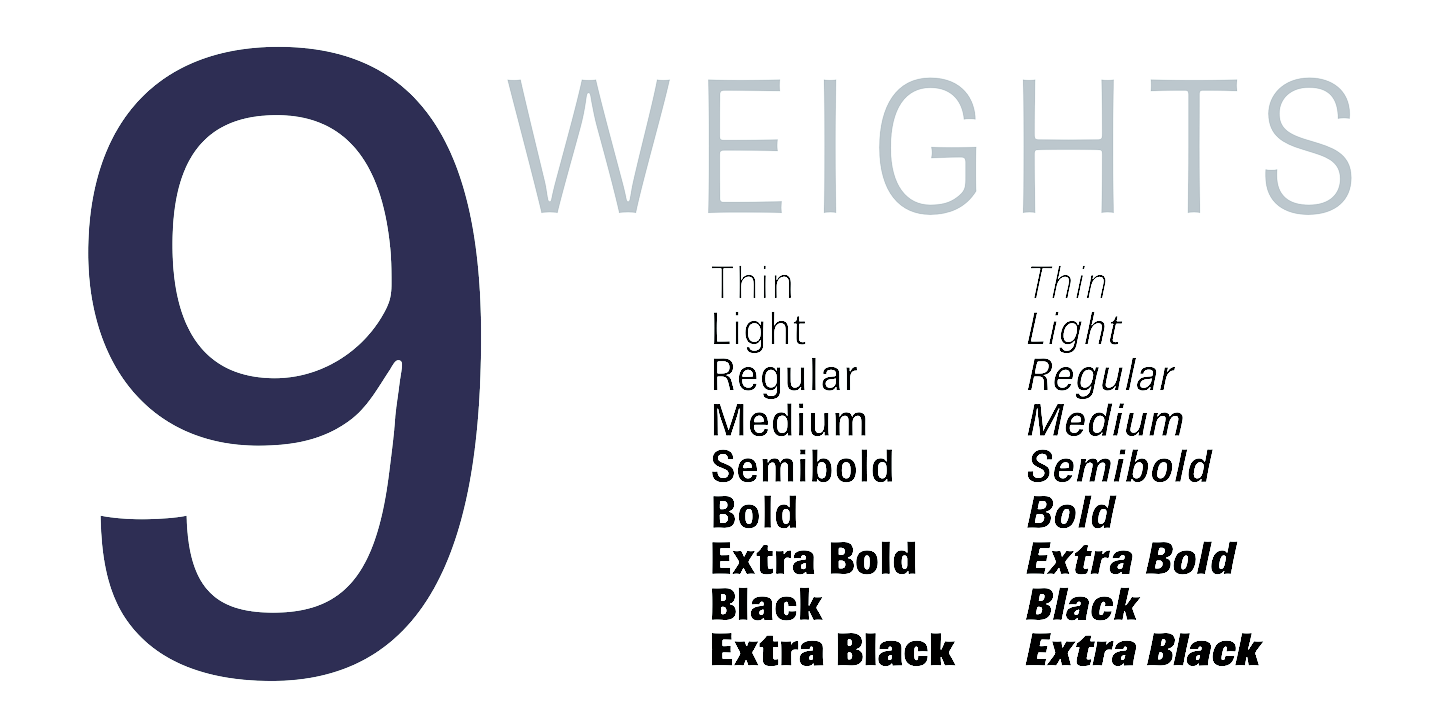
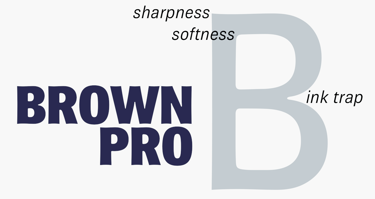
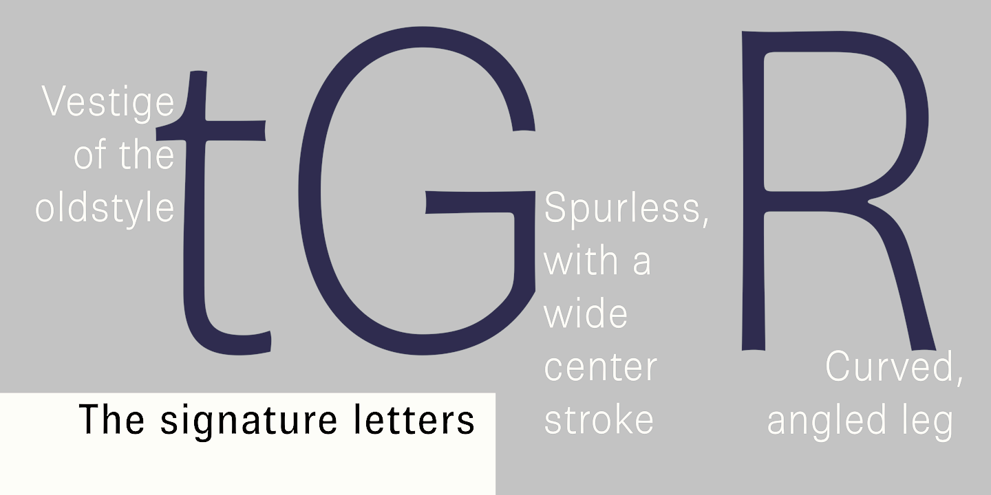
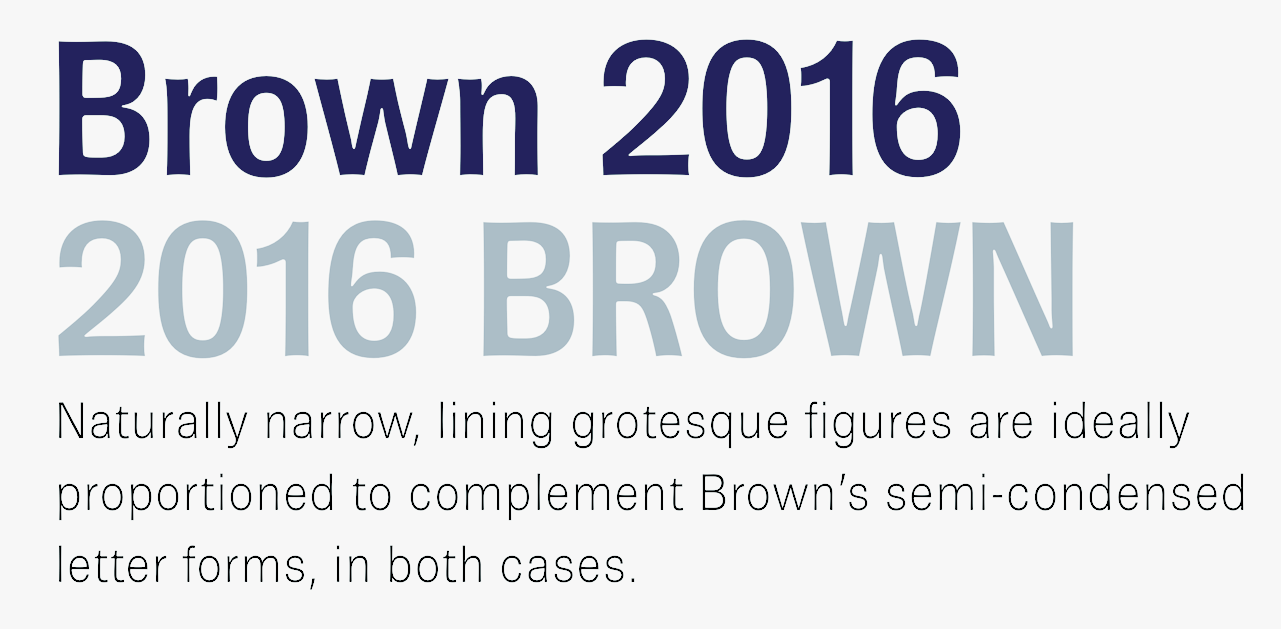
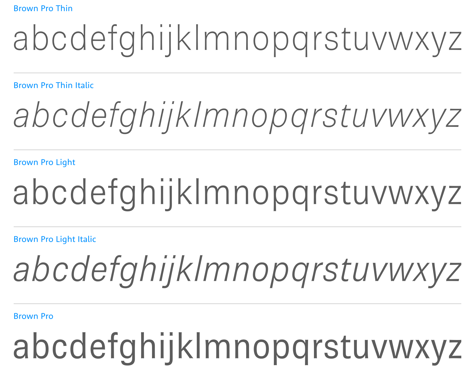
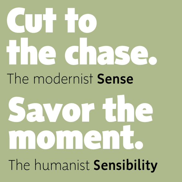
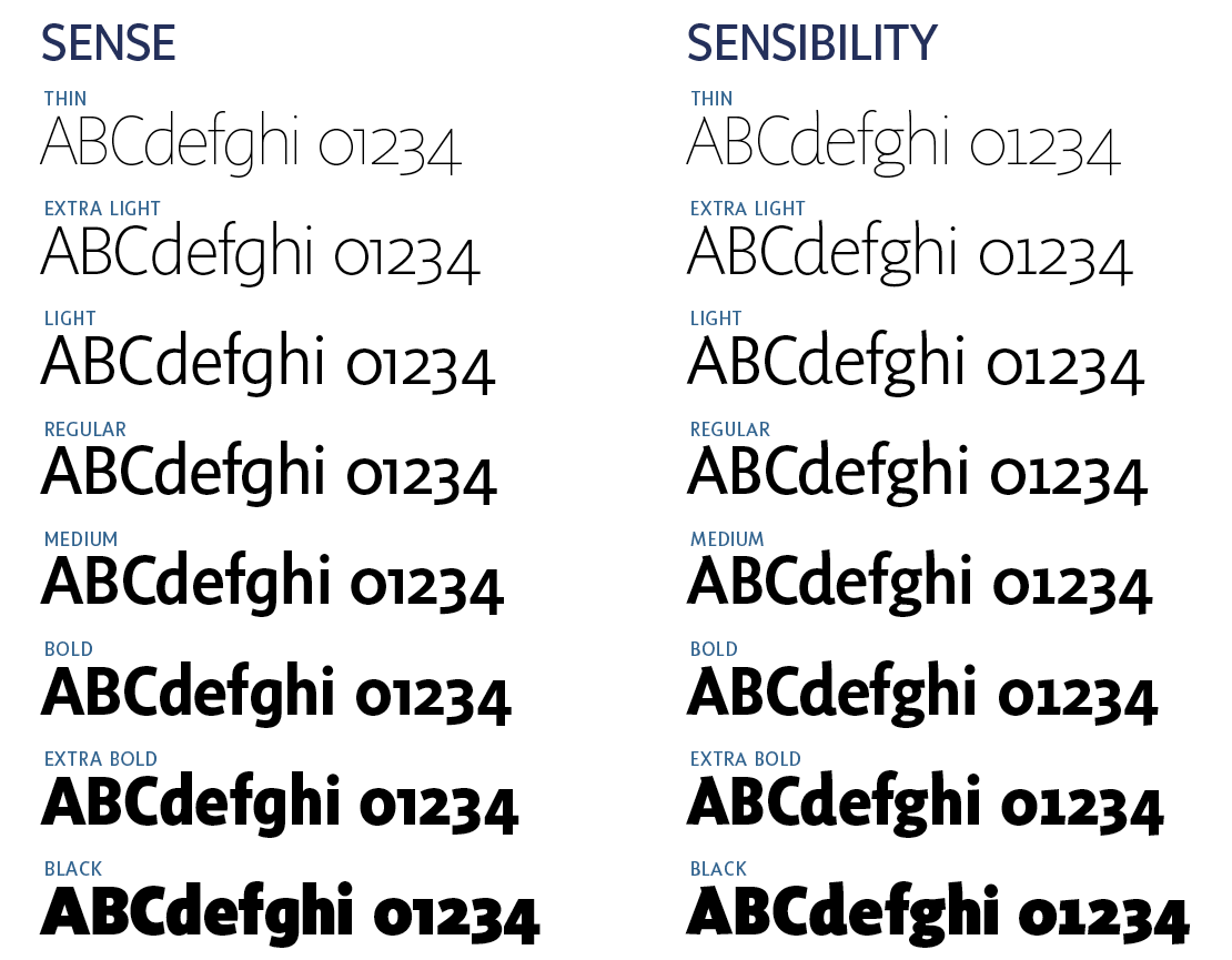
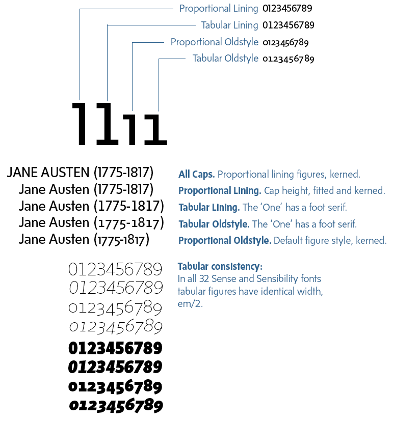
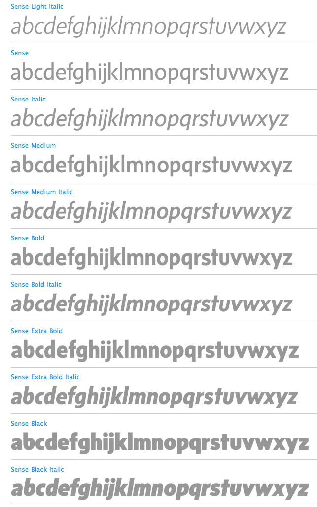
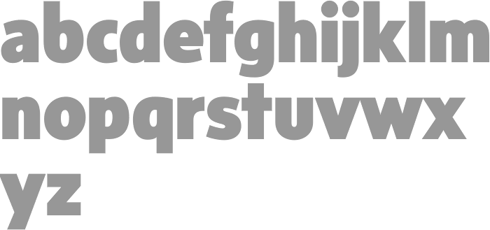
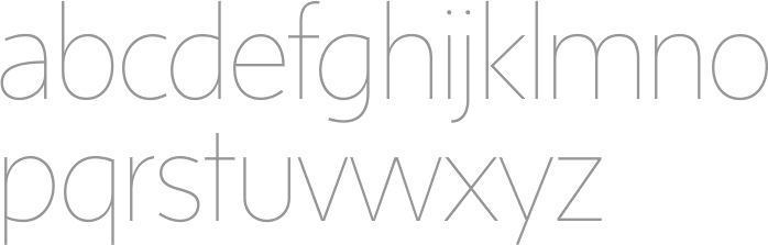
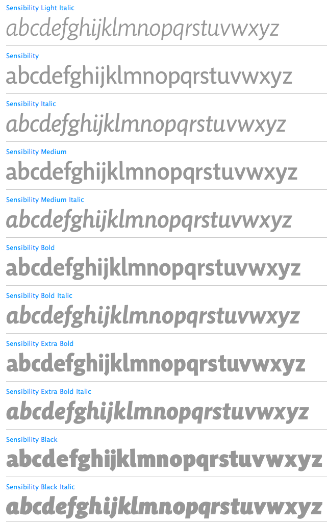
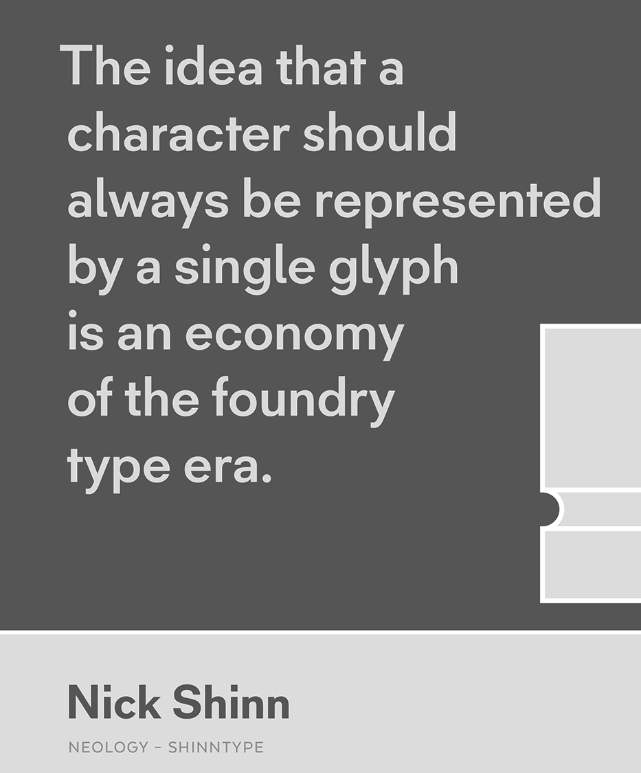
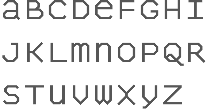
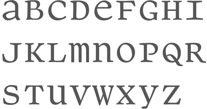
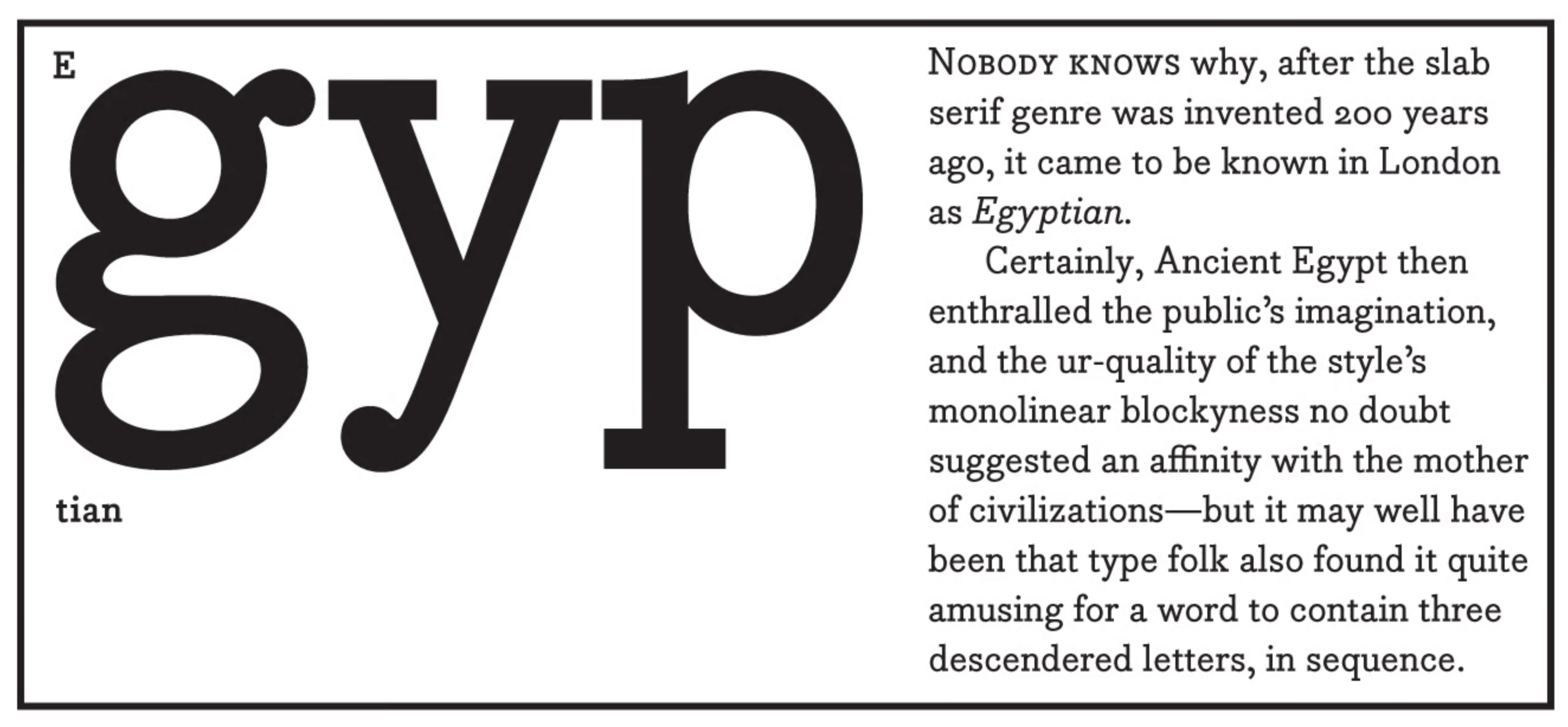
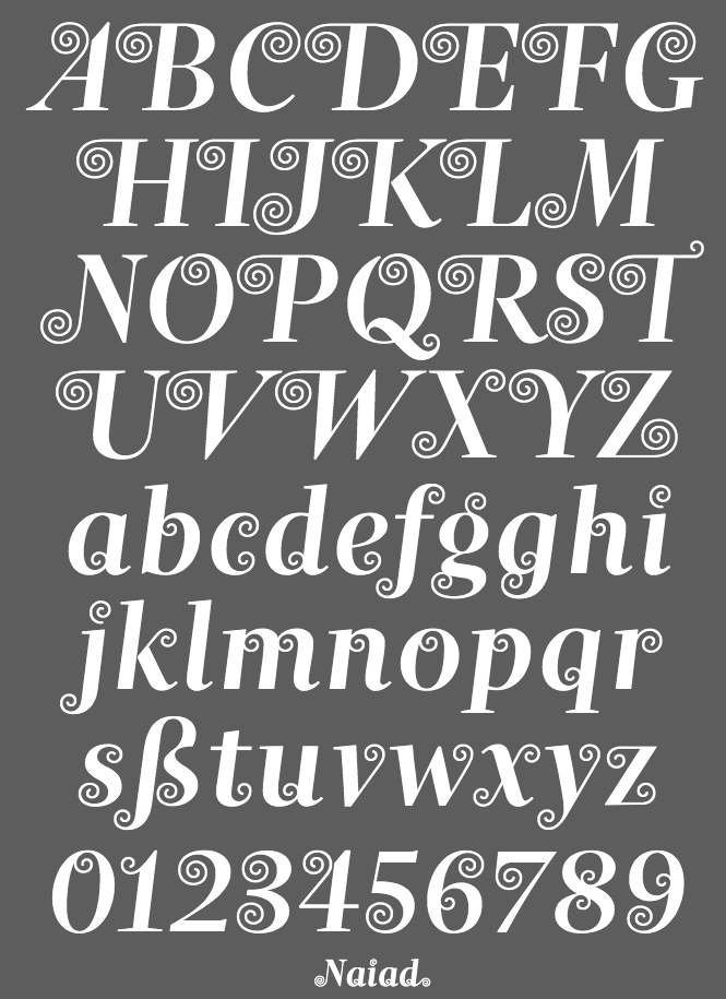
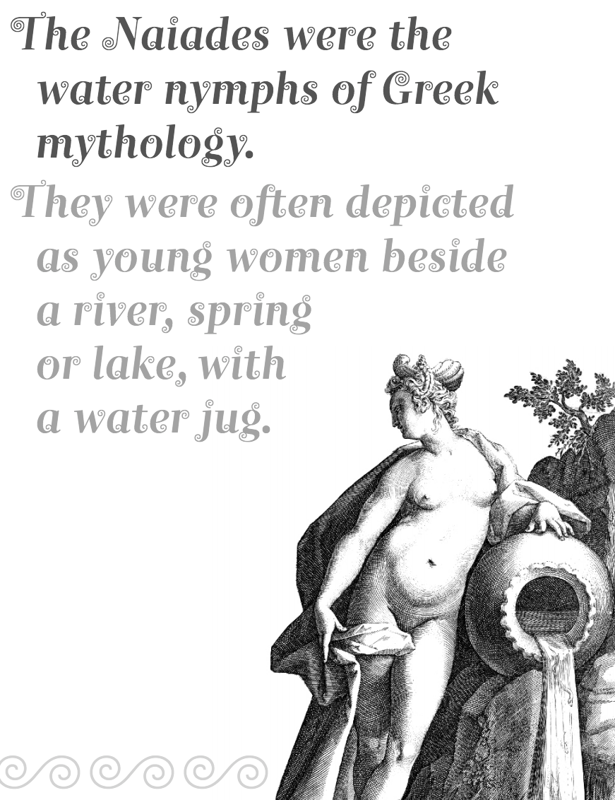
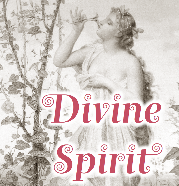
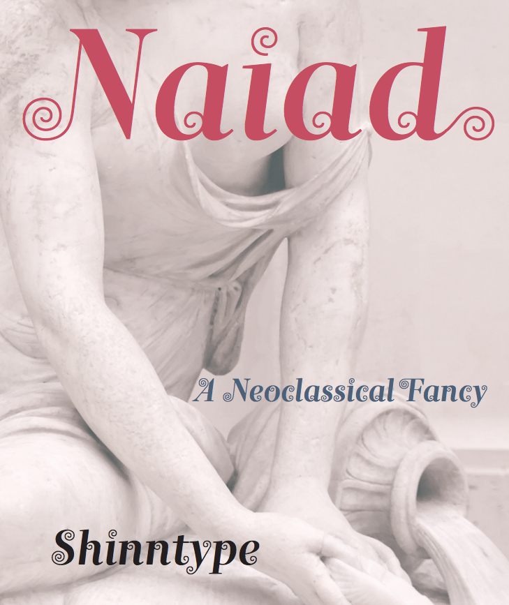
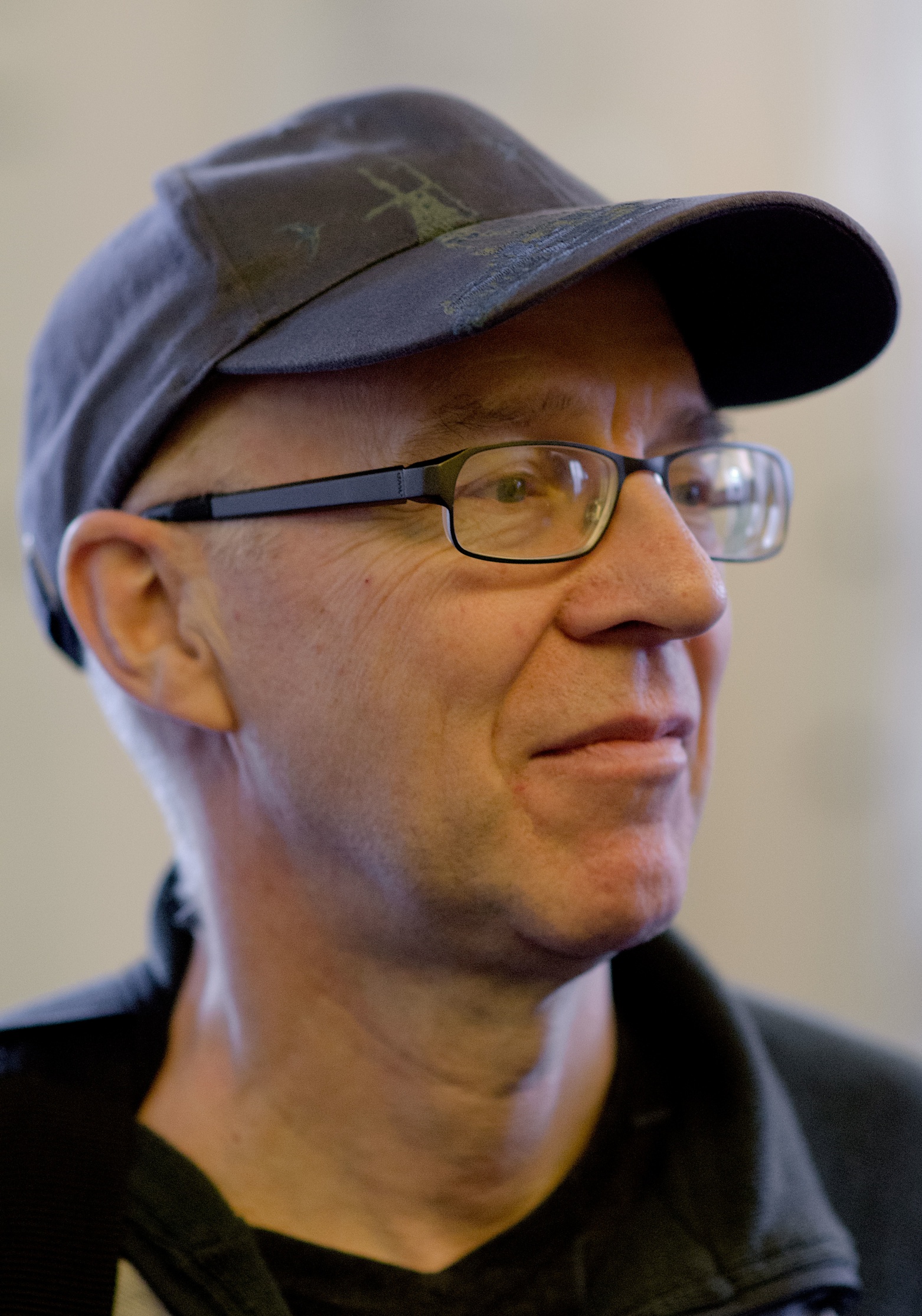
Nick Shinn (b. London, 1952) is an art director and type designer. He teaches at York University in Toronto, and is a founding member of the Type Club of Toronto. He writes regularly for Graphic Exchange magazine, and has contributed to Applied Arts, Marketing, Design, and Druk. He founded Shinn Type in 1999, and made fifteen type families. Interview by Jan Middendorp, in which he describes himself as a contrarian. Pic by Isaias Loaiza. Pic by Chris Lozos at Typo SF in San Francisco in 2012. Custom typefaces have been produced for newspapers such as The Birmingham News (Alabama), The Chicago Tribune, The Daily Express (London), The Daily Mail (London), The Globe and Mail (Toronto), The Montreal Gazette, and The St. Petersburg Times (Florida). Custom fonts, with exclusive rights, have been created for corporations such as Thomson Nelson, Enbridge, Rogers Communications Inc., and Martha Stewart Living. Nick organizes type evenings in Toronto all year long. Shinn Type fonts at MyFonts. Behance link. He is the designer of Fontesque (a wild family of curly glyphs), the monospaced font Monkey Mono, Artefact (1999), Beaufort (a sharply serifed family done in 1999; in 2008, he published a 10-style extension called Beaufort Pro), Bodoni Egyptian (1999), Alphaville (2000, techno typeface with straight mono-width strokes), Brown, Brown Gothic, Duffy Script (2008, in 4 styles: an interpretation of the lettering of contemporary illustrator Amanda Duffy, aka Losergirl), Handsome (1999, cursive handwriting family, since 2005 available in OpenType), Merlin, Oneleigh (1999, masterful!!), Paradigm (1995, updated in 2008, inspired by 15th century letterforms), Shinn, Walburn (1996) [note: Walburn and Brown were originally commissioned for the 2000 redesign of the Globe and Mail. Walburn is an adaptation of a didone typeface by Erich Walbaum, c.1800], Worldwide (1999). In 2001, he designed the Richler font in honour of the memory of Mordecai Richler. The Richler font was only available to the Giller Prize, Random House and the Richler family until its public release in May 2013 at MyFonts, where Richler (+Cyrillic, +Greek) is advertised as a 21st century antiqua book face. In 2002, he published Goodchild (a Jenson revival; see also Goodchild Pro (2017). Goodchild is a Venetian with clean (not antiqued!) outlines and a larger-than-Jensonian x-height. It comes in 4 styles and is targeted at sophisticated academic typography) and the liquid lettering family Morphica, exclusively at Veer. In 2003, he released the absolutely gorgeous "modern" sans Eunoia (which has a unicase weight), and the quirky sans family Preface (2003; Preface Thin is a hairline weight; Preface Light is free at FontShop). In 2003, he also published the mmonowidth unicase family Panoptica (2003), which includes styles called Regular, Sans, Egyptian, Doesburg and Octagonal, to name a few. In 2004, he released Nicholas, a Jensonian serif family, which is the headline version of Goodchild. Additions in 2006 include Softmachine (VAG Rounded/comic book style family). Sexy type from Toronto is an article by Erin Kobayashi about Shinn's work published in the Toronto Star on April 15, 2007. Nick Shinn designed the type for the redesign of The Globe and Mail in April 2007: Globe and Mail Text [look at the f], Globe and Mail Sans (or GM Sans), Globe and Mail News (or GM News). In 2008, these typefaces went retail. One typeface is called Pratt, named after David Pratt, the design director at The Globe and Mail who commissioned the typeface for his redesign of the paper. The companion typeface will be called Pratt Sans. Additions in 2008: Figgins Sans (4 styles), Scotch Modern (a 5 style didone family that revives the typeface used in New York State Cabinet of Natural History), Scotch Micro. Paul Shaw writes: Scotch Roman, beloved by D.B. Updike and W.A. Dwiggins, was a standard in the typographic repertoire of pre-World War II printers but fell out of favor after the war, supplanted by Bodoni. Nick Shinn of Shinntype has made a bid to resurrect this oft-maligned typeface with Scotch Modern. Scotch Modern is not a revival of the familiar Scotch Roman of Linotype and Monotype, but of a more modern design attributed to George Bruce, the great 19th-century New York punchcutter. Shinn used a sample of the typeface from the New York State Cabinet of Natural History's 23rd Annual Report for the Year 1869 (printed in 1873) as a model. He drew it by eye, aided by a sharp loupe: no photographic enlargements, no scans, no tracing. The ends of the strokes are slightly rounded, to capture the effect of metal type being impressed into soft paper. Shinn contends that the 19th-century Scotch types were "eminently readable" and a factor in the rise of modern literacy. His rendition, an OpenType font, aims for readability in all situations with display, regular, and microtype versions. The display roman includes a unicase font-a nod to Bradbury Thompson's Alphabet 26 experiment-and the italic has elegant swash caps. Scotch Roman has never been a typeface for those seeking eternal beauty or anyone desperate for typographic kicks. Dwiggins gave it a 10 for legibility (where 10 was "reasonable human perfection") but only 4 for grace and 0 for novelty. Shinn's Scotch Modern, with its many OpenType extras, scores well on all three counts. It's a typeface for those who prefer a mature single malt: simple at first, but more complex as it is savored. Photograph. At ATypI 2008 in St. Petersburg, his talk was entitled Scotch Modern. Several catalogs have been published by Shinntype. Particularly noteworthy is The Modern Suite (2008, Nick Shinn, Coach House Press, Toronto), which showcases Figgins Sans and Scotch Modern. Sample of some Scotch Modern dingbats. Production in 2010: Sensibility (a humanist sans superfamily), Sense (a modernist sans superfamily), Bodoni Egyptian Pro (a monoline slab Bodoni experiment---the Pro version of a 1999 family by him). In 2011, he created Checker, an all caps 3d black and white-tiled typeface, and Parity (a roman unicase pair). Naiad (2013) is a didone, or neoclassical, typeface with Victorian curlicues thrown in to create a Victorian look. Pratt Nova (2014) is a 17-style large x-height typeface family that attempts to achieve visual and semantic opulence, equipping the typographer with a comprehensive array of harmonized fonts, all rigorously drawn, superbly fitted iterations of a single, profoundly original design. Neology (2014) is a 15-style sans family subdivieded into Deco, Grotesque and plain sans subfamilies. Brown Pro (2016) is a classic grotesque, distinguished by its semi-condensed proportions and slight flaring of the edges and some ink traps. Figgins Standard (2016) is a take on the low-contrast original sans typefaces designed in the 1830s in industrial London. Gambado (2016). This is a collection of shaken typefaces with bouncing letters. Particular fonts include Gambado Sans and Gambado Scotch. Dair (2017) is a revival of Canada's first home-grown typeface, Cartier, which was completed by Carl Dair in 1967 and named after 16th century explorer Jacques Cartier, who mapped the Gulf of St. Lawrence in the 1530s. Dair 67 and Dair 67 Italic are facsimiles of the original fonts. Dair and Dair Italic are fully-featured 21st century fonts. In 2018, Nick Shinn published Phiz, a diverse suite of 27 decorative fonts based on Figgins Sans Extra Bold. Designer of Boxley (2016), a superelliptical sans typeface family. At the end of 2020, he published the 14-style condensed rounded sans typeface family Aptly. o Typefaces from 2021: Buslingthorpe (a tall-necked typeface in which the x-height is only 29% of the ascender height, beating classic tall fonts such as Rudolf Koch's Koch Antiqua, and Lucian Bernhard's Lucian and Bernhard Modern). Speaker at ATypI 2017 Montreal. MyFonts interview. I Love Typography link. FontShop link. Klingspor link. |
EXTERNAL LINKS |
| | |


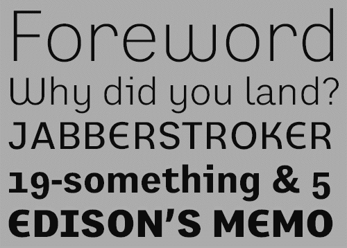
file name: Shinntype Buslingthorpe 2021 1
file name: Shinntype Buslingthorpe 2021 2
file name: Shinntype Buslingthorpe 2021 3
file name: Shinntype Buslingthorpe 2021 4
file name: Shinntype Buslingthorpe 2021 5
file name: Shinntype Buslingthorpe 2021
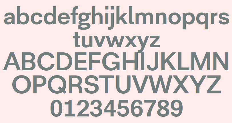
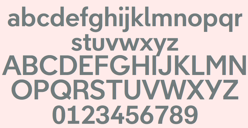
file name: Shinntype Aptly 2020 1
file name: Shinntype Aptly 2020 5

file name: Shinntype Aptly 2020
file name: Nick Shinn Phiz 2018 282244
file name: Nick Shinn Phiz 2018 282245
file name: Nick Shinn Phiz 2018 282247
file name: Nick Shinn Phiz 2018
file name: Nick Shinn Dair 2017 248032 after Carl Dair Cartier 1967
file name: Nick Shinn Dair 2017 248033 after Carl Dair Cartier 1967
file name: Nick Shinn Dair 2017 248035 after Carl Dair Cartier 1967
file name: Nick Shinn Dair 2017 248036 after Carl Dair Cartier 1967
file name: Nick Shinn Dair 2017 248037 after Carl Dair Cartier 1967

file name: Nick Shinn Dair 2017 after Carl Dair Cartier 1967
file name: Nick Shinn Dair67 Italic 2017 after Carl Dair Cartier 1967
file name: Nick Shinn phiz Rough Shadow 2019
file name: Shinn Type Figgins Standard 2016 212917

file name: Shinn Type Figgins Standard 2016 212918

file name: Shinn Type Figgins Standard 2016 212920

file name: Shinn Type Figgins Standard 2016
file name: Nick Shinn Boxley 2016 219791
file name: Nick Shinn Boxley 2016 219793

file name: Nick Shinn Boxley 2016a

file name: Nick Shinn Boxley 2016b
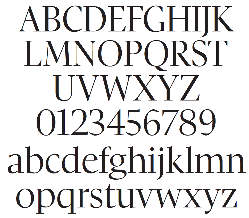
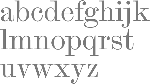
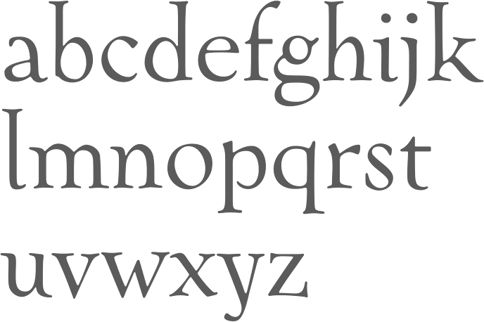
file name: Nick Shinn Goodchild Pro 2017 224183

file name: Nick Shinn Goodchild Pro 2017
file name: Nick Shinn Goodchild Pro 2017a
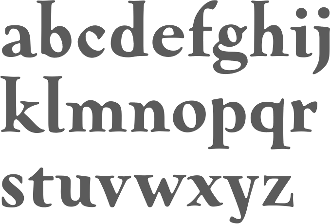
file name: Nick Shinn Nicholas 2004
file name: Nick Shinn Nicholas 2004
file name: Nick Shinn Nicholas 2004
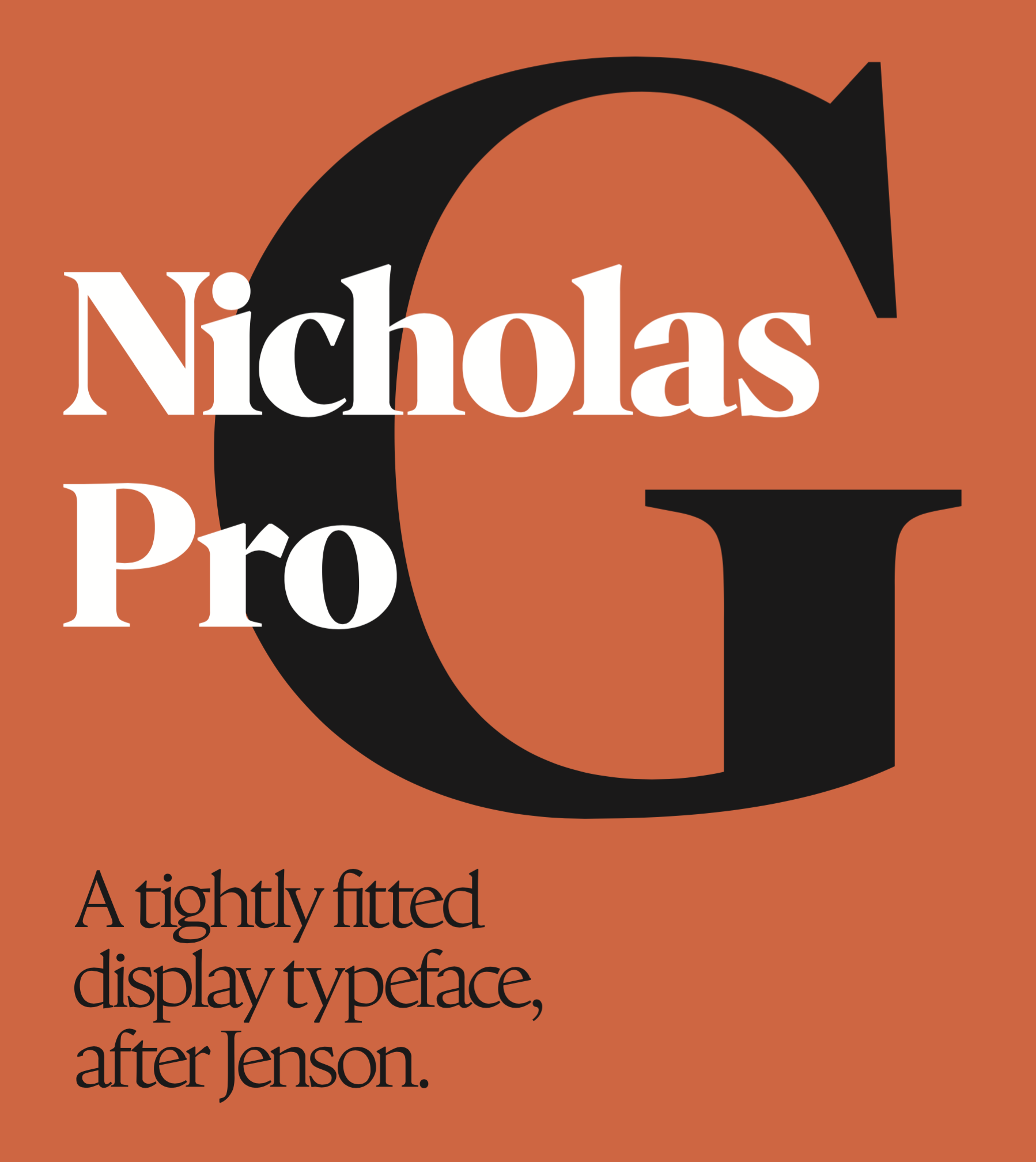
file name: Nick Shinn Nicholas 2004
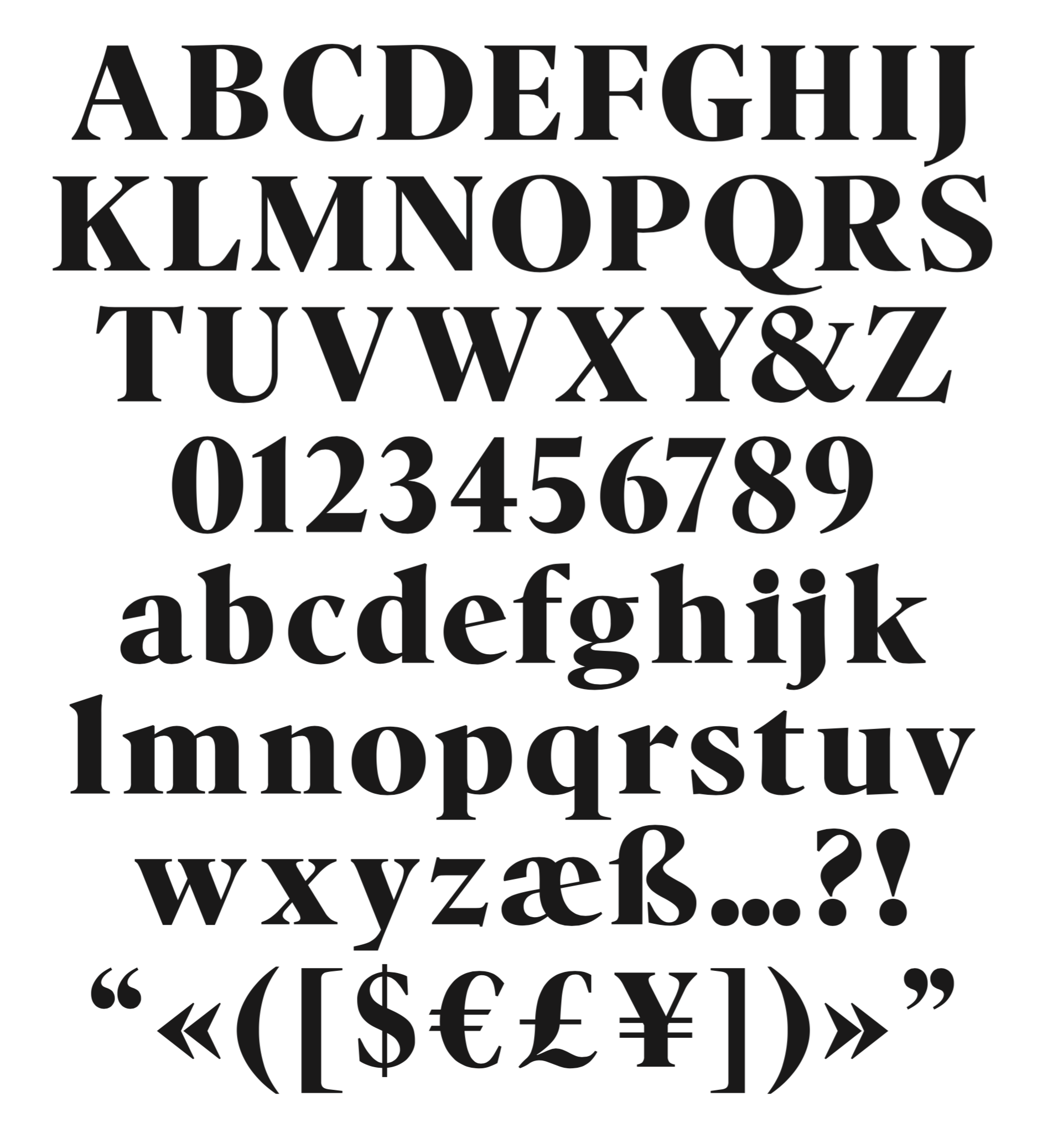
file name: Nick Shinn Nicholas 2004
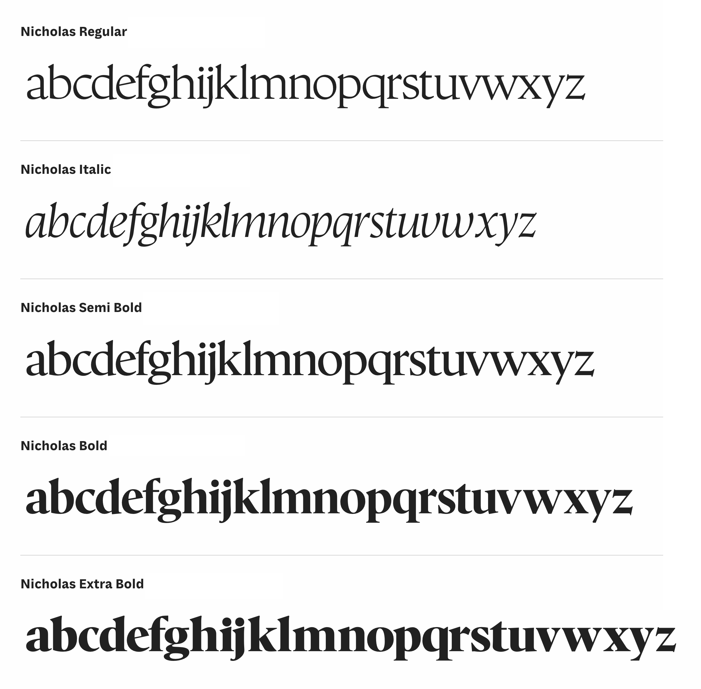
file name: Nick Shinn Nicholas 2004
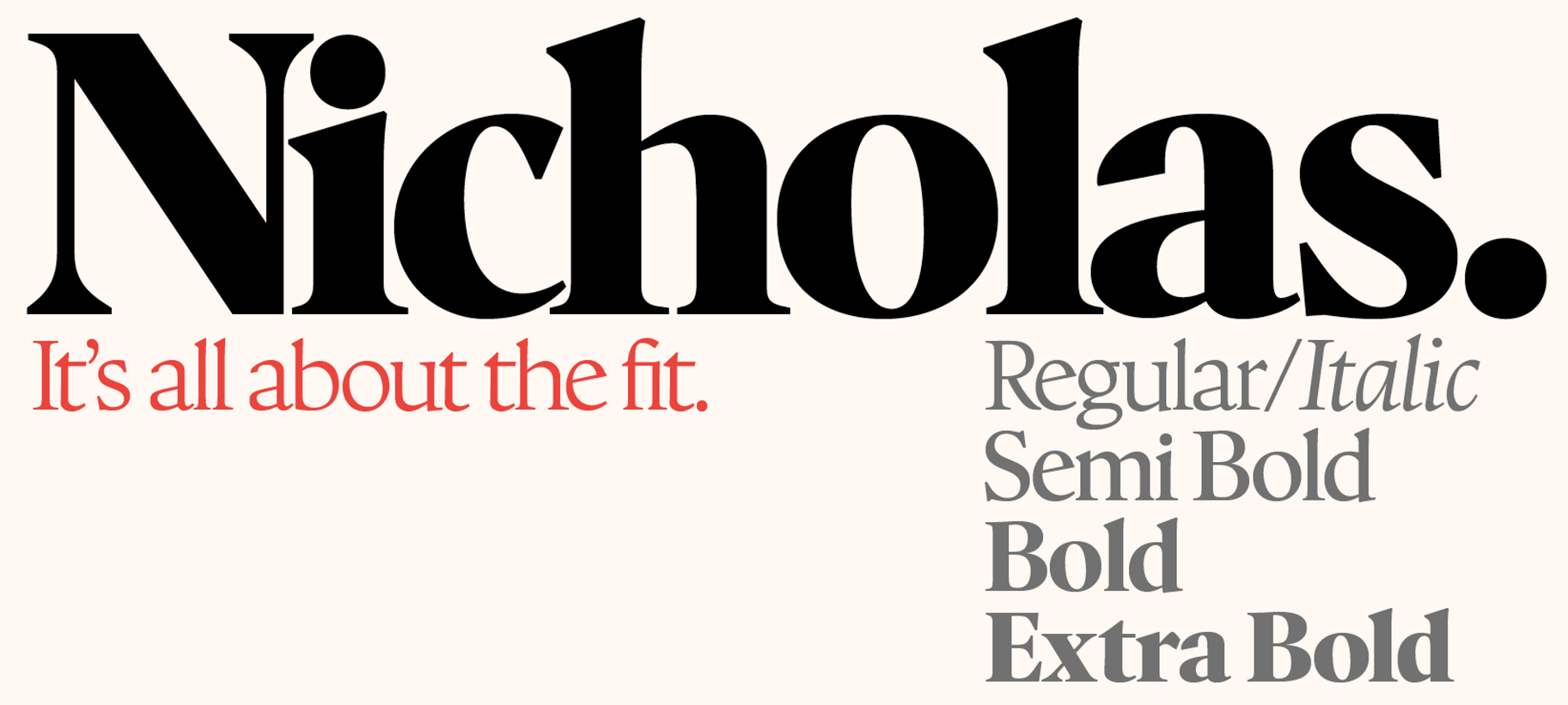
file name: Nick Shinn Nicholas 2004
file name: Nick Shinn Gambado 2016a

file name: Shinn Type Gambado 2016
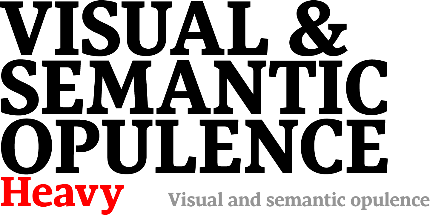
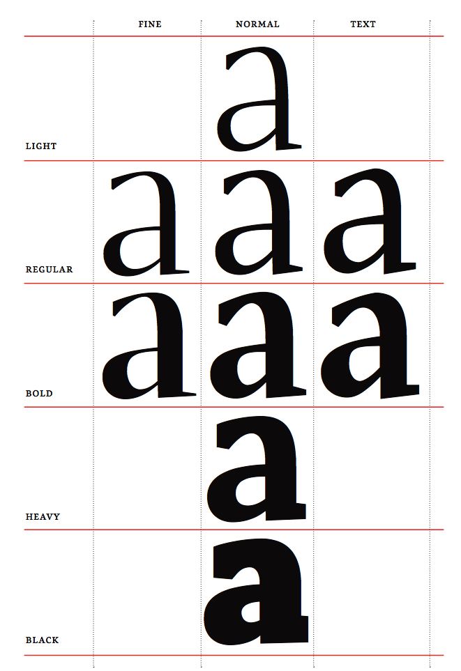
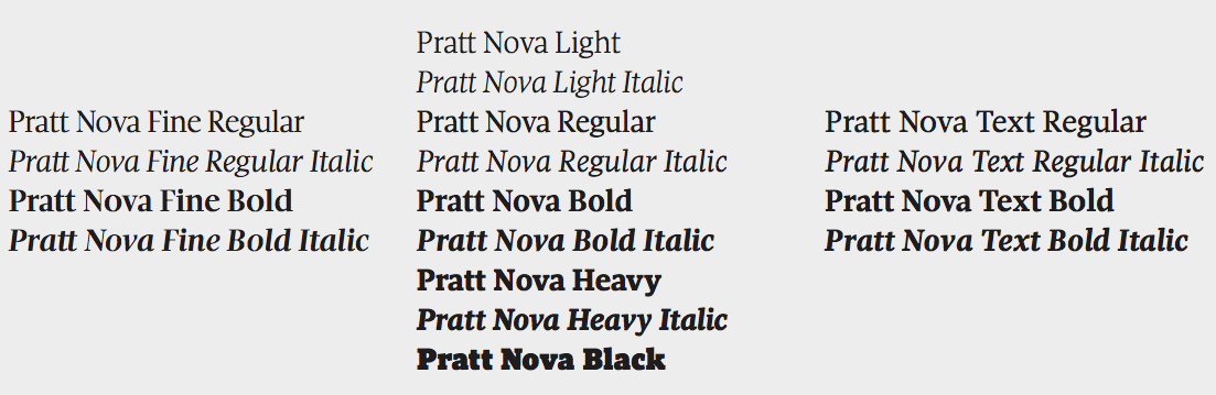
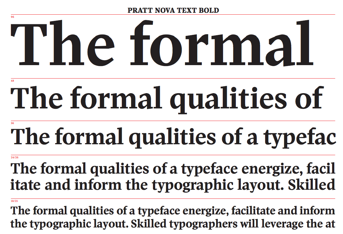
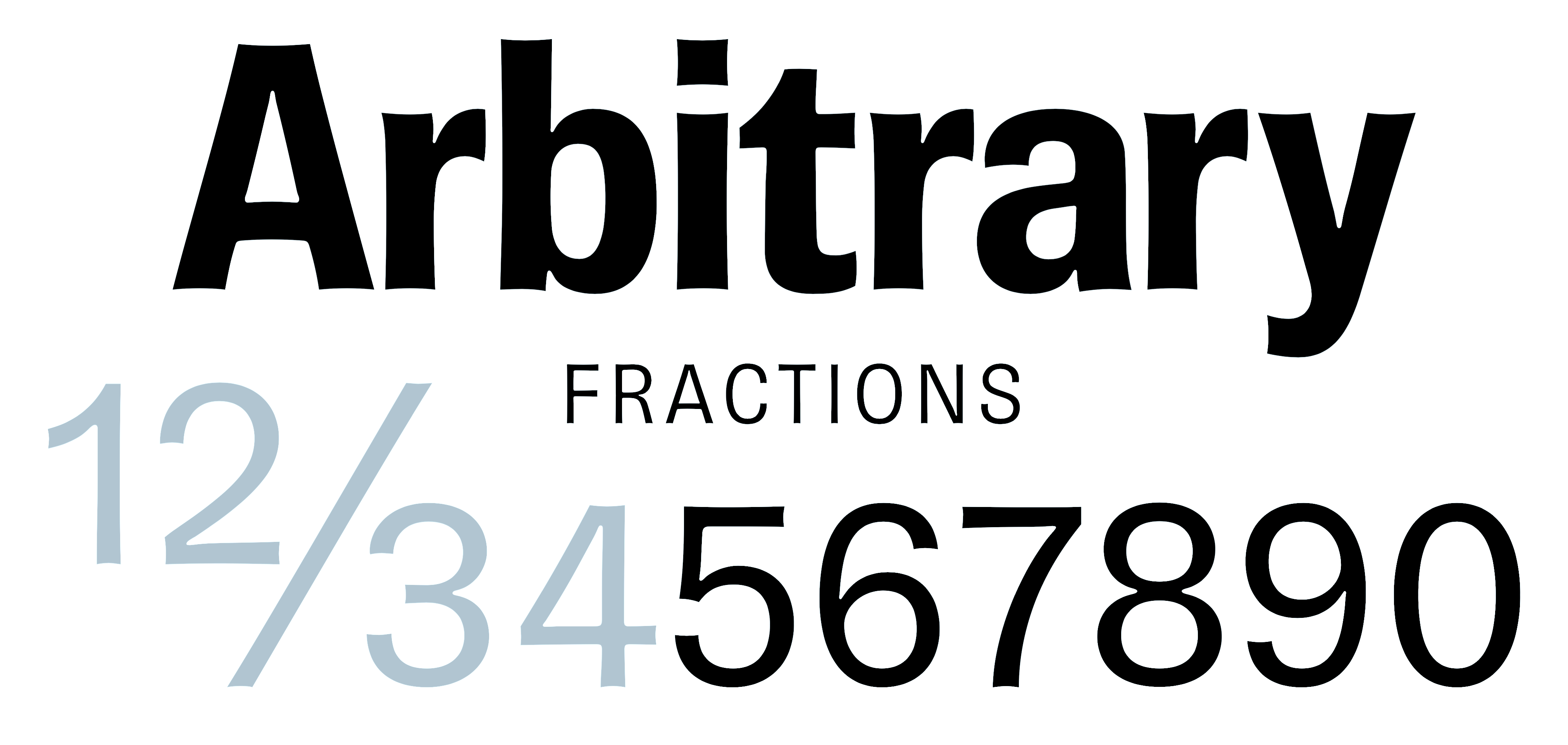
file name: Nick Shinn Pratt Nova 2014
file name: Nick Shinn Pratt Nova 2014b
file name: Nick Shinn Pratt Nova 2014c
file name: Nick Shinn Pratt Nova 2014d

file name: Nick Shinn Pratt Nova 2014e
file name: Nick Shinn Pratt Nova 2014f
file name: Nick Shinn Pratt Nova 2014g

file name: Nick Shinn Pratt Nova 2014h
file name: Nick Shinn Pratt Nova 2014i
file name: Nick Shinn Pratt Nova Black 2014
file name: Nick Shinn Pratt Nova Fine Regular 2014
file name: Nick Shinn Brown Pro 2016 201657
file name: Nick Shinn Brown Pro 2016 201658
file name: Nick Shinn Brown Pro 2016 201659
file name: Nick Shinn Brown Pro 2016 201660
file name: Nick Shinn Brown Pro 2016 201661

file name: Nick Shinn Brown Pro 2016
file name: Nick Shinn Brown Pro 2016b
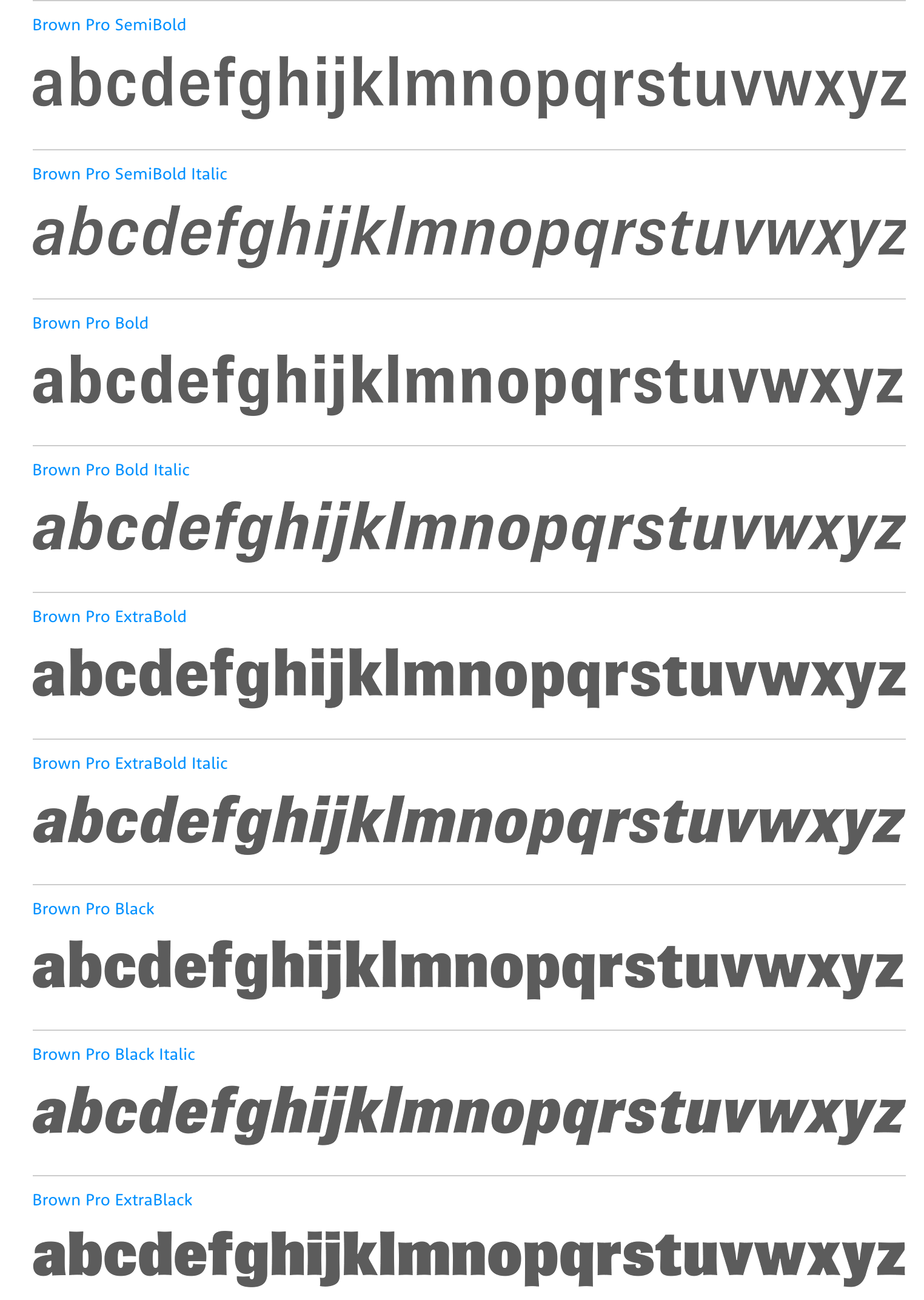
file name: Nick Shinn Brown Pro 2016c
file name: Nick Shinn Brown Pro 2016f
file name: Shinn Type Scotch Modern 2011 11 09
file name: Nick Shinn Scotch Modern Some Dingbats

file name: Nick Shinn Sense 2010
file name: Nick Shinn Sense Senibility 2010
file name: Nick Shinn Sense Sensibilitry 2010f
file name: Nick Shinn Sense Sensibilitry 2010h
file name: Nick Shinn Sense Sensibility 2011
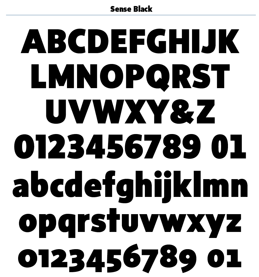
file name: Nick Shinn Sense Black 2010
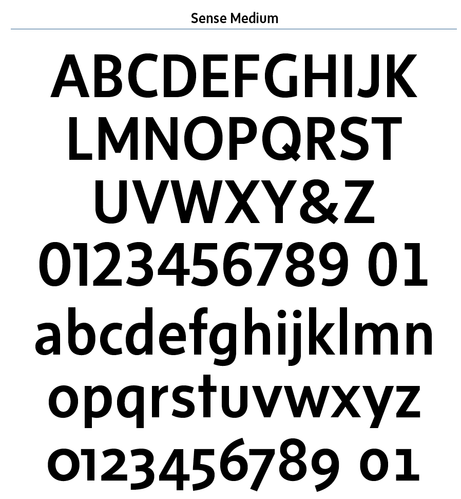
file name: Nick Shinn Sense Medium 2010
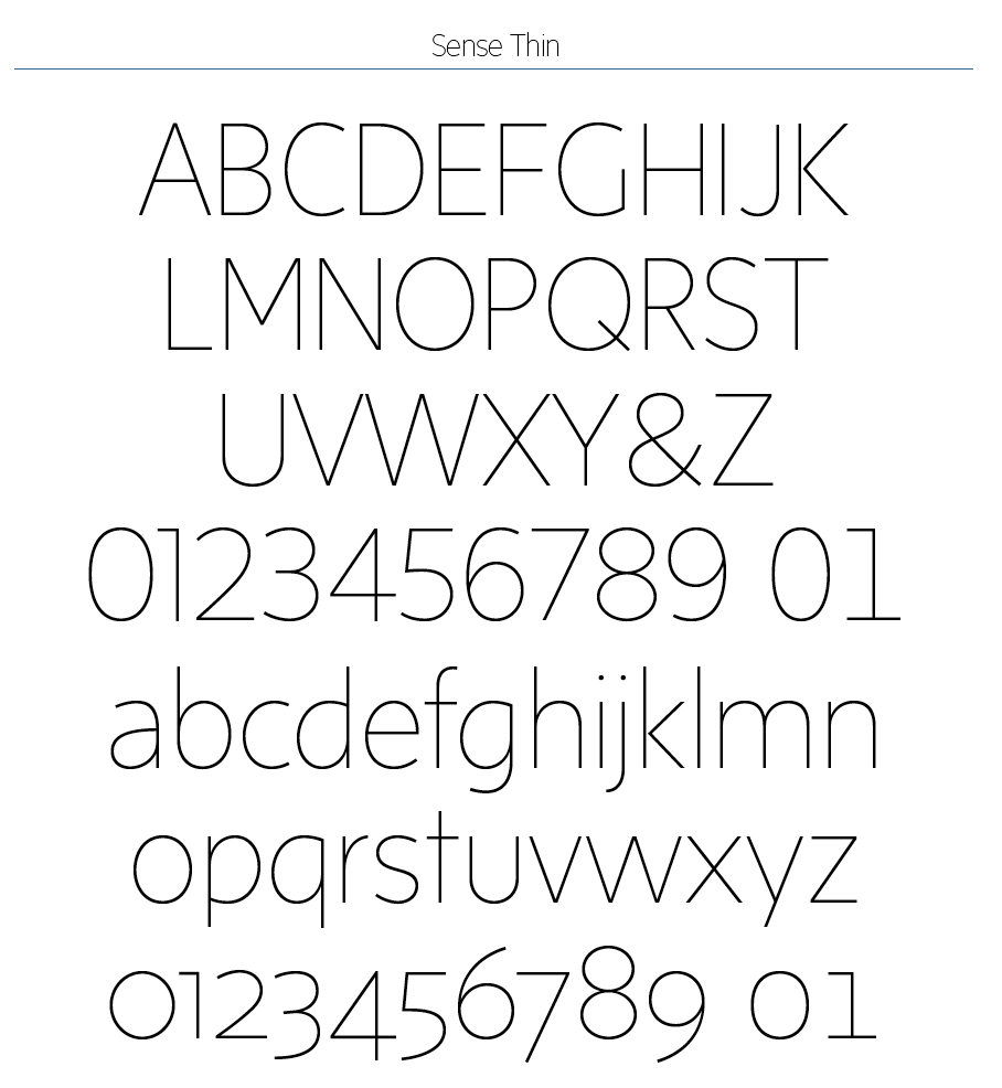
file name: Nick Shinn Sense Thin 2010
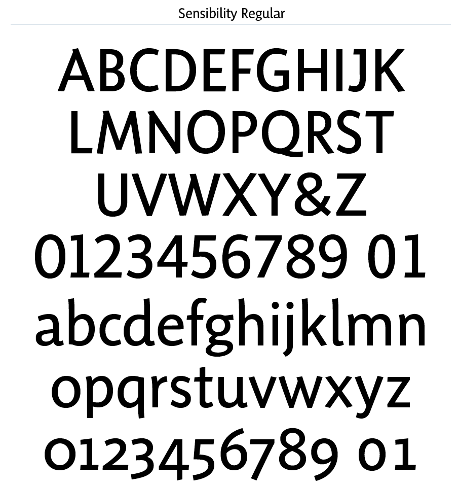
file name: Nick Shinn Sensibilitry Regular 2010
file name: Nick Shinn Sense 2010
file name: Nick Shinn Sense Black 2010
file name: Nick Shinn Sense Thin 2010
file name: Nick Shinn Sensibility 2010 Catalog

file name: Nick Shinn Sensibility Black 2010

file name: Nick Shinn Walburn Ultra 1996b
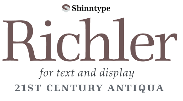
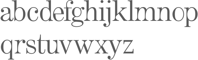
file name: Nick Shinn Richler 2013
file name: Nick Shinn Richler 2013l

file name: Nick Shinn Richler Bold 2013

file name: Nick Shinn Richler Highlight 2013b
file name: Nick Shinn Richler Pro P E Highlight 2013
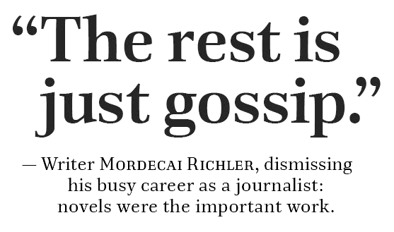
file name: Nick Shinn Richler 2013h
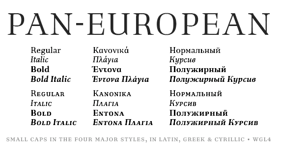
file name: Nick Shinn Richler 2013i
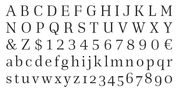
file name: Nick Shinn Richler 2013j
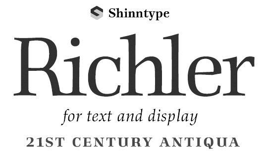
file name: Nick Shinn Richler 2013k
file name: Nick Shinn Artefact 1999
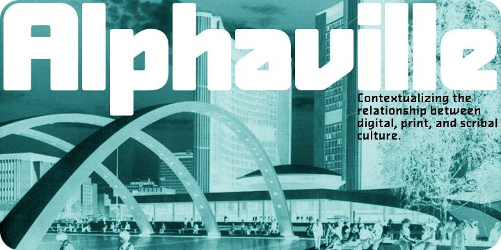
file name: Nick Shinn Alphaville
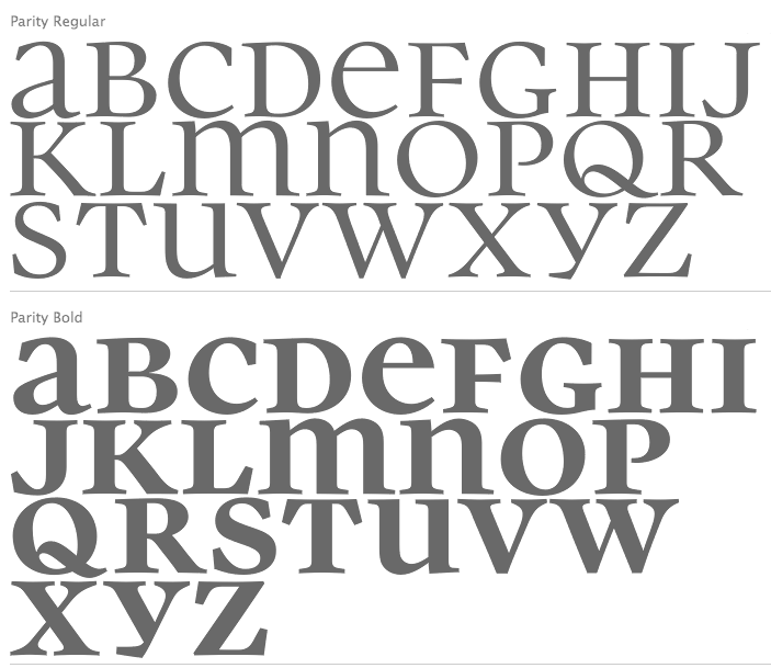
file name: Nick Shinn Parity 2011
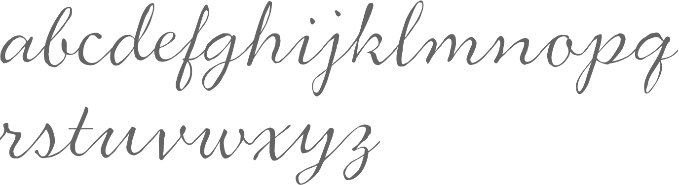
file name: Nick Shinn Duffy Script 2008
file name: Nick Shinn Duffy Script 2008b

file name: Nick Shinn G M News 2007

file name: Nick Shinn G M News Overview 2007
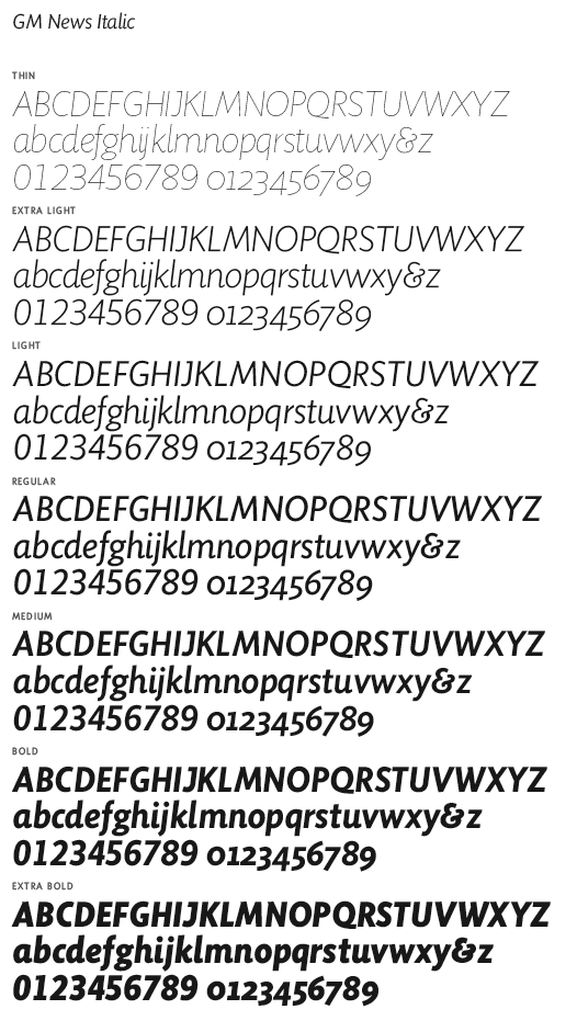
file name: Nick Shinn G M News Italic 2007
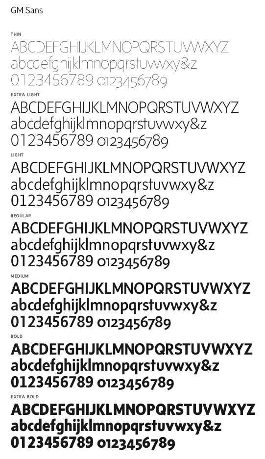
file name: Nick Shinn G M Sans 2007

file name: Nick Shinn G M Sans Overview 2007
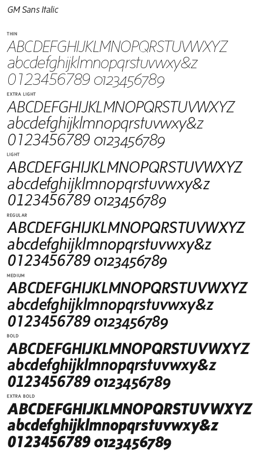
file name: Nick Shinn G M Sans Italic 2007
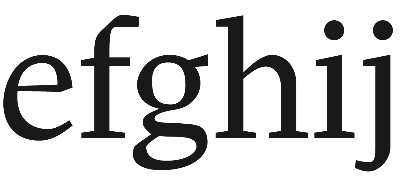
file name: Nick Shinn G M Text Bold 2007 Look At The F

file name: Nick Shinn G M Text Bold 2007
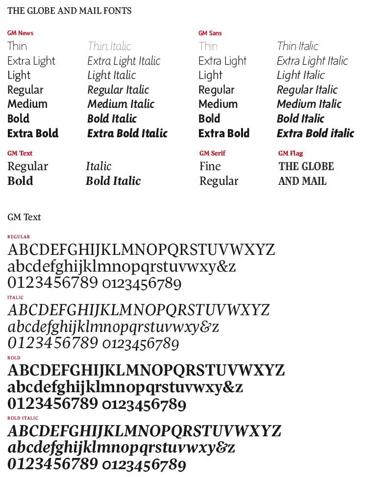
file name: Nick Shinn Globe And Mail Fonts 2007

file name: Nick Shinn Beaufort Pro 2008

file name: Shinn Beaufort b
file name: Nick Shinn F F Oneleigh 1999b
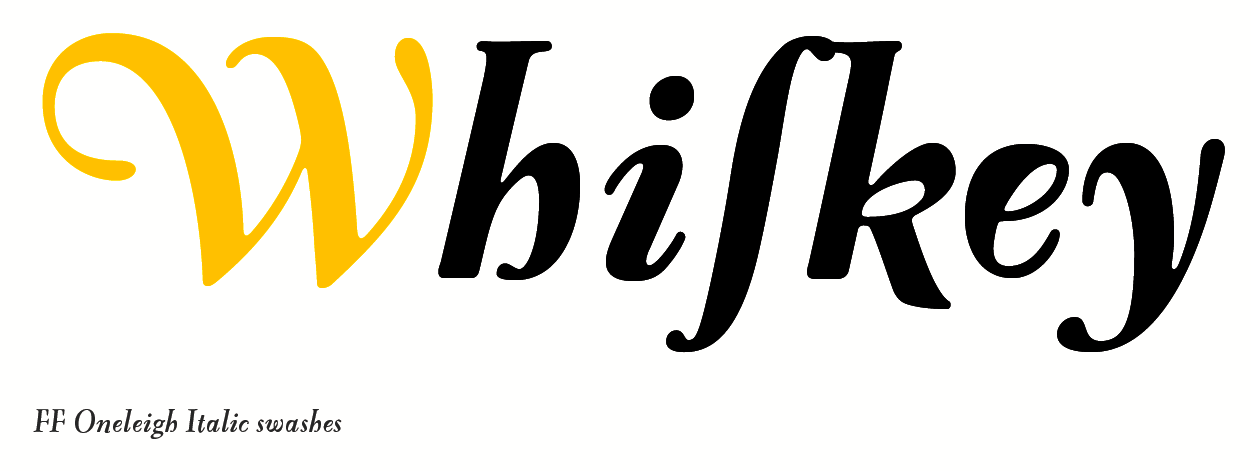
file name: Nick Shinn F F Oneleigh 1999d

file name: Nick Shinn F F Oneleigh 1999e
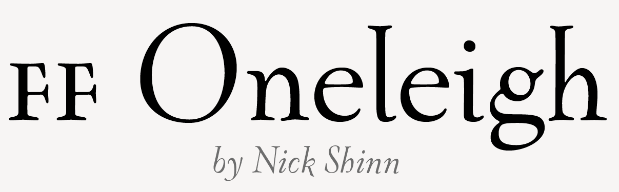
file name: Nick Shinn F F Oneleigh 1999h
file name: Nick Shinn F F Oneleigh 1999i
file name: Nick Shinn F F Oneleigh 1999j

file name: Nick Shinn F F Oneleigh2009b

file name: Nick Shinn F F Oneleigh Black Italic
file name: Nick Shinn Handsome Pro Classic 2002
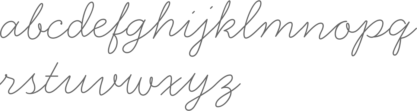
file name: Nick Shinn Handsome Pro Thin 2002
file name: Nick Shinn Preface 2003
file name: Nick Shinn Neology Deco Light 2014

file name: Nick Shinn Neology Grotesque Extra Bold 2014
file name: Nick Shinn Neology Grotesque Medium 2014
file name: Nick Shinn Neology Medium 2014
file name: Nick Shinn Neology 2014 Poster by Bill Dawson 2015

file name: Nick Shinn Panoptica Doesburg 2003
file name: Nick Shinn Panoptica Octagonal 2003
file name: Nick Shinn Panoptica Regular 2003
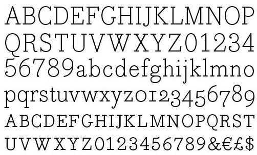
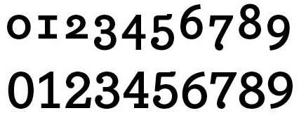
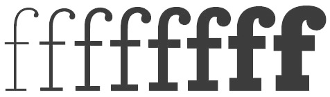
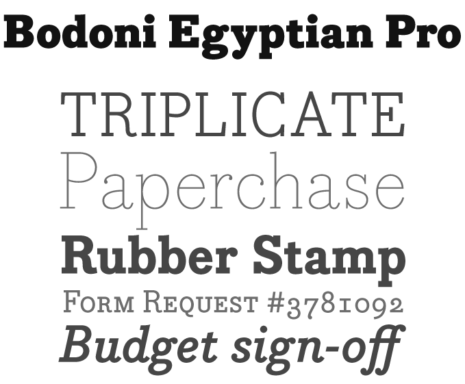
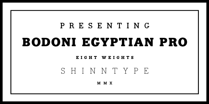
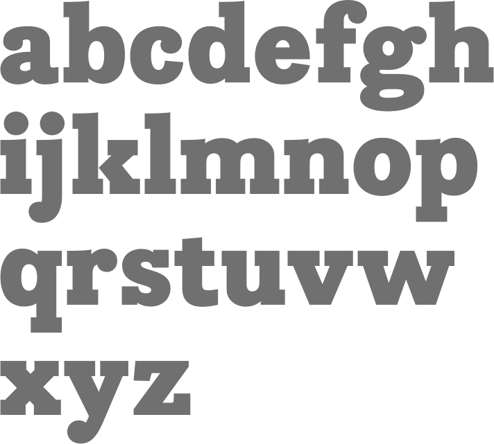
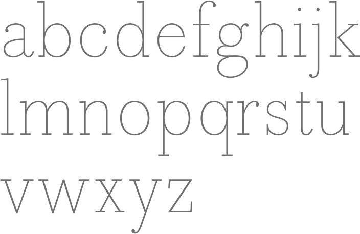
file name: Nick Shinn Bodoni Egyptian Pro 1999
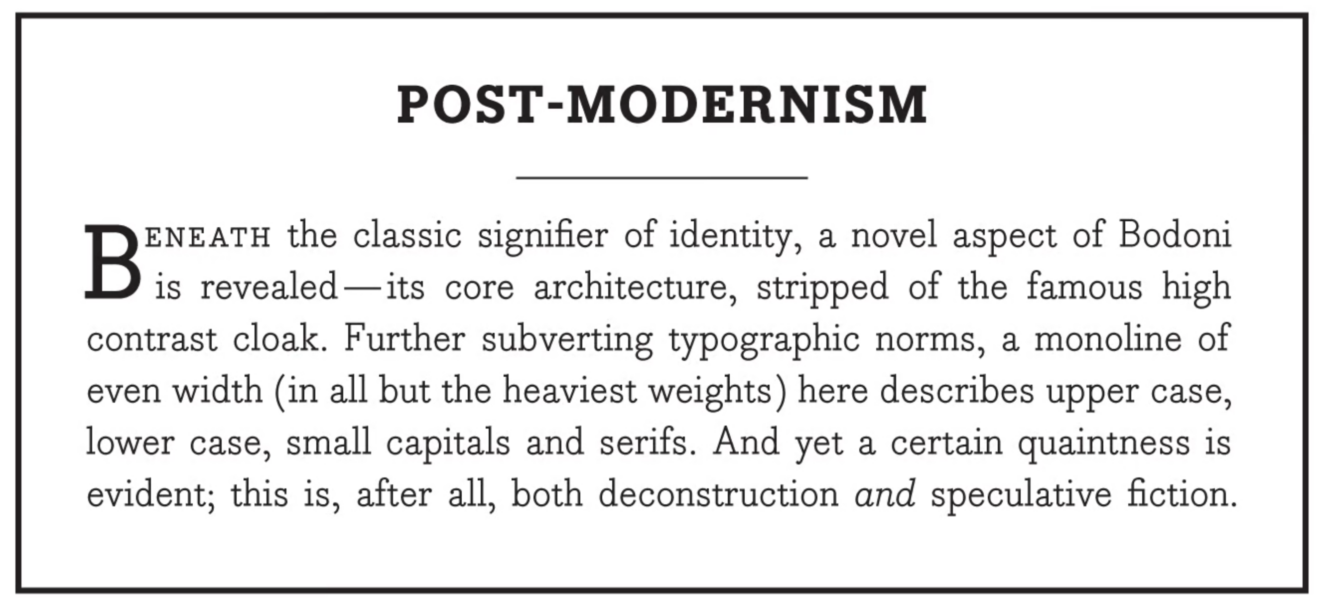
file name: Nick Shinn Bodoni Egyptian Pro 1999
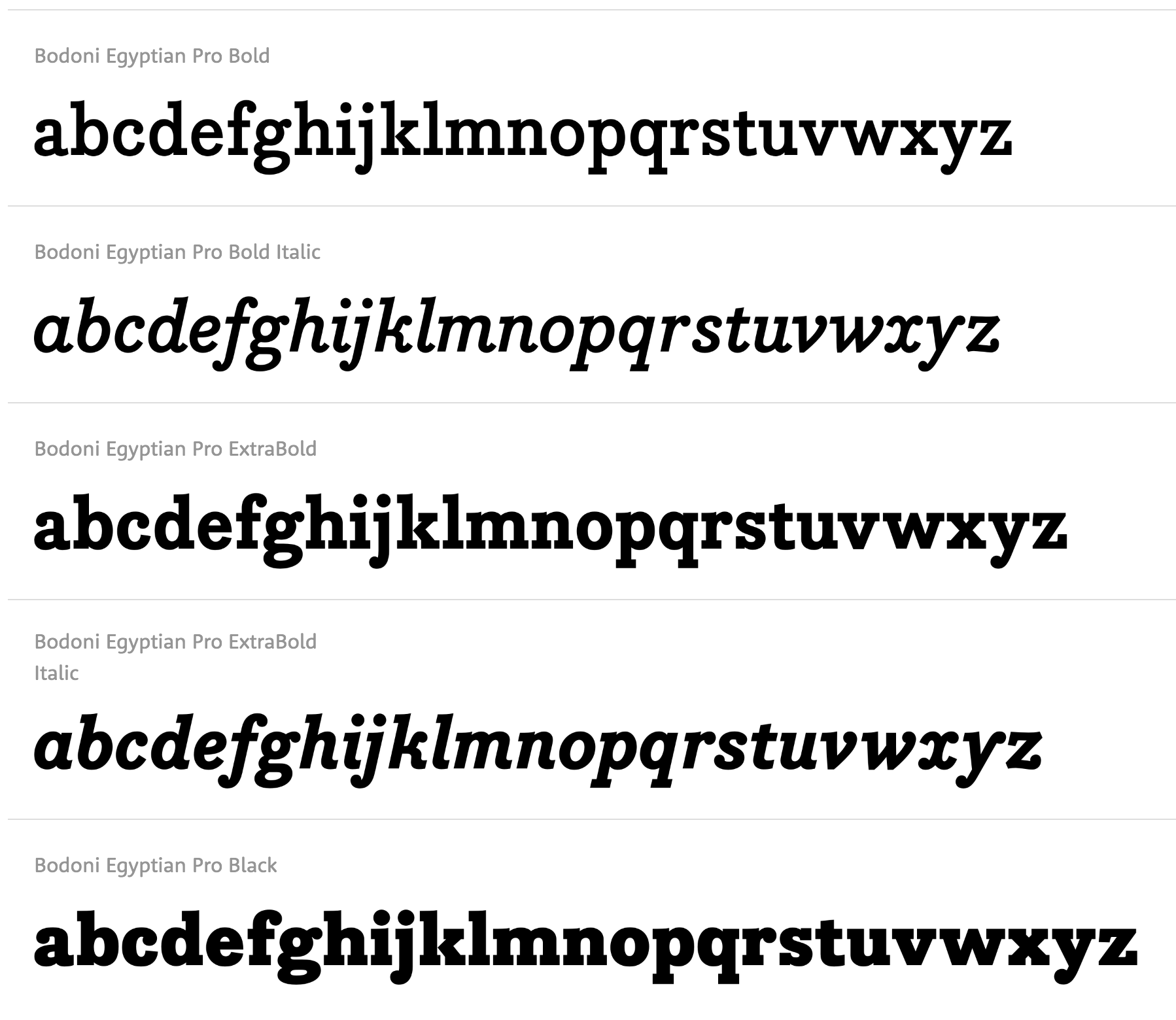
file name: Nick Shinn Bodoni Egyptian Pro 1999
file name: Nick Shinn Bodoni Egyptian Pro 1999
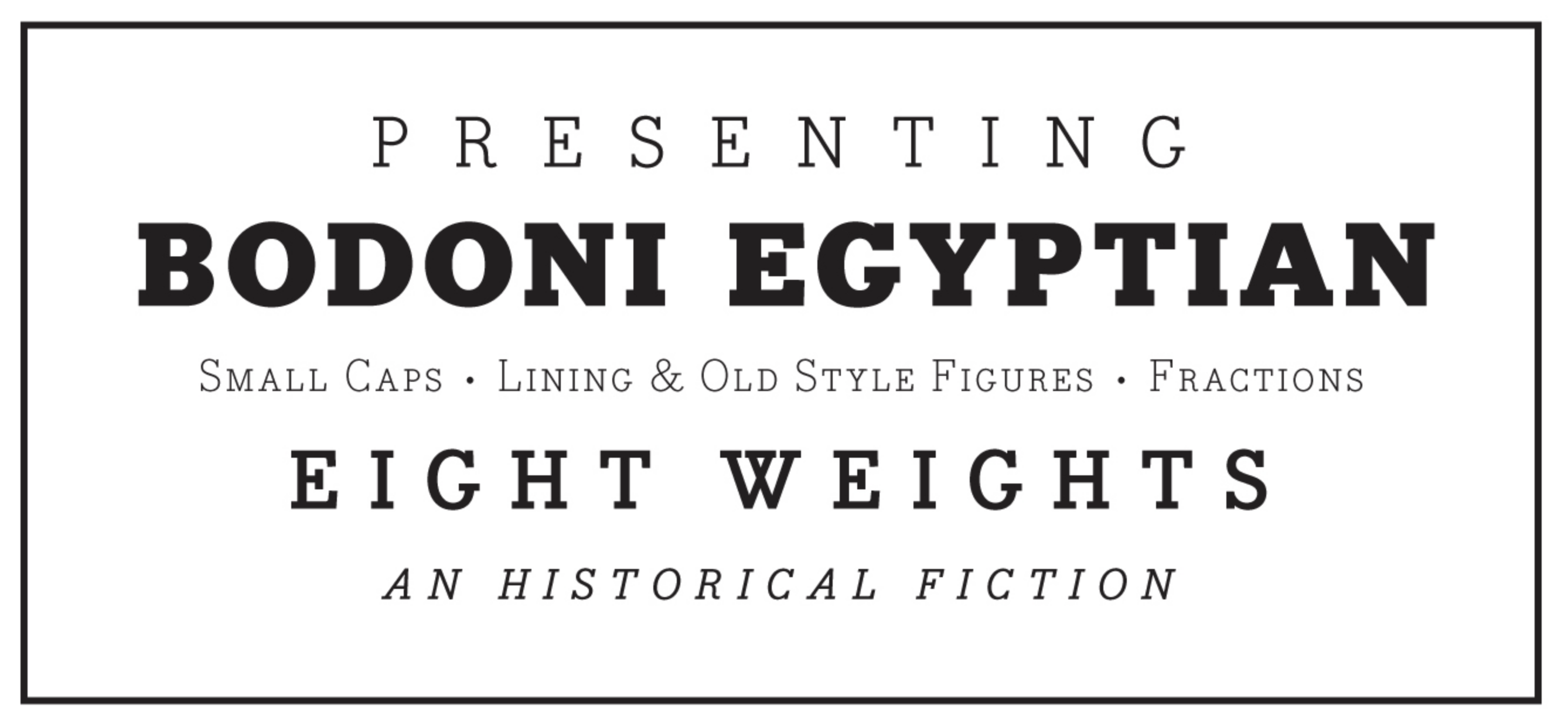
file name: Nick Shinn Bodoni Egyptian Pro 1999
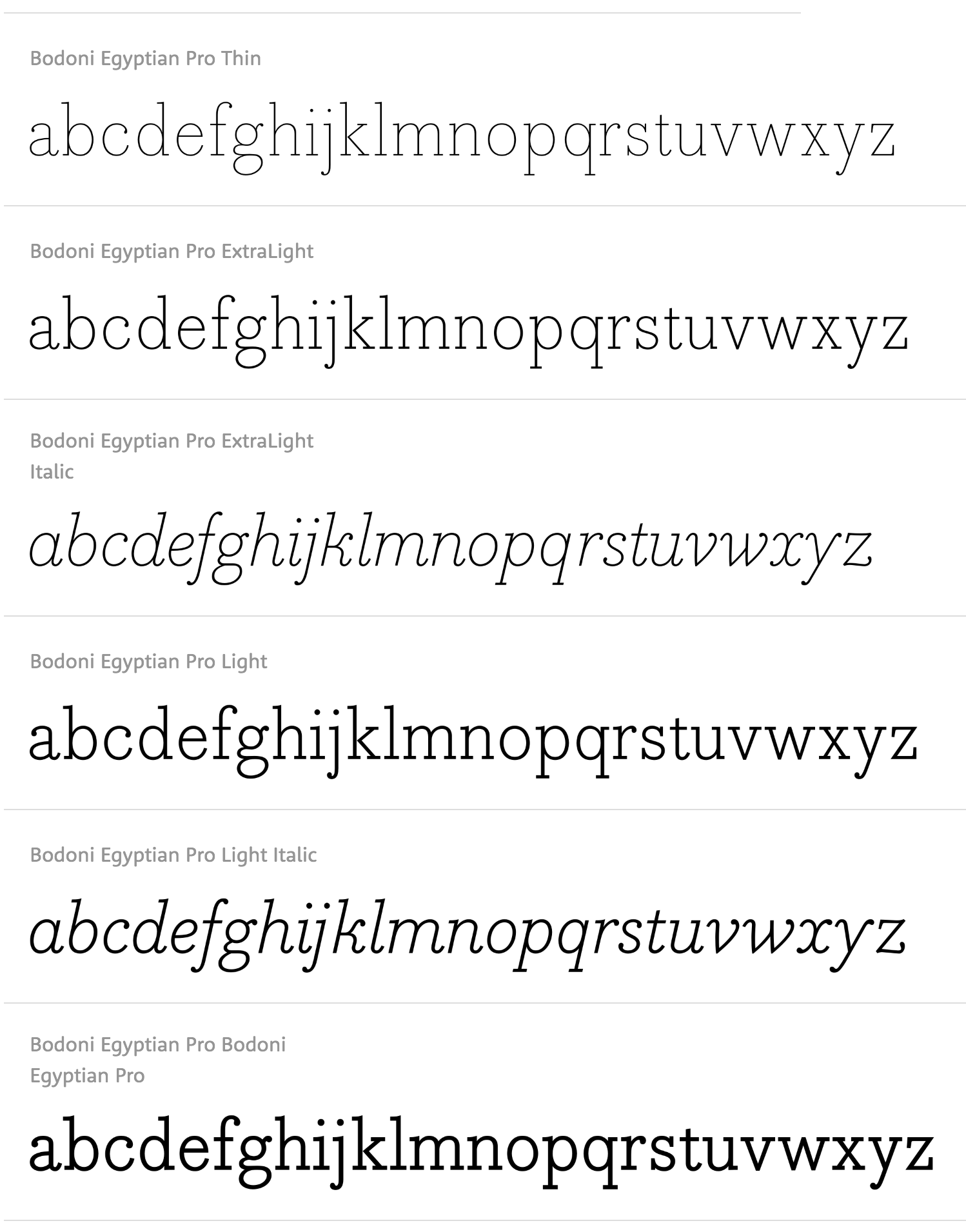
file name: Nick Shinn Bodoni Egyptian Pro 1999
file name: Nick Shinn Bodoni Egyptian 2011
file name: Nick Shinn Bodoni Egyptian 2011b
file name: Nick Shinn Bodoni Egyptian 2011c
file name: Nick Shinn Bodoni Egyptian
file name: Nick Shinn Bodoni Egyptian Pro 2010
file name: Nick Shinn Bodoni Egyptian Pro Black 2010
file name: Nick Shinn Bodoni Egyptian Pro Thin 2010
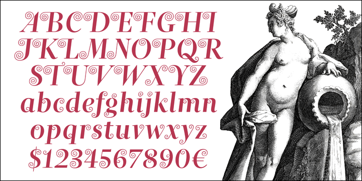
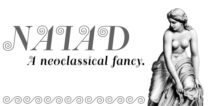
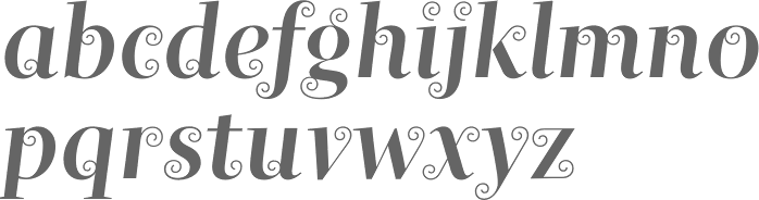
file name: Nick Shinn Naiad 2013
file name: Nick Shinn Naiad 2013b
file name: Nick Shinn Naiad 2013e
file name: Nick Shinn Naiad 2013f

file name: Nick Shinn Naiad 2013g
file name: Nick Shinn Naiad 2013h
file name: Nick Shinn Naiad 2013i
file name: Nick Shinn Naiad 2013j

file name: Ale Paul Nick Shinn Type Con2014 Pic by Pete Bella
file name: Chris Lozos Pic of Nick Shinn Typo S F 2012

file name: Nick Shinn Pic
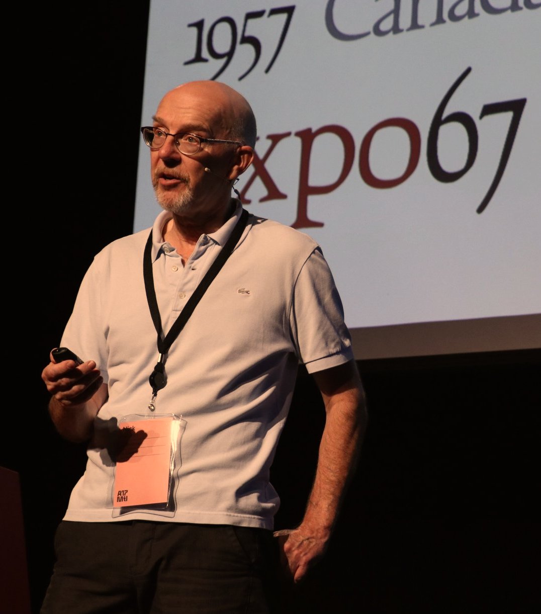
file name: Nick Shinn A Typ I 2017
| | |
|
Luc Devroye ⦿ School of Computer Science ⦿ McGill University Montreal, Canada H3A 2K6 ⦿ lucdevroye@gmail.com ⦿ https://luc.devroye.org ⦿ https://luc.devroye.org/fonts.html |