TYPE DESIGN INFORMATION PAGE last updated on Tue May 5 11:47:58 EDT 2026
FONT RECOGNITION VIA FONT MOOSE

|
|
|
|
Christian Schwartz
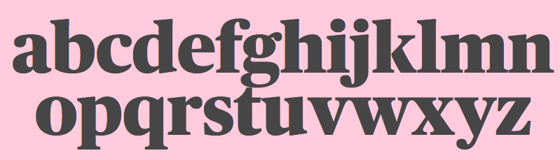
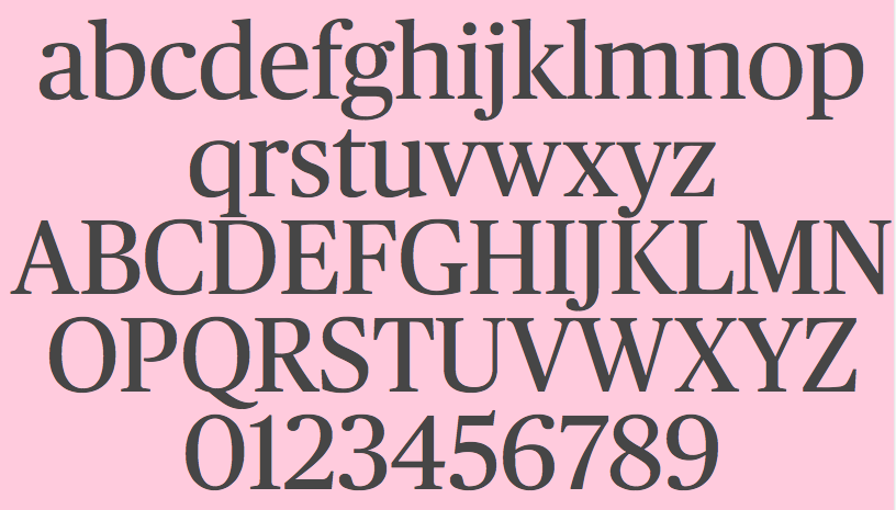
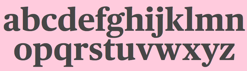
Christian Schwartz was born in 1977 in East Washington, NH, and grew up in a small town in New Hampshire. He attended Carnegie Mellon University in Pittsburgh, Pennsylvania, where he graduated in 1999 with a degree in Communication Design. After graduation, he spent three months as the in-house type designer at MetaDesign Berlin, under the supervision of Erik Spiekermann. In January 2000, he joined Font Bureau. Near the end of 2000, he founded Orange Italic with Chicago-based designer Dino Sanchez, and left Font Bureau in August 2001 to concentrate full-time on developing this company. Orange Italic published the first issue of their online magazine at the end of 2001 and released their first set of typefaces in the beginning of 2002. Presently, he is an independent type designer in New York City, and has operated foundries like Christian Schwartz Design and Commercial Type (the latter since 2009). He has designed commercial fonts for Emigre, FontShop, House Industries and Font Bureau as well as proprietary designs for corporations and publications. In 2005, Orange Italic joined the type coop Village. His presentations. At ATypI 2004 in Prague, he spoke about "The accidental text face". At ATypI 2006 in Lisbon, he and Paul Barnes explained the development of a 200-style font family for the Guardian which includes Guardian Egyptian and Guardian Sans. FontShop's page on his work. Bio at Emigre. At ATypI 2007 in Brighton, he was awarded the Prix Charles Peignot. Jan Middendorp's interview in October 2007. Speaker at ATypI 2009 in Mexico City, where he announced his new type foundry, simply called Commercial. FontShop link. Font selection at MyFonts. A partial list of his creations:
|
EXTERNAL LINKS |
| | |


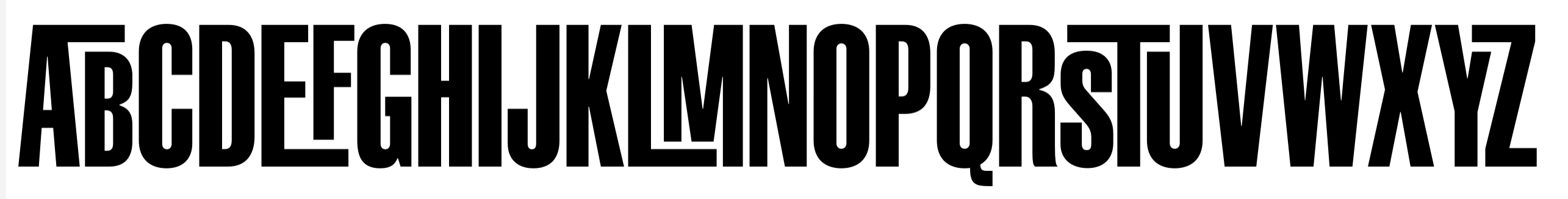
file name: A T F Alternate Gothic
file name: Font Haus Zombie 2022
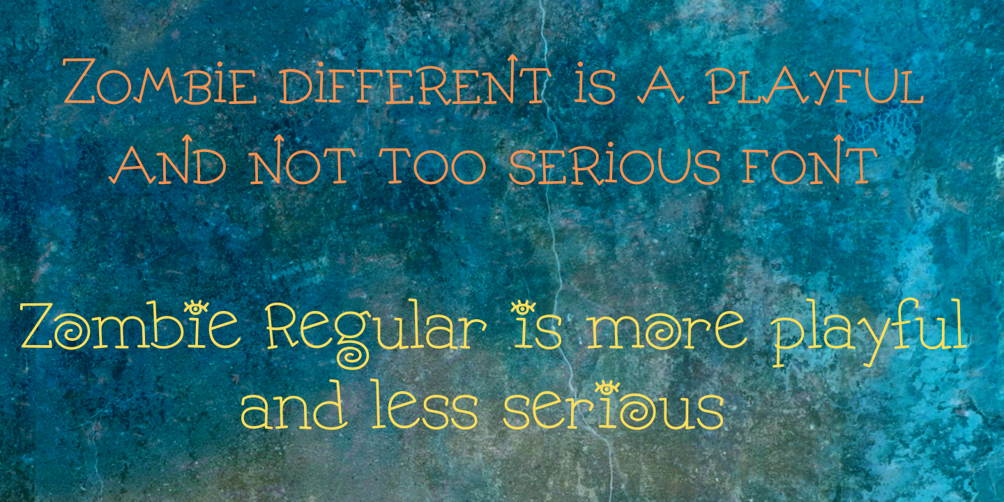
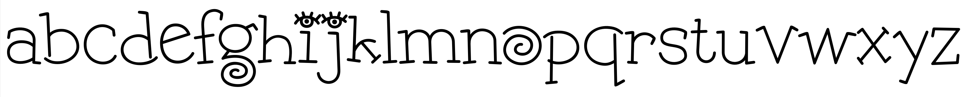
file name: Christian Schwartz Zombie 2022
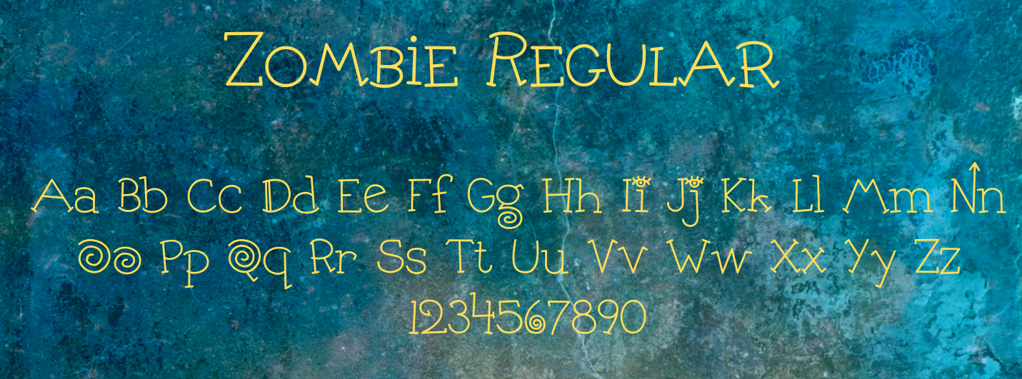
file name: Christian Schwartz Zombie 2022
file name: Christian Schwartz Paul Barnes Tanja Roman 2016
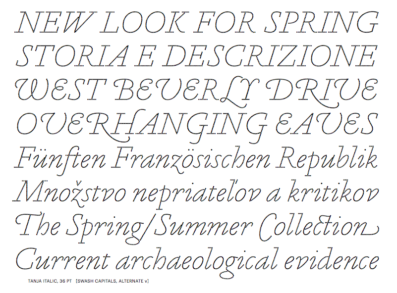
file name: Christian Schwartz Paul Barnes Tanja Roman 2016b
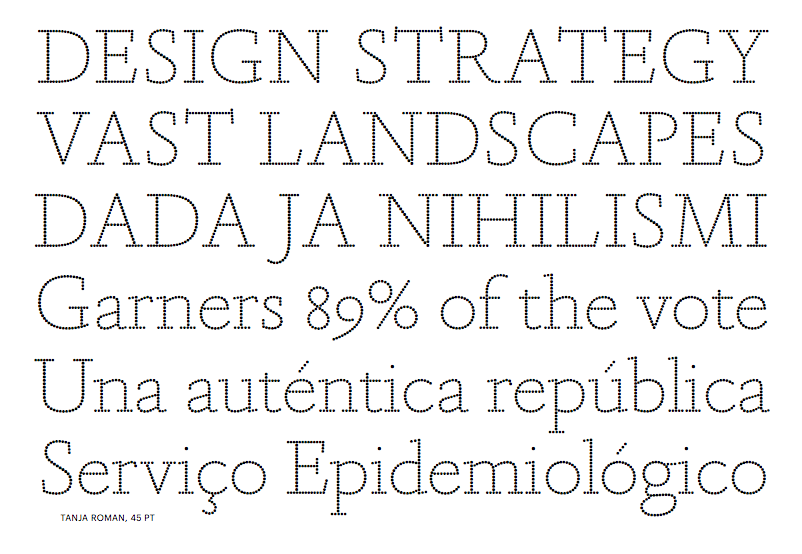
file name: Christian Schwartz Paul Barnes Tanja Roman 2016c

file name: Christian Schwartz Paul Barnes Tanja Roman 2016d
file name: Paul Barnes Christian Schwartz Berton Hasebe Guardian Sans Condensed Black 2012
file name: Christian Schwartz Moma Sans Condensed Semibold 2017

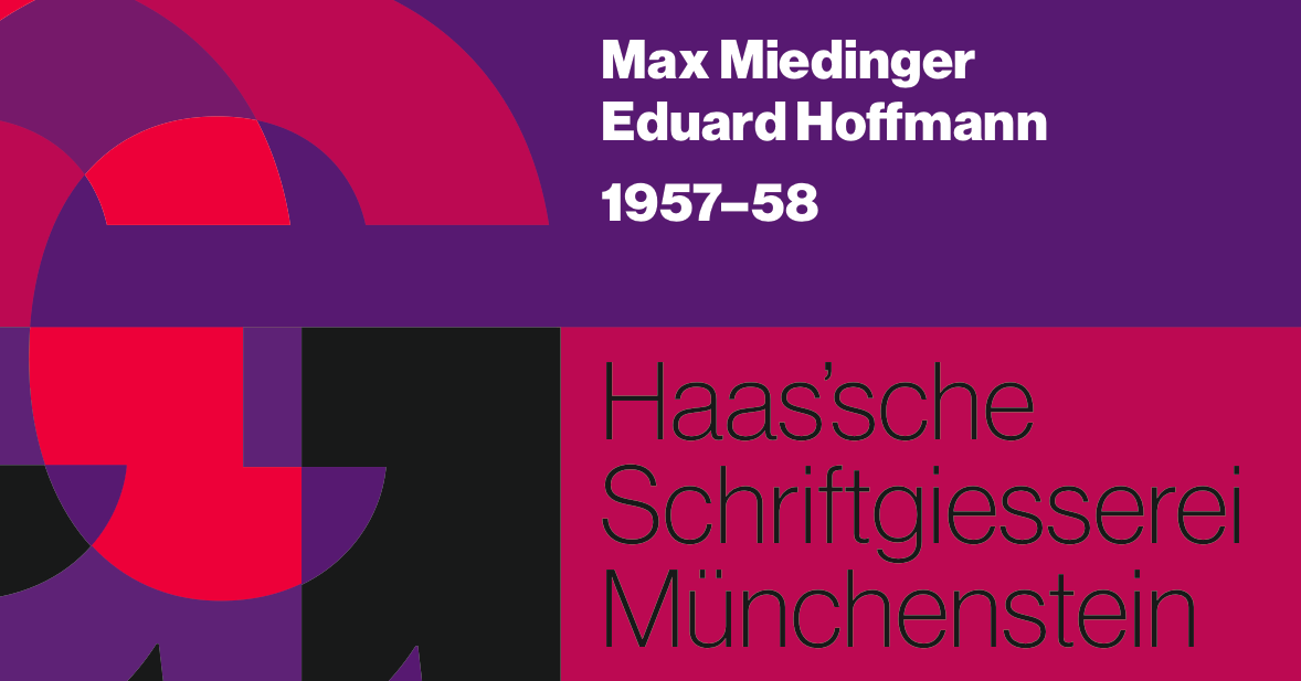
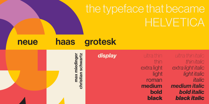
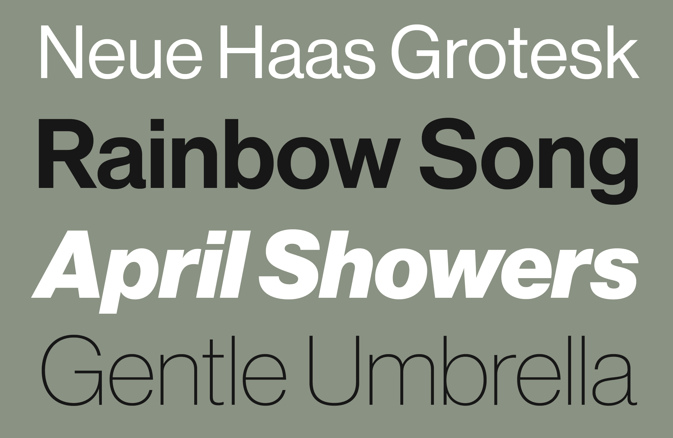
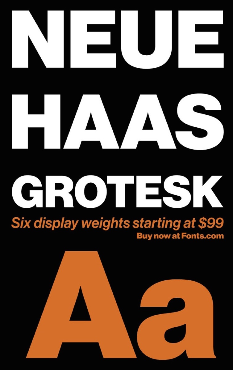
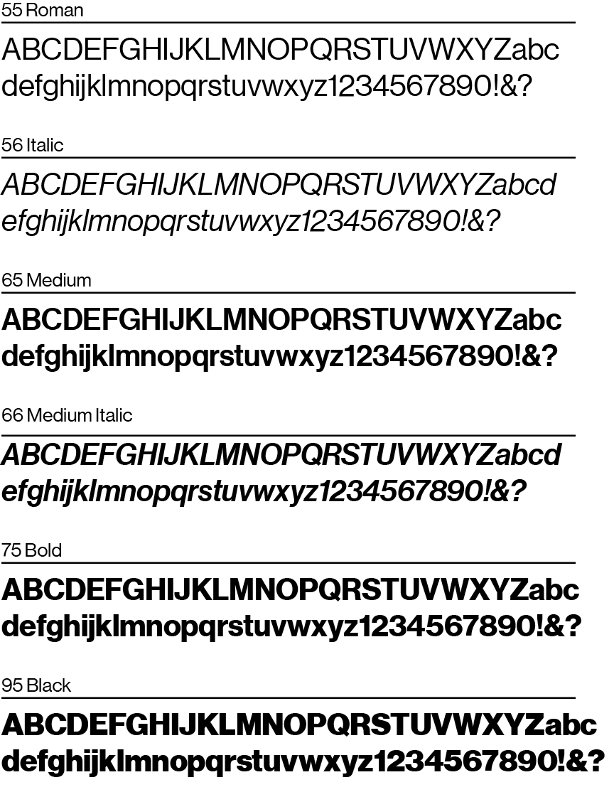
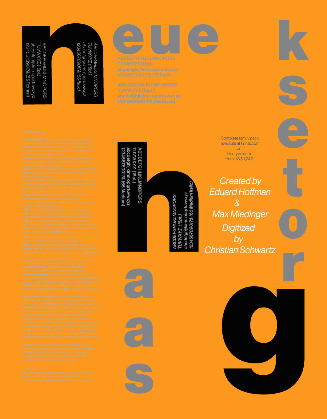
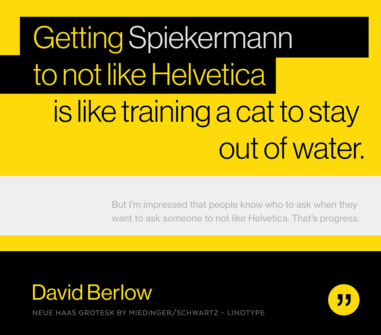
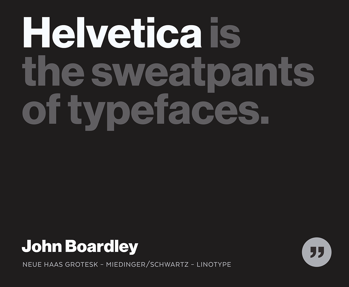
file name: Christian Schwartz Neue Haas Grotesk 2012 77946
file name: Christian Schwartz Neue Haas Grotesk 2012d

file name: Christian Schwartz Neue Haas Grotesk 2011
file name: Christian Schwartz Neue Haas Grotesk 2011i

file name: Christian Schwartz Neue Haas Grotesk 2011

file name: Christian Schwartz Neue Haas Grotesk 2011b

file name: Christian Schwartz Neue Haas Grotesk 2011c
file name: Christian Schwartz Neue Haas Grotesk 2012
file name: Christian Schwartz Neue Haas Grotesk 2012 poster by Jason Egan 2018
file name: Christian Schwartz Neue Haas Grotesk 2012 poster by Jason Egan 2018a
file name: Christian Schwartz Neue Haas Grotesk 2011 Poster by Jeannine Haslett 2017

file name: Christian Schwartz Neue Haas Grotesk 2011d

file name: Christian Schwartz Neue Haas Grotesk 2011e

file name: Christian Schwartz Neue Haas Grotesk 2011f

file name: Christian Schwartz Neue Haas Grotesk 2011g

file name: Christian Schwartz Neue Haas Grotesk 2011h
file name: Christian Schwartz Neue Haas Grotesk 2011 Poster by Bill Dawson 2015
file name: Christian Schwartz Neue Haas Grotesk 2011 Poster by Bill Dawson 2015b
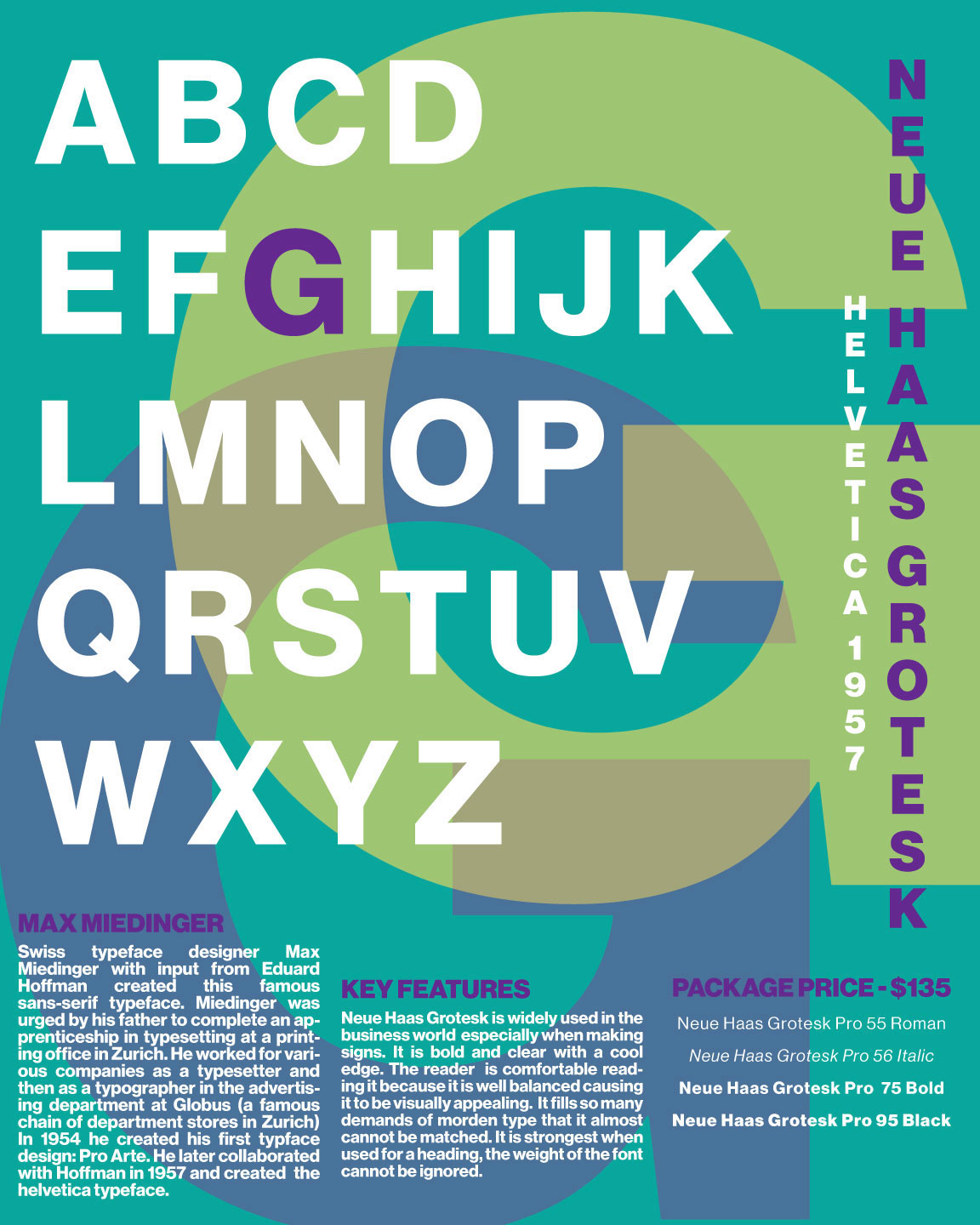
file name: Christian Schwartz Neue Haas Grotesk 2011 Poster by Georgia Eyers 2016
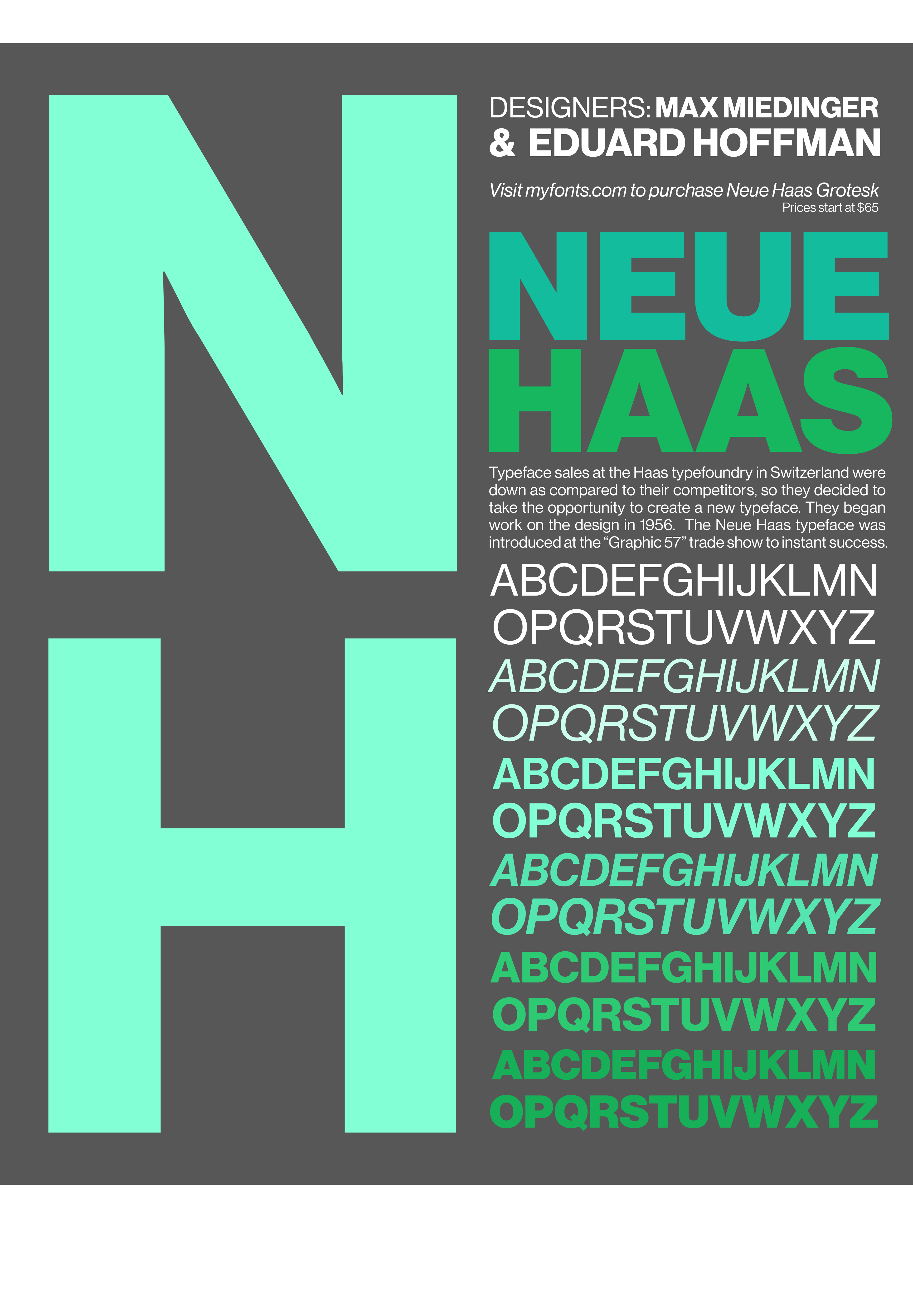
file name: Christian Schwartz Neue Haas Grotesk 2012 Poster by Antonia Smith 2017

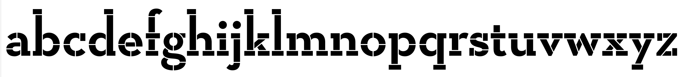
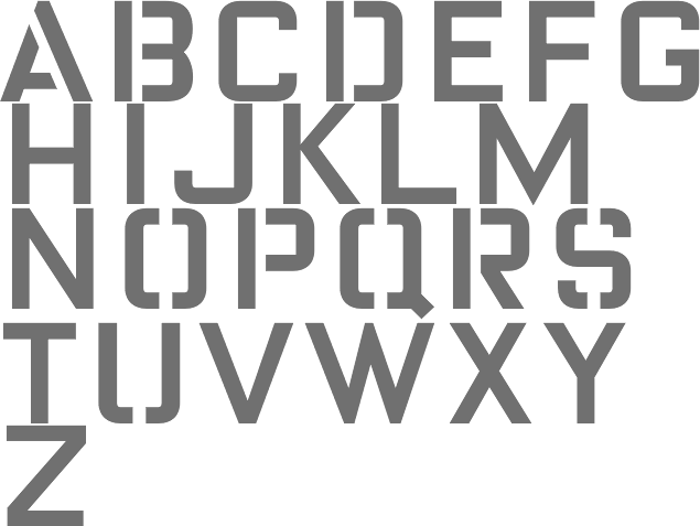
file name: House Industries Yorklyn Stencil 2021

file name: House Industries Yorklyn Stencil 2021 1
file name: House Industries Yorklyn Stencil 2021 2

file name: House Industries Yorklyn Stencil 2021 4
file name: House Industries Yorklyn Stencil 2021 5
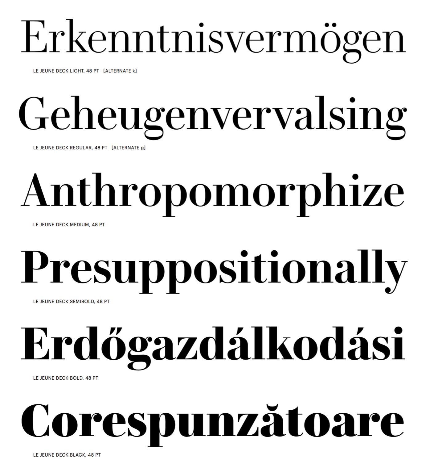
file name: Greg Gazdowicz Christian Schwartz Paul Barnes Le Jeune Deck 2016c
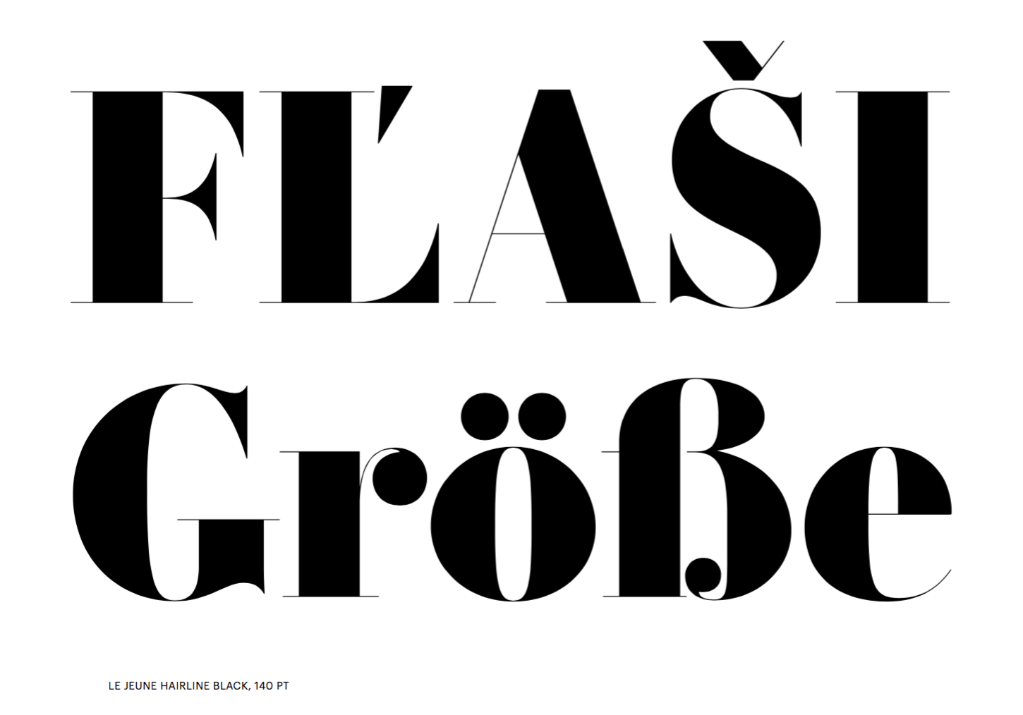
file name: Greg Gazdowicz Christian Schwartz Paul Barnes Le Jeune Hairline Black 2016
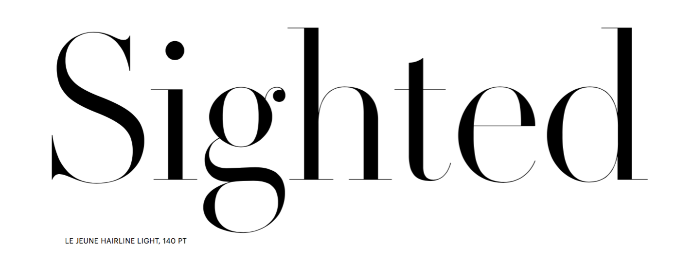
file name: Greg Gazdowicz Christian Schwartz Paul Barnes Le Jeune Hairline Light 2016
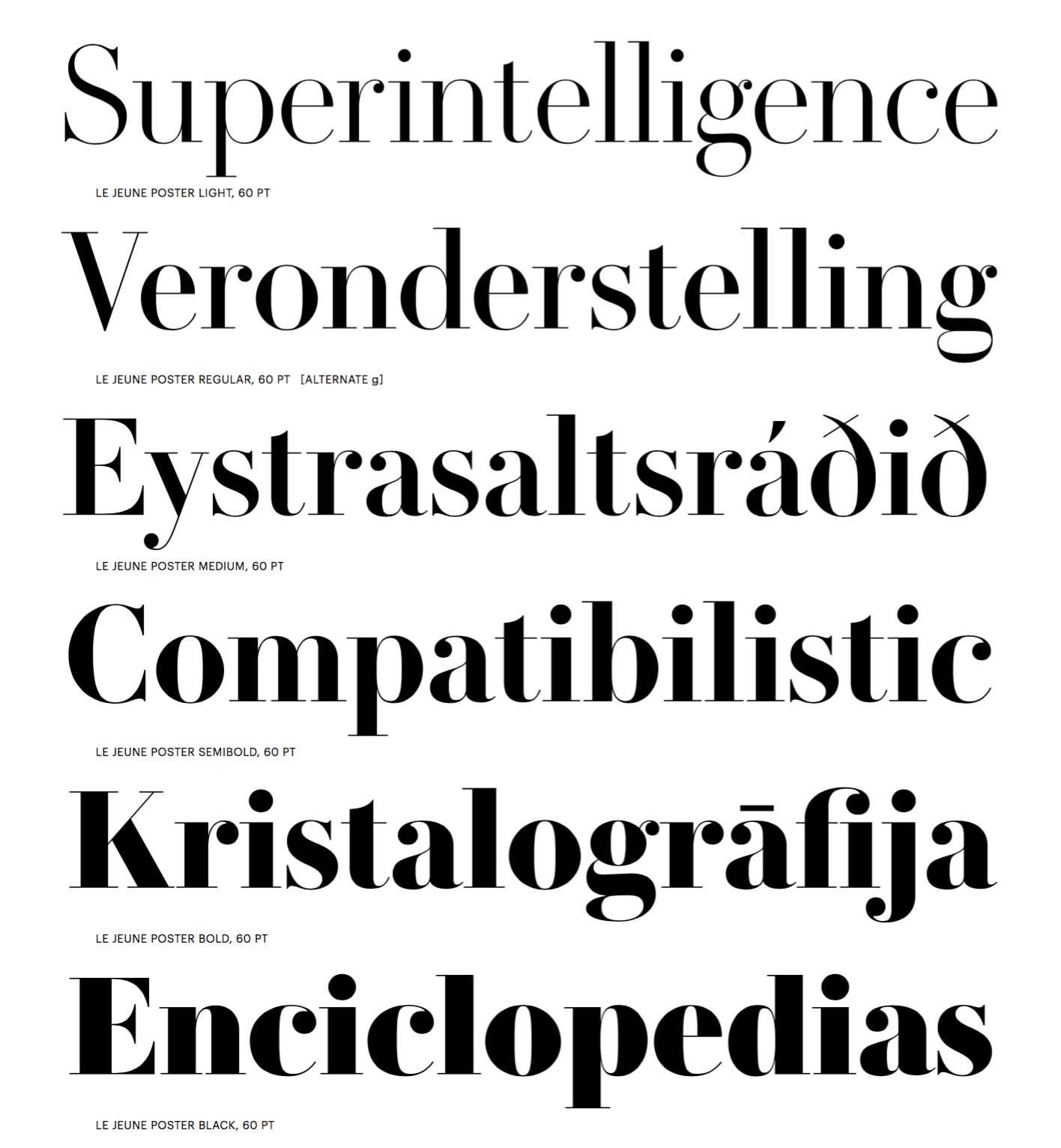
file name: Greg Gazdowicz Christian Schwartz Paul Barnes Le Jeune Poster 2016b
file name: Greg Gazdowicz Christian Schwartz Paul Barnes Le Jeune Text 2016
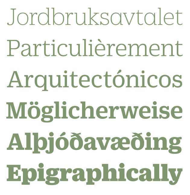
file name: Christian Schwartz Guardian Text Egyptian 2005
file name: Christian Schwartz Dino Sanchez Gravitas 2014
file name: Christian Schwartz Dino Sanchez Gravitas 2014a
file name: Christian Schwartz Dino Sanchez Gravitas 2014b
file name: Christian Schwartz Dino Sanchez Gravitas 2014e
file name: Christian Schwartz Dino Sanchez Gravitas 2014vb
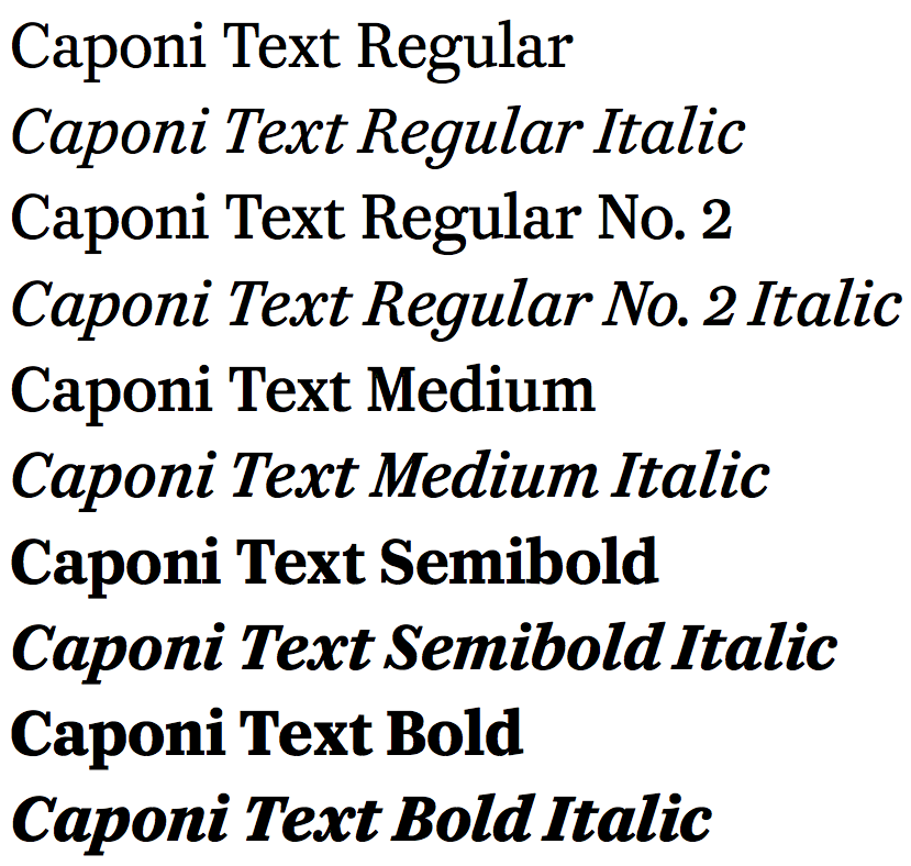
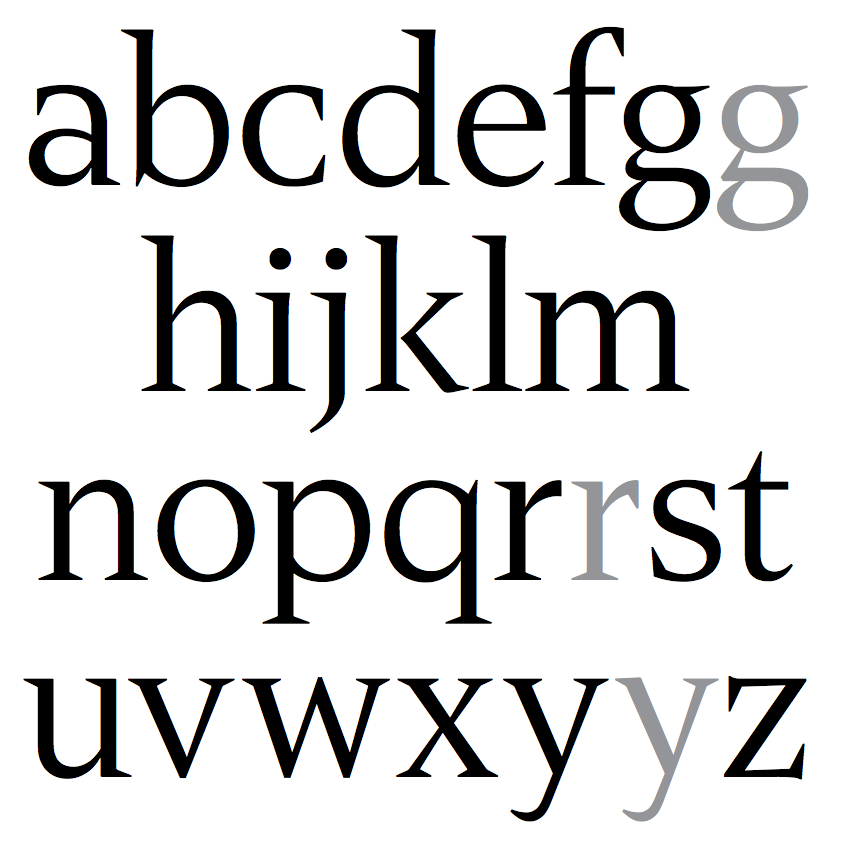
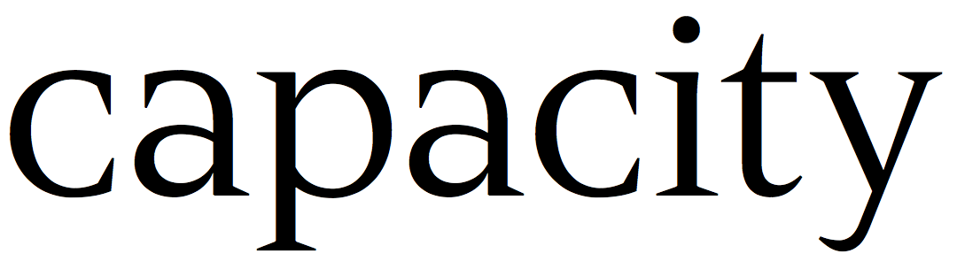
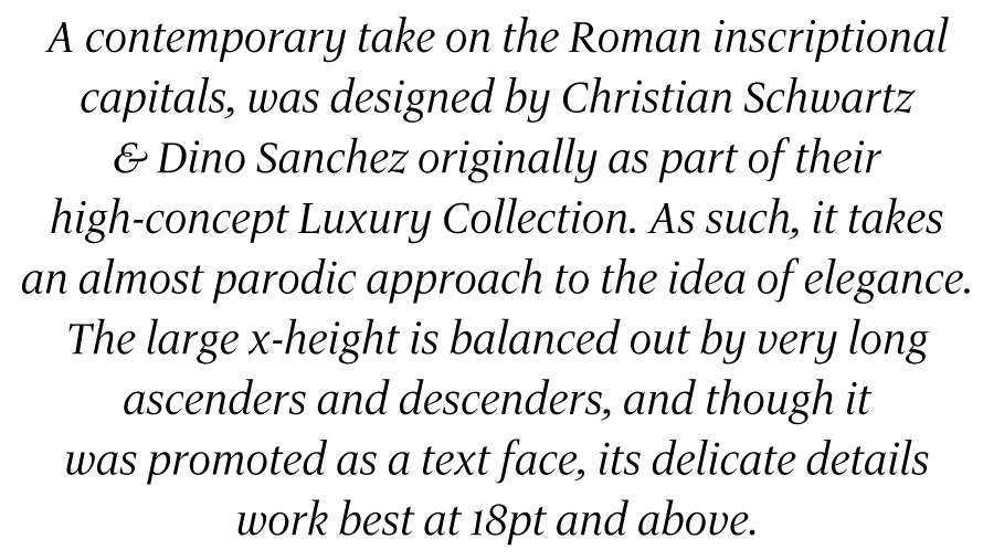
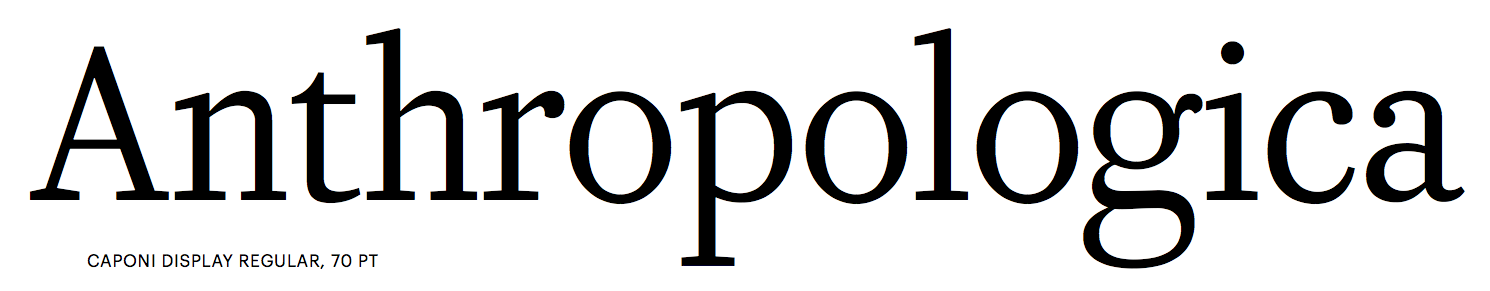
file name: Christian Schwartz Paul Barnes Miguel Reyes Caponi 2014
file name: Christian Schwartz Paul Barnes Miguel Reyes Caponi 2014b
file name: Christian Schwartz Paul Barnes Miguel Reyes Caponi 2014c
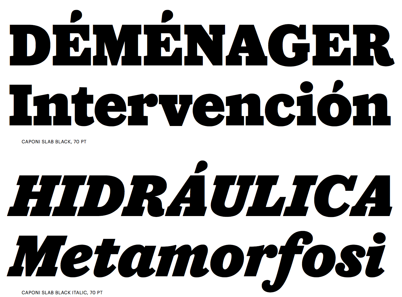
file name: Christian Schwartz Paul Barnes Miguel Reyes Caponi 2014cl
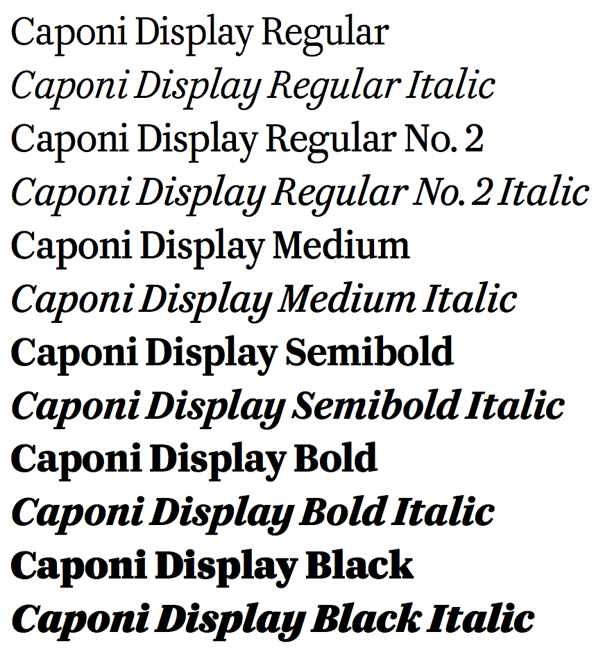
file name: Christian Schwartz Paul Barnes Miguel Reyes Caponi 2014d
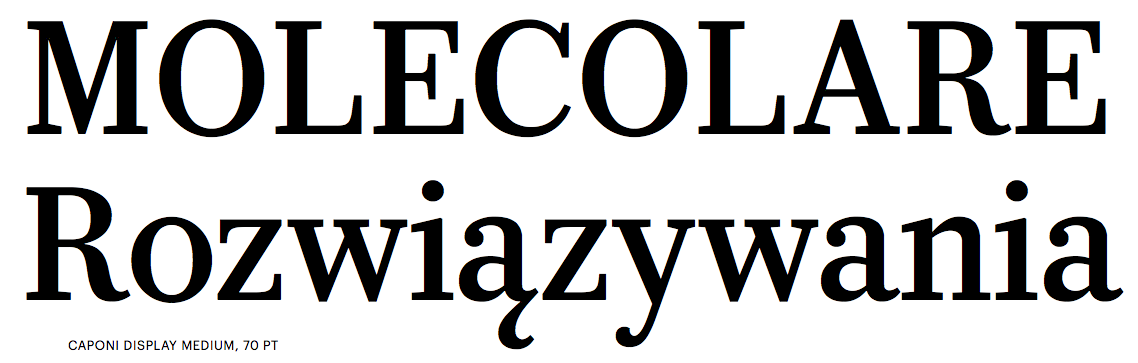
file name: Christian Schwartz Paul Barnes Miguel Reyes Caponi 2014e
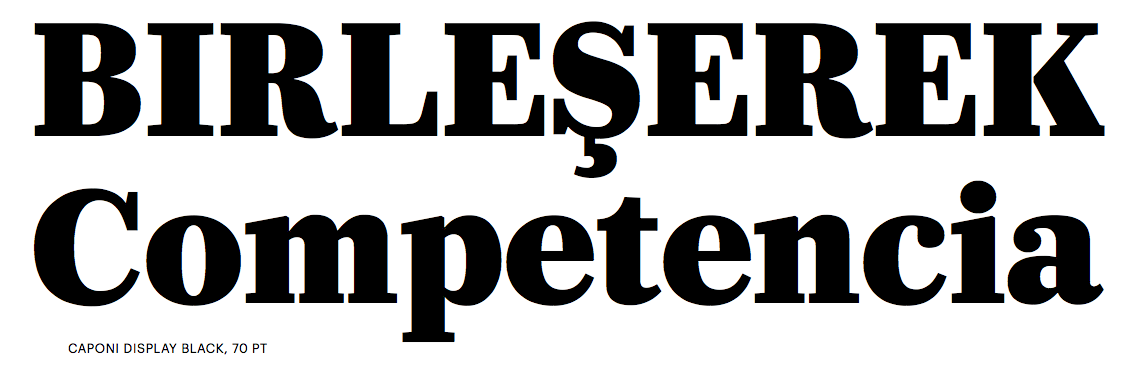
file name: Christian Schwartz Paul Barnes Miguel Reyes Caponi 2014f
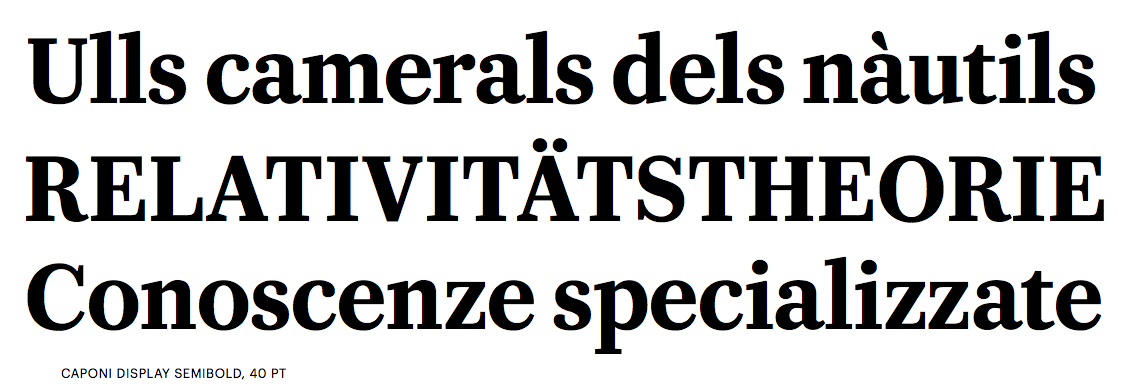
file name: Christian Schwartz Paul Barnes Miguel Reyes Caponi 2014g
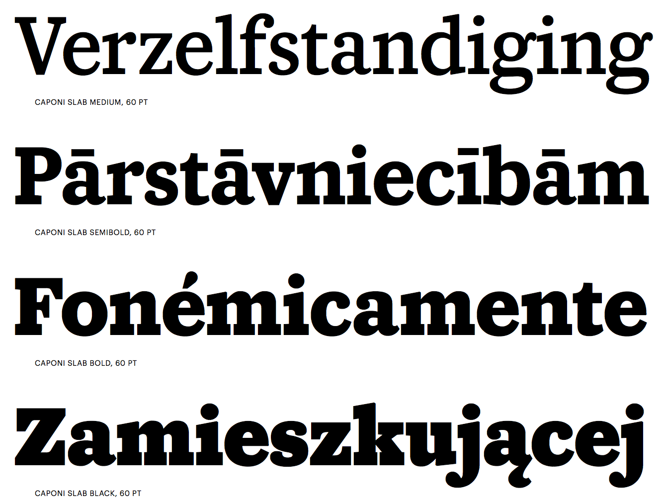
file name: Christian Schwartz Paul Barnes Miguel Reyes Caponi 2014h
file name: Christian Schwartz Paul Barnes Miguel Reyes Caponi 2014i

file name: Christian Schwartz Paul Barnes Miguel Reyes Caponi 2014j
file name: Christian Schwartz Paul Barnes Miguel Reyes Caponi 2014k
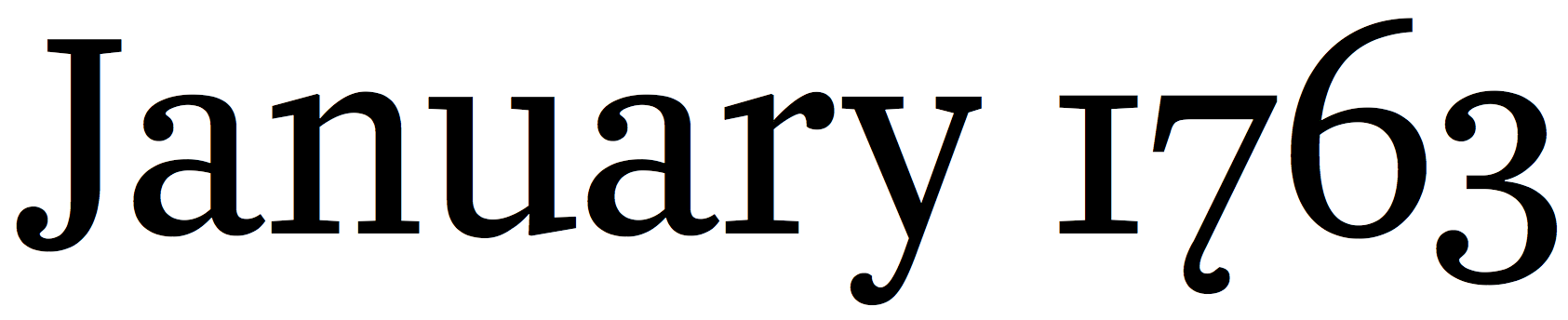
file name: Christian Schwartz Pennsylvania 2000
file name: Christian Schwartz Font Bureau Pennsylvania Bold S C 1999

file name: Font Bureau Farnham

file name: Farnham Text Scanby Fontasm 2010

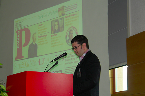
file name: Paul Barnes Publico 2011
file name: Paul Barnes Christian Schwartz Publico Headline Black 2010

file name: Paul Barnes Christian Schwartz Publico Headline Black 2010b
file name: Paul Barnes Christian Schwartz Publico Headline Roman 2010
file name: Paul Barnes Christian Schwartz Publico Text Bold 2010

file name: Christian Schwartz Plinc Hanover 2009
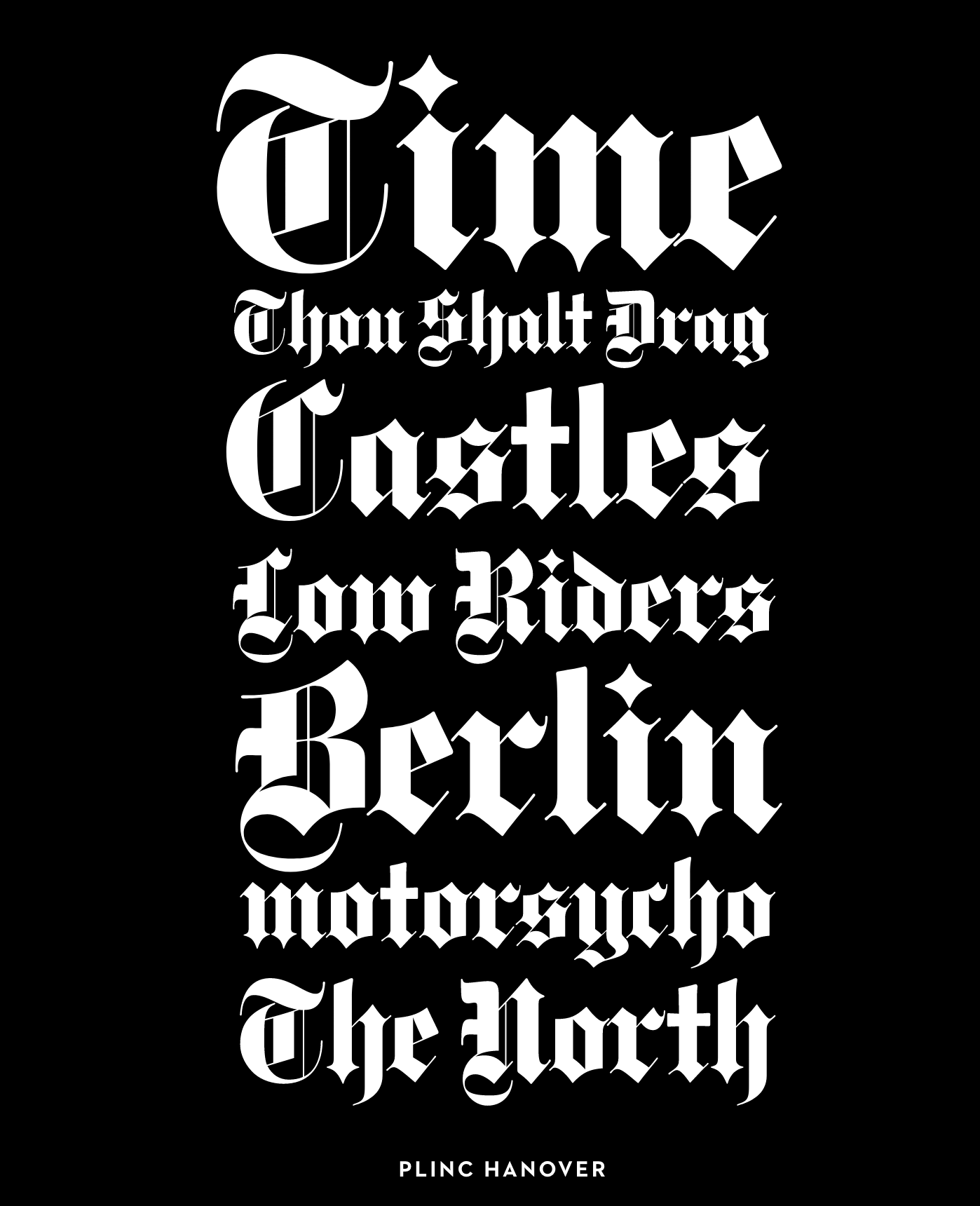
file name: Christian Schwartz Plinc Hanover 2009

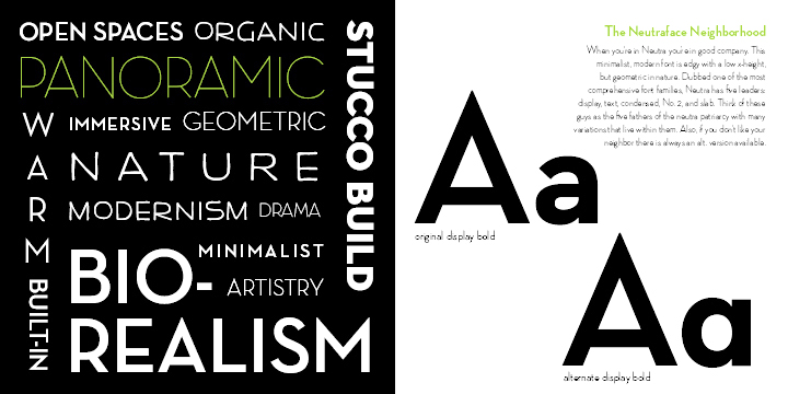
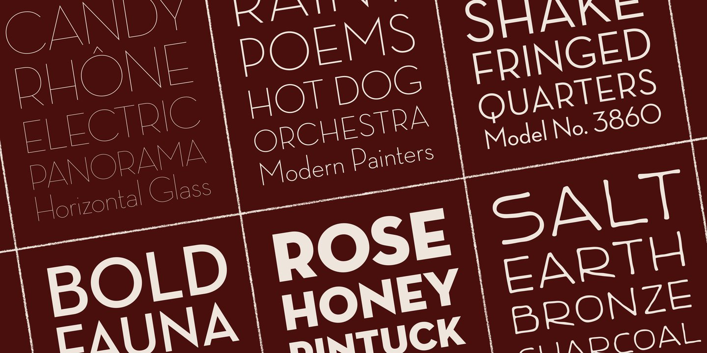
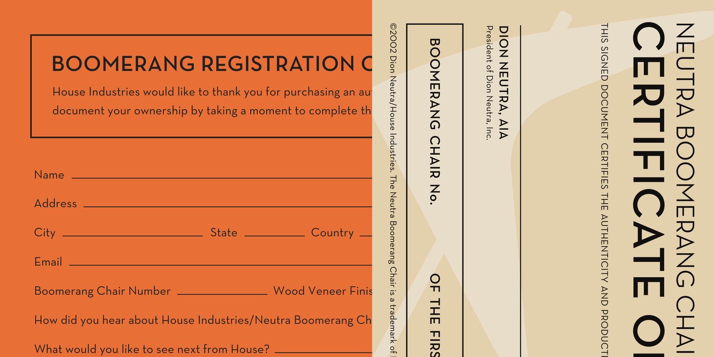
file name: House Industries Neutraface Condensed 2021
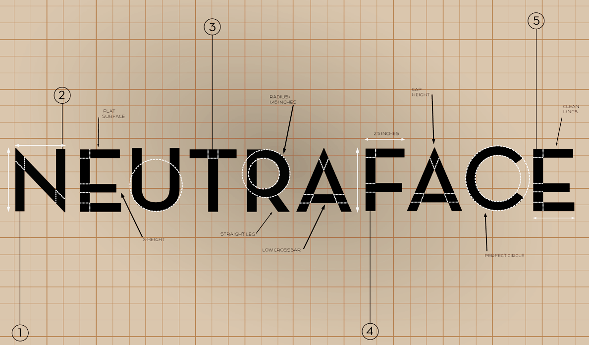
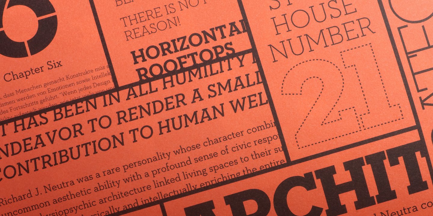
file name: Christian Schwartz Neutraface 2002 Poster by Chelsea Beuch 2015
file name: Christian Schwartz Neutraface 2002 Poster by Chelsea Beuch 2015b

file name: Richard Neutra Neutraface poster by Michelle Regna

file name: Richard Neutra Neutraface poster by Ioana Dumitrescu

file name: Christian Schwartz Neutraface 2002 poster by Nico Kockritz 2013
file name: Christian Schwartz Neutraface 2002 Poster by Laura Holzmann 2016
file name: Christian Schwartz Neutraface 2002 Poster by Laura Holzmann 2016c

file name: Maggie Winters Neutraface Poster 2011
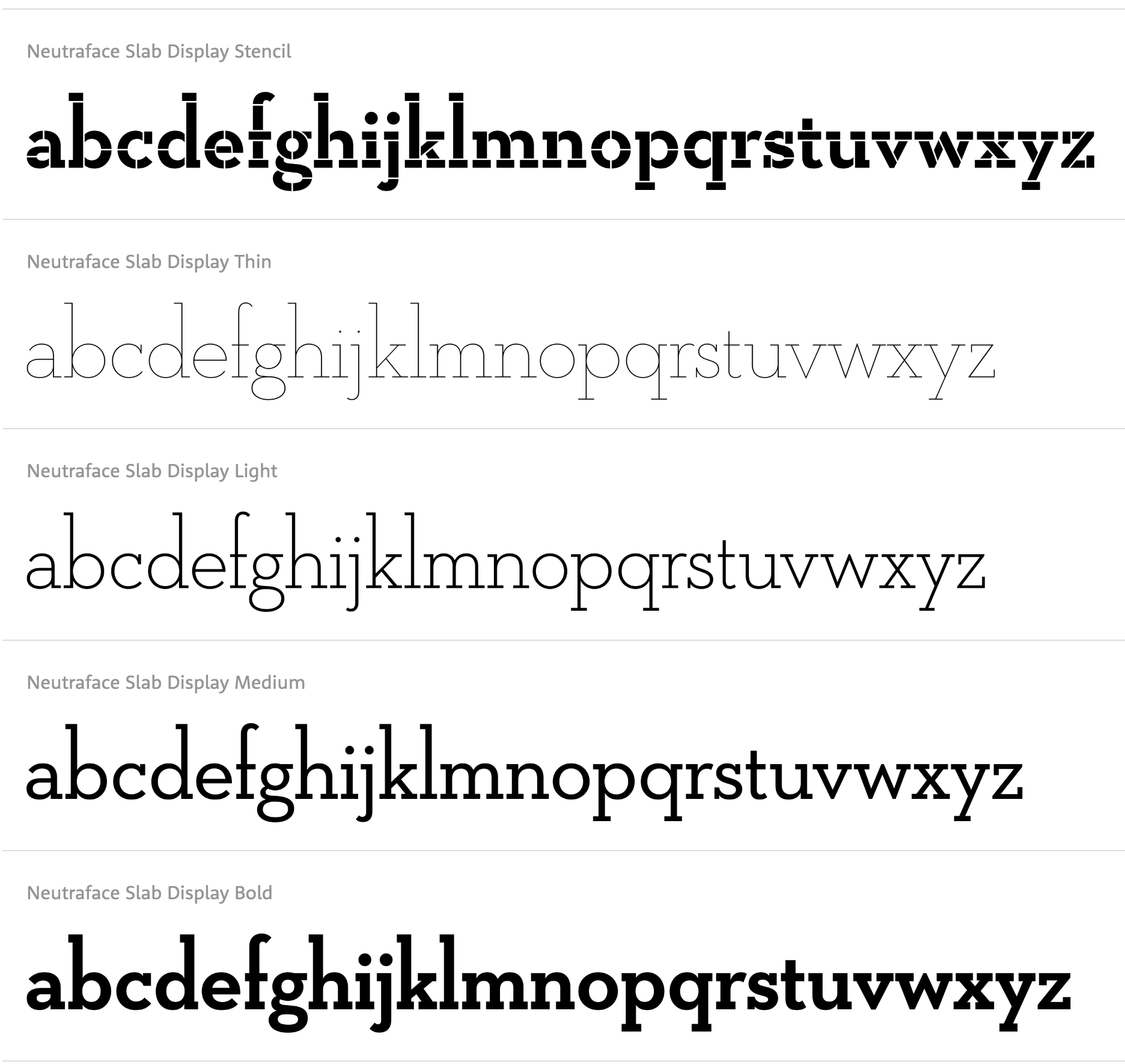
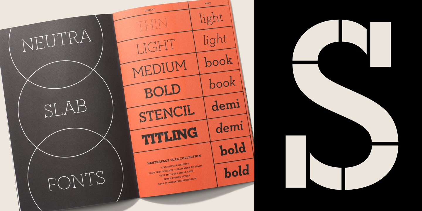
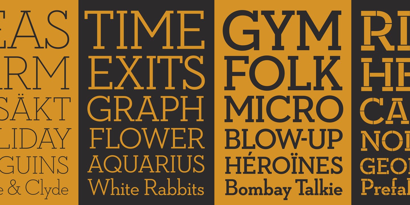
file name: House Industries Neutraface Slab Display 2021
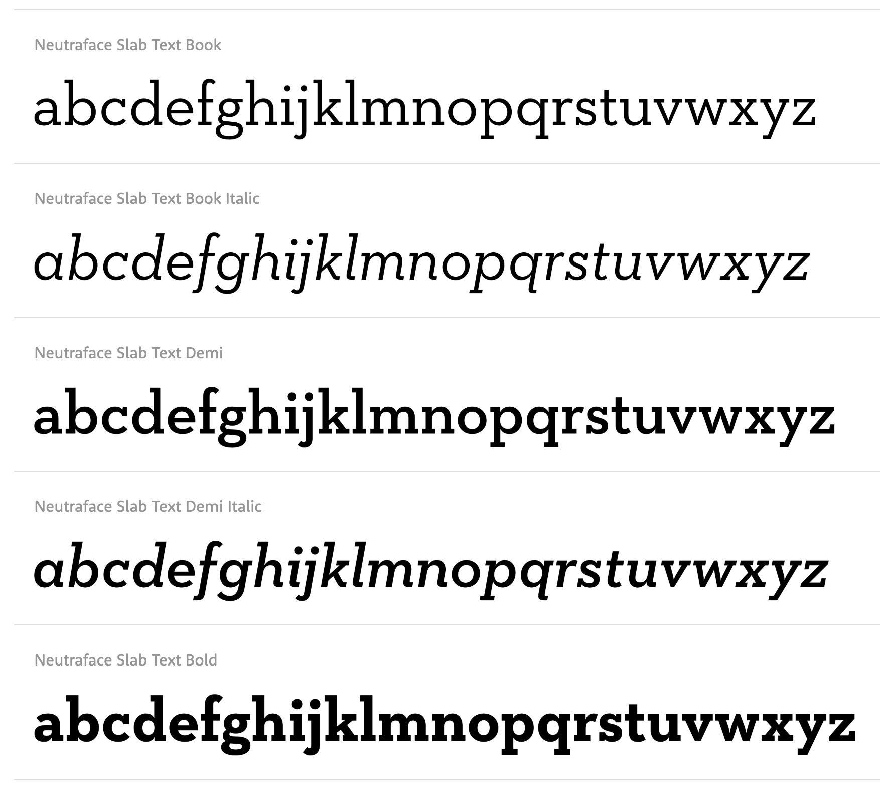
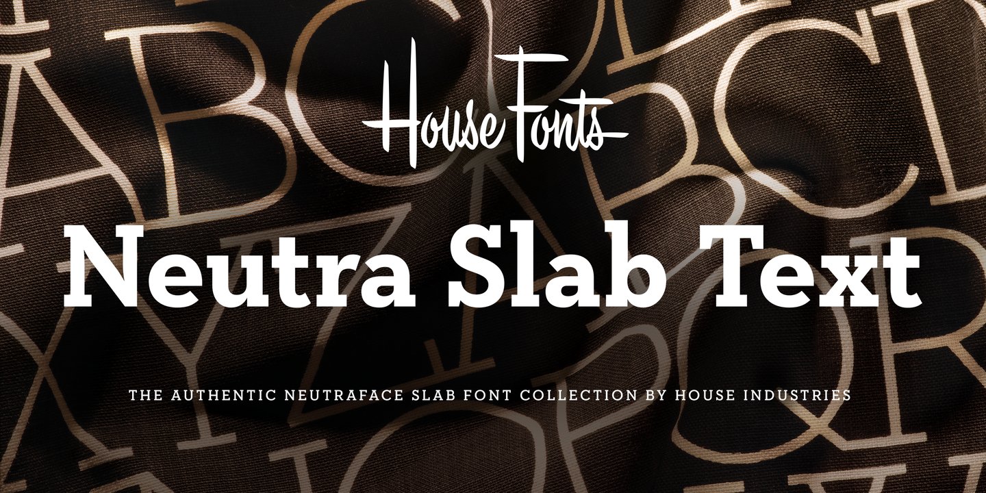
file name: House Industries Neutraface Slab Text 2021
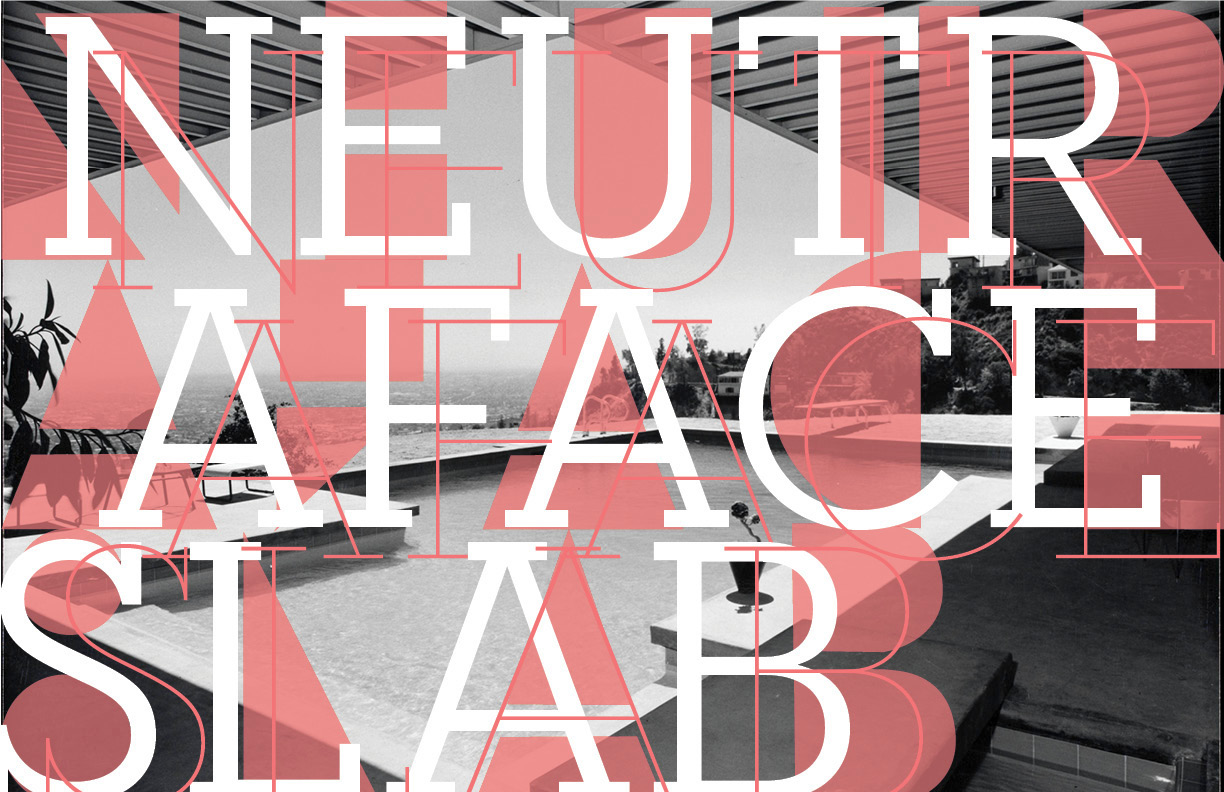
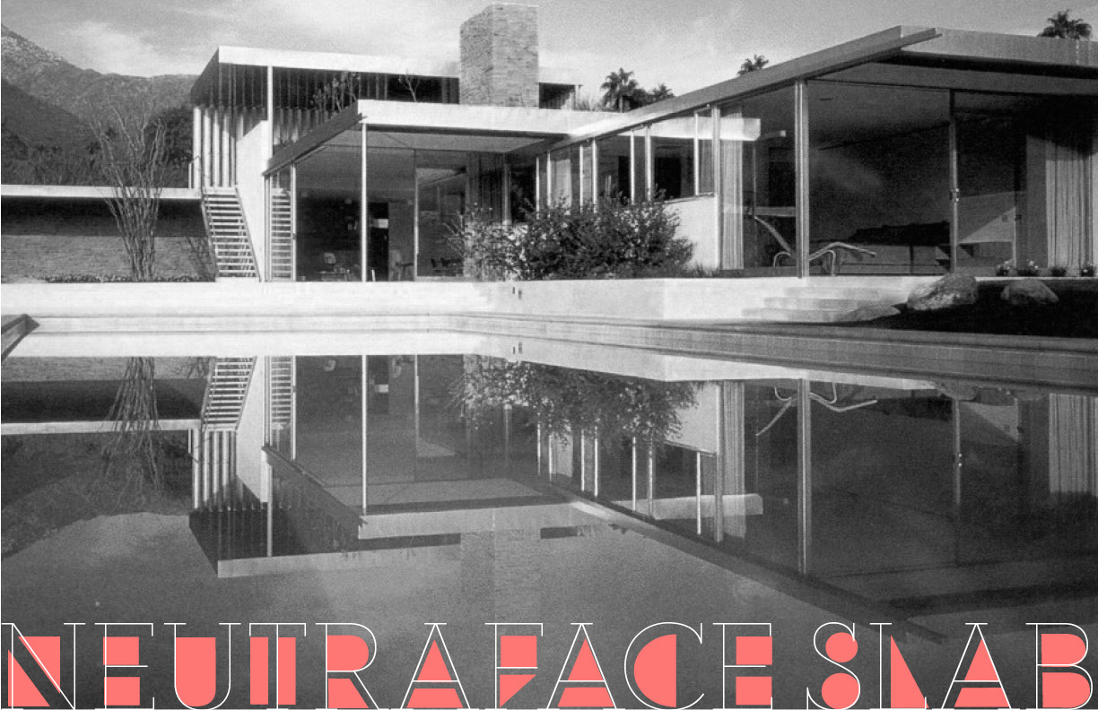
file name: Atelier Carvalho Bernau Neutraface Slab 2010 Poster by Emily Ruskey 2016
file name: Atelier Carvalho Bernau Neutraface Slab 2010 Poster by Emily Ruskey 2016b
file name: Atelier Carvalho Bernau Neutraface Slab 2010 Poster by Emily Ruskey 2016c
file name: Atelier Carvalho Bernau Neutraface Slab 2010 Poster by Emily Ruskey 2016d
file name: House Industries Neutraface Slab Display 2021 1
file name: House Industries Neutraface Slab Display 2021 2
file name: House Industries Neutraface Slab Display 2021 3
file name: House Industries Neutraface Slab Display 2021 4
file name: House Industries Neutraface Slab Display 2021
file name: House Industries Neutraface Slab Text 2021 1
file name: House Industries Neutraface Slab Text 2021 2
file name: House Industries Neutraface Slab Text 2021 3

file name: House Industries Neutraface Slab Text 2021

file name: House Industries Neutraface Display 2021

file name: House Industries Neutraface Display 2021 1

file name: House Industries Neutraface Display 2021 4
file name: House Industries Neutraface Display 2021 5
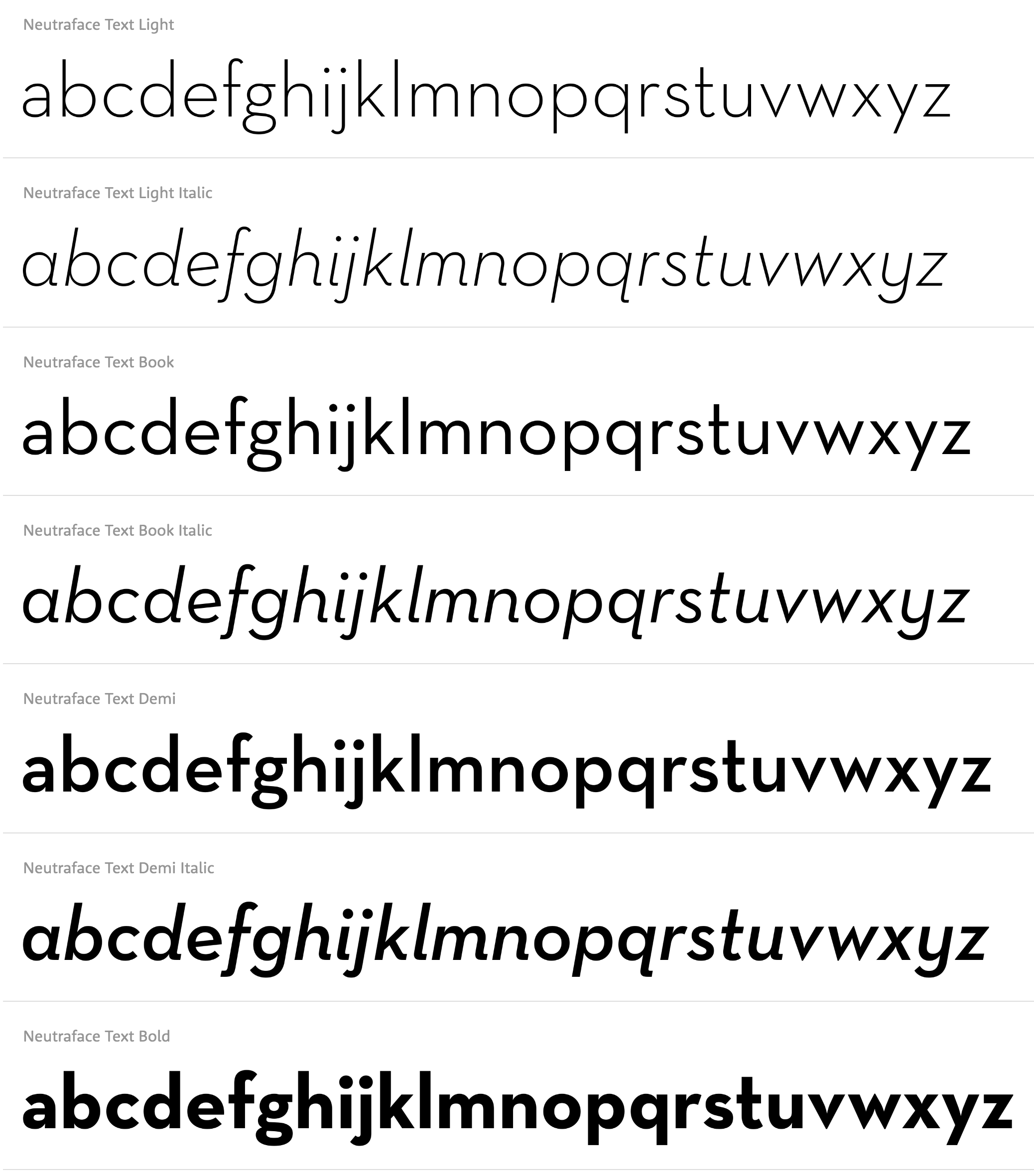
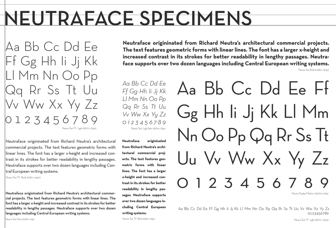
file name: Christian Schwartz Neutraface Text

file name: House Industries Neutraface Text 2021

file name: House Industries Neutraface Text 2021 1
file name: House Industries Neutraface Text 2021 4

file name: House Industries Plinc Swiss Interlock 2021 1

file name: House Industries Plinc Swiss Interlock 2021 2
file name: House Industries Plinc Swiss Interlock 2021

file name: Tobias Frere Jones Christian Schwartz Interstate Mono 2000
file name: Tobias Frere Jones Interstate 1993

file name: Christian Schwartz Erik Spiekermann F F Bau 2001 2004

file name: Christian Schwartz Zizou 2011

file name: Christian Schwartz F F Oxide Solid Pro Regular 2010
file name: Christian Schwartz F F Oxide Stencil Pro 2010

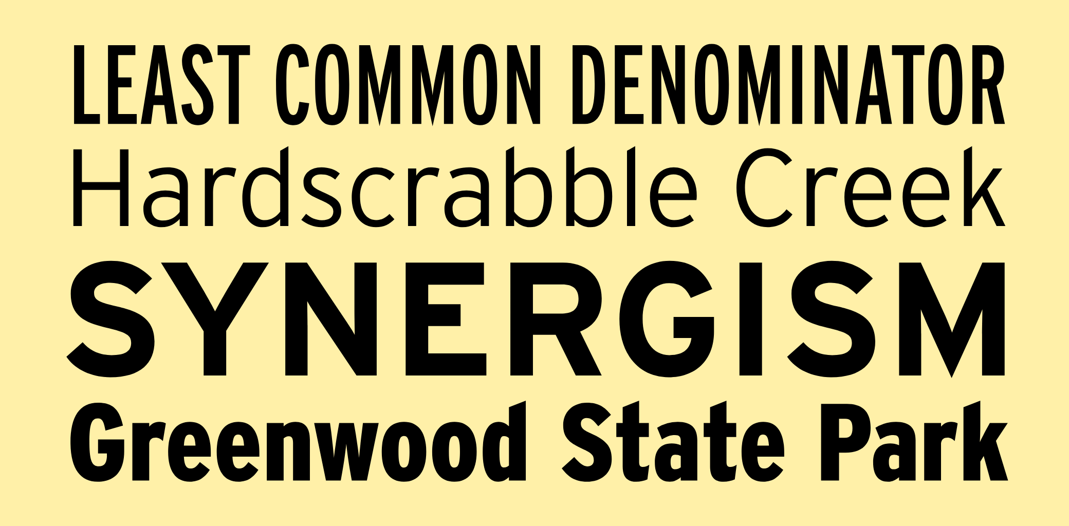
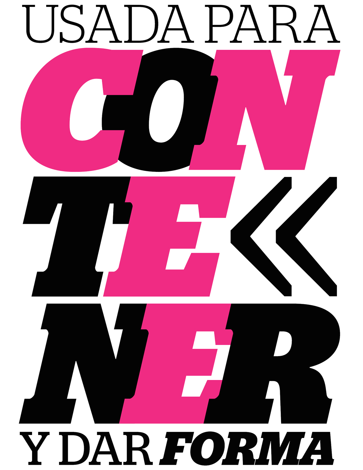
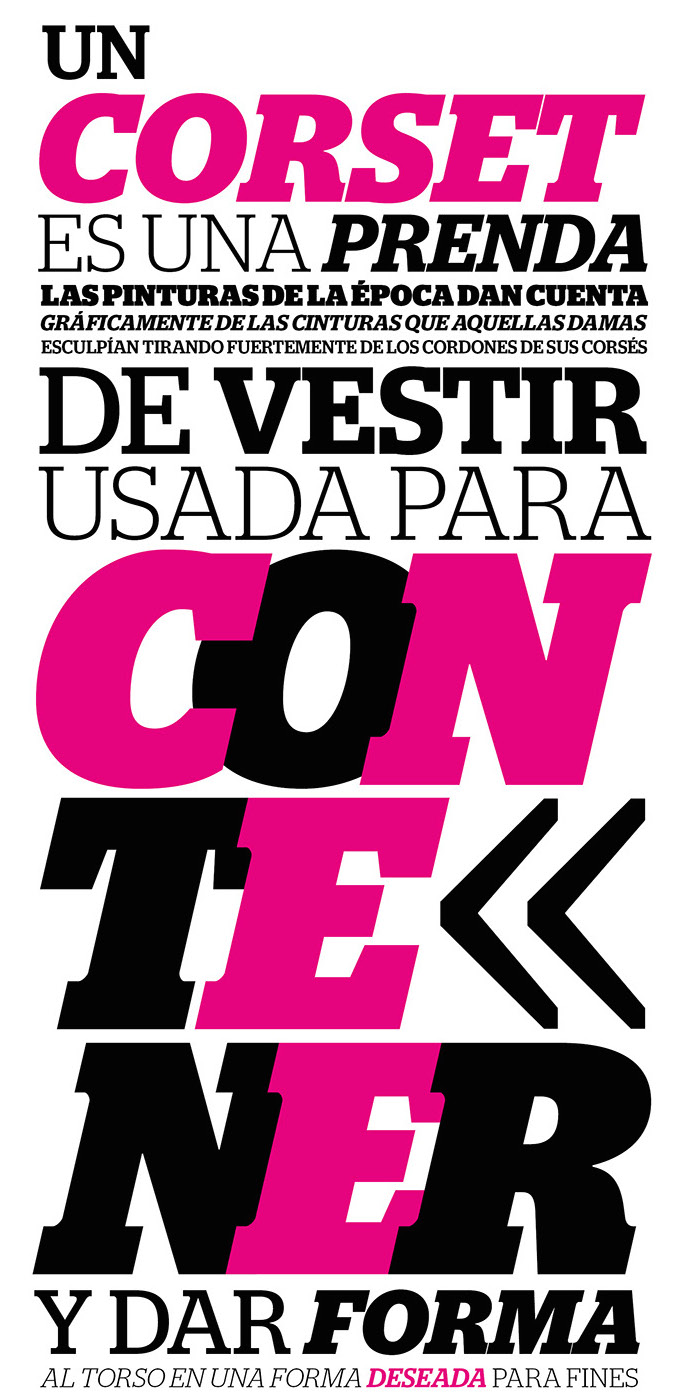
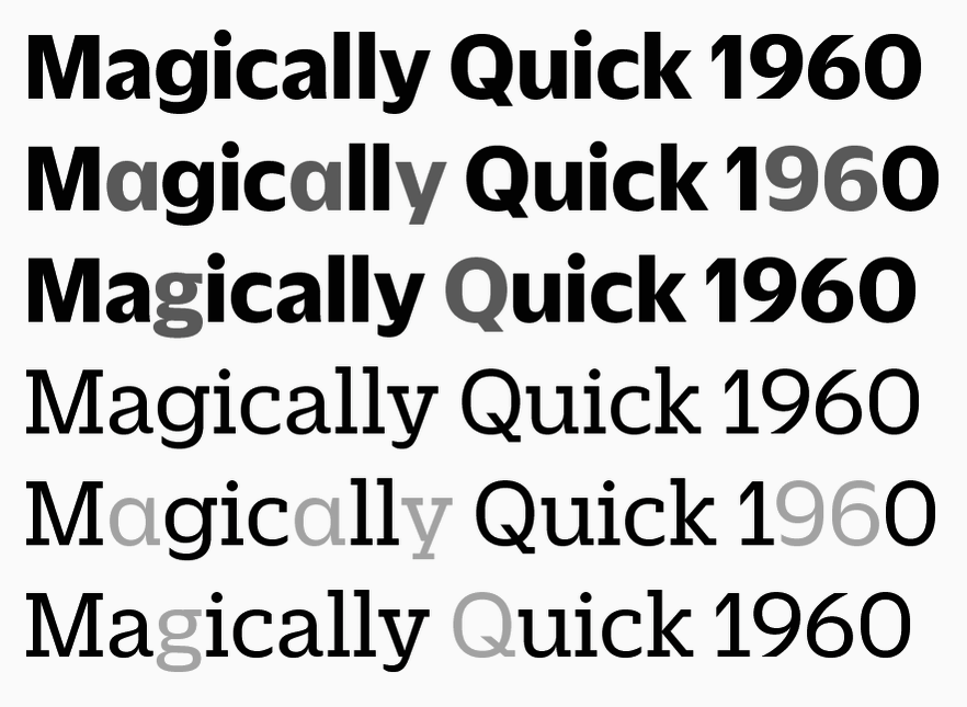
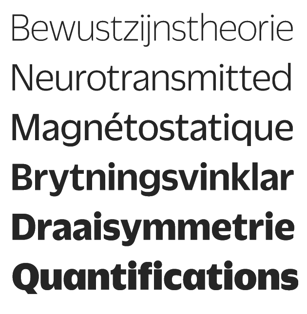
file name: Christian Schwartz Graphik Wide 2018

file name: Christian Schwartz Graphik Wide 2018
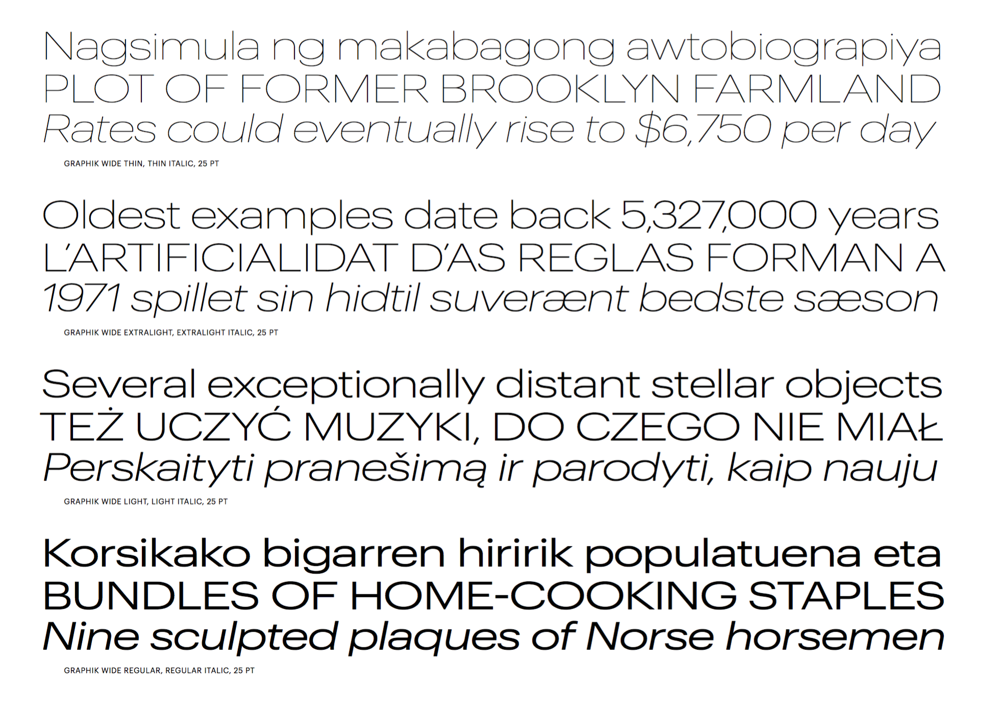
file name: Christian Schwartz Graphik Wide 2018
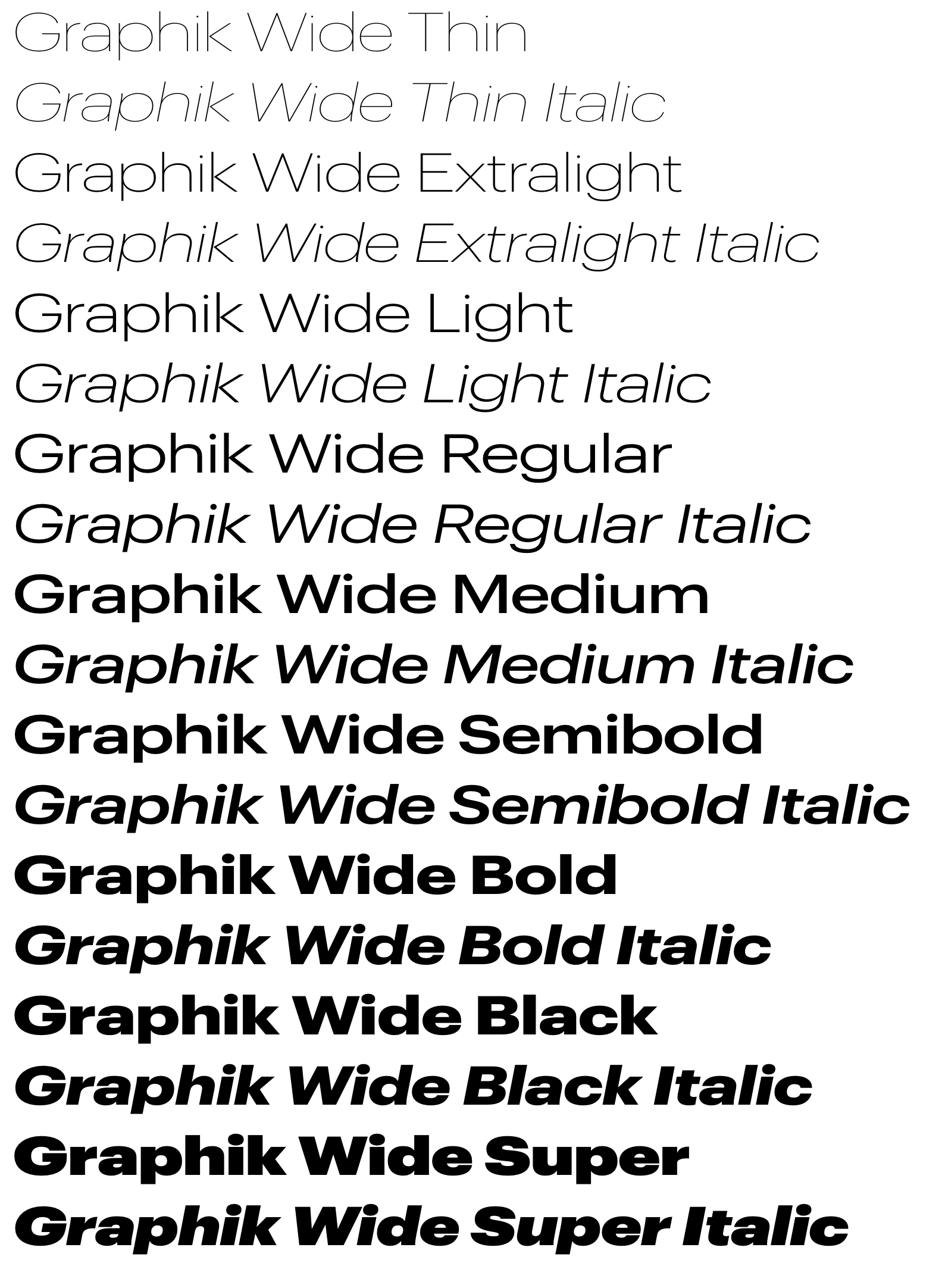
file name: Christian Schwartz Graphik Wide 2018

file name: Christian Schwartz Graphik

file name: stag tca 140x182

file name: Christian Schwartz Stag Dot 2009

file name: Christian Schwartz Stag Stag Dot

file name: Christian Schwartz Stag Dot 2009b
file name: Christian Schwartz Stag Esquire 2006 Poster by Bill Dawson 2015
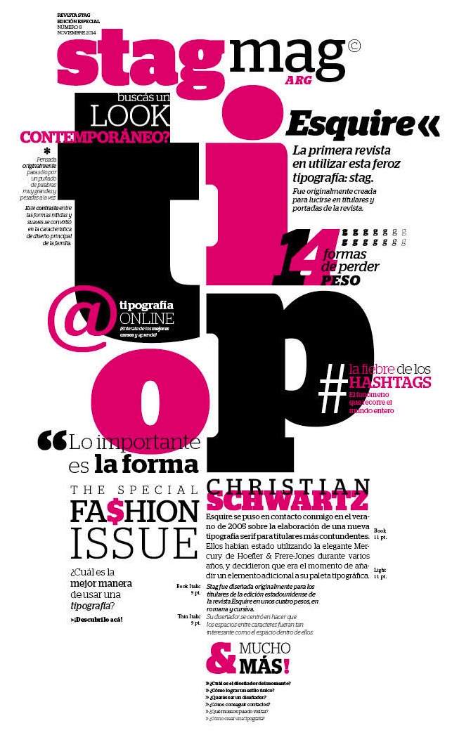
file name: Christian Schwartz Stag Esquire 2006 Poster by Guadalupe Peyrallo 2015
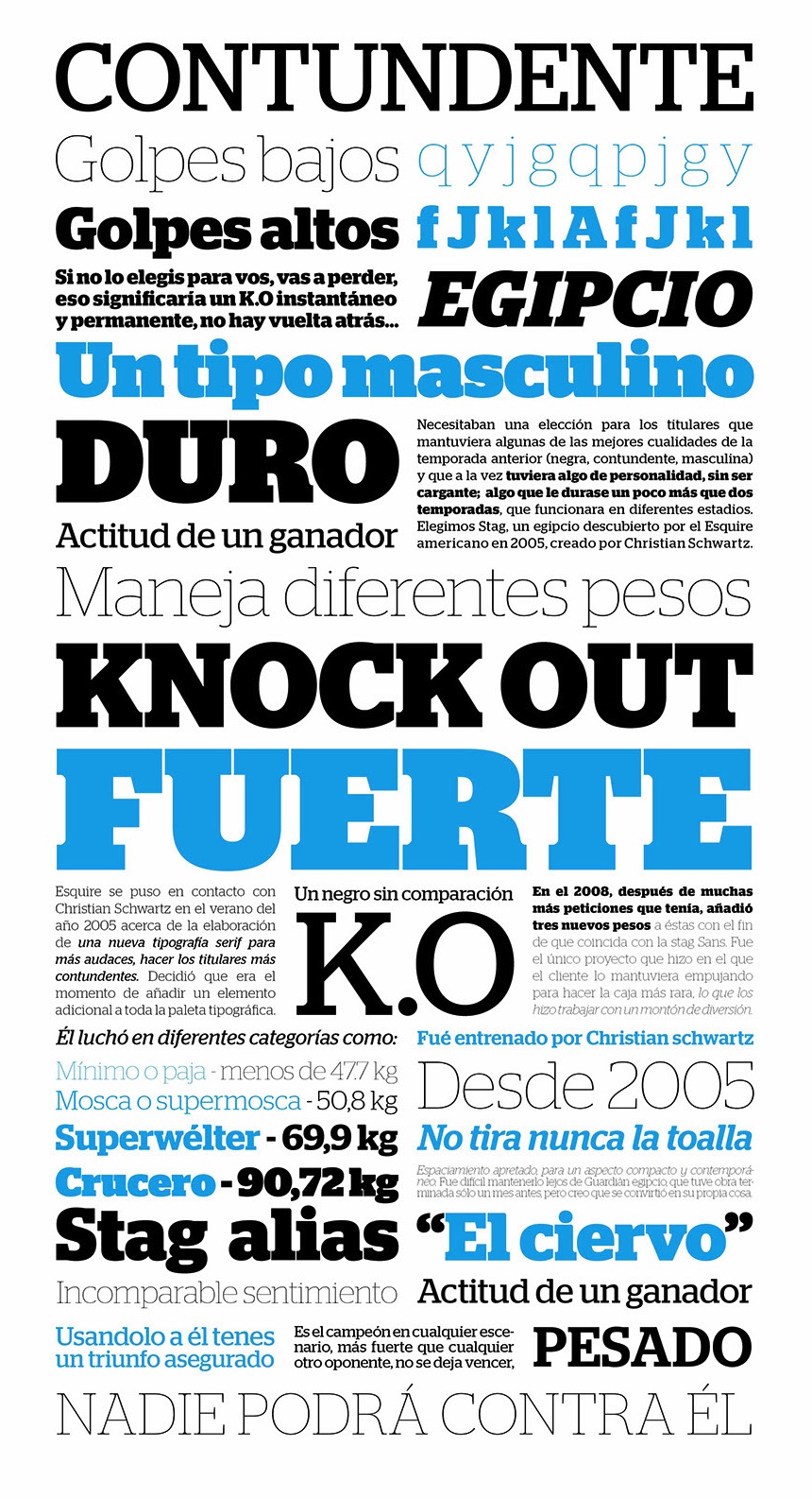
file name: Christian Schwartz Stag 2006 Poster by Leandro De La Cruz 2016
file name: Christian Schwartz Stag 2006 Poster by Victoria Costa Paz 2016
file name: Christian Schwartz Stag 2006 Poster by Victoria Costa Paz 2016b
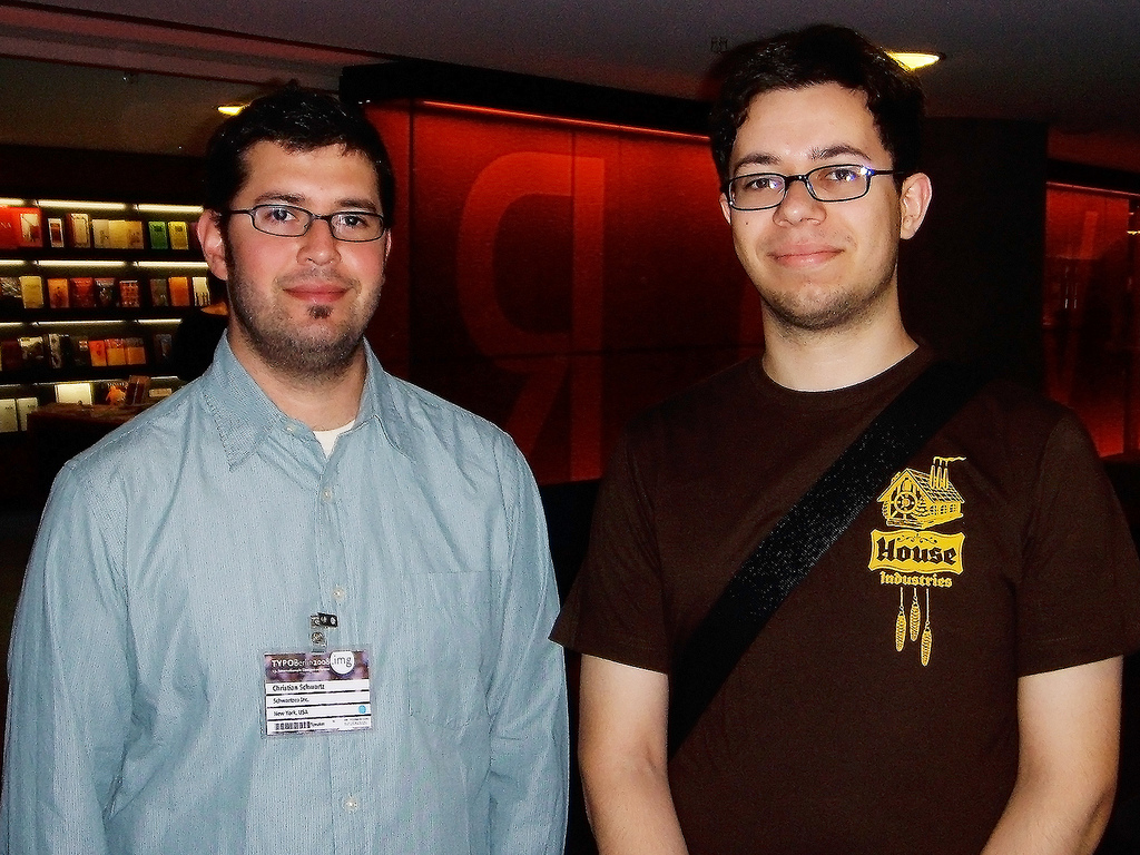
file name: Pic Christian Schwartz
file name: Pic Christian Schwartz Typotechnica2007
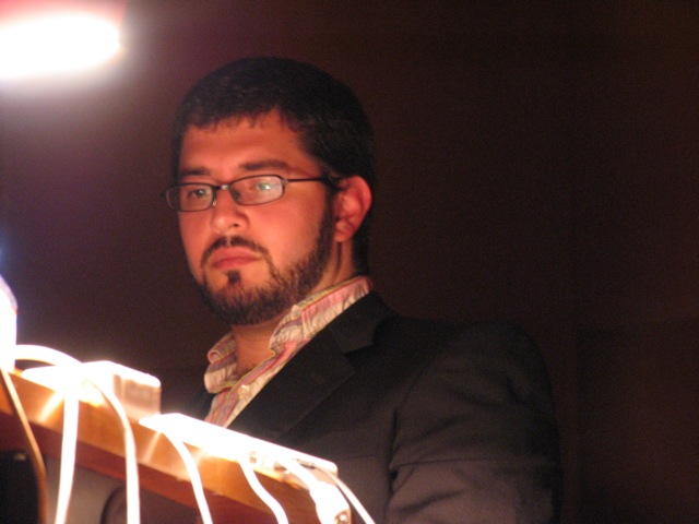
file name: Pic Christian Schwartz Lisbon
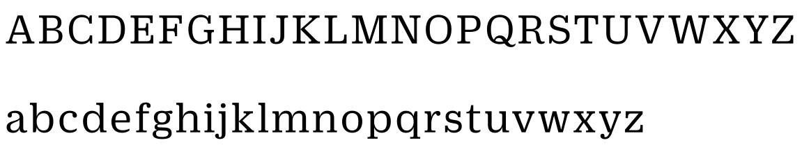
file name: Christian Schwartz Miguel Reyes Duplicate 2013
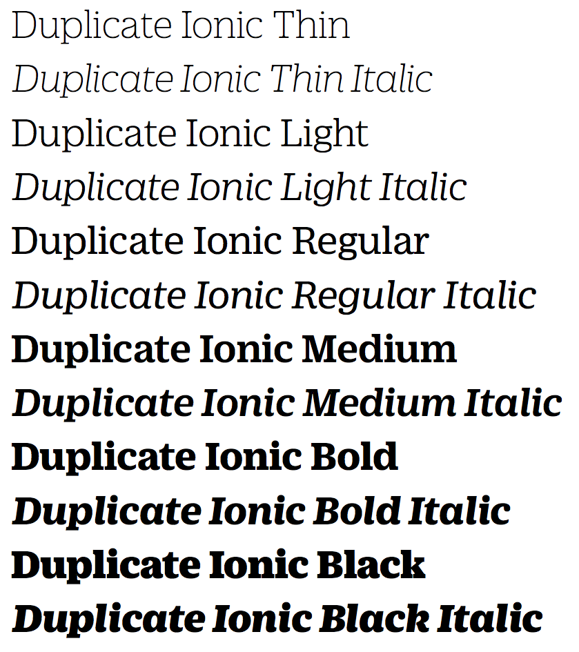
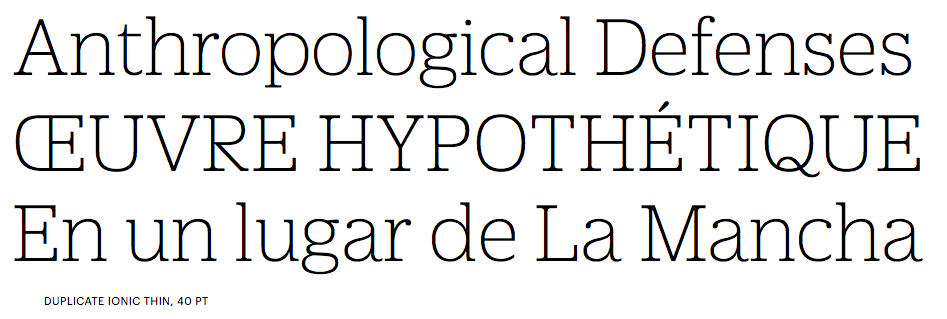
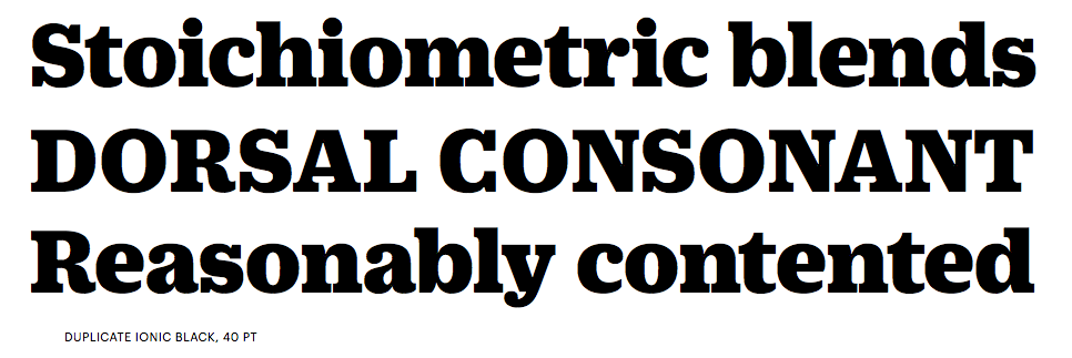
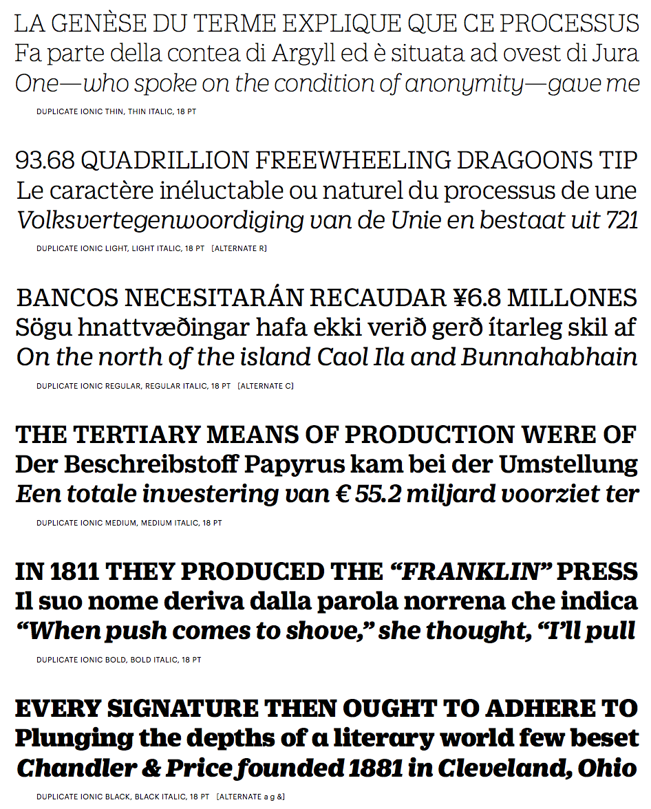
file name: Christian Schwartz Miguel Reyes Duplicate Ionic 2013
file name: Christian Schwartz Miguel Reyes Duplicate Ionic 2013b
file name: Christian Schwartz Miguel Reyes Duplicate Ionic 2013c
file name: Christian Schwartz Miguel Reyes Duplicate Ionic 2013d
file name: Christian Schwartz Miguel Reyes Duplicate Ionic 2013e
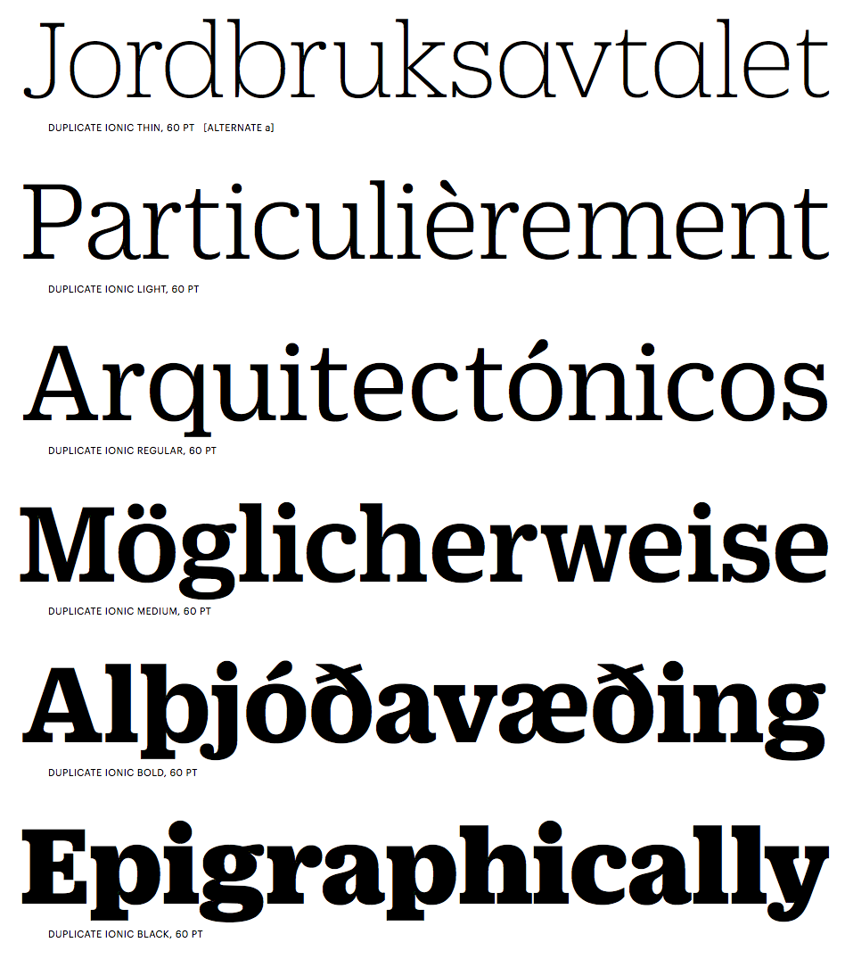
file name: Christian Schwartz Miguel Reyes Duplicate Ionic 2013f
file name: Christian Schwartz Miguel Reyes Duplicate Ionic 2013g

file name: Christian Schwartz Miguel Reyes Duplicate Ionic 2013h
file name: Miguel Reyes Christian Schwartz Duplicate Ionic T D C Award 2014

file name: Christian Schwartz Miguel Reyes Duplicate Ionic N Z Z Sonntag 2013
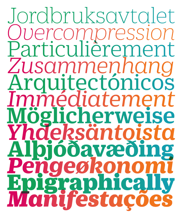
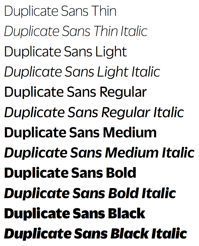
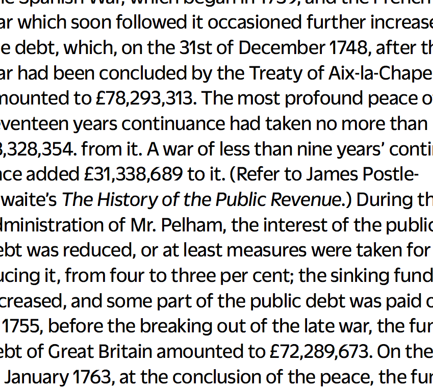
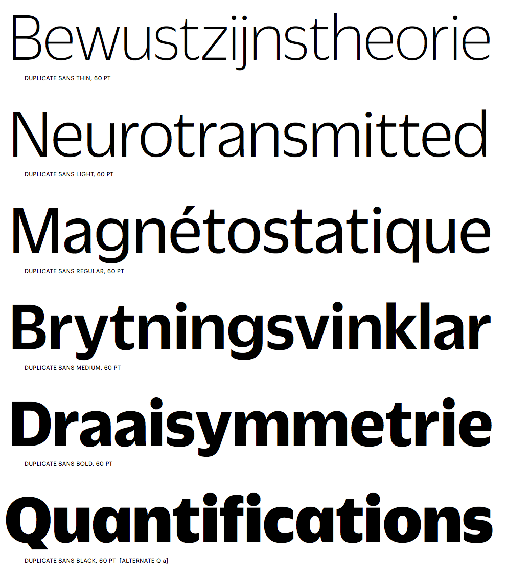
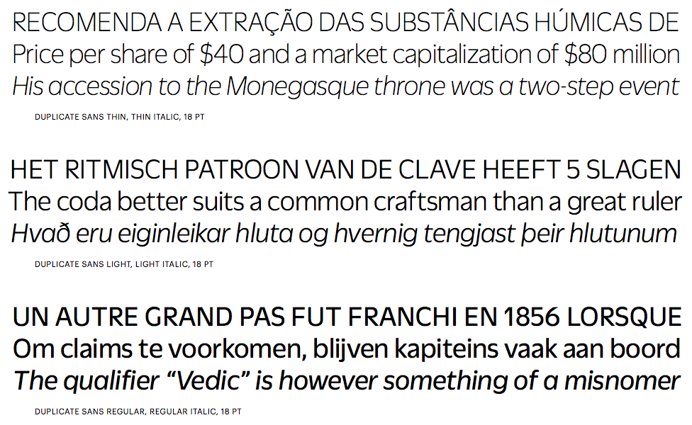
file name: Christian Schwartz Miguel Reyes Duplicate Sans 2013
file name: Christian Schwartz Miguel Reyes Duplicate Sans 2013b

file name: Christian Schwartz Miguel Reyes Duplicate Sans 2013c
file name: Christian Schwartz Miguel Reyes Duplicate Sans 2013d

file name: Christian Schwartz Miguel Reyes Duplicate Sans 2013e

file name: Christian Schwartz Miguel Reyes Duplicate Sans 2013f
file name: Christian Schwartz Miguel Reyes Duplicate Sans 2013g
file name: Christian Schwartz Miguel Reyes Duplicate Sans 2013h
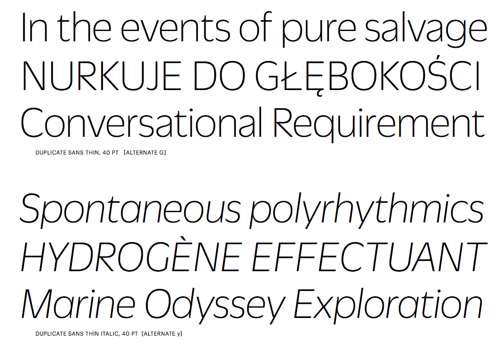
file name: Christian Schwartz Miguel Reyes Duplicate Sans 2013i
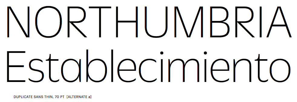
file name: Christian Schwartz Miguel Reyes Duplicate Sans 2013j

file name: Christian Schwartz Miguel Reyes Duplicate Slab 2013

file name: Christian Schwartz Miguel Reyes Duplicate Slab 2013b

file name: Christian Schwartz Miguel Reyes Duplicate Slab 2013c
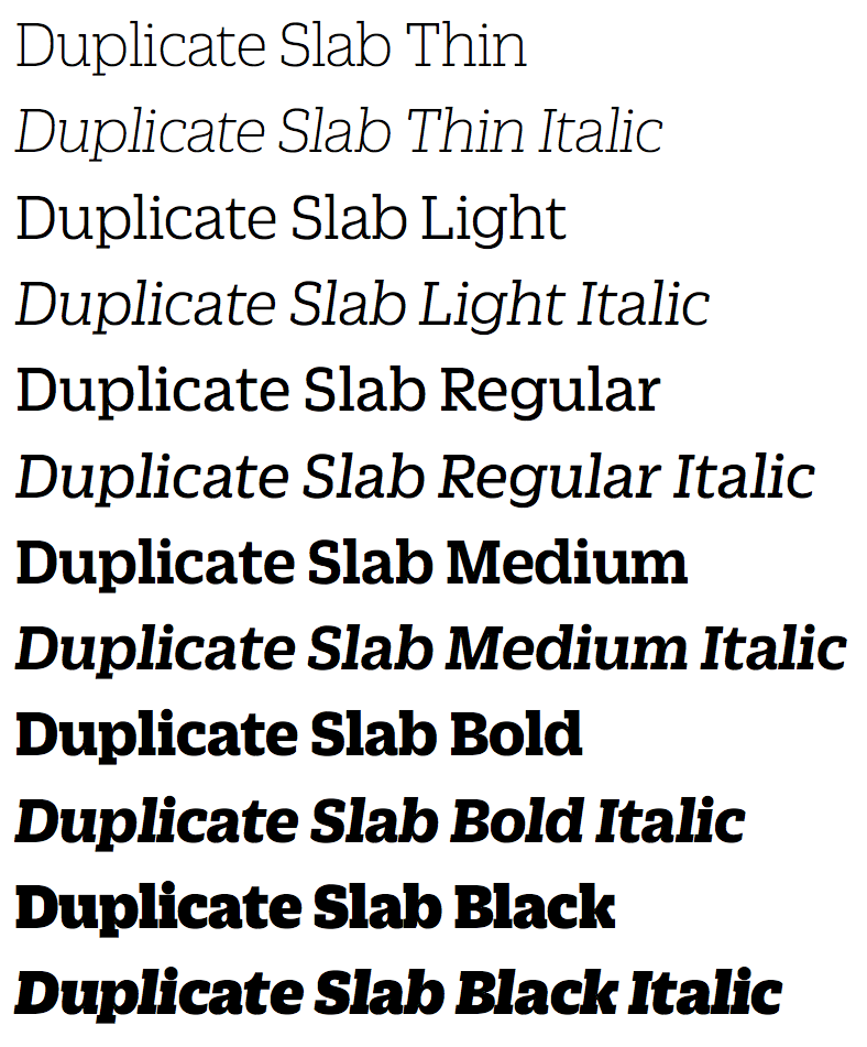
file name: Christian Schwartz Miguel Reyes Duplicate Slab 2013d
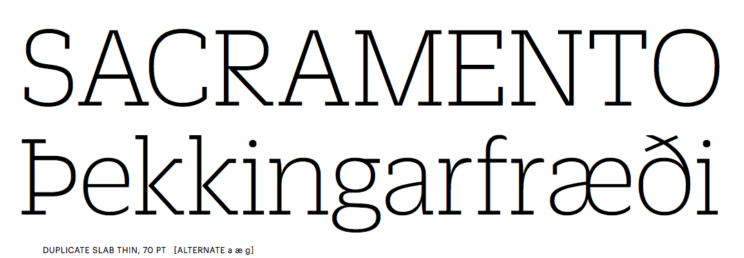
file name: Christian Schwartz Miguel Reyes Duplicate Slab 2013e
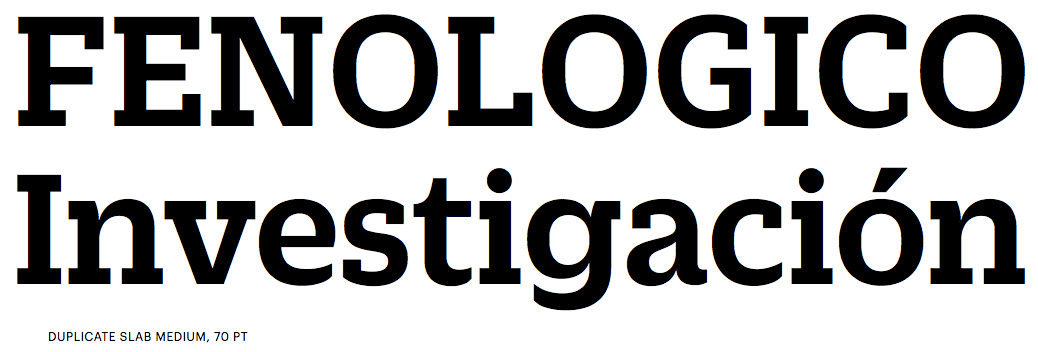
file name: Christian Schwartz Miguel Reyes Duplicate Slab 2013f
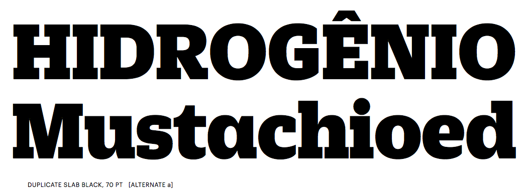
file name: Christian Schwartz Miguel Reyes Duplicate Slab 2013g
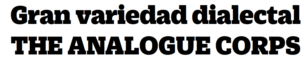
file name: Christian Schwartz Miguel Reyes Duplicate Slab 2013h
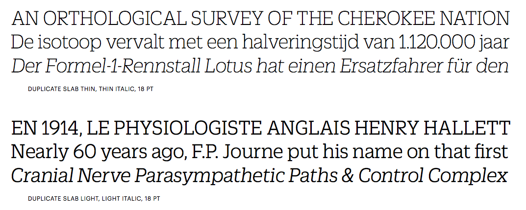
file name: Christian Schwartz Miguel Reyes Duplicate Slab 2013i
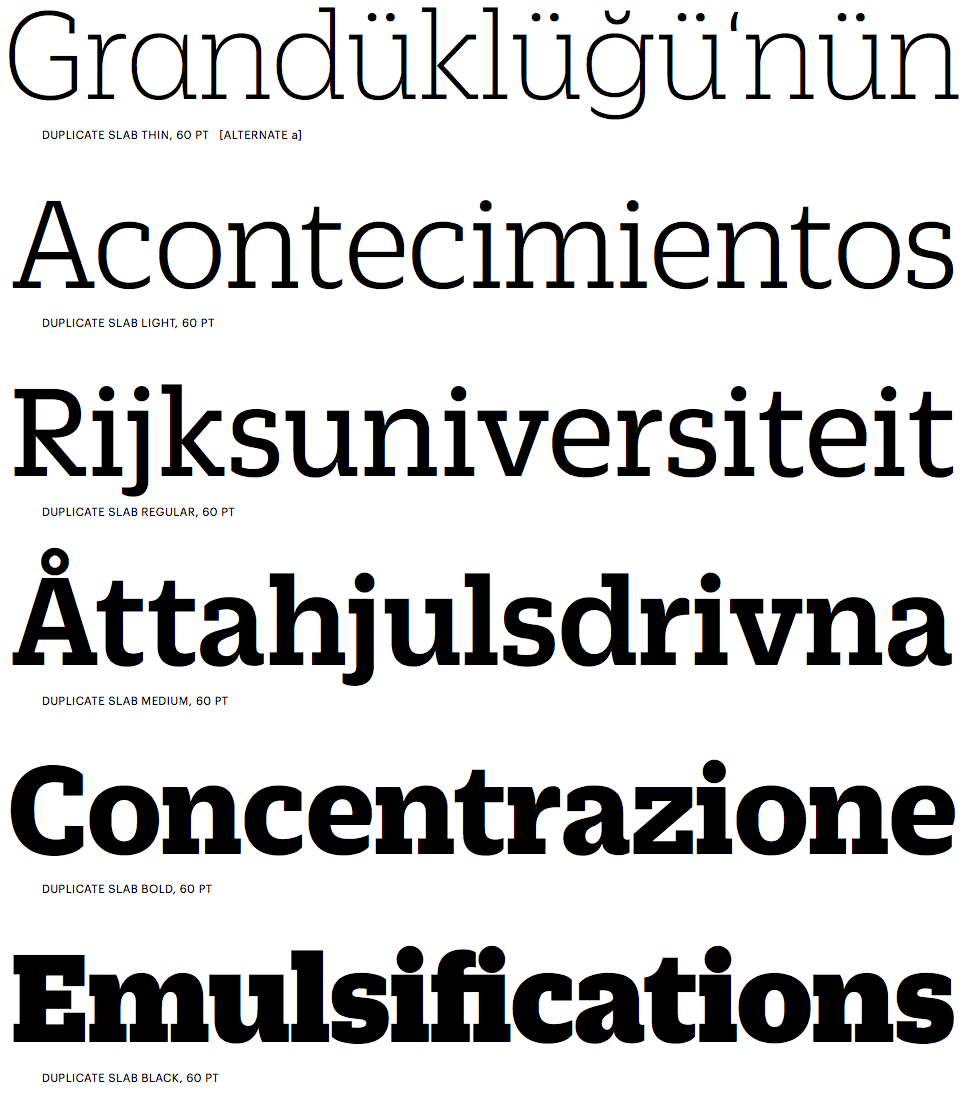
file name: Christian Schwartz Miguel Reyes Duplicate Slab 2013j
file name: Christian Schwartz Miguel Reyes Duplicate Slab 2013k
| | |
|
Luc Devroye ⦿ School of Computer Science ⦿ McGill University Montreal, Canada H3A 2K6 ⦿ lucdevroye@gmail.com ⦿ https://luc.devroye.org ⦿ https://luc.devroye.org/fonts.html |