TYPE DESIGN INFORMATION PAGE last updated on Sat May 16 08:11:00 EDT 2026
FONT RECOGNITION VIA FONT MOOSE

|
|
|
|
|
Type glossaries | ||
|
|
|
|
SWITCH TO INDEX FILE
100types
| Educational and reference site run by Ben Archer, a designer, educator and type enthusiast located in England (who was in Auckland, New Zealand, before that). Glossary. Timeline. Type categories. Paul Shaw's list of the 100 most significant typefaces of all times were recategorized by Archer:
|
Agate is an old size type of approximately 5.5 points, a size that mattered for small print such as in newspapers. In newspaper advertising, fourteen agate lines made one inch of matter. [Google] [More] ⦿ | |
All Good Things Typography
| Dead link. Archive (FontPool), history of type, type classification (by Matthias Neuber and Morton K. Pedersen), page layout guide, type choice guide, logo type guide, mixing type guide, Windows software guide, Mac type software guide, glossary. By Kevin Woodward. [Google] [More] ⦿ |
FAQ kept by James Goffin. Font links. Alternate URL. Type glossary. [Google] [More] ⦿ | |
| |
A Russian language page with visual illustrations of font terminology. [Google] [More] ⦿ | |
Andrew S. Fuller
| |
Ben Archer
| |
Russian calligraphic blog. Russian type and calligraphy glossary and links. [Google] [More] ⦿ | |
Cont Ed Typography
| Educational pages on typography and type design. Some links. Run by Stan Schwartz. [Google] [More] ⦿ |
Site about typography. Despite the slow loading, worthwhile information on type, including a glossary and a type history timeline. Incredible-flashy design, yet the authors forgot to mention their own names. [Google] [More] ⦿ | |
| |
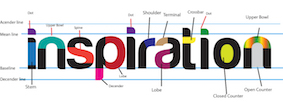
Born in Caracas, Deborah is currently studying fine arts at California State University. She made a great type poster that explains typographic terminology. [Google] [More] ⦿ | |
Dr. Roland Unger's German language glossary. HTML help. [Google] [More] ⦿ | |
Drew Binkley
| |
German author of Typographie-Lexikon (2005, in German). [Google] [More] ⦿ | |
Emday Fonts
| From Nijmegen, The Netherlands, Miriam van der Have's Dutch site offers a general introduction to fonts and font terminology. An impressive glossary. [Google] [More] ⦿ |
Foam Train Font Foundry
| Free truetype fonts (PC, Mac) by Andrew Fuller from Portland, OR (was: Lincoln, NE), at his Foam Train Font Foundry: MMMCarbony, Buddy, Derez, Derez Hitek, Deltoid, Gloopy, Hobbit Tattoo-Brush, Hobbit Tattoo-Sloppy, Reeeally Quik Hand, RoundyButt, Unserif, DryToastCaps, Iron Filings, Eeewww Messy Boy, Thirty Months of Victory (2002, handwriting), LeakyPen (2002), Early Western Greek, Samaritan 300BC (2002), Face Eater, Fingerpaint Sans, Ingloriouser (grunge), Rat Brain, Tory Gothic Caps, Lumpin, Wendus, and InsideOut Cow. Commercial fonts include Blackburn Hand, Salted Slug, Satavahana 200AD (2003), Face Eater, Fingerpaint Sans, Gloopy, MMM Carbony, Rat Brain, Reeeeally Quik Hand. This site has a great glossary as well as subpages on type history, classification, and anatomy. Dafont link. Old URL. [Google] [More] ⦿ |
Fontroduction
| Ian Obermuller's introduction to typefaces, with a visual glossary, and wonderfully instructive pages on type classification and type recognition. Ian is a 2010 graduate of the Seattle Central Creative Academy. [Google] [More] ⦿ |
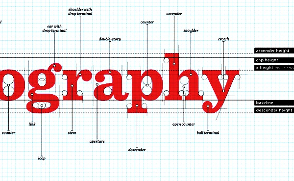
Typeface anatomy and glossary by FontShop. [Google] [More] ⦿ | |
German glossary/lexicon for typography and layout, edited by Renate Bradatsch (in German). [Google] [More] ⦿ | |
Glossary of Typesetting Terms (1994, University of Chicago Press) was written by Richard Eckersley, Charles M. Ellertson, Richard A.ngstadt and Richard Hendel. Downloads: i, ii, iii. [Google] [More] ⦿ | |
Goetz Morgenschweis
| |
Gunnlaugur Briem
| |
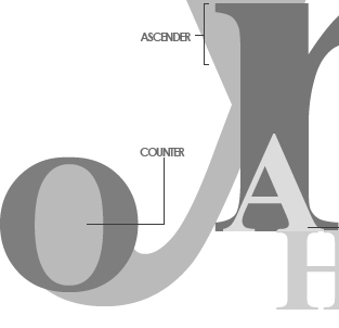
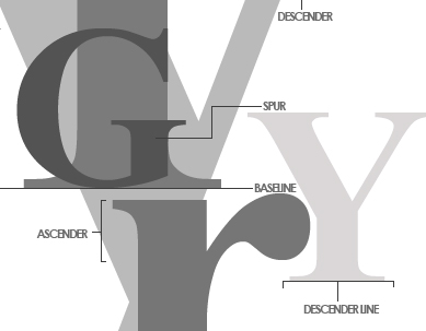
A useful introduction to humanist (or Venetian) types by John D. Boardley. They appeared in the 1460s and were modelled on the open letterforms of the Italian humanist writers (calligraphers) at that time. The types can be recognized by the sloping crossbar on the "e", the small x-height, the dark color of text set in this type, and the low contrast of thick and thin strokes. Examples include Jenson, Kennerly, Centaur, Stempel Schneidler, Verona, Lutetia, Jersey, Lynton. [Google] [More] ⦿ | |
Ian Obermuller
| |
Infillism is a new type design word coined by Stephen Coles. It refers to the creation of textured or derivative typefaces based on classical skeletons or outlines such as Helvetica. [Google] [More] ⦿ | |
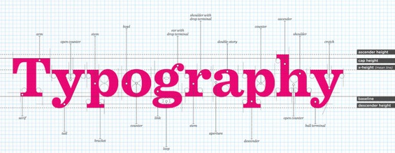
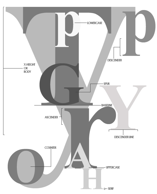
Typeface anatomy site by Jacci Howard Bear. [Google] [More] ⦿ | |
Jacci Howard Bear
| |
| |
Independent part-time type designer, ex-type teacher at the International Design Academy in Montreal, and presently working at an ad agency in France. Type glossary in French. [Google] [More] ⦿ | |
John D. Boardley
| |
John M. Fiscella
| |
John Magnik
| |
| |
London-based graphic and web designer, who created the outline typeface Limitations Digitized (2010) and Allen Key (2010, rough handprinting). Type anatomy poster. [Google] [More] ⦿ | |
Kai F. Oetzbach
| |
Kevin Woodward
| |
Font news in English, Spanish and Galego. Lots of updates! Goodies on type classification, font search, a type glossary, font identification, type articles, and related information. [Google] [More] ⦿ | |
Christophe Badani's French glossary on calligraphy. [Google] [More] ⦿ | |
Lothar Südkamp
| |
| |
Has a nice glossary of typography and printing. [Google] [More] ⦿ | |
Michael Brandt
| |
Type pages by Michael Nicklas (in German). It has a German glossary. [Google] [More] ⦿ | |
Miriam van der Have
| |
Notes on type design
| Gunnlaugur Briem's very informative on-line notes / course on type design, published in 1998-2001. Glossary. [Google] [More] ⦿ |
Old Style typefaces
|
|
Øyvin Rannem
| |
ParaType news, in Russian. De-Fis is ParaType's e-zine. Russian type glossary. [Google] [More] ⦿ | |
Pitch is the number of characters and spaces in one inch (about 2.54 cm) of running text, that is, characters per inch (abbreviated cpi). The pitch is popular as a measurement of font size of typewriters and printers. The relation between pitch font size and typographic font size (points) is often, but not necessarily, the inverse: a 12-pitch typewriter font is equal in height to 10-point typographic font, while a 10 pitch-typewriter font is equal in height to 12-point typographic font. The most widespread fonts in typewriters are 10 and 12 pitch, called pica and elite, respectively. [Google] [More] ⦿ | |
Company in New York City that sells charts. In their collection, there are some nice typographic posters that explain the anatomy of type to beginners. [Google] [More] ⦿ | |
Production First Software
| Production First Software offers edriginal, revival and historic designs and specializing in non-latin scripts including Armenian, Cyrillic, Greek, Hebrew, Thai, mathematical symbols and pi characters. It is run by John M. Fiscella in San Francisco since 1990, with most typefaces created immediately after that. John M. Fiscella designed the fonts for symbols and many of the alphabetic scripts for the unicode charts and all typefaces complky with unicode standards. List of typefaces: BernalPF, Blck2LineGothicPF Logo, Blck3LineGothicPF Logo, Blck4LineGothicPF Logo, CourPF, CourPF Bold, CourPF BoldOblique, CourPF Oblique, EdwardianMansePFTitling, EriePF, EuroPF-Bold, EuroPF-BoldOblique, FiftiesPopPF, GrandVictorianPFTitling, HlvPF Bold, HlvPF BoldOblique, HlvPF Medium, HlvPF Oblique, ItalianatePF, ItalianateMulticolor1PF, ItalianateMulticolor2PF, ItalianateMulticolor3PF, ItalianateSansPF, LafayettePF, LosPFBold, MisionPFAntique, MisionPFBold, MisionPFBook, MisionPFBookMetal, MisionPFLight, MisionPFTitling, PalouPFTitling, PiazzaPFScript, RadioPF, RadioCityPF, SymbolPF Bold, SymbolPF BoldItalic, SymbolPF Italic, TexMexPF, TmsPF Bold, TmsPF BoldItalic, TmsPF Cursive, TmsPF Italic, TmsPF Rom +, TmsMathPF Cursive, TmsHebWidePF Rom, UnvPF Bold, UnvPF BoldOblique, UnvPF Oblique, UnvPF Medium, UviewPF Bold, UviewPF BoldOblique, UviewPF Oblique, UviewPF Medium, ZenonPFTitling. [Google] [MyFonts] [More] ⦿ |
Fantastic glossary of type terms. Very complete. In German. See also here. [Google] [More] ⦿ | |
Newport, Wales-based graphic designer and photographer. She created a nice set of graphics that explain the various typographic terms. [Google] [More] ⦿ | |
Schrift und Typografie
| |
German page about typography. Has some history, and a glossary. Link died. [Google] [More] ⦿ | |
Wonderful German site concerned with typography. Plus a German glossary. Small free font archive. Type in use on posters, such as this beautiful 1964 poster by Lou Dorfsman (1918-2008). Their type classification:
| |
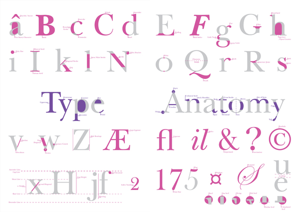
Icelandic art director, designer and typographer Sigurður Ármannsson graduated from The School of Arts and Crafts [now Icelandic Academy of the Arts]. He teaches there part-time. He also studied at the Rijksakademie van Beeldende Kunsten in Amsterdam. Creator of the structured sans family Guinevere Pro (2011, Canada Type). His font anatomy wallpaper is a visual glossary of the parts of typefaces. Klingspor link. Home page at font.is. Blog. [Google] [MyFonts] [More] ⦿ | |
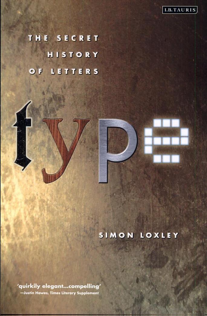
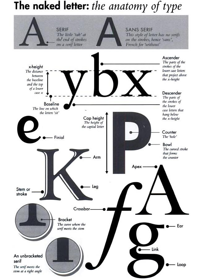
Author of Type: The Secret History of Letters (2004, I.B. Taurus, London, UK). See also Google books. Cover of that book. Anatomy of type drawing from that book. [Google] [More] ⦿ | |
In 2010-2012, Dick Pape created a number of (mostly caps-only) typefaces based on that book. These include SSWAntiquaPionsel, SSWAntiquaVersalien (a caps set based on Ludovico Vicentino, 1523), SSWCelticAntiquaOutline, SSWFederAntiqua, SSWHollowScript, SSWHolz (Lombardic caps), SSWJensonsAntiqua, SSWLeopoldAntiqua, SSWLombardischeVersalien, SSWMannheimOrnament, SSWPlakatschrift (a useful outline alphabet), SSWRoundPrinting, SSWRusticAlphabet, SSWRusticScript, SSWSchablonenschrift (Bauhaus-style stencil face), SSWUrbanAntiqua-Versal, SSWWoodcuts. | |
Stan Schwartz
| |
The Evolution of Type
| History of type. Type glossary. Links. Site maintained by Michael Brandt and Oriana Anholt of mediumbold. Old URL. Micael Brandt is also the author of The Evolution of Type. [Google] [More] ⦿ |
Also called Graphion's Online Type Museum, or earlier, Graphion, a site by Michael sanbon that disappeared in 1999. Subsections:
| |
The Typographic Desk Reference (Oak Knoll Press, New Castle, DE, 2009) is Theodore Rosendorf's useful reference guide of typographic terms and type classification. There is a foreword by Ellen Lupton. The much larger Second Edition (2015) is coauthored wit Erik Spiekermann. Theo Rosendorf is based in Decatur, GA. [Google] [More] ⦿ | |
A tittle or superscript dot is a small distinguishing mark, such as a diacritic or the dot on a lowercase i or j. The tittle is an integral part of the glyph of i and j, but diacritic dots can appear over other letters in various languages. In most languages, the tittle of i or j is omitted when a diacritic is placed in the tittle's usual position. [Google] [More] ⦿ | |
Type glossary
| Jacci Howard Bear's Desktop Publishing Glossary. [Google] [More] ⦿ |
Type Goemo
| German language type site. Has a glossatry, type classification information, type measurement information, type history, type design information, the works. Link died. [Google] [More] ⦿ |
Type Hype
| Lothar Südkamp's page on type (in German). There are about 80 brief bios of type designers, as well as a German type lexicon, and some notes on the history of type. [Google] [More] ⦿ |
Typefaces---a free tutorial
| Link gone. John Magnik's tutorial on typefaces and typographic terminology. Type classification. [Google] [More] ⦿ |
Fantastic German collection of web pages with a glossary of sorts. More an encyclopedia of typography, really. By Karen Wegehenkel, Technical University of Dresden. Has a good bibliography of type books as well. Link died. [Google] [More] ⦿ | |
German language typography site. Has a glossary, type history, HTML tips, and useful type information. By Götz Morgenschweis. [Google] [More] ⦿ | |
Typo Knowledge Base (tkb)
| A type portal managed by teachers and students at the Fachhochschule Aachen, Germany, in German. The page contains the basic rules of legibility and good typography. There is a historic timeline, a list of famous type designers, a list of famous typefaces, a timeline of the great typefaces, anatomy of a letter (glossary), lecture notes, and font downloads of fonts that were developed in the courses of K.F. Oetzbach. The latter include Fegron (Marcel Feiter) and Unperfekt, Semiperfekt and Sansperfekt (Niels Vollrath). Finally, there are many useful book reviews. The site was started by K. F. Oetzbach, André Berkmüler, Natascha Dell and Simon (Burschi) Becker. There are about 25 people participating in the growth of this type portal. K.F. Oetzbach is the codesigner in 2005-2006 with Natascha Dell at Fontfarm of several fonts. [Google] [More] ⦿ |
Dutch type site and blog, with a glossary, and explanations of the main styles of typefaces. It is run by Milena Spaan, Sandra Kassenaar and Maurits de Bruijn. The former two are students, and the latter is a teacher at the Hogeschool voor de Kunsten Arnhem. [Google] [More] ⦿ | |
A German typography site with pages on classification, news, designers, a type glossary, and tutorials. Run by Ralf Hermann. [Google] [More] ⦿ | |
Typografi.no
| Øyvin Rannem's Norwegian type portal. Has a good lexicon (in Norwegian). [Google] [More] ⦿ |
Typography Deconstructed (TypeDecon)
|
|
Wolfgang Beinert's German page on various point systems. There is also a fantastic German glossary. Check also the gorgeous designs in Atelier Beinert in München. [Google] [More] ⦿ | |
Karen Wegehenkel's type glossary, in German. Disappeared. [Google] [More] ⦿ | |
German type wiki. Has a German glossary. [Google] [More] ⦿ | |
From U&LC, vol. 11, No. 4, in 1984:
| |
A letter's relative amount of blackness. Proper terminology for weight has never been precisely determined. In types used for continuous reading, two weights are generally used the original design, called either regular or light, and a boldface. Square serif and sans serif types have as many as eight or nine different weights, differently described by each manufacturer. Most likely this imprecision can never be corrected. Today's digital typefaces may have weights that are characterized by the terms hairline, light, regular, medium, semibold, bold, ultrabold, black and heavy. [Google] [More] ⦿ | |
Wolf Lumb
|
 The ampersand was developed along with the rest of the Latin alphabet in the first century, when Romans would occasionally combine the letters E and T into one glyph, to mean and. It was included in the Latin alphabet which was still in use in medieval times. In modern Latin, the ampersand maintained its status of member of the alphabet until the mid-1800s. [
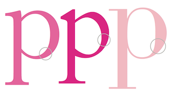 North Bergen, NJ-based designer of several didactic posters that illustrate the terminology used in type design. [
 [
[
 For a school project in 2017 in Singapore, Jovelle Wong designed a couple of good-looking colorful posters that illustrate type terminology. [
 German designer, b. 1965. Currently, he teaches typography at the University of Lapland in Rovaniemi, Finland, but maintains a home in Wuppertal, Germany. His typefaces:
  A useful introduction to old style (or garalde) types by John D. Boardley. The types can be recognized by the horizontal crossbar on the "e", and more contrast between thick and thin (compared to humanist typefaces). The serifs have wedges, and the letterforms are smooth and refined. They were in vogue for almost 200 years, starting with Bembo in 1495 (Aldus Manutius and Francesco Griffo) and Francesco Griffo's first italic type in 1501. The French caught on 40 years later, and the Garamond-style typefaces saw the light ca. 1540, thanks to Claude Garamond and Robert Granjon. Christoffel van Dijck and Mikós Kis were doing garaldes in the Dutch region ca. 1600 (see styles like Ehrhardt). Finally, Caslon (William Caslon, ca. 1725) is also classified as a garalde. Old style digital typefaces include Berling, Calisto,
  Author of Von der Schrift und den Schriftarten (Reinhard Welz Vermittler Verlag, Mannheim). These have a history of type and lettering, instructions on lettering (e.g.,
  A site to help educate those interested in typography and the anatomy of type. Has a nice visual type glossary. [
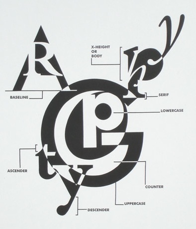
|
|
|
|