TYPE DESIGN INFORMATION PAGE last updated on Sat May 16 08:15:39 EDT 2026
FONT RECOGNITION VIA FONT MOOSE

|
|
|
|
|
The type scene in Iceland | ||
|
|
|
|

SWITCH TO INDEX FILE
He contributed to the GNU Freefont project via FreeSerif Cyrillic, and some of the Greek symbols. He also provided valuable direction about Cyrillic and Greek typesetting. Kernest link. Fontspace link. Another URL. Google Plus link. Abstract Fonts link. [Google] [MyFonts] [More] ⦿ | |
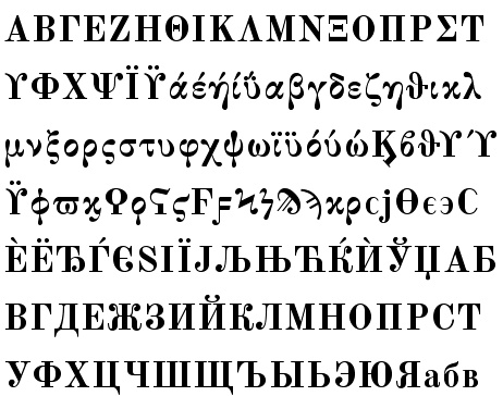
Alphabetum
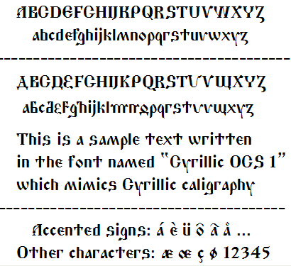
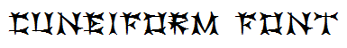
| Juan-José Marcos García (b. Salamanca, Spain, 1963) is a professor of classics at the University of Plasencia in Spain. He has developed one of the most complete Unicode fonts named ALPHABETUM Unicode for linguistics and classical languages (classical&medieval Latin, ancient Greek, Etruscan, Oscan, Umbrian, Faliscan, Messapic, Picene, Iberic, Celtiberic, Gothic, Runic, Modern Greek, Cyrillic, Devanagari-based languages, Old&Middle English, Hebrew, Sanskrit, IPA, Ogham, Ugaritic, Old Persian, Old Church Slavonic, Brahmi, Glagolitic, Ogham, ancient Greek Avestan, Kharoshti, Old Norse, Old Icelandic, Old Danish and Old Nordic in general, Bengali, Hindi, Marathi, Phoenician, Cypriot, Linear B with plans for Glagolitic). This font has over 5000 glyphs, and contains most characters that concern classicists (rare symbols, signs for metrics, epigraphical symbols, "Saxon" typeface for Old English, etcetera). A demo font can be downloaded [see also Lucius Hartmann's place]. His Greek font Grammata (2002) is now called Ellenike. He also created a package of fonts for Latin paleography (medieval handwriting on parchments): Capitalis Elegans, Capitalis Rustica, Capitalis Monumentalis, Antiqua Cursiva Romana, Nova Cursiva Romana (2014), Uncialis, Semiuncialis, Beneventana Minuscula, Visigothica Minuscula, Luxoviensis Minuscula, Insularis Minuscula, Insularis Majuscula, Carolingia Minuscula, Gothica Textura Quadrata, Gothica Textura Prescissa, Gothica Rotunda, Gothica Bastarda, Gothica Cursiva, Bastarda Anglicana (2014) and Humanistica Antiqua. PDF entitled Fonts For Latin Palaeography (2008-2014), in which Marcos gives an enjoyable historic overview. Alphabetum is not Marcos's only excursion into type design. In 2011, he created two simulation fonts called Sefarad and Al Andalus which imitate Hebrew and Arabic calligraphy, respectively. Cyrillic OCS (2012) is a pair of Latin fonts that emulate Old Church Slavonic (old Cyrillic). In 2013, he created Cuneus, a cuneiform simulation typeface. Paleographic fonts for Greek (2014) has ten fonts designed by Marcos: Angular Uncial, Biblical Uncial, Coptic Uncial, Papyrus Uncial, Round Uncial, Slavonic Uncial, Sloping Uncial, Minuscule IX, Minuscule XI and Minuscule XV. These fonts are representative of the main styles of Greek handwriting used during the Classical World and Middle Ages on papyrus and parchments. There is also a short manual of Greek Paleography (71 pages) which explains the development of Greek handwriting from the fourth century B.C. to the invention of printing with movable type in the middle of the fifteenth A.D. He wrote a text book entitled History of Greek Typography: From the Invention of Printing to the Digital Age (in Spanish; second edition, 2018). See also here and here. [Google] [More] ⦿ |
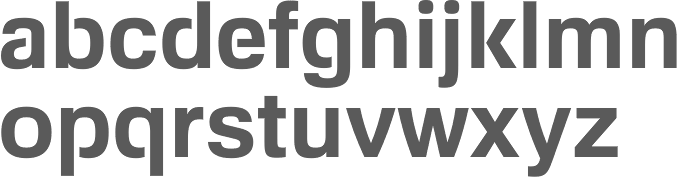
Reykjavik, Iceland-based designer of the free sans serif typeface Shrimp (2020). [Google] [More] ⦿ | |
She designed Magnimo while at Reading. Aoife writes: from the Latin Magna, meaning great or large, and the Indic Anima, meaning spirit or soul. Magnimo is a big-hearted typeface with many moods and voices. I am quite impressed by this three-style typeface (Regular, Italic, Upright Italic), which, with its lively angular design, seems just right for green party and energy drink magazines. All the extra features expected of a 2010 typeface are there, including a matching and nicely balanced Greek, and coverage of most European diacritics. Additional scans: i, ii, iii. In 2016, she published the free Google Font family BioRhyme (+Expanded). See also Open Font Library. Speaker at ATypI 2016 in Warsaw on Synoptic Translations. Speaker at ATypI 2017 Montreal, where she entertained the crowd with socially relevant typography and type for dissenting voices. Speaker at ATypI 2018 in Antwerp. [Google] [More] ⦿ | |
In 2016, Pablo Garcia Risueño, Apostolos Syropoulos and Natalia Verges launched the free package SVR Symbols. The glyphs of this font are ideograms that have been designed for use in Physics texts. Some symbols are standard and some are entirely new. Still in 2016, he designed the calligraphic Greek font Frederika2016 as an attempt to digitize Hermann Zapf's Frederika font. The font is the Greek companion of Virtuosa by the same designer. Kernest link. [Google] [More] ⦿ | |
Designer in Reykjavik. Behance link. Creator of the geometric sans typeface GeoBeta (2012). [Google] [More] ⦿ | |
Asta Thrastardottir is a graduate student at RISD. Originally from Iceland, she is based in Providence. At Type Cooper 2020, she designed Eyja, a slender display serif. [Google] [More] ⦿ | |
| |
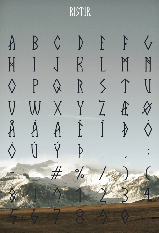
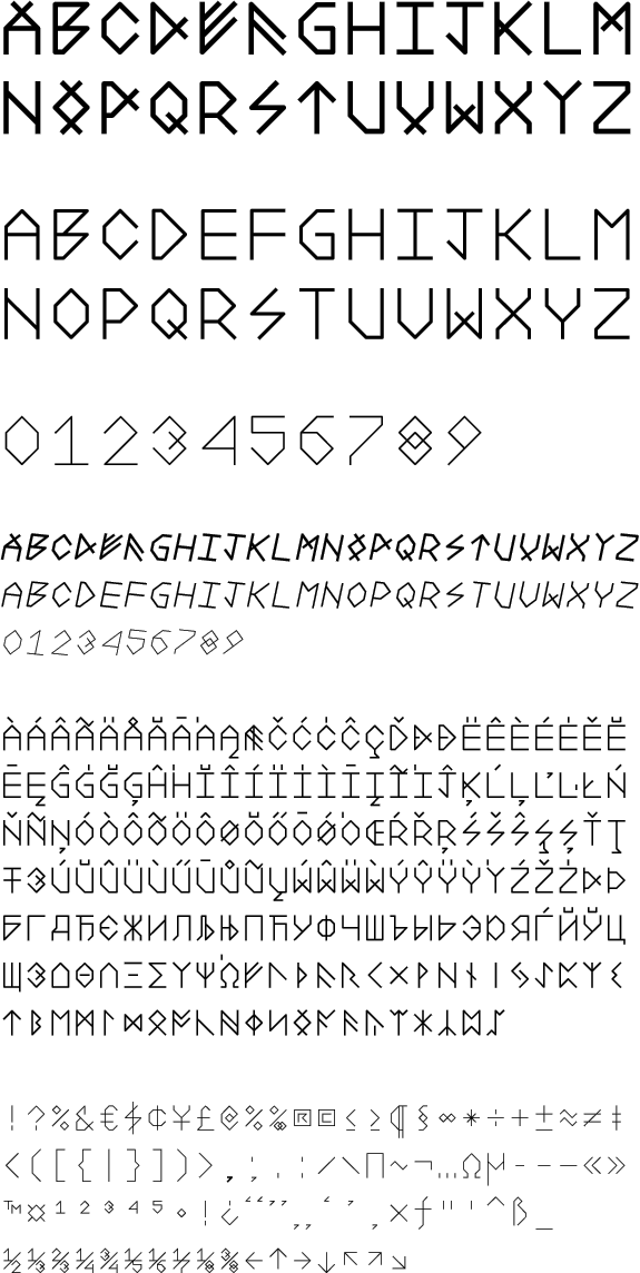
Originally from Reykjavik, Atli Þor Árnason is studying at The School of Visual Communication in Haderslev, Denmark. He created the runic and/or Futhark simulation typeface Ristir (2011), a typeface that was heavily inspired by The Elder and The Newer Futhark alphabet. Behance link. [Google] [More] ⦿ | |
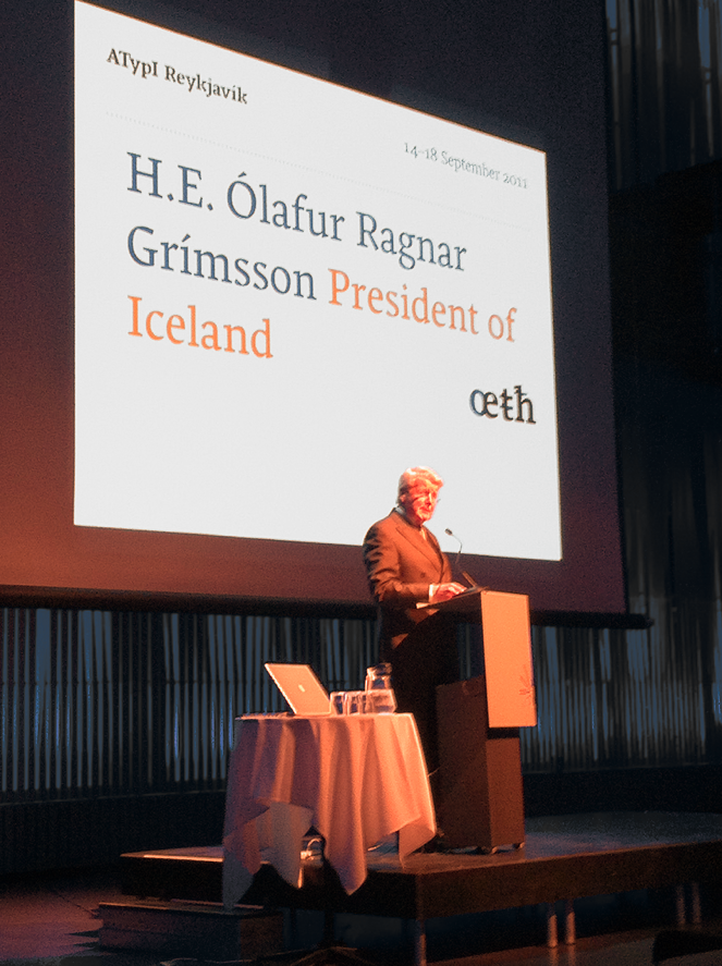
Speakers: Mark Barratt, Sofie Beier, Clare Bell, Aaron Bell, Frederik Berlaen, David Berlow, John D Berry, Filip Blazek, Frank Blokland, Mary Ann Bolger, Gunnlaugur Briem, Nadine Chahine, Nathan Davis, Jo De Baerdemaeker, Timothy Donaldson, Michael Duggan, Steen Ejlers, Michael Everson, Steinar Ingi Farestveit, Victor Gaultney, Frank Griesshammer, Hanna Hakala, Theodore Harrison, Ralf Herrmann, Robert Hillier, Otmar Hoefer, Richard Kegler, Eric Kindel, Christoph Knoth, Atilla Korap, Neelakash Kshetrimayum, Indra Kupferschmid, Hanif Kureshi, Johannes Kuester, Marcus Leis Allion, Gerry Leonidas, Raph Levien, Gudmundur Oddur Magnusson, Steve Matteson, Dermot McGuinne, Thomas Milo, Meta Newhouse, Toshi Omagari, Sarah Owens, Thomas Phinney, Rathna Ramanathan, Daniel Reynolds, Daniel Rhatigan, Peter Rosenfeld, Nadine Rossa, Zachary Scheuren, Dawn Shaikh, Nick Sherman, Vaibhav Singh, Christopher Slye, Fred Smeijers, Mirjam Somers, Sridhar Srikantham, Mathew Staunton, Claus Soerensen, Marc Tobias Kunisch, Gunnar Vilhjalmsson, Ian Watson, Torben Wilhelmsen, Jurgen Willrodt, Onur Yazicigil, Pascal Zoghbi, Carolina de Bartolo, Hyun Guk Ryu, Anton Kaldal Agustsson. Not one Latin American---what is going on? Can we have the next meeting in Argentina or Brazil? | |
Benedikt Gröndal
| |
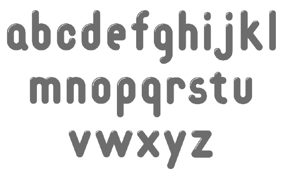
Icelandic graphic design student who lives in Reykjavik. He designed the pearly typeface Typhoon in 2008 during the course Holy Geometry at the Iceland Academy of the Arts. [Google] [More] ⦿ | |
| |
Gunnlaugur Briem is selling his own lettering book collection. [Google] [More] ⦿ | |
Brian Suda
| |
Carl Edlund Anderson
| |
CheapProfonts
|
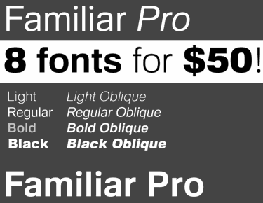
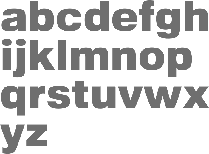
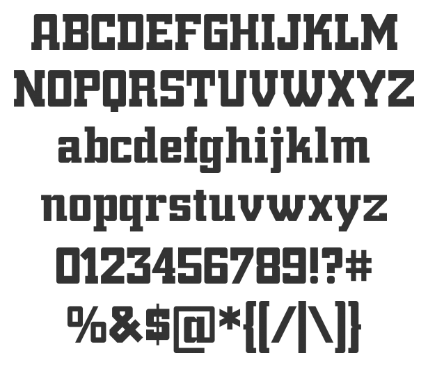
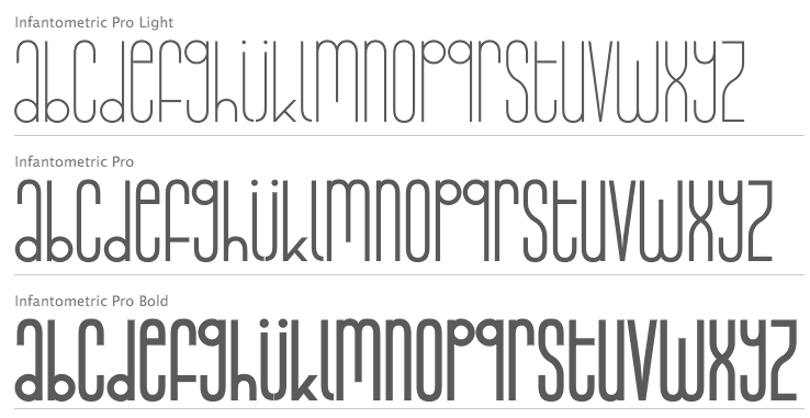
Designer at FontStruct in 2008 of cowboy_hippie and Syndrome X (DNA-look typeface inspired by Syndrome BRK by Brian Kent). Nelsson's fonts are Classic Trash BRK Pro, Dynamic BRK Pro, Galapogos BRK Pro, Genotype BRK Pro, King Cool KC Pro (kid's hand; done with Kimberly Geswein), Lamebrain BRK Pro, Matrise Pro and Matrise Text Pro (dot matrix), Phorfeit BRK Pro, Syndrome BRK Pro, Technique BRK Pro, Vigilance BRK Pro, Grapple BRK Pro. The "BRK" refers to Brian Kent, the original free font designer. In 2009, he added a number of fonts that were done by Nick Curtis some years before that (hence the "NF"): Boogie Nights NF Pro (art deco face), Copasetic NF Pro, Coventry Garden NF Pro, Pro, Fontleroy NF Pro, Hamburger Heaven NF Pro, Monterey Popsicle NF Pro, and Wooden Nickel NF Pro. Trypewriter Pro (2009) is based on Kevin King's Trypewriter. Helldorado Pro (2009) is a Tuscan wood type style typeface based on a font by Levente Halmos. Designer of Isbit Pro (2012, a magnificent melting ice cube-shaped superlliptical typeface family), Familiar Pro (2011, designed with the same metric as Helvetica but "better than Arial"), Bloco Pro (2010, fat counterless face), Trump Town Pro (2009, athletic lettering slab serif), Geometric Soft Pro (2009), Geometry Script Pro (2010, upright connected script), DIN Fun Pro (2011), Infantometric Pro (2012), Foobar Pro (2012) and Cheap Pro Fonts Serif (2009). Typefaces from 2013: Adultometric Pro (narrow monoline sans). Dafont. Fontspace link. Fontsquirrel link. Catalog of Nelsson's bestselling typefaces. [Google] [MyFonts] [More] ⦿ |
Icelandic designer based in Reykjavik who is working on Broderi (2003, a script bitmap font). [Google] [More] ⦿ | |
Born in Iceland, Daniel is a graduate of the University of Iceland. During his studies at IOED in Barcelona, he created the shiny rounded bubblegum typeface Bubble (2012) and the pixel typeface Acid Make-Out (2012, FontStruct). [Google] [More] ⦿ | |
Icelandic graphic designer. In 2008, during a course called Holy Geometry at the Academy of the Arts in Iceland, he created the geometric modular typeface Rotunda. In 2009, he made the sans headline face Vesuvio. [Google] [More] ⦿ | |
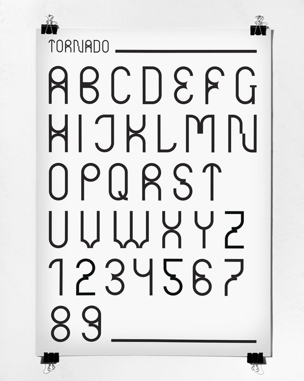
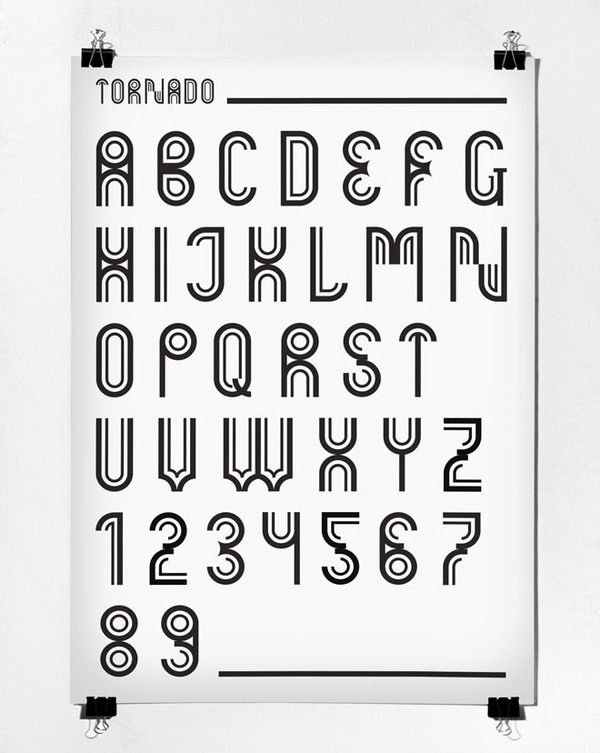
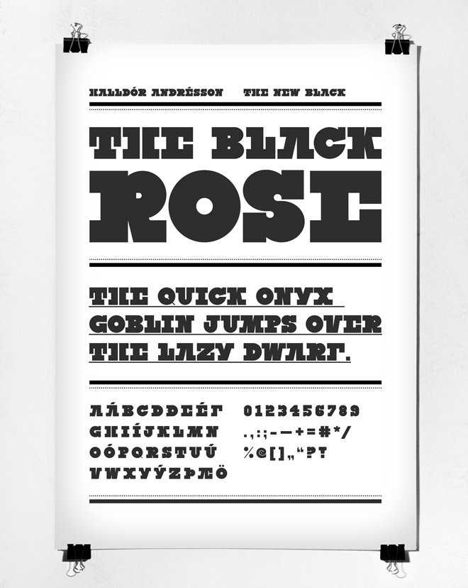
Icelandic graphic designer in Reykjavik. Asplund's Stockholm public library inspired him to create the geometric compass-and-ruler family Tornado (2010). The New Black (2009) is a very black threatening headline type. Behance link. [Google] [More] ⦿ | |
Edlund Font Project
| Carl Edlund Anderson from the Dept. of Anglo-Saxon, Norse,&Celtic at St. John's College, University of Cambridge, makes medieval fonts of the highest quality. Made an Icelandic font, Eidlundur (Mac Icelandic encoding), Edlund Insular, Edlund SmallCaps, Edlund (Italic). Work on these fonts was done by Darcy Burner, Carl Anderson and Gary Munch. [Google] [More] ⦿ |
During a type design course at Iceland Academy of the Arts in 2011, Einar Guðmundsson (Reykjavik) made the Harmony typeface based on some letters by Wim Crouwel's typeface Stedelijk. Behance link. [Google] [More] ⦿ | |
Designer (b. 1967) of Thor (1997) at GarageFonts. He graduated in graphic design from The Icelandic Academy of the Arts, Reykjavik, Iceland in 1991. Klingspor link. [Google] [More] ⦿ | |
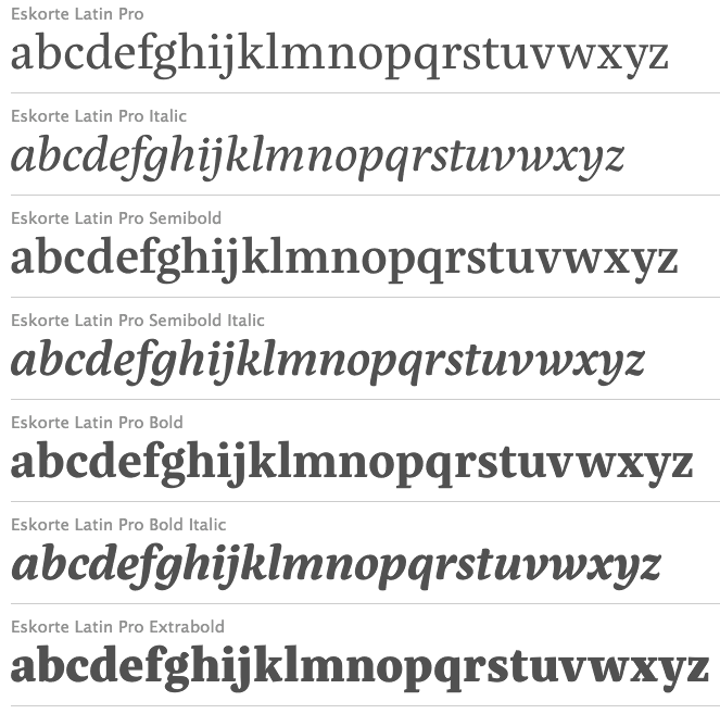
Graphic designer from Dortmund, Germany, who lives in Husavik, Iceland. Her design company is called Elefont. After studying visual communication in the university of applied sciences in Dortmund, she co-founded the design studio Radau. Graduate of the University of Reading in 2011. Elena designs logos, retail and custom fonts. She is a visiting lecturer at HBK Saar and LHI Reykjavík, and a mentor at Alphabettes, a network to support and promote women in the type industry. Creator of these typefaces: Eskorte (2011, her graduation project), Eskorte Persian (2011), Klebo (2011, mechanical / octagonal), Eskorte Armenian (2011), Paroli (2011, a bold rounded signage face, Die Gestalten), and Biec (2012). In 2013, Eskorte was published by Rosetta Type. Eskorte supports Arabic, Farsi, Urdu, and over ninety languages using the Latin script. Titus Nemeth was consulted for the Arabic portion. In 2016, Elena Schneider and Miles Newlyn co-designed the almost reverse contrast typeface family New Herman. In 2019, she published the experimental techno typefaces Halunke and Konsole at Future Fonts. She writes about Konsole: Konsole is a clean sans serif typeface with a touch of technology. Inspired by audio equipment, it gives off robotic energy. A variable font was added in 2019. Still in 2019, she released the German expressionist typeface Birra Bruin at Darden Studio. At Tomorrow Type, she released the Cyrillic version of Halunke (2020). Future Fonts link. [Google] [MyFonts] [More] ⦿ | |
Elli Egilsson (b. Reykjavik, Iceland) runs the AC Bananas studio in London. His typefaces include Splatter (2012) and Cactus (2012, spiky). All typefaces are free. [Google] [More] ⦿ | |
Free Mac fonts in the EversonMono series for CSX, Celtic, Croatian, Cyrillic, Esperanto, Gaelic, Georgian, Greek, Icelandic, Inuktitut, Ogham, Romanian, Sami, and Turkish. [Google] [More] ⦿ | |
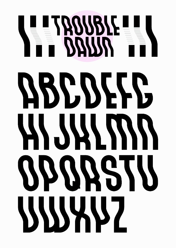
Graphic designer in Reykjavik. During his studies at the Iceland Academy of Arts, he created Turning Night (2013, a decorative typeface) and Trouble Dawn (2013, a wavy font). [Google] [More] ⦿ | |
Designer in Reykjavik who created several typefaces and logotypes in 2012. Behance link. [Google] [More] ⦿ | |
FELTRON
| New York-based Nicholas Felton's fonts at FELTRON: the pixel fonts Remove (OpenType), Foss (caps inspired by Icelandic writing), Whip, Amtrix S (pixel type), Megabit, Sibilance, Amtrix 4, Amtrix 5, Amtrix 6. He also made the experimental geometric typeface Shipflat (2004, T-26), which won an award at the TDC2 2005 type competition. Klingspor link. [Google] [More] ⦿ |
Fontar
| Graphic designer and art director with a background in the advertising industries of Iceland and Sweden, who has a PhD in graphic design from Luleå University of Technology, Sweden, and lives in Huddinge, Sweden. In 2022, he designed Tacit (a monolinear Scandinavian sans based on the designer's PhD thesis). [Google] [MyFonts] [More] ⦿ |
font.is
| Icelandic type blog by Icelandic designer and typographer Sigurður Ármannsson, a graduate from The School of Arts and Crafts [now Icelandic Academy of the Arts]. He teaches there part-time. He also studied at the Rijksakademie van Beeldende Kunsten in Amsterdam. [Google] [More] ⦿ |
Frosti Gnarr Studio is a creative and graphic design studio in Seltjarnarnes, Iceland. Its art director is Frosti Gnarr, who has an MA from HKU in The Netherlands. He designed a few experimental and other typefaces in 2012. [Google] [More] ⦿ | |
Speaker at ATypI 2011 in Reykjavik on the topic of Driftwood. [Google] [More] ⦿ | |
Guðmundur Úlfarsson (b. 1984, Reykjavik) created Las Vegas (2011, custom made for Off Beat Cinema Magazine), L10 (for the LungA 10 yearbook---this typeface won the prize for best type design in Iceland in March 2011), Separat (done with Mads Freund Brunse, and used in Sigrún Halla Unnarsdóttir), and L11 (for LungA 2011, also done with Mads Freund Brunse). L10 Bold is free at Bast Magazine. Old GUNMAD link. GUNMAD link. Home page. [Google] [More] ⦿ | |
Gunnar Vilhjalmsson
| |
Keynote speaker at ATypI 2011 in Reykjavik. FontShop link. [Google] [MyFonts] [More] ⦿ | |
Gunnlaugur S.E. Briem
| |
Halldór Björn Halldórsson
| |
Handwriting Models
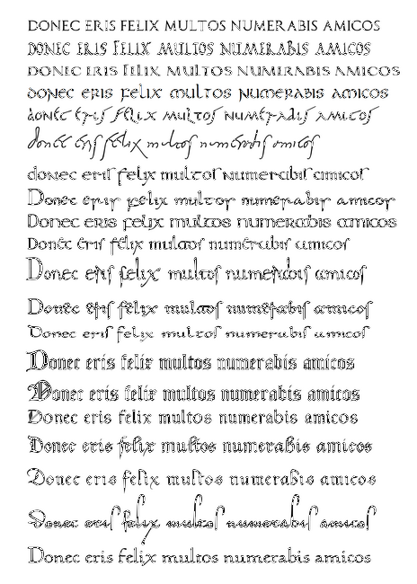
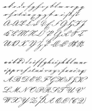
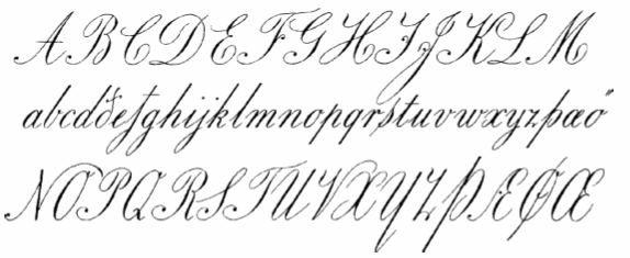
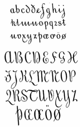
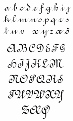
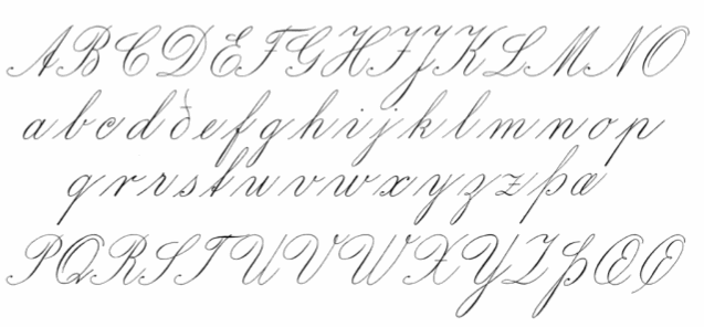
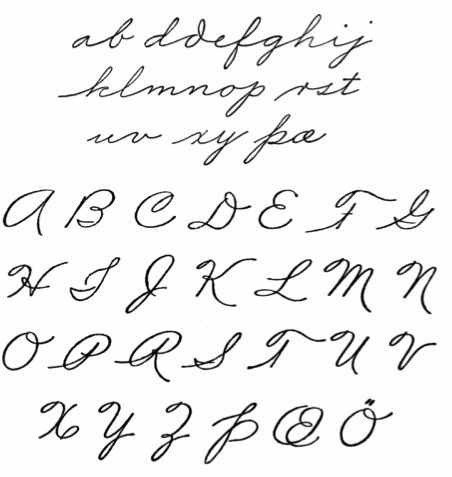
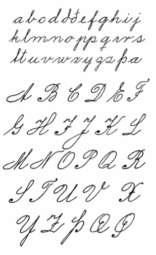
| Handwriting Models An Icelandic Manual, 1883 [fre download] was written by Benedikt Gröndal (1826-1907), an Icelandic poet, painter, draftsman, calligrapher and library historian. After a master's degree in Scandinavian Studies from the University of Copenhagen in 1863, he taught, wrote, and published a periodical, Gefn. In 2007, a foreword and useful introduction to handwriting models was added by Gunnlaugur Briem, and he placed all on his web site for free download. I quote: In 1875, Denmark changed handwriting models, replacing blackletter cursive by copperplate. This extended to its Icelandic dominion, where copybooks and model sheets in the new style were in short supply. Eight years later, a much needed handwriting manual by Benedikt Gröndal was published. The old style and the new are similar in appearance but have different letterforms. This picture shows the old blackletter cursive (top) and the new copperplate (bottom)---it was taken from Almanak Hins íslenzka þjóðvinafélags, Copenhagen (1877). Gröndal's copperplate and Gröndal's ronde. The foreword by Briem also shows a Danish ronde that appeared in Rundskrifts-Bogen; til Skolebrug og Hjemmeøvelse, ca. 1880. He also grabs the opportunity to showcase the most handsome of all Icelandic copperplate models done by Jón Þórarinsson in Skrifbók með forskriftum, 1. hefti (Reykjavík, ca. 1896). The American Palmer method, more open but less gracious, is illustrated in this alphabet from 1922 by Steingrímur Arason (from Litla skrifbókin, Reykjavík. Variants of this are shown in the alphabets of Guðmundur I. Guðjónsson, published between 1939 and 1953. Briem concludes: Handwriting based on copperplate was largely abandoned in Icelandic schools in 1984. It was replaced by italic, a modern monoline version of renaissance handwriting that owes much to Ludovico Arrighi's approach. A large selection of model sheets in this style is available for free download from the internet. He also shows Italiuskrift05, his own suggestion for schools. [Google] [More] ⦿ |
Reykjavik, Iceland-based designer of these display typefaces in 2013 (while at the Iceland Academy of the Arts): Ping Pong, Pinball (connect-the-dots typeface), Flying Giraf, Pixel Overdrive, Long John, Karlus&Baktus. Behance link. [Google] [More] ⦿ | |
Graphic designer in Reykjavik. He created the monoline rounded all-caps rounded typeface Gelato (2011, Ten Dollar Fonts) and Live A Lot (2012, alchemic; at Ten Dollar Fonts). [Google] [More] ⦿ | |
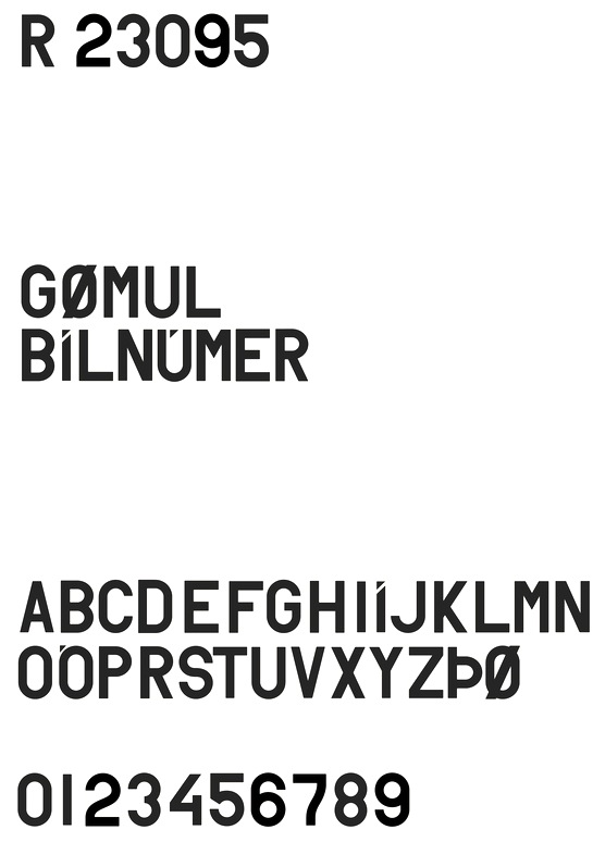
Icelandic graphic designer. Behance link. Gunnarsson created R23095, a typeface based on Icelandic car license plates that were used between 1950 and 1989. [Google] [More] ⦿ | |
As a student in Reykjavik, Iceland, Hrefna Lind created the lachrymal typeface Whale (2014). Behance link. [Google] [More] ⦿ | |
Illustrator and designer in Reykjavik. Creator of the Replica font system in 2012. She writes: The font Replica was made in 2011 in a course taught by Amundi Sigurðasson. The font is based on two very different typefaces called Autoscape and History. Autoscape is very robotic monospace font and History is a font that consists of 20 layers, each representing a different period in type history. Replica is a monospace typeface that has seven layers that can be rearanged in any way, styles ranging from robotic to romantic. [Google] [More] ⦿ | |
Icelandic designer of the futuristic typefaces Complete (2006) and Keystone (2006). [Google] [More] ⦿ | |
icelandic
| Joergen Pind's metafont sources for Icelandic. Plus files to use in TeX. From the Institute of Lexicography, University of Iceland, Reykjavik. [Google] [More] ⦿ |
Reykjavik, Iceland-based graphic designer. Creator of the drunk serif typeface Bukowski (2014). Behance link. [Google] [More] ⦿ | |
Coding that supports the following languages: Afrikaans, Catalan, Danish, Dutch, English, Faeroese, Finnish, French, German, Galician, Irish, Icelandic, Italian, Norwegian, Portuguese, Spanish and Swedish. See also here, here, here, here, here, here, here, and here. More specifically, other ISO-8859 groups are as follows:
| |
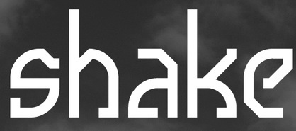
Icelandic designer. Creator of Shake (2011), an octagonal face with a few quarter circles thrown in. [Google] [More] ⦿ | |
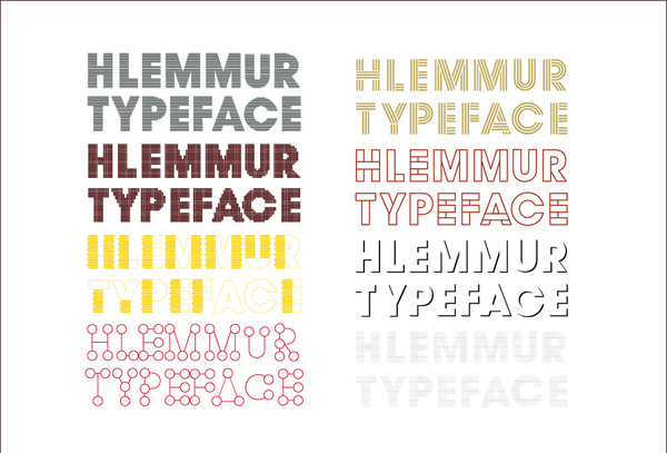
Reykjavik-based designer (b. 1982) of the modular type family Hlemmur (2011). Behance link. [Google] [More] ⦿ | |
Icelandic graphic designer, b. Reykjavik. He created the fat finger typeface Skar (2006) and designed many music album covers. About his experimental typeface Morthens (2007), he writes: Morthens is a strict script display typreface. The brief was to find a type typeface and design another typeface based on that. I decided to use a script typeface called Vitrina by Pablo Medina. I used it because I liked the method he uses creating his typefaces. He takes picture of his urban surroundings and bases his typefaces on them. I created a typeface based on the most prominent thing in my urban surrounding at the moment which is construcion sites. It has three weights called Ásbjörn, Þorlákur and Haukur. [Google] [More] ⦿ | |
Joergen Pind
| |
Reykjavik, Iceland-based graphic designer. He created the geometric paper-cut like typeface Building (2009). [Google] [More] ⦿ | |
Juan-José Marcos García
| |
Mads Freund Brunse
| |
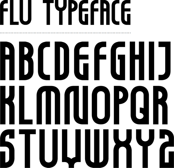
Maggi Noem graduated from the Icelandic Academy of the Arts in 2007. She has been living and working freelance since then in Reykjavík, Iceland. Designer of the monoline display typeface Flu (2009). [Google] [More] ⦿ | |
Matej Hlavacek
| |
| |
Nadja Kargruber
| |
Nana Kar
|
|
Nicholas Felton
| |
Great links page on Old English, Icelandic, Norwegian, Swedish, Celtic and Germanic. [Google] [More] ⦿ | |
Optional Is
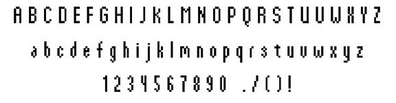
| Reykjavik, Iceland-based design and software company. At CERN Hackday in 2013, they designed the free monospaced computer programming font Meyrin or Meyrin CERN terminal): First you need to create an SVG file for each glyph. There is a template.svg which can be used to create new glyphs. There is a descender of two units and ascender of 3 units. This is used for diacritics. Once each glyph is an individual SVG file, you can import them into a font creation tool. We used the online service http://icomoon.io From this we upload and map each SVG file to a specific unicode code point. We did some final tweaks in font forge to get the space character and additional metadata. We completed all the characters which are available on the IBM System 6000 keyboard. We ran a simple script to output all available characters, took screenshots and tried to create these as well. This is not a complete Unicode font, but you are welcome to fork the repo and create additional glyphs as needed. Open Font Library link. Use Modify link, where Meyrin is attributed to Brian Suda. [Google] [More] ⦿ |
Or Type
|
In 2013, Or Type offered these sans typefaces: La Pontaise Bold (contrasted, Peignotian style), Rather Semibold (wide grotesk), L10 Bold (geometric sans), Separat. Some of these typefaces are leftovers of the earlier GUNMAD type foundry: L10 was orinally done for the LungA 10 yearbook---this typeface won the prize for best type design in Iceland in March 2011, and Separat was used in Sigrún Halla Unnarsdóttir. Mads Brunse also designed L11 (also for LungA) in 2011. Newer fonts include Lemmen, Landnama, Boogie School (reverse stress typeface), Boogie School Sans (2019) and Boogie School Serif. Linkedin link. [Google] [More] ⦿ |
Icelandic linguistics professor at the University of Stockholm. Since 1989, he has made fonts for phonetic transcription and fonts for writing out Old Icelandic as it appears in Icelandic manuscripts. He also works with the Árni Magnússon Institute in Iceland, an institute devoted to the preservation and publication of Icelandic manuscript texts. With two other Icelanders, Jörundur Hilmarsson and Sigurdur H. Pálsson, he has made these fonts, which hopefully will soon be available for free download:
| |
Polar Font series: Mac fonts at MacCampus for Icelandic and Faroese: Nimbus IC family, Courier IC, Magister IC, Paltus IC family, Schoolbook IC, and Campus Sans. All formats. [Google] [More] ⦿ | |
Rakel Tómas
| |
Reynir Heiðberg Stefánsson
| |
Roger S. Nelsson
| |
Designer of the rune font "Icelandic Runes" (1998). [Google] [More] ⦿ | |
Icelandic graphic designer. Creator of the grungy Disorder Type (2009) and Broken Type. Hellofont link. [Google] [More] ⦿ | |
A nice quote by him: Designing a proper typeface is a difficult and boring process. When you've sketched down your main ideas, there is not much room for creativity, it just becomes hard labor, a bit like doing the dishes. [Google] [More] ⦿ | |
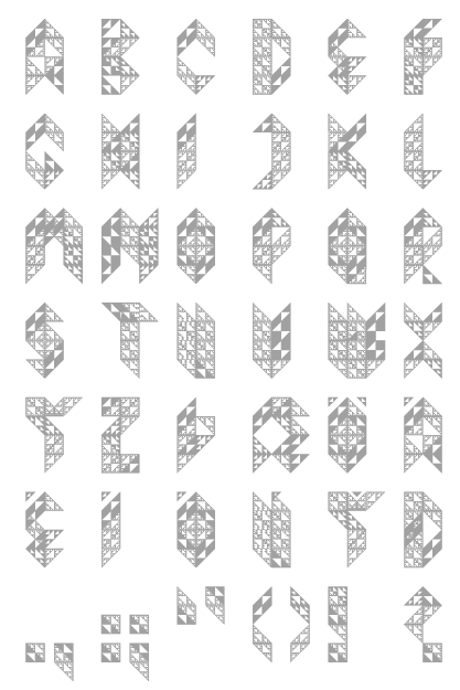
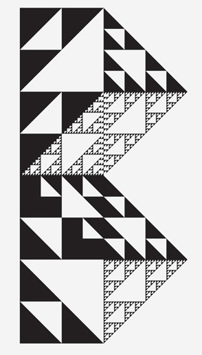
Sigurður Oddsson or Siggi Odds or Siggi Oddsson, was born in Reykjavík, Iceland, in 1985, but spent a large part of his childhood in Vancouver, Canada. He graduated from college (in science) in 2005 and graduated with a B.A. degree in graphic design from the Iceland Academy of the Arts in Reykjavík, Iceland in the spring of 2008. He is an illustrator and graphic designer. Typefaces created by him include Sniðagrind (2007, an experimental typeface inspired by Gateway, by designer Stephan Müller), Kögra (2006, a typeface based on fractals made at The Iceland Academy of the Arts), and Aryan Monkey (2007, a curly font done with Sveinn Daviðsson). [Google] [More] ⦿ | |
| |
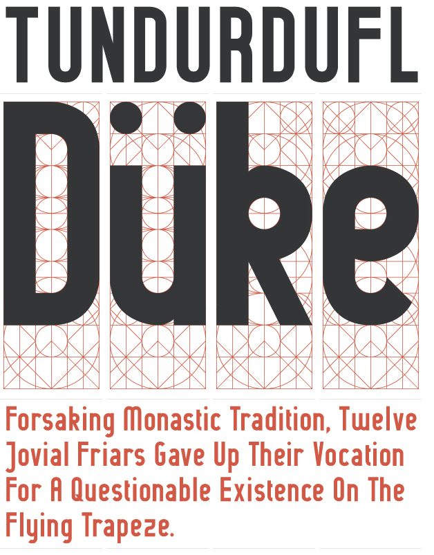
Icelandic art director, designer and typographer Sigurður Ármannsson graduated from The School of Arts and Crafts [now Icelandic Academy of the Arts]. He teaches there part-time. He also studied at the Rijksakademie van Beeldende Kunsten in Amsterdam. Creator of the structured sans family Guinevere Pro (2011, Canada Type). His font anatomy wallpaper is a visual glossary of the parts of typefaces. Klingspor link. Home page at font.is. Blog. [Google] [MyFonts] [More] ⦿ | |
Sigurður Ármannsson
| |
Creator in Reykjavik of the wavy hypnotic and futuristic typeface Pastura (2011). [Google] [More] ⦿ | |
Silk Type
|
She set up Silk Type in 2017 and promptly published the high-contrast fashion mag typeface family Silk Serif. In 2018, she published another fashion mag bracketed serif typeface, Velvet, or Velour, and followed it up with Velour Raw (for text in smaller sizes). Typefaces from 2019: Silk Sans Display. Typefaces from 2021: Gingham (a 10-style geometric sans that mixes in some of Renner's early playful Futura elements), Chiffon (a delicate serif). [Google] [MyFonts] [More] ⦿ |
| |
Graphic and type designer from Reykjavik, who created two experimental typefaces in 2008 with Jared Eberhardt: Syrillic, and Worn. Behance link. [Google] [More] ⦿ | |
His typefaces:
YWFT link. MyFonts link. FontShop link. [Google] [MyFonts] [More] ⦿ | |
| |
Graphic designer and illustrator in Reykjavik, Iceland. Creator of the decorative caps typeface There Be Monsters (2013), which is based upon the illustrations found on a 1598 map of Iceland drawn by Abraham Ortelius. [Google] [More] ⦿ | |
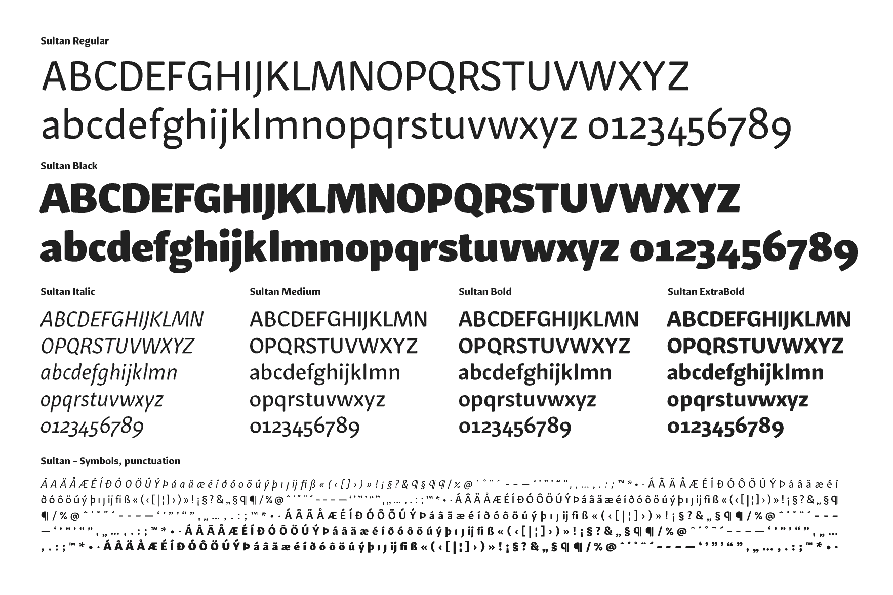
At KABK, he designed the rounded sans serif family Sultan (2012) and Paperclip People (2012). In 2014, he created Eve Sans Neue. Eve Online is a massively multiplayer space trading game. It is developed by CCP in Iceland. The interface typeface for Eve was drawn as a pixel font by Friðrik Örn Haraldson, and later converted into a vector font. Sveinbjörn was asked to redraw it, specifically to make it more legible. . Klingspor link. [Google] [More] ⦿ | |
Sveinn Þorri Daviðsson was born and raised in Akureyri on the north-east side of Iceland. He moved to Reykjavik in 2005 to study graphic design at the Iceland Academy of the Arts (B.A. degree in 2008). After his graduation, he moved to Berlin, where he shares a studio space with his friend Siggi Eggertsson. His typefaces:
| |
Iceland-based designer (b. 2002) of Bootleg Tim Burton (2019) and Mouse Writing (2019). [Google] [More] ⦿ | |
Té Rowan
|
|
The Icelandic Method
| A free instruction booklet by Gunnlaugur S.E. Briem written in 1985, and concerned with handwriting education for Icelandic children. Nan Jay Barchowsky, who published it in her series called Cursive Italic News says: The Ministry of Education in Iceland is introducing italic handwriting in schools. That is the result of pressure from teachers who were dissatisfied with the style they had, a copperplate-based business hand. A group of Icelandic teachers who are interested in experimental teaching of italic formed a working party last year, They were interested in the method and asked Briem to put together instructions that could be used with children by teachers who had little or no experience with italic. The members of the working party initially paid for the printing out of their own pockets. Dr. Gunnlaugur S.E. Briem donated his work. The scheme has been very well received. Letters of support have come in from handwriting experts in many parts of the world, Education authorities in other countries have suggested collaboration. The PDF showcases three font families by Briem himself, Italiuskrift05 (his casual handwriting for instructions, dated 1985), BriemAnvil06 (serif family) and BriemAnvilSans07 (sans family). [Google] [More] ⦿ |
| |
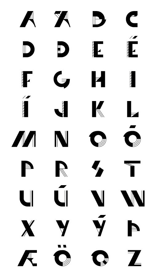
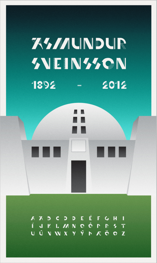
Þorleifur Gunnar Gíslason is a graphic designer in Reykjavik, Iceland, and graphic design student at the Iceland Academy of the Arts. In 2009, he made Coffee, a font based on coffee beans laid out on a flat surface. In 2011, he designed the experimental geometric (cubist?) typeface Ásmundur, which was inspired by Cassandre's Bifur and is a tribute to Icelandic sculpture artist Ásmundur Sveinsson. [Google] [More] ⦿ | |
The Thule Roman and Sans fonts (for the Mac) at MacCampus. These fonts have custom encoding, based on standard Mac Icelandic encoding. [Google] [More] ⦿ | |
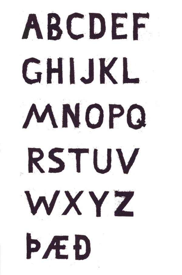
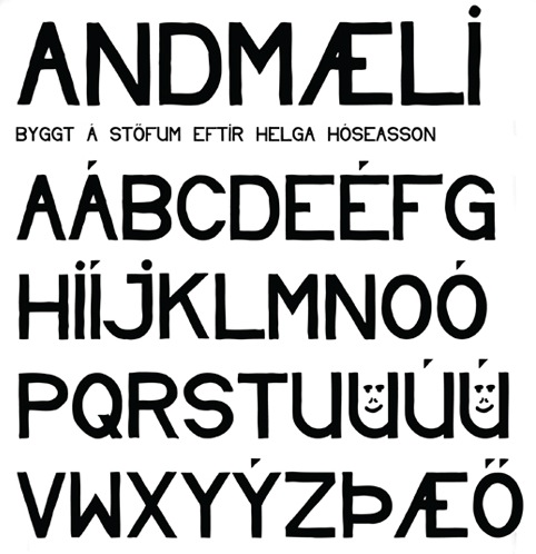
Úlfur Kolka is a graphic designer in Reykjavik, Iceland (and now, Inglewood, CA), who created the poster lettering typeface Andmaeli (2010), which is based on Helgi Hoseasson's protesting signs. Home page. [Google] [More] ⦿ | |
Description of character sets.
| |
Universal Thirst
|
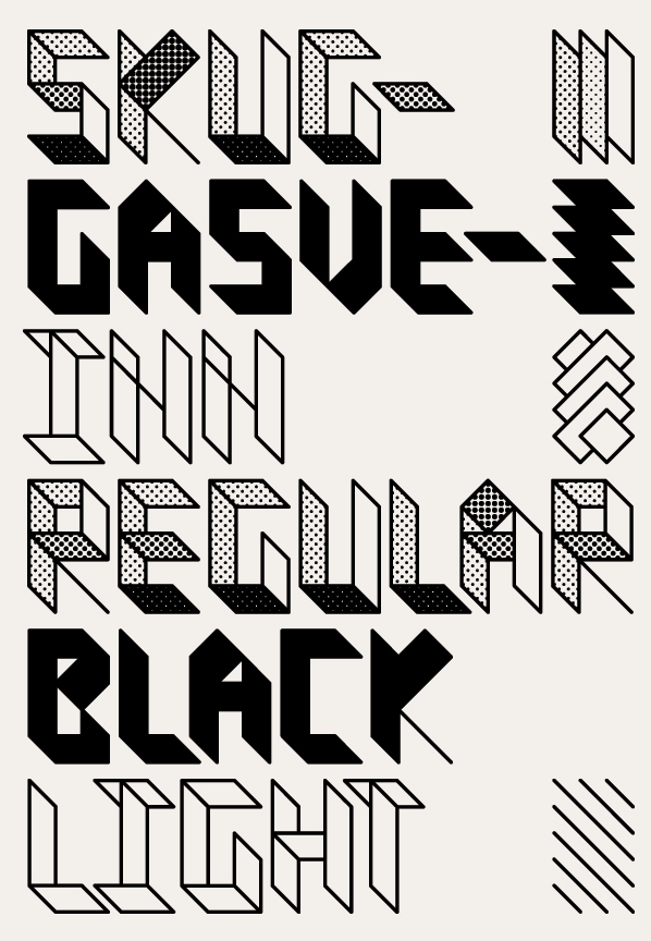
Gunnar co-designed the experimental display typeface Skuggasveinn with Siggi Eggertsson in 2005. He also co-designed Grasrot (2005). Old URL. At the University of Reading in 2010, his thesis typeface was Germain, a sturdy typeface that has some calligraphic origins (especially of course for its Arabic weight). The Latin appears to be a manly workhorse. Ryman Eco is a free multilined typeface created in 2014 by Dan Rhatigan and Gunnar Vilhjálmsson at Monotype that satisfies its two design goals---beauty and economy (it uses 33% less ink than a normal text font). In 2015, he developed a bespoke typeface for The Gourmand Magazine in cooperation with The Gourmand's artistic director, David Lane. The resulting typefaces, Gourmand Grotesque 777 and 888 won a bronze medal at the 2015 European design Awards competition. In 2019, Gunnar Vilhjalmsson, Kalapi Gajjar and the Linotype design Studio developed the 5-style Linotype Gujarati for use in print and on the screen. In 2019, he was part of a team that extended Matthew Carter's Devanagari from 1977 into Linotype Devanagari. Speaker at and coorganizer of ATypI 2011 in Reykjavik. [Google] [MyFonts] [More] ⦿ |
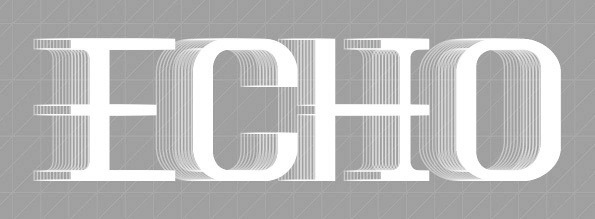
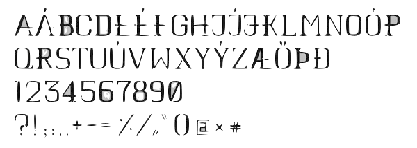
Graphic designer in Reykjavik. She created Echo (2011). [Google] [More] ⦿ | |
Vesturbaer
|
|
Archive of free foreign language fonts covering Arabic, Armenian, Bengali, Bulgarian, Burmese, Cambodian, Celtic, Chinese, Croatian, Czech, Estonian, Old English, Farsi, Georgian, German, Greek, Hawaiian, Hebrew, Hindi, Hmong, Hungarian, Icelandic, Japanese, Khmer, Korean, Latvian, Myanmar, Nepali, Persian, Polish, Punjabi, Romanian, Russian, Serbian, Slovenian, Tagalog, Tamil, Thai, Turkish, Ukranian, Urdu, Vietnamese and Welsh. [Google] [More] ⦿ | |
WorldScript: language utilities for the Mac (free downloads). Includes Turkish, Cherokee, Uralic Cyrillic, Georgian, Icelandic, Maltese, Vietnamese, Celtic, Intuktitut, Greek and Coptic support. Page maintained by Michael Everson. [Google] [More] ⦿ |

 Russian developer of these free font families, quite exquisite and complete:
  Aoife is an Irish typeface designer and teacher. She has a BA degree in Visual Communications from Dublin Institute of Technology (2005) and an MA in Typeface Design from the
  Xanthi, Greece-based designer of the Greek type1 font family
  During her studies at Iceland Academy of the Arts in Reykjavik, Astros Traustadottir created the display sans typeface Seaside (2015), which was inspired by seashells.
  The 2011 ATypI conference took place in Reykjavik, Iceland, from September 14-18, 2011, at the
  Reykjavik, Iceland-based designer of the hipster typeface Harbour (2015).
  Started in 2008, this web place by Norwegian entrepreneur Roger S. Nelsson (based in Honningsvåg, Norway) sells fonts by Ray Larabie, Brian Kent, Nick Curtis, Derek Vogelpohl and Kevin King that were originally freeware fonts. Nelsson reworked them (more glyphs, more multilingual) and asks about 10 dollars per font now. He says his fonts now cover these Latin languages: Afrikaans, Albanian, Basque, Belarusian (Lacinka), Bosnian, Breton, Catalan, Chamorro, Chichewa, Cornish, Croatian, Czech, Danish, Dutch, English, Esperanto, Estonian, Faroese, Filipino (Tagalog), Finnish, French, Frisian, Galican, German, Greenlandic, Guarani, Hungarian, Icelandic, Indonesian, Irish (Gaelic), Italian, Kashubian, Kurdish (Kurmanji), Latvian, Lithuanian, Luxembourgian, Malagasy, Maltese, Maori, Northern Sotho, Norwegian, Occitan, Polish, Portuguese, Rhaeto-Romance, Romanian, Saami (Inari), Saami (Lule), Saami (North), Saami (South), Scots (Gaelic), Serbian (latin), Slovak(ian), Slovene, Sorbian (Lower), Sorbian (Upper), Spanish, Swedish, Tswana, Turkish, Turkmen, Ulithian, Walloon, Welsh, Yapese.
  [
[ Briem is a fantastic Icelandic calligrapher and type designer. His typefaces:
  During his studies, Oulu, Finland-based Mika Hautamäki designed the mini-serifed Latin / Cyrillic / Icelandic headline typeface Pyramiden (2016) and thin architectural sans typeface Arkkari Light (2016). [
 Nadja Kargruber (Nana Kar, Reykjavik, Iceland) was born in Italy and grew up in Tesido in northern Italy. She graduated from the Accademia Leonetto Cappiello in Florence in 2014 before moving to Iceland. She designed these typefaces in 2014: Aventa (human figurines) and Allure (ultra-condensed thin sans).
  Art director and graphic designer Mads Fruend Brunse (b. Denmark) is based in London. After graduating from ECAL (Lausanne) in 2009, Brunse has experience from working with people such as Node Berlin Oslo (Germany), Vladimir Llovet Casademont (Germany), Sofie Spindler (The Netherlands) and OK-RM (UK). Since 2007 he is collaborating with Guðmundur Ingi Úlfarsson (Iceland) under the name GUNMAD. In March 2013, he set up the type foundry Or Type together with Úlfarsson. Or Type is based in Reykjavik, Iceland.
  [
[ Icelandic graphic designer, illustrator and type designer, b. 1984 in Akureyri, a small town on the north coast of Iceland. He graduated from the Iceland Academy of the Arts in Reykjavík in 2006. He now lives in London and/or Berlin.
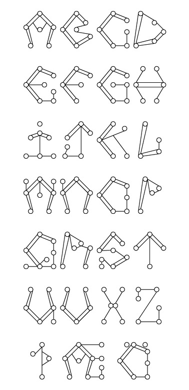
  With a BA in visual communication from the Icelandic Academy of the Arts, Reykjavik-based Sigríður Rún created Icelandic Alphabet (2013), a typeface that consists of skeletal structures.
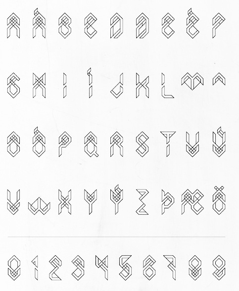
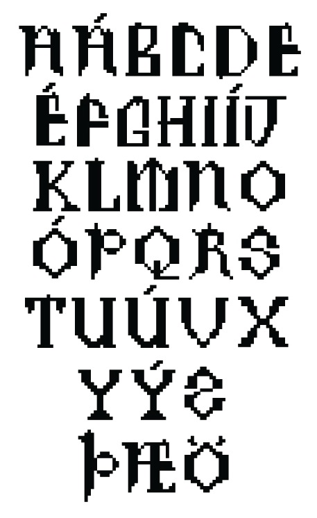
 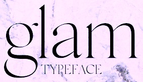 Or Rakel Tómasdottir. Graphic designer in Reykjavik, Iceland, who works for Glamour Iceland (as art director) and Condé Nast, and graduated from Iceland Academy of the Arts in 2016. Her full name is Rakel Tómasdóttir. In 2015, she created the high-contrast fashion magazine typeface Glam, which is used in Glamour Iceland Magazine.
  Icelandic dreator of the art nouveau typeface
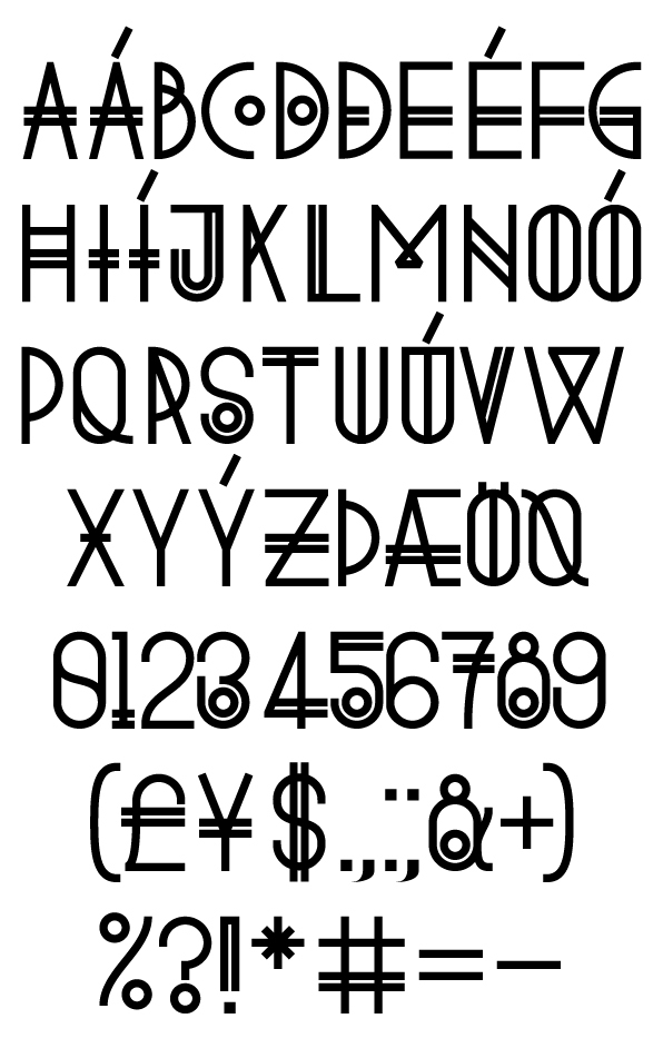
  Designer (b. Siglufjordur, Iceland), who got a BA in graphic design from Iceland Arts in 1993, and lived in Reykjavik. He took a job in Atlanta, GA, designing for CNN.com. In the next five years, Stefan worked his way from interactive designer to creative director. He co-founded the interactive agency Armchair, and has directed projects such as Coca-Cola's M5.
  University student in Reykjavik, Iceland, b. 1986. As a graphic and type designer, he created the sans typeface
  Sveinbjörn Pálsson (Reykjavik, Iceland) studied graphic design at the Iceland Academy of The Arts in Reykjavík. He has had a varied career in design, with work in magazine design, interaction design, art direction, tomb-stone lettering, custom type design and other fields. He graduated in 2012 from the
  Type aficionado in Neskaupstaður, Iceland, who created these free fonts: Kilde Sans (2015, Open Font Library: the uprights from Paul Hunt's
  Reykjavik-based designer of the display sans typeface
 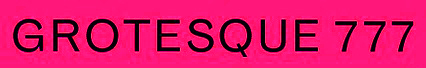 Icelandic designer and type designer in Reykjavik (and now Germany). Co-founder of Universal Thirst, an Indian and Icelandic type foundry that makes typefaces for the Indic, Latin and Arabic scripts. Gunnar studied graphic design at Iceland University of the Arts, and worked briefly in Reykjavik's creative industry before becoming a freelance designer and focusing on collaborations within the cultural sector. After completing his M.A. in Typeface Design at the University of Reading in 2010, he joined Monotype's London studio, working on major type projects for global brands. Since launching in 2016, Universal Thirst has taken on bespoke projects for Google, The Gourmand, Frieze Art Fair, DesignMarch, Monotype and Falcon Enamelware, and is scheduled to open its font library to the world in 2019.
  Czech graphic design, photography and type design studio run by
|
|
|
|