TYPE DESIGN INFORMATION PAGE last updated on Mon Jun 8 17:41:23 EDT 2026
FONT RECOGNITION VIA FONT MOOSE

|
|
|
|
|
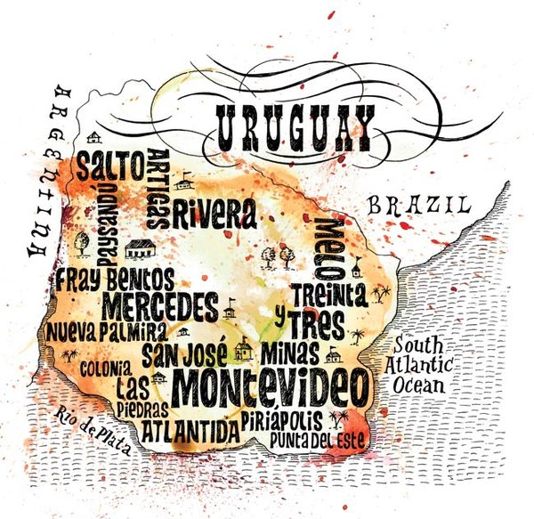
Uruguayan type design | ||
|
|
|
|
SWITCH TO INDEX FILE
During her studies at Universidad de la Republica in Montevideo, Alejandra Lamenza designed the jazzy display typeface Swingtronica (2016) and the poster typeface Alquimia (2018). [Google] [More] ⦿ | |
Montevideo, Uruguay-based designer of the sturdy display typeface Paulista (2016). [Google] [More] ⦿ | |
Ally Times is an on-line mag in Uruguay. At Dafont, we van download her hand-drawn typefaces May Handwrite (2012). [Google] [More] ⦿ | |
During her studies, Montevideo, Uruguay-based Ana Paula Massa designed the display typeface Glupp (2017). [Google] [More] ⦿ | |
Uruguayan winner of an award at Tipos Latinos 2008 for her experimental typeface called H Continua (codesigned with Maria Laura Fernandez, Andrea Montedonico, Ruth Slomovitz). [Google] [More] ⦿ | |
Uruguayan winner of an award at Tipos Latinos 2008 for her experimental typeface called H Continua (codesigned with Andrea Grossy, Maria Laura Fernandez, Ruth Slomovitz). [Google] [More] ⦿ | |
Graphic design studio based in Montevideo, Uruguay. In 2016, they designed the free dot matrix typeface Montevideo, and published it at Citype. [Google] [More] ⦿ | |
Benderski Design
| Gabriel Amijai Benderski Perez (b. 1988) is a designer based in Montevideo, Uruguay. He received a BA from ORT University, and creates typographically relevant posters and logos. [Google] [More] ⦿ |
Graphic designer based in Uruguay. In 2021, Daniel Ibanez, Bryan Rodriguez and Valentina Garcia co-designed the display typeface Morquio. [Google] [More] ⦿ | |
| |
Montevideo-based creator of an unnamed sans typeface in 2013. [Google] [More] ⦿ | |
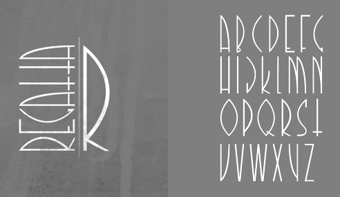
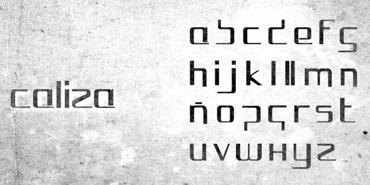
A graduate of Universidad ORT, Clara Rodriguez (Montevideo, Uruguay) created the avant-garde typeface Regatta (2013) and the squarish sci-fi typeface Caliza (2013). [Google] [More] ⦿ | |
Ciudad de la Costa, Canelones, Uruguay-based designer of the free left-leaning experimental typeface Distorsion Milenia (2020), which was done for a school project at Escuela Carne. [Google] [More] ⦿ | |
During his studies at Universidad de la Republica in Montevideo, Uruguay, Damian Rodriguez designed the display typeface Siri (2015). [Google] [More] ⦿ | |
Graphic designer based in Montevideo, Uruguay. In 2021, Daniel Ibanez, Bryan Rodriguez and Valentina Garcia co-designed the display typeface Morquio. [Google] [More] ⦿ | |
Montevideo, Uruguay-based designer of the cutout typeface AiIsadora (2016). [Google] [More] ⦿ | |
Uruguayan type designer. Award winner at Tipos Latinos 2010 for his typeface Uruguay 1976 (with Sergio Rodríguez). [Google] [More] ⦿ | |
Montevideo, Uruguay-based designer of the display typefaces Avocado (2011), Contraste (2011) and Montevideo (2007). Behance link. [Google] [More] ⦿ | |
Uruguayan type designer (born in 1952 in Montevideo), one of the pioneers of Brazilian type, dabbling mainly in corporate type in Brazil, such as for Vasp (1985), Cia. Hering, Bardahl and Continental 2001. [Google] [More] ⦿ | |
| |
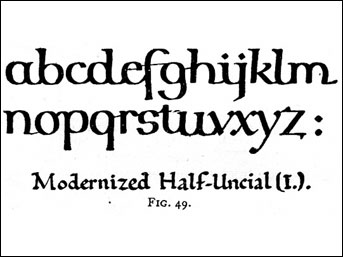
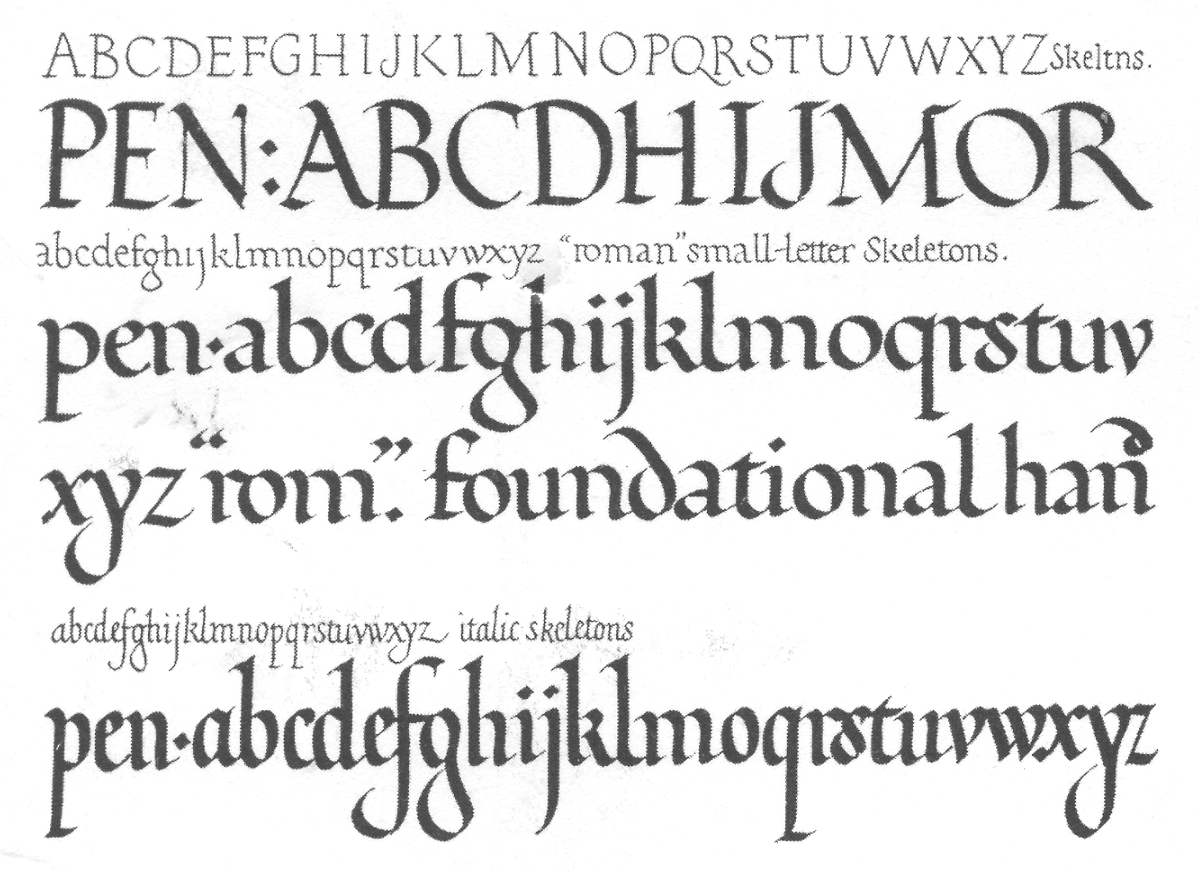
In 1916, he made a typeface for the London Underground (helped by Eric Gill). Johnston's London Transport type was reworked by Colin Banks in his New Johnston (1979), and again in 2016 by Malou Verlomme at Monotype, on commission for Transport For London (TfL), as Johnston100. Edward Johnston's fonts show a strong influence by Eric Gill. Hamlet-Type (1912-27, designed for a Shakespeare edition, Cranach Press, 1929) was also called Kessler-Blackletter. It was designed by Edward Johnston and cut in three sizes (10, 12 and 18 pt) by Edward Prince for William Shakespeare's Hamlet (published by Harry Kessler's Cranach Press in Weimar in 1929). The type is based on the Durandus for the lowercases, and Sweynheim & Pannartz's Subiaco type for the capitals. For a digital revival, see Hamlet Tertia 18 and Hamlet Cicero 12 by Alexis Faudot and Rafael Ribas which was developed at a workshop in Weimar in 2018. Hamlet was revived by Manfred Klein and Petra Heidorn as HamletOrNot. Johnston designed Imprint-Antiqua with Gerard Meynell and J. H. Mason in 1913. It includes Imprint Shadow. Digital descendants exist at Monotype [Imprint MT], URW [Imprint URW, preferred over the MT version by some of my correspondents], SoftMaker [I771], and Bitstream [Dutch 766<]. Johnston Sans Serif was done in 1916. A version of the London Underground typeface (1997, by Richard Kegler) was digitized by P22. In 2007, Paul D. Hunt extended that typeface to a 21-style multilingual collection called P22 Underground Pro. At ITC, Dave Farey and Richard Dawson recreated a Johnston sans serif family with 3 weights, aptly called ITC Johnston. Nick Curtis created Underground NF in 1999. Jordan Davies called his revivals London Medium (2017) and London Heavy (2017). Many other designers aped Johnston's Underground as well. In 2012, Greg Fleming published Railway Sans as a free open source font at OFL. It is based upon Johnston's original drawings and work started by Justin Howes just before his death. In 2021, P22 added italics to P22 Underground Pro and now covers Latin, Cyrillic and Greek---help with this newest version came from Housestyle Graphics (Dave Farey; for the italics), James Todd, and Patrick Griffin (final mastering). Edward Johnston is a book published by Priscilla Johnston (London, 1959). Author of Writing&illuminating,&lettering (1917, J. Hogg, London; original done in 1906). Writing Illuminating Lettering at Amazon. Scans of some lettering by him: illuminations (1917), modernized half uncial (1906), Calligraphy by Johnston. Digital fonts based on alphabets from the 1906 book include Edward's Uncial 1904 (2011, David Kettlewell). | |
During her studies at FADU / UDELAR (Universidad de la Republica) in Montevideo, Uruguay, Eliana Lemos designed a fat display typeface (2017). [Google] [More] ⦿ | |
Montevideo-based designer (b. 1986) of Hilda (2013). Behance link. [Google] [More] ⦿ | |
Based in Montevideo, this studio created a compass-and-ruler typeface in 2013 called Adela. It was created at MACA under the guidance of Gustavo Wojciechowski. [Google] [More] ⦿ | |
Fábrica de tipos
|
View Vicente Lamonaca's typefaces. [Google] [MyFonts] [More] ⦿ |
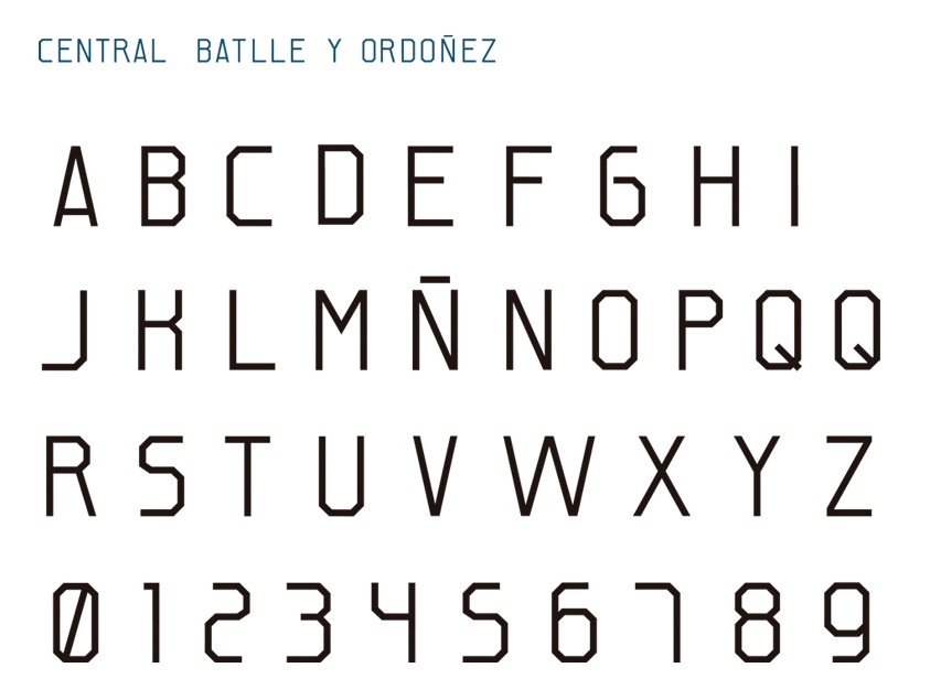
Fabián Bicco (Montevideo, Uruguay) is a designer and illustrator. He created the octagonal CBO (Central J. Batlle y Ordoñez) font in 2012. Behance link. [Google] [More] ⦿ | |
Graphic designer in Montevideo, Uruguay. Creator of the chubby rounded sans typeface Contenta (2015) for a school project at a local university. [Google] [More] ⦿ | |
As a student in Montevideo, Uruguay, Federico Montaldo created the straight-edged typeface Vasir (2015). [Google] [More] ⦿ | |
Montevideo, Uruguay-based designer of the modular logotype or display typeface Babo (2017). [Google] [More] ⦿ | |
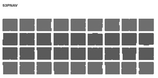
Montevideo-based designer who created 53 PNAV in 2012, the fattest font ever, together with Nicolas Branca. This typeface was chosen for the Type and identity of 53 Premio Nacional de Artes Visuales de Uruguay (Uruguayan national arts awards). In 2010, he made the dot matrix typeface Minima. Carlos (2012) is a chiseled face. In 2016, he designed the sans typeface Elemental. Behance link. Newer Behance link. [Google] [More] ⦿ | |
For his Bachelors thesis at HEAD in Geneva, he created the typeface Genève (2014): In developing Genève I was inspired by the typeface used by French printer/editor/publisher Henri II Estienne in his famous book Thesaurus Linguae Graecae, published in Geneva in 1572. This typeface was brought to Geneva by Henri's father, Robert Estienne, who, before settling in Geneva and working as Calvin's printer, was the printer of France's King, François I. This typeface highly influenced the typographers and printers in Geneva at that time. Henri and Robert Estienne's work in Geneva helped it to become one of the most important cities in Europe for print and typography in the sixteenth century. Genève consists of four styles: Classique (humanist serif), Austère (geometric serif), Spontanée (humanist sans-serif) and Alternative (stencil, display version). Graduate of the MATD program at the University of Reading, class of 2015. His graduation typeface was Exentra which was was conceived for publications promoting forward-thinking through a contemporary and experimental vision of modern culture and trends. It supports Latin, Gurmukhi and Greek. In addition, Fermin added the fat face didone / gothic mixture mixture font Black Display for applications in fashion, and the super-angular and scary Franky as sub-styles of Exentra. In 2017, he published Thesaurus, the renaming and outgrowth of Genève, at Typotheque. Thesaurus Display Italic followed in 2018. Well-deserved winner at Tipos Latinos 2018 of a grand prize. In 2019, he designed Brick Pro (Display, Text) for Colophon, which explains: Brick's foundations lie in the signage of three prominent pubs in London's East End, The Jolly Butchers (Brick Lane---now closed), The Royal Oak (Columbia Road), and The Prince Albert (Acton Street). Referencing their Art Deco traits, with a trace of Art Nouveau heritage, Brick is Fermín Guerrero’s re-interpretation and continuation of the vernaculars elegant gestures, brought into the 21st century. [Google] [MyFonts] [More] ⦿ | |
| |
Fernando Díaz
| |
| |
Gabriel Benderski
| |
Montevideo, Uruguay-based designer of the free op-art typeface Reverb (2015). Behance link. [Google] [More] ⦿ | |
During his studies in Montevideo, Guillermo Elutchanz created the angular text typeface Vilamajo (2014). [Google] [More] ⦿ | |
Based in Montevideo and born in 1989, Guillernina's first typeface is the hand-printed Nieve (2013). [Google] [More] ⦿ | |
Uruguayan designer, aka Maca, of Yaugurú (2007, so condensed that the letters simulate barcodes). [Google] [More] ⦿ | |
Montevideo-based but semi-Swiss designer (b. 1984) of Faux Tangram (2013). Free ai format download. [Google] [More] ⦿ | |
| |
Well-known Uruguayan artist. In his honor, Sanfrancisco Estudio (Montevideo) created the hand-printed Iturria typeface in 2013 based on the artist's hand. It also created the identity of the Fundacion Iturria. [Google] [More] ⦿ | |
A printing and publishing house in Montevideo, Uruguay, that produced the first specimen book in that country, Muestras de Caracteres de Latras Geroglificos y Guarniciones que existen en la Imprenta de la Caridad (Montevideo, 1838). [Google] [More] ⦿ | |
As a student at Universita de la Republica, Jami Fadua (Montevideo, Uruguay) designed the semi-outline display typeface Rügen (2016). [Google] [More] ⦿ | |
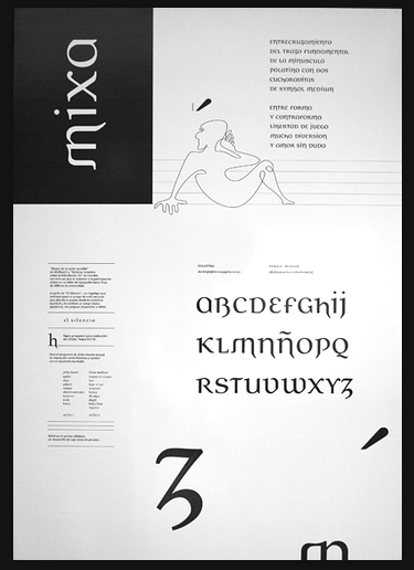
Uruguayan graphic designer (b. 1974) who graduated from ORT Uruguay in 2006. Creator of Mixa (2006), an award winning unicase font, at the Biennal of Latin Letters in 2006. Mixa, which was based on the logotype of the rock group El Silencio, was published in 2007 at Intellecta Design. | |
| |
In 2013, he made the decomposable typeface Op. | |
Graphic and web designer in Montevideo. In 2012, he designed Figari Sans and Barreiro Serif. [Google] [More] ⦿ | |
Freelance designer in Montevideo, who created the roundish Mush Font (2014). [Google] [More] ⦿ | |
Uruguayan designer of the Google Web Font sans typeface Gafata (2012, TipoType and Underground). One can also get a free font at MyFonts called Recta Gafata (2013, TipoType). Google Plus link. Fontsquirrel link. [Google] [MyFonts] [More] ⦿ | |
Uruguayan creator of the comic book typeface Manga Espanol (2010). [Google] [More] ⦿ | |
Musician and graphic designer in Montevideo, Uruguay. In 2014, she created the thin sans typeface Childish Font. [Google] [More] ⦿ | |
Montevideo, Uruguay-based designer of the curly Victorian typeface Migra (2016). [Google] [More] ⦿ | |
In 2018, she published Elisetta at Sudtipos. This type family of 6 fonts was specially crafted to write, edit and compose music sheets, lyrics, texts and notes. Winner at Tipos Latinos 2018 of a type design award for Elisetta. In 2019, she published Frambuesa at Sudtipos. [Google] [MyFonts] [More] ⦿ | |
| |
Graphic designer in Montevideo, Uruguay. In 2017, he published the curly condensed (and blackboard bold) typeface Fragua, which takes inspiration from the ironwork seen in the old center of Montevideo. [Google] [More] ⦿ | |
Uruguayan designer of Randall (2007, octagonal family made in memory of the guitarist Dimebag Darrell). [Google] [More] ⦿ | |
Canelones, Uruguay-based designer of the typeface Suprematica (2015), which is roote in the suprematist movement, and in particular in the work of Liubov Popova. This typeface was done as part of a school project at LDCV. Behance link. [Google] [More] ⦿ | |
Uruguayan winner of an award at Tipos Latinos 2008 for her experimental typeface called H Continua (codesigned with Andrea Grossy, Andrea Montedonico, Ruth Slomovitz). [Google] [More] ⦿ | |
Montevideo-based designer of the organic typeface Escrin. See also here. [Google] [More] ⦿ | |
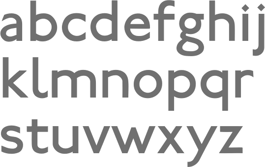
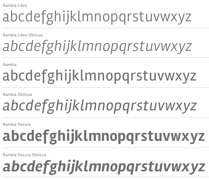
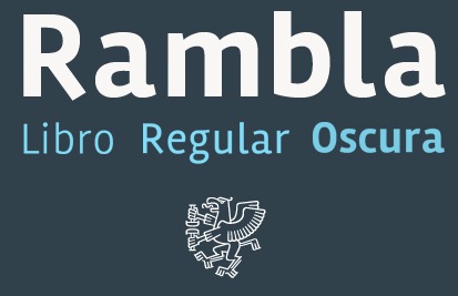
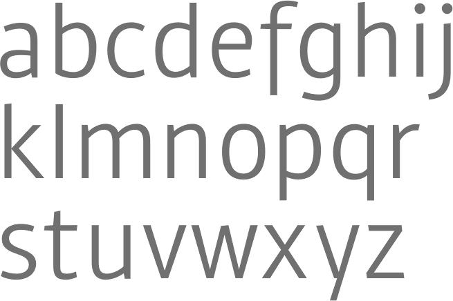
In 2013, he designed the humanist sans family Amelia at TipoType and Underground. He added Amelia Rounded in 2015. Amelia won an award at Tipos Latinos 2016. At Tipos Latinos 2012, Martín Sommaruga won an award in the display type category for the didone typeface family Rufina Regular. Rufina Ornaments followed in 2015. In 2013, he designed Amelia Basic, a soft very humanist sans typeface family. At Google Web fonts, one can download free versions of Rufina and Rambla. Rufina was published at TipoType in 2014. Marin&eacite; (2014; see also Marin&eacite; STD) is an unstrict geometric sans published by TipoType. It was followed in 2017 by Mariné Rounded. In 2016, he designed Rufina Stencil. Google Plus link. [Google] [MyFonts] [More] ⦿ | |
Montevideo, Uruguay-based designer of the cable channel-themed Zapping Font (2016). [Google] [More] ⦿ | |
Montevideo, Uruguay-based designer and illustrator, who created Redrum (2016), an angular typeface influenced by Stanley Kubrick's movies. It was developed during his studies at FARQ (Udelar). Behance link. [Google] [More] ⦿ | |
During his studies at Universidad de la Republica in Montevideo, Uruguay, Mauricio Castro designed the wall painting font Moai (2017). [Google] [More] ⦿ | |
| |
At the Intendencia Municipal de Montevideo (Uruguay), we found a free font, Montevideo JTG (2002), inspired by the handwriting of Uruguayan artist Joaquin Torres Garcia (2003). There was also a dingbat font, Montevideo JTG Symbol (2002). The original link died. [Google] [More] ⦿ | |
During her studies, Nadia Florio (San José de Mayo, Uruguay) designed the typeface Amalie Rohe (2015, named after Mies Van Der Rohe). [Google] [More] ⦿ | |
Montevideo-based Natalia Vilanova designed the titling typeface Berlina in 2017. [Google] [More] ⦿ | |
Montevideo-based designer of Abece Serif (2013). [Google] [More] ⦿ | |
Montevideo, Uruguay-based designer of a squarish modular display typeface in 2017. [Google] [More] ⦿ | |
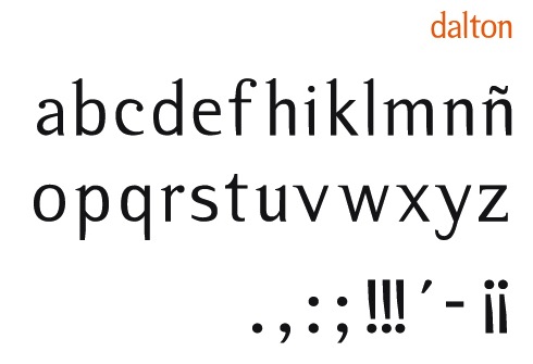
Designer in Montevideo who created Dalton (2012), a semi-serifed typeface. [Google] [More] ⦿ | |
Uruguayan designer of Digit (2009), an LED face. [Google] [More] ⦿ | |
Pansa Studio
|
|
Montevideo, Uriguay-based designer of the weathered typeface family Dafunk (2014), which was developed dring his studies at ORT. [Google] [More] ⦿ | |
During his studies in Montevideo, Pollo Perdomo (Montevideo, Uruguay) designed the blackletter typeface Minimum (2017). [Google] [More] ⦿ | |
During his studies in Montevideo, Uruguay, Rensso Soberal designed the deco poster typeface Denssa (2016). [Google] [More] ⦿ | |
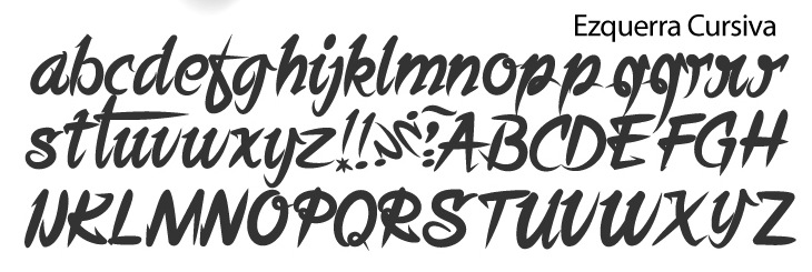
Rodolfo Fernández Alvarez (who is from Montevideo, Asunción and Málaga) developed EzquerraCursiva (2010), a brush and signage face, based on the work of anarchist painter and letterer Francisco Ezquerra, who was active in Uruguay from ca. 1950 until ca. 1970, after fleeing Spain before World war II. [Google] [More] ⦿ | |
Montevideo, Uruguay-based designer of the handcrafted typeface Babka (2017). [Google] [More] ⦿ | |
Uruguayan winner of an award at Tipos Latinos 2008 for her experimental typeface called H Continua (codesigned with Andrea Grossy, Andrea Montedonico, Maria Laura Fernandez). [Google] [More] ⦿ | |
During his studies at FADU / UBA in Buenos Aires, Montevideo, Uruguay-based Santiago Uribe created Vivienda Sans (2016) and Monobloq (2016, monoline monospaced basic sans). [Google] [More] ⦿ | |
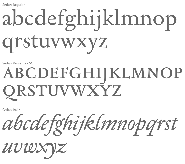
Uruguayan type designer. Award winner at Tipos Latinos 2010 for his early Baroque text typeface Sedán, which was published by TipoType in 2012. In 2009, he published the free typeface Transitoria at TipoType. [Google] [More] ⦿ | |
Montevideo, Uruguay-based designer of Quebracho (2015). [Google] [More] ⦿ | |
Montevideo-based creator of a typographic poster entitled John Lennon (2012). [Google] [More] ⦿ | |
Uruguayan type designer. Award winner at Tipos Latinos 2010 for his typeface Uruguay 1976 (with Diego Cataldo). [Google] [More] ⦿ | |
Montevideo-based designer of the organic sans typeface La Vuelta (2014). [Google] [More] ⦿ | |
Graphic designer in Maldonado, Uruguay. Creator of a mini-serifed display typeface called Sophie (2014). Behance link. [Google] [More] ⦿ | |
During her studies in Montevideo, Soledad Balarini designed the connected script typeface La Linea. [Google] [More] ⦿ | |
Montevideo-based designer of a beautiful ink splatter typeface in 2012. Behance link. [Google] [More] ⦿ | |
Uruguayan designer of the rounded typeface Hinata (2015), which was part of a school project. [Google] [More] ⦿ | |
Montevideo, Uruguay-based designer of the children's book typeface Hola (2017). [Google] [More] ⦿ | |
Vicente Lamonaca's directory for making information about national [Uruguayan] typographic production accessible in a transparent and open manner. The foundries listed bu them in the middle of 2025 include Dodma 580, Strong Typem Reset Type, TipoType and Underground. At that time, the typographers covered included Alejandro Sequeira, Avril Ponce de Leon, Camila Basso, Eduardo Bacigalupo, Edward Johnston, Fermin Guerrero, Fernanda Nunez, Fernando Díz, Gustavo Wojciechowski, Ignacio Corbo, Jose Perdomo, Juan Odriozola, Lautaro Hourcade, Martin of the Many, Martín Sommaruga, Matias Di Iorio, Sebastian Salazar, Vicente Lamonaca, and Ximena Insua. [Google] [More] ⦿ | |
Uruguayan type jump page. It has a blog, a schedule of local type events, and a group of type designers who present their creations. These include
| |
| |
Tipos Latinos Uruguay as of 2010: Felicia de Azevedo, José de los Santos, Diego Carnales, Alejandro di Candia, Vicente Lamónaca y Gustavo Wojciechowski. [Google] [More] ⦿ | |
TipoType
|
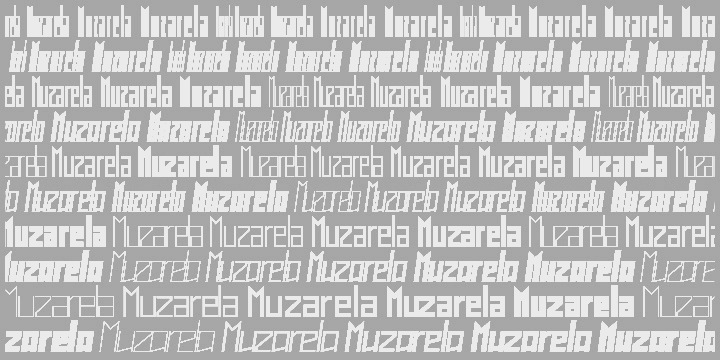
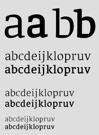
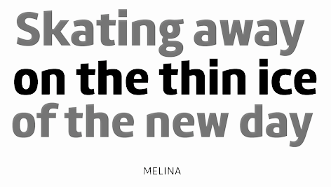
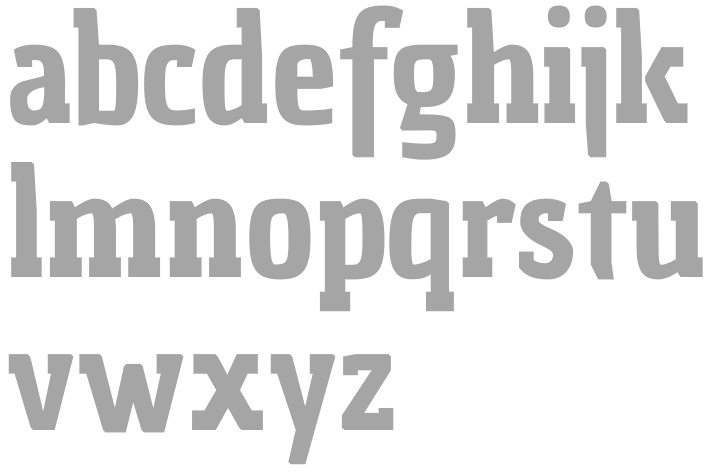
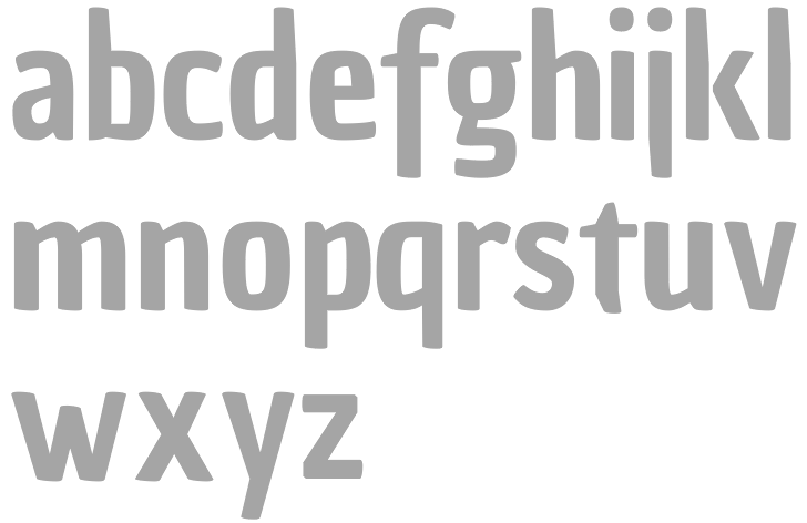
Fonts include Quiroga Serif (2009, Fernando Díaz), Muzarela (2011, a 50-style squarish family), Chau Philomène (2010), Chau Trouville (2010), Chau Marbella (2010) and Chau La Madeleine (2010) [all Chau fonts were done by Vicente Lamónaca] and Economica (2007, Vicente Lamónaca; see Economica Cyrillic Pro in 2016, done with Sergiy Tkachenko). Fernando Díaz created Quadratta Serif (2007, a slab serif done at Intellecta Design). This typeface won in the best text category at Tipos Latinos 2008. It was renamed Quiroga Serif in 2014 and published at TipoType. Sedan (2012, Sebastian Salazar, TipoType) is a delicate early baroque typeface family with tall ascenders, and the elegance of a garalde. Other typefaces by Díaz include Logomotion (2012), Fénix (2009-2010, a free soft wedge-serifed typeface not to be confused with Fenix by Frantisek Storm; free at Google Web Fonts), Helena (2011), Libertad (2008-2010, sans) and Libertad Office (2015). Libertad won an award at Tipos Latinos 2016. Melina is a 16-style house font that borrows from letters from scripts. In 2014, TipoType published the handwriting font La Paz. In 2015, Fernando Diaz published the 18-style semi-techno sans typeface family Trasandina. This text typeface won an award at Tipos Latinos 2016. Codesigner, with Ignacio Corbo at TipoType, of the part-humanist part-geometric mega-sans typeface family Brother 1816, designed in 2016, to celebrate 200 years since the first appearance of a sans typeface. It has normal and printed (weathered) subfamilies. Winner at Tipos Latinos 2018 of a type design award. We also find Brother XL and Brother XS in 2019. The TipoType team published the 24-variant sans typeface family Fieldwork in 2018. It contains Hum (for humanist) and Geo (for geometric) subfamilies. Extraordinarily versatile and appropriate for information design applications, this family is called geohumanist by its creators. Typefaces from 2020: Mundial (a 14-style geometric sans), Rotunda (advertized as a modern rational grotesque, and a blend of humanist, grotesque and geometric). Typefaces from 2021: Fisterra (a flared all caps display serif), Rustica (an 18-style humanist sans. with two variable fonts). Klingspor link. Creative Market link. Fernando's own page. MyFonts link. Behance link. MyFonts interview. [Google] [MyFonts] [More] ⦿ |
Montevideo, Uruguay-based designer of Istometric (2018). [Google] [More] ⦿ | |
Trini Testi
| |
| |
Graphic designer based in Canelones, Uruguay. In 2021, Daniel Ibanez, Bryan Rodriguez and Valentina Garcia co-designed the display typeface Morquio. [Google] [More] ⦿ | |
Vicente Lamónaca
| |
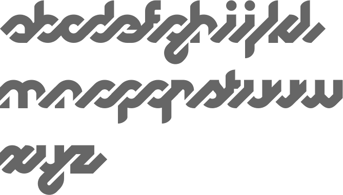
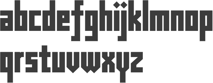
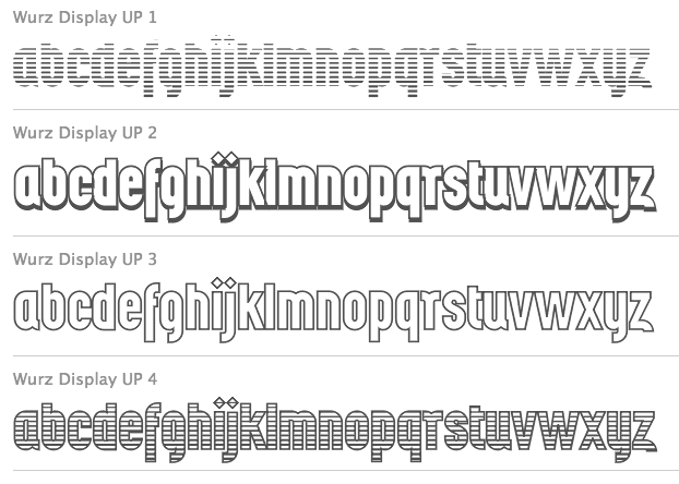
Lamonaca created the experimental typefaces Quetzal and Equis Normal. He also made Chau Trouville (2010, a slab serif), Chau Philomène (2010, Google Web Fonts), Chau La Madeleine (2010, slightly elliptical), and Chau Marbella. Other typefaces: Muzarela (2011), Económica Sans Serif (2007, see also MyFonts or Google Web Fonts), Economica Cyrillic Pro (2016, with Sergiy Tkachenko), Economica Next (2017, with José Perdomo), Wurz and Wurz Display (2013), St Patrick (2013, TipoType---the oblique version of San Benito), Korn (2013, grunge), Arya (2013, a solid, bilined or trilined all caps sans family, Tipotype; extended in 2017 to Arya Rounded), Prevya (2013, inspired by the metalwork of the early twentieth century), Yapa (2013, a display titling typeface followed by Yapa Rough in 2014), and San Benito (2012, bold blackletter style). Editor of Tipografía Latnoamericana (2013, Wolkowicz Publishers), a book with contributions by Zalma Jalluf, Ewan Clayton, Julio Ferro, Eduardo Rodríguez Tunni, Fernando Díaz, Lautaro Hourcade, Viviana Monsalve, Patricia Benítez, Fabio Ares, María Laura Fernández, Miguel Catopodis, Alejandro Valdez, Juan Heilborn, César Puertas, Ignacio Martínez-Villalba, Felipe Cáceres, Francisco Calles, Crist&ocute;bal Henestrosa, María Teresa Bruno, Juan Pablo del Peral, Fábio Lopez, Fábio Haag, Tony de Marco, Francisco Gálvez, Marcela Romero, Aldo de Losa, Henrique Nardi, Gustavo Wojciechowski, Marina Chaccur, Juan Carlos Darias, Víctor García, Marina Garone Gravier, Juan Pablo de Gregorio, Cláudio Rocha, Cecilia Consolo, Pablo Cosgaya, Alejandro Paul, Rubén Fontana, Diego Vainesman, Oscar Yáñez, Dave Crossland. In 2017, Tipotype published Vicente Lamoncaca's 48-font family Arazati which was inspired by Edward Johnston's (humanistic sans) typefaces, although its design is not based on a literal reconstruction. Two monospaced variants called Arazati Codex are free. Arazati is the name of the place in Uruguay where Johnston was born in 1872. Arazati moved over to Underground in 2019. In 2018, he published the exclusive angular text typeface Alacena---only 220 licenses will be sold. Bio. Google Plus link. Klingspor link. View Vicente Lamonaca's typefaces. [Google] [MyFonts] [More] ⦿ |

 Born in Montevideo. After working as a designer at the Peluffo Giguens Foundation in 2016, she worked in 2018 as head of graphic communication at the Sodre National Auditorium. During her studies at ORT in Montevideo, Camila Basso Rubbo designed the condensed movie credit font family
  Industrial designer in Montevideo, Uruguay. Creator of Dr. No (2014), a typeface inspired by chairs designed by Philippe Stark. [
 Born in Uruguay in 1872, he died in the UK in 1944. A medical doctor, he taught all his life at the Central School of Arts and Crafts in London and at the Royal College of Art in London. From 1910 until 1930, he designed fonts for the Cranach-Presse in Weimar, which was owned by Count Harry Kessler.
  Uruguayan foundry, est. 2011, which also acts as an open forum and blog, on which active participation is welcomed. Their first fonts (which used to be at TipoType) are both by Vicente Lamónaca. They are
  Born in Carmelo, Colonia, Uruguay in 1983, then based in Geneva, Switzerland, where he studied Visual Communication at the Haute Ecole d'Art et de Design, and now back in Montevideo, Uruguay, this graphic designer created the counterless geometric typeface
  Graduate of ORT in Montevideo, who now teachas digital design at the same university. She designed these typefaces:
  [
[ Montevideo-based codesigner, with Fernando Diaz at TipoType, of the part-humanist part-geometric 32-style mega-sans typeface family
  Codesigner with Vicente Lamonaca of
  Uruguayan designer in Montevideo (b. San José del Mayo, 1978) of
  Aka Lu Ronderos. Lucia is a visual communication designer who studied at the National University of La Plata. During 2015-2017, she was part of the first Masters in Typography cohort at the University of Buenos Aires. In 2016, Micaela Novarini and Lucia Ronderos designed the Nordic style display typeface family
  During her graphic design studies in Montevideo, Malena Guevgeozian created the sans typeface Canterville (2015). [
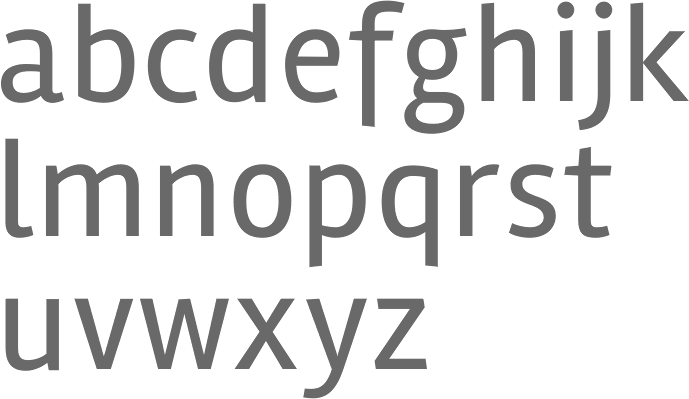
 Uruguayan type designer. Since 2001, he has been teaching in Communication and Design at the ORT University in Uruguay. Award winner at Tipos Latinos 2010 for his humanist sans large x-height typeface family MVD Rambla. In 2011, he
  Pansa Studio is a brand, design and animation studio in Stockholm, which was founded in 2013 in Verona, Italy, by Rodrigo Nasta (b. 1986, Montevideo, Uruguay), and Trini Testi (b. 1990, Rome). In 2013, Trini Testi designed the elegant tall-legged, almost Peignotian, typeface Funkadeli. Trini has an MA in graphic design from IED.
  The Fourth Bienal de la Tipografía Latinoamericana comprised a type competition, Tipos Latinos 2010. The jury consisted of Paco Calles (Mexico), José de los Santos (Uruguay), Juan Heilborn (Paraguay), Fabio López (Brazil), César Puertas (Colombia), Hugo Rivera Scott (Chile) and Marcela Romero (Argentina). The awards have in each category, if applicable, a first prize (certificado de excelencia, CdE below) as well as regular awards:
  Tipotype is a foundry, est. 2009 in Montevideo, Uruguay, by
  This seems to be a new Uruguayan type foundry that split off from TipoType late in 2018 or early in 2019. It carries typefaces by Raul Israel, Vicente Lamonaca, Micaela Novarini, Fernanda Nunez, José Perdomo, Lucia Ronderos, Martin Sommaruga, and Sergiy Tkachenko. As of January 2019, their typefaces were:
  [
[ This Montevideo-based designer (b. 1967, Mexico City) has a degree in Graphic Design from the University ORT Uruguay. He lives in Montevideo since 1985. Since 2000, he teaches in the area of publishing in the Faculty of Communication and Design at University ORT in Montevideo, in the Faculty of Communication and Design. Since 2005 he is also teaching Typography II. He is a partner of the design studio Taller de Comunicación.
|
|
|
|