TYPE DESIGN INFORMATION PAGE last updated on Sun Jul 12 21:51:41 EDT 2026
FONT RECOGNITION VIA FONT MOOSE

|
|
|
|
|
Type scene in Iowa | ||
|
|
|
|
SWITCH TO INDEX FILE
Student of Graphic & Web Design at DMACC (Des Moines Area Community College). FontStructor who made DMACC Andrade (2011). [Google] [More] ⦿ | |
At Drake University, Des Moines, IA-based Aaron Chier designed Rocketeer Caps (2017). [Google] [More] ⦿ | |
A discussion on the Type Design list and the Typophiles regarding Adobe Trajan (by Carl Twombly) and Father Edward M. Catich (d. 1979), of St. Ambrose University in Davenport, Iowa, who created many of the forms and did much of the research on which Trajan was presumably based. [Google] [More] ⦿ | |
Student at DMACC in Des Moines, IA, in 2013, who designed the high-contrast typeface Little One Sided (2013, FontStruct). [Google] [More] ⦿ | |
Student of Graphic & Web Design at DMACC (Des Moines Area Community College). FontStructor who made Block Bubbles (2012, dot matrix typeface). [Google] [More] ⦿ | |
Cedar Rapids, IA-based designer of the video game typeface Arcade (2016). [Google] [More] ⦿ | |
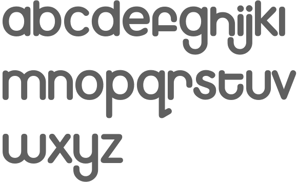
Ames, IA-based designer of the geometric typeface Golvan (2014). [Google] [More] ⦿ | |
Sioux City, IA-based designer (b. 1972) of the fat finger fonts AJ Cool Beans and Beautiful Day (2014). [Google] [More] ⦿ | |
Aneeks Designs
| Iowa-based designer of the handcrafted typeface Strawberry Mojito (2017). [Google] [More] ⦿ |
Angela Lane
| |
Anika Ehlers
| |
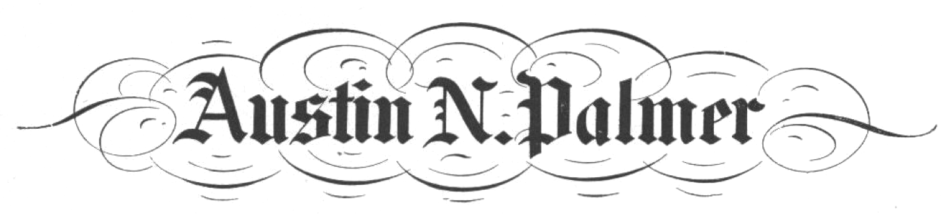
Austin Norman Palmer
| |
FontStructor who made the piano key typeface Make A Move On (2013), which was inspired by Milton Glaser. The typeface was developed during Jacobs's studies at DMACC in Des Moines, IA. [Google] [More] ⦿ | |
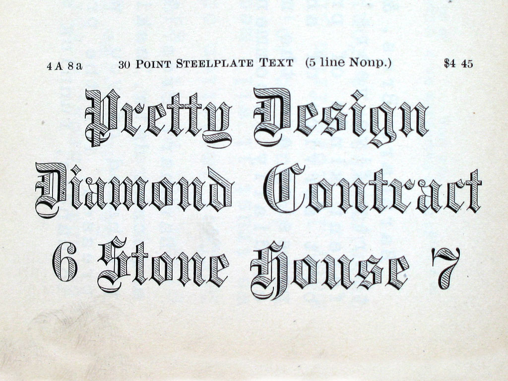
BB&S was purchased by ATF about 1911 and it operated independently until about 1930. Typophile page on them. Text file with a list of the typefaces in their Catalog 25 (1925). Discussion of some of their typefaces and digitizations:
Digital typefaces that descend from Barnhart / BBS. [Google] [MyFonts] [More] ⦿ | |
Born in Mount Pleasant, IA, in 1962, Barry Deck is a freelance graphic designer in LA, Chicago and NYC. He designed Arbitrary (1990, a sharp-serifed sans) and Template Gothic (1990, grunge; see here for the Cyrillic version by Igor Polovodov and the Greek version by Panos Haratzopoulos) at Emigre in 1992 and 1994 [MyFonts says 1990...]. Rudy van der Lans recalls the Template Gothic story: It was designed by Barry Deck while he was a student at Cal Arts in the early 90s. Under the auspices of Ed Fella and Jeffery Keedy there was a lot of exciting type design experimentation going on at CalArts in those days. I remember that particular graduate class came to visit our studio in '92 or so. That's when we first saw Template Gothic. We liked the font and asked Barry if he would let us release it commercially. Hrant Papazian says that a lot of the credit for Template Gothic should go to Ed Fella. Besides these two Emigre fonts, Barry designed many other typefaces. He sells Barry Sans Serif (1989), Washout, Traitor, Truth, Fontoid, Canicopulus Script (1989, named in honor of Eric Gill's extracurricular activities), Cyberotica (1994), Caustic Biomorph (1992, part of FUSE 4), Cyberfriendly, Moderne Sans Serif, Mutant Industry Roman (1989), and Orgasm Heavy. More recently, Barry Deck designed Eunuverse specifically for RayGun and it was used in a few issues before this mag was bought-out. Fonts at Thirstype: Cyberotica, Eunuverse, Traitor, Truth, FauxCRA (2002), Caustic Biomorph, Repressed, Orgasm, and Canicopulis. [Google] [MyFonts] [More] ⦿ | |
Ben Balvanz
| |
During his art studies, Cedar Falls, IA-based Ben Uhl created the circuit font Watty (2015). [Google] [More] ⦿ | |
Student of Graphic & Web Design at DMACC (Des Moines Area Community College). FontStructor whose fonts include Fat And Sassy (2011). [Google] [More] ⦿ | |
Des Moines, IA-based creator (b. 1985) of Bradford (2009, handwriting). Love Studios Design. [Google] [More] ⦿ | |
Designer from Iowa City, who shows some photogaphs of sign lettering at his site. [Google] [More] ⦿ | |
Graduate of the University of Northern Iowa. Cedar Falls, IA-based creator of Playing Card Font (2017). [Google] [More] ⦿ | |
| |
During his studies at Des Moines Area Community College, Ankeny, IA-based Brandon Johnson designed the free space-age typeface Astronaut (2016, FontStruct). [Google] [More] ⦿ | |
| |
Student of Graphic & Web Design at DMACC (Des Moines Area Community College). FontStructor who made Punch Out Caps (2012). [Google] [More] ⦿ | |
| |
Student at DMACC in Des Moines, IA, in 2013, who designed the thin typeface Top Heavy (2013, FontStruct). [Google] [More] ⦿ | |
Illustrator and poster designer in Chicago in the 1920s and 1930s, who lived from 1880 (b. Stockton, CA)-1972 (d. Des Plaines, IA). Many of the ornamental typefaces in the Barnhart Brothers&Spindler catalog of 1931, Typefaces: border designs, typecast ornaments, brass rule: selective specimens of preferred matter, are due to Junge. His typefaces:
| |
Catherine Haugland
| |
Charles S. Hazlett of Boone, IA, and John West, of Chicago, co-designed a script typeface for BBS in 1890. [Google] [More] ⦿ | |
Cheapfontgenerator
| There are two parts to this site which is associated with Miley Cyrus from Des Moines, IA. The first one deals with a 5 USD per font handwriting service based on templates. The other one is a free font foundry with about 80 original fonts. There is also a blog. [Google] [More] ⦿ |
Graduate of Iowa State University, now based in San Francisco. In 2016, she designed the display typeface The Curl, which is inspired by curled paper. She also made Tarot Card Icons (2016). Behance link. [Google] [More] ⦿ | |
Colin Wales
| |
Student of Graphic & Web Design at DMACC (Des Moines Area Community College). FontStructor whose fonts include Bignblack (2011, fat counterless face). [Google] [More] ⦿ | |
Student at DMACC in Des Moines, IA, in 2013, who designed the chunky typeface Robochunk (2013, FontStruct). [Google] [More] ⦿ | |
Student of Graphic & Web Design at DMACC (Des Moines Area Community College). FontStructor who made Negative Space Place (2012, white on black letters). [Google] [More] ⦿ | |
Danielle Ellis
| |
Defay Designs
| Danielle Ellis (Defay Designs, Iowa) designed the monoline display sans typefaces Pricisia and Dellis, the Peignotian sans typeface Mattie, and the display typefaces Abstracular and Ridiculous in 2017. Creative Market link. [Google] [More] ⦿ |
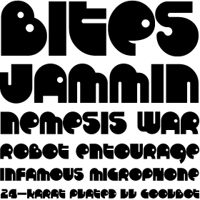
Fort Dodge, Iowa-based designer (b. 1972) of MKX Title (2015), a titling font modeled after the font used in Mortal Kombat X. [Google] [More] ⦿ | |
Researcher at the National Print Museum in Dublin, and one of the world's top experts on Irish type design. Author of Irish Type Design: a history of printing types in the Irish character (Blackrock: Irish Academic Press, 1992). He obtained a doctorate from Trinity College Dublin for work completed on the subject of the Irish Character in Print. He was Art Director of the University of Iowa Press for a number of years before returning to Ireland. He was a lecturer in design at the Dublin Institute of Technology, where he held the position of Head of the Departments of Visual Communication and Fine Art. At ATypI in 2003, he spoke about Irish type design: the Canadian connection. Speaker at ATypI 2010 in Dublin. Speaker at ATypI 2011 in Reykjavik. [Google] [More] ⦿ | |
Eclectic Anthology
|
|
| |
Electric Typographer
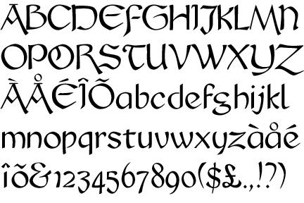
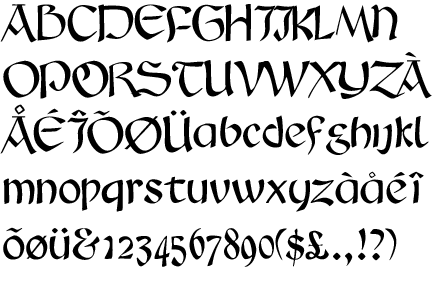
| Judith Sutcliffe (Audubon, IA) is the Electric Typographer (est. 1986, Santa Barbara, CA). She has made absolutely exquisite highly original typefaces, which are sold by many foundries and vendors, including Will-Harris. Her typefaces: Abelard (1988, mediaeval), LeonardoHand (Da Vinci's handwriting--greeeeaaaat), Lutahline (clean hand-printed family), ArabiaFelix, Petroglyph (nice dingbat series), AuntJudy, BlockParty, PetroglyphHawaii, ItalianAElectric, TaglienteInitials (another great calligraphic font), TommysType (letters on a clothesline), Kiilani, and Troubador (1988-1989, mediaeval) and Troubador Initials (1989). Atomic Type sells her fonts. Other fonts: Petroglyph Hawaii (1993), Daylilies, Greene, GreeneGreene, Insecta, Leaves, OldstyleChewed, Finfont, Flourish, Hawaii Set, Maskerade, Santa Barbara Electric (1989, a Lombardic / uncial face; + Barbara Svelte, + Barbara Plump), Schampel, Electric Stamps, Daly Hand, Kiilani, Mesopotamia (1992). Emodigi site. At Will-Harris House, we find these fonts by Judith Sutcliffe: Catastrophe, Tommy, Daly Hand and Daly Text (based on the casual calligraphy of Pacific Northwest artist George Daly), Finfont (fish), Daylilies, Leaves, Flourish (calligraphic family), Greene&Greene (architectral lettering), a Hawaiian set consisting of Kiilani, Hibiscus (alphadings), and RockArt dingbats, Insecta (dings), Oldstyle Chewed, Leonardo (neat handwriting of DaVinci simulated), Petroglyphs, Schampel (blackletter), Serpent, Maskerade (masks), Tagliente (nice old-fashioned lettering and caps). FontShop link. Another FontShop link. Klingspor link. [Google] [MyFonts] [More] ⦿ |
| |
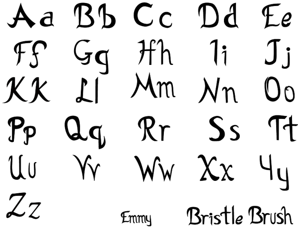
During her graphic design studies, Sioux City, IA-based Emmy Hamblen created the brush scrtipt Bristle Brush (2013). [Google] [More] ⦿ | |
Des Moines, IA-based graphic and web design company. They created the squarish display typeface Nominee Display in 2015. Creative Market link. [Google] [More] ⦿ | |
Fontalicious
|
At T-26: Marshmallow (2001, rounded monoline geometric face), Superfly (2002, a Western font), Thursdoo (2002), Pacfont Good (2002), Thug (2002), Dokyo (2002, a free competitor of Futura Extra Black and Folio Extra Bold), Supreme (2002), Fresh (2002, at Chank's place), Juice (2002), Pinball (2002, not free), RunTron1983 (2002), Pixel Pirate (2002), Odysseus (2002). Rascal Miniatures, Wonderkid, Smilage Regular, Milk with Peanut Butter and Barnaby Candy machine are 2009 comic book style creations. Other 2009 fonts include Gringo Enchilada, Brute Strength, Blonk and Sparkle, Cheri Liney, Metroflex, Weltron (techno family), Sanka, Rolloglide (multiline), Pussycat, Poppycock, Pasteris, Moog Schmoog, Moog Synthesizer, Magnum, Krupke, Joinks, Jabbie, Hustle, Hungrumlat, Gravity, Fresh, FineOMite, Dunebug 45mph, Coney Island, Blackjack, Atomic, Air Regular, Shatner, Pixel Pirate, Munkeyshine, Thursdoo, Swinkydad, Surf Safari, Supreme, Stoney Billy, Speed Freaks, Bike Riding Chopper (Tuscan), Popcorn Loaded (ultra fat), Malibu Oceanside, Snafurter (Sinaloa?), Der Weiner Stentzel (stencil), Wordworth Byte, Blingo Diamond and Tiger Roams Jungle (art deco chic). Fonts from 2014: Blonk, Kangaroo, Giant, Jingles, Rascal, Coopman, Sinafurter (Sinaloa meets Frankfurter), Supergum (bubblegum font), Tiger, Popcorn, Der Weiner Stentzel (rounded stencil), Milk, Plague (scary font), Wonder (popart), Globitron (art deco), Death Squad (brush face), Spring Break, Tigra (stencil),Tigra (stencil), Fantastic, Parker (signage script) and the vector sets Mid Century Patterns, Banners (01, 02, 03, 05), Campus (01, 02, 03, 04: athletic lettering), Chickabiddles, Holiday 03, Jewelry, Lip Service 03, Optical Illusions, Seals, On The Radio, Viva, Hipster, Geometric Patters (+02). Interview. Alternate URL. Dafont link. Yet another URL. And another one. Many fonts sold since 2007 by Font Bros (see here for the announcement). URL from 2005-2007. Behance link. [Google] [MyFonts] [More] ⦿ |
Fonts by WindWalker64
|
Dafont link. Fontspace link. [Google] [More] ⦿ |
Davenport-based Iowan, b. 1981. Alternate URL. He created the grunge blackletter metal typeface Death Fucking Metal (2009). [Google] [More] ⦿ | |
Student of Graphic & Web Design at DMACC (Des Moines Area Community College). FontStructor who made Gilligan's Fontland (2011, octagonal typeface). [Google] [More] ⦿ | |
Cedar Falls, IA-based designer of the bilined typeface Round & Roll (2017). [Google] [More] ⦿ | |
Student of Graphic & Web Design at DMACC (Des Moines Area Community College). FontStructor who made Master Sword (2012, a texture typeface that was inspired by The Legend of Zelda). [Google] [More] ⦿ | |
Student at DMACC in Des Moines, IA, in 2013, who designed the thin gas pipe typeface Pipeline (2013, FontStruct). His second typeface was Walking Stick (2013). [Google] [More] ⦿ | |
| |
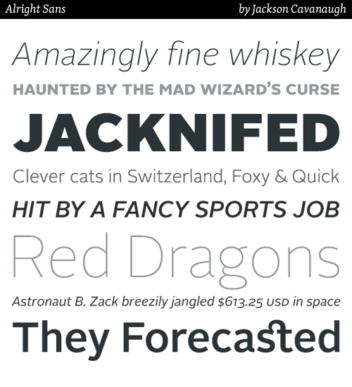
Jackson Cavanaugh
| |
Des Moines, IA-based designer of Des Deco (2014). [Google] [More] ⦿ | |
James Hamelton Jr (Keokuk, IA, b. 1988) created the hand-printed typefaces Fombre (2013), Jaymse (2013), Prelude (2013), Clara Lee Cursive (2013), HM Hamelton Hand (2013) and HM Keokuk (2013). Dafont link. [Google] [More] ⦿ | |
As a student at Iowa State University in Ames, IA, Jean Colangelo designed the handcrafted typeface Fiddlesticks (2015). [Google] [More] ⦿ | |
Student of Graphic & Web Design at DMACC (Des Moines Area Community College). FontStructor who made Heavy and Lava Lamp in 2011. [Google] [More] ⦿ | |
Mug shot. Klingspor link. Brief bio. MyFonts page. FontShop link. John Downer, a master water polo player (2006). Bitstream bio. Showcase of John Downer's typefaces at MyFonts. [Google] [MyFonts] [More] ⦿ | |
John Schappler (1921-2017) graduated from the University of Iowa (1959), John had been a student of Father Edward Catich at St. Ambrose College, in Iowa, and had also worked with Ray Da Boll and R. Hunter Middleton. He worked from 1959-1965 at IBM on type design for typewriters in the era of IBM's Selectric typewriters. He was the designer of the typefaces IBM Script, Adjutant, and Delegate. From 1967 until 1971 he was director of type design at Ludlow Typograph Co. He was manager of typeface design at the Chicago office of Compugraphic (1971-1973) and director of typography at Sun Chemical (1973-1976) and type and art director at Itek Composition Systems (1979-1984). He retired in Nashua, NH. John carved the tombstone of Victor Hammer, who had been his friend and mentor. He designed these typefaces at Itek: Paul Mark (1977), Rita Script (1978). [Google] [More] ⦿ | |
Student of Graphic & Web Design at DMACC (Des Moines Area Community College). FontStructor who made Punctis (2012, dot matrix face). [Google] [More] ⦿ | |
Judith Sutcliffe
| |
Judy Long (Des Moines, IA) designed X-Ray Typeface in 2013. [Google] [More] ⦿ | |
Storm Lake, IA-based student designer of the lava lamp typeface Beautifully Tragic (2014). Behance link. [Google] [More] ⦿ | |
Student of Graphic & Web Design at DMACC (Des Moines Area Community College). FontStructor who made Emma Witchson (2012, alchemic typeface). [Google] [More] ⦿ | |
Student of Graphic & Web Design at DMACC (Des Moines Area Community College). FontStructor who made Old Stencil (2012, thin stencil face). [Google] [More] ⦿ | |
Professor in the School of Journalism and Mass Communication and Director of the Typography Laboratory at the University of Iowa, b, 1947, d. Iowa City, 2008. At ATypI 2003 in Vancouver, she spoke about this fascinating topic: "Both experts on letterforms, Geofroy Tory and Simon de Colines often worked together in the 1520s and 30s, skillfully developing the French Renaissance style. As a punchcutter and printer, Colines worked behind the scenes at the university in Paris, while Tory left the university to write Champ Fleury, a treatise on letterforms, and later assumed the role of King.s printer. This presentation examines the many points of connection between the two men and explores the typographical interplay achieved by their collaboration." She was the first mentor of John Downer, and John's obituary mentions this: Our times in Iowa City were fabulous, as well. We enjoyed visits paid by our mutual friends John Dreyfus, Sebastian Carter, Robert Bringhurst, and other notable writers and typographers whom Kay was able to invite on behalf of the UI. Last year, Kay accepted Professor Emeritus distinction. As a scholar of type and printing, Kay spent summers in research libraries and rare book collections. Her primary interest was The Golden Age of French Printing, and Paris was like a second home to Kay. Her particular focus within that one aspect of 16th-century French typography was on the work of Simon de Colines. She was widely regarded as the world's foremost authority on Colines. Her contributions to our collective knowledge of his work are substantial. The articles she wrote and the papers she presented were but a small taste of what she had in store. Her book on Colines was in progress when she died. [Google] [More] ⦿ | |
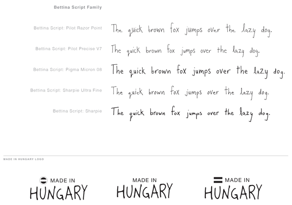
Student at the University of Northern Iowa in Cedar Falls, IA creator of the hand-printed Bettina Script (2012). [Google] [More] ⦿ | |
During her studies at Iowa State University, Kenzie Hosch created the display typeface Book Ends (2014). [Google] [More] ⦿ | |
Kevin Meinert
| |
Kris Sullens
| |
Student of Graphic & Web Design at DMACC (Des Moines Area Community College). FontStructor who made the ornamental typeface Chloey (2012). [Google] [More] ⦿ | |
Student of Graphic & Web Design at DMACC (Des Moines Area Community College). FontStructor who made Black Bunny, White Bunny (2012), Maze (2011), Thorns Font (2012). [Google] [More] ⦿ | |
Cedar Falls, IA-based graphic designer who made Stick Letter Font (2010). [Google] [More] ⦿ | |
Des Moines, IA-based designer of the ornamental alphabet Octopus (2017). [Google] [More] ⦿ | |
Graphic Design student at Iowa State University who lives in Davenport, IA. Creator of the 3d trompe-l'oeuil typeface Paradox (2011). [Google] [More] ⦿ | |
Student of Graphic & Web Design at DMACC (Des Moines Area Community College). FontStructor who made Dinand (2012, a typeface with holes for screws). [Google] [More] ⦿ | |
| |
Maurice Meilleur is a recovering political theorist turned graphic designer and design researcher and writer (in his own words). He completed a PhD in political theory from Indiana University Bloomington in 2004, and earned an MFA in graphic design from the University of Illinois at Urbana-Champaign in 2015. He is an assistant professor of graphic design at Iowa State University in Ames, Iowa, where he teaches and studies typography and design semiotics and methods. Earlier, he was assistant professor of graphic design in the Department of Art at Appalachian State University in Boone, North Carolina. Maurice is writing a book on the principles and history of modular scripts. His experimental modular typeface Kast was a jury finalist in the Society of Typographic Aficionados' 2016 ProtoType competition. He has developed Kast into paper, photographic, print, and digital artifacts, and begun to explore digital animation using Python and Drawbot as part of a larger investigation into typographic representation and parametric/algorithmic/generative formal systems. At ATypI 2018 in Antwerp, he spoke on modular scripts and generative design. [Google] [More] ⦿ | |
Iowan designer who created the phototype fonts Jamon Book and Old Hamcherry (1966). FontsInUse link. [Google] [More] ⦿ | |
Student of Graphic & Web Design at DMACC (Des Moines Area Community College). FontStructor who made Julie (2012, dot matrix face), Boing Boing (2012), and Out of Nowhere (2012). [Google] [More] ⦿ | |
| |
Miley Cyrus
| |
Student at DMACC in Des Moines, IA, in 2013, who designed the alchemic typeface The Sharpness (2013, FontStruct). [Google] [More] ⦿ | |
Student of Graphic & Web Design at DMACC (Des Moines Area Community College). FontStructor who made Block Spike (2012). [Google] [More] ⦿ | |
Ames, IA-based designer of a curly upright script font in 2016. Behance link. [Google] [More] ⦿ | |
Tipton, IA-based designer of the squarish modular typeface Scharnier (2015). [Google] [More] ⦿ | |
Student of Graphic & Web Design at DMACC (Des Moines Area Community College). FontStructor who made Top Heavy Dots (2012, texture face). [Google] [More] ⦿ | |
Okay Type
|
Jackson designed Alright Sans (2009, clean sans) and Alright Display (voguish hairline sans). In 2012, he created The Harriet Series (with Harriet Text and Harriet Display subfamilies), a full Sotch Roman / Baskerville / didone family that won an award at TDC 2012. In 2016, he was asked by Mac Lewis, artistic director at Playboy, to design a new headline typeface for the magazine. Cavanaugh designed a heavy slab serif for the occasion. In 2019, he released the ultra-black typeface family Okay. [Google] [MyFonts] [More] ⦿ |
Student of Graphic & Web Design at DMACC (Des Moines Area Community College). FontStructor who made The Hounds (2012, dot matrix face) and Rectangle Squares (2012, pixel face). [Google] [More] ⦿ | |
Des Moines, IA-based designer of a typographic map of Chicago in 2015. Behance link. [Google] [More] ⦿ | |
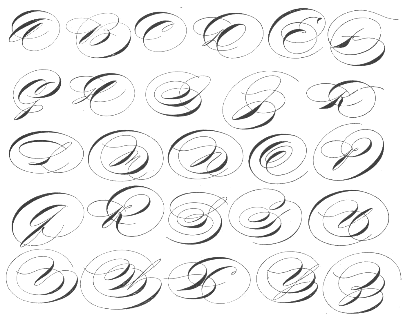
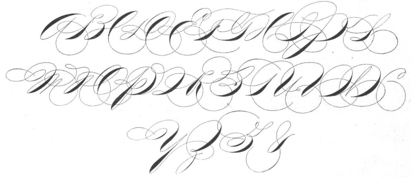
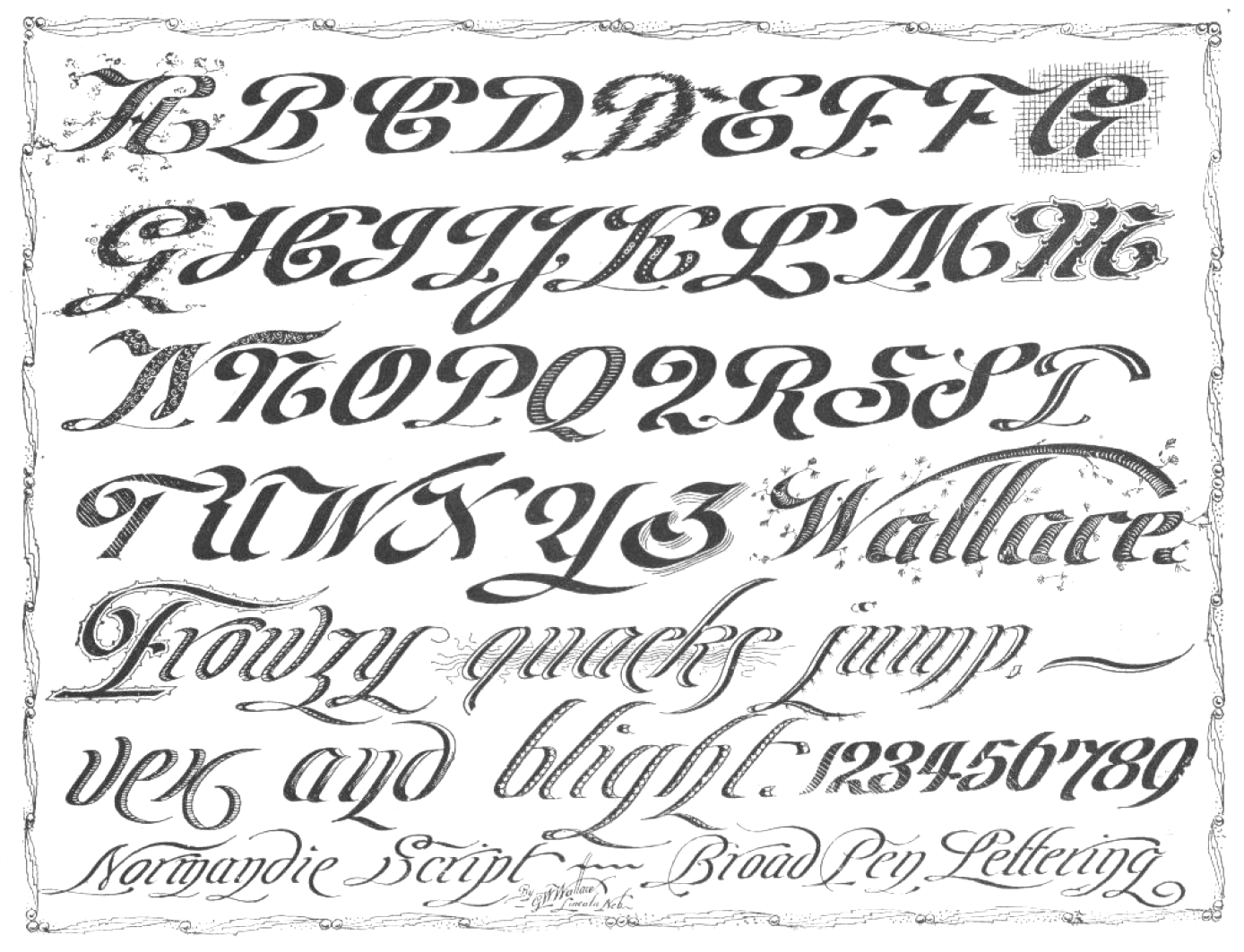
Portfolio of Ornate Penmanship
|
|
Student of Graphic & Web Design at DMACC (Des Moines Area Community College). FontStructor who made Stress to Impress (2012), Live Evil (2012) and Chain Gang (2012). Aka luv2disc. [Google] [More] ⦿ | |
Abstract Fonts link. Klingspor link. Dafont link. Fontspace link. [Google] [More] ⦿ | |
Student of Graphic & Web Design at DMACC (Des Moines Area Community College). FontStructor who made Hole Punched (2012). [Google] [More] ⦿ | |
During his studies, Lamoni, IA-based Samuel Hinkhouse designed the rounded monoline sans typeface Azuline (2016). [Google] [More] ⦿ | |
During his studies at DMACC in Des Moines, IA, Seth Gagle designed the straight-edged typeface Thor's Mark (2013, FontStruct). [Google] [More] ⦿ | |
Graphic designer and illustrator in Bettendorf, IA, who created the vintage decorative steamboat style typeface Shutter in 2016. [Google] [More] ⦿ | |
Student of Graphic & Web Design at DMACC (Des Moines Area Community College). FontStructor whose fonts include Sharp (2011, vertically striped face). [Google] [More] ⦿ | |
Port Charlotte, FL-based company owned by the infamous Paul Eric King (pastor of Harborview Christian Church in the same city, b. Stormlaks, IA, 1954), who has reengineered most of Monotype's and Adobe's fonts in the 1990s. For example, their Just My Type CD ($29.95) had 3360 fonts. It was not a foundry, but copied fonts. The Key Fonts Pro 3003 for Macintosh has the same old rip-off fonts found on the older 1555 Key Fonts Pro CD, plus a few new fonts ripped off from new victims. Incredibly, the Postscript versions came without AFM files and were thus useless. Apparently, the kerning present in the TrueType versions or the IBM PostScript versions is the pits, so the whole set is worthless, and proves that King, who is being sued by Adobe, knows nothing about fonts and does not care about quality. Paul King ignored my email regarding the kerning/AFM matter. The kerning pairs on the 1555 Key Fonts Pro CD in contrast were much better. Also, all his fonts can be extracted from the PDF files if you convert these files to PS. Paul King was condemned in court in February 1998 for violation of copyright. King's legal troubles continued on another front: he was arrested on July 2, 2001, for allegedly paddling a child so hard he left bruises. In all, he faced eight accusations of alleged child abuse. The trial started in August 2002. He was convicted in November 2002 and was sentenced on December 30, 2002. Relevant web sites: crime record, Sun Herald (select "Search News Archives", respond "YES" that you are a subscriber, enter "Paul King" for the search keywords (don't use quotes), click Begin Search), Herald Tribune (select Archives (in the left column under Services), enter keywords "paul king" (you must use quotation marks)), NBC, ABC, Booking document (click on Case Number, enter "01000534F", click on Documents). On December 31, 2002, Paul King was sentenced to three months of jail term (see also here). | |
Ames, IA-based designer of the modular typeface Modual (2011). [Google] [More] ⦿ | |
Subatomic
| Kevin Meinert (Subatomic) is/was a student at Iowa State who made the SubatomicScreen screen font family (2001). He also created Subatomic Tsoonami (2004, based on 2004 Toonami font used on Cartoon Network) and Subatomic Screen Condensed (2001). Home page. Dafont link. Fontsy link. [Google] [More] ⦿ |
Student of Graphic & Web Design at DMACC (Des Moines Area Community College). FontStructor who made Phato (2012, octagonal face). [Google] [More] ⦿ | |
During his MFA graphic design graduate studies at University of Illinois at Urbana-Champaign, Taekyeom Lee created the Hangul simulation typeface Hangul (2010), the modular typeface Wire (2012), the pure op-art typeface Dizzy (2011), and the 3d Latin typeface Land (2013). His latest research explores unconventional methods of creating three-dimensional type with materials and techniques unique to type design, such as ceramics and 3D printing. He is currently an Assistant Professor of Graphic Design at Iowa State University in Ames, Iowa. Before that, he was an Assistant professor of Graphic Design at Appalachian State University in Boone, NC. Home page. Speaker at ATypI 2018 in Antwerp. [Google] [More] ⦿ | |
Dubuque, IA-based designer of these commercial typefaces, mostly for sports: League, Drift, Veneno, Beta, Combine Sport. [Google] [More] ⦿ | |
ThefType
| Two shareware fonts, Fringe and El Wonko, designed by Colin Wales from Muscatine, IA. [Google] [More] ⦿ |
During her studies at Iowa State University in Ames, IA, Tia Nieland designed the futuristic typeface Satellite (2017) with FontStruct. [Google] [More] ⦿ | |
Dubuque, IA-based designer (b. 1991) of the free origami font Slashfold (2015). Behance link. Dafont link. [Google] [More] ⦿ | |
Tre Bomb Nation
| From Cedar Rapids, IA, Kris Sullens' graffiti fonts: West Side Plain, East Side Motel, 187. Abstract Fonts link. [Google] [More] ⦿ |
Student of Graphic & Web Design at DMACC (Des Moines Area Community College). FontStructor who made Black Barb (2012). [Google] [More] ⦿ | |
Student of Graphic & Web Design at DMACC (Des Moines Area Community College). FontStructor whose fonts include Biscuit (2011). [Google] [More] ⦿ | |
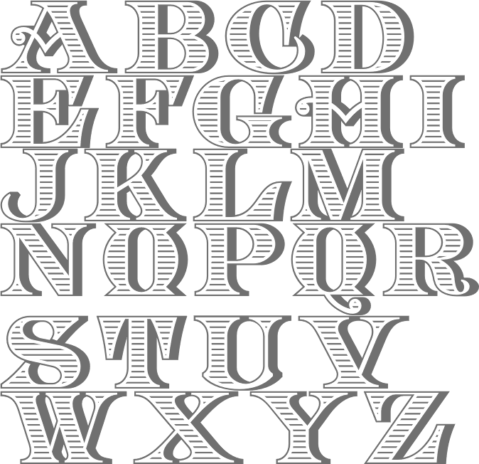
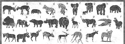
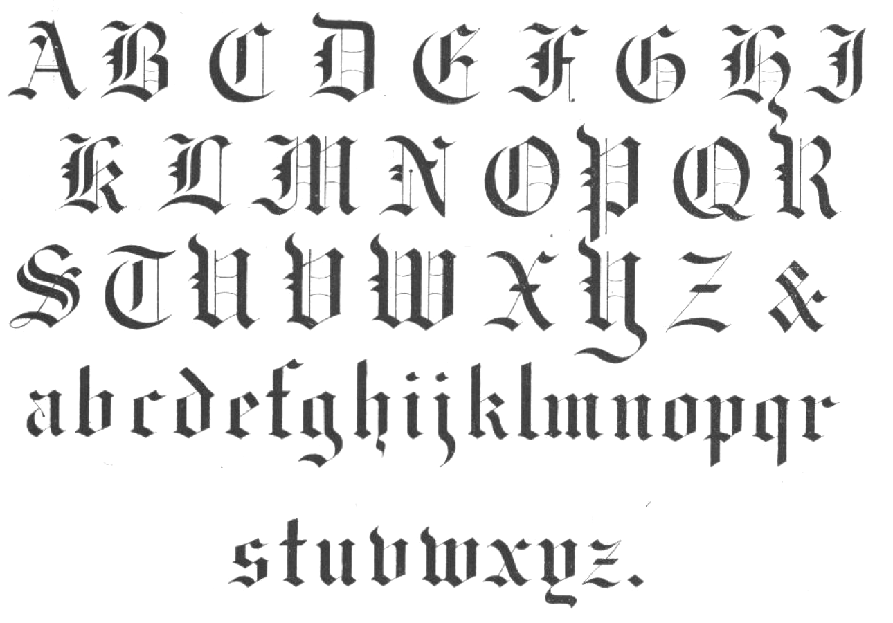
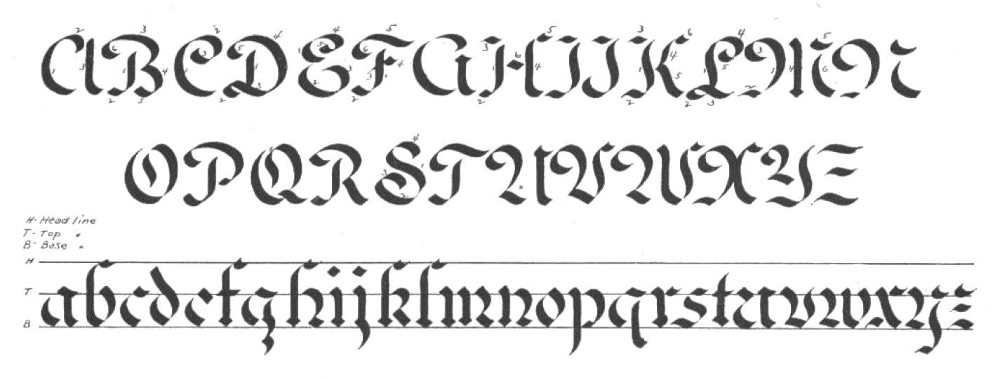
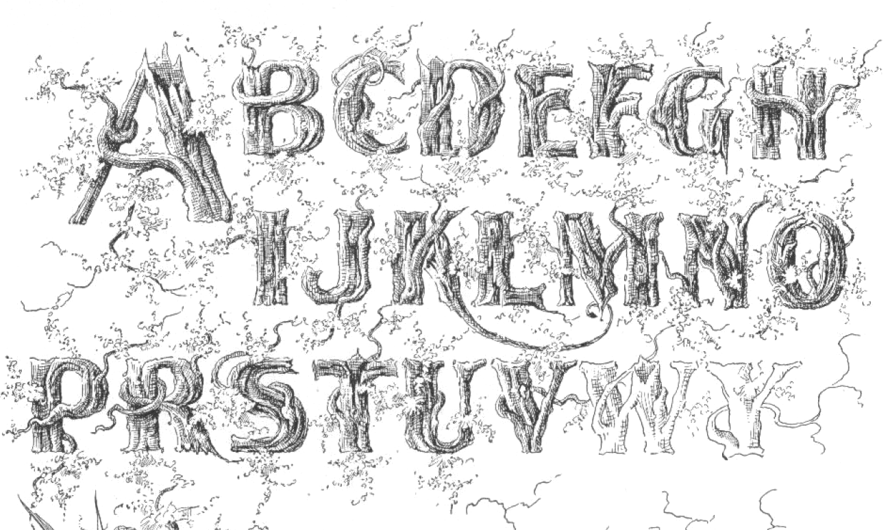
Victorian era painter in Vinton, IA. Author of Grinnell's Hand Book of Painting (1894), which shows some alphabets for sign painters. Local download. [Google] [More] ⦿ | |
Des Moines, IA-based artist. Alternate URL. Creator of the Mayan symbology fonts MaianNeptune (2007), MaianQuiet (2007), MaianTempest (2007). [Google] [More] ⦿ | |
Student of Graphic & Web Design at DMACC (Des Moines Area Community College). FontStructor whose fonts include Anett (2010). [Google] [More] ⦿ | |
Or Walt Stewart. Senior Software Engineer at Esterline Technologies Corporation in the Dubuque, Iowa area. Designer of the grungy Convincing Pirate (2017), the eerie Mortified (2017), the rounded sans typeface Semi Casual (2017) and the textured typeface Haunting Spirits (2017). In 2018, he designed Dear Old Dad and Mortified Drip. In 2019, he added Cookbook Title. [Google] [More] ⦿ | |
Designer in Iowa City, IA, who created a pictorial alphabet in 2014. Behance link. [Google] [More] ⦿ |

 Chicago-based foundry, which grew out of The Great Western Type Foundry in 1868 when the Barnhart brothers (newspaper publishers in Iowa who came to Chicago as advertising agents) bought out the Toepfer family in 1868. They retained Herman Spindler as the foreman, since he was the only typefounder in the group. Aggressive in business, BB&S became the largest foundry in Chicago.
  Iowa-based typographer and graphic design who was born in California. He created
  Student of Graphic & Web Design at DMACC (Des Moines Area Community College). FontStructor who made the good-looking display typeface
  Cedar Rapids, IA-based designer of the art nouveau typeface Alphonse (2015), which is named after Czech art nouveau artist Alphonse Mucha. [
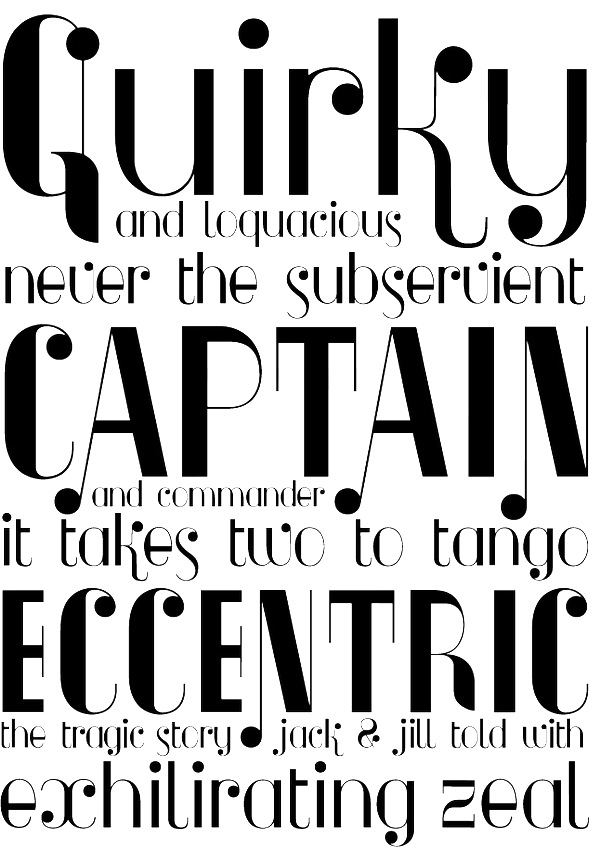
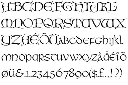
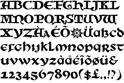
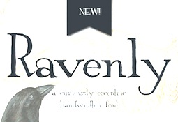 Catherine Haugland (Eclectic Anthology, Iowa) created the vintage handcrafted typeface Ravenly in 2015---to be used for mystery novels and ghostbuster movies. In 2016, she published the curly script typeface Georgette and Harlequity.
  Student of Graphic & Web Design at DMACC (Des Moines Area Community College). FontStructor whose fonts include
  Ames, IA-based designer of the art deco typeface Interval (2015).
  Original fonts by Ben Balvanz from Cedar Rapids, Iowa (b. Cedar Rapids, 1975), who now lives in South California. His
  Angela Lane from Dallas, Iowa, sells some of her own creations at about 5USD a font at her outfit, Windwalker64. Other fonts are freeware or shareware, but all fonts are nice! Dingbats include WWNativeDream, WWNativeSpirit, WWFeathers, WWAnimalPrints, WWBearySpecial, WWFurryFriends, WWKuteKats, WWSafari, WWDesigns, WWFloralCorner, WWFloralGreetings, WWFreebie, WWBorderBat, WWBullets, WWDaffyDelight, WWBeauty, WWFloralTime, WWFancyHats, WWDelightful, WWGingerbread, WWButtonTime, WWFairyFantasy,
  Student of Graphic & Web Design at DMACC (Des Moines Area Community College). FontStructor who made
  [
[ Celebrated American sign painter and type designer (b. Tacoma, WA, 1951), who lives in Iowa City, IA. Downer earned a BA degree in Fine Art from Washington State University, and both an MA degree and an MFA degree in painting from the University of Iowa. John Downer has been a journeyman sign painter since 1973, and a type designer since 1983. He is known as a type critic and type historian. He teaches hand lettering and lectures widely at educational institutions and professional conferences. Downer's professional activities include sign painting, lettering, glass gilding, type design, typography, and logo design. His typefaces:
  Student of Graphic & Web Design at DMACC (Des Moines Area Community College). FontStructor who made
  Student of Graphic & Web Design at DMACC (Des Moines Area Community College). FontStructor who made a few nice typefaces in 2012. These include
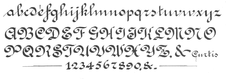
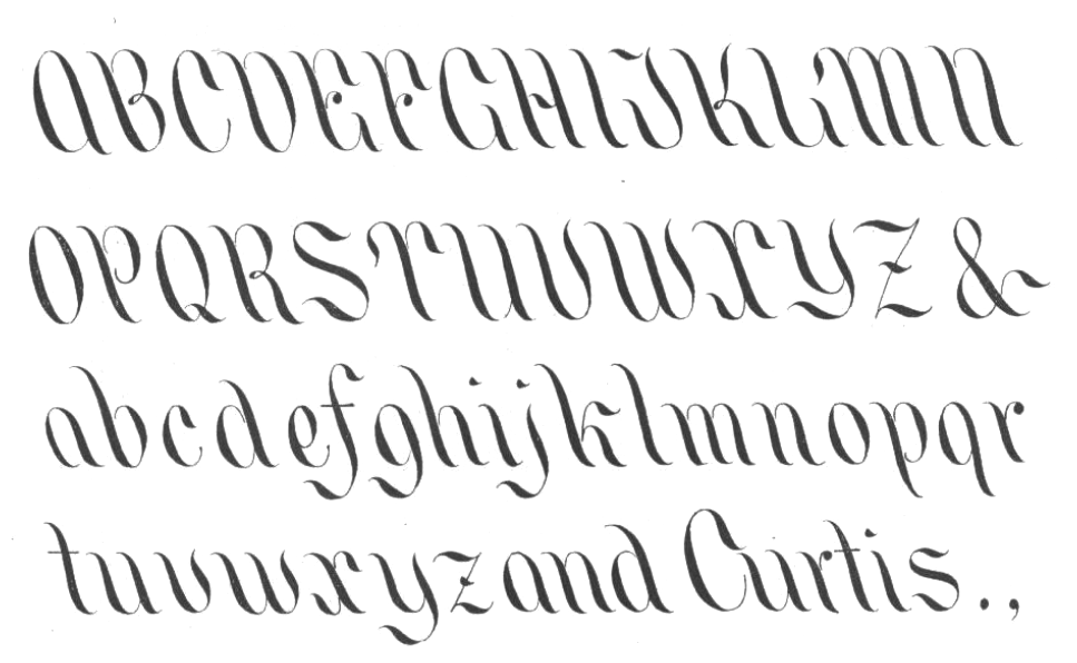
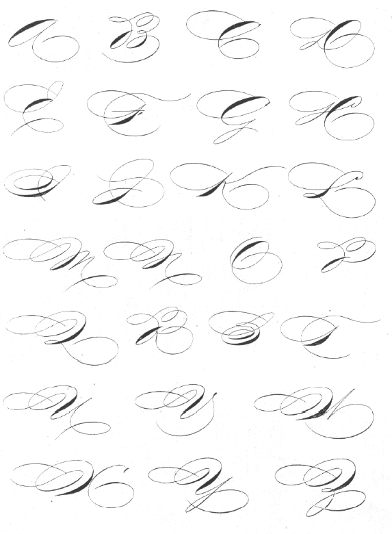
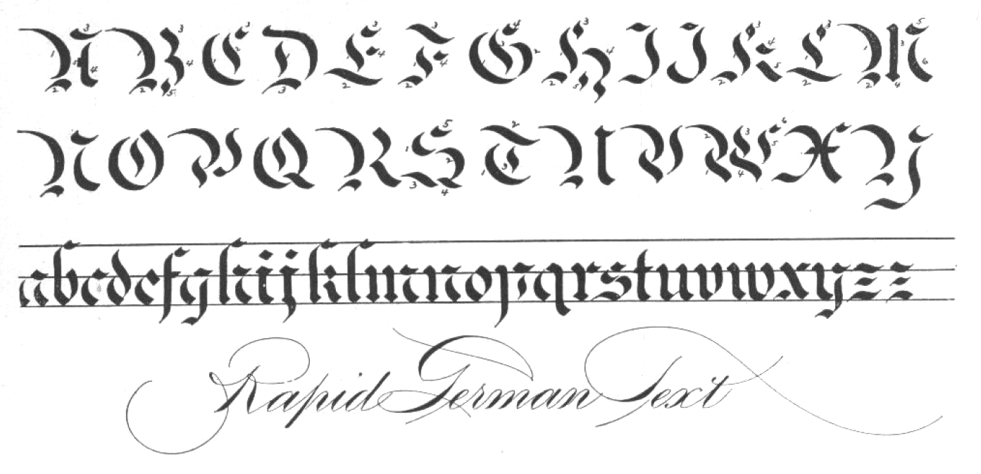
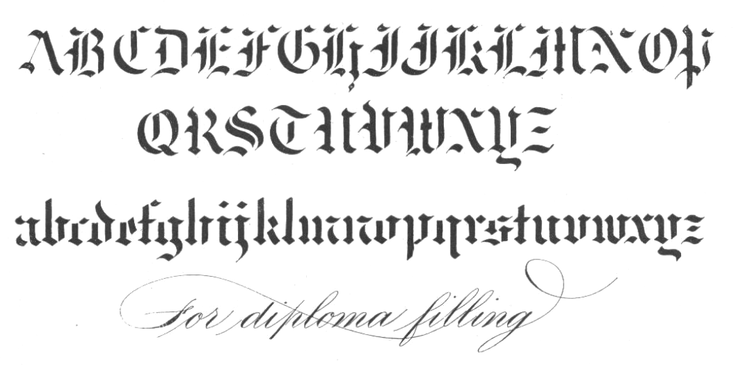
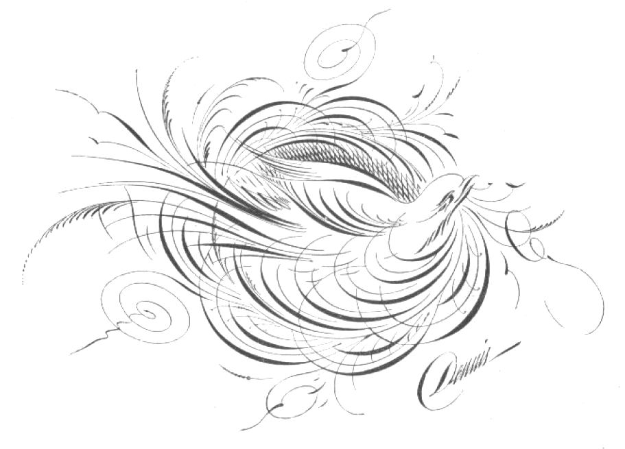
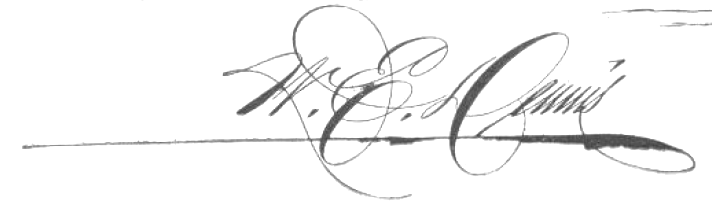
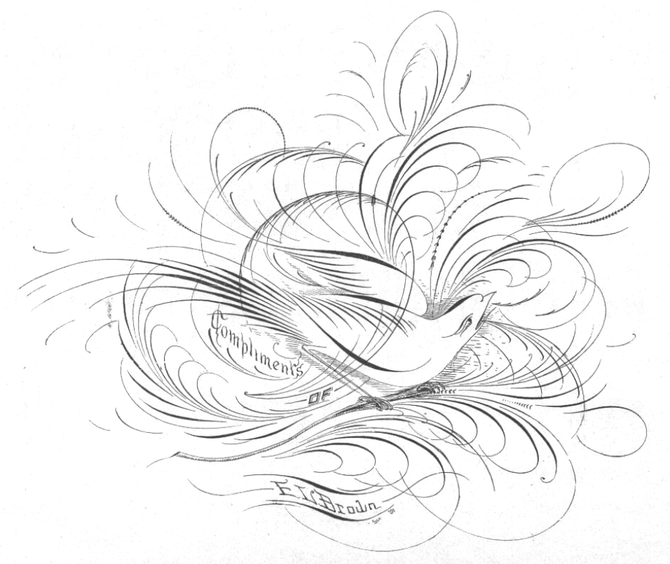
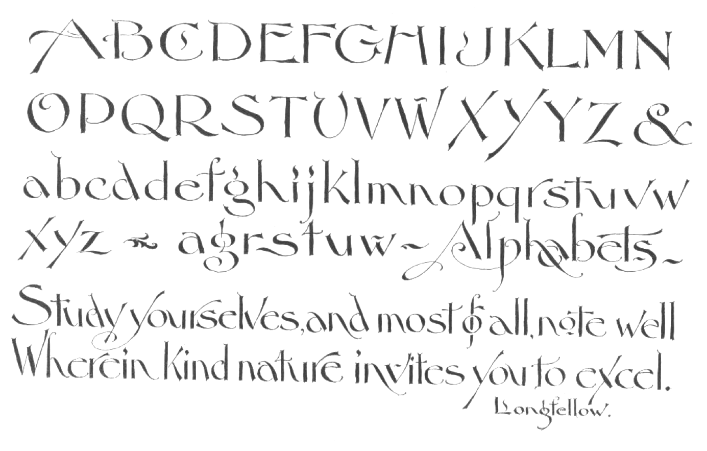
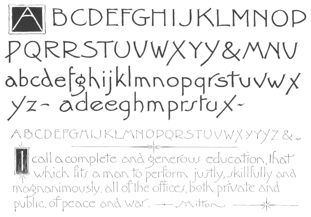
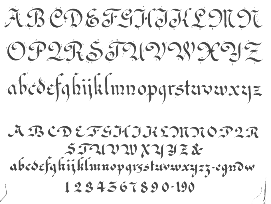
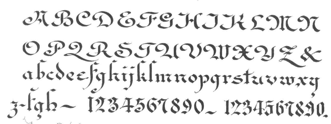
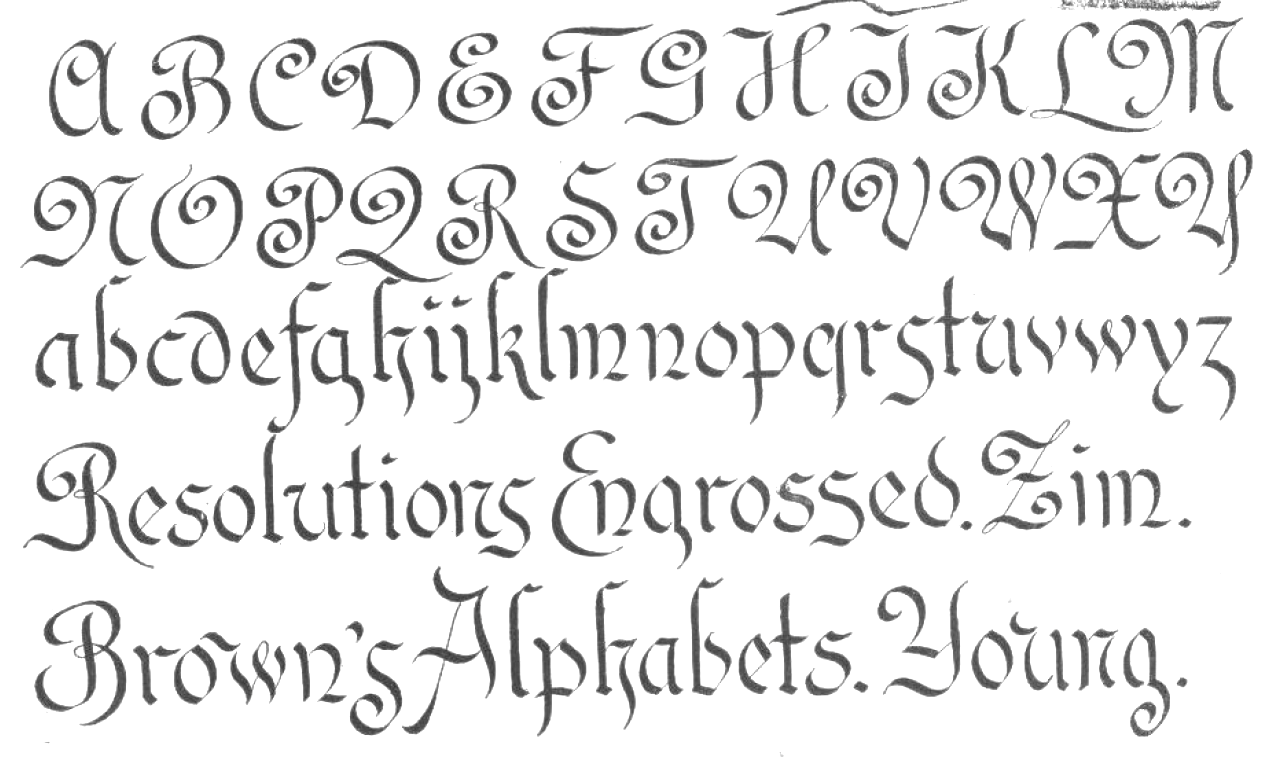
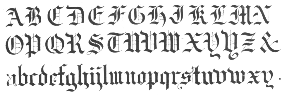
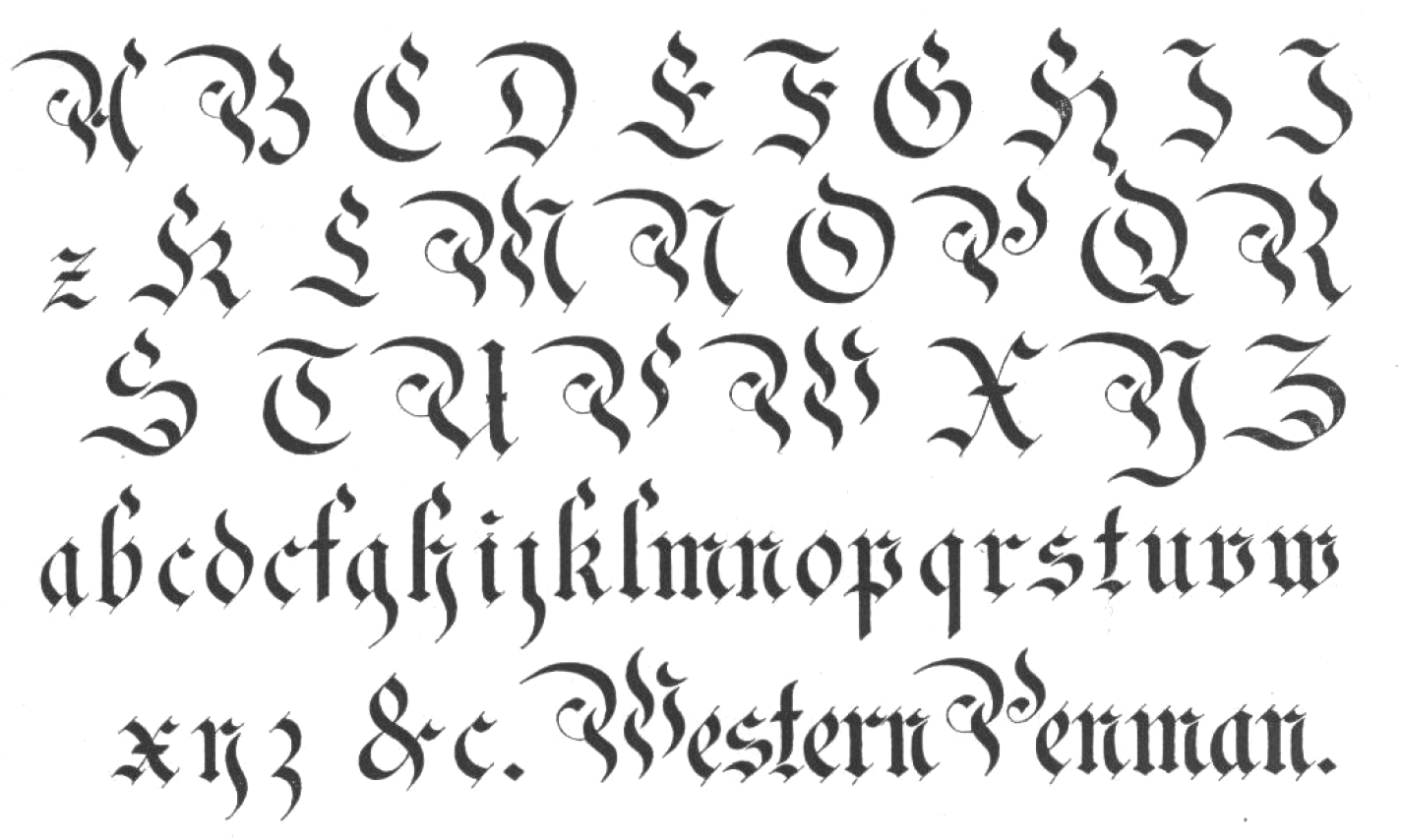
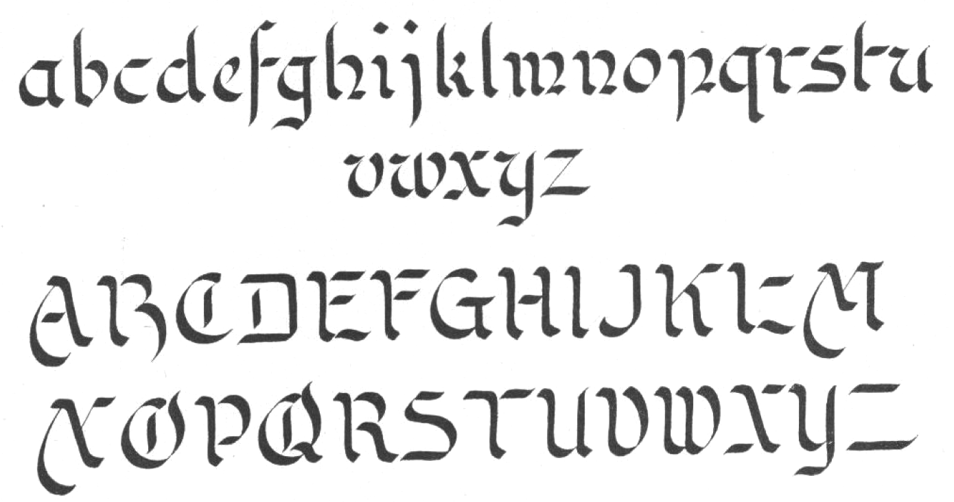
 Penmanship book by the Austin N. Palmer Company in Cedar Rapids, IA, probably published in 1896, and edited by Austin N. Palmer. It contains numerous hand-drawn alphabets. Contributors include F.A. Curtis of Hartford, CT (
 Designer from Elkader, IA (or is he from Garnavillo, IA?), b. 1956. No web page, but the fonts, mostly made in the early 1990s, were collected by CybaPee at TypOasis for your downloading pleasure. His typefaces:
|
|
|
|