TYPE DESIGN INFORMATION PAGE last updated on Mon Mar 9 16:08:24 EDT 2026
FONT RECOGNITION VIA FONT MOOSE

|
|
|
|
|
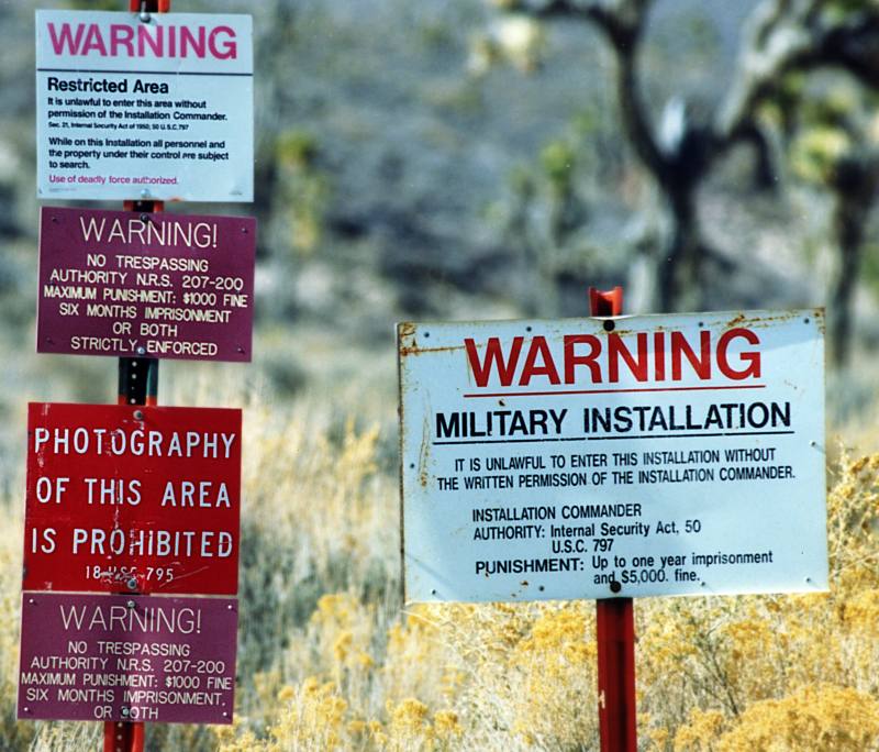
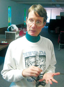
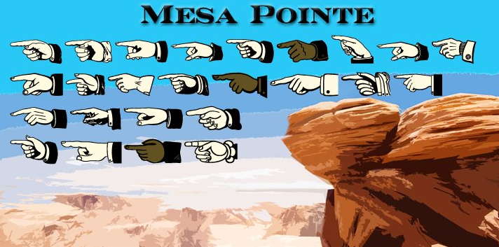
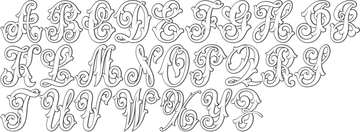
Type scene in Nevada | ||
|
|
|
|
SWITCH TO INDEX FILE
Graphic designer in Las Vegas, NV, who created an untitled display typeface in 2013. [Google] [More] ⦿ | |
Las Vegas, NV-based designer of the scribbly Wired Font (2016). [Google] [More] ⦿ | |
Designer from Reno, NV, who was a student at MCAD in Minneapolis. Creator of the free font Tortuga (2008, Chank Store) and the commercial ink splatter typeface Collateral Damage (1999, with Chris Hunt and Chank Diesel). [Google] [MyFonts] [More] ⦿ | |
Annie Opitz Olsen, a graduate of the University of Nevada, Reno, was previously a Reno printer and calligraphy teacher. She works for Wycliffe Bible Translators and has given type design training workshops in Bangalore and Mexico City. Creator (with Victor Gaultney) at SIL International (Dallas, TX) of the Open Font License package of sans serif fonts called Andika Design Review (2006, weights called A through G). Andika means "to write" in Swahili. Annie writes: Andika is a sans serif, Unicode-compliant font designed especially for literacy use, taking into account the needs of beginning readers. The focus is on clear, easy-to-perceive letterforms that will not be easily confused with one another. Andika was develioped between 2004 and 2015. It contains about 600 glyphs. The early fonts were called Andika DesRev A and Andika DesRev B. The current fonts, Andika, Andika Basic (2008) and Andika New Basic (2015) are here. See also Fontsquirrel and Google Fonts. In 2020, the design of Andika New Basic is attributed to Victor Gaultney, Annie Olsen, Pablo Ugerman in one place and Victor Gaultney, Annie Olsen, Julie Remington, Don Collingsworth and Eric Hays in another. Codesigner of various other typefaces at SIL, including Gentium Plus (2014; with J. Victor Gaultney, Iska Routamaa and Becca Hirsbrunner). Speaker at ATypI 2009 in Mexico City, where she updated the type world on the newest features of Andika, which is constantly being expanded. Interview. Google Font Directory link. [Google] [More] ⦿ | |
Las Vegas, NV-based designer of Duct Tape (2017), an alphabet entirely made with duct tape. Behance link. [Google] [More] ⦿ | |
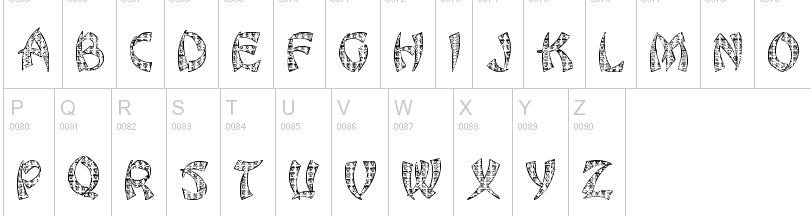
As a student in Las Vegas, NV, who created the handcrafted typeface Chaos (2016). [Google] [More] ⦿ | |
Arlo
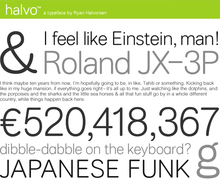
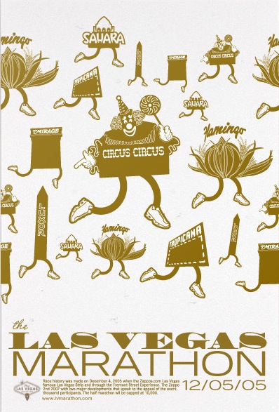
| Ryan Halvorsen (Arlo) created the sans family Halvo (TypeTrust). His graphic design work includes the poster for the Las Vegas Marathon in 2005. Arlo is a graphic design firm based in Chicago. We look for design solutions that are memorable, timeless, and communicate with high-speed efficiency. Maximum heart; minimal fluff we like to say. While small in size, we design for big names; Nike, American Eagle Outfitters,&Effen Vodka just to name a few. The firm was established in 2004 by Ryan Halvorsen and Patrick Filler. Ryan Halvorsen cut his graphic design teeth in Rome, Italy, and returned to Chicago to work at Segura, Inc. Silas Dilworth also works at Arlo. [Google] [More] ⦿ |
Astigmatic One Eye
|
Fontsquirrel link. Dafont link. Fontspace link. A partial list of the AOE fonts made in 2011: Engagement (2011, a free brush script at Google Web Fonts), Fascinate (2011, an art deco typeface at Google Web Fonts; +Inline), Original Surfer (2011, a free Google Web Font inspired by a vintage advertisement for the "California Cliffs Caravan Park"), Smokum (2011, a Western / Italian face), Yellowtail (2011, signage face), Redressed (2011), Special Elite (2010, a free old typewriter face), Aclonica (2011). Typefaces from 2008 or before: Horseplay AOE (2008, Western style), Cake and Sodomy AOE (2008), Good Eatin AOE (2008), Paradiso AOE (2008, inspired by logotype of the Paris Resort and Casino in Las Vegas), Montelago AOE (2007, a script inspired by the logotype of the Mirage Resort and Casino in Las Vegas), Jack Chain AOE (2007), Henhouse (2007), Schnitzle (2007), Luxurian AOE (2007, inspired by the logo of the Luxor Hotel&Casino in Las Vegas), Digital Disco AOE (2007), Mighty Tuxedo AOE (2007), Makeshift AOE (2007), Clarity AOE (2007, slab serif headline; + grungy version), Red Pigtails AOE (2007), Run Tron 1983 (2002), Eyeliner AOE (2006, Tekton-like), Mother Hen (2007), Gloversville (2007, comic book style), Mighty Tuxedo AOE (2007, condensed sans), Quick Handle AOE (2007), Surfing Bird (2007), Hydrogen (2004), Hardliner (2004, fifties diner style), Big Ruckus (2004), SS Antique No. 5 (2004), Europa Twin (2003), EuroMachina (2003, techno), Lord Rat (2003: papercut sans), Love Anxiety (2003), BuzzSaw (2003), Skullbearer (2003, skull dingbats), Beatnick Blue (2002), Geisha Boy (2002), Mardi Party (2002), Midcrime (2002), Ocovilla (2002), Ruthless (2002), Saltie Doggie (2002), Whiskers (2002), Royal Gothic, Family, Eggit, Jericho, Wild Monkeys (2002), 5FingeredGothSW, AlienArgonautAOE, AlphaMackAOE, AmphibiPrint, AngiomaAOE, AntiChristSuperstar, AntiChristSuperstarSW, AstigmaSolid, BigLimboAOE, BigLimbodOutAOE, BoneRollAOE, BoneRollAOEBold, BoundAOE, BrailleAOE, BulletBallsAOE, ButterflyChromosome, ButterflyChromosomeAOE, ButtonButton, ButtonButtonAOE, CType, CTypeAOE, CelticLionAOE-Bold, CelticLionAOE-BoldItalic, CelticLionAOE-Italic, CelticLionAOE, CharailleAOE, ChickenScratch, ChickenScratchAOE, ClunkerAOE, ClunkerAOE-Bold, CropBats, CropBatsAOE, CropBatsIIAOE, DarkNightAOE, DeadGrit, DeliveryMatrixAOE, DetourAOE, DigitalDiscoAOE, DigitalDiscoAOEOblique, DingleBerries, DoggyPrintAOE, DraxLumaAOE, DungeonKeeperII, DungeonKeeperIIBold, DungeonKeeperIIItalic, EggItAOE, EggitAOE-Italic, EggitOutlineAOE, ElectricHermes, ElectricHermesAOE, ElectricHermesAOECharge, FearAOE, FilthAOE, FishyPrintAOEOne, FishyPrintOneAOE, FishyPrintTwoAOE, FutharkAOE, FutharkAOEInline, FutharkAOEInline, GateKeeperAOE, Ghoulish Fright AOE (2006), GlagoliticAOE (1999, grungy glagolitic), GorgonCocoonAOE, Gotik, GreyAlienSW, HAL9000AOE, HAL9000AOEBold, HAL9000AOEBoldItalic, HAL9000AOEItalic, HandageAOE, HandageAOEBold, HauntAOE, HybridLCDAOE, IDSupernovaSW, IslanderAOE, JokerWildAOE, KillMeCraig, KillMeCraigAOE, Kinderfeld, KittyPrint, KittyPrintAOE, Kornucopia, KornucopiaAOE, LinusFace, LinusFaceAOE, LinusPlayAOE, LinusPlaySW, Lochen, LovesickAOE, Manson, MasterPlan, Mervale Script Pro (2012: a brushy script based on the 1940's Fawcett Publications Mary Marvel comic), Microbe, MooCowSW, MotherlodeLoadedAOE-Italic, MotherlodeLoadedAOE, MotherlodeStrippedAOE-Italic, MotherlodeStrippedAOE, MysterioSWTrial, NightmareAOE, OrnaMental, Pantera, PapaManoAOE, PenicillinAOE (described as a bacterial stencil typeface), PixelGantryAOE, PixelGantryAOEBold, PixelGantryAOEBoldItalic, PixelGantryAOEHeavy, PixelGantryAOEHeavyItalic, PixelGantryAOEItalic, PixelGantryHiliteAOE, PixelGantryHiliteAOEItalic, PoppyAOE, PoseidonAOE, Prick, QuiltedAOE, QuiltedAOEBlack, QuiltedTrial, RippleCrumb, RippleCrumbUltraCon, ROCKY, ROCKYAOE, RustedMachineSW, SSExpAntiqueAOE, Schizm, Schrill, SchrillAOE, SchrillAOEOblique, Scrawn, ScrawnAOE, ScrawnCyrAOE, ScrawnKOI8AOE, ScrewedAOE, ScrewedAOEOblique, ScrewedSW, SeaweedFireAOE, SenthAOE, ShampooSW, ShottyTransferTrial, SkinnerAOE, SlurCrumb, SpatCrumb, SpikeCrumbGeiger, SpikeCrumbSwizzle, SpikeCrumbSwollen, SteelcapRubbingTrial, StruckSW, StrutterAOE, SunspotsAOE, SurferComicTrial, TRANSHUMANALPHABET10, TRANSHUMANKATAKANA20, TannarinAOE, TannarinAOEOblique, TibetanBeefgardenAOE, TibetanBeefgardenAOE, TouristTrapAOE, TransponderAOE, TransponderGridAOE, UglyStickAOE, VanguardIIIAOE-Bold, VanguardIIIAOE-BoldOblique, VanguardIIIAOE-Oblique, VanguardIIIAOE, Ventilate, VentilateAOE, Y2KPopMuzikAOE, Y2KPopMuzikOutlineAOE, YoungItchAOE, ZeichensSW, ZenoPotionAOE, Zombie, BeatnikBlueAOE, BeatnikBlueFillAOE, GeishaBoyAOE, MardiPartyAOE, MindCrimeAOE, OcovillaAOE, PolynesianTouristAOE, RuthlessAOE, SaltyDoggieAOE, SpruceAOE, WhiskersAOE-Oblique, WhiskersAOE, WhiskersAltCapsAOE-Oblique, WhiskersAltCapsAOE (2002), Habitual, Automatic (techno), Bitrux, Filth (an eerie brush script), Cake&Sodomy, Gulag, Bad Comp, Detour, Alien Argonaut, Dark Night, GateKeeper (Halloween font), Gargamel Smurf, Invocation, Neuntotter, Geisha Boy, Saratoga Slim, Gobe, Stingwire, Lavatype, Tapehead, Islander, Clunker, Digelectric, Gargamel, Krulo-Tag, Krelesanta, SurferComic, Bound, Culture Vulture, Intruder, Cavalier, Anoxia, Synchrounous (IBM logo style lettering), Luna, Data Error, Lunokhod, Jericho. There are many techno and gothic fonts. Kill Me Craig is the first 26 death scene dingbat font (scenes by Craig Dowsett). KittyPrint takes the LinusFace font concept to more realistic cat head dingbats. Krelesanta (not free) is a funky font inspired by the band Kreamy Electric Santa. The free ButtonButton is useful for making buttons. Lovesick AOE is a scrawly, lovelorn typeface, i's dotted with hearts. Strutter AOE is based on the KISS logo. Senth AOR is a runic font. Charaille is one of the many dot matrix fonts. Cavalero is inspired by the logotype of the Chevy Cavalier. At Bitstream in 2001, AOE published Cavalero, Stingwire and Tannarin. And in 2002, he published the comic book font Big Limbo, Euro Machina BT and Islander there. Bio at Bitstream. In 2005, Bonislawsky and Sandler realeased 500 fonts, via Bitstream and MyFonts, under the label Breaking The Norm. In 2006, Astigmatic published their typewriter collection, which includes Military Document, Bank Statement, State Evidence Small Caps, State Evidence, Urgent telegram, Library Report, Overdrawn Account, Customs Paperwork, Incoming Fax and Office Memorandum. From the bio and various pieces of information, one is led to believe that Brian was born in Poland, and now lives in Miami, but that may be wrong. In 2010, he placed a free font at the Google Directory, Syncopate. Along the same lines, we find the derived square serif typeface Stint Ultra Condensed (2011, Google Web Fonts) and Stint Ultra Expanded (2012). In 2011, several other typefaces followed there, like Ultra (fat didone), Maiden Orange, Special Elite (2010, a free old typewriter face), Just Another Hand, Crushed, Luckiest Guy (comic book face), Aclonica, Redressed, Montezuma (a curly connected upright script), Devonshire (brush script), Fondamento (calligraphic lettering), Yellowatil (connected retro script), Righteous (free at Google Web Fonts: inspired by the all capitals letterforms from the deco posters of Hungarian artist Robert Berény for Modiano), Ribeye and Ribeye Marrow> (cartoon and/or tattoo style lettering---free at Google Web Fonts), Spicy Rice (2011, free festive display typeface at Google Web Fonts). Contributions in 2012: Marcellus (2012, Trajan, flared roman, at Google Fonts and CTAN), Eagle Lake (a free calligraphic font at Google Web Fonts), Uncial Antiqua, Jim Nightshade (2012, free at Google web fonts), Dynalight (2012, a retro script inspired by a vintage luggage tag for the Southern Pacific 4449 Daylight steam locomotive), Yesteryear (a retro script loosely based on the title screen from the 1942 film The Palm Beach Story), Parisienne (Google Web Fonts: casual connected script based on a 1960s ad for bras), Shojumaru (Google Web Fonts: an oriental simulation typeface inspired by a poster for the Marlon Brando movie Sayonara), Berkshire Swash (Google Web Fonts), Audiowide (Google Web Fonts), Romanesco (Google Web Fonts: a narrow calligraphic style), Galindo (Google Web Fonts), Oregano (Google Web Fonts: based on cartoon style lettering of calligrapher and logo designer Rand Holub. This style of hand lettering adorned many retro brochures and advertisements of the late 40's through the 1960's), Peralta (Google Web Fonts: an Egyptian comic book face), Eagle Lake (Google Web Fonts: calligraphic), McLaren (Google Web Fonts: comic book style alphabet), Freckle Face, Hanalei Fill, Hanalei [Polynesian bamboo or tiki lettering], Purple Purse, Margarine, Risque, Clicker Script [image], Stalemate [a gracious script, by Jim Lyles for AOE], Mouse Memoirs, Quintessential [Google Web Fonts: chancery hand], Bigelow Rules, Englebert [Google Web Fonts: from the title screen of the 1930's film titled Der blue Engel, starring Marlene Dietrich], Sacramento [Google Web Fonts: connected script]. Typefaces from 2013: Freckle Face (grunge), Grand Hotel, Purple Purse (Purple Purse draws its inspiration from a vintage Ivory Soap ad from the 1950's. Somewhat of a cross between Bodoni and Pixie, this font finds that it never truly takes itself seriously). Stiggy & Sands is the American type foundry of Brian Bonislawsky and Jim Lyles, est. 2013. Their first commercial typefaces, all jointly designed, are Luckiest Guy Pro (a fat comic book font based on vintage 1950s ads) and Marcellus Pro (a flared roman inscriptional typeface with both upper and lower case, originally published in 2012 by Astigmatic). Typefaces from 2014: Franken Jr AOE Pro (inspired by the title screen from the 1966 Hanna Barbera cartoon Frankenstein Jr), Good Eatin Pro AOE (inspired by the title screen from the 1942 Warner Bros. cartoon Dog Tired), Ghostkid AOE Pro (comic letter style). Typefaces from 2015: Shanks Antique 5 AOE (after the newspaper typeface Memorial (1865, Stevens, Shanks & Sons)), Reliquaire AOE (a somber blackletter typeface inspired by Memorial (1881, Boston Type Foundry)). Typefaces from 2016: Mailuna Pro AOE (a gothic sans), Kentish AOE Pro (art deco). Reardon AOE (a digitization of a film typeface called Joyce Black by LetterGraphics), Berkmire AOE (1970s style robot-inspired techno font), Blackheath Pro AOE (this typeface started as a digitization of a film typeface called Roberts Square by LetterGraphics), Delaware Pro AOE (art deco), Rutland AOE (a futuristic font that is a digitization of a film typeface called Maccaro by LetterGraphics). In 2016, Brian J. Bonislawasky and Jim Lyles published the rugged octagonal mega typeface family Tradesman at Grype. In 2017, they added the art deco typeface Cowling Sans AOE (which is based on alphabet from "Lettering for Commercial Purposes" by Wm. Hugh Gordon). In 2018, they published the letterpress emulation typeface Prison Pro, Pink Sangria (50s style movie font), Manic Tambourine, Motenacity (a Martian cartoon font), the old typewriter font Office Memorandum Pro, and the Flintstone font Strongman. Typefaces from 2021: Klutz AOE Pro (a condensed all caps beatnik font), Data Error AOE Pro (based on early dot matrix printers), Customs Paperwork AOE Pro (based on the NuMode Type No. 61 vintage typewriter), Rinzler AOE Pro (a great stencil font that revives LetterGraphics' Caren), Restraining Order AOE Pro (an old typewriter font), Brazarri AOE Pro (an Aztec emulation font based on MacKeller, Smiths and Jordan's Bizarre from 1884). View Astigmatic's typeface library. View the typefaces made by Brian Bonislawsky. Fontsquirrel link. Dafont link. Fontspace link. Creative Market link. [Google] [MyFonts] [More] ⦿ |
| |
Brian Bonislawsky
| |
Born in 1973 in Pittsburgh, PA, Brian Bonislawsky has been involved in many type design projects and created many foundries.
View the typefaces made by Brian Bonislawsky. [Google] [MyFonts] [More] ⦿ | |
Brian J. Bonislawsky
| |
Brian J. Bonislawsky
| |
Brian Johnson
| |
Partner with Dar Freeland at Cricket Graphics, Las Vegas. He created the commercial dingbat fonts Belfry Bats, CommBats, Coso, Retro Metro, SinBats, SwinginDick, ByteMe. [Google] [More] ⦿ | |
Las Vegas, Nevada-based designer (b. 1990) of a number of grunge typefaces (2004) that can be found here and here. She also made the Exocet-lookalike HIM (2004). [Google] [More] ⦿ | |
Las Vegas, NV-based designer of the floral caps typeface Flow (2017). [Google] [More] ⦿ | |
Charles Leroux
| |
Choz Cunningham
| |
Chuck Davis
| |
CrickArt Illustration Fonts
| Commercial dingbat fonts by Cricket Graphics: Belfry Bats, CommBats, Coso, Meeples One, Retro Metro, SinBats, SwinginDick, YogosOne, ByteMe. YogosOne and MeeplesOne are by Dar Freeland. The other fonts are by Brian Swanson. Both are located in Las Vegas. [Google] [More] ⦿ |
Las Vegas-based designer (b. 1977) of the free handcrafted typeface Big Boss (2015). Dafont link. [Google] [More] ⦿ | |
Graphic designer in Las Vegas. During her studies at University of Nevada, Las Vegas, she created the 3d typeface Line2 (2017). [Google] [More] ⦿ | |
Dar Freeland
| |
Design Concern
|
|
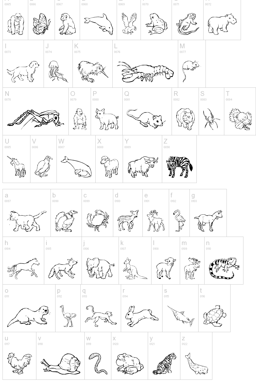
Original fonts by Henderson, NV-based "Jenna" (JLR) that are either dingbats for kids or letters with a theme: Rugbats, Precious Moments, Blu's Blocks, JLRChineseLoveLetters (oriental simulation face), JLR Jenna's Feet, JLR Di's Gems, Jenna's Hand, JLR Koko Gorilla Good, JLR Kokopelli1, JLR Placebo, JLR School Slate (2000), Sophie Scholl, JLR Teddy Bear, Judy's Garland, JLR Baby, JLR Binkies, JLR Celestial, JLR Chillies, JLR Clonmacnoise, JLR Father's Day, JLR Fishin'Hole, JLR T-Shirt, JLR Wheelchair, JLR Cat Nap, Jenna's Holidings, JLR Waves, JLR Diaper Pins, JLR Country Hearts, Jenna's New Pooh, Nina's Animals, Mickey Ears, Mickey Ears Extra, Jenna's Kitties, Jenna's Shells, Pooh Bear, Jenna's Punkins, Scoobats, Jenna's Bear Bats, Sesame Street, Blu'ds Clues. TricksNTreats. Fontspace equates GorillaBlu with Jenna, aka JLRWeb, aka Dingbrat's Dingbats. Dafont link to GorillaBlu. [Google] [More] ⦿ | |
West Reno, NV-based designer of Lyons Liberation Font (2015), which was created the way an engineer would make a font. Behance link. [Google] [More] ⦿ | |
Las Vegas, NV-based creator of a nice capital S logo for Starlet, a cocktail bar in the Palms Casino Resort. | |
Exclamachine Type Foundry
| Choz Cunningham (b. 1975, Santa Cruz, CA) is a Las Vegas and more recently, Nashville, TN-based designer and artist, who set up Exclamachine in 2005. Until 2012, exclamachine published free fonts. In 2012, it went commercial via MyFonts. Designer of Whiskey Songs (2007), Crass Roots, Crass Roots Alt (2016), and Crass Roots OFL (2007, stencil), Misqot (2006), The Troubles (2006), Limberjack (2006, an ornate wood titling font), this blackletter-inspired serif face (2006), Futurelic (2006, futuristic), Zugzwang (2006), Sketchy Times Bold (2005, grunge), Sketchy Times (2005, grunge), Basket of Hammers (2005, a nice wallpainting/graffiti font). His company, also called Exclamachine Foundry, where these fonts can be downloaded: The Black Bloc (2006, blackletter-inspired), MISQOT (2006), Kutura Frontalis (2006), PaulMaul (2006), Zugzwang (2006), Sketchy Times (2006), Carlos Caffeinated (2006), Basket of Hammers (2006), Disc Inferno (2006, LED simulation), Rosda Laevigata)2007, handprinting), and this heavy metal band font (2006). In 2012, Choz published the commercial typefaces MISQOT (scratchy) and Paul Maul XT (irregular hand-printed face). Typefaces from 2013: FinFang (comic book style caps), Lestatic Slashed (+Condensed), Lestatic Obsidian Outline (grungy), Lestatic Lashed (Arabic simulation face), Lestatic Celerite, Lestatic Carved, Lestatic CSS, Lestatic Withered Condensed, Lestatic Withered, Lestatic Sliced. Dafont link. Open Font Library link. Home page. Fontspace link. [Google] [MyFonts] [More] ⦿ |
| |
Font Mesa
|
Free fonts include Cactus Sandwich (Mexican simulation face), Timepiece (originally called Tax Cut), Timepiece 3D, Magic School One and Two (2004, two Harry Potter typefaces), Wild Ride, Corleone (2001: see also here), Corleone Due (2001), MightyRapids (2001: discontinued) and the Ferrari logo font FerroRosso (2002). Michael Hagemann's commercial fonts by year of production:
Klingspor link. Fontspace link. Dafont link. Creative Market link. MyFonts page. View Michael Hagemann's typefaces. Abstract Fonts link, [Google] [MyFonts] [More] ⦿ |
Grype
|
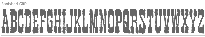
Obliterate GRP (2013) is a grungy letterpress typeface. In 2016, Brian J. Bonislawasky and Jim Lyles published the rugged octagonal mega typeface family Tradesman, the rounded sans Tailwind, and the techno typeface Offroad at Grype. In 2017, they added Jukebox Hero (stencil), Lustra (a mechanical sans), Lustra Text, and Sunblock Pro (2017, by Brian J. Bonislawasky and Jim Lyles). Typefaces from 2018: Aspire Narrow SmallCaps, Aspire SmallCaps, Aspire, Aspire Narrow. Typefaces from 2019: Decade (a logotype inspired by an alphabet in Letters and Lettering (1938, Paul Carlyle and Guy Oring)). Typefaces from 2020: Binder (a revival of the ultra-condensed movie credit typeface Binder Style by Joseph Binder for D. Stempel in 1959), Avionic (a 40-style sci-fi family, inspired by aerodynamics and the Air China company logotype). Typefaces from 2022: Midsole SC, Midsole (a 40-style squarish sans with square counters). [Google] [MyFonts] [More] ⦿ |
Las Vegas, NV-based designer of the free font Yang (2018). [Google] [More] ⦿ | |
Las Vegas-based type designer who created the sci-fi typeface Apogee 013 (2012). His foundry is called zero 13. Behance link. [Google] [MyFonts] [More] ⦿ | |
Graduate of the University of Nevada at Las Vegas. Las Vegas-based designer of the poster typeface Button (2016). [Google] [More] ⦿ | |
Home Grown Design Studio
|
Behance link. Creative Market link. Link for Home Grown Design Studio. [Google] [More] ⦿ |
Las Vegas, NV-based designer of the monoline connected script typeface Korsive (2017). [Google] [More] ⦿ | |
James Fajardo (was: Yakap.com)
|
Fajardo's fonts include James Fajardo (2003, handwriting), Alanis Hand (2003, handwriting of Alanis Morrisette), Suwa (2003), Jempol, IBAYO, Sulatko, TheMoment, Yakap, Sixdaggers, AlbummeSmooth (2003), Ibayo (2003), Jempolfreak (2003), Gyllenhaal (pixel font for 8pt). In 2007, he set up the commercial Fajardo Font Foundry, where he published the script typefaces James Paul (2007) and Nanette (2008). 1001 Fonts link. [Google] [MyFonts] [More] ⦿ |
James Paul Fajardo
| |
Las Vegas, NV-based designer of Nailed (2016), a school project display typeface done for a course at UNLV. He also designed the multilined typeface Strich (2016). [Google] [More] ⦿ | |
Student who lives in Sparks, NV. Creator of an extreme-contrast didone headline typeface called JIST (2014). [Google] [More] ⦿ | |
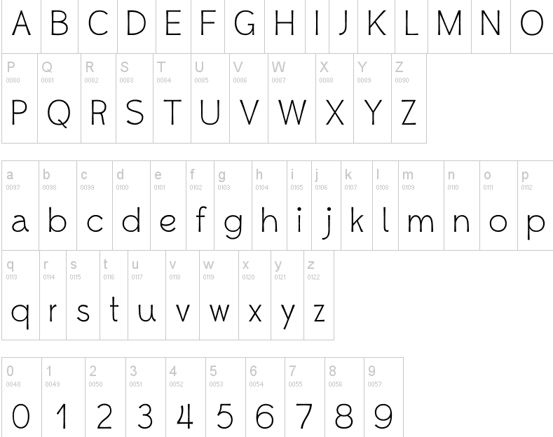
Las Vegas, NV-based designer of the free pixel font LispM Monospace (2015): The Lisp Machine console font is a version of the monospace font used on the consoles of the MIT, Symbolics, and Texas Instruments Lisp Machines. It is based on Juanjo Garcia's PCF bitmap conversion of the CPTFONT from the original MIT Lisp Machines. The fonts in this repository are vector fonts based on the 13-point PCF included in the src directory. [Google] [More] ⦿ | |
This Las Vegas-based company offers a TrueType font containing two versions of the customer's signature for 30USD. [Google] [More] ⦿ | |
Henderson, NV-based designer of the prismatic typeface Zen (2015). [Google] [More] ⦿ | |
Las Vegas-based creator of Dainty Daisies (2013), a children's script font. [Google] [More] ⦿ | |
Las Vegas-based designer of the hand-drawn typeface Kit Type (2012, +Extra, +Thin). Dafont link. [Google] [More] ⦿ | |
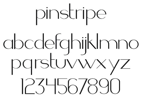
During her studies in Las Vegas, NV, Kristen Pierce created the Peignotian display typeface Pinstripe (2013). [Google] [More] ⦿ | |
Lauren Hodges
| |
Lauren Thompson
| |
Letterhead Fonts
|
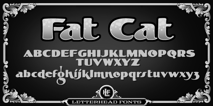
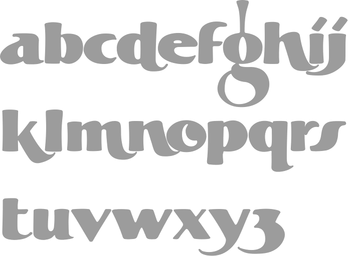
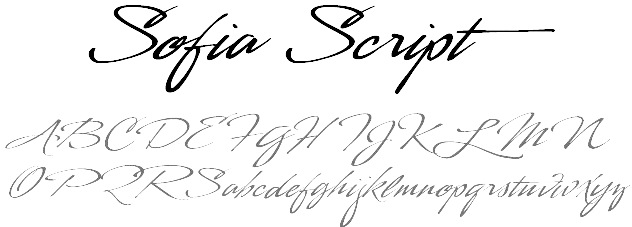
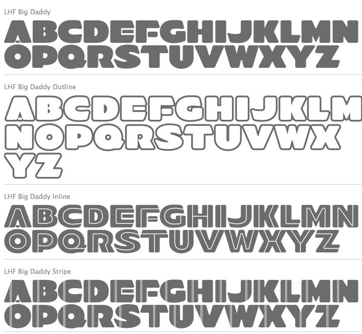
Free fonts "Letterhead Tuscan" (handlettering), Quadrex (2006, 3d effect font), and Wal-Mart People (dingbats). Early display fonts include Esoteric (1999), Wall Dog, Double Gild, Convecta, Smalts, Splash, Lisa. His Atkinson collection has a few nice lettering alphabets: Heavy Sign Script, Eccentric French, Fancy Roman and Modern 1908 Classic (now called Cafe Nouveau). Mike Stowe designed Old Blackletter in 2001. Ken McTague made the hand-lettered style typeface Boston Truckstyle. Designed by Brian Kniceley in 2000: LHF Henderson Church, LHF Ohnimus Florid, LHF Ohnimus Spiked, LHF Strong Tea House, Strong Caliope, Strong Nouveau. Fonts made around 2000 by Chuck Davis: LHFActionMovie LHF Bulletin Plug, LHF Classic Block, LHF Condensed French, LHF Convecta (2005, beveled face), LHF Cool Blue, LHF Crouching Tiger, LHF Def Artist, LHF Def Writer, LHF Double Gild, LHF Eccentric French Lt, LHF Esoteric, LHF Heavy French Roman, LHF Heavy Sign Script, LHF Jami (2000), LHF Letterhead Tuscan, LHF Lisa, LHF Modern 1908 Classic, LHF Quantum (2001, techno family), LHF Smalts, LHF Splash, LHF Tuscan Full Block (Western style), LHF Wall Dog, LHF Letterhead Tuscan. Fonts made in 2001 by Chuck Davis: LHF Advertisers Plug ATK, LHF Argentine Solid, LHF Boston Truckstyle, LHF Esoteric New, LHF Grants Antique, LHF Mister Kooky, LHF Mister Spooky, LHF Scriptana (2003, angular calligraphic script). The following are all by Chuck Davis: Kung Faux (2021: oriental simulation), LHF Antique Shop, LHF Fat Cat (2011, a round informal typeface influenced by Alf Becker's rounded block letterstyle), LHF Bank Note (2007), Quadrex (2005), Menace (2004, comic book style), Michelle (2004, calligraphic script), LHF Ambrosia (2004, free), Sofia Script (2003), Stanford Script (2003), Sarah Script (2003), Fancy Full Round (2003, a Western typeface inspired by Al Imelli, ca. 1900), Matthews Thin (2003, tall caps face), New Modern Classic (2003), LHF Birgitta (2003, roman style typeface, inspired by an E.C. Matthews book), LHF Happy Fun Ball (2003, comic book style), CD Esoteric, OldSignFont, Robin, LHFDefWriter, LHFDefArtist, LHF Amarillo (2001, a spurred serif), LHFBeckerMonogramEnglish, LHFBeckerPosterScript, LHFBeckerRoundedBlock, LHFConclaveFLATreg, Cool Blue (2003), LHFConclaveFLATwide, LHFConclaveROUNDreg, LHFConclaveROUNDwide, LHFConclaveSHARPreg, LHFConclaveSHARPwide, LHFCrouchingTiger, LHFCrouchingTigerCONVEX, LHFEquinox, LHF Esoteric3 (2004), LHFMirageBOLD, LHFMirageITALIC, LHFMirageREG, LHFMonogram, LHFQuantumCONVEX, LHFQuantumREG, LHFRomanaClassico, LHFScriptana (great lettering font), LHFTimberlodge, Village, Kelly Ann, Outlaw, Hensler (2002, a cigar box face), Antique Half Block (2002, wood type), Spurred Egyptian, Wolverine, Ortlieb, Super Thick&Thin, Denise, Hensler, Charlotte, Antique Half Block (2002), Supabad (2003), Brianna (2003, techno), Happy Fun Ball (2003, comic book family), Naylorville (2004), LHF Grant's Antique (2004, caps only Victorian face), Michelle (2004), Cafe Corina (2006, a decorative 19th century style free font by Chuck Davis), LHF Ambrosia (2004, a purely Victorian free font by Chuck Davis), Lincoln (2006), No Fishin (2006), LHF Bell Boy (2004, a free art deco font, Chuck Davis), LHF Full Block (2003; free slab serif athletic number typeface by Davis), Mike's Block (free slab serif by Davis), Old Block (free athletic numbering typeface by Davis), LHF Old Stock (2007), (2007, lettering from old stock market certificates), Hick Sticks (2007, letters made from sticks), LHF Fast Slant (2007, comic book style), LHF Cartoon Cowboy (2009), LHF Big Daddy (2012, fat signage family), LHF Comic Caps 2 (2014), LHF Advertisers Square (2014, after a signage alphabet by Al Imelli, 1922), LHF Asylum (2015, scratchy brush), LHF Black Rose Script (2016), LHF Mastercraft (2017). Typeface categories: 3D, 30's and 40's, 50's and 60's, Art Deco, Art Nouveau, Bold, Calligraphic, Cartoon, Casual, Circus, Condensed, Convex, Corners, Decorative, Distressed, Early 1900's, Extended, Fire Truck, Formal, Gothic, Graffiti, Inline, Late 1800's, Layered, Light, Modern, Old English, Ornaments, Panels, Prismatic, Racing, Railroad, Ribbons, Roman, Sanborn Map Co., Sans Serif, Scripts, Scrollwork, Shadow, Stock Certificate, Swashes, Victorian, Western, Word Art. Designers: Arthur Vanson, Brad King, Bruce Bowers, Charles Borges, Chuck Davis, Dan Sawatzky, Dave Correll, Dave Smith, David Parr, Denise Bayers, Duncan Wilkie, Francis Lestingi, Jeff Marshall, John Davis, John Studden, Kaitlin Sims, Ken McTague, Mark Searfoss, Mike Erickson, Mike Jackson, Patrick Kalange, Rob Cooper, Steve Contreras, Tom Kennedy. At one point, Chuck Davis was running Blu Creative Media, where he published BLU Esoteric (1999). Interview at MyFonts. Letterhead link. Behance link. [Google] [MyFonts] [More] ⦿ |
During her studies at the University of Nevada, Las Vegas, Lyanicka Marcos (Henderson, NV) designed the display typeface Luxton (2016). [Google] [More] ⦿ | |
East Las Vegas, NV-based designer of the free hand-crafter typeface Backburner (2017). Behance link. [Google] [More] ⦿ | |
During his studies at UNLV, Las Vegas-based Matthew Segundo (b. Salinas, CA) created Math Deco (2015). [Google] [More] ⦿ | |
Michael Hagemann
| |
During her studies in Las Vegas, NV, Miranda Manns designed the geometric solid typeface Primary (2018). [Google] [More] ⦿ | |
In 2013, she designed Kryptonian Script for Warner Bros' Man of Steel. In 2015, she created a typeface based on strings, Two Pencil Typeface, as well as the experimental typeface Motorix (released by the Psy/Ops type foundry in San Francisco). In 2016, Monica Maccaux and Greg Lindy joined forces for the creation of the cursive school script font ABC Mouse Cursive. Behance link. Blue Taco Design. [Google] [More] ⦿ | |
Monogram Fonts Co
|
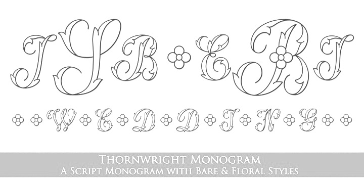
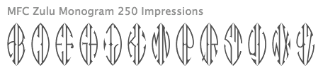
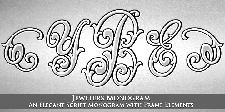
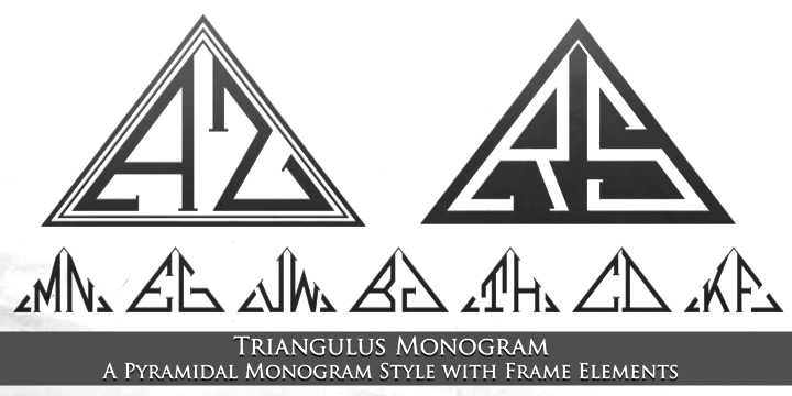
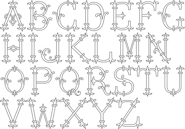
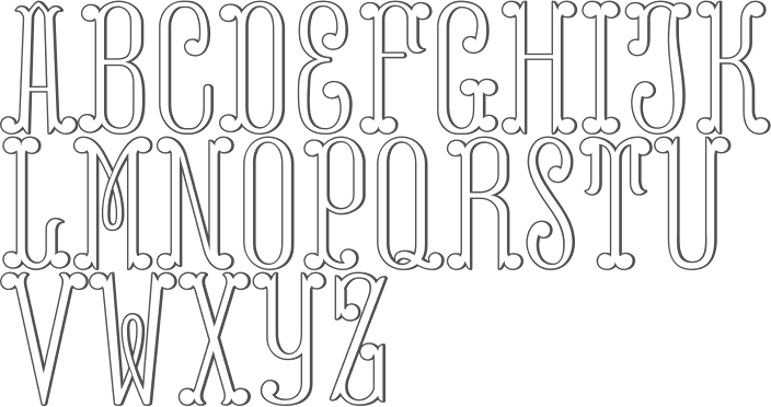
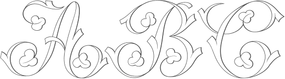
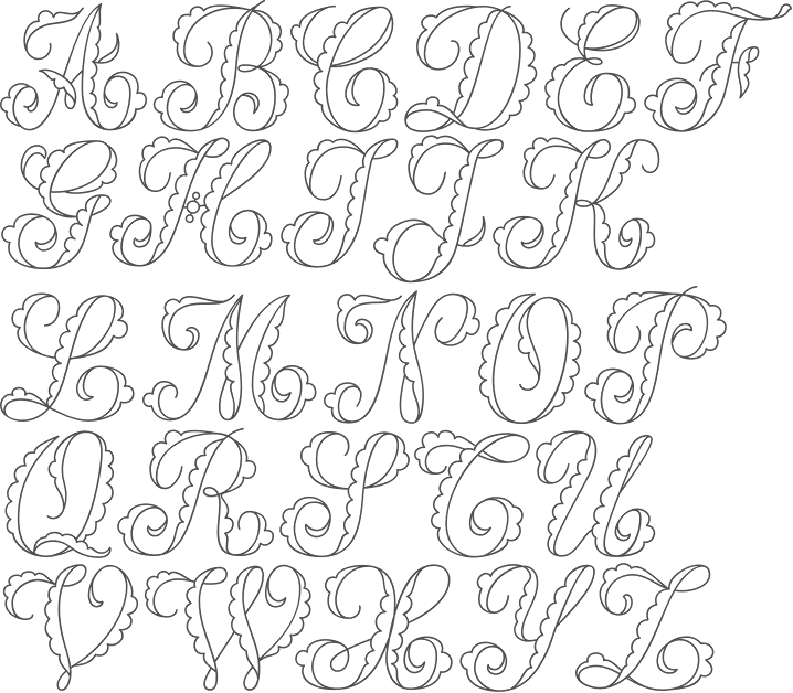
MFC Hills Medieval (2010) was developed from an overly ornamental blackletter type specimen found in the 1882 Hills Manual of Social and Business Forms. The interesting Victorian outline family Sappho Monogram (2010) was inspired by an alphabet set from the book, Monograms and Alphabets for Combination by Dollfus Mieg&Cie, first published in the 1890s. Typefaces from 2012: MFC Bruce Corners. Typefaces from 2013, all done with Jim Lyles: MFC Baelon Monogram (an 800-character monster font with outlined spurred letters from Dollfus Mieg's book, ca. 1890), MFC Bontebok Monogram, MFC Carnivale Monogram (known as Romantiques No. 3 and Ornate No. 2), MFC Thornwright Monogram (from the Manuel de Broderies No. 179 by N. Alexandre & Cie. from the late 1800s), MFC Zulu Monogram (an African-themed font inspired by Bibliothèque D.M.C: Alphabets et Monogrammes 2nd Series), MFC Jewelers Monogram (based on a decorative alphabet designed in 1901 by Marcus Goldsmith, an inventor of elegant accessories), MFC Verre Monogram, MFC Triangulus Monogram (based on a vintage publication called "Bibliotheque D.M.C: Alphabets et Monogrammes 2nd Series"), MFC Chaoxiang Monogram, MFC Fantasie Monogram, MFC Mastaba Monogram, MFC Voyeur Monogram (based on Broadway Monogram Initials in Book of American Types (1893, ATF)), MFC Haute Monde Monogram, based on Elite Monogram Initials in Book of American Types (1893, ATF)), MFC Budding Monogram, MFC Hardwood Monogram, MFC Almond Monogram, MFC Brass Rules Petit (based on filets from the Franklin Type Foundry), MFC Damask and MFC Damask Flourish (by Brian J. Bonislawsky and Jim Lyles, a Victorian capitals and floriated caps pair of typefaces based on Oxford No. 2 from the 1893 catalog of the Cleveland Type Foundry). Typefaces from 2014: MFC Medieval Monogram (a Lombradic caps typeface based on Book of American Types (1934, American Type Founders)), MFC Chaplet Monogram (from Dessins de Broderies---Album No. 486 (Sajou, late 1800s)), MFC Capulet Monogram (based on Monograms and Alphabets for Combination (Dollfus Mieg & Cie, 1890s)), MFC Klaver Monogram, MFC Billow Monogram (from Manuel de Broderies No. 179 by N. Alexandre & Cie. from the late 1800's), MFC Aldercott Monogram (by Brian J. Bonislawsky and Jim Lyles, after a 1901 alphabet by Marcus Goldsmith, an inventor of elegant accessories of personal nature). Typefaces from 2015: MFC Tattersaw Monogram, MFC Livermore Monogram (based on Victorian alphabets shown in Charles J. Strong's The Art of Show Card Writing, 1907), MFC Ringold Monogram (based on Strong's Book of Designs, 1917), MFC Petworth Monogram, MFC Piege Monogram, MFC Gilchrist Initials, MFC Gilchrist Monogram, MFC Arteaga Borders One, MFC Arteaga Borders Two, MFC Arteaga Borders Three, MFC Brass Rules Grand (based on Franklin Type Foundry's brass rules in Convenient Book of Specimens, 1889). Typefaces from 2016: MFC Diresworth Monogram (based on an alphabet set from the book, Monograms and Alphabets for Combination by Dollfus Mieg & Cie, first published in the 1890's), MFC Spindler Borders, MFC Imperator Monogram (based on Monograms and Alphabets for Combination by Dollfus Mieg & Cie, 1890s), MFC Mercer (an initials set from the book Monograms and Alphabets for Combination by Dollfus, Mieg & Cie, first published in the 1880s), MFC Botanical Borders (based on a collection of border treatments from the 1886 Spécimens de caractères d'imprimerie by E. Houpied a Paris), MFC Diamondside Monogram, MFC Redding Monogram (a highly ornate lettering style from Letters and Lettering by Carlyle & Oring), MFC Rodizio (a layered chromatic typeface family inspired by wood types by William H. Page), MFC Falconer Monogram, MFC Glencullen Monogram, MFC Bruce's Corners Two (based on Metal Corners found in Specimens of Printed Types (1882, Bruce Type Foundry)), MFC Westport Monogram, MFC Arkena Monogram (art nouveau font based on Strong's Book of Designs (1917)). Typefaces from 2017: MFC Enschede Borders (based on floral borders in the 1904 Ornamenten Hoofdlijsten en Sluitstukken book by Joh. Enschedé & Zonen, Haarlem), MFC Keating Monogram (based on Monograms and Alphabets for Combination (1890s, Dollfus, Mieg & Cie)). Typefaces from 2018: MFC Stencil Borders Six, MFC Elmstead Monogram and MFC Endeavor Monogram (both based on Dollfus, Mieg & Cie, 1890s), MFC Blossom Monogram (a chromatic layering font), MFC Buttergin Monogram (based on Tuscan typeface shown in Letters and Lettering by Carlyle & Oring), MFC Stencil Borders Five, MFC Stencil Borders Four, MFC Stencil Borders Three, MFC Stencil Borders Two, MFC Stencil Borders One (all by Brian Bonislawsky), MFC Diamondstack Monogram, MFC Sansome Monogram (an art nouveau typeface based on John F. Irwin's Rustic Roman from 1906). Typefaces from 2019: MFC Joliet Monogram (2019: based on a vintage McCalls Kaumagraph Transfer), MFC French Roman (an all caps typeface based on French Roman Light in an 1899 lettering publication by International Correspondence Schools), MFC Diamerrick Monogram (diamond-shaped monograms), MFC Ambeau Monogram (2019, based on the decorative art nouveau alphabet called American Beauty in J.M. Bergling's Art Alphabets and Lettering, 1914), MFC Diamas Monogram (diamond-shaped monograms), MFC Nadall Medieval (an uncial/blackletter font based on Bernd Nadall's Faust from 1898). Typefaces from 2020: MFC Patisserie Monogram (from Letters and Lettering by Carlyle & Oring), MFC Decatur Monogram (after an alphabet seen in J.M. Bergling's book Monograms and Engraving Alphabets). Typefaces from 2021: MFC Deco Diamond Monogram. View the typefaces made by Brian Bonislawsky. Typefaces from 2022: MFC Heathcliff Monogram (2022: rhombic monograms). Creative Market link. [Google] [MyFonts] [More] ⦿ |
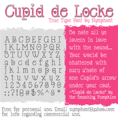
Nymfont (was: Nymphont)
|
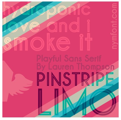
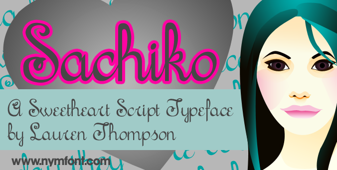
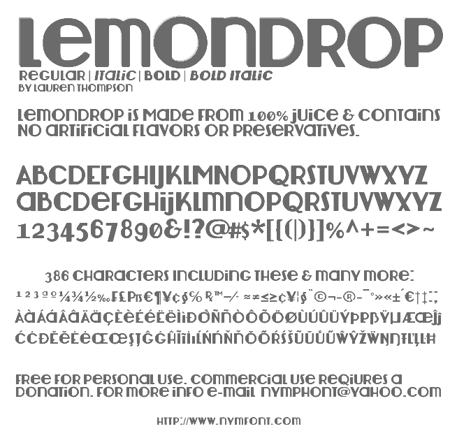
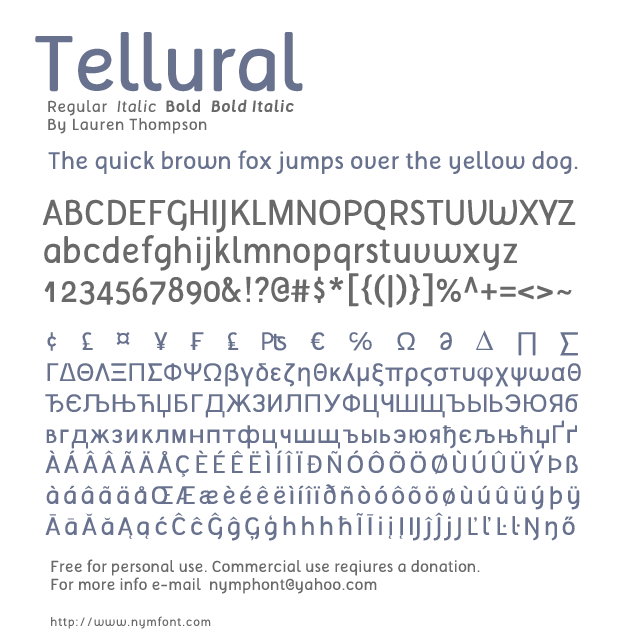
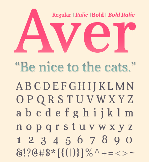
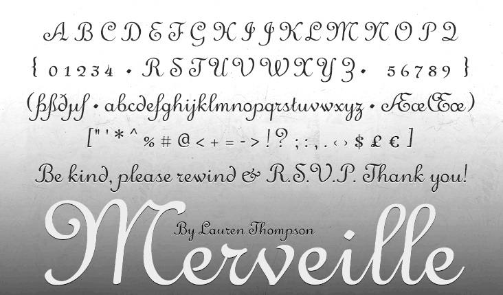
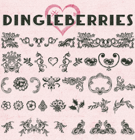
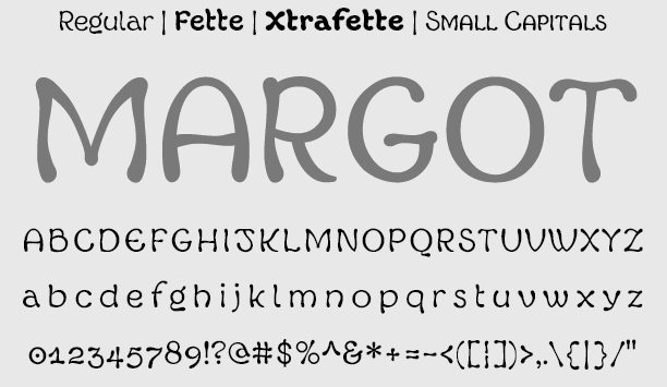
Nymph's handwriting (2009) followed a bit later. LT White Fang (2009) is an outline blackletter face. LT Sweet Nothings (+ Dingbats), Cupi de Locke and Damask Dings were added in 2009. Champagne&Limousine (2009) is an elegant geometric sans family. Caviar Dreams (2009) and LT Anomaly (2009) are sans families. Happy Phantom (2009, +Demi) is a typewriter-style slab serif. Pinstripe Limo (2010) is bilined. Sachiko (2010) is an upright connected script. Jolly (2010) is a monoline sans family with four weights. Lemondrop (2012) is an art deco family. Tellural (2012) is a monoline sans typeface family. The 4-style serif typeface Aver (2012) is quite useful. In 2013, she published Merveille (a ronde script), Xiomara (connected curly script), Connie (a late Victorian or early art nouveau typeface), Whipsmart (a clean flared sans), the classic ornamental font Dingleberries, Margot (a quaint almost art nouveau alphabet), and the informal Tuscan typeface Robinne Truecase. Typefaces from 2016: Rolande (handcrafted), Knud (yummy script). Devian Tart link. Abstract Fonts link. Fontspace link. Nymfont home page, which has a type design blog. Klingspor link. [Google] [More] ⦿ |
Creator (b. 1984) of RonDRs Script (2012, a fat finger face). Ronald lives in Las Vegas. [Google] [More] ⦿ | |
Ryan Halvorsen
| |
| |
During his studies, Las Vegas, NV-based Steven Wall designed the Aztec-style typeface Montezuma (2017). [Google] [More] ⦿ | |
Las Vegas, NV-based female suspense writer, b. 1981. Designer of Dragon Freestyle (2004, a graffiti face). Web site. [Google] [More] ⦿ | |
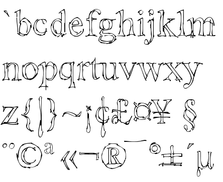
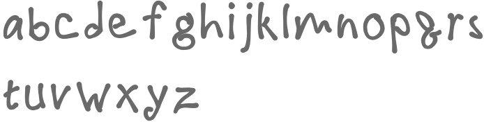
American creator in Las Vegas (b. 1993) who made the hand-printed typeface Scribbles (2009). [Google] [More] ⦿ | |
Versus Twin
|
View the typefaces published by Versus Twin. View the typefaces made by Brian Bonislawsky. [Google] [MyFonts] [More] ⦿ |


 During his studies, Ben Lueck (Henderson, NV) designed the industrial typeface FTC (2017), the octagonal typeface Sau (2017), the art deco Wendo (2017) and the wavy Vhoul (2017).
  [
[ [
[ [
[ [
[ Scottsdale, AZ-based creator of the hand-lettered tattoo typeface Xibalba (2014) and the squarish De Stijl-related typeface family Adaptype (2016). In cooperation with
  Las Vegas-based designer (
 Grype was set up by
  Lauren Hodges grew up in Madison, AL, and studied design at Auburn University, class of 2013. Her freelance business is Home Grown Design Studio in Dothan, AL. In 2014, she designed the typeface Rayv. In 2017, she added the handcrafted party poster font Octave.
 [
[
 [
[ Graphic designer, who has an MFA in Graphic Design at Otis College of Art & Design (Los Angeles) in 2012. She currently teaches graphic design at the University of Nevada, Las Vegas and is Creative Director at Blue Taco Design in Las Vegas. Monica created a few experimental typefaces in 2012, such as
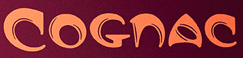
 Lauren Thompson (Nymfont, or Nymphont) is a designer from Las Vegas (b. 1982). She created the elegant sans typeface LT Oksana (2008), the grungy Frail 7 bedazzled (2008) and the classical ornament typeface Nymphette (2008). Her
  During her studies in Las Vegas, NV, Sam Irvin designed the stunning all caps typeface Cut Away (2015). [
 Foundry, est. 2004 by Brian Bonislawsky and Brian Jaramillo (Harvey) and located in Long Beach, CA, and Las Vegas, NV. The fonts are realeased through Veer/Umbrella. Jaramillo has been associated with DEFCON and Apollo26, while Bonislawsky was active at Astigmatic and Font Diner.
|
|
|
|