| | |
Adrian Pelletier
[Build Interactive]
|
[More] ⦿
|
Anastasia Fekete
|
Based in New Hampshire, Anastasia Fekete created the hipster all caps typeface Edge Caps (2014). [Google]
[More] ⦿
|
Andy Krahling
[Sunwalk Designs]
|
[More] ⦿
|
Ashley Dupont
|
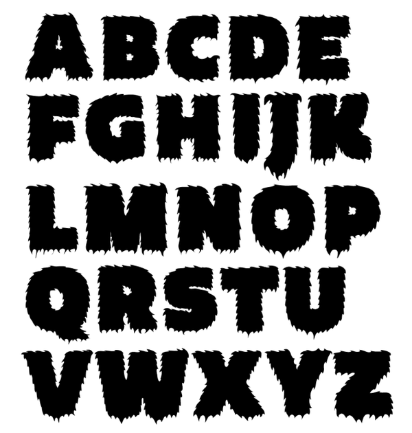
Durham, NH-based designer of the textured all caps typeface Flurry (2015). [Google]
[More] ⦿
|
Bill Garth
[Photon Inc]

|
[MyFonts]
[More] ⦿
|
Brendan Lucente
|
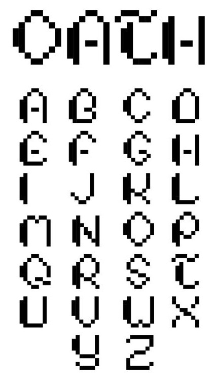
Graduate of NHIA who lives in Charlestown, NH. Creator of the pixel typeface Oath (2013). [Google]
[More] ⦿
|
Build Interactive
[Adrian Pelletier]
|
Wolfeboro, New Hampshire-based graphic designer whose company is called Build Interactive. In 2015, he created the rugged handcrafted all caps signage typeface Northern Passage. In 2016, he added the poster font Speed Track (renamed Fast Track). Typefaces from 2017: Bakwoods Cabin, Fifties Paint Brush. Typefaces from 2018: Timber Hitch, Lunar Tundra Brush, Mini Nature Icons. [Google]
[More] ⦿
|
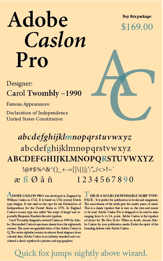
Carol Twombly
|
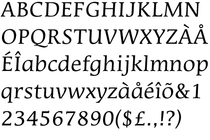
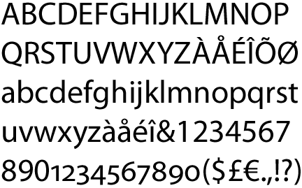
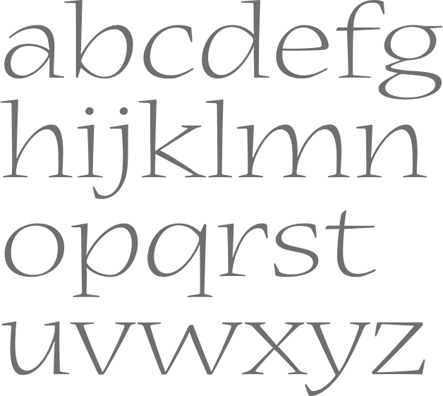
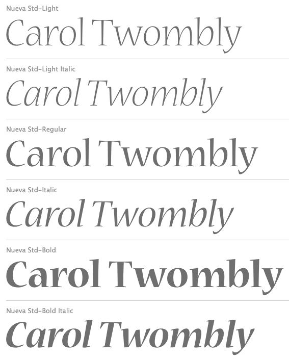
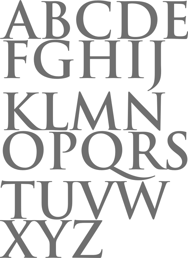
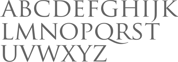
 Born in 1959 in Concord, Carol Twombly studied at the Rhode Island School of Design and under Charles Bigelow at Stanford, and joined the Bigelow&Holmes studio for four years. In 1988, she joined Adobe and started designing typefaces. She was featured in 5 American Type Designers by Spurius Press. In 1994, she won the Prix Charles Peignot. In 1999, she retired from type design.
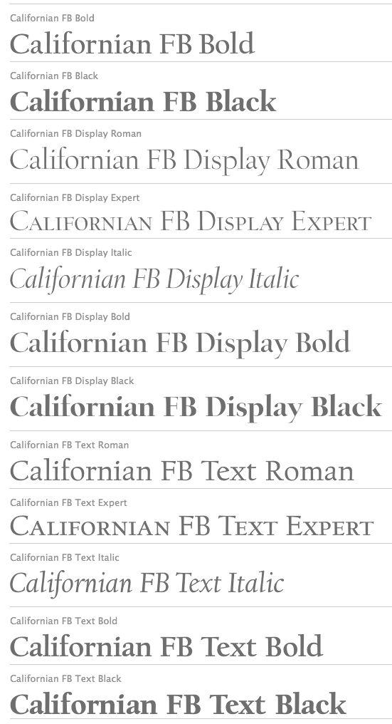
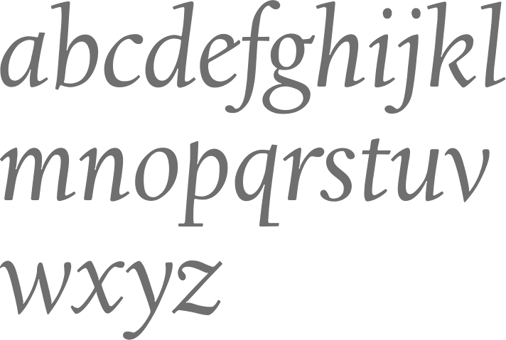
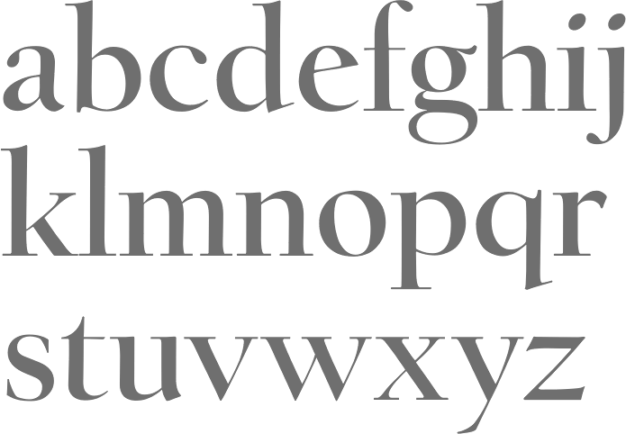
 Linotype link. FontShop link. Typophile link. A book about Twombly by Nancy Stock-Allen (Oak Knoll Press, Newcastle, 2016): Carol Twombly: Her Brief But Brilliant Career in Type Design. Her typefaces: - FB Californian (1987-1994, with David Berlow and Jane Patterson).
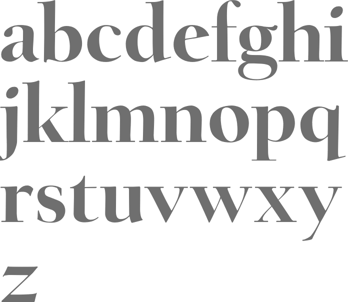
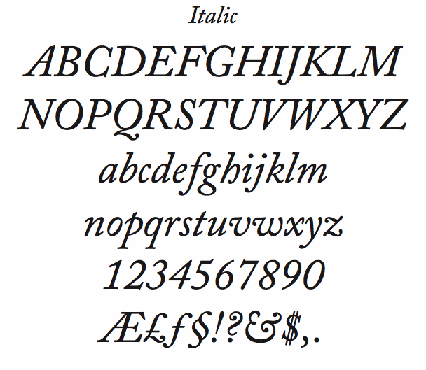
- Adobe Caslon (1990). Poster by Rachel McKay.
- Chaparral (1997).
- Charlemagne (1989).
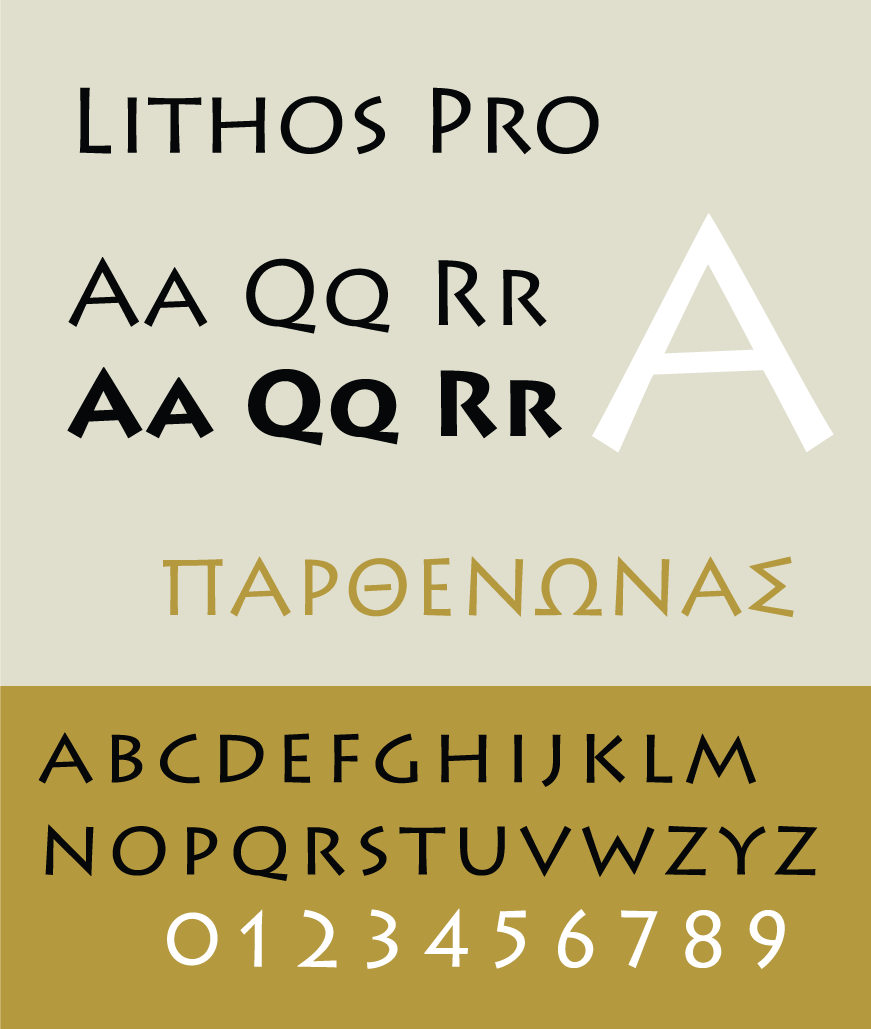
- Lithos (1989, the famous stone-cut look face).
- Mirarae (1984). This typeface with its characteristic mid-eighties oversized x-height won her the Morisawa Gold Prize.
- Myriad (1992, with Robert Slimbach), Myriad Wild, Myriad Sketch, and Myriad Tilt.
- Nueva (1994, +Extended).
- Trajan (1989, Adobe).
- Viva (1993).
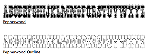
- The Western typefaces Pepperwood (1994), Rosewood (1994), Ponderosa (1990) and Zebrawood, all co-designed with Kim Buker Chansler and Carl Crossgrove. Pepperwood was patterned after a 1877 wood type by Vanderburgh, Wells and Company. [Caution: Some say that she did *not* co-design these typefaces, contradicting MyFonts and other sources.]
View the typefaces made by Carol Twombly. [Google]
[MyFonts]
[More] ⦿
|
Chris Simpkins
[Source Foundry]
|
[More] ⦿
|
Christian Schwartz
|
 Christian Schwartz was born in 1977 in East Washington, NH, and grew up in a small town in New Hampshire. He attended Carnegie Mellon University in Pittsburgh, Pennsylvania, where he graduated in 1999 with a degree in Communication Design. After graduation, he spent three months as the in-house type designer at MetaDesign Berlin, under the supervision of Erik Spiekermann. In January 2000, he joined Font Bureau. Near the end of 2000, he founded Orange Italic with Chicago-based designer Dino Sanchez, and left Font Bureau in August 2001 to concentrate full-time on developing this company. Orange Italic published the first issue of their online magazine at the end of 2001 and released their first set of typefaces in the beginning of 2002. Presently, he is an independent type designer in New York City, and has operated foundries like Christian Schwartz Design and Commercial Type (the latter since 2009). He has designed commercial fonts for Emigre, FontShop, House Industries and Font Bureau as well as proprietary designs for corporations and publications. In 2005, Orange Italic joined the type coop Village.
 His presentations. At ATypI 2004 in Prague, he spoke about "The accidental text face". At ATypI 2006 in Lisbon, he and Paul Barnes explained the development of a 200-style font family for the Guardian which includes Guardian Egyptian and Guardian Sans. FontShop's page on his work. Bio at Emigre. At ATypI 2007 in Brighton, he was awarded the Prix Charles Peignot. Jan Middendorp's interview in October 2007. Speaker at ATypI 2009 in Mexico City, where he announced his new type foundry, simply called Commercial. FontShop link. Font selection at MyFonts. A partial list of his creations: - FF Bau (2001-2004): Art direction by Erik Spiekermann. Released by FontShop International. He says: Bau is based on Grotesk, a typeface released by the Schelter&Giesecke type foundry in Leipzig, Germany at the end of the 19th century and used prominently by the designers at the Bauhaus. Each weight was drawn separately, to give the family the irregularity of the original, and the Super is new.
- Neutraface (2002, House Industries) and Neutraface Condensed (2004). Art directed by Ken Barber and Andy Cruz. MyFonts offers Neutraface Slab Text, Neutraface Slab Display, Neutraface Display and Neutraface Text. Schwartz states: Neutraface was an ambitious project to design the most typographically complete geometric sans serif family ever. We didn't have many actual samples of the lettering that the Neutras used on their buildings, so it ended up taking a lot of interpretation. There was no reference for the lowercase, so it's drawn from scratch, looking at Futura, Nobel, and Tempo for reference. Stephen Coles reports: Reminiscent of the recent FB Relay and HTF Gotham, Neutraface is an exaggerated Nobel with nods to Bauhaus and architectural lettering. Yes, and maybe Futura? Maggie Winters, Ioana Dumitrescu, Nico Köckritz, Nico Kockritz and Michelle Regna made great Neutraface posters.
- Neutraface No. 2 (2007), discussed by Stephen Coles: By simply raising Neutrafaces low waist, most of that quaintness is removed in No. 2, moving the whole family (which is completely mixable) toward more versatile, workhorse territory. This release is surely Houses response to seeing so many examples of Neutraface standardized by its users. Also new is an inline version. Who doesn't love inline type? It so vividly recalls WPA posters and other pre-war hand lettering. There are other heavy, inlined sans serifs like Phosphate, but one with a full family of weights and text cuts to back it up is very appealing. A typophile states: Designed by Christian Schwartz for House Industries, Neutraface captures the 1950s stylings of architect Richard Neutra in a beautiful typeface meant for application on the screen, in print, and in metalwork. If you are ever in need of a classy retro face, they don't get any more polished than this.
- At House Industries, Christian Schwartz, Mitja Miklavcic and Ben Kiel co-developed Yorklyn Stencil.
- Farnham (2004, Font Bureau) and Farnham Headline (2006, Schwartzco). Commissioned by Esterson Associates and de Luxe Associates. Winner of an award at TDC2 2004. Based on work by Johannes Fleischman, a German punchcutter who worked for the Enschedé Foundry in Haarlem in the mid-to-late 1700s. Schwartz: Truly part of the transistion from oldstyle (i.e. Garamond) to modern (i.e. Bodoni) Fleischman's romans are remarkable for their energy and "sparkle" on the page, as he took advantage of better tools and harder steel to push the limits of how thin strokes could get. In the 1800s, Fleischman's work fell into obscurity as tastes changed, but interest was renewed in the 1990s as digital revivals were designed by Matthew Carter, the Hoefler Type Foundry, and the Dutch Type Library, each focusing on a different aspect of the source material. I think the DTL version is the most faithful to the source, leaving the bumps and quirks inherent to metal type untouched. I've taken the opposite approach, using the source material as a starting point and trying to design a very contemporary text typeface that uses the basic structure and character of Fleischman without duplicating features that I found outdated, distracting, or unttatractive (i.e., the extra "spikes" on the capital E and F, or the form of the y).
- FF Unit (2003-2004, Fontshop, designed with Erik Spiekermann). A clean and blocky evolution of FF Meta intended as a corporate typeface for the Deutsche Bahn (but subsequently not used).
- Amplitude (2001-2003, Font Bureau), Amplitude Classified and Amplitude Headline. A newspaper-style ink-trapped sans family, unfortunately given the same name as a 2001 font by Aenigma. Winner of an award at TDC2 2004. The typeface selected by the St Louis Post Dispatch in 2005. One of many agates (type for small text) successfully developed by him. This page explains that they've dumped Dutch 811 and Bodoni and Helvetica and Franklin Gothic and News Gothic (whew!) for various weights of Amplitude, Poynter Old Style Display and Poynter Old Style Text. AmplitudeAubi was designed in 2002-2003 by Schwartz and Font Bureau for the German mag AutoBild.
- Simian (2001, House Industries): SimianDisplay-Chimpanzee, SimianDisplay-Gorilla, SimianDisplay-Orangutan, SimianText-Chimpanzee, SimianText-Gorilla, SimianText-Orangutan. Designed at Font Bureau. Art Direction by Ken Barber and Andy Cruz. Schwartz: "Although Simian's roots are in Ed Benguiat's logos for the Planet of the Apes movies, Simian wound up veering off in its own direction. The display styles look very techno, and we really went nuts with the ligatures, since this was one of House's first Opentype releases."
- Publico (2007): A predecessor of Guradian Egyptian. Schwartz writes: During the two year process of designing the typeface that would eventually become Guardian Egyptian, Paul Barnes and I ended up discarding many ideas along the way. Some of them were decent, just not right for the Guardian, including a serif family first called Stockholm, then renamed Hacienda after the legendary club in the Guardian's original home city of Manchester. Everyone involved liked the family well enough, but it didn't fit the paper as the design evolved, and several rounds of reworking left us more and more unsure of what it was supposed to look like. In the summer of 2006, Mark Porter and Esterson Associates were hired to redesign Publico, a major Portuguese daily newspaper, for an early 2007 launch. He asked us to take another look at Hacienda, to see if we might be able to untangle our many rounds of changes, figure out what it was supposed to look like in the first place, and finish it in a very short amount of time. Spending some time away from the typeface did our eyes a world of good. When we looked at it again, it was obvious that it really needed its "sparkle" played up, so we increased the sharpness of the serifs, to play against softer ball terminals, and kept the contrast high as the weight increased, ending up with an elegant and serious family with some humor at its extreme weights. As a Spanish name is not suitable for a typeface for a Portuguese newspaper, Hacienda was renamed once more, finally ending up as Publico. Production and design assistance by Kai Bernau. Commissioned by Mark Porter and Esterson Associates for Publico
- Austin (2003): Designed by Paul Barnes at Schwartzco. Commissioned by Sheila Jack at Harper's&Queen.
- Giorgio (2007): Commissioned by Chris Martinez at T, the New York Times Sunday style magazine. Small size versions produced with Kris Sowersby. Not available for relicensing. A high contrast condensed "modern" display typeface related to Imre Reiner's Corvinus. Ben Kiel raves: Giorgio, like the fashion models that it shares space with in T, the New York Times fashion magazine, is brutal in its demands. It is a shockingly beautiful typeface, one so arresting that I stopped turning the page when I first saw it a Sunday morning about a year ago. [...] Giorgio exudes pure sex and competes with the photographs beside it. The designers at T were clearly unafraid of what it demands from the typographer and, over the past year, kept on finding ways to push Giorgio to its limit. Extremely well drawn in its details, full of tension between contrast and grace, it is a typeface that demands to be given space, to be used with wit and courage, and for the typographer to be unafraid in making it the page.
- Empire State Building (2007): An art deco titling typeface designed with Paul Barnes for Laura Varacchi at Two Twelve Associates. Icons designed by Kevin Dresser at Dresser Johnson. Exclusive to the Empire State Building.
- Guardian (2004-2005): Commissioned by Mark Porter at The Guardian. Designed with Paul Barnes. Not available for relicensing until 2008. Based on an Egyptian, this 200-style family consists of Guardian Egyptian (the main text face), Guardian Sans, Guardian Text Egyptian, Guardian Text Sans and Guardian Agate.
- Houston (2003): Commissioned by Roger Black at Danilo Black, Inc., for the Houston Chronicle. Schwartz: As far as I know, this typeface is the first Venetian Oldstyle ever drawn for newspaper text, and only Roger Black could come up with such a brilliant and bizarre idea. The basic structures are based on British Monotype's Italian Old Style, which was based on William Morris's Golden Type. The italic (particularly the alternate italic used in feature sections) also borrows from Nebiolo Jenson Oldstyle, and there is a hint of ATF Jenson Oldstyle in places as well.
- Popular (2004): Commissioned by Robb Rice at Danilo Black, Inc., for Popular Mechanics. An Egyptian on testosterone.
- Stag (2005): Commissioned by David Curcurito and Darhil Crooks at Esquire. Yet another very masculine slab serif family. Schwartz writes I showed them a range of slab serifs produced by French and German foundries around 1900-1940, and synthesized elements from several of them (notably Beton, Peignot's Egyptienne Noir, Georg Trump's Schadow, and Scarab) into a new typeface with a very large x-height, extremely short ascenders and descenders, and tight spacing. Also, we find Stag Sans (2007, Village) and Stag Dot (2008, Village).
- Plinc Hanover (2009, House Industries). A digitization of a blackletter font by Photo Lettering Inc.
- Fritz (1997, Font Bureau). Schwartz: "Fritz is based on various pieces of handlettering done in the early 20th century by Ozwald Cooper, a type designer and lettering artist best known for the ubiquitous Cooper Black. Galapagos Type foundry's Maiandra and Robusto are based on the same pieces of lettering."
- Latino-Rumba, Latino-Samba (2000, House Industries). Art Direction by Andy Cruz. Designed with Ken Barber. Jazzy letters based on an earlier design of Schwartz, called Atlas (1993).
- Pennsylvania (2000, FontBureau). A monospaed family inspired by Pennsylvanian license plates. Schwartz: "Thai type designer Anuthin Wongsunkakon's Keystone State (1999, T26) is based on the exact same source."
- Plinc Swiss Interlock (by Christian Schwartz and Adam Cruz for House Industries). Based on originals by PhotoLetteringInc.
- Luxury (2002, Orange Italic, co-designed with Dino Sanchez). Gold, Platinum and Diamond are the names of the 1930s headline typefaces made (jokingly) for use with luxury items. The six-weight Luxury family at House Industries in 2006, contains three serif text weights called Luxury Text, as well as three display typefaces, called Platinum (art deco), Gold, and Diamond (all caps with triangular serifs).
- Los Feliz (2002, Emigre). Based on handlettered signs found in LA.
- Unfinished typefaces: Masthead, Reform, Bitmaps, Bilbao, Boyband, Addison, Elektro, Sandbox, Vendôme, Bailey.
- Fonts drawn in high school: Flywheel (1992, FontHaus), Atlas (1993, FontHaus, a "a fairly faithful revival of Potomac Latin, designed in the late 1950s for PhotoLettering, Inc"), Elroy (1993, FontHaus), ElroyExtrasOrnaments, Hairspray (1993, "a revival of Steinweiss Scrawl, designed in the mid-1950s by Alex Steinweiss, best known for his handlettered record covers": HairsprayBlonde, HairsprayBrunette, HairsprayPix, HairsprayRedhead), Twist (1994, Precision Type and Agfa), Zombie (1995, Precision Type and Agfa), Morticia (1995, Agfa/Monotype), Gladys (1996, an unreleased revival of ATF's turn-of-the-century Master Script).
- Ant&Bee&Art Fonts (1994-1995): three dingbat fonts, Baby Boom, C'est la vie, and Raining Cats&Dogs, based on drawings by Christian's aunt, Jill Weber. Released by FontHaus.
- Digitizations done between 1993-1995: Dolmen (Letraset), Latino Elongated (Letraset), Regatta Condensed (Letraset), Fashion Compressed (Letraset), Jack Regular (Jack Tom), Tempto Openface (Tintin Timen).
- Hand-tuned bitmap fonts: Syssy, Zimmer's Egyptian, Elizzzabeth, Newt Gothic, Trags X, Tibia, Fibula, Tino, Digest Cyrillic (based on Tal Leming's Digest). Free downloads of the pixel typefaces Newt Gothic, Tibula and Fibia here.
- At Village and Orange Italic, one can get Local Gothic (2005), now in OpenType, a crazy mix of Helvetica Bold, Futura Extra Bold, Franklin Gothic Condensed and Alternate Gothic No. 2. It is a collection of alternates one can cycle through---thus a for of randomization.
- FF Oxide (2005), a Bank Gothic style stencil family. FF Oxide Light is free!
- Graphik (2008), a sans between geometric and grotesk made for thew Wallpaper mag. Kris sSwersby writes: In a sweltering typographic climate that favours organic look-at-me typefaces bursting with a thousand OpenType tricks, Graphik is a refreshing splash of cool rationality. Its serious, pared-back forms reference classic sans serifs but remain thoroughly modern and never get frigid. Any designer worth their salt needs to turn away from the screen&pick up the latest copy of Wallpaper magazine. There you will find one of the most beautiful, restrained sans serifs designed in a very long time. See also Graphik Wide (2018).
- In 2011, he created a 22-style revival of Helvetica called Neue Haas Grotesk (Linotype), which offers alternates such as a straigt-legged R and a differently-seriffed a. It is based on the original drawings of Miedinger in 1957.
Schwartz also made numerous custom fonts: [Google]
[MyFonts]
[More] ⦿
|
Christina Lyons
|
Keene, NH-based designer of the display typeface Luta (2016). Behance link. [Google]
[More] ⦿
|
Christopher Simpkins
|
 Christopher Eric Simpkins (1974-2025), of Hanover, NH, grew up in Gainesville, Florida, and attended the University of Florida. He earned his medical degree from the Johns Hopkins University School of Medicine. Quoting from his obituary, Chrise was a skilled and dedicated transplant surgeon whose work saved many lives. His gentle bedside manner and concern for his patients and colleagues earned him respect and admiration throughout his career. Chris was honored with numerous teaching awards and affectionately known by colleagues and patients as the Gentle Giant for his calm, kind demeanor. In recent years, he served as a Senior User Experience Program Manager at Google, with a special interest in font development. Chris initiated and guided the creation of Google Sans Code, a new brand font designed specifically for reading and writing code, and he program-managed the design and development of other Google font families that were recognized with both internal and international design awards. Throughout his time at Google, Chris led a broad network of vendors and partnered with teams across the company to integrate these fonts to major Google platforms.
 As a principal of Sourve Foundry in Baltimore, MD, he designed the free (open source) monospaced typeface Hack (2015) specifically for writing source code. Dafont link. Open Font Library link. Behance link. Sourcefoundry link. Official obituary. [Google]
[More] ⦿
|
Cosmo Catalano
|
Editor of A web log of design and high drama which frequently comments on typographic matters such as web fonts (why pay for them?), traffic signs, and typeface use. He calls himself the world's toughest writer, and lives in the New England area (he graduated from Dartmouth, NH). In this piece entitled The Tell-Tale R Some Thoughts on Clearview, Cosmo writes this about the decision to start using Clearview for America's highway signs: While I admit it's (much) easier to read, I can't say I'm exactly psyched about seeing it. There are a variety of reasons why. I suppose my gut reaction is that it no longer feels like I'm driving down a federally-funded expressway-it feels like I'm staring at ads. While I've mentioned that Interstate has really picked up its public profile recently, Interstate isn't really the FHWA typeface. Tobias Frere-Jones got a lot of attention for Interstate because the edits he made were very subtle, yet somehow made the font tolerable for more than 12 characters at a time. Clearview, on the other hand, was in use for advertising years before it ever appeared along the highway-most notably by megalith AT&T. I liked the old, ugly FWHA typeface because it was so odd and idiosyncratic. It was like watching a David Bowie in his "androgynous alien" days-no mistaking it for anything else, let alone a sweeping corporate rebranding. FWHA's cold formlessness was also nice because it didn't encourage you to interact. One of Steve Jobs' most persistent design maxims is that products need to be anthropomorphic; it makes people want to engage with them. Clearview is definitely more human than FHWA, but is that really a good thing? Do we really want people relating to and engaging with signage? Or do we want them to glance, comprehend, and get their eyes back on the road? I'm also skeptical of the notion that legibility should be the only standard. Reading interstate signage-even with the old, weird FHWA face-is pretty damn easy. If you need the extra 200 feet to pick out an exit, what other details are you missing? Should you really be on the road? [Google]
[More] ⦿
|
Dan Carr
[Golgonooza Letter Foundry]
|
[MyFonts]
[More] ⦿
|
Elice Laughner
|
Greenfield, NH-based designer of the display typeface Annulus (2015). [Google]
[More] ⦿
|
Eric Hu
|
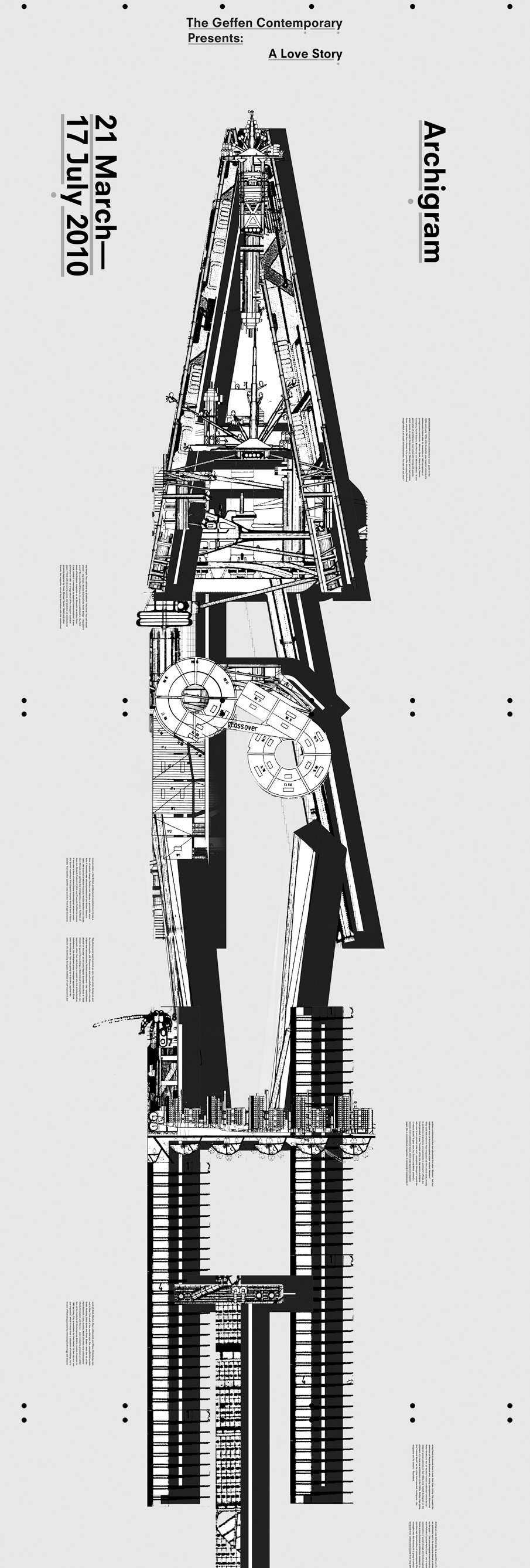
Student at Yale University's School of Art. In 2010, Eric hu designed a 17-foot poster celebrating the works of a 1960's avant-garde architecture group named Archigram. The poster features a customized typeface, stacked vertically and then collaged and intermixed with pieces and artifacts of Archigram's drawings. Metaphorically, this creates an entirely new megastructure and through the scale of the poster, the work reflects the rigor and passion of Archigram. [Google]
[More] ⦿
|
Evan Limberger
|
Evan Limberger (New Hampshire, USA) created the 3d display typeface Fluxx (2012). [Google]
[More] ⦿
|
Frajil Farms Productions
[Jill Weber]
|
Aunt of Christian Schwartz who designed the dingbats for Christian Schwartz's dingbat typefaces Baby Boom, C'est la vie, and Raining Cats & Dogs (1994-1995). She ran Frajil Farms Productions out of Mount Vernon, NH, and had her work distributed originally by FontHaus under the label Ant and Bee Art Fonts, where her fonts included the dingbat typefaces Baby Boom One and Two, C'est la vie, Raining Cats and Dogs. Identifont link. Klingspor link. [Google]
[More] ⦿
|
Gahlord Dewald
|
Punchcutter at the Golgonooza Letter Foundry (New Hampshire), run by Dan Carr. At one point associated with Weeds Media Consortium in Burlington, VT. [Google]
[MyFonts]
[More] ⦿
|
Golgonooza Letter Foundry
[Dan Carr]
|
Dan Carr (b. Cranston, RI, 1951-2012) was an American poet, type designer, typographer, printer, teacher, punchcutter, environmentalist, human rights activist and New Hampshire State Representative (2008-2010). Carr received his BA at Clark University in Worcester, Massachusetts. In Boston, in 1979 he and his partner Julia Ferrari, started the Golgonooza Letter Foundry & Press, a hot metal Monotype graphic design and composition house, which they moved to Ashuelot, NH, in 1982. Together they created Trois Fontaines Press in 1997, a limited edition fine press. Carr taught typography, and the history of typography at Keene State University in Keene, NH. He died after a struggle with cancer. At Golgonooza they produced high-quality letterpress books for a wide variety of clients. Dan Carr is the designer of the great-looking text fonts Lyons and Cheneau, 1990-1994, as well as Regulus (a metal font created in 1998 that earned him the title of Master Typographic Punchcutter of France in 1999), Philosophie, Genesis Numerals, and Beckett Bodoni, at the Golgonooza Letter Foundry. He won a Bukvaraz 2001 award for Parmenides (a metal type for archaic Greek). His digital typeface "Cheneau" was chosen for a judges' choice award by the Type Directors Club in 2000. Both Dan Carr's Parmenides Greek and Christopher Stinehour's Diogenes Greek were commissioned by the printer Peter Koch for The Fragments of Parmenides. Alternate URL. Klingspor link. Caxton Club link. [Google]
[MyFonts]
[More] ⦿
|
Hannah Tarbotton
|
Nashua, NH-based designer of a drop caps alphabet in 2016. [Google]
[More] ⦿
|
Henry Mikiewicz
|
Type designer who is credited with Feinen (1983, Compugraphic), a Celtic look font in four styles. Recreations include Feinen by Datascan, APT Feinen Inline (1997, Alan Jay Prescott), FC-Feinen (company unknown), Furst (or OPTIFurst; made by OptiFont/Castcraft Software), and Baldur (by Mad Irishman Productions). On Usenet, someone wrote this: I first encountered Feinen in 1982 in a Compugraphic type book. I believe it was designed by Henry Mikiewicz. As far as I know, only Compugraphic offered it until Opti Castcraft did their version and named it Furst. I believe that Feinen was offered in three weights plus an inline version. I don't know if it was ever released as a PostScript font. I can find only two weights of the Opti Castcraft version. They were/are offered as TrueType and Open Type fonts. See also here. On the web, we find a reference to Henry Mikiewicz Design and Development URW America P.O. Box 700 Barrington, NH 03825, so that could well be the designer of Feinen. [Google]
[More] ⦿
|
Itek
|
Type foundry and vendor active in the 1970s and 1980s, when it was associated with International Type Founders (ITC). It was based in Nashua, New Hampshire. John Schappler was art director at Itek Composition Systems from 1979 until 1984. [Google]
[More] ⦿
|
Jason Meagher
|
 During his studies, Greenland, NH-based Jason Meagher designed an encircled experimental typeface (2016). [Google]
[More] ⦿
During his studies, Greenland, NH-based Jason Meagher designed an encircled experimental typeface (2016). [Google]
[More] ⦿
|
Jennifer Kinon
[OCD: Original Champions of Design]
|
[More] ⦿
|
Jeremy Edelblut
|
 Graduate of Ringling College of Art and Design. Wilton, NH-based creator of Simple Dandy (2014), Perlines (2014, textured all caps typeface), Xack (2014, a tall geometric hairline sans) and the counterless black typeface Blooky (2014). Dafont link. [Google]
[More] ⦿
Graduate of Ringling College of Art and Design. Wilton, NH-based creator of Simple Dandy (2014), Perlines (2014, textured all caps typeface), Xack (2014, a tall geometric hairline sans) and the counterless black typeface Blooky (2014). Dafont link. [Google]
[More] ⦿
|
Jill Weber
[Frajil Farms Productions]
|
[More] ⦿
|
John Schappler
|
John Schappler (1921-2017) graduated from the University of Iowa (1959), John had been a student of Father Edward Catich at St. Ambrose College, in Iowa, and had also worked with Ray Da Boll and R. Hunter Middleton. He worked from 1959-1965 at IBM on type design for typewriters in the era of IBM's Selectric typewriters. He was the designer of the typefaces IBM Script, Adjutant, and Delegate. From 1967 until 1971 he was director of type design at Ludlow Typograph Co. He was manager of typeface design at the Chicago office of Compugraphic (1971-1973) and director of typography at Sun Chemical (1973-1976) and type and art director at Itek Composition Systems (1979-1984). He retired in Nashua, NH. John carved the tombstone of Victor Hammer, who had been his friend and mentor. He designed these typefaces at Itek: Paul Mark (1977), Rita Script (1978). [Google]
[More] ⦿
|
Julie Quast
|
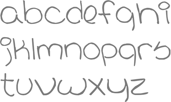
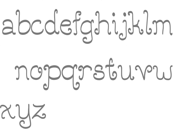
Portsmouth, NH-based designer of Dandelion Tea (2014), a handcrafted font developed under the tutelage of Dan Carr. Behance link. [Google]
[More] ⦿
|
Justine Elgner
|
During her graphic design studies in Manchester, NH, Justine Elgner created a squarish modular typeface (2013). [Google]
[More] ⦿
|
Katie DeRosa
|
During her graphic design studies in Londonderry, NH, Katie DeRosa created the octagonal 3d typeface Abstract Alphabet (2014). [Google]
[More] ⦿
|
Kimberly Warzelhan
|
Kimberly Warzelhan from Nassau, NH, aka the Frogfrau, has designed Frog Dings 1 and Frog Mess 1, that used to be available from OMEGA Font Labs. Under the name OmegaFrog in the late 90s, she created the dingbats Frog Dings, Frog on Edge, Frog Flourishes, Froggi Giggles, FrogGothic, and Froggi. Her frogfrau.com domain moved to Erratic Frog ca. 2003. She wasn't offering any fonts from there until 2005 when she decided to bring back her FroggiX series (dingbats: FroggiX3, FroggiX4, FroggiX5, FroggiX6, all made 1998), but we are still waiting. [Google]
[More] ⦿
|
Lance Hidy
|
 Lance Hidy (b. 1946, Portland, Oregon) studied art at Yale in 1964. After Yale, he studied calligraphy with Lloyd Reynolds and printing with Leonard Baskin and Harold McGrath at Gehenna Press before co-founding the publishing house David R. Godine (Brookline, MA) in 1969. Art director for the Harvard Business Review. He designed monographs of the work of Ansel Adams and Arnold Newman. He also made some postage stamps and silk screen posters. A resident of Merrimac, and of Newburyport, MA, he is a freelance designer of posters and books.
 Designer of the Adobe multiple master font Penumbra (1994). In its four styles, from Penumbra sans to Penumbra Flare, Penumbra Half Serif and Penumbra Serif, we see a gradual interpolation between a geometric sans and a Trajan-like classical roman serif headline face. Discussion by Phinney. MyFonts link. [Google]
[MyFonts]
[More] ⦿
|
Lara McCormick
|
Lara has a Bachelor of Arts, Sociology (1993) from UCLA, a Masters in Fine Arts from the School of Visual Arts in New York City (2007), and a certificate in typography from the Cooper Union in New York (2011). She taught at Pratt in New York from 2007 until 2009, at the School of Visual Arts in New York from 2007 until 2011, and at the New Hampshire Institute of Art from 2012 onwards. Lara designed a few typefaces during her career. Behance link. [Google]
[More] ⦿
|
Laura Eames
|
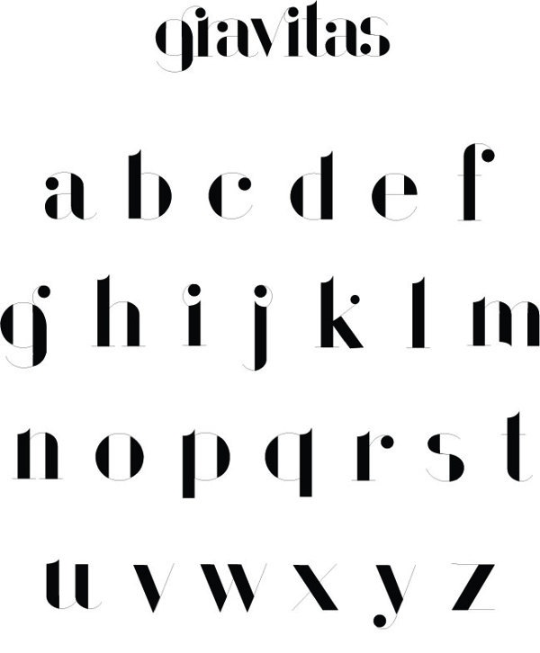
During her fine arts studies, Laura Eames (Nashua, NH) created the high-contrast didone display typeface Gravitas (2013). [Google]
[More] ⦿
|
Marie Hickey
|
Manchester, NH-based designer of Tallulah (2014), a condensed poster typeface. [Google]
[More] ⦿
|
Matt Ritchie
|
Nashua, NH-based graphic designer. Creator of Hairy (2010). Home page. [Google]
[More] ⦿
|
Matthew Butterick
[MB Type]
|
[MyFonts]
[More] ⦿
|
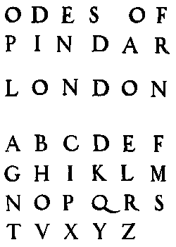
Maxfield Parrish
|
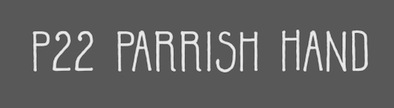 P22, which sells Parrish Roman, Parrish Hand and Parrish Extras (dingbats), writes this about the Phildalphia-born artist Maxfield Parrish: Maxfield Parrish (1870-1966), whose career spanned nearly ninety years, holds a unique place in American art and culture. He was enormously accomplished and successful in both fine art and commercial endeavors. Parrish's hand-drawn letters were a significant part of his works, which bridged the familiar with a startling otherworldliness. P22 has created the Parrish font set in cooperation with the National Museum of American Illustration. See also here. Character made a font called MaxfieldParrish140 in 2007 and writes this: From an incomplete (no "N") hand-drawn alphabet by Maxfield Parrish. See figure 140 of "Letters&Lettering" by Frank Chouteau Brown, 1921. This is a different source than the P22 Parrish font family. Examples of Parrish's lettering: Modern American letters, Modern American capitals. Maxfield died in 1966 in Plainfield, NH. [Google]
[MyFonts]
[More] ⦿
P22, which sells Parrish Roman, Parrish Hand and Parrish Extras (dingbats), writes this about the Phildalphia-born artist Maxfield Parrish: Maxfield Parrish (1870-1966), whose career spanned nearly ninety years, holds a unique place in American art and culture. He was enormously accomplished and successful in both fine art and commercial endeavors. Parrish's hand-drawn letters were a significant part of his works, which bridged the familiar with a startling otherworldliness. P22 has created the Parrish font set in cooperation with the National Museum of American Illustration. See also here. Character made a font called MaxfieldParrish140 in 2007 and writes this: From an incomplete (no "N") hand-drawn alphabet by Maxfield Parrish. See figure 140 of "Letters&Lettering" by Frank Chouteau Brown, 1921. This is a different source than the P22 Parrish font family. Examples of Parrish's lettering: Modern American letters, Modern American capitals. Maxfield died in 1966 in Plainfield, NH. [Google]
[MyFonts]
[More] ⦿
|
MB Type
[Matthew Butterick]
|
 Matthew Butterick (b. 1970, Michigan) grew up in New Hampshire. He got his B.A. degree from Harvard University in visual&environmental studies, also studying mathematics and letterpress printing. His work is in the permanent collection of the Houghton Library at Harvard. Butterick started his design career at the Font Bureau as a typeface designer and engineer. At the beginning of the Internet era, he moved to San Francisco and founded website design and engineering company Atomic Vision. Atomic Vision was later acquired by open-source software developer Red Hat. More recently, Butterick got a law degree from UCLA and has been practicing civil litigation in Los Angeles, Butterick Law Corporation. He operates a web site called Typography for Lawyers and another one called Butterick's Practical Typography.
 In 2010, he published Typography for Lawyers. MyFonts link. FontShop link. Klingspor link. Font Bureau link. He has some great one-liners, such as The only good Copperplate is a dead Copperplate. Matthew Butterick's creations: - Agitprop: in the FUSE 12 collection.
- Wessex (1993): A family published at Font Bureau in 1993. Font Bureau writes: Initially conceived by Matthew Butterick as a Bulmer revival, Wessex took on characteristics of Baskerville&Caledonia as design proceeded. In 1938, W.A. Dwiggins had taken the hard necessities of the non-kerning line-caster italic duplexed onto the same widths as roman, and turned them into design virtues. Inspired by the surprising beauty of his wide-bodied Caledonia italic, Butterick used it as a model for Wessex.
- Hermes (1995, 2010, Font Bureau). Blurb at Font Bureau: Schriftguss and Wollmer called it Hermes; Berthold called it Block. Hermann Hoffmann's 1908 design inspired FB Hermes, which evokes the German grotesks that were workhorses of factory printing 100 years ago. Blunt corners suggest the wear and tear of rough presswork. Matthew Butterick created the original styles in 1995. In 2010, he added more weights, italics, and alternate glyphs to expand the family's versatility. Currently, the family contains Hermes Classic and Hermes Maia.
- Triplicate. A large family of typewriter fonts that feature both monospacing and proportional spacing.
- HeraldGothic (1993, Font Bureau). A condensed typeface with bevelled, or octagonal, corners.
- Chunk.
- Alix FB (2011, Font Bureau). A monospaced family based on two IBM selectric typewriter face, Prestige Elite and Light Italic.
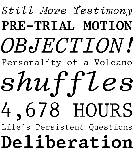
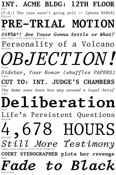
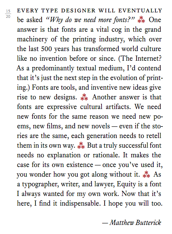
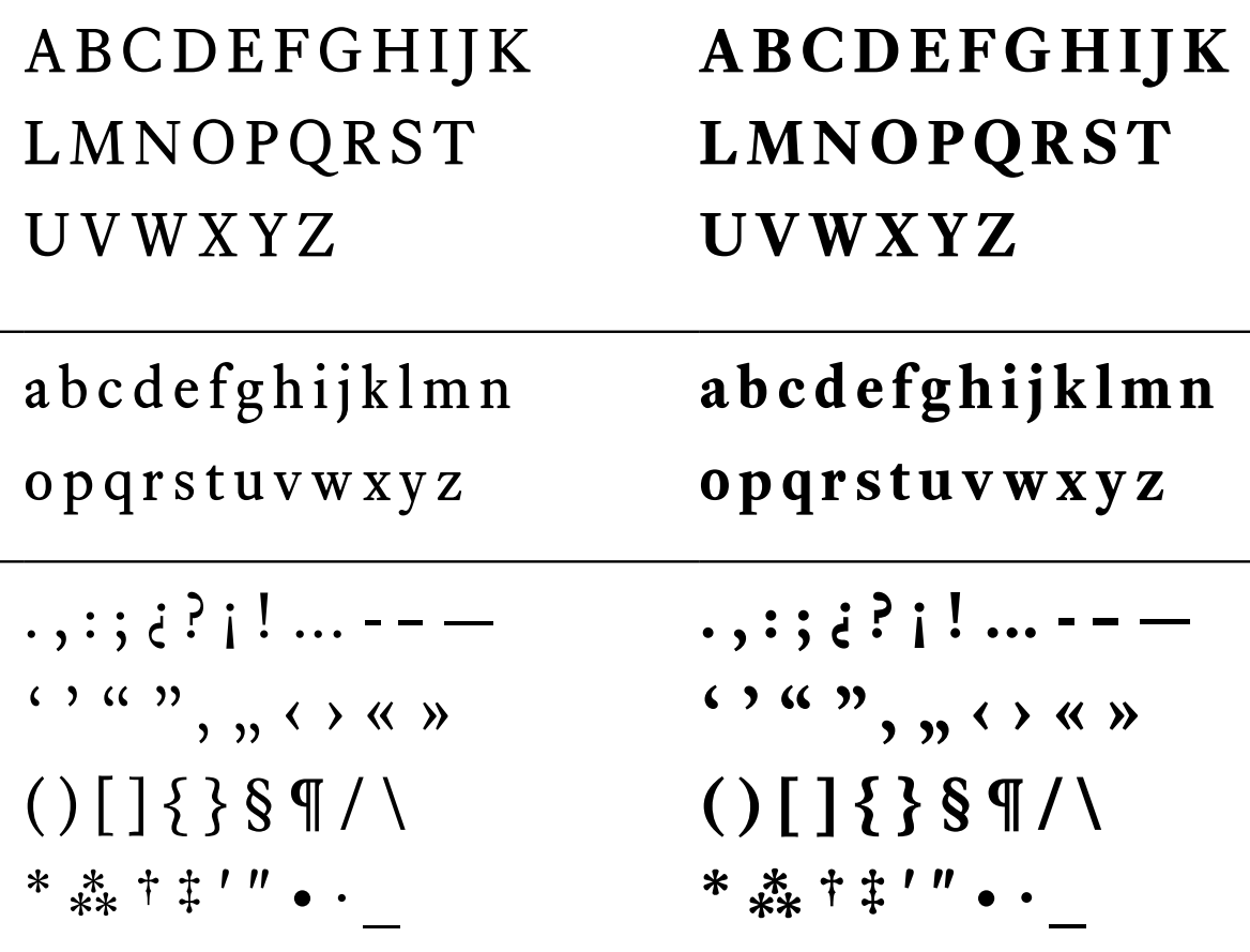
- Equity (2011) is a readable text family, based on Ehrhardt.
- Berlin Sans (1994). Font Bureau: Berlin Sans is based on a brilliant alphabet from the late twenties, originally released by Bauer with the name Negro, the very first sans that Lucian Bernhard ever designed. Assisted by Matthew Butterick, David Berlow expanded this single font into a series of four weights.
- Advocate and Advocate Slab (2015-2017). A large sans and slab family. Caps only.
- Concourse (2013-2017). A large sans family.
- Valkyrie (2018).
- Century Supra (2018). A modern typeface.
[Google]
[MyFonts]
[More] ⦿
|
Melifonts
[Melinda Jeffs]
|
 Born in Boston, MA, in 1988, Melinda Jeffs designs type. She founded Melifonts in 2011 in Hampton, NH. Creator of Drama Queen (2011, hand-printed), Belle Script (2011, curly letters), Pantsy Fance (2011, curly lettering), Rayna (2011), Donnia (2012), Sweet Cheeks (2012, hand-printed), Sariah (2011), Tandy Lee (2012, hand-printed), Polite Script, Meli Hand, and Weights and Measures (2011, slightly brushy). All her typefaces cover Cyrillic as well.
 Fontspace link. Klingspor link. [Google]
[MyFonts]
[More] ⦿
|
Melinda Jeffs
[Melifonts]
|
[MyFonts]
[More] ⦿
|
Meredith Carson
|
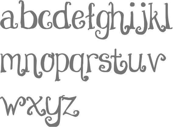
 Manchester, NH-based designer of a curly Victorian alphabet in 2014. She also created Blue Lobster Type (2014). [Google]
[More] ⦿
Manchester, NH-based designer of a curly Victorian alphabet in 2014. She also created Blue Lobster Type (2014). [Google]
[More] ⦿
|
Nick Beaulieu
|
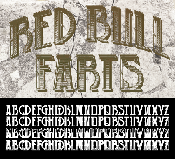
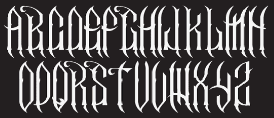
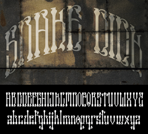
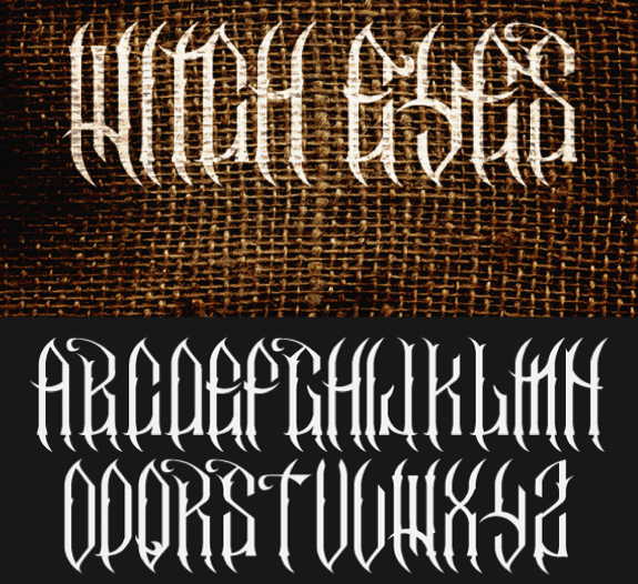
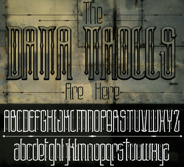
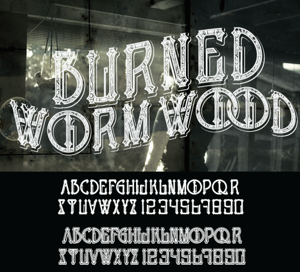
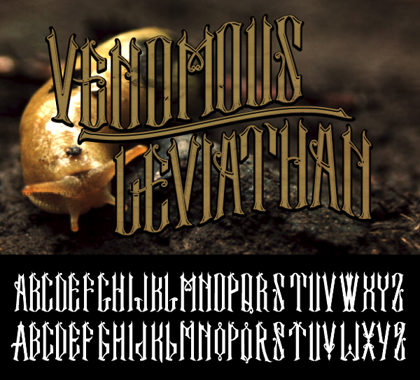
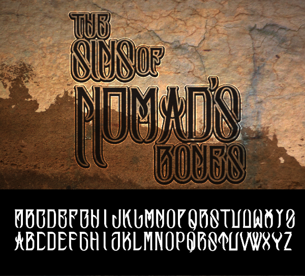
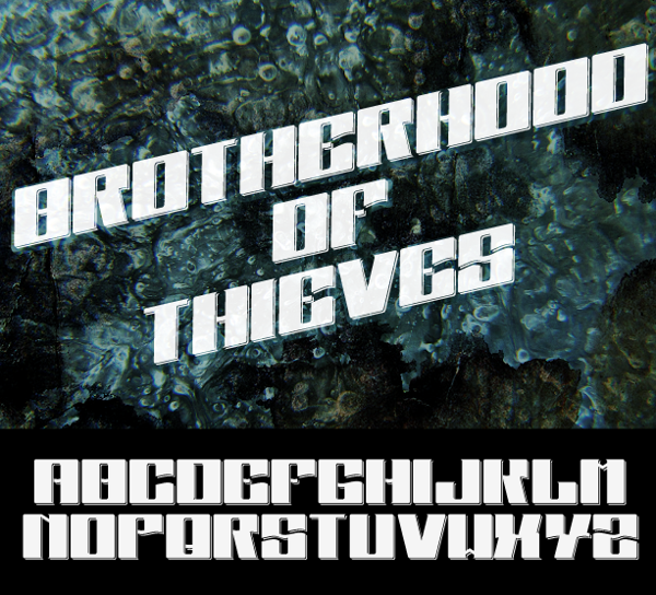
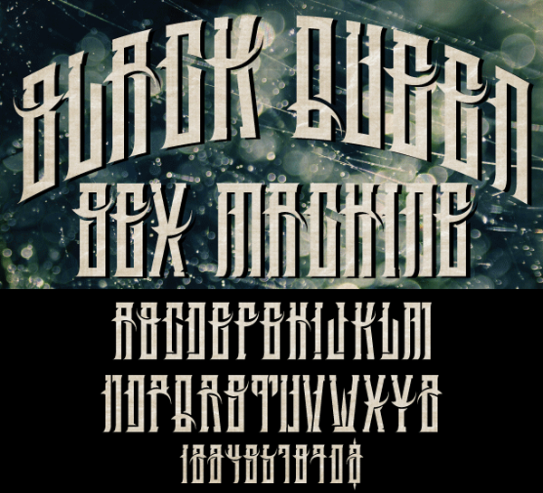
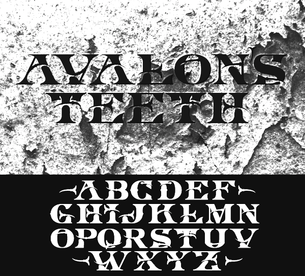
Gothic font designer in Littleton, NH. Creations include the free font DBYD (2011), and the commercial typefaces Dynasty Belt (2011), Steel Heart (2011), Killer Saints Hymn (2011), Red Bill Farts, and an unnamed gothic face (2011). Snake Dick and Witch Eyes are free. Typefaces from 2013: Data Trolls, Burned Wormwood (Western, ornamental wood type), Venomous Leviathan, The Sins of Nomad's Bones, Brotherhood of Thieves, Black Queen Sex Machine, Avalon's Teeth. Typefaces from 2014: Ninja Scorpion Penis, Appalachian Force, Future Sperm, Bulgarian Mustache, Blunderbuss, King Slayer. Behance link. [Google]
[More] ⦿
|
Noah Chicoine
|
Creator of an unnamed typeface in 2013. Noah is based in Keene, NH. [Google]
[More] ⦿
|
OCD: Original Champions of Design
[Jennifer Kinon]
|
 Branding and design agency in New York City. Subpage for the free labyrinthine typeface Free (2013) that won an award at TDC 2014. Free was co-designed by Matt Kay, Jennifer Kinon and Bobby C. Martin.
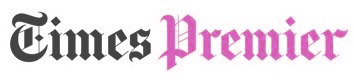
 Times Premier (for The New York Times) is a masthead blackletter done by Jennifer Kinon, Bobby C. Martin Jr, Matt Kay, Jonathan Lee and Michael McCaughley based on lettering by Matthew Carter. For the Museum of African Art, Jesse Ragan created the Afri Sans typeface family. In 2018, they created the custom branding and logo typeface Dartmouth Ruzicka for Dartmouth University, based on type on a bicentennial seal and plaque designed by Rudolph Ruzicka, a typeface designer who retired in Hanover, NH. [Google]
[More] ⦿
|
Photon Inc
[Bill Garth]
|
Company in Wilmington, MA, founded by William Garth. MyFonts writes: In the 1950s, 1960s and 1970s, Photon, under Billy Garth, built a large and rambling library of low quality typefaces, original in nothing but scripts. A group of higher quality material created at Deberny&Peignot for Lumitype - Photon's European arm - under Higgonet and Moyroud was added when the younger Higgonet closed Deberny&Peignot. After Photon went out of business, the library was passed through Dymo (1975) to Itek (1979), and then to Unitex (1983), itself later acquired by Chorus Data Systems of New Hampshirer. [Google]
[MyFonts]
[More] ⦿
|
Plaid Gecko
[Rachel Litzinger]
|
New Hampshire-based designer of the handcrafted typeface Picketfence (2016). Creative Market link. [Google]
[More] ⦿
|
Rachel Litzinger
[Plaid Gecko]
|
[More] ⦿
|
Rauner Special Collections Library
|
Located in the middle of Dartmouth College's ivy league campus in Hanover, New Hampshire, this special collections library includes the archive of type designer Rudolph Ruzicka, as well as materials from famous graphic arts historian Ray Nash. [Google]
[More] ⦿
|
Ray Nash
|
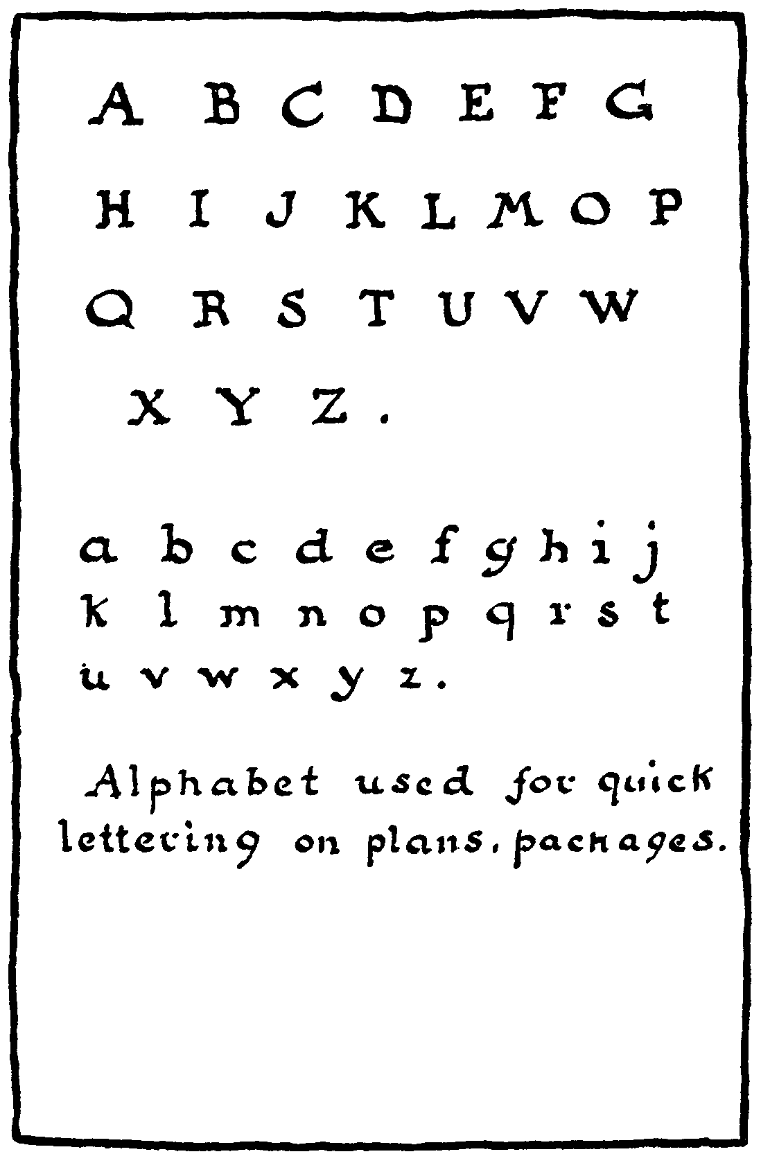
graphic art historian in Hanover, NH. Many say that Ray Nash's book American Penmanship, 1800-1850. A History of Writing and a Bibliography of Copybooks from Jenkins to Spencer (1969, Worcester: American Antiquarian Society) is the best bibliography on the subject. The book is 303 pages long. [Google]
[More] ⦿
|
Sara Wachendorf
|
During her studies in Manchester, NH, in 2013, Sara Wachendorf created a pixel typeface. [Google]
[More] ⦿
|
Source Foundry
[Chris Simpkins]
|
Christopher Eric Simpkins (1974-2025), of Hanover, NH, grew up in Gainesville, Florida, and attended the University of Florida. He earned his medical degree from the Johns Hopkins University School of Medicine. Quoting from his obituary, Chris was a skilled and dedicated transplant surgeon whose work saved many lives. His gentle bedside manner and concern for his patients and colleagues earned him respect and admiration throughout his career. Chris was honored with numerous teaching awards and affectionately known by colleagues and patients as the Gentle Giant for his calm, kind demeanor. In recent years, he served as a Senior User Experience Program Manager at Google, with a special interest in font development. Chris initiated and guided the creation of Google Sans Code, a new brand font designed specifically for reading and writing code, and he program-managed the design and development of other Google font families that were recognized with both internal and international design awards. Throughout his time at Google, Chris led a broad network of vendors and partnered with teams across the company to integrate these fonts to major Google platforms. As the principal of Source Foundry in Baltimore, MD, he wrote these free font tools: - font-unicode. A command line application that performs searches for Unicode character names by Unicode code points, and for Unicode code points by character names. It supports the Unicode standard v8.0.0. The query results are supplemented with the Adobe Glyph List for New Fonts v1.7 glyph names where applicable.
- compare-typefaces. Simple browser tool to compare a string between several typefaces, intended to judge the legibility of easily confusable glyphs.
- ufodiff. A command line UFO source file diff tool for collaborative typeface development projects.
- ufolint. A source file linter for typeface development in Unified Font Object (UFO) source code. It was designed for continuous integration testing of UFO source contributions to typeface projects.
- font-line: OpenType vertical metrics reporting and font line spacing adjustment tool.
- font-ttfa: A command line TTFA table reporting tool for fonts hinted with ttfautohint.
- fontname.py: Font renaming script for otf and ttf fonts.
- font-tables: An OpenType font table reporting tool for ttf and otf font files.
In addition, Chris designed the free programming font Hack (2018), a fork of Deja Vu SansMono. Github link. Use Modify link. Official obituary. [Google]
[More] ⦿
|
Sunwalk Designs
[Andy Krahling]
|
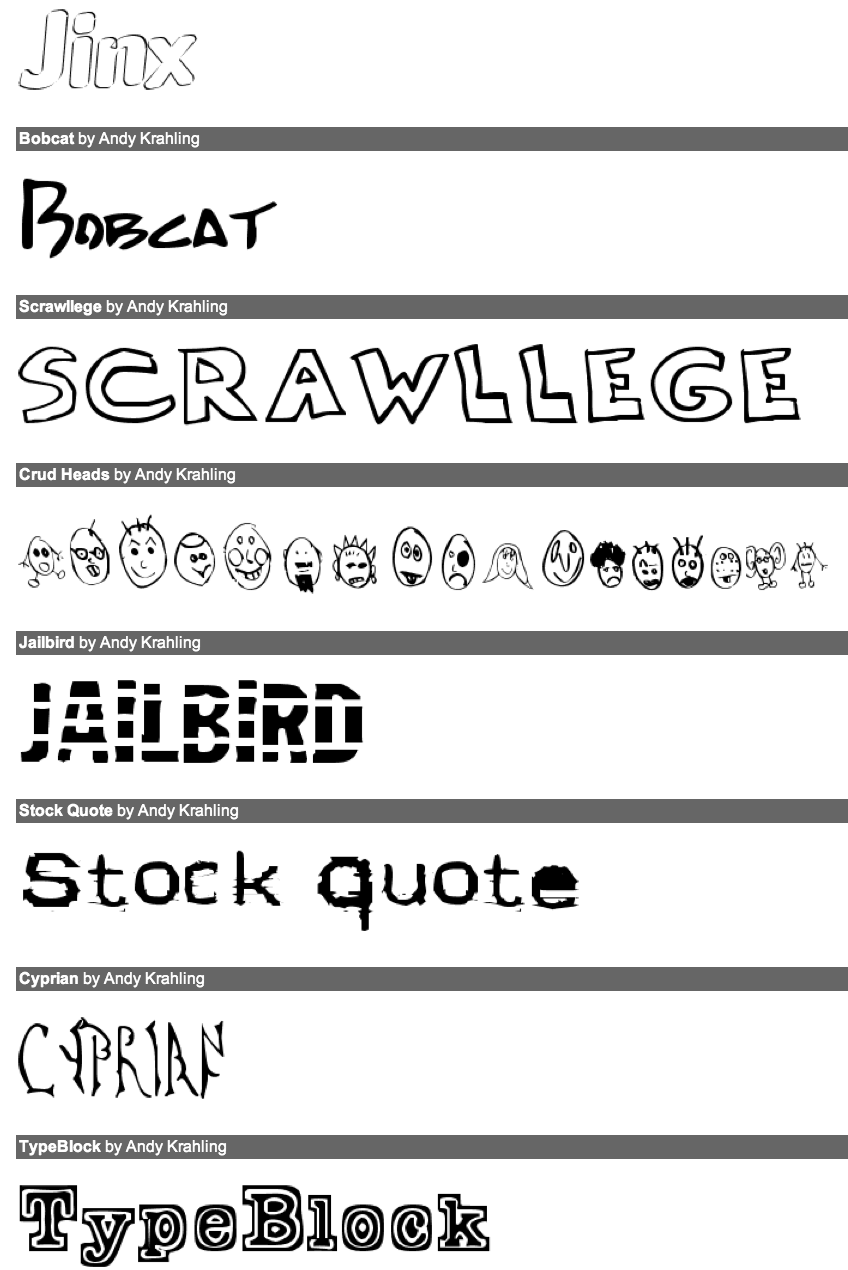
The type design work of Manchester, NH's Andy Krahling, features handwriting fonts and grungy typefaces. Free typefaces include Elementric, AndyHand, Matta, Bobcat, MrHanky, Ruffian Outline, Ruffian Bold, Pointed, PointedOut, FatLefty, Jinx, Strait, Cyprian, Primer, Schooldaze, CrudHeads, Squish, Skimpus, Schooldaze, Simpleton, Squish, Sigmund, Bobcat, Dot2Dot, Kilroy Was Here, Matt9, Scrawllege, Simpleton, Lockjaw, Zag, Stockquote, Type Block (2012), HesitantShadow, Bloated, Jailbird and NotsoSkimpus. Andy also makes handwriting and signature fonts. Logo fonts custom-made at about 100USD a font. Commercial fonts at 10USD a shot include Britta Regular, Class Bold, Class, Cowpoker, Fred Regular, Jerko Bold, Jerko Outline, Jerko Regular, Joe, Lockjaw Bold, Marko Heavy, Marko Regular, Maryhand, Minerva Bold, Minerva, Norm Write Bold, Norm Write Left, Norm Write, Scripto Hand Bold, Scripto Hand, Tape, Wallaby. Dafont link. Abstract Fonts link. Catalog. Abstract Fonts link. [Google]
[More] ⦿
|
Suzie Barros
|
Suzie Barros (Manchester, NH) created the pixel typeface Pistil Whipped (2013). [Google]
[More] ⦿
|
Tiffany Look
|
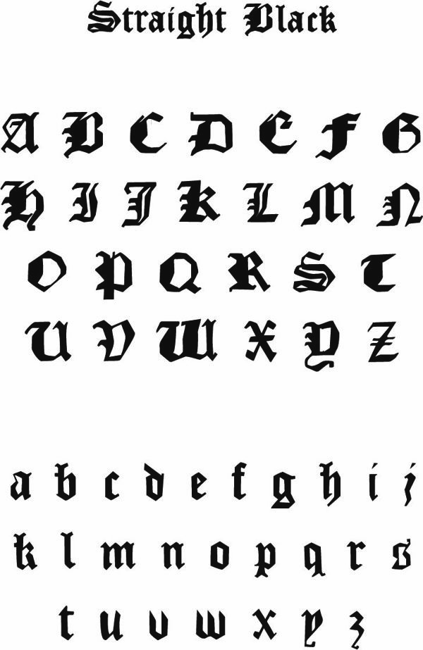
As a student at the New Hampshire Institute of Art, Tiffany Look (Manchester, NH) created the blackletter typeface Straight Black (2013). [Google]
[More] ⦿
|
Type Solutions
|
Founded in 1989 by Sampo Kaasila. Based in Plaisted, New Hampshire, the contacts of this typography outfit are Ed Edman and Amy Hensiek. They offer font engines and type software. It markets type software, and has fantastic web presentations, such as this page showing Gothic Kanji output in small type. On December 2, 1998 Bitstream bought Type Solutions, Inc. for $600,000 US. There are some occasional fonts by them out in cyberspace, but they stopped making fonts. [Google]
[More] ⦿
|
Will Carter
|
Born near London in 1912, d. 2001. His typefaces: - Klang (1955). This typeface at Lanston Monotype was bought by Stephenson Blake from Monotype.
- Dartmouth (1961), Dartmouth Titling (for Letraset). Mac McGrew on Dartmouth: Dartmouth may be the last new typeface cut in metal. Paul Duensing says it was designed by Will Carter as a titling letter for the college of that name for signage and other display uses. It was based on Octavian Roman which Carter and David Kindersley had co-designed in 1960-61 for English Monotype. New figures for this cutting were drawn by Will Rueter of Toronto. Dartmouth was cut and cast in 22-point in 1991 at Duensing's Private Press and Type foundry.
- Octavian (1961, with David Kindersley).
Obituary: Founder of the Rampant Lions Press, who kept Cambridge supplied with fine printing and lettering of all kinds begun by Will Carter more than 60 years ago and continued by his son Sebastian, the Rampant Lions Press has been the leading English private press of the postwar period, following handsomely in the tradition of the Golden Cockerel and Nonesuch Presses. The Rampant Lions location in Cambridge and its close ties to the university guaranteed a stream of jobbing work in the early years---supporting it financially and spreading its reputation, as well as making it the obvious choice of printer for many books conceived within academia's groves. Both Will and Sebastian have been notable for their wide circle of friends and collaborators from the worlds of typography and lettercutting, fine printing, literary criticism, scholarly publishing and good bookselling. In addition to its own books, the Rampant Lions Press has always taken on work for other publishers, making printing not a solitary obsession, but a co-operative and convivial pleasure. Their customers have included Lord Rothschild, Dadie Rylands, Brooke Crutchley, Douglas Cleverdon and Ted Hughes, while those who produced illustrations for the press have included John Piper, Michael Ayrton, Anthony Gross, Leonard Baskin and John Buckland Wright. At a time when commercial publishing was increasingly done by lithographic methods, the Rampant Lions kept before the public examples of how much deeper, crisper and blacker good presswork from metal type can be. In reaction to photocomposition and then computer setting, there has been something of a revival of private printing, with presses of various degrees of accomplishment and preciousness emerging around the country; but the Rampant Lions was a crucial link back to the days when metal type was in everyday use. The changes in technology also gave it the opportunity to build up a collection of specialist fonts of type from foundries and from other presses, including the Golden Cockerel Roman. William Nicholas Carter was born in Slough into a very bookish family. He was, for instance, a great-great-nephew of the Eton master William Johnson Cory, famous for the Eton Boating Song and his translation of Callimachus' Epigram, "They told me, Heraclitus, they told me you were dead." Cory's Lucretilis was in due course handsomely printed at the Rampant Lions, with an introduction by John Sparrow. Will was the younger brother by seven years of the bookseller, biblio-historian and Housman scholar John Carter, who with Graham Pollard exposed the T. J. Wise forgeries of 19th-century pamphlets, in the classic case of bibliographic detection. Their cousin was the outstanding wood-engraver Reynolds Stone, who was to cut one of several devices for the Rampant Lions, as he previously had for Frances Meynell's Nonesuch. Will Carter's interest in printing began when he visited Oxford University Press in 1924 at the age of 12, where he was allowed to print a visiting card for himself using the 17th-century Fell type. A few days later, John Johnson, who was shortly to become Printer to the University of Oxford, sent the boy some type to experiment with, hoping that it would make for an amusing and useful hobby. After his schooling at Radley, Carter worked as a trainee with the printers Unwin Brothers for two years. He transferred to the Shenval Press, under James Shand, and then to Heffer's printing works in Cambridge in 1934, where he rose to be a designer. In his spare time, he began jobbing printing in Jordan's Yard on an octavo flat-bed Adana press, an Albion hand-press and later an Adana platten press. His first book, in an edition of just 50 copies, was the printer John Baskerville' Preface to his 1758 edition of Paradise Lost. "The pathetic part about it was that I took the text from Updike" wrote Carter years later, "and, beyond noticing a certain abruptness in the ending, didn't realise that it wasn't complete." The slump in the prices of rare books and modern first editions at the beginning of the 1930s made life difficult for private presses. Book-collecting had been fashionable in the giddy 1920s. Books had been bought as financial speculations and there were many eager customers, so it was possible to sell comparatively long runs. "Nonesuch limited editions sold to the full of their hundreds," wrote Sir Frances Meynell in My Lives in 1971. But after the crash of 1929-30, the next two decades saw a retrenchment in book collecting and publishing. Most of the successful new enterprises of the period were in the form of popular editions, such as Penguins, rather than fine collectors' items, and Carter could not support himself with Rampant Lions work alone. He married Barbara Digby in 1939 and moved to Chesterton Road, where they were to live for the rest of their lives. During the war he served in the Royal Navy in the South Atlantic and the Eastern Mediterranean, commanding a converted Greek sailing ship, transporting undercover agents around occupied Greece, until his demobilisation in 1946. Back in England he returned to Heffers, but in 1949 he steeled himself to pursue his passion, and the Rampant Lions Press, named after the family arms, became his full-time occupation. Happily, he was soon commissioned by Geoffrey Keynes to print 75 copies of Emblems of Experience by Siegfried Sassoon, for the author. Although much of his work consisted of printing wedding invitations, change-of-address cards and suchlike announcements, rather than books, it was so conspicuously fine that five years later an entire issue of the typographic world's house magazine, The Monotype Recorder, was devoted to Carter. In 1961 he served as president of the fine printers and typophiles dining society the Double Crown Club. And his life in letters extended beyond printing, into calligraphy, letter-cutting and type-design. In 1936 he had carved some lettering on a round breadboard for Brooke Crutchley, and he was to continue carving decorative alphabets---often of his own design---into different shaped panels for 60 years. In 1948, the year he published an essay on Chancery Italics in Printing Review, he met Eric Gill's last apprentice, the lettercutter David Kindersley, and learnt to cut in slate. The first of his commissions was the war memorial at Magdalene College, and he went on to produce many elegant gravestones and tablets. His lettering in stone and wood was exhibited in Frankfurt, Prague and New York, and his hand and eye were chosen for the foundation stone of the new British Library, cut and installed while St Pancras was still a building site. As he wrote, "the handling of type and the setting out of carved inscriptions came to influence each other. The setting of printer's caps in particular has reached a fine point of sensitivity as a result." This feeling for the shapes of letters led naturally to his designing his own. His typeface Klang was released by Monotype in 1955, and showed the influence of Rudolf Koch and his son Paul, in whose studio Carter had spend some months in 1938. (The type designer Hermann Zapf had been working nearby in Frankfurt at the time, and Carter considered him a major influence on his own lettering.) Later Carter and Kindersley collaborated on the design of another face, Octavian. Around 1963 Douglas Cleverdon approached the Rampant Lions to print an edition of The Rime of the Ancient Mariner, with ten copper-engravings that had been exe cuted by the artist and writer David Jones in 1928. This partnership was to lead to a series of books under the Clover Hill imprint, culminating in 1981 in the mighty (and mighty expensive) Engravings of David Jones. In 1974 Clover Hill Editions published William Morris's poem The Story of Cupid and Psyche, with wood-engravings designed by Edward Burne-Jones. The blocks for this large two-volume set had been engraved, mostly by Morris, for the Kelmscott Press in 1865 but had never been printed. Fortunately, Brooke Crutchley, by then the Cambridge University Printer, was able to persuade the University Library to lend Will and Sebastian the Kelmscott collection's black-letter Troy type for this edition, the most ambitious collaboration between father and son. Will Carter was artist-in-residence at Dartmouth College, New Hampshire, in 1969, where for Letraset he designed Dartmouth Titling, a slightly swaggering set of Roman capitals. He served on the Royal Mint's advisory committee from 1971 to 1991, and the architectural advisory panel of Westminster Abbey from 1979 to 1992. He was elected an honorary Fellow of Magdalene College in 1977, and appointed OBE in 1984. In the summer of 1982 a Rampant Lions retrospective was held at the Fitzwilliam Museum in Cambridge, for which the Carters wrote and printed a useful catalogue and checklist of the 172 books printed up to that time. By then the press had largely been handed over to Sebastian, and Will was devoting his time to carving and lettering. Over the years he produced many calligraphic book-jackets and title-pages, particularly for Cambridge University Press and Chatto&Windus. He also accepted commissions for book-labels for private collectors, many of which were doubtless pasted into volumes from the Rampant Lions Press. Will Carter's wife died in 1994, but he is survived by his son and three daughters. Will Carter, OBE, printer, type designer and lettercutter, was born on September 24, 1912. He died on March 17, 2001, aged 88. Catalog of his typefaces. Klingspor link. FontShop link. Linotype link. [Google]
[MyFonts]
[More] ⦿
|
William C. Pelon
|
New Hampshire-based creator of UWJack8 (2005), an old typewriter font based on a mid 1930s Underwood typewriter. Dafont link. [Google]
[More] ⦿
|
William Dana Orcutt
|
Book designer, typographer and author (b. 1870, West Lebanon, d. 1953, Boston). Designer of French Round Face&Italic, Humanistic, Laurentian, Suburban French&Italic, and Verona. McGrew comments on each face: - Suburban French is one of Monotype's first independent recreations of typefaces from classic sources abroad. It was cut about 1911 at the suggestion of J. Horace MacFarland, prominent Pennsylvania printer, and was adapted to Monotype under the supervision of MacFarland and William Dana Orcutt, a well known typographer and book designer in New England. Its source is said to have been a Didot oldstyle first cut about 1804, but the Monotype typeface was first introduced under the name of Bodoni Roman. The double serifs at the top of lowercase vertical strokes are a distinguishing feature. Compare French Round Face.
- Verona is ATF's adaptation about 1951 of Bologna, which had been cut by Stephenson Blake in England in 1948. It is said to have been cut from Stephenson Blake's drawings, but lining figures were drawn to replace the hanging figures which Stephenson Blake had featured. The name was changed to avoid having disrespectful printers call it "baloney," yet retaining an Italian connotation. At the time ATF did not realize that Stephenson Blake had in turn adapted the design from an earlier ATF face, Humanistic (q.v.), drawn by William Dana Orcutt in 1904. With or without its later modifications, which are minor, this typeface retains more of the appearance of hand-lettering than almost any other cut in metal, and composes into a beautiful page with properly close spacing. Compare Freehand, Motto, Heritage, Thompson Quillscript. Incidentally, when ATF took Verona as a new name for Stephenson Blake's Bologna, they also overlooked the fact that Stephenson Blake uses the name Verona for their copy of BB&S-ATF's Munder Venezian.
- French Round Face, originally called Didot Roman or simply Modern, was one of the first revivals of the typefaces cut by Firmin Didot in France about 1784. This was cut for Monotype in 1910, under the direction of J. Horace MacFarland and William Dana Orcutt. The italic is unusual in that some lowercase letters have serifs like the roman. No. 16 on Linotype and Intertype is similar but heavier. Compare Suburban French.
- Humanistic was designed by William Dana Orcutt and privately cast by ATF in 1904 for the University Press, Cambridge, Massachusetts. It is a careful rendering into type of the round humanist writing of the Renaissance period, based in particular on the 1485 manuscript of Antonio Sinibaldi's Virgil in the Laurentian Library at Florence, Italy. This is considered by some to be hand-lettering in its most beautiful form, and occurred after the development of roman types as we know them. In 1940 this type was adapted to Monotype keyboard composition, under the direction of Orcutt and Sol Hess, the 21-point size being used for a large edition of Science and Health. The Monotype cutting, known as Laurentian closely follows the foundry version, including some but not all of the original alternate characters. A few years later the design was modified by Stephenson Blake in England, and issued as Bologna; this in turn was adapted by ATF as Verona (q.v.).
Note: Humanistic/Verona were digitally extended in 2006 by Ray Larabie as Mikadan (Typodermic). Klingspor link. [Google]
[More] ⦿
|
Yvonne Simmermacher
|
Manchester, NH-based designer of the minimalist sans typefaces Genivo (2021), Toai (2021) and Halon (2021). [Google]
[More] ⦿
|
Zachary Afshar
|
Manchester, NH-based designer of Vernacular Typeface (2015). This typeface was finished during his studies at New Hampshire Institute of Art, Behance link. [Google]
[More] ⦿
|
