TYPE DESIGN INFORMATION PAGE last updated on Mon Mar 9 16:08:42 EDT 2026
FONT RECOGNITION VIA FONT MOOSE

|
|
|
|
|
Type scene in Vermont | ||
|
|
|
|

SWITCH TO INDEX FILE
Aboutype
|
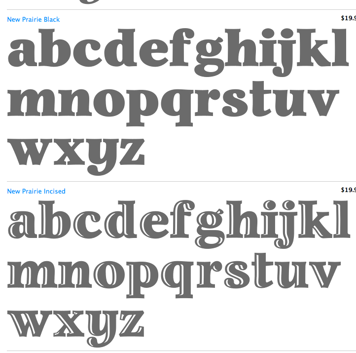
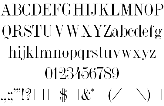
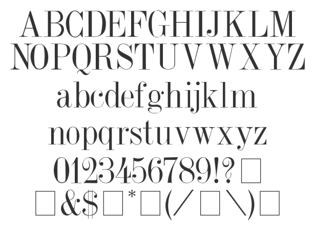
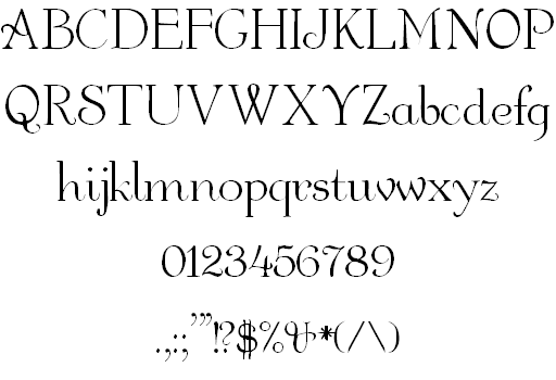
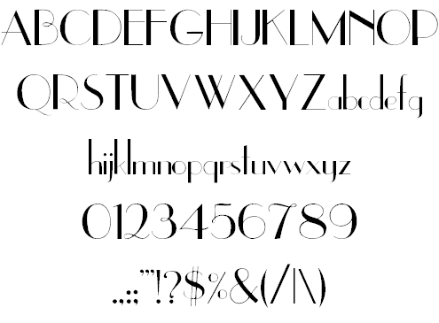
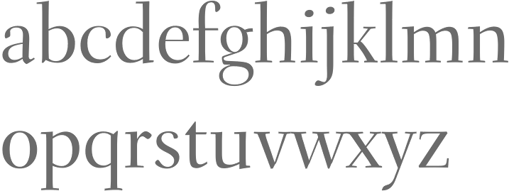
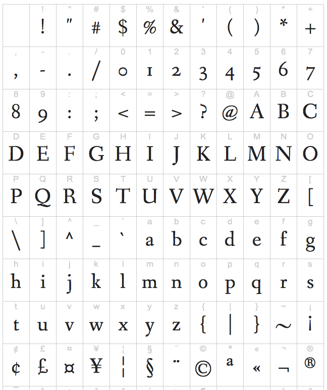
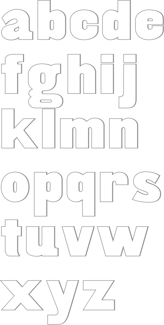
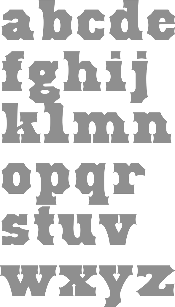
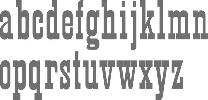
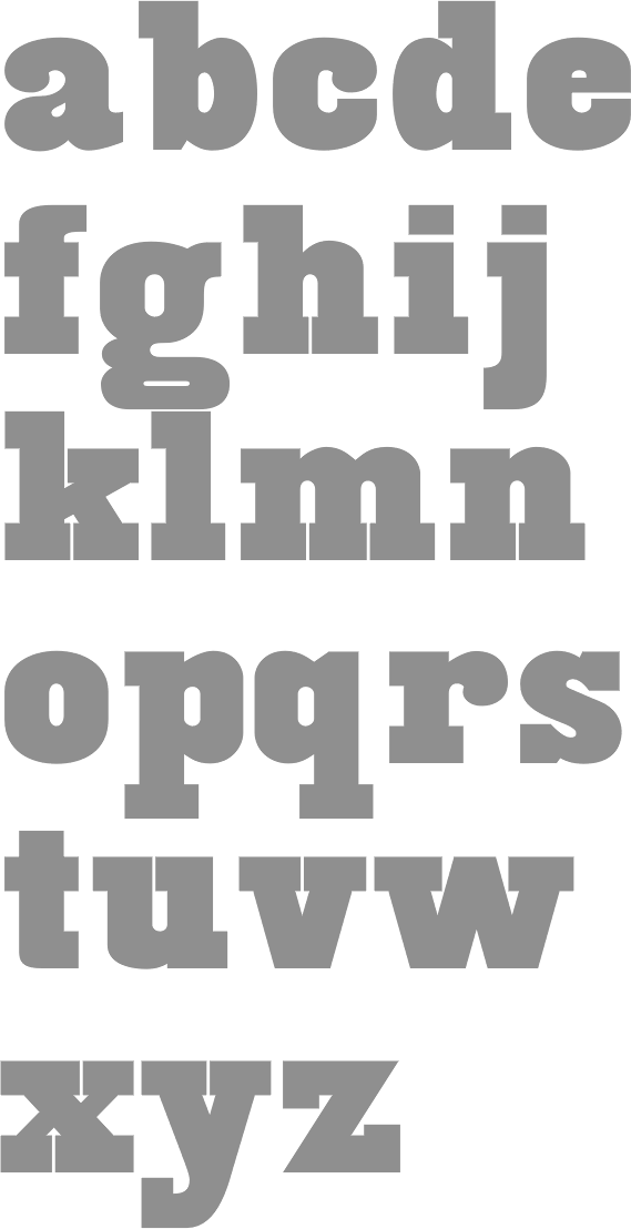
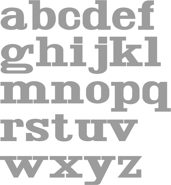
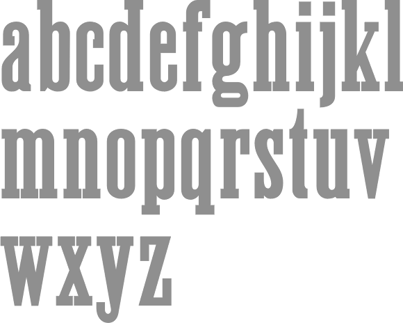
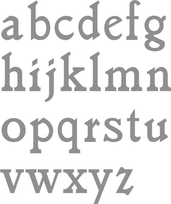
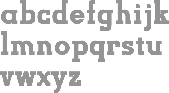
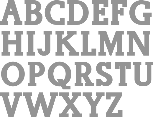
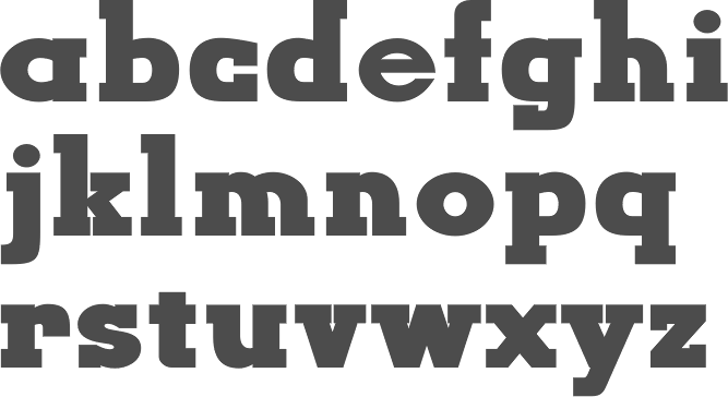
LeFevre's fonts include Antique Central (shop sign font), Bitters, Boot Stitch, Capital, Crombury (2006, elegant high-ascendered display family), Cullens Shoes, Downtown, Elongated Roman, Erasurehead, Everett Mill, Free Zone (2001, geometric sans), Granger (2007), Hemmings, Hunter (2001, a slab serif family in the style of Beton), Hunter Poster, Mac Sans Outline Poster, Max Stitch, Merchant, Minernil (2006, slab serif family), Mulsanne (race car font), New Horizon (inscriptional, Trajan), New Horizon Titling, New Prairie (2001, transitional family), Pemberton, Pitch Pipe (2001, modern, bold), Putney (shop sign font), Ravenna, Rays Cafe, Redeye (2001, a religiously condensed and quite unreadable face), Redeye Sans, Revenue, Saloon, Sparrow (2007), Vanquish (2001, geometric sans), Wade Vernacular, Whitingham, and Zone. Some fonts now sold through MyFonts: Antique Central, Bitters, Boot Stitch, Capital, Crombury, Cullens Shoes, Downtown, Elongated Roman, Erasurehead, Everett Mill, Free Zone, Hemmings, Hunter, Hunter Poster, Max Stitch, Merchant, Mulsanne, New Horizon, New Prairie, Pemberton, Pitch Pipe, Putney, Ravenna, Rays Cafe, Redeye, Redeye Sans, Redeye Serif, Revenue, Saloon, Vanquish, Wade Vernacular, Zone, Sydney, Charles, Merrimac, Willem, Float, Proceed, Salonika. View Aboutype's typefaces. Obituary. [Google] [MyFonts] [More] ⦿ |
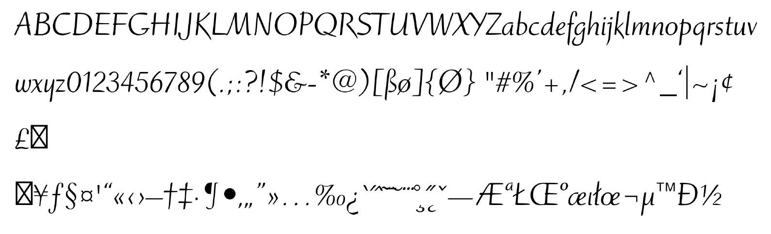
Adam B. Ford is an author, snowboard instructor, and zipline guide living with his dog Bulo in Vermont. He has published seven children's books and works on a variety of photo, video, and design projects. His first font was designed in 1990 but it was not until 2021 that he started retailing his typefaces. In 2021, he released Hulpy (an informal comic book font), Pleroid (an elliptical stylized sci-fi font), Bezura (a monolinear sans that tries to minimize the number of Bezier points) and Bylum (hand-drawn). [Google] [MyFonts] [More] ⦿ | |
Alec Julien
| |
Burlington, VT-based designer of Dextra (2017). [Google] [More] ⦿ | |
Born in 1954 in Athol, MA. Studied at the University of Vermont and the Mass. College of Art. Type designer and type design manager at Compugraphic at some point. The eight weight-Garth Graphic family was jointly designed by Renée LeWinter, John Matt and Constance Blanchard (1979, Agfa / Monotype). Fonshp link. [Google] [MyFonts] [More] ⦿ | |
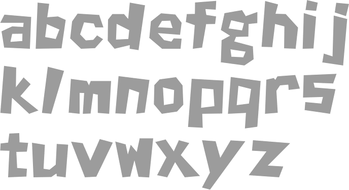
Designer of the counterless modular fat typeface Moduli (2010). In 2010, he graduated with a degree in graphic design from Champlain College in Burlington, VT. [Google] [More] ⦿ | |
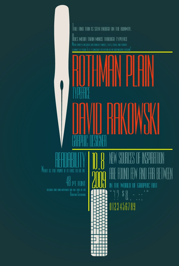
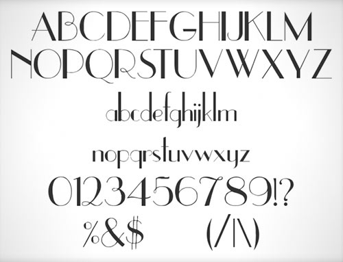
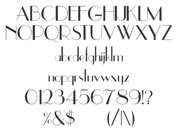
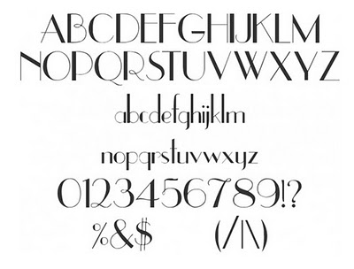
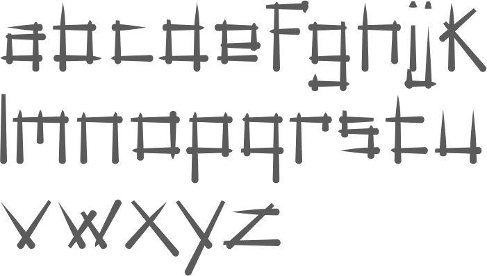
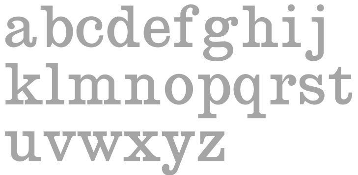
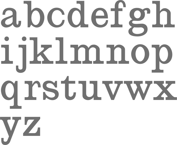
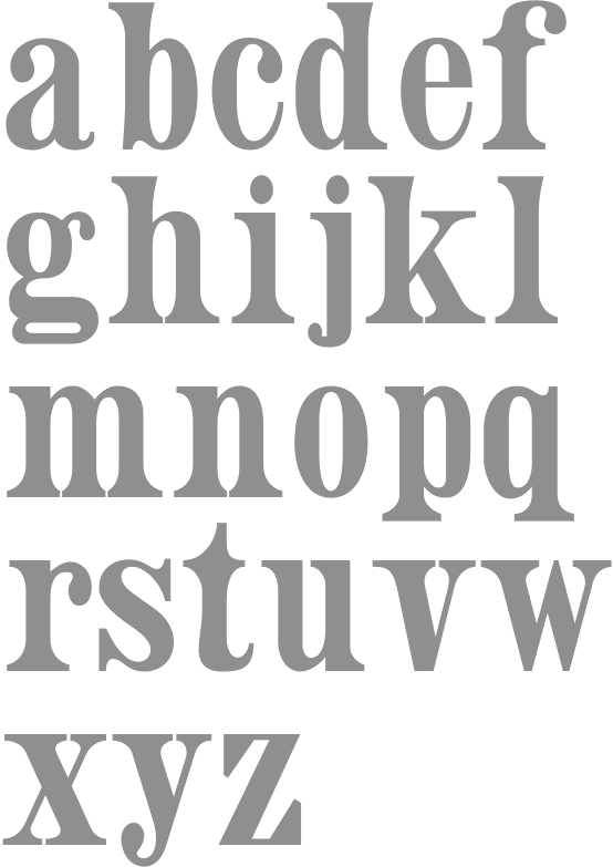
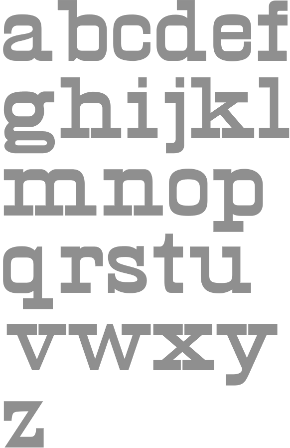
List of Rakowski's fonts: 3-DWedgie, Aarcover, AdineKirnberg-Script, Ann-Stone, Beachman, Beffle (1991, after Fry's Ornamented No. 2 from Stephenson Blake), Bizarro, BrailleFont, BunnyEars, ChristensenCaps, Crackling, DaBigKeyCaps, DavysCrappyWriting, DavysDingbats, DavysKeyCaps, DavysNewOther, DavysOtherDingbats, DavysRibbons, DeBalme Initials, DieterCaps, Diner-Fatt, Diner-Obese, Diner-Regular, Diner-Skinny, Dobkin-Script, Dragonwick, Dubiel (1991), Dupuy-Light, DupuyBALloon, Eileen, EileenCaps, EileensMediumZodiac, Elizabeth-Ann, Elzevier, EraserDust, Firecat, Gallaudet (a sign language font), Garton (1993), Gessele-Script, GriffinOne, Harting (an old typewriter font), Headhunter, Holtzschue, Horst, Ian-Bent, Jeff-Nichols, Jumble, Kinigstein, Konanur, KoshgarianLight, Kramer, Lassus (1993), LeeCaps, Lemiesz (a free version of Publicity Gothic, 1916), Lilith-Heavy, Lilith-Initals, Lilith-Light, Lintsec, Logger, LowerEastSide, McGarey-Fractured, Multiform, Nauert, NixonInChina (oriental simulation), ParisMetro, Pixie, Pointage, Polo, Rechtman-Script, ReliefDeco, ReliefInReverse, Reynolds, Rockmaker, Rothman [note: poster by Lauren Buroker], Rounded, Rudelsberg (a Munch Jugendstil style font), Salter, Shotling, Showboat, Shrapnel, Starburst, TejaratchiCaps, TenderleafCaps, ToneAndDebs, Tribeca, Uechi, UpperEastSide (1990), UpperWestSide (lettering from the New Yorker magazine), VarahCaps, Wedgie, Wharmby, WhatA-Relief, Will-Harris, Zaleski, and Zallman-Caps. Some downloads: Uechi, Rothman, Tejaratchi, Eileen Caps and Elzevier Caps, Paris Metro, Davy's Dingbats (see also here). With Klaus Herrmann, of Intecsas in Düsseldorf, he started updating his fonts from 1992-1999. Those fonts can be bought at Will-Harris. Here is an interview with David. Download 120 of his fonts here. And finally, a text file with the names of most of his fonts. Mark Johansson explains the history of Rakowski's fonts. Dafont link. MyFonts page. Abstract Fonts link. Font Squirrel link. Fontspace link. Klingspor link. [Google] [MyFonts] [More] ⦿ | |
Punchcutter at the Golgonooza Letter Foundry (New Hampshire), run by Dan Carr. At one point associated with Weeds Media Consortium in Burlington, VT. [Google] [MyFonts] [More] ⦿ | |
Haiku Monkey
|
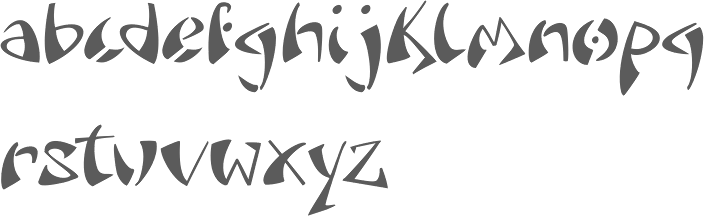
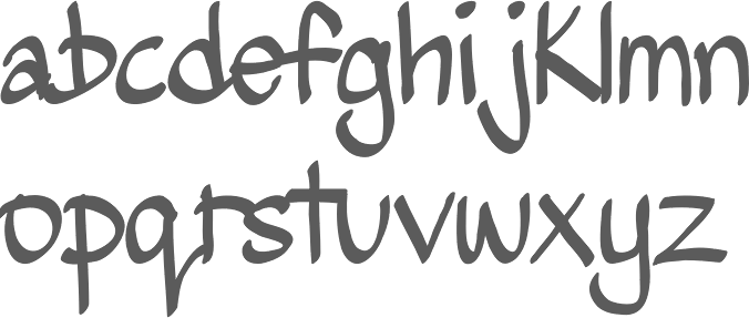
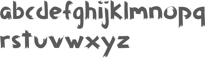
Free fonts: Lavoisier (2009, sans), Skritch (2008, handwriting), Geekium (2008, a math symbols font based on Gentium), 36 Dots (dot matrix face), Teacher Sez (2007, blackboard script). Devian Tart carries these free fonts/demos: Skritch, Rany, Teacher Sez, Steel Jalopy (2008, based on Steel Sedan), Insolent (2009), I Am A Bird (2009, slab serif family), Myrna (2009). Lavoisier (2009) is a free monoline font, later cyrillicized by Sergey Tkachenko. Working on Modus (2009). Additions in 2010: Lockwood (a strong all-caps sans display face), m7 (a slab serif typewriter face), Blues Vity (condensed display face), m13 (fat slab serif), Mineola, Hunk (fat all-caps display face). Creations from 2011: Zurdo (hand-printed). Typefaces from 2012: Shockproof (a tall display face). Typefaces from 2013: Arcation (techno). In 2014, Alec Julien published the skyline typeface family Lexave. Typefaces from 2015: Gilmour (a sturdy slab serif, +Cyrillic). Typefaces from 2016: Gama (octagonally cut Star Trek font). Typefaces from 2018: Syd, Sid. Interview by Seven Days. Fontsquirrel link. Klingspor link. Kernest link. |
During her graphic design studies at Savannah College of Art and Design (SCAD) Jessica Castillo (Swanton, VT) created the upright frilly script typeface Bellaluna (2013). [Google] [More] ⦿ | |
Joffre LeFevre
| |
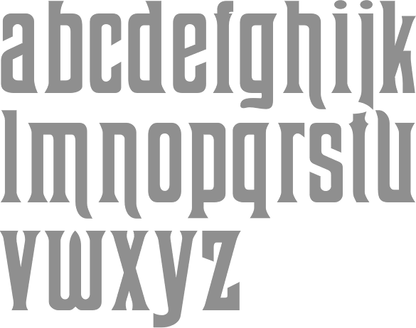
Jericho, VT-based designer of Pixie Talon (2004). [Google] [More] ⦿ | |
Jordan Davies
| |
Jory Raphael is a designer and entrepreneur living in Vermont. Founder of Sensible World. Designer of icon sets such as Elements, Forecast, Air, Symbolicons Block and Symbolicons Line. His work is available from Symbolicons.com and Symbolset. [Google] [More] ⦿ | |
Graphic designer and illustrator in Burlington, VT, who created the display typeface Billiards in 2015. [Google] [More] ⦿ | |
Mary Trafton lives in Montpelier, Vermont, where she creates marketing, promotional, and website graphics for the Hunger Mountain Co-op. She received a BA in Italian at Smith College, an MA in Design and MFA in Drawing at the University of Iowa. She also studied at the Boston Museum School with fellow student, Charles Gibbons. Designer at Bitstream of Full Moon BT (with Charles Gibbons). This hand-printed family won an award at the TDC2 2003 competition. It includes FM Black Cherry Moon, Alternate, Ligature, and Doubles (all with Charles Gibbons). FontShop link. [Google] [MyFonts] [More] ⦿ | |
His early fonts were released at VGC, the Visual Graphics Corporation: VGC Aquarius (2, 4, 5, 6, 7, 8, Outline) (1967) (this was digitized in 2007 by Steve Jackaman as Aquarius), VGCArnholm Sans Bold (1965), VGC Fovea (1977). Arnholm also designed WTC Veritas for the World Typeface Center, New York, 1981-85. He created these headline typefaces for the Los Angeles Times, 1980: L.A. Times Regular, L.A. Times regular italic, L.A. Times Bold and L.A. Times Bold Italic. MyFonts page. Linotype bio. FontShop link. Klingspor link. View Ronald Arnholm's typefaces. [Google] [MyFonts] [More] ⦿ | |
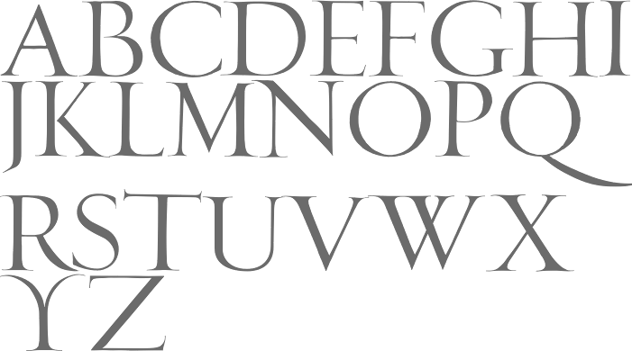
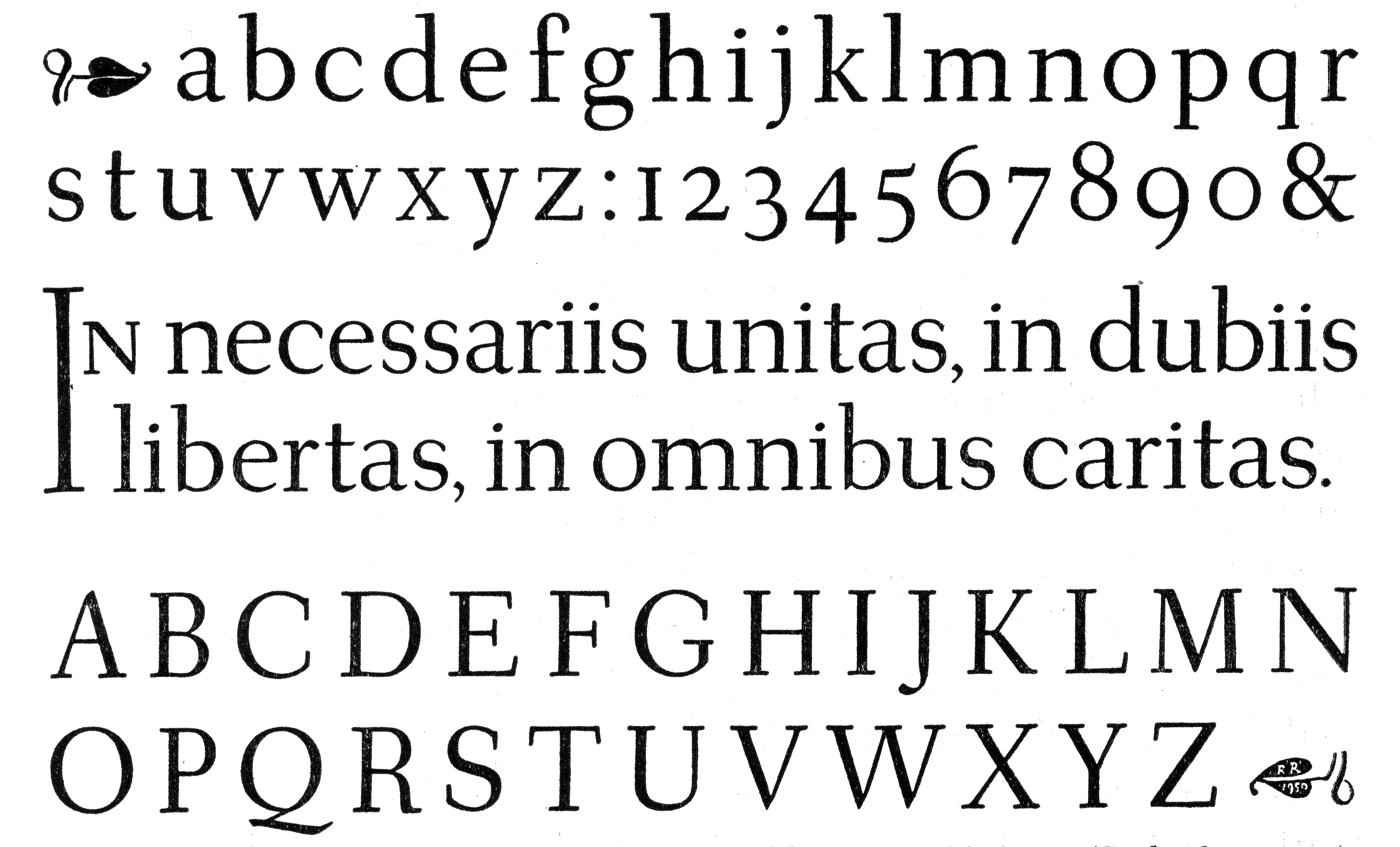
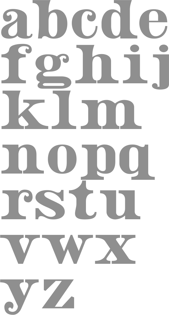
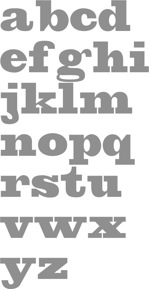
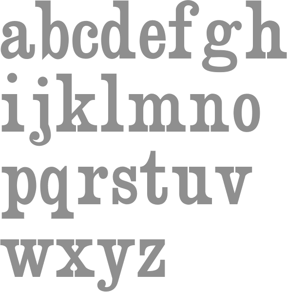
Rudolf (Rudolph) Ruzicka was a Czech type designer (1883-1978), wood engraver and designer, who worked for 50 years as a consultant for the Mergenthaler Linotype Company. He had a farm in Vermont. Designer of these typefaces:
Ruzicka was also known for his engravings: see this wood engraving example. Bio. FontShop link. An alphabet drawn in 1950 on his farm in Vermont (taken from PAGA, vol. 1, no. 1, page 12, 1953). Klingspor PDF. FontShop link. Klingspor link. View digital versions of Rudolf Ruzicka's typefaces. View Rudolph Ruzicka's typefaces. [Google] [MyFonts] [More] ⦿ | |
American landscape photographer who made Pixel Alphabet (2011). [Google] [More] ⦿ | |
The Government of Vermont showed some map symbol fonts: Warning Signs, Regulatory Signs, Guide Signs #90, and Guide Signs #91. No downloads. [Google] [More] ⦿ | |
Vermont-based author (b. 1897) of Goudy, Master of Letters (Black Cat Press, Chicago, 1938; published in 1939; see also here), about the life of Frederic Goudy (1865-1947). The book has quite a bit of historic detail such as a vivid description of the fire that destroyed Goudy's workplace at Deepdene. But there are virtually no type specimens or typographic images. [Google] [More] ⦿ | |
New York-based typefounders who published their work in Specimen of printing types and ornaments, from the type and stereotype foundry of William Hagar (New York, 1850). William Hagar was born in 1798 in Rutland, VT. He moved to New York in 1816 where he worked with Elihu White at the White Type Foundry. In 1823, he took over George B. Lothian's part of the foundry of Lothian&Pell to form Hagar&Pell, who were the first to introduce Scotch to American printersi (Hagar had asked David Bruce Jr. to cut the punches for the lightface series). This company was dissolved in 1830. Hagar's Scotch never sold well---the first successful Scotch family was credited to James Conner, who had bought the original punches and a few more cuts by Edwin Starr. In 1835 Hagar returned to typefounding to buy an interest in the foundry of his friend, Elihu White. This became White&Hagar. White died in 1836, and Hagar continued until 1839. From 1840 until 1842 he was a partner of George B. Lothian, who had a legendary temper. The company William Hagar was established a bit later thanks to the purchase by Caleb Bartlett, Hagar's friend, of the machinery of James Conner who had financial problems. In 1845 Hagar purchased his partner's interests, and he was the sole owner until 1852 when he sold the foundry to his sons, William and John. He died in 1863. The business declined due to the inexperience of the children and the mounting competition and would later become ATF. In 1887, the business was sold to three other New York typefounders. Among digital revivals of its typefaces, we cite Apple Pie (2009, William Hagemann, FontMesa), an extension of an ornate Bodoni all caps typeface by Hagar, ca. 1850. See also AWT Hagar Concave Tuscan Shade (2013, Dick Pape. [Google] [More] ⦿ | |
Wooden Type Fonts (was: American Wood Type and, Wooden Type)
|
Showcase of his most popular fonts at MyFonts. Klingspor link. [Google] [MyFonts] [More] ⦿ |
Graphic designer from Burlington, Vermont, who, during his studies at the Maryland Institute College of Art in Baltimore, created Espresso Alphabet (2014). Behance link. [Google] [More] ⦿ |

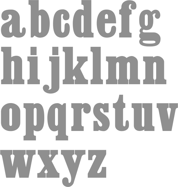
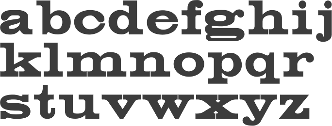
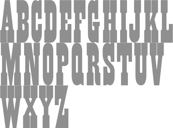
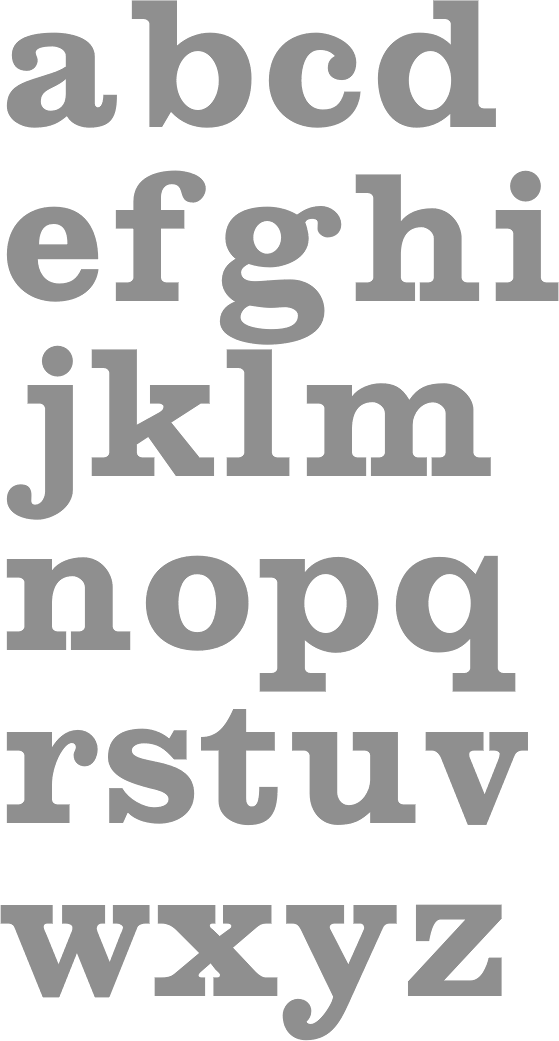
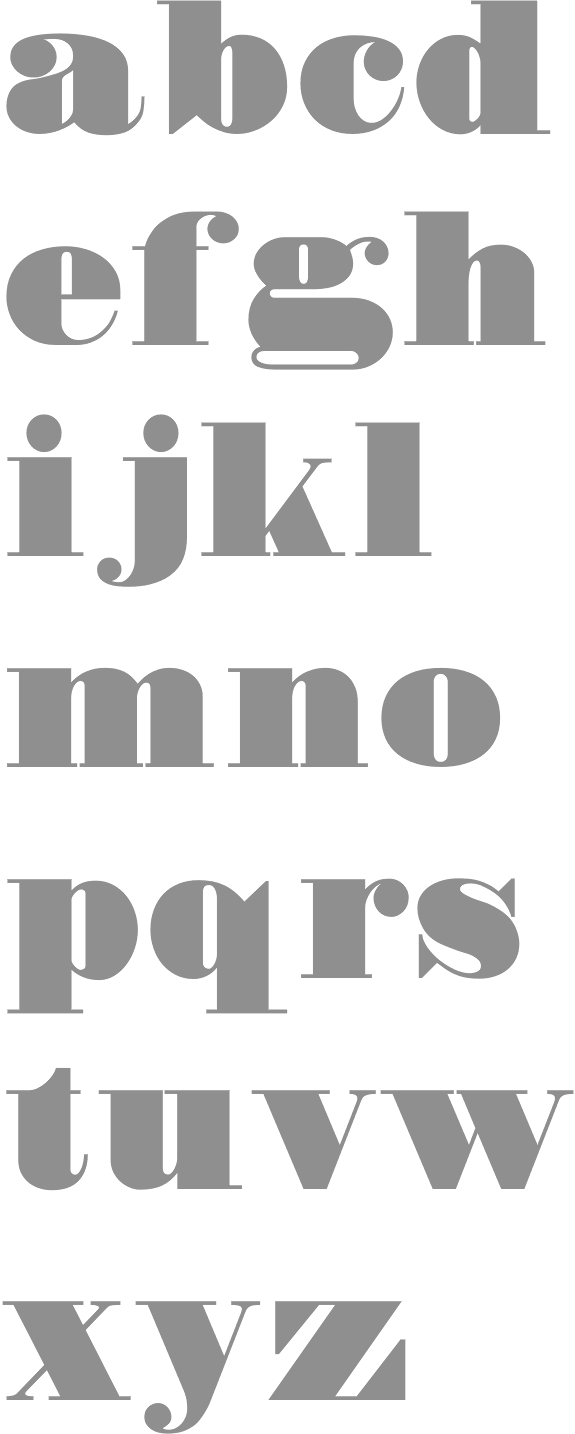
 Aboutype (est. 1991) was Joffre LeFevre's small Boston-based foundry and custom font bureau. LeFevre (b. 1945, Muskegon, WI, d. 2022, Proctorsville, VT) has been making typefaces since about 1970. He studied Fine Arts (illustration) at Kendall College of Art and Design and Fine Arts (graphic design) at Grand Valley State University. He also received an honorary Masters in Fine Arts from Babson College. For twenty years serving as principal type designer and type product designer for Compugraphic/Agfa Corporation before founding Aboutype Associates, Inc., a type design studio and custom digitizing service in 1989. He retired to Vermont in 2009. Joffre LeFevre's 1997 Volkswagen font series is floating around in web space however. As he says, The Volkswagen fonts were hand-drawn by me to a specification based on a long neglected display version of Futura that was developed by a photo composition type foundry in the early seventies. Similar to the type used in the introduction of the first VW Beetle.
  [
[ Type designer and composer, born in St. Albans, VT, in 1958. He was one of the early free/shareware type designers, well-known for creating revivals of 19th century typefaces. He was the Walter W. Naumburg Professor of Composition at Brandeis University, and has previously taught at Harvard University, Columbia University, and Stanford University.
  Commercial foundry, est. 2007 in Burlington, VT, by
  [
[ Professor of Art Graphic Design at Lamar Dodd School of Art, part of the University of Georgia, Athens. Born in 1939 in Barre, VT, Arnholm designed the lapidary typeface
  Wooden Type Fonts (was: American Wood Type) is founded and run by
|
|
|
|