TYPE DESIGN INFORMATION PAGE last updated on Sun Jan 25 02:56:21 EST 2026
FONT RECOGNITION VIA FONT MOOSE
|
|
|
|
Occupant Fonts
[Cyrus Highsmith]
Senior designer at Font Bureau since 1997, after graduating that year from the Rhode Island School of Design. Born in Milwaukee, WI, he now is a faculty member at RISD, where he teaches typography in the department of Graphic Design. He regularly offers a summer course on Digital Type Design, Summer Institute of Graphic Design, Rhode Island School of Design. His sketchbooks are now on line. In 2016, he set up Occupant Fonts as part of the Type Network. In September 2017, Morisawa announced the establishment of "Morisawa Providence Drawing Office" in Providence, RI, as its new base for developing Latin fonts. Cyrus Highsmith, who had served as a designer for Font Bureau for many years, and who started Occupant Fonts in 2015, has been appointed as its creative director. By this move, Morisawa acquired Occupant Fonts. Author of Inside Paragraphs, written for a foundational typography course. Matthew Carter writes: Cyrus Highsmith takes the lid off a paragraph of type and shows its inner workings. There is nothing you need to understand about using type that's not in this book. Cyrus explains the correct terms for the typographic components of form and space that make a letter, a word, a line, a paragraph, and he does it with clear drawings, simple language, and a legible typeface for the text. Cyrus created wonderful typefaces such as Loupot (1997, with Laurie Rosenwald, based on the lettering on Charles Loupot's St. Raphael poster from 1948), Eggwhite (2000-2018, for comics), Relay (2002, a somewhat art deco sans serif family that will be in vogue for years to come!), Benton Sans (1995-2003, with Tobias Frere-Jones, a revival of Benton's 1903 family, News Gothic; see also Benton Sans Wide, 2013), Occupant Gothic (2000-2018, angular), Prensa (2003, a simple 24-style serif family), Prensa Display (2012), Dispatch (1999-2000), Halo (2003), the 12-weight Stainless family (2001), and Daleys Gothic (1998). The Wall Street Journal uses his D4ScotchD4Scotch family (2001). He made a modified Palatino for the newspaper El Mercurio, and designed Zocalo or El Universal for the newspaper El Universal. He won Bukvaraz 2001 awards for Prensa and Relay. His Amira (Font Bureau) and (Spanish-feeling) Zocalo (Font Bureau) won awards at TDC2 2004. At ATypI 2004 in Prague, he spoke about the wealth of typefaces. In 2006, Escrow (Font Bureau) was published, an out-of-this-world 44-style subdued Scotch family that is used by The Wall Street Journal. In 2007, still at Font Bureau, he created Antenna, a 56-style sans family, as well as Biscotti, a delicate connected (wedding) script commissioned in 2004 by Gretchen Smelter and Donna Agajanian for Brides magazine. His calligraphic copperplate script Novia (2007, Font Bureau) was commissioned to grace the pages of Martha Stewart Weddings. Still in 2007, he won an award for his newspaper type family Quiosco (Font Bureau). Font Bureau writes: With Quiosco, Cyrus Highsmith continues an examination of themes and possibilities which he first explored in Prensa, inspired by the work of W. A. Dwiggins---specifically a dynamic tension between inner and outer contours. However, the crackling, electrical energy of Prensa here gives way to a more fluid, mercurial muscularity in Quiosco. See also Quiosco Display. In 2006, he designed Scout for Geraldine Hessler's redesign of Entertainment Weekly, under the influence of DIN, Venus and Cairoli. Scout is a utilitarian sans serif series that was followed in 2013 with Scout RE---four styles optimized for screen text and small sizes in print. In 2016, he added Scout Text. In 2010, at Font Bureau, he published the extensive families Ibis Text and Ibis Display, which he says were influenced by Walbaum (1919) and Melior (1952). The Webtype version IbisRE is poorly kerned / displayed in my browser though. From 2007 until 2010, he developed Salvo Sans and Salvo Serif (Font Bureau), which were originally called Boomer Sans and Serif. They were released in 2011. In 2012, he published Serge (an angular script family in three styles: a frisky, acrobatic typeface that dashes off decorative blurbs, signs, and headlines with a lively, angular zest), Heron Sans and Heron Serif at Font Bureau, which writes: Heron Serif and Sans are born of hard iron and steel, but galvanized with Cyrus Highsmith's warmth and energy. In 2013, he published Icebox at Font Bureau---a font that is based on a set of magnetic letters found at a variety store. Typefaces from 2014: Tick and Tock, two stencil styles. Typefaces from 2015: Antenna Serif. Typefaces from 2016: Gasket, Gasket Unicase, Gasket Uncial. Typefaces from 2017: Allium. Typefaces from 2018: Allium Text. Speaker at ATypI 2013 in Amsterdam: Don't design web fonts Its theme is: The successful type series of the future will be the ones that can move between media. He says that new typefaces should be smarter than the devices that use them. In 2015, he received the coveted Gerrit Noordzij Prijs. His illustrations were the subject of an exhibition and a book, both called Products Of A Thinking Hand (Typotheque / KABK, 2018). View Cyrus Highsmith's typefaces. Klingspor link. FontShop link. MyFonts interview. Old Font Bureau link. |
EXTERNAL LINKS |
| | |

file name: Cyrus Highsmith Pic

file name: Cyrus Highsmith Allium 2017

file name: Cyrus Highsmith Allium Text 2018

file name: Allium Black 2017

file name: Allium Medium 2017

file name: Cyrus Highsmith Eggwhite 2000 2018

file name: Cyrus Highsmith Occupant Gothic 2000 2018

file name: Cyrus Highsmith Drawing 2018

file name: Cyrus Highsmith Drawing 2018b

file name: Cyrus Highsmith Products Of A Thinking Hand 2018

file name: Cyrus Highsmith Heron Sans Semi Bold 2012

file name: Cyrus Highsmith Heron Serif Cond Medium 2012

file name: Cyrus Highsmith Gerrit Noordzij Award 2015 Pic by Hank Gianotten

file name: Cyrus Highsmith Gerrit Noordzij Award 2015b

file name: Cyrus Highsmith Salvo Sans Salvo Serif 2011

file name: Cyrus Highsmith Salvo Sans 2007 2010

file name: Cyrus Highsmith Salvo Sans 2007 2010

file name: Cyrus Highsmith Salvo Sans Bold 2007 2010

file name: Cyrus Highsmith Salvo Sans Condensed Black 2007 2010

file name: Cyrus Highsmith Salvo Serif Extra Condensed Black 2007 2010

file name: Cyrus Highsmith Salvo Serif 2007 2010

file name: Cyrus Highsmith Salvo Serif Light 2007 2010

file name: Cyrus Highsmith Portrait

file name: Cyrus Highsmith Icebox 2013

file name: Cyrus Highsmith Serge 2012

file name: Cyrus Highsmith Serge 2012a

file name: Cyrus Highsmith Serge 2013b

file name: Cyrus Highsmith Serge 2013c

file name: Cyrus Highsmith Serge 2013d

file name: Cyrus Highsmith Gasket 2016

file name: Cyrus Highsmith Gasket 2016b

file name: Cyrus Highsmith Gasket Bold 2016

file name: Cyrus Highsmith Gasket Uncial 2016

file name: Cyrus Highsmith Gasket Unicase 2016

file name: Cyrus Highsmith Scout Scout Text 2006 2016

file name: Cyrus Highsmith Scout 2006

file name: Cyrus Highsmith Scout Text 2016

file name: Cyrus Highsmith Scout Text 2016

file name: Cyrus Highsmith Tick Tock 2014

file name: Cyrus Highsmith Tick 2014

file name: Cyrus Highsmith Tock 2014
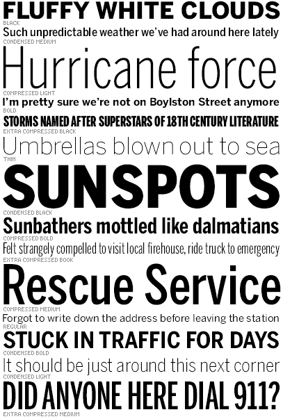
file name: Cyrus Highsmith Benton Sans 1995 2003
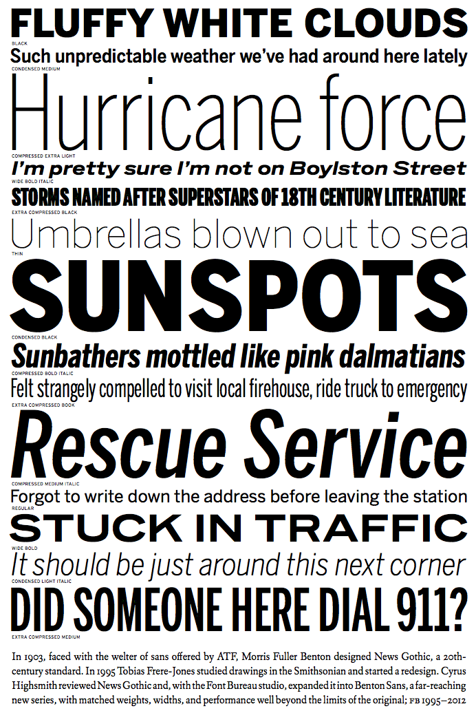
file name: Cyrus Highsmith Benton Sans 1995 2012

file name: Cyrus Highsmith Benton Sans 1995 2012

file name: Cyrus Highsmith Benton Sans 1995 2012b

file name: Cyrus Highsmith Benton Sans 1995 2012c

file name: Cyrus Highsmith Benton Sans 1995 2012d

file name: Cyrus Highsmith Benton Sans 1995 2012e

file name: Cyrus Highsmith Benton Sans 1995 2012f
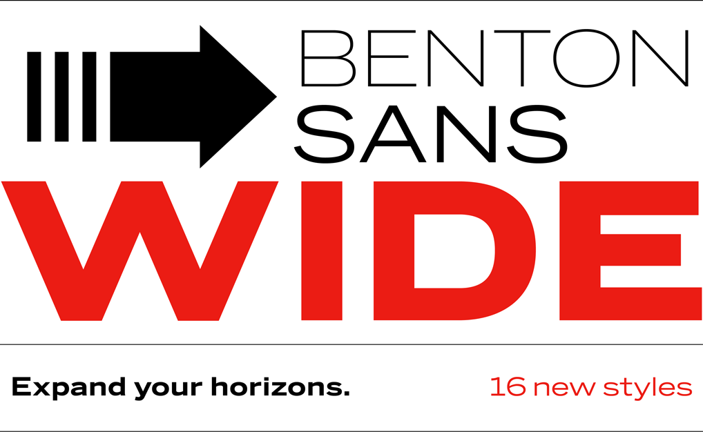
file name: Cyrus Highsmith Benton Sans Wide 2013

file name: Cyrus Highsmith Benton Sans Extra Comp Thin 2000

file name: Cyrus Highsmith Benton Sans Thin 2000

file name: Font Bureau Benton

file name: Cyrus Highsmith Inside Paragraphs

file name: Cyrus Highsmith Stainless 2001

file name: Cyrus Highsmith Escrow

file name: Cyrus Highsmith Escrow

file name: Cyrus Highsmith Antenna

file name: Cyrus Highsmith Antenna Serif 2015

file name: Laurie Rosenwald Cyrus Highsmith Loupot 1998 after Charles Loupot 1948

file name: Laurie Rosenwald Cyrus Highsmith Loupot 1998 after Charles Loupot 1948b

file name: Laurie Rosenwald Cyrus Highsmith Loupot 1998 after Charles Loupot 1948c

file name: Laurie Rosenwald Cyrus Highsmith Loupot Bold 1997

file name: Cyrus Highsmith Quiosco 2006

file name: Cyrus Highsmith Quiosco Semibold 2006

file name: Cyrus Highsmith Novia 2007

file name: Cyrus Highsmith Novia 2007b

file name: Cyrus Highsmith Amira

file name: Cyrus Highsmith Halo 2003

file name: Cyrus Highsmith Prensa 2003

file name: Cyrus Highsmith Prensa Display 2012

file name: Cyrus Highsmith Prensa Display Cond Black 2012

file name: zocalo1 140x222

file name: Cyrus Highsmith Zocalo Display 2002

file name: Cyrus Highsmith Dispatch Black 1999 2000

file name: Cyrus Highsmith Dispatch Condensed 1999 2000

file name: Cyrus Highsmith Ibis Display 2010a

file name: Cyrus Highsmith Ibis Display 2010b

file name: Cyrus Highsmith Ibis Display 2010c

file name: Cyrus Highsmith Ibis Text 2010

file name: Cyrus Highsmith Ibis Display Black 2010a

file name: Cyrus Highsmith Ibis Display Condensed Black 2010a

file name: Fontbureau Ibis Display 2010

file name: Fontbureau Ibis Text 2010

file name: Cyrus Highsmith Ibis Display 2010 Poster by Bill Dawson 2015

file name: Cyrus Highsmith Victoria Rushton 2018

file name: A Typ I 2017 Cyrus Highsmith

file name: Cyrus Highsmith Pic

file name: Cyrus Highsmith Pic
| | |
|
Luc Devroye ⦿ School of Computer Science ⦿ McGill University Montreal, Canada H3A 2K6 ⦿ lucdevroye@gmail.com ⦿ https://luc.devroye.org ⦿ https://luc.devroye.org/fonts.html |


