TYPE DESIGN INFORMATION PAGE last updated on Wed May 6 16:09:14 EDT 2026
FONT RECOGNITION VIA FONT MOOSE
|
|
|
|
Doyald Young: Logotypes and Letterforms
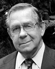
[Doyald Young]
Graphic designer, typographer, type designer, author, teacher and lecturer, born in 1926 in Holliday, TX. He died on February 28, 2011 due to complications following a heart operation. He attended Los Angeles City College, Los Angeles Trade Technical Jr. College, and Art Center College of Design where he has taught for 27 years and holds the honorary title Inaugural Master of the School. Doyald drew characters, often of a calligraphic or handlettered nature. He was deeply influenced by his mentor, Hermann Zapf. Steve Heller writes: When digital programs like Fontographer made it easy for anyone with a computer to create typefaces, many of them purposefully inelegant, he advocated a high level of craftsmanship that he believed had been lost. In so doing, Mr. Young challenged a new generation to reject so-called grunge design in favor of precision. When the American Institute of Graphic Arts awarded Young its 2009 Medal for Lifetime Achievement, Marian Bantjes wrote Taste. Practicality. Formality. Understated prestige. The combination of those qualities forms as perfect a descriptor of Young's work as any you are likely to find, both in the process and the result. Although he is widely known for his elegant curves and scripts, he has never been a showy designer---there is not a trace of ego in his work. The range of letterforms able to flow at any time from his hand is great, and there is no way to particularly define Young's mark unless you have seen the hand-drawn comp. That is where his work is unmistakable: perfect letterforms drawn in pencil at a surprisingly small size without so much as a mark of hesitation or awkwardness. The style varies but the fluidity and perfection do not. Links and media: Scott Erickson's movie on Doyald Young. FontShop link. Klingspor link. Short obituary and video. Longer video about his life. Steven Heller's obituary in the New York Times. Obituary by Marian Bantjes for AIGA. He was adored and respected for his craft and gentleness. Portrait. Another portrait (credit: Louise Sandhaus). Author of several influential texts:
His typefaces include the extra bold condensed sports scripts fonts Home Run Sanscript (1999) and Home Run Script (1999, a connected bold retro signage script), Young Gallant (2010, a formal calligraphic script based on the alphabets his teacher, Leach, trained him on), ITC Eclat (1985, 1992, fat script face, which was used for titles by Comedy Central and the Queen Latifah movie Beauty Shop), Young Finesse (2003, an Optima-inspired thin headline typeface used in his book, Fonts&Logos), Young Finesse Italic (2006), Guts (1976, VGC), and Young Baroque (1984, 1992, Letraset; calligraphic Spencerian copperplate script; this is copied by Castcraft as OPTI Yen Script). |
EXTERNAL LINKS |
| | |

file name: Doyald Young Young Gallant 2010

file name: Doyald Young Bette Midler Logo 2002

file name: Doyald Young Books

file name: Doyald Young Catalog

file name: Doyald Young Grammy Awards Logo 1988

file name: Doyald Young Pic by Louise Sandhaus

file name: Doyald Young Picture

file name: Doyald Young Pic

file name: Doyald Young Prince The Hits Collection 2000

file name: Doyald Young Sinatra The Man And His Music T V Special 1981

file name: Doyald Young for Apex Engraving 1974

file name: Doyald Young Home Run 2006

file name: Doyald Young Young Baroque 1984

file name: Letraset Young Baroque L E T Plain 1990

file name: Doyald Young Young Finesse 2003

file name: Doyald Young Dec2010 Pic
| | |
|
Luc Devroye ⦿ School of Computer Science ⦿ McGill University Montreal, Canada H3A 2K6 ⦿ lucdevroye@gmail.com ⦿ https://luc.devroye.org ⦿ https://luc.devroye.org/fonts.html |


