TYPE DESIGN INFORMATION PAGE last updated on Thu Apr 16 21:59:07 EDT 2026
FONT RECOGNITION VIA FONT MOOSE
|
|
|
|
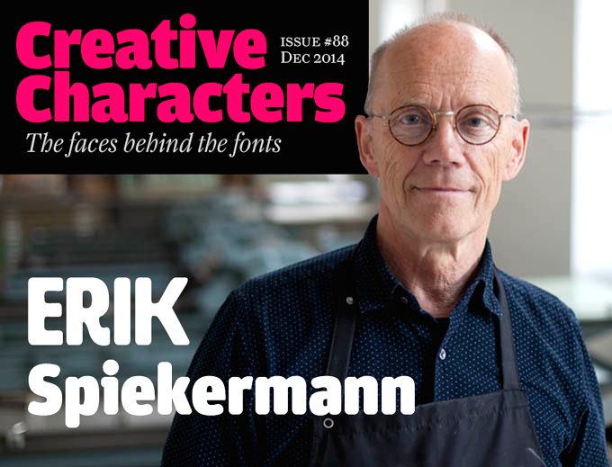
German type designer and graphic designer par excellence, born in 1947 in Stadthagen. He set up MetaDesign in Berlin in 1979. In 1988 he set up FontShop, home of the FontFont collection. He holds an honorary professorship at the Academy of Arts in Bremen, is board member of ATypI and the German Design Council, and president of the ISTD (International Society of Typographic Designers). In July 2000, Erik left MetaDesign Berlin. He now lives and works in Berlin, London and San Francisco, designing publications, complex design systems and more typefaces. He collaborated on the publication of the comprehensive FontBook. Author of Stop Stealing Sheep & Find Out How Type Works (2nd Edition) (Adobe Press, Second Edition, 2002, First Edition, 1993). He taught typography at the Art Academy in Bremen, and is guest-lecturer at several schools around the world. In October 2003, he received the third Gerrit Noordzij Prize, which is given every other year to a designer who has played an important role in the field of type design and typography. It is an initiative of the postgraduate course in Type&Media at the Hague Royal Academy of Art with the Meermanno Museum (The Hague). His essay on information design. Biography. Bio at Linotype. Laudatio by John Walters of Eye Magazine. Blog. Presentation at ATypI 2006 in Lisbon. Presentation at ATypI 2008 in St. Petersburg. Interviewed in 2006 by Rob Forbes. Speaker at ATypI 2010 in Dublin. He made the following typefaces and type families:
Picture of Eric Spiekermann shot by Chris Lozos at Typo SF in 2012. |
EXTERNAL LINKS |
| | |

file name: Joao Miranda Erik Spiekermann Drawing 2011

file name: Erik Spiekermann Typeface Catalog

file name: Erik Spiekermann Anja Meiners Ralph Du Carrois Case 2022

file name: Erik Spiekermann Anja Meiners Ralph Du Carrois Case 2022

file name: Erik Spiekermann Anja Meiners Ralph Du Carrois Case 2022

file name: Erik Spiekermann Anja Meiners Ralph Du Carrois Case 2022

file name: Erik Spiekermann Anja Meiners Ralph Du Carrois Case Text 2022

file name: Erik Spiekermann Anja Meiners Ralph Du Carrois Case Text 2022

file name: Erik Spiekermann Anja Meiners Ralph Du Carrois Case Text 2022

file name: Erik Spiekermann Anja Meiners Ralph Du Carrois Case Text 2022

file name: Erik Spiekermann Gravis01

file name: Erik Spiekermann Axel2009

file name: Erik Spiekermann Axel2009 Face

file name: Pic Spiekermann

file name: Pic Spiekermann Lisbon

file name: Pic Spiekermann Translation 37443

file name: Pic Spiekermanns Types

file name: Pic Erik Spiekermann

file name: Pic Erik Spiekermann2

file name: Pic Erik Spiekermann

file name: Erik Spiekermann Pic

file name: Erik Spiekermann Pic 2014

file name: Erik Spiekermann H W T Artz 2014

file name: Erik Spiekermann H W T Artz 2014b

file name: Erik Spiekermann H W T Artz 2014c

file name: Erik Spiekermann H W T Artz 2014h

file name: Erik Spiekermann H W T Artz 2014i

file name: Erik Spiekermann H W T Artz 2014j

file name: Erik Spiekermann H W T Artz 2014k

file name: Erik Spiekermann Ralph Du Carrois F F Real 2015

file name: Erik Spiekermann Ralph Du Carrois F F Real 2017

file name: Erik Spiekermann Ralph Du Carrois F F Real 2015b

file name: Erik Spiekermann Ralph Du Carrois F F Real 2015c

file name: Erik Spiekermann Ralph Du Carrois F F Real 2015d

file name: Erik Spiekermann Ralph Du Carrois Anja Meiners F F Real Pro Demibold Oblique 2018

file name: Font Font F F Real Head 2015 190500

file name: Font Font F F Real Head 2015

file name: Font Font F F Real Text 2015 190515

file name: Font Font F F Real Text 2015

file name: Erik Spiekermann Ralph Du Carrois F F Real 2015e

file name: Erik Spiekermann Ralph Du Carrois F F Real 2015f

file name: Erik Spiekermann Ralph Du Carrois F F Real 2015g

file name: Erik Spiekermann Ralph Du Carrois F F Real 2015 Poster by Bill Dawson 2015

file name: Erik Spiekermann Leica Pic

file name: Ole Schaefer Erik Spiekermann F F Govan 2001

file name: Ole Schaefer Erik Spiekermann F F Govan 2001b

file name: Pic Simone Wolf Erik Spiekerman A Typ I2006

file name: Pic atypi02 Erik Spiekermann

file name: Chris Lozos Pic of Erik Spiekermann Typo S F 2012

file name: Erik Spiekermann Pic

file name: Erik Spiekermann F F Info Display Bold 2000

file name: Erik Spiekermann I T C Officina Sans Bold 1990

file name: Erik Spiekermann I T C Officina Serif 1990

file name: Erik Spiekermann I T C Officina Sans 1989 1990

file name: Erik Spiekermann Ole Schaefer I T C Officina Sans 1990 1997b

file name: Erik Spiekermann Ole Schaefer I T C Officina Sans 1990 1997c

file name: Erik Spiekermann I T C Officina Sans 1989 1990 Poster by Danielle Parisi 2016

file name: Erik Spiekermann Officina Sans 1990 poster by Carolina Lo Re 2015

file name: Erik Spiekermann Officina 1989 Poster by Xenia Mre 2021

file name: Erik Spiekermann Officina Serif 1988 poster by Agustina Viola 2017b

file name: Erik Spiekermann Officina Serif 1988 poster by Agustina Viola 2017c

file name: Erik Spiekermann Officina Serif 1988 poster by Susana Santos 2013

file name: Erik Spiekermann Ole Schaefer0 I T C Officina Sans 1990 1997

file name: Berthold Louis Oppenheim 1913 Lo Type Bold Erik Spiekermann 1980b

file name: Erik Spiekermann Lo Type B Q Cond Med 1980 after Luis Oppenheim 1914

file name: Erik Spiekermann Lo Type B Q Medium 1980 after Luis Oppenheim 1914

file name: Erik Spiekermann F F Unit Rounded Ultra

file name: Erik Spiekermann F F Unit Rounded Italic 2016

file name: Erik Spiekermann F F Unit Rounded O T 2007

file name: Erik Spiekermann Fighting Creative Block 2011

file name: Erik Spiekermann Christian Schwartz and Kris Sowersby F F Unit Slab 2009

file name: Erik Spiekermann F F Unit 2003

file name: Erik Spiekermann F F Unit O T Ultra 2003

file name: Ole Schaefer Erik Spiekermann F F Info 1998

file name: Erik Spiekermann Christian Schwartz Josh Darden F F Meta Headline 2005

file name: Erik Spiekermann Christian Schwartz Josh Darden F F Meta Headline 2005

file name: Erik Spiekermann Christian Schwartz Kris Sowersby Meta Serif Pro Bold 2007

file name: Erik Spiekermann Christian Schwartz Meta Serif Pro Medium 2007

file name: Erik Spiekermann Meta Poster by Bailey Wells 2011

file name: Erik Spiekermann Meta Poster by Bailey Wells 2011b

file name: Erik Spiekermann F F Meta 1991 Poster by Sara Klapheke 2019

file name: Erik Spiekermann F F Meta 1985 Poster by Sara Klapheke 2019

file name: Erik Spiekermann F F Meta 1985 Poster by Brandon Scott 2017

file name: Erik Spiekermann F F Meta 1985 Poster by Brandon Scott 2017b

file name: Erik Spiekermann F F Meta 2003 198858

file name: Erik Spiekermann F F Meta 1991 Poster by Brandon Korvas 2015

file name: Erik Spiekermann F F Meta 1991 Poster by Brandon Korvas 2015b

file name: Erik Spiekermann F F Meta 1991 Poster by Brandon Korvas 2015c

file name: Erik Spiekermann Meta Correspondence Pro 2010

file name: Erik Spiekermann Ole Schaefer F F Meta Correspondence 1997

file name: Erik Spiekermann F F Meta lowercase

file name: Erik Spiekermann F F Meta Pro Book 2003

file name: Erik Spiekermann F F Meta Pro Thin 2003

file name: Erik Spiekermann Meta 1991 Poster by Brandon Scott 2015

file name: Erik Spiekermann Meta 1991 Poster by Brandon Scott 2015b

file name: Erik Spiekermann Meta I O T Book

file name: Erik Spiekermann F F Meta 1985 Poster by Elise Reina 2017

file name: Erik Spiekermann F F Meta 1985 Poster by Elise Reina 2017 3

file name: Erik Spiekermann F F Meta 1985 Poster by Elise Reina 2017 4

file name: Erik Spiekermann F F Meta 1985 Poster by Tyler Simcoe 2017

file name: Erik Spiekermann F F Meta

file name: Erik Spiekermann F F Meta Poster by Elizabeth Hixon 2014

file name: Erik Spiekermann F F Meta Poster by Elizabeth Hixon 2014b

file name: Erik Spiekermann F F Meta Poster by Elizabeth Hixon 2014c

file name: Erik Spiekermann F F Meta Headline Comp O T Black 2005

file name: Erik Spiekermann F F Meta Headline Cond Black 2005

file name: Erik Spiekermann F F Meta Cond Pro Book 2001

file name: Berthold H Berthold 1913 Erik Spiekermann 1979 Berliner Grotesk

file name: Erik Spiekermann Ralph Du Carrois Fira Sans Fira Mono 2012 2013

file name: Erik Spiekermann Ralph Du Carrois Fira Sans Fira Mono 2012 2013b

file name: Erik Spiekermann Ralph Du Carrois Fira Sans 2012 2013f

file name: Erik Spiekermann Ralph Du Carrois Fira Sans 2012 2013g

file name: Erik Spiekermann Ralph Du Carrois Fira Sans Fira Mono 2012 2013c

file name: Erik Spiekermann Ralph Du Carrois Fira Sans Fira Mono 2012 2013b

file name: Erik Spiekermann Ralph Du Carrois Fira Sans 2012 2013c

file name: Erik Spiekermann Ralph Du Carrois Fira Sans 2012 2013d

file name: Erik Spiekermann Ralph Du Carrois Fira Sans 2012 2013e

file name: Erik Spiekermann Ralph Du Carrois Fira Sans 2012 Poster by Bill Dawson 2015

file name: Erik Spiekermann Ralph Du Carrois Fira Sans 2013

file name: Carrois Type Design Fira Sans 2013

file name: Carrois Type Design Fira Sans 2013b

file name: Carrois Type Design Fira Sans 2013c

file name: Erik Spiekermann Jelle Bosma Nokia Sans Nokia Serif 2002
| | |
|
Luc Devroye ⦿ School of Computer Science ⦿ McGill University Montreal, Canada H3A 2K6 ⦿ lucdevroye@gmail.com ⦿ https://luc.devroye.org ⦿ https://luc.devroye.org/fonts.html |


