TYPE DESIGN INFORMATION PAGE last updated on Wed May 6 16:09:27 EDT 2026
FONT RECOGNITION VIA FONT MOOSE
|
|
|
|
After a start at Autologic in Newbury Park in 1983, this prolific American master craftsman (b. Evanston, IL, 1956) helped pioneer digital type design at Adobe (which he joined in 1987) and created
For Warnock Pro, he got an award at the Type Directors Club (TDC2) 2001 competition. In 1991, he received the Prix Charles Peignot for excellence in type design. Minion Pro Greek, Minion Pro Cyrillic&Greek and Brioso Pro won awards at the TDC2 Type Directors Club's Type Design Competition 2002. At TDC2 2006, he won an award for Garamond Premier Pro. Arno Pro won an award at the TDC2 2007 competition. In 2018, he received the Frederic W. Goudy Award for Typographic Excellence at Rochester Institute of Technology. Bio at Linotype. Minion Pro now ships with Acrobat Reader and covers all European languages, including Greek and Cyrillic. |
EXTERNAL LINKS |
| | |

file name: Robert Slimbach Pelago 2018

file name: Robert Slimbach Pelago Semibold 2017

file name: Robert Slimbach Pelago 2018

file name: Robert Slimbach Pelago 2018

file name: Robert Slimbach Arno 2007

file name: Robert Slimbach Arno 2007 Poster by Megan Bonner 2016

file name: Robert Slimbach Arno 2007 Poster by Megan Bonner 2016b

file name: Robert Slimbach Arno 2007 Poster by Pablo Stambole 2016

file name: Robert Slimbach Arno 2007 Poster by Caylie Hausman 2015

file name: Arno Pro

file name: Robert Slimbach I T C Slimbach 1986

file name: Robert Slimbach I T C Slimbach 1986

file name: Robert Slimbach I T C Slimbach 1986

file name: Robert Slimbach I T C Slimbach 1986

file name: Robert Slimbach Acumin

file name: Robert Slimbach Acumin Wide

file name: Robert Slimbach0 Minion Pro

file name: Robert Slimbach Minion3 2021

file name: Robert Slimbach Minion3 Caption 2021

file name: Robert Slimbach Minion3 Display 2021

file name: Robert Slimbach Minion Pro Black 1990

file name: Robert Slimbach Minion Pro Condensed 1990

file name: Robert Slimbach Minion 1990 Poster by Sananda Dutta 2013

file name: Robert Slimbach Minion 1990 Poster by Sananda Dutta 2013b

file name: Robert Slimbach Minion 1990 Poster by Gabrielle Schneider 2015

file name: Robert Slimbach Minion Pro 1990 Poster by Alicia Boulos 2013

file name: Adobe Minion

file name: Adobe Minion

file name: Adobe Minion Pro

file name: Adobe Cronos Pro Poster by Jamie Groenestein 2010

file name: Robert Slimbach Cronos Pro Display

file name: Robert Slimbach Ten Oldstyle 2017

file name: Robert Slimbach Ten Oldstyle 2017

file name: Adobe Ten Mincho 2021

file name: Ryoko Nishizuka Robert Slimbach Ten Mincho 2017

file name: Ryoko Nishizuka Robert Slimbach Ten Mincho 2017b

file name: Ryoko Nishizuka Robert Slimbach Ten Mincho 2017c
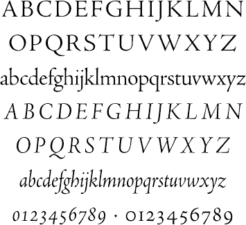
file name: Robert Slimbch Adobe Jenson

file name: Pic atypi2002 Slimbach laughing

file name: Robert Slimbach Adobe Jenson

file name: Robert Slimbach Adobe Jenson Pro 1995 2000

file name: Robert Slimbach Adobe Jenson Pro 1995 2000 86630

file name: Robert Slimbach Adobe Jenson Pro 1995 2000 86631

file name: Robert Slimbach Adobe Jenson Pro 1995 2000a
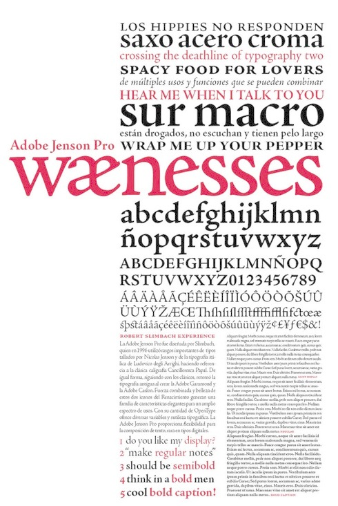
file name: Robert Slimbach Adobe Jenson Pro 1996 Poster by Gabriela Da Costa 2014
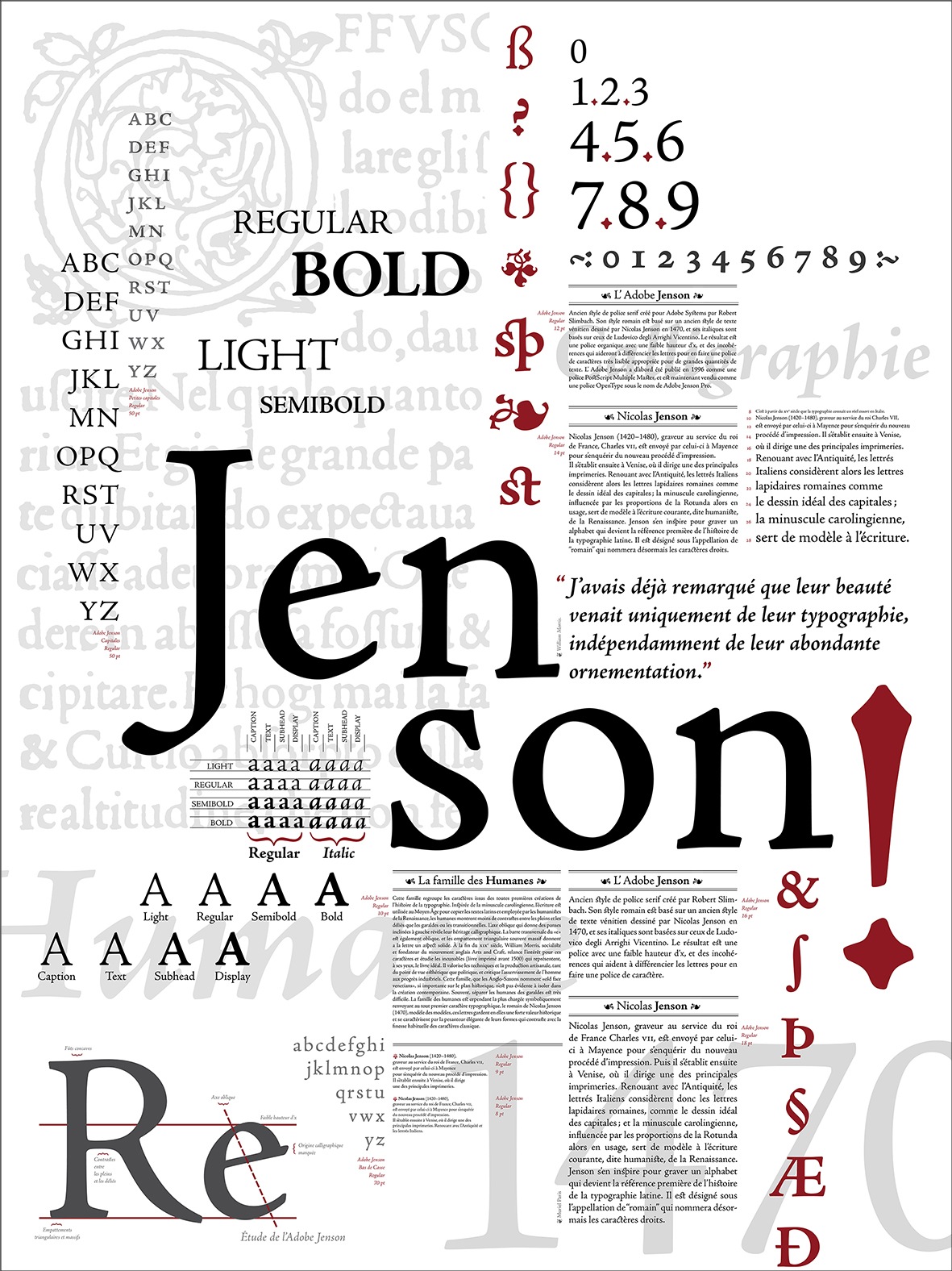
file name: Robert Slimbach Adobe Jenson Pro 1995 2000 Poster by Caroline Grimprel Anselme Calabrese 2014
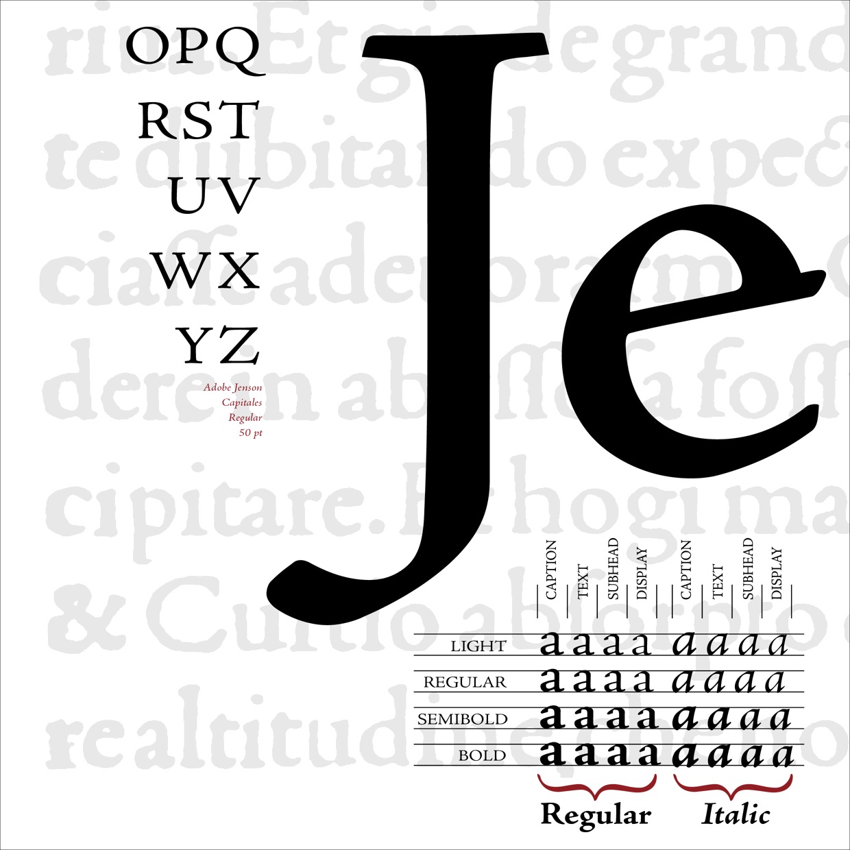
file name: Robert Slimbach Adobe Jenson Pro 1995 2000 Poster by Caroline Grimprel Anselme Calabrese 2014b
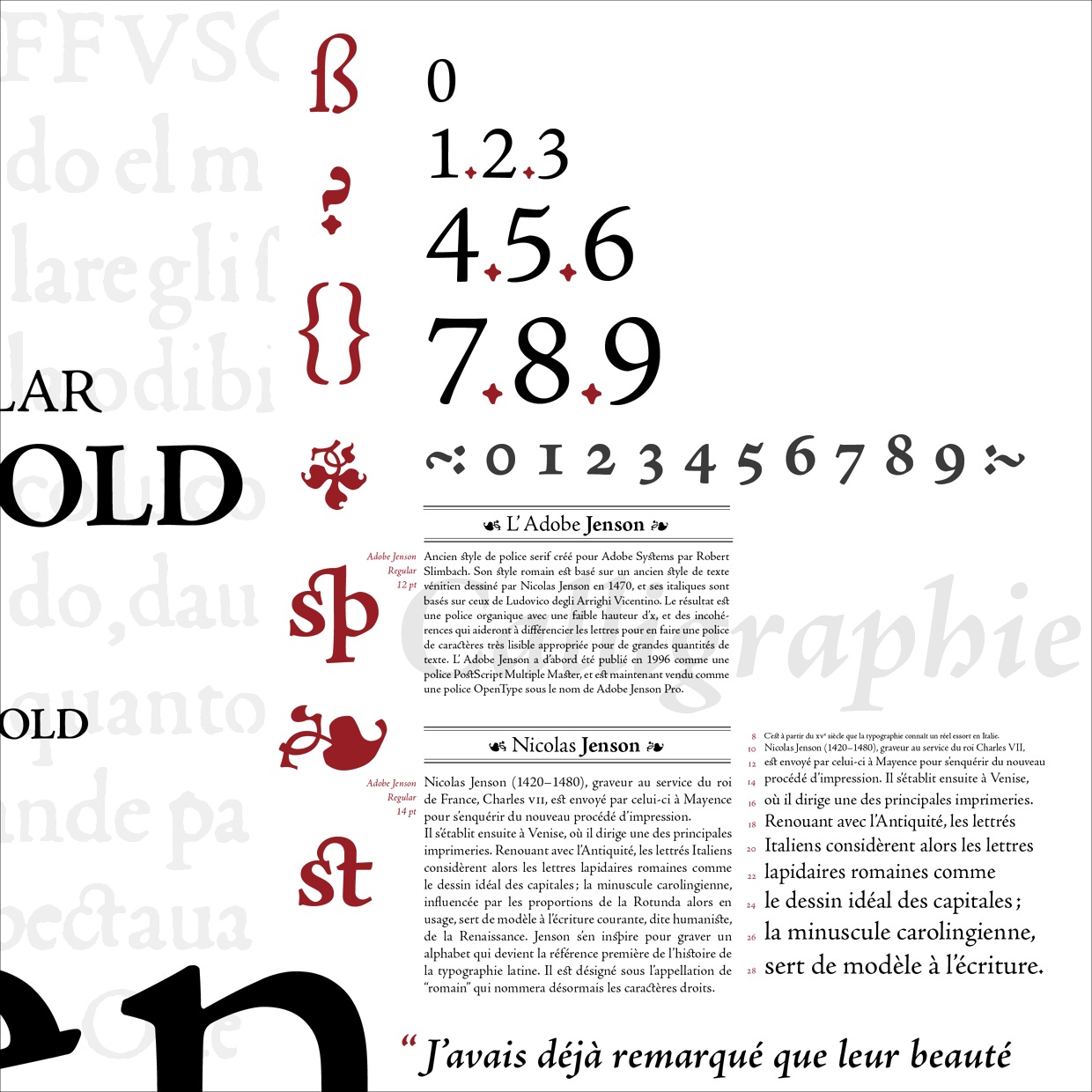
file name: Robert Slimbach Adobe Jenson Pro 1995 2000 Poster by Caroline Grimprel Anselme Calabrese 2014c
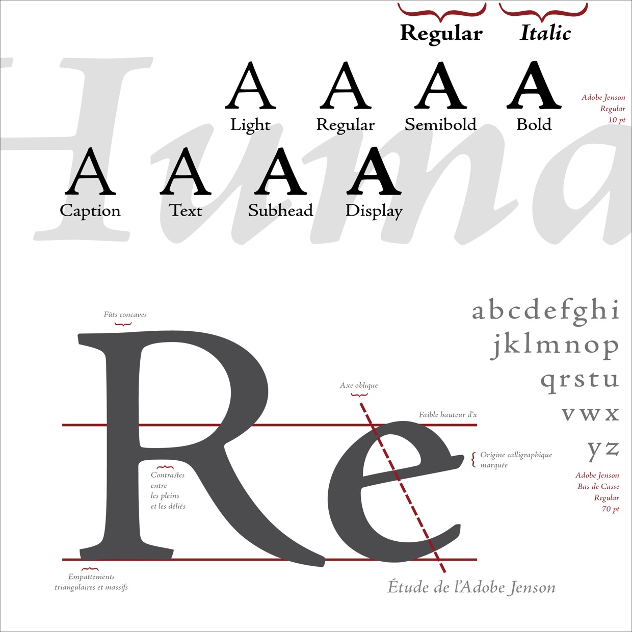
file name: Robert Slimbach Adobe Jenson Pro 1995 2000 Poster by Caroline Grimprel Anselme Calabrese 2014d
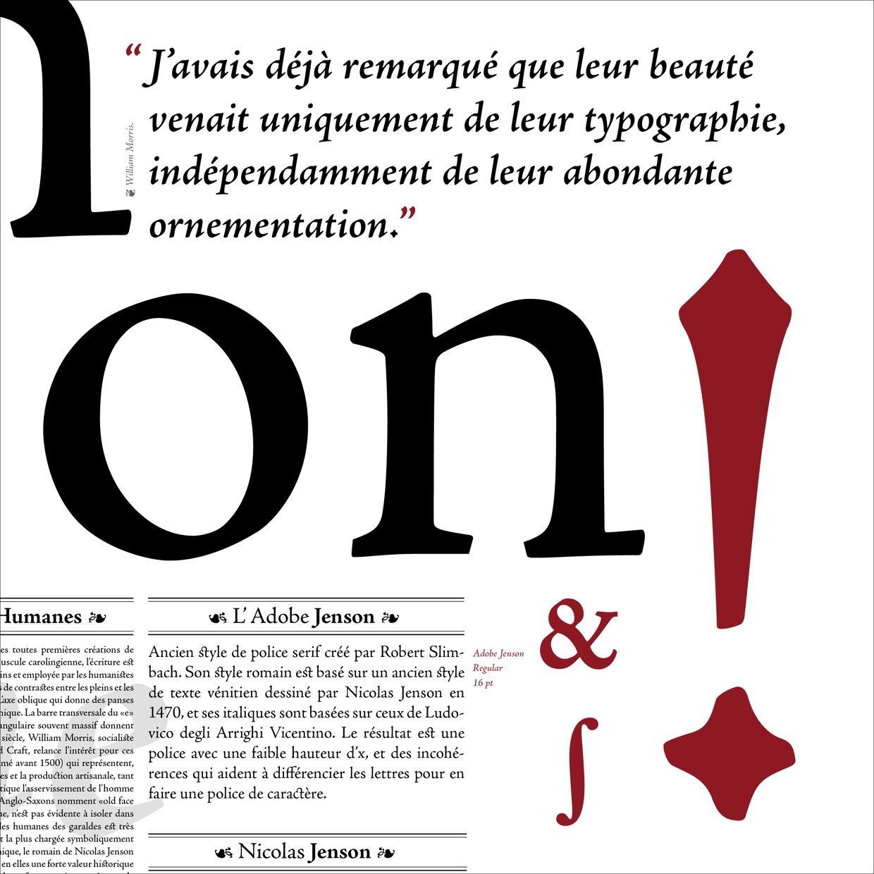
file name: Robert Slimbach Adobe Jenson Pro 1995 2000 Poster by Caroline Grimprel Anselme Calabrese 2014e
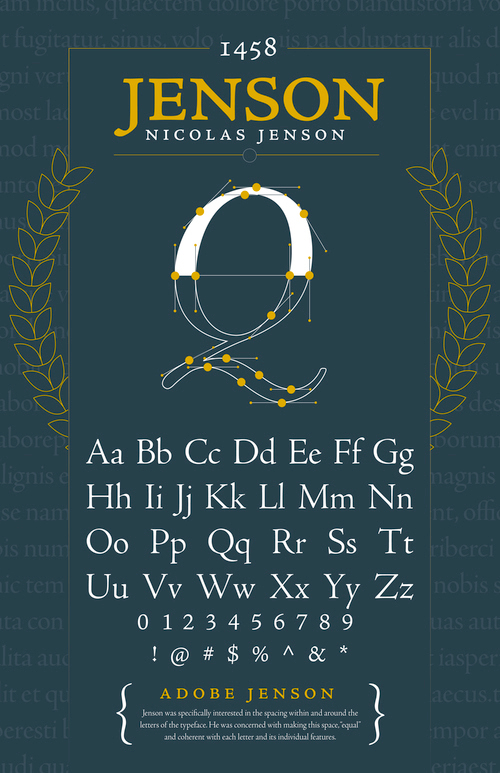
file name: Robert Slimbach Adobe Jenson Pro 1995 2000 Poster by Will Scharlott 2015
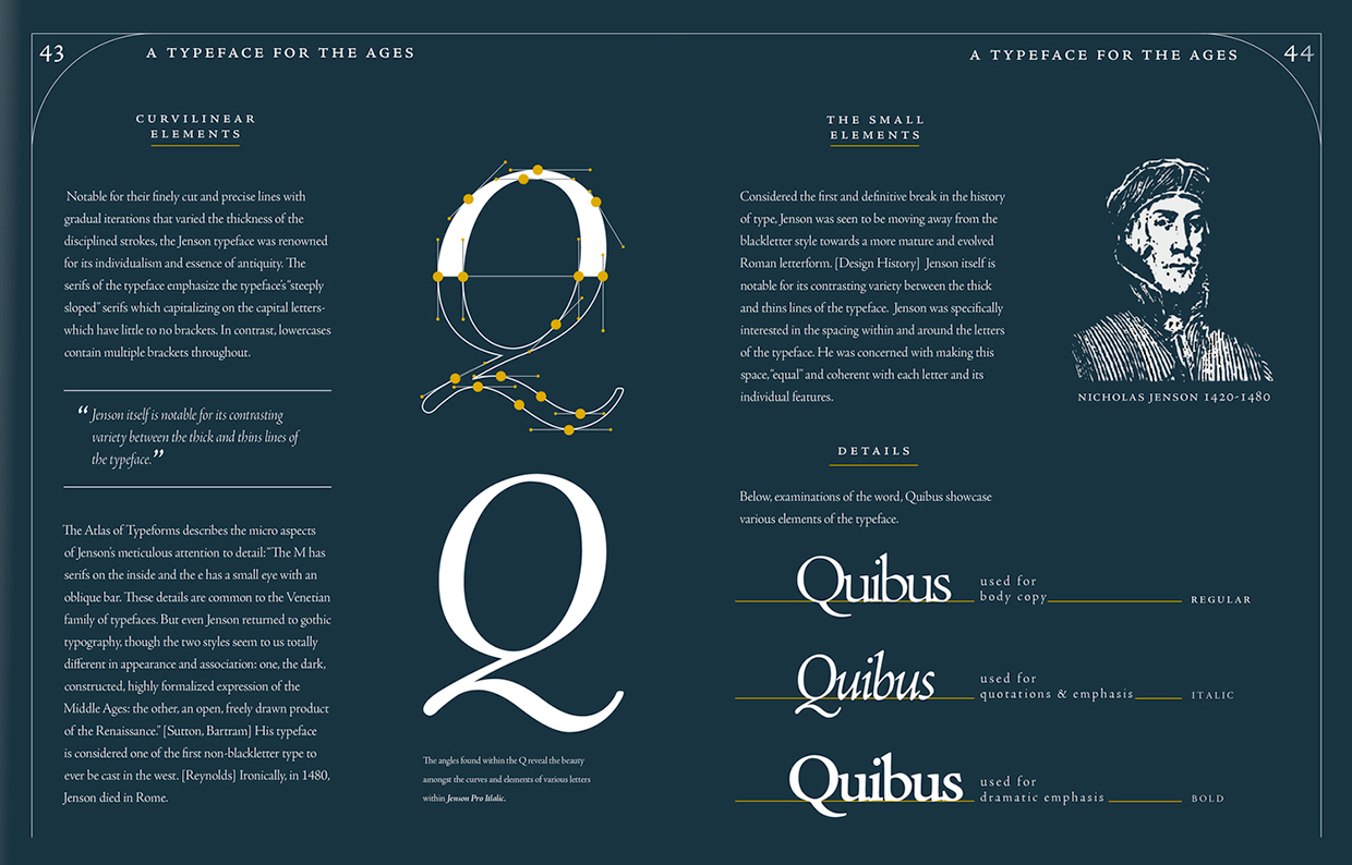
file name: Robert Slimbach Adobe Jenson Pro 1995 2000 Poster by Will Scharlott 2015b
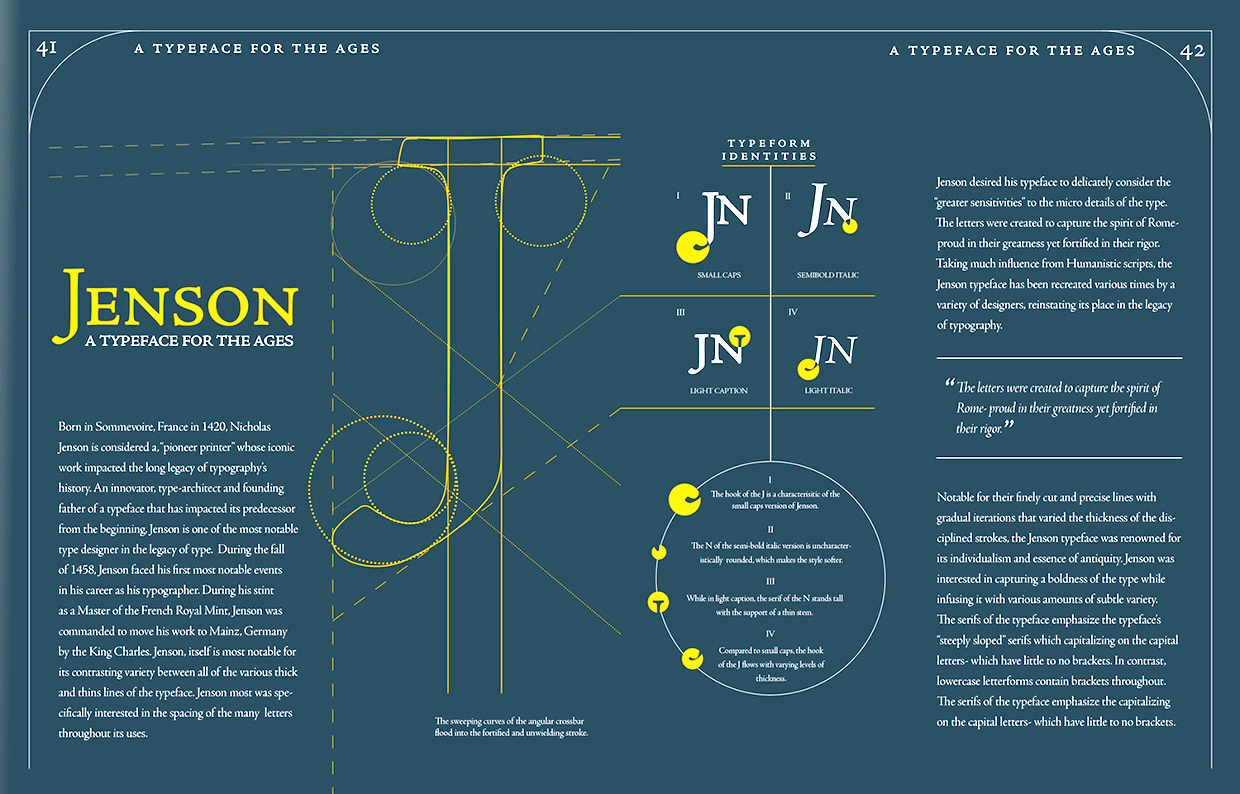
file name: Robert Slimbach Adobe Jenson Pro 1995 2000 Poster by Will Scharlott 2015c

file name: Adobe Clean

file name: Adobe Clean Bold 2009

file name: Robert Slimbach Adobe Clean 2009a

file name: Robert Slimbach Adobe Clean 2009b

file name: Robert Slimbach Adobe Clean 2009c

file name: Robert Slimbach Adobe Clean 2009g

file name: Robert Slimbach Adobe Clean U X Bold 2008 2018

file name: Robert Slimbach Adobe Hand B 2012

file name: Adobe Adobe Handwriting 2021

file name: Robert Slimbach Adobe Text 2010

file name: Robert Slimbach Adobe Text 2010

file name: Robert Slimbach Adobe Text Cyrillic 2010

file name: Robert Slimbach Warnock Pro 2000

file name: Robert Slimbach Sanvito Pro 1993

file name: Robert Slimbach Sanvito Pro 1993b

file name: Robert Slimbach Sanvito Pro 1993c

file name: Robert Slimbach Sanvito Pro Display Semibold 1993

file name: Robert Slimbach I T C Giovanni Black 1989

file name: Robert Slimbach Kepler 1997

file name: Robert Slimbach Kepler 1996

file name: Robert Slimbach Kepler Semibold 1996

file name: Robert Slimbach Kepler Semibold 1996b

file name: Robert Slimbach Kepler Semibold 1996c

file name: Robert Slimbach Kepler 1997 Poster by Maggie Morgans 2014

file name: Robert Slimbach Kepler 1996d

file name: Robert Slimbach Kepler 1996 Poster by Claire Allison 2015b

file name: Robert Slimbach Kepler 1996 Poster by Claire Allison 2015c

file name: Robert Slimbach Kepler 1996 Poster by Claire Allison 2015f

file name: Robert Slimbach Kepler Opticals 2003

file name: Robert Slimbach Warnock Pro 2000

file name: Robert Slimbach Utopia Opticals 2003

file name: Robert Slimbach Utopia 1989 Poster by Rachel Benoit 2015

file name: P22 Operina vs Robert Slimbach Poetica Pic By Paulo Heitlinger 2010

file name: Robert Slimbach Poetica 1992

file name: Robert Slimbach Poetica 1992b

file name: Robert Slimbach Poetica 1992c

file name: Robert Slimbach Brioso Pro 2003

file name: Robert Slimbach Brioso Pro Medium 2002

file name: Brioso Pro Icelandic

file name: Kristina Reinholds Brioso Pro Poster 2011

file name: Nick Di Stefano Brioso Poster 2011

file name: Robert Slimbach Adobe Garamond 1989 Poster by Felicia Ingram 2018

file name: Robert Slimbach Adobe Garamond 2015 poster by Odin Lowsley 2018
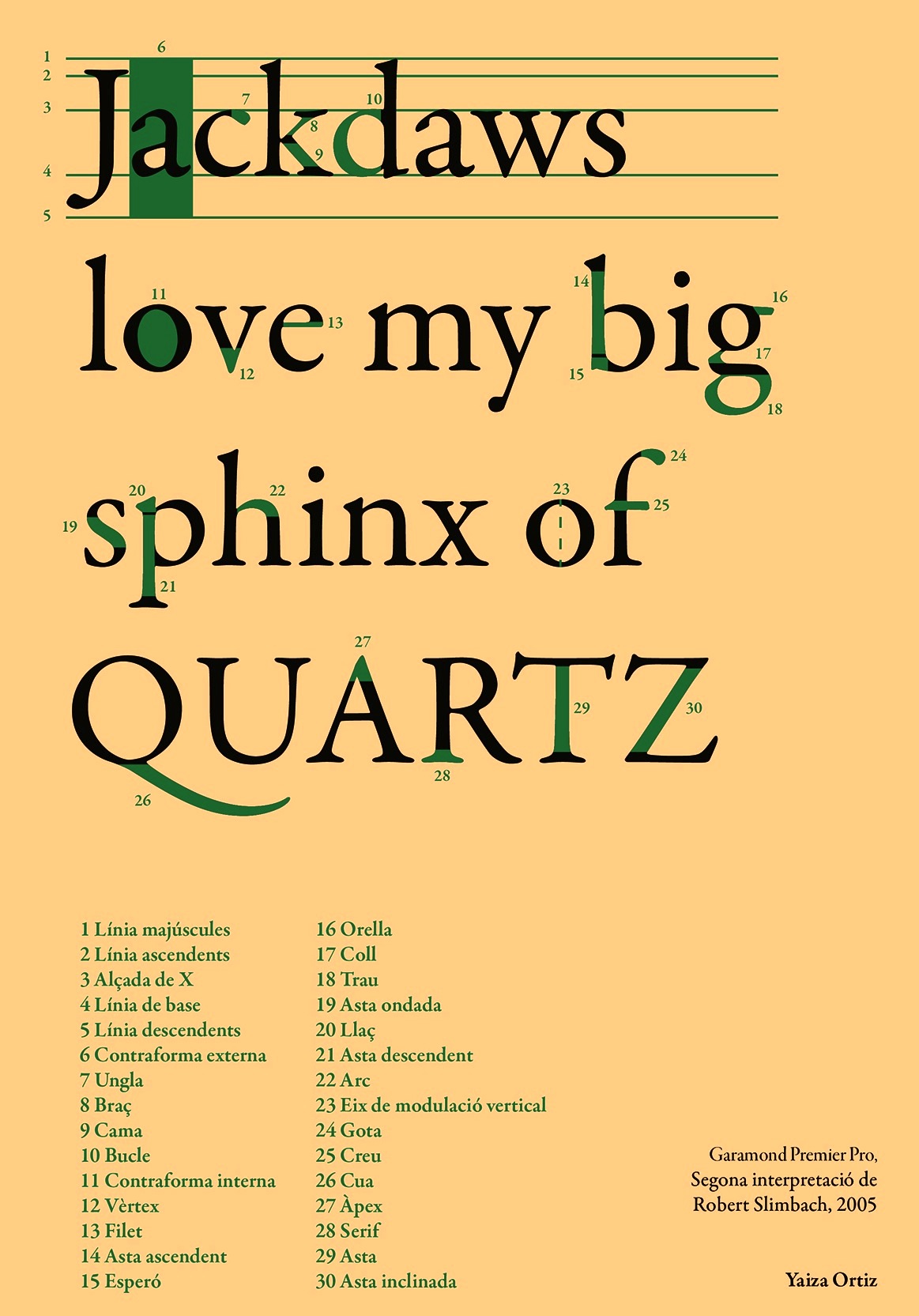
file name: Robert Slimbach Garamond Premier Pro 2005 Poster by Yaiza Ortiz 2015
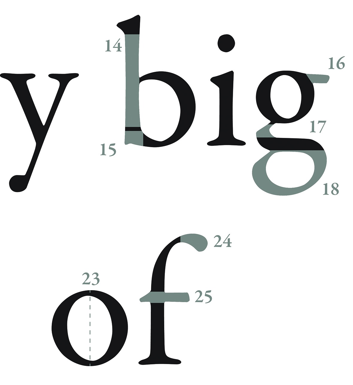
file name: Robert Slimbach Garamond Premier Pro 2005 Poster by Yaiza Ortiz 2015b
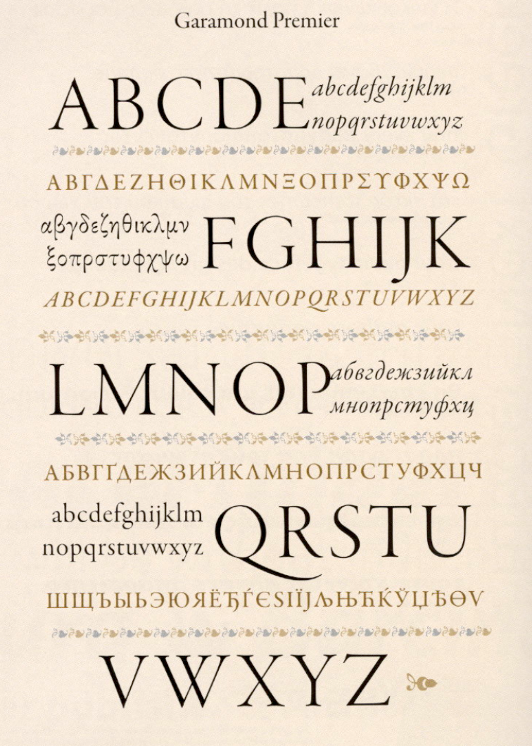
file name: T D C2006 Robert Slimbach Garamond Premier Pro
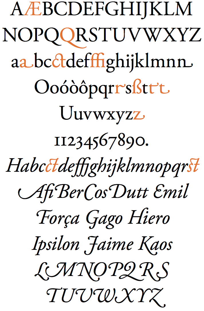
file name: Adobe Garamond Pro
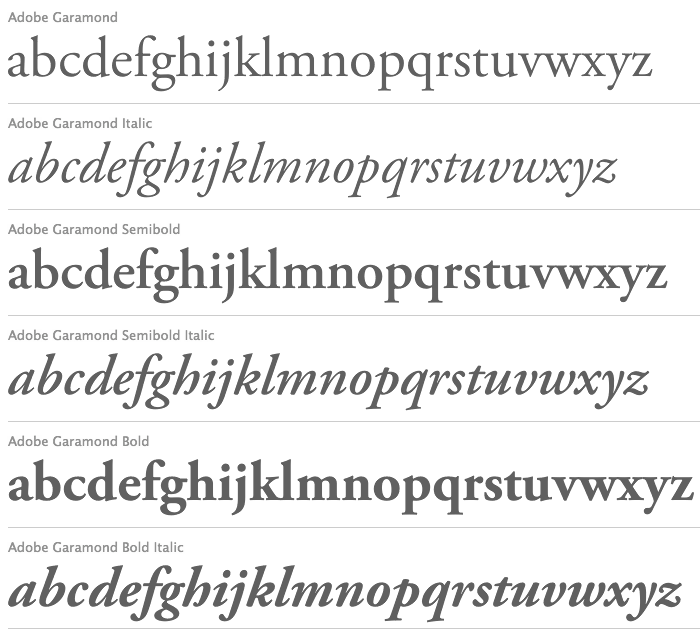
file name: Robert Slimbach Adobe Garamond 1989 2001

file name: Robert Slimbach Adobe Garamond 1989 2001b

file name: Robert Slimbach Adobe Garamond 1989 2001d

file name: Robert Slimbach Adobe Garamond Bold 1989 2001

file name: Robert Slimbach Adobe Garamond Poster by Eva Antoinette 2015

file name: Robert Slimbach Adobe Garamond Poster by Eva Antoinette 2015b

file name: Robert Slimbach Garamond Premier Pro 1992 2004

file name: Robert Slimbach Garamond Premier Pro 1992 2004b

file name: Robert Slimbach Garamond Premier Pro 1992 2004d

file name: Robert Slimbach Garamond Premier Pro 1992 2004f

file name: Robert Slimbach Garamond Premier Pro Greek 1992 2004

file name: Robert Slimbach Myriad 2011

file name: Robert Slimbach Carol Twombly Myriad 2002 Poster by Muberra Kablan 2015

file name: Robert Slimbach Carol Twombly Fred Brady Christopher Slye Myriad Pro 1992 Poster by Najid Hijazi 2017

file name: Robert Slimbach Carol Twombly Fred Brady Christopher Slye Myriad Pro 1992 Poster by Najid Hijazi 2017b

file name: Robert Slimbach Carol Twombly Fred Brady Christopher Slye Myriad Pro 1992 Poster by Najid Hijazi 2017c

file name: Robert Slimbach Carol Twombly Fred Brady Christopher Slye Myriad Pro 1992 Poster by Najid Hijazi 2017d

file name: Carol Twombly Robert Slimbach Myriad Pro 1992

file name: Myriad Pro Cyrillic 2015

file name: Myriad Pro Cyrillic 2015b

file name: Robert Slimbach Carol Twombly Fred Brady Christopher Slye Myriad 1992 Poster by Megan Hyjack 2016

file name: Robert Slimbach Carol Twombly Fred Brady Christopher Slye Myriad Pro 1992 Poster by Michael Morrison 2017

file name: Robert Slimbach Carol Twombly Fred Brady Christopher Slye Myriad Pro 1992

file name: Robert Slimbach Carol Twombly Fred Brady Christopher Slye Myriad Pro 1992b

file name: Robert Slimbach Carol Twombly Fred Brady Christopher Slye Myriad Pro 1992d

file name: Robert Slimbach Carol Twombly Fred Brady Christopher Slye Myriad Pro 1992e

file name: Robert Slimbach Carol Twombly Fred Brady Christopher Slye Myriad 1992

file name: Robert Slimbach Carol Twombly Fred Brady Christopher Slye Myriad 1992 Poster by Kyle Osterhoudt 2016

file name: Robert Slimbach Carol Twombly Fred Brady Christopher Slye Myriad 1992 Poster by Kyle Osterhoudt 2016b
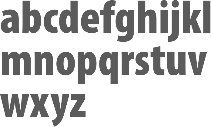
file name: Robert Slimbach Carol Twombly Fred Brady Christopher Slye Myriad Pro Cond Black 1992

file name: Robert Slimbach Carol Twombly Fred Brady Christopher Slye Myriad Pro Semibold 1992

file name: Robert Slimbach Carol Twombly Fred Brady Christopher Slye Myriad Pro Semiext Black 1992

file name: Robert Slimbach Myriad Arabic 2011

file name: Robert Slimbach Myriad Arabic 2011b

file name: Robert Slimbach Myriad Arabic 2011c

file name: Robert Slimbach Myriad Arabic 2011d

file name: Robert Slimbach Myriad Arabic 2011e

file name: Robert Slimbach Myriad Hebrew 2011

file name: Robert Slimbach Myriad Hebrew 2011b

file name: Robert Slimbach Myriad Hebrew 2011c

file name: Robert Slimbach Myriad Hebrew 2011d

file name: Robert Slimbach Myriad Hebrew 2011e

file name: Robert Slimbach Trajan Pro 2011

file name: Robert Slimbach Adobe Trojan Pro3 2013

file name: Robert Slimbach Trajan Pro 2011b

file name: Robert Slimbach Trajan Pro 2011c

file name: Robert Slimbach Trajan Pro 2011d

file name: Robert Slimbach Trajan Pro 2011e

file name: Adobe Trajan Sans 2021

file name: Robert Slimbach Trajan Sans 2011

file name: Robert Slimbach Trajan Sans Pro 2011

file name: Robert Slimbach Trajan Sans Pro 2011b

file name: Robert Slimbach Trajan Sans Pro 2011c

file name: Robert Slimbach Trajan Sans Pro 2011d

file name: Robert Slimbach Trajan Sans Pro 2011e

file name: Robert Slimbach Trajan Sans Pro 2011f

file name: Robert Slimbach Trajan Sans Pro 2011g

file name: Pic atypi2002 Robert Slimbach

file name: Pic atypi02 Slimbach s 20writing

file name: Pic atypi02 Slimbach writing2

file name: Pic atypi02 Robert Slimbach laughing

file name: Pic atypi02 Robert Slimbach up

file name: Pic atypi02 Robert Slimbach1

file name: Pic Robert Slimbach

file name: Robert Slimbach Pic
| | |
|
Luc Devroye ⦿ School of Computer Science ⦿ McGill University Montreal, Canada H3A 2K6 ⦿ lucdevroye@gmail.com ⦿ https://luc.devroye.org ⦿ https://luc.devroye.org/fonts.html |


