TYPE DESIGN INFORMATION PAGE last updated on Wed May 6 16:09:29 EDT 2026
FONT RECOGNITION VIA FONT MOOSE
|
|
|
|
British stone carver, wood engraver, essayist and type designer Arthur Eric Rowton Gill was born in Brighton, England in 1882. He died in 1940. He was a student of Johnston and worked for some time for the Golden Cockerell Press in London. He became one of the most influential English type designers of the 20th century. The text book Eric Gill (Fiona McCarthy, Faber and Faber Ltd) describes his life. Publishers Weekly writes: An English artist-craftsman in the tradition of William Morris, Eric Gill (1882-1940) exemplifies the search for a lifestyle to heal the split between work and leisure, art and industry. He is remembered today for his fine engravings and stone carvings, his legendary typefaces and book designs for the Golden Cockerel Press. Yet there was another side to the man, downplayed by previous biographers: a fervent convert to Catholicism and leader of three Catholic arts-and-crafts communes, Gill had a hyperactive libido which extended to incest with his sisters and daughters, as well as numerous extramarital affairs, according to British writer MacCarthy. He rationalized his penile acrobatics by inventing a bizarre pseudoreligious theory. In MacCarthy's candid portrait, Gill, who preserved the outward image of a devout father-figure, was neither saint nor humbug, but a highly sexed creative artist trapped by his Victorian concept of masculinity. This charismatic firebrand was a renegade Fabian socialist, a bohemian friend of Augustus John and Bertrand Russell. His adventurous life, as re-created in this beautifully written, absorbing biography, is disturbingly relevant to our time. A follow-up article by McCarthy in The Guardian, 2006. Canicopulus Script (1989, Barry Deck) is a font named to remember one of Eric Gill's favorite extracurricular activities. Author of An Essay on Typography (1931, revised in 1936). For a French edition, see Eric Gill Un Essai sur la Typographie (Boris Donné and Patricia Menay, Ypsilon Editeur, 2011). Gill once said: There are now about as many different varieties of letters as there are different kinds of fools. His typefaces include
|
EXTERNAL LINKS |
| | |

file name: Bitstream Lapidary333 Black

file name: Eric Gilll Gill Sans Shadow338 Monotype 1929

file name: Eric Gill Gill Sans 1929 Poster by Jane Chang 2015

file name: Toto K22 Eric Gill Shadow

file name: Eric Gill Moshe Spizer Alphonso Ioso Gill Letter J Hebrew 1932

file name: Eric Gill Gill Sans
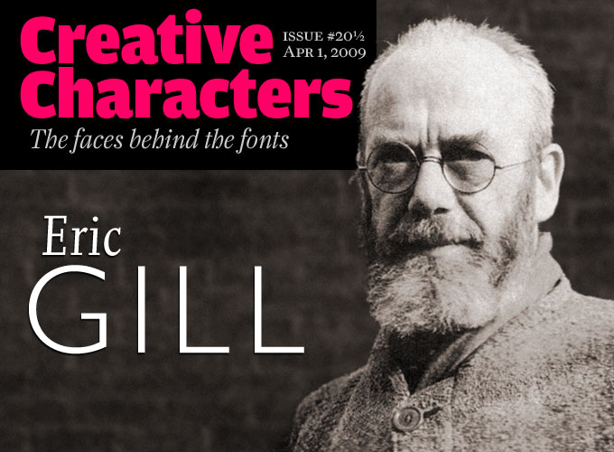
file name: Eric Gill Pic

file name: Eric Gill Golden Cockerel Type 1929

file name: Eric Gill An Essay On Typography 1931

file name: Eric Gill An Essay on Typography 1931

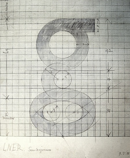
file name: Eric Gill Gill Sans Sketch of g

file name: Eric Gill Gill Sans 1927

file name: Eric Gill Gill Sans 1926 Poster by Danielle Bello 2014

file name: Eric Gill Gill Sans 1926 Poster by Danielle Bello 2014b

file name: Eric Gill Gill Sans Poster by Katharina Felski 2013

file name: Eric Gill Gill Sans Poster by Katharina Felski 2013b

file name: Eric Gill Gill Sans Poster by Katharina Felski 2013c

file name: Eric Gill Gill Sans Poster by Katharina Felski 2013d

file name: Eric Gill Gill Sans Poster by Katharina Felski 2013e

file name: Eric Gill Gill Sans Poster by Katharina Felski 2013f

file name: Eric Gill Gill Sans 1928 Poster by Noora Abdulla 2016

file name: Eric Gill Gill Sans Poster by Priyanka Selvar 2013

file name: Eric Gill Gill Sans 1929 Poster by Meg Mc Coy 2016

file name: Eric Gill Gill Sans 1929 Poster by Mindy Chou 2017

file name: Eric Gill Gill Sans 1926 1928

file name: Eric Gill Gill Sans 1929 Poster by Alyssa Gomez 2015

file name: Eric Gill Gill Sans poster by John Bakhan 2013

file name: Eric Gill Gill Sans 1928 Poster by Alexander Murphy White 2015

file name: Eric Gill Gill Sans 1928 Poster By Tori Estes 2013

file name: Eric Gill Gill Sans Poster by Lizzi Robertson 2013

file name: Eric Gill Gill Sans 1927 Poster by Malu Quinteros 2014

file name: Eric Gill Gill Sans 1929 Poster by Sam An 2016

file name: Eric Gill Gill Sans 1927 Poster by Niteesh Yadav 2014

file name: Eric Gill Gill Sans Bold Traffic Sign Czechoslovakia

file name: Monotype Gill Sans W G L 1990 1998

file name: Eric Gill Gill Sans 1928 Poster by Stephen Geary 2015

file name: Eric Gill Gill Sans 1928 1932 Monotype 183211

file name: Eric Gill Gill Sans 1928 1932 Monotype 183213

file name: Eric Gill Gill Sans 1928 1932 Monotype 183214

file name: Eric Gill Gill Sans 1928 1932 Monotype 183216

file name: Eric Gill Gill Sans 1929 poster by Claudia Sergio 2018

file name: Eric Gill Gill Sans 1928 Poster by Elizabeth Newell 2016b

file name: Eric Gill Gill Sans 1928 Poster by Elizabeth Newell 2016d

file name: Eric Gill Gill Sans 1928 Poster by Elizabeth Newell 2016e
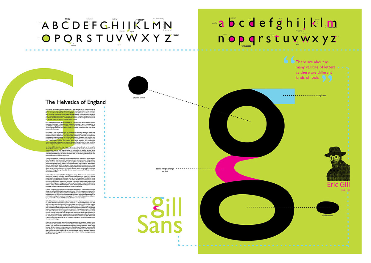
file name: Eric Gill Gill Sans 1928 Poster by Elizabeth Newell 2016f

file name: Eric Gill Gill Sans 1928 Poster by Skyler Baker 2016

file name: Eric Gill Gill Sans 1926 Poster by Anan Yassin 2016

file name: Eric Gill Gill Sans 1928 Poster by Florence Liang 2009

file name: George Ryan Gill Sans Nova 2015b

file name: George Ryan Gill Sans Nova 2015 189743

file name: George Ryan Gill Sans Nova 2015 189745

file name: George Ryan Gill Sans Nova 2015 189746

file name: George Ryan Gill Sans Nova 2015 189747

file name: George Ryan Gill Sans Nova 2015 189748

file name: George Ryan Gill Sans Nova 2015 189750

file name: George Ryan Gill Sans Nova 2015 189751

file name: George Ryan Gill Sans Nova 2015 189781

file name: George Ryan Gill Sans Nova 2015

file name: George Ryan Gill Sans Nova Deco 2015

file name: George Ryan Gill Sans Nova Heavy 2015

file name: George Ryan Gill Sans Nova Inline Semibold 2015

file name: George Ryan Gill Sans Nova Shadowed Light 2015

file name: George Ryan Gill Sans Nova Utra Light 2015

file name: Gil Traffic Sign Font in D D R based on Eric Gill Gill Sans Bold

file name: Softmaker Chantilly Serial Bold 2010
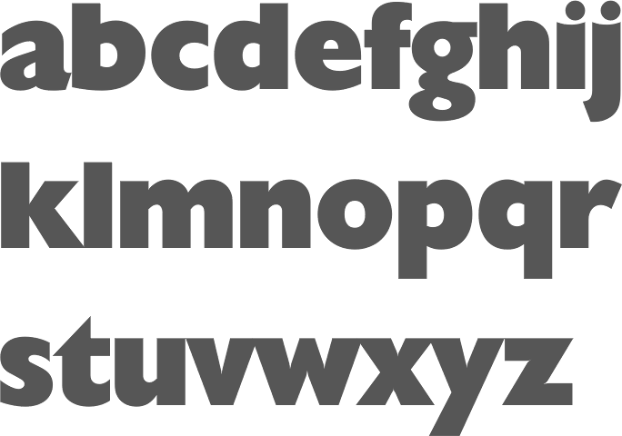
file name: Softmaker Chantilly Serial Heavy 2010

file name: Softmaker Chantilly Serial Xlight 2010

file name: Colin Banks Gill Facia Monotype after Eric Gill

file name: Colin Banks Gill Facia Regular Display Monotype after Eric Gill

file name: Eric Gill Alphabet For W H Smith Sons 1925

file name: Eric Gill Hague Gill Joanna 1930

file name: Monotype Joanna 1958 after Eric Gill Joanna 1930

file name: Eric Gill Joanna 1931 Poster by Camille Allen 2014

file name: Ben Jones Joanna Nova 2015 189767

file name: Ben Jones Joanna Nova 2015 189768

file name: Ben Jones Joanna Nova 2015 189769

file name: Ben Jones Joanna Nova 2015 189770

file name: Ben Jones Joanna Nova 2015 189779

file name: Ben Jones Joanna Nova 2015

file name: Ben Jones Joanna Nova Ultra Black 2015

file name: Terrance Weinzierl Joanna Sans Nova 2015 189757

file name: Terrance Weinzierl Joanna Sans Nova 2015 189759

file name: Terrance Weinzierl Joanna Sans Nova 2015 189760

file name: Terrance Weinzierl Joanna Sans Nova 2015 189780

file name: Terrance Weinzierl Joanna Sans Nova 2015 190318

file name: Terrance Weinzierl Joanna Sans Nova 2015

file name: Terrance Weinzierl Joanna Sans Nova Black 2015

file name: Eric Gill Kayo 1936

file name: Eric Gill Kayo 1936b
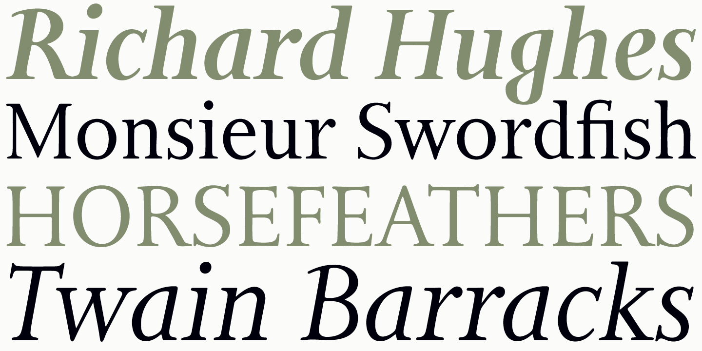
file name: Patrick Griffin Bill Troop Bunyan Pro 2016 after Eric Gill Bunyan 1934 205859
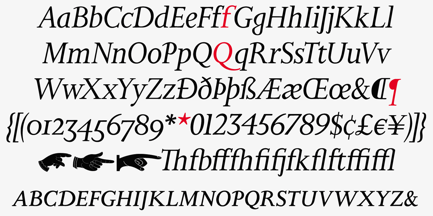
file name: Patrick Griffin Bill Troop Bunyan Pro 2016 after Eric Gill Bunyan 1934 205861
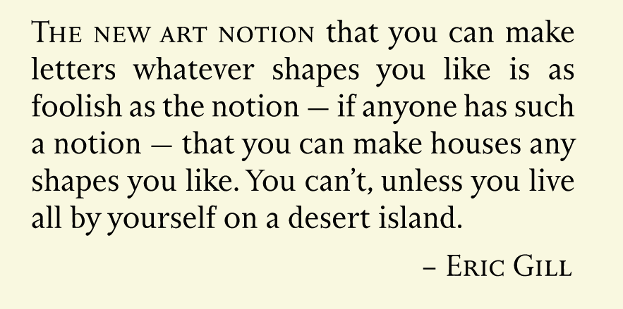
file name: Patrick Griffin Bill Troop Bunyan Pro 2016 after Eric Gill Bunyan 1934 205862
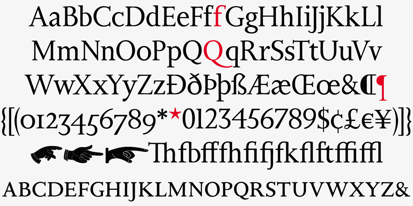
file name: Patrick Griffin Bill Troop Bunyan Pro 2016 after Eric Gill Bunyan 1934 205865
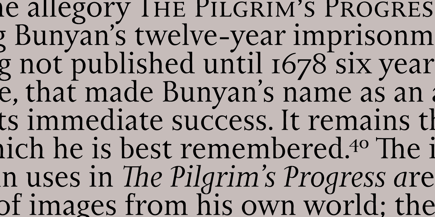
file name: Patrick Griffin Bill Troop Bunyan Pro 2016 after Eric Gill Bunyan 1934 205867

file name: Walter Tracy Pilgrim Pro Roman after Eric Gill Pilgrim 1934

file name: Softmaker Palermo Serial Medium 1999

file name: Softmaker Palermo Shadow Medium 1999

file name: Eric Gill Ex Libris Ananda Coomaraswamy

file name: Eric Gill Ex Libris Jacob Weiss

file name: Eric Gill Perpetua 1929 Poster by Faruk Garib 2017

file name: Monotype Imaging Perpetua 2011 12 01

file name: Eric Gill Perpetua 1929 Poster by Shannon Kogelmann 2015

file name: Eric Gill Perpetua 1928 1929

file name: Eric Gill Perpetua 1929

file name: Eric Gill Perpetua 1929
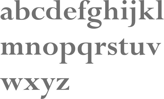
file name: Monotype Imaging Perpetua Bold 2011 12 01

file name: Monotype Imaging Perpetua Bold Italic 2011 12 01

file name: Monotype Imaging Perpetua Bold Italic Oldstyle Figures 2011 12 01

file name: Monotype Imaging Perpetua Bold Oldstyle Figures 2011 12 01

file name: Monotype Imaging Perpetua Italic 2011 12 01

file name: Monotype Imaging Perpetua Italic Oldstyle Figures 2011 12 01

file name: Monotype Imaging Perpetua Caps Oldstyle Figures 2011 12 01

file name: Monotype Imaging Perpetua Titling M T 2011 12 01

file name: Monotype Imaging Perpetua Titling M T Bold 2011 12 01

file name: Monotype Imaging Perpetua Titling M T Light 2011 12 01
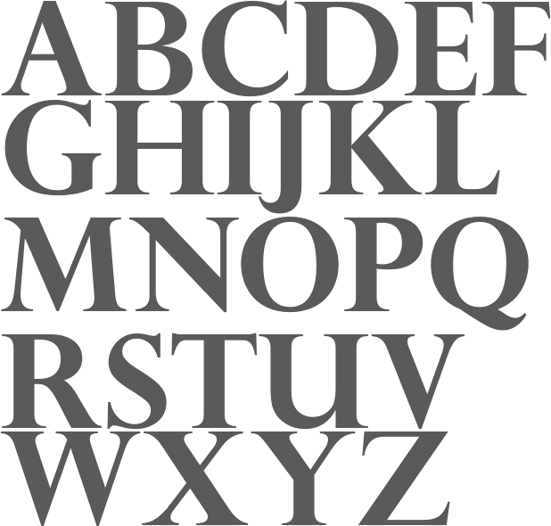
file name: Monotype Perpetua Pro Titling Bold
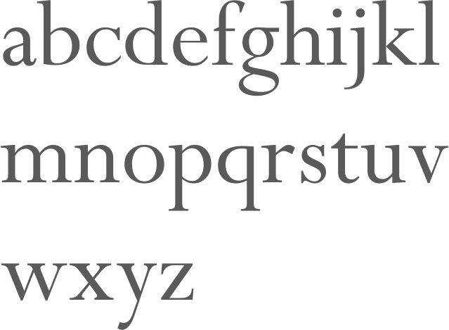
file name: Monotype Perpetua Roman

file name: Eric Gill Perpetua Pro Bold Monotype 1928 1935

file name: Eric Gill Perpetua Titling 1928 1935

file name: Eric Gill Perpetua Titling 1928 1935b

file name: Eric Gill Dress 1920
| | |
|
Luc Devroye ⦿ School of Computer Science ⦿ McGill University Montreal, Canada H3A 2K6 ⦿ lucdevroye@gmail.com ⦿ https://luc.devroye.org ⦿ https://luc.devroye.org/fonts.html |

