TYPE DESIGN INFORMATION PAGE last updated on Mon Apr 13 05:22:08 EDT 2026
FONT RECOGNITION VIA FONT MOOSE

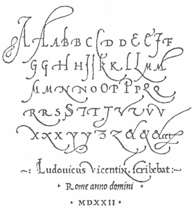
file name: Ludovicus Vicentini 1522

file name: Ludovico Degli Arrighi Vicentino Alphabet 1522

file name: James Grieshaber P22 Operina Pro 2003

file name: James Grieshaber P22 Operina Pro 2003

file name: James Grieshaber P22 Operina Pro 2003

file name: James Grieshaber P22 Operina Pro 2003

file name: James Grieshaber P22 Operina Pro 2003

file name: James Grieshaber P22 Operina Pro 2003

file name: various/arrighi3

file name: various/arrighi4

file name: Italian Capitals by Lud Vicentino 16th Century a

file name: Italian Capitals by Lud Vicentino 16th Century b

file name: Italian Minuscule by Vicentino 16th Century

file name: Ludovico Degli Arrighi Vicentino La Operina Roma 1522

file name: Vicentino 1525

file name: Vicentinodi Ludovico Arrighi Corsivo 1524 1526
| | |
|
Luc Devroye ⦿ School of Computer Science ⦿ McGill University Montreal, Canada H3A 2K6 ⦿ lucdevroye@gmail.com ⦿ https://luc.devroye.org ⦿ https://luc.devroye.org/fonts.html |


