TYPE DESIGN INFORMATION PAGE last updated on Fri May 1 17:29:37 EDT 2026
FONT RECOGNITION VIA FONT MOOSE
|
|
|
|
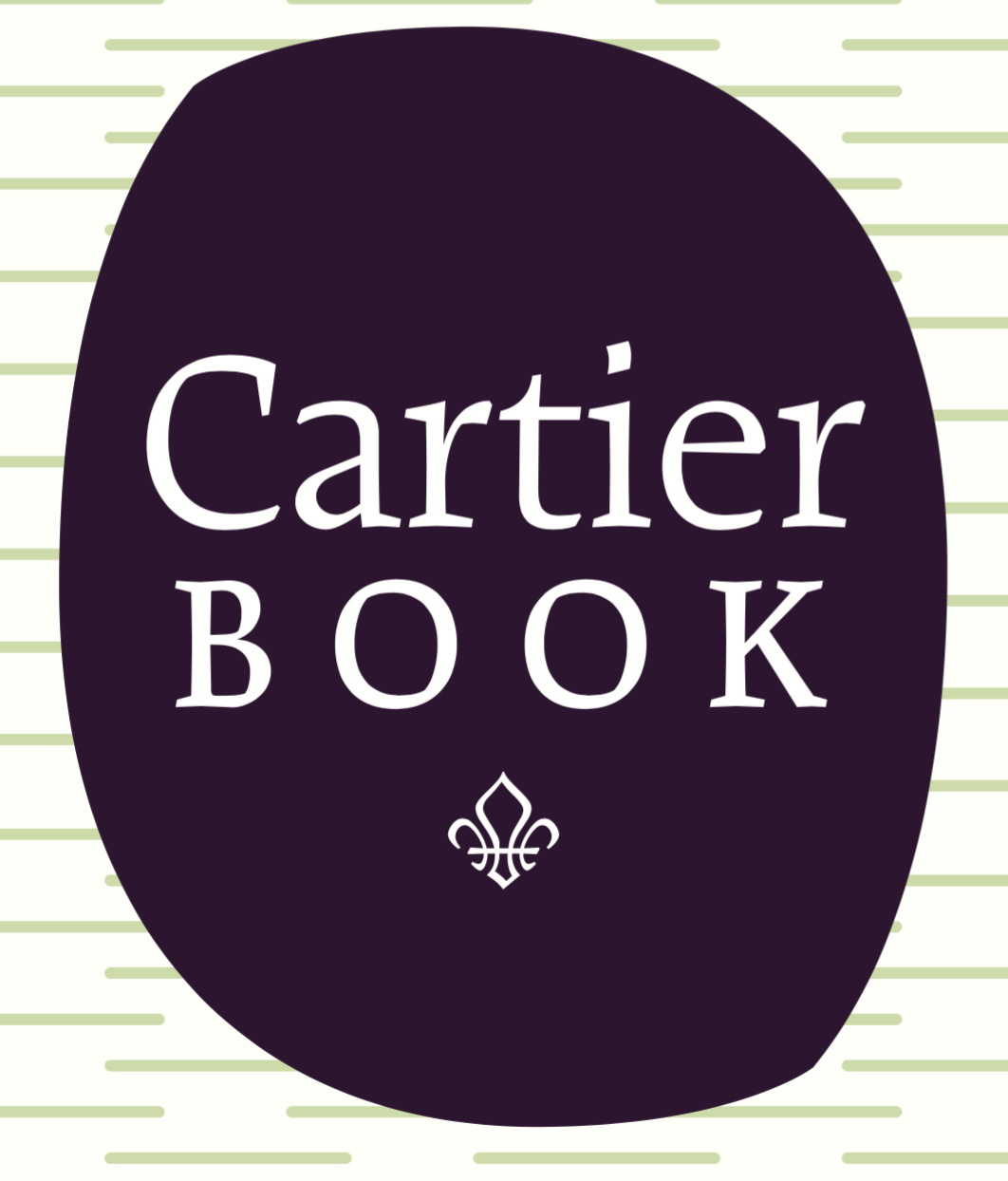
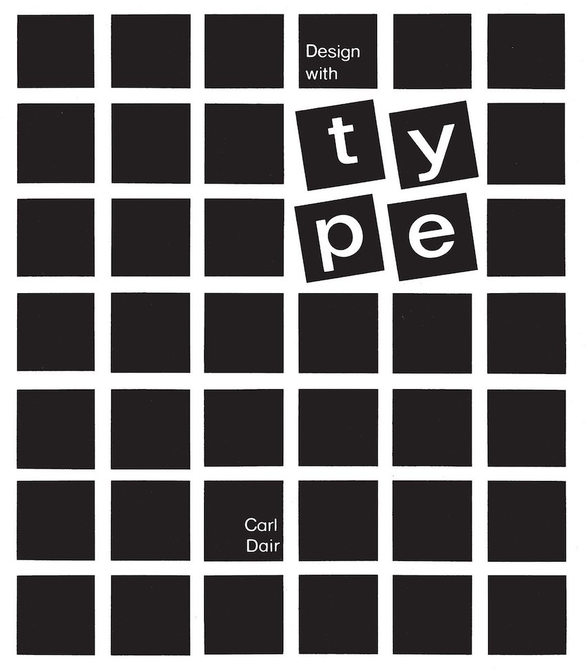
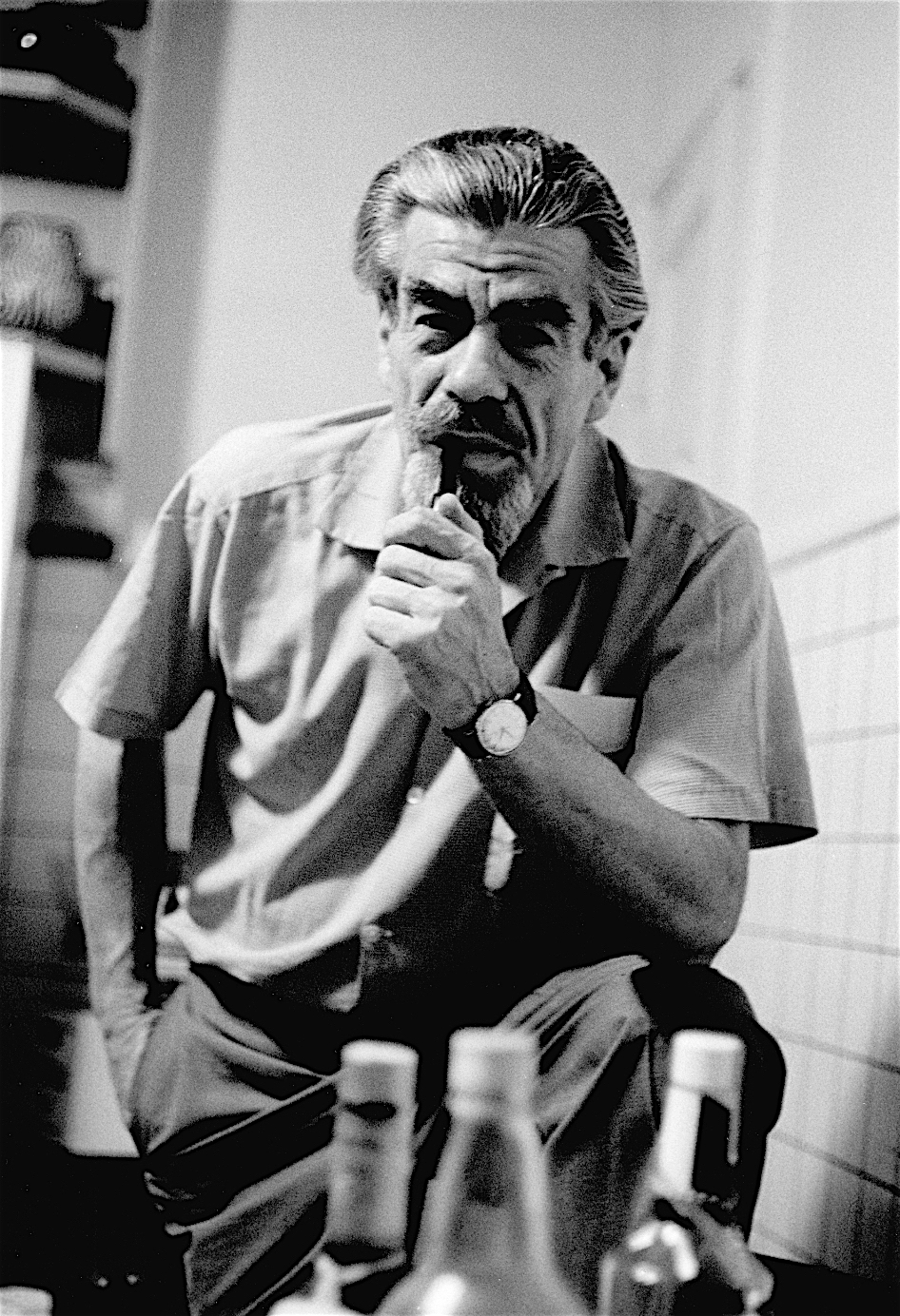
Renowned Canadian type and graphic designer (b. Welland, Ontario, 1912, d. 1967 from a heart attack on a flight between New York and Toronto). He ran the Eveleigh-Dair Studio from 1947-1951 in Montreal with partner Henry Eveleigh. He worked mainly as a freelance designer, was department store art director and even typographic director for the National Film Board of Canada (1945). Dair lectured on typography at the Ontario College of Art between 1959 and 1962, and taught for a couple of years at the Jamaica School of Arts and Crafts. In 1956 and 1957 he received an RSC fellowship to study type design and manufacture in the Netherlands. During this period he had the opportunity to study metal type and hand-punching at Enschedé Foundry in Haarlem, where he created a silent film called Gravers and Files documenting one of the last great punchcutters, P. H. Rädisch. There is a beautiful modern version of the movie with voiceover by Matthew Carter. He created Canada's first roman typeface, Cartier (1967, MonoLino Typesetting Company Limited) for Canada's centennial. Cartier was unfinished when he died. Rod McDonald finished it, to become a working and much larger typeface family called Cartier Book in 2000. Cartier has a sequel: Raleigh (Ingrama, 1977), co-designed by Robert Norton, David Anderson and Adrian Williams is sold by Bitstream, Adobe, Linotype, Paratype, and URW++. It is characterized by a bloated belly N. Raleigh was produced in 1977 by Robert Norton, and was based on Carl Dair's Cartier typeface. It was renamed Raleigh after Dair's death. Adrian Williams added three weights for a display series, and Robert Norton designed the text version. Several typefaces were influenced by Cartier. These include Ludwig Ubele's award-winning FF Tundra (2011). For a full revival, including both a facsimile and an interpretation, see Nick Shinn's Dair (2017). Author of Design with Type (1952, revised and expanded in 1967 and republished by the University of Toronto Press (First Edition) in 2000). He also wrote several wonderful short treatises on various topics in type design. John Berry discusses Dair's seven different kinds of contrast, size, weight, form, structure, texture, color and direction. |
EXTERNAL LINKS |
| | |

file name: Carl Dair Rod Mc Donald Cartier Book 2000d

file name: Carl Dair Rod Mc Donald Cartier Book 2000f

file name: Carl Dair Cartier Book

file name: Carl Dair David Anderson Adrian Williams Robert Norton Bitstream Raleigh 1990

file name: David Anderson Raleigh Bitstream 1977

file name: Carl Dair Robert Norton Adrian Williams Raleigh L T Std 1977

file name: Robert Norton Raleigh 1977

file name: Robert Norton Raleigh 1977b

file name: Carl Dair Cartier Book

file name: Carl Dair Cartier Book

file name: Carl Dair Cartier Book 1967

file name: Carl Dair Design With Type Cover 2016

file name: Nick Shinn Dair 2017 248032 after Carl Dair Cartier 1967

file name: Nick Shinn Dair 2017 248033 after Carl Dair Cartier 1967

file name: Nick Shinn Dair 2017 248035 after Carl Dair Cartier 1967

file name: Nick Shinn Dair 2017 248036 after Carl Dair Cartier 1967

file name: Nick Shinn Dair 2017 248037 after Carl Dair Cartier 1967

file name: Nick Shinn Dair 2017 after Carl Dair Cartier 1967

file name: Nick Shinn Dair67 Italic 2017 after Carl Dair Cartier 1967

file name: Roger Excoffon Max Caflisch Anton Stankowski Carl Dair Hans Neuburg Olle Eksell Typomundus Pic 1964

file name: Carl Dair Pic
| | |
|
Luc Devroye ⦿ School of Computer Science ⦿ McGill University Montreal, Canada H3A 2K6 ⦿ lucdevroye@gmail.com ⦿ https://luc.devroye.org ⦿ https://luc.devroye.org/fonts.html |


