TYPE DESIGN INFORMATION PAGE last updated on Thu Apr 16 22:01:30 EDT 2026
FONT RECOGNITION VIA FONT MOOSE
|
|
|
|
Paul Beaujon was the pen name of Beatrice L. Warde. Born in New York in 1900, she died in London in 1969. A typographer, writer, and art historian, she worked for the British Monotype Corporation for most of her life, and was known for her energy, enthusiasm and speeches. Collaborator of Stanley Morison. She created a typeface called Arrighi. She is famous for The Crystal Goblet or Printing Should be Invisible (The Crystal Goblet, Sixteen Essays on Typography, Cleveland, 1956, and Sylvan Press, London, 1955), which is also reproduced here and here. The text was originally printed in London in 1932, under the pseudonym Paul Beaujon. Here are two passages:
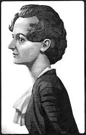
Drawing of her by Eric Gill. Life story. Beatrice Warde was educated at Barnard College, Columbia, where she studied calligraphy and letterforms. From 1921 until 1925, she was the assistant librarian at American Type Founders. In 1925, she married the book and type designer Frederic Warde, who was Director of Printing at the Princeton University Press. Together, they moved to Europe, where Beatrice worked on The Fleuron: A Journal of Typography (Cambridge, England: At the University Press, and New York: Doubleday Doran, 1923-1930), which was at that time edited by Stanley Morison. As explained above, she is best known for an article she published in the 1926 issue of The Fleuron, written under the pseudonym Paul Beaujon, which traced types mistakenly attributed to Garamond back to Jean Jannon. In 1927, she became editor of The Monotype Recorder in London. Rebecca Davidson of the Princeton University Library wrote in 2004: Beatrice Warde was a believer in the power of the printed word to defend freedom, and she designed and printed her famous manifesto, This Is A Printing Office, in 1932, using Eric Gill's Perpetua typeface. She rejected the avant-garde in typography, believing that classical forms provided a "clearly polished window" through which ideas could be communicated. The Crystal Goblet: Sixteen Essays on Typography (1955) is an anthology of her writings. Wood engraved portrait of Warde by Bernard Brussel-Smith (1950). |
EXTERNAL LINKS |
| | |

file name: beatricewarde by ericgill

file name: Beatrice L Warde Portrait by Bernard Brussel Smith 1950

file name: T D C Beatrice Warde Scholarship Poster 2021

file name: Stanley Morison Beatrie Warde Pic 1960s

file name: Beatrice Warde Portrait by Mark Summers 1988
| | |
|
Luc Devroye ⦿ School of Computer Science ⦿ McGill University Montreal, Canada H3A 2K6 ⦿ lucdevroye@gmail.com ⦿ https://luc.devroye.org ⦿ https://luc.devroye.org/fonts.html |


